

- •241.50, Outdoor Advertising
- •010, Contents
- •247, Exhibits
- •251, Newsletters
- •391, FAQ: Basic Standards
- •392, FAQ: Advertising & Branding
- •Contents
- •Glossary
- •Letter from John D. Opie
- •What is the GE Identity Program?
- •Using Primary Marks
- •Corporate Marks
- •outside the U.S.A.
- •Used by Outsiders
- •How Trademarks Come into Being
- •Selecting Secondary Word Marks
- •Using Secondary Word Marks
- •Protecting Secondary Marks
- •131, Graphic Signatures
- •Contents
- •General Guidelines
- •Signature Elements
- •Signature Content
- •Signature Arrangements
- •Signature Monogram
- •Signature Typography:
- •Univers 68 & 48
- •ITC New Baskerville Italic
- •Laser Line
- •132, Color
- •Contents
- •Corporate Colors
- •GE Grey & Metallic Color Palette
- •GE Dark Color Palette
- •Using Other Colors
- •133, Typography
- •Contents
- •The Univers Series
- •The ITC New Baskerville Series
- •Contents
- •Dynamic Monogram
- •One-Quarter
- •Circle Versions
- •Bar Versions
- •Reproduction Alternatives
- •Contents
- •220, Packaging
- •Contents
- •Packaging outside the U.S.A.
- •OEM Packaging
- •Contents
- •Guidelines
- •Information Matrix
- •Examples
- •OEM Shipping Cases & Cartons
- •241, Advertising
- •Contents
- •World Wide Web Site References
- •Broadcast Advertising
- •Guidelines
- •Examples
- •White Pages Listings
- •Advertising outside the U.S.A.
- •Contents
- •Layout Guidelines
- •Employment Agency Logos
- •Dynamic Monogram
- •Copy Guidelines
- •Advertising outside the U.S.A.
- •Contents
- •Creative Matrix
- •Contents
- •Creative Matrix
- •Use & Care Guides
- •Contents
- •Signature Guidelines
- •Point-of-Sale Materials
- •Special Promotions at the Point of Sale
- •Novelties
- •T-Shirts
- •Contents
- •Introduction
- •Typical Exhibits
- •Exhibit Supplier Contacts
- •Glossary
- •Introduction
- •Project Scheduling Outline
- •Sample Project Schedule
- •Budgeting
- •Tabletop Exhibit
- •Introduction
- •Introduction
- •Wall Panels
- •Posts
- •Beams
- •Lightwalls
- •Ceiling Panels
- •Shelves
- •Cabinets & Counters
- •Wall Lights
- •Light Bars
- •Introduction
- •Exhibit Colors & Materials
- •Standard Graphic Signature Overlays
- •Sizes of Graphic Overlays
- •Background Formats
- •Introduction
- •Services
- •Element Use Costs
- •Exhibit Use Costs
- •General Guidelines
- •Portable Exhibit Order
- •New Tradeshow Alert
- •Contents
- •General Guidelines
- •Recommended Typefaces & Sizes
- •General Guidelines
- •Cover Pages
- •Overhead Title Transparencies
- •Title Slides
- •Using the Monogram with Other Logos
- •on Cover Pages
- •in Overhead Title Transparencies
- •in Title Slides
- •Two- & Three-Column Grids
- •General Guidelines
- •for Print Presentations
- •for Overhead Transparencies
- •for Slides
- •for Print Presentations
- •for Overhead Transparencies
- •Build Style
- •for Overhead Transparencies
- •in Overhead Transparencies
- •in slides
- •Introduction
- •Flow Charts
- •Single Pie Charts
- •Multiple Pie Charts
- •Single Bar Charts
- •Multiple Bar Charts
- •Chart Labels
- •Contents
- •Typewritten Newsletters
- •Name Tags
- •Security Badges
- •Uniform Patches
- •Contents
- •Standard Letterhead
- •Standard Second Sheet
- •Monarch Letterhead
- •Internal Letterhead
- •News Release Letterhead
- •News Bulletin Letterhead
- •Standard Envelope
- •Internal Envelope
- •News Release Envelope
- •Airmail Envelope
- •Large Mailing Envelope
- •Business Cards
- •Mailing Label
- •Contents
- •Letterhead
- •Second Sheet
- •Monarch Letterhead
- •Internal Letterhead
- •Envelope
- •Monarch Envelope
- •Internal Envelope
- •Business Card
- •Contents
- •Standard Letterhead
- •Standard Second Sheet
- •Internal Letterhead
- •Standard Envelope
- •Business Cards
- •Contents
- •Standard Second Sheet Format
- •Monarch Letterhead Format
- •Internal Letterhead Format
- •Envelope Formats
- •Mailing Label Format
- •Contents
- •Standard Letterhead Format
- •Standard Second Sheet Format
- •Internal Letterhead Format
- •Standard Envelope Format
- •Contents
- •Forms Requirements
- •The Graphic Signature & Form Title
- •Structuring Information in a Form
- •Consolidating Forms
- •Selecting a Form Format
- •Short Forms
- •Forms with Extensive Instructions
- •External Forms
- •280, Facility Signs
- •Contents
- •Pylon Sign
- •Monument Sign
- •Pole Sign
- •Ground Sign
- •Individual Sign Elements
- •Roof Sign
- •Decals on Glass Doors
- •Directional Signs
- •How to Order Facility Signs
- •Contents
- •General Guidelines
- •Tractor-Trailers
- •Service Vans
- •Service Pickup Trucks
- •In-Plant Vehicles
- •Industrial Haulage
- •Heavy Construction Equipment
- •Tarpaulins
- •Straight-Box Trucks
- •Contents
- •Component Naming Standards
- •Developing Component Names
- •Using Communicative Names
- •Contents
- •Graphic Signatures
- •Typography
- •Color
- •Reproduction Materials
- •Contents
- •Introduction
- •Winning Combinations
- •GE Identity Overview
- •GE Graphic System
- •Naming Process Overview
- •Five-Level Naming Scheme
- •Naming Decision Tree
- •Industry Issues Research, 1986
- •Naming Process outside the U.S.A.
- •Joint Marks
- •Contents
- •Introduction
- •GE Identity Overview
- •GE Graphic System
- •Five-Level Naming Scheme
- •Naming Process outside the U.S.A.
- •Contents
- •Introduction
- •GE Identity Overview
- •GE Graphic System
- •Joint Marks
- •Contents
- •GE Trademarks & Trade Names
- •GE Identity Overview
- •GE Graphic System
- •Five Basic Rules
- •Examples of Typical Applications
- •Reproduction Guidelines & Materials
- •Contents
- •Introduction
- •GE Trademarks & Trade Names
- •GE Identity Overview
- •GE Graphic System
- •Five Basic Rules
- •Advertising
- •Promotional Materials
- •Print & Product Literature
- •Signs
- •Vehicles
- •Stationery
- •Business Forms
- •Reproduction Guidelines & Materials
- •370, OEMs
- •OEM Packaging
- •OEM Shipping Cases & Cartons
- •Getting Started
- •Standard Navigational Tools
- •Custom Links
- •Document Plan
- •Introduction & General Guidelines
- •Linear Dynamic Monogram
- •Sizing the Signature Monogram
- •16-Unit Grid
- •10-Unit Grid
- •16-Unit Grid
- •10-Unit Grid
- •700, Document Plan

02 |
Section 02: Cover Pages & Titles |
248.02.05 |
Using the Monogram with Other Logos |
|
on Cover Pages
Examples are reductions of 11 x 8 1⁄2 - inch formats.
g
GE Power Generation
to
Power, Inc.
1988
VIRGINIA POWER
Monogram: 80-point GE Logo Font, signature typography: 20-point Univers 68, text: 36-point ITC New Baskerville
 g
g
GE Power Generation
Proposal to
Virginia Power, Inc.
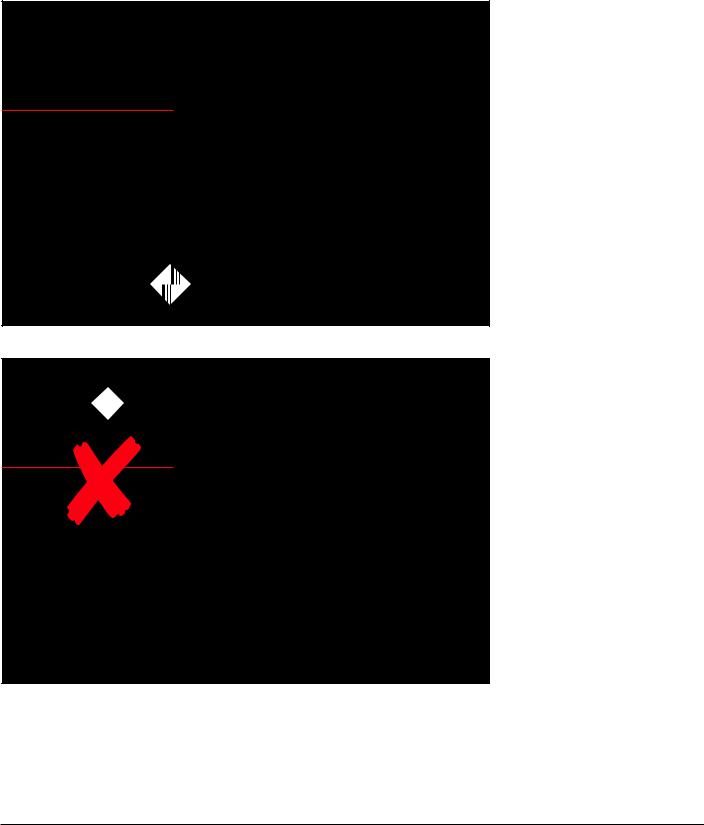
When using the logo of another company on a cover page, follow these guidelines, as shown in the example at the upper left:
•Keep the other logo outside the graphic signature, well separated from the Monogram. Do not place the other logo next to the Monogram (for example, do not place it to the right of the Monogram, as shown in the incorrect example at the lower left). Because such
a placement suggests a strong alliance with GE, it is reserved for the identification of only those joint ventures that are licensed to use joint marks.
(For more information on joint marks, see document 341, Name & Trademark Practices for Affiliates, pages 30 to 35.)
•Avoid using the other logo in the title; instead, use the name of the company in the title, set in the same typeface and size as the balance of the title.
•Place the logo at the bottom of the cover sheet, separated from but aligned with the other elements.
June 1988
GE Identity Program |
248, Presentation Materials |
GE Identity Website: http://www.ge.com/identity |
GE Identity Hotline: 800 654-2696 or 518 869-2824 (DC: 232-2696)

02 |
Section 02: Cover Pages & Titles |
248.02.06 |
Using the Monogram with Other Logos |
|
in Overhead Title Transparencies
Examples are reductions of 11 x 8 1⁄2 - inch formats.
g
GE Power Generation
to
Power, Inc.
1988
VIRGINIA POWER
Monogram: 80-point GE Logo Font, signature typography: 20-point Univers 68, text: 36-point Univers 75
g 


GE Power Generation
Proposal to
Virginia Power, Inc.
When using the logo of another company in a title transparency, follow these guidelines, as shown in the example at the upper left:
•Keep the other logo outside the graphic signature, well separated from the Monogram. Do not place the other logo next to the Monogram (for example, do not place it to the right of the Monogram, as shown in the incorrect example at the lower left). Because such
a placement suggests a strong alliance with GE, it is reserved for the identification of only those joint ventures that are licensed to use joint marks.
(For more information on joint marks, see document 341, Name & Trademark Practices for Affiliates, pages 30 to 35.)
•Avoid using the other logo in the title; instead, use the name of the company in the title, set in the same typeface and size as the balance of the title.
•Place the logo at the bottom of the overhead transparency, separated from but aligned with the other elements.
June 1988
GE Identity Program |
248, Presentation Materials |
GE Identity Website: http://www.ge.com/identity |
GE Identity Hotline: 800 654-2696 or 518 869-2824 (DC: 232-2696)
02 |
Section 02: Cover Pages & Titles |
248.02.07 |
Using the Monogram with Other Logos |
|
in Title Slides
Examples are reductions of a 4 5⁄8 x 7 - inch format for 35 mm slides.
e
GE Power Generation
Proposal to
Virginia Power, Inc.
VIRGINIA POWER
Monogram: 66-point GE Logo Font, signature typography and text: 22-point Univers 68
e 


GE Power Generation
Proposal to
Virginia Power, Inc.
Graphic signature: 34-point Univers 68, text: 34-point Univers 65 and 55
Note: The letterspacing
of light type against a dark background is slightly more open than that normally used in print.
When using the logo of another company in a title slide, follow these guidelines, as shown in the example at the upper left:
•Keep the other logo outside the graphic signature, well separated from the Monogram. Do not place the other logo next to the Monogram (for example, do not place it to the right of the Monogram, as shown in the incorrect example at the lower left). Because such
a placement suggests a strong alliance with GE, it is reserved for the identification of only those joint ventures that are licensed to use joint marks.
(For more information on joint marks, see document 341, Name & Trademark Practices for Affiliates, pages 30 to 35.)
•Avoid using the other logo in the title; instead, use the name of the company in the title, set in the same typeface and size as the balance of the title.
•Place the logo at the bottom of the title slide, separated from but aligned with the other elements.
GE Identity Program |
248, Presentation Materials |
GE Identity Website: http://www.ge.com/identity |
GE Identity Hotline: 800 654-2696 or 518 869-2824 (DC: 232-2696)

03
The same basic style for text is used in all print, overhead, and slide presentations:
•Use a fine (thin) horizontal line at the top of the presentation format. Place the headline above the line and the body text below it.
•Set type flush left, ragged right.
•Use at least one point of additional space between lines of type.
•Do not indent paragraphs; instead, skip at least one-half line space between paragraphs.
Section 03: Headlines, Text, & Tables |
248.03.01 |
Text Style General Guidelines |
|
Headline & Top Horizontal Line
Typeface: Univers 68.*
For recommended type sizes, see page 01.03.
Keep the headline and top horizontal line the same size and in the same position on all pages or transparencies, whether the text and headlines are long or short.
Because most laser printers cannot print up to the edge of the paper, in the examples of print presentations and overhead transparencies on pages 03.02 and 03.03, the top horizontal line is shown beginning at the left margin, aligned with the left edge of the headline and text.
Nevertheless, if the line can bleed left off the format, it should, as shown in the examples of slides on page 03.04.
Body Text
Typefaces
•Body copy: ITC New Baskerville
•Subheads and highlights: Univers 68*
For recommended type sizes, see page 01.03.
Begin the body text at least one line space below the horizontal line used at the top of all presentation formats. Keep this beginning point the same on all pages or transparencies, whether the body text is long or short.
When listing items,
• for first-level indents, use solid bullets
• for second-level indents, use short dashes
*For names used in computer typesetting, see the footnote on page 01.03.
GE Identity Program |
248, Presentation Materials |
GE Identity Website: http://www.ge.com/identity |
GE Identity Hotline: 800 654-2696 or 518 869-2824 (DC: 232-2696)

03 |
Section 03: Headlines, Text, & Tables |
248.03.02 |
Text Style for Print Presentations |
|
Examples are reductions of 11 x 8 1⁄2 - inch formats.
|
|
|
|
Body Copy |
|
|
|
|
Use ITC New Baskerville, sized by |
|
Customer Focus Magazine |
|
|
this method: |
|
|
|
|
• Determine the size required for |
|
Marketing |
|
|
the page with the most text. |
|
• EDI and GE Plastics |
|
|
• Use that size for all body text in the |
|
– Upwards of 60 customers are tied into GEP’s EDI system – a look at how and why it works. |
|
|
presentation. |
|
• EDI and GE Lighting |
|
|
|
|
– The customers are demanding it and GE Lighting is delivering – a look at their EDI system. |
|
|
Note: To maintain easy readability, |
|
• Pumping new life into an old market |
|
|
do not use a size smaller than 10 |
|
– GE Plastics and GE Motors link up to solve a common problem and create sales for both. |
|
|
points or larger than 16 points for |
|
|
|
|
|
|
Service |
|
|
body text. The recommended size |
|
• GE “Action Center” in action |
|
|
is 12 to 14 points. |
|
– GE Mortgage Insurance is providing unsurpassed service to customers. |
|
|
Subheads & Highlights |
|
• AIM for Excellence year-end winner |
|
|
|
|
– ED&C earns $25,000 grand prize. |
|
|
• For first-level subheads and highlights, |
|
• GE Aircraft Engines’ Quality Ambassadors |
|
|
use Univers 68* in the same size |
|
– GEAE employees visit the customers to spread the quality and service message back home |
|
|
|
|
|
|
as the body text. Do not box or |
|
|
|
|
|
|
|
Selling |
|
|
underline highlights. |
|
• Laptops in Louisville |
|
|
• For second-level subheads, use ITC |
|
– GE Appliances is increasing field sales productivity through the use of portable computers. |
|
|
New Baskerville Italic. |
|
• GEIS “is it” for Coke |
|
|
|
|
– An on-site project manager is the secret formula in GE Information Service’s success |
|
|
Page Numbers & Footnotes |
|
with Coca-Cola in Atlanta. |
|
|
Use ITC New Baskerville, 2 points |
|
|
25 |
||
|
|
smaller than the body text. |
||
|
|
|
|
|
|
|
|
|
|
Subheads: Univers 68, text: 14-point ITC New Baskerville |
|
|
|
|
*For names used in computer typesetting, see the footnote on page 01.03.
GE Identity Program |
248, Presentation Materials |
GE Identity Website: http://www.ge.com/identity |
GE Identity Hotline: 800 654-2696 or 518 869-2824 (DC: 232-2696)

03 |
Section 03: Headlines, Text, & Tables |
248.03.03 |
Text Style for Overhead Transparencies |
|
Examples are reductions of 11 x 8 1⁄2 - inch formats.
Customer Focus Magazine
Marketing
•EDI and GE Plastics
–A look at how and why GEP’s EDI system works
•EDI and GE Lighting
–The customers demand EDI: GE Lighting delivers
•Pumping new life into an old market
–GE Plastics and GE Motors link up and create sales for both
Service
•GE “Action Center” in action
–GE Mortgage Insurance is providing unsurpassed service to customers
•AIM for excellence year-end winner
–ED&C earns $25,000 grand prize
Subheads: Univers 65, text: 24-point Univers 55
Customer Focus Magazine
Marketing
•EDI and GE Plastics
–A look at how and why GEP’s EDI system works
•EDI and GE Lighting
–The customers demand EDI: GE Lighting delivers
•Pumping new life into an old market
–GE Plastics and GE Motors link up and create sales for both
Service
•GE “Action Center” in action
–GE Mortgage Insurance is providing unsurpassed service to customers
•AIM for excellence year-end winner
–ED&C earns $25,000 grand prize
Overhead projections are difficult to read when they contain too much copy. To enhance legibility,
•make overhead transparencies summaries of the corresponding print presentation
•use the largest type size that space permits
Compared to preparing a print presentation, when preparing overhead transparencies,
•shorten copy to express the gist of an idea, omitting detail (When the presentation is made, the commentator can elaborate on the idea and cite details.)
•break long material into several overhead transparencies, as shown in the examples at the left
Body Copy
Use Univers 55, 56, 47, or 48* for the body text. Determine the size and style required and use the same size and style in all body text in the presentation.
Subheads & Highlights
To differentiate subheads and highlights from the body text, use the bold or black version of the typeface selected for the body text (Univers 75, 76, 67, or 68*) in the same size as the body text.
Recommended combinations of typefaces* for body copy and subheads:
Text |
Subhead |
Univers 55 |
Univers 75, 76, 68 |
Univers 56 |
Univers 76 |
Univers 48 |
Univers 68 |
Do not box, underline, or otherwise embellish highlights.
Subheads: Univers 68, text: 20-point Univers 48 |
*For names used in computer typesetting, |
|
|
|
see the footnote on page 01.03. |
|
|
|
GE Identity Program |
248, Presentation Materials |
GE Identity Website: http://www.ge.com/identity |
GE Identity Hotline: 800 654-2696 or 518 869-2824 (DC: 232-2696)

03 |
Section 03: Headlines, Text, & Tables |
248.03.04 |
Text Style for Slides |
|
Examples are reductions of a 4 5⁄8 x 7 - inch format for 35 mm slides.
Customer Focus Magazine
Marketing
•EDI and GE Plastics
–How and why GEP’s system works
•EDI and GE Lighting
–Customers are demanding it
•Pumping new life into an old market
–GE Plastics/GE Motors link up and benefit
Subheads and text: 22-point Univers 68 and 48
Customer Focus Magazine
Marketing
•EDI and GE Plastics
–How and why GEP’s system works
•EDI and GE Lighting
–Customers are demanding it
•Pumping new life into an old market
–GE Plastics/GE Motors link up, benefit
Subheads: Univers 75, text: 22-point Univers 55
Note: The letterspacing
of light type against a dark background is slightly more open than that normally used in print.
Slides are difficult to read when they contain too much copy.
To enhance legibility, make slides very brief summaries of the corresponding print presentation. Compared to preparing a print presentation, when preparing slides,
•shorten copy using only key words and phrases (When the presentation is made, the commentator can define and expand on the idea and cite details.)
•break long material into several slides, as shown in the examples at the left
Body Copy
Use Univers 55, 56, 47, or 48* for the body text. Determine the size and style required and use the same size and style in all body text in the presentation.
Subheads & Highlights
To differentiate subheads and highlights from the body text, use either (but not both)
•the bold or black version of the typeface selected for the body text (Univers 75, 76, 67, or 68*) in the same size as the body text
•color
Recommended combinations of typefaces* for body copy and subheads when color is not used for differentiation:
Text |
Subhead |
Univers 55 |
Univers 75, 76, 68 |
Univers 56 |
Univers 76 |
Univers 48 |
Univers 68 |
Do not box or underline highlights.
*For names used in computer typesetting, see the footnote on page 01.03.
GE Identity Program |
248, Presentation Materials |
GE Identity Website: http://www.ge.com/identity |
GE Identity Hotline: 800 654-2696 or 518 869-2824 (DC: 232-2696)