

Примеры брендбуков / intel
.pdfBuilding
the
Intel Brand
Graphics Standards for Using the Intel Corporate Logo
Rev. 3
August 1997
WelcomeOne Intel Image
Worldwide
Intel Corporation relies on its well-recognized dropped “e” Corporate Logo to communicate a strong and identifiable image worldwide. The proper consistent use of the Intel Corporate Logo is an important means of presenting and preserving this brand image. Communications that carry the Intel Corporate Logo convey recognition of one of the most admired companies according to a March 1996 Survey in Fortune Magazine.
How to Use Your Portable Document File (pdf)
It’s easy. Go to the Table of Contents on page 2 and 3 (use an arrow in the toolbar or your keyword arrows to move sequentially from page to page). To get to the information you want, double-click on that entry in the Table of Contents. You can read the information either from your monitor screen or print out the pages you want to use, but please remember that we need to streamline paper flow and place emphasis on eliminating paper waste.
Keep the following tips in mind:
•All measurements are given in both inches and millimeters.
•Remember that the figures you see are not actual size. Please do not measure from your monitor screen or from a printout. Instead, follow the measurements provided. (Use the magnifying glass with the + symbol to enlarge the information to view it more easily on your monitor screen.)
1

ContentsTable of Contents
Welcome |
1 |
•One Intel Image Worldwide
•How to Use Your Portable Document File (pdf)
The Intel Name |
4 |
•Use the Intel Name Properly to Build Brand Equity
•Correct Wordmark Usage
•Incorrect Wordmark Usage
Intel Corporate Logo |
5 |
•A Brief Look at the History of the Intel Corporate Logo
•What is the Intel Corporate Logo?
•Who May Use the Intel Corporate Logo?
•Intel Corporate Logo Basics
Guidelines |
6-8 |
• Correct Intel Corporate Logo Usage |
|
• Circle ® |
|
• Clear Space |
|
• Minimum Size |
|
• Maximum Size |
|
• Color |
|
• Correct Color Usage |
|
• Backgrounds |
|
• Correct Backgrounds |
|
• Incorrect Backgrounds |
|
Incorrect Usage |
9 |
|
|
• Dilution of the Intel Corporate Logo |
|
• Incorrect Logo Usage |
|
Trademarks and Brands |
10 |
|
|
•Protecting Our Trademarks and Brands
•Product Logos
2

ContentsTable of Contents continued from previous page
Corporate Identity |
11 |
•Expressing Intel Corporate Identity
•What Is the Intel Corporate Identity System?
Co-marketing or Sponsorships |
12 |
•Using the Intel Corporate Logo in Co-marketing
•Using the Intel Corporate Logo for Sponsorship
•How to Request Co-marketing/Sponsorship Approval
Six Frequently Asked Questions |
13 |
•What is the Minimum Logo Size?
•How Do I Determine Clear Space?
•What Kind of Background Is Appropriate for the Intel Corporate Logo?
•What Are the Approved Colors for the Intel Corporate Logo?
•How Is the Word “Intel” Used with Other Words or in Text?
•What Do I Do When a Third Party Requests to Use the Intel Corporate Logo?
3

TheIntel
NameUse the Intel Name Properly
to Build Brand Equity
Intel has much value attached to our name. Our communicators are encouraged, with the help of this guideline, to use the Intel name in a proper manner. There are two very basic but distinct ways in which the Intel name may appear: one is in text (wordmark) and the other is in the specified graphic form (logo) of the Intel Corporate Logo.
When the Intel name is used in body copy or headlines, it should be typeset in the same face and style as the surrounding copy. Do not try to re-create or imitate the logo stylistically with text type. If you wish to emphasize the name, it may appear as “INTEL,” in all caps, or as “Intel,” with an initial cap “I.”
Correct Wordmark Usage
In text, you may emphasize INTEL this way, by using all caps
Another possibility for use in text, but with less emphasis, is to use Intel this way, by using initial cap and lowercase
Incorrect Wordmark Usage
Don’t combine parts of company name with other words
Don’t combine company name with other words
Don’t combine company name with prefixes or suffixes
Don’t use part of company name to create other words
INTEL
Intel
Don’t use the small “i” in an acronym
Don’t use all lowercase letters
4
Intel Corporate
LogoA Brief Look at the History
of the Intel Corporate Logo
To obtain a logo sheet or electronic logo file, call the CID hotline at 408.765.7696. For the electronic logo file, you will need to specify DOS or MAC. Available file formats are: .eps, .gif, .tif.
The logo library is located on Intel’s intranet at: www–cid.intel.com
Derived from the name Integrated Electronics, the original Intel Corporate Logo was designed by an engineer. The original Intel Corporate Logo was used until 1991 when the design of the logo was studied and modified very slightly into the version we use today. The Intel Corporate Logo was developed to serve as a strong, legible and enduring symbol of a company that is committed to safety and technology.
What Is the Intel
Corporate Logo?
The Intel Corporate Logo refers to a specific, stylized graphic image which has been developed to represent the company. The Intel Corporate Logo is not only a symbol but also a piece of artwork. It cannot be reproduced in type. It may not be used in body copy or headlines or in the possessive, plural or as part of another word.
Who May Use the Intel
Corporate Logo?
The Intel Corporate Logo is available for use by Intel employee communicators (referred to as “Intel Communicators” henceforward) responsible for promoting Intel Corporation and its products. The Intel Corporate Logo may only be used by other parties under written authorization/license for one-time usage from Intel Corporation. (For written authorization and permission to use the Intel Corporate logo, call the Corporate Identity Hotline at (408) 765-7696.) If you do not meet the above criteria, you are not authorized to use the Intel Corporate Logo.
Intel Corporate Logo Basics
1.Always reproduce the Intel Corporate Logo from a logo sheet, an electronic logo file or download the logo from the logo library on Intel’s Intranet.
2.Always use the Intel Corporate Logo alone, never with other words.
3.Always use the Intel Corporate Logo as is, never alter it in any way.
5
GuidelinesCorrect Intel Corporate Logo Usage
The Intel Corporate Logo is the primary identification of Intel Corporation. It should appear on all Intel communications and products.
Do use the Intel Corporate Logo as shown:
1. With correct clear space
2. Not smaller than the minimum size
3.In an approved logo color, preferably Intel Blue
4.On a clear background
5.Within the Corporate Identity system if part of an Intel print communication.
(see page 11)
Circle ®
The Intel Corporate Logo is a registered trademark and must always be followed by a ® mark. The Intel Corporate Logo is always provided with its ® mark in the proper position. The ® mark must never be cut off or changed in proportion or position (exception: in large scale logo usage, such as building signage, you may change the proportion).
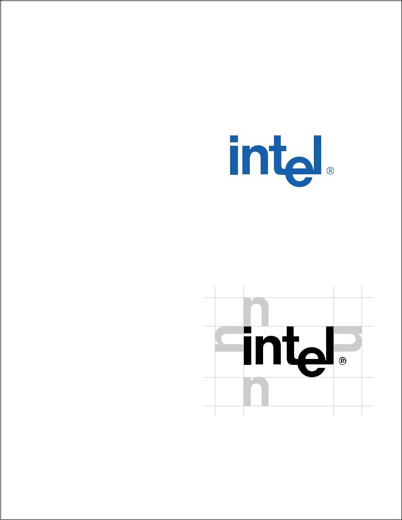
Clear Space
In all applications of the Intel Corporate Logo, the clear space around the logo should be equal to the height of the left edge of the “n” in Intel. Any background inside of this clear space must be even, unpatterned, and free from
typography or any other graphic elements. If the logo is used directly
on a photographic image, the clear space area must still provide for good contrast between background and logo and be even in tone and
pattern free.
Minimum clear space
If the Intel Corporate Logo is used at minimum size (43 pixels wide) in a web application, the clearspace is 12 pixels (HSPACE = “12,” VSPACE = “12”).
6
GuidelinesMinimum Size
5/8"
Minimum size
in print:
14.5 mm or 5/8"
Minimum size
on web:
43 pixels (640 × 480)
The minimum size for use of the logo in most environments is 14.5 mm or 5/8". Minimum size is always measured from the left side of the “i” in Intel to the right side of the circle of the ®. There are a few special situations such as the application of the logo to a Website button where the physical limitations of the environment require that the minimum size be reduced below the 14.5 mm or 5/8" dimension.
On a standard VGA screen, 13" or 15" diagonal, 640x480 pixels, the logo should not appear smaller than 43 pixels wide, measured from the left side of the “i” in the Intel to the right side of the circle of the ®.
Maximum Size
There is no maximum size for Intel Corporate Logo usage. However, when using the Intel Corporate Logo at very large sizes (over 3 feet wide) you will need to adjust the size and position of the ®. The ® symbol should be reduced and repositioned closer to the logo so it is legible but unobtrusive.
Solid Intel Blue
color in the
following systems:
PANTONE®* 285C
Toyo 8502
CMYK: 100C, 30M, 0Y, 0K
In Japan: DIC or C100 M20 (equivalent to PANTONE 285C)
Web Site Specifications:
RGB: R-0, G-51, B-255
Call Lark Schumacher at 408.765.1038 for assistance in reproducing Intel Blue.
* PANTONE® is a registered trademark of Pantone Inc.
The colors shown in these guidelines are not intended to match the PANTONE Color Standards. For accurate PANTONE Color Standards, refer to the current edition of the PANTONE Color Formula Guide.
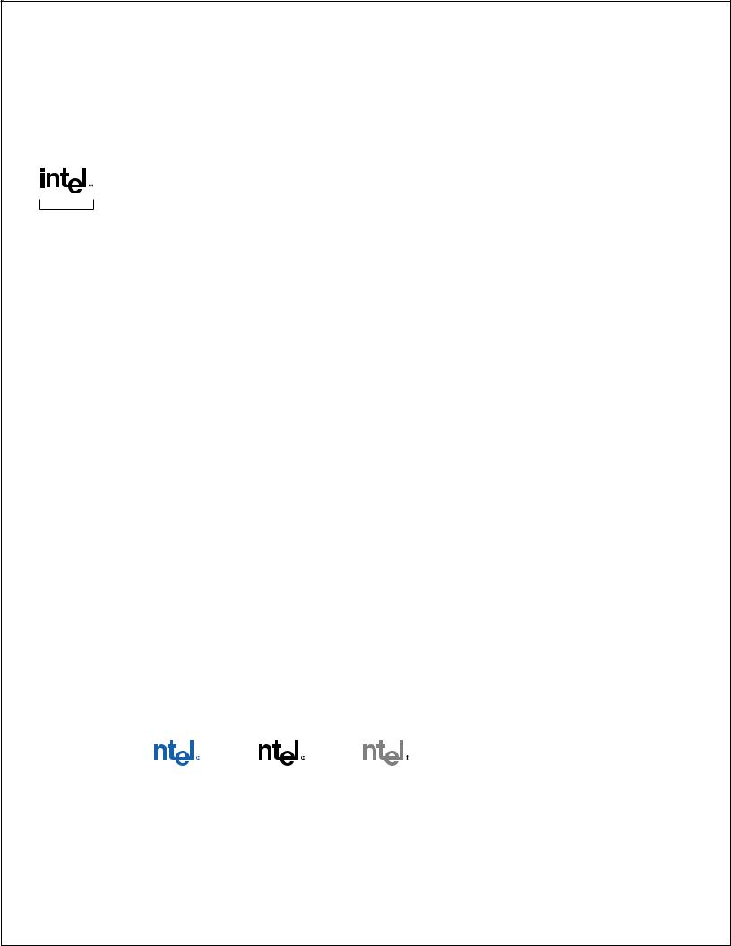
Color
The approved colors for the Intel Corporate Logo are:
1.Intel Blue—Visually match hue to Pantone* 285C run “hot”
2.Reversed to white out of a high contrast background (50% or darker)
3.Black (solid or screened 50% or darker—Note: ® prints 100% black)
Other techniques such as embossing, debossing, varnishing, etc. may be used in conjunction with the basic printing techniques as a means of creating special effects within the approved color range and contrast levels.
Additionally, special applications may call for an understated presentation of the logo. In these instances, it is acceptable to present the logo without color as a blind embossed, debossed, varnished or clear, hot-stamped image. Foil stamping in gold, silver or metallic colors is unacceptable.
Correct Color Usage
|
|
|
|
|
|
|
|
|
|
|
|
|
|
|
|
|
|
|
|
|
|
|
|
|
|
|
|
|
|
|
|
|
|
|
|
|
|
|
|
|
|
|
|
|
Intel Blue on white |
Black on white |
50% tint of black or |
|
|
|
|
|
|
|
|||||
White on Intel Blue |
|
White on black |
||||||||||||
|
|
|
|
|
darker. Note: ® prints |
|
|
Reversed to white out of a high |
||||||
|
|
|
|
|
|
as 100% black |
|
|
contrast background (50% or darker) |
|||||
7
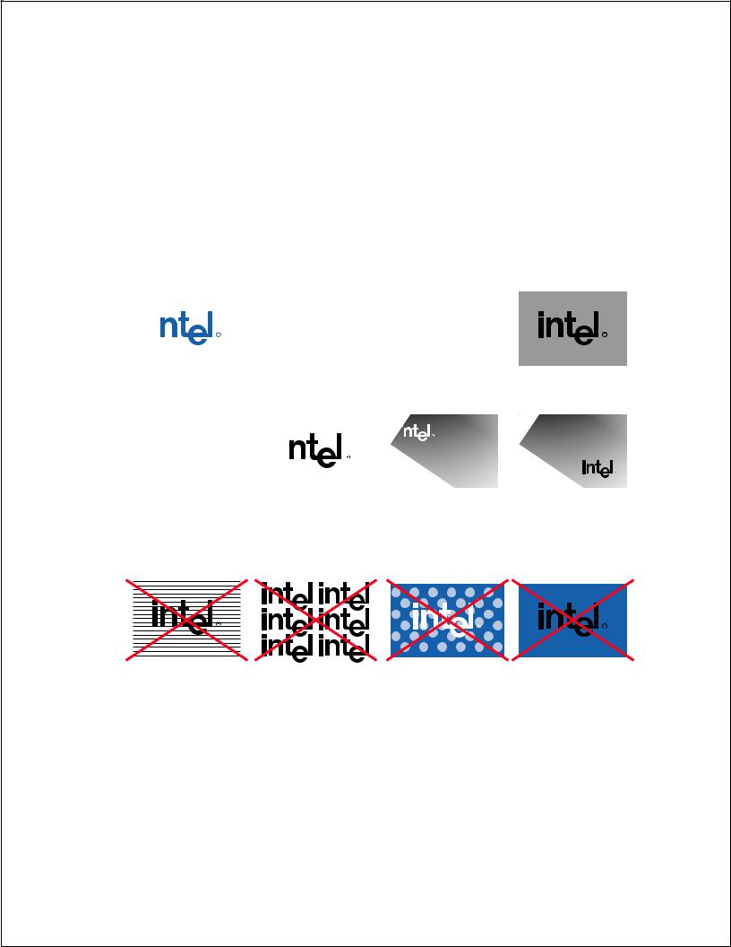
GuidelinesBackgrounds
The Intel Corporate Logo should always appear on a clean, clear solid background. The background needs to be of high contrast to the Intel Corporate logo color (example: value equivalent to 50% black or darker if using a white logo). If placing the Intel Corporate Logo on an illustration or photograph, the area that the Intel Corporate Logo is positioned needs to be clear of any patterns and variations of color.
Correct Backgrounds
|
|
|
|
|
|
|
|
|
|
|
|
|
|
|
|
|
|
|
|
|
|
|
|
|
|
|
|
|
|
|
|
|
|
|
|
|
|
|
|
|
|
|
|
|
|
|
|
|
|
|
|
Intel Blue on white |
|
White on black |
|
White on 50% tint of black or |
||||||||
|
|
|
|
|
|
|
|
darker |
||||
|
|
|
|
|
|
|
|
|
|
|
|
|
|
|
|
|
|
|
|
|
|
|
|
|
|
|
|
|
|
|
|
|
|
|
|
|
|
|
|
|
|
|
|
|
|
|
|
|
|
|
|
|
|
|
|
|
|
|
|
|
|
|
|
|
|
|
|
|
|
|
|
|
|
|
|
|
|
Black on value of 40% black or lighter
White on high contrast color (value equivalent to 50% black or darker)
Black on low contrast color (value equivalent to 40% black or lighter)
White on dark, neutral section of photo, illustration or graphic
Black on light, neutral section of photo, illustration or graphic
Incorrect Backgrounds
Don’t put the logo on a patterned background
Don’t use the logo to make a pattern or background
Don’t put logo on a busy background
Don’t put a black logo on an Intel Blue background
8
Incorrect
DilutionUsageof the Intel Corporate Logo
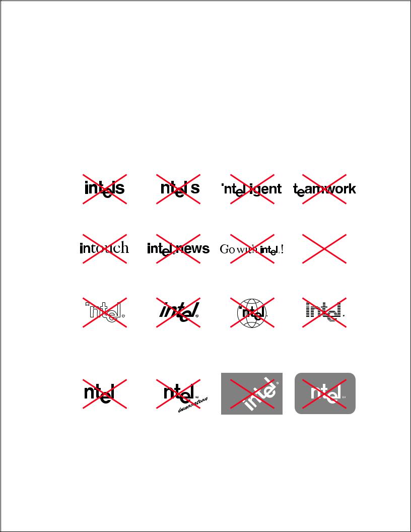
Diluting the Intel Corporate Logo (by using it improperly) lessens its value as a recognizable visual entity. Following are a few ways in which parts or all of the logo have been manipulated or incorporated to make new inappropriate/unacceptable visual elements. In each of these examples, there is a weakening of our recognizable Intel Corporate Logo.
Incorrect Logo Usage
|
|
|
|
|
|
|
|
|
|
|
|
|
|
|
|
Don’t make the logo plural |
Don’t make the logo possessive |
Don’t make a word out of the |
Don’t use part of the logo in a |
||||
|
|
|
|
|
logo |
word |
|
intel family
Don’t use part of the logo in |
Don’t use the logo as a masthead |
Don’t use the logo in running |
|||||
a phrase |
|
copy or headlines |
|||||
|
|
|
|
|
|
|
|
|
|
|
|
|
|
|
|
|
|
|
|
|
|
|
|
|
|
|
|
|
|
|
|
|
|
|
|
|
|
|
|
|
|
|
|
|
|
|
|
|
|
|
|
|
|
|
|
Don’t imitate the logo with type fonts
Don’t outline the logo |
Don’t slant or graphically modify |
|||||
|
|
|
|
the logo |
||
|
|
|
|
|
|
|
|
|
|
|
|
|
|
|
|
|
|
|
|
|
|
|
|
|
|
|
|
|
|
|
|
|
|
|
Don’t combine the logo with other graphic elements even if the clear space is respected
Don’t make a pattern, texture or gradation in the logo
|
|
|
|
|
|
|
|
|
|
|
|
|
|
|
Don’t add rules adjacent to the logo Don’t add promotional tag lines |
Don’t display the logo on an |
Don’t contain the logo within |
||
|
angle |
a shape |
||
9