

Примеры брендбуков / kent-fire-rescue-service[1]
.pdfKENT FIRE & RESCUE SER VICE C O R P O R AT E I D E N T I T Y G U I D E L I N E S |
NOVEMBER 2003 |
V E R S I O N 1 . 1 |
For artwork, please go to: www.kent.fire-uk.org/kfrs-artwork
KENT FIRE & RESCUE SER VICE CORPORATE IDENTITY GUIDELINES |
FOREWORD BY THE CHIEF FIRE OFFICER |
00.01 |
Using our corporate identity correctly and consistently is important. Every time we use our logo, we send a message about the quality of our services, about the value we place on the organisation and ourselves.
I want people to see us as a professional organisation and, whether a leaflet will be seen by our own staff or reproduced thousands of times for the public, it should be clearly branded and immediately obvious that it was produced by Kent Fire & Rescue Service.
This manual has been designed to inform and help you implement our corporate identity. Please help me by paying careful attention to its contents.
Peter Coombs QFSM MIFireE
Chief Executive & Chief Fire Officer

KENT FIRE & RESCUE SER VICE CORPORATE IDENTITY GUIDELINES |
INTRODUCTION TO THESE GUIDELINES |
00.02 |
These guidelines have been designed to introduce and help you apply the Kent Fire & Rescue Service (KFRS) brand and corporate identity.
Whether you are a member of staff or a supplier, you must follow these rules.
Logotypes, documents and other artwork can be obtained by contacting the Media & Communication Team:
Suzi J Christie
Head of Media & Communication T 01622 698241
E suzi.christie@kent.fire-uk.org
Jackie Hughes
Media Technical Adviser T 01622 698218
E jackie.hughes@kent.fire-uk.org
KENT FIRE & RESCUE SER VICE CORPORATE IDENTITY GUIDELINES |
INTRODUCTION |
CONTENTS |
00.03 |
01.00 |
BASIC ELEMENTS |
01.01 |
Introduction |
|
|
01.02 |
Corporate colours |
|
|
01.03 |
Corporate typeface |
|
|
01.04 |
Referring to KMFRA |
|
|
01.05 |
Language |
|
|
02.00 |
KFRS LOGOTYPE |
02.01 |
Introduction |
|
|
02.02 |
Large version |
|
|
02.03 |
Small version |
|
|
02.04 |
Colour versions |
|
|
02.05 |
On colour background |
|
|
02.06 |
Greyscale versions |
|
|
02.07 |
Black & white versions |
|
|
02.08 |
Minimum space |
|
|
02.09 |
Minimum size reproduction |
|
|
03.00 |
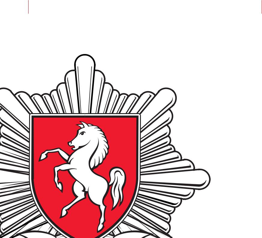
KFRS BADGE |
03.01 |
Introduction |
|
|
03.02 |
Large version |
|
|
03.03 |
Small version |
|
|
03.04 |
Colour versions |
|
|
03.05 |
On colour background |
|
|
03.06 |
Greyscale versions |
|
|
03.07 |
Black & white versions |
|
|
03.08 |
Minimum space |
|
|
03.09 |
Minimum size reproduction |
|
|
04.00 STATIONERY
04.01 Introduction
04.02 KFRS Letterhead
04.03 Other stationery
04.04 Compliments slips
04.05 Business cards
05.00 PUBLICATIONS
05.01 Introduction
05.02 Brochures & leaflets
05.03 Internal covers
05.04 Newsletters
05.05 Posters
05.06 Advertising
06.00 ELECTRONIC MEDIA
06.01 Introduction
06.02 Presentations
07.00 SIGNAGE
07.01 Introduction
07.02 Large premises sign
07.03 External address sign
08.00 VEHICLE LIVERY
08.01 Introduction
08.02 Appliance vehicles
08.03 Support vehicles
Section 01
Basic elements
KENT FIRE & RESCUE SER VICE CORPORATE IDENTITY GUIDELINES |
BASIC ELEMENTS |
The basic elements of Kent Fire & Rescue Service’s (KFRS) corporate identity are:
The KFRS logotype (section 02)
The KFRS badge (section 03)
The corporate colours
The corporate typeface
INTRODUCTION |
01.01 |
The KFRS identity is made up of a combination of these elements which are used in a variety of applications.
These guidelines will explain how to use the elements so that the style and brand are used in the correct way.
Every application must maintain the ‘spirit’ of the identity and be well designed.
KENT FIRE & RESCUE SER VICE CORPORATE IDENTITY GUIDELINES |
BASIC ELEMENTS |
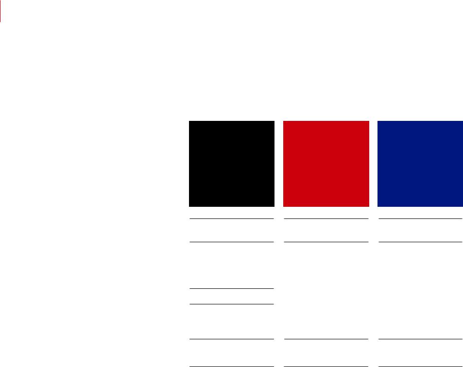
CORPORATE COLOURS |
01.02 |
KFRS Black
to match PMS Black
CMYK
C0.0
M0.0
Y0.0
K100.0
HTML 000000
RGB
R0 G 0 B 0
R0 % G 0 % B 0 %
There are three main corporate colours |
PMS: Pantone Matching System |
|
which should be reproduced as |
CMYK: 4-colour process = |
|
accurately as possible in whichever |
||
Cyan, Magenta, Yellow, Black |
||
medium they are used. |
||
|
||
|
HTML: web safe hexadecimal value |
|
|
RGB: Digital Red, Green, Blue values |
KFRS Red
to match PMS 485
KFRS Blue
to match PMS 2738
CMYK |
|
CMYK |
||
C |
0.0 |
|
C |
100.0 |
M |
100.0 |
|
M |
79.0 |
Y |
100.0 |
|
Y |
0.0 |
K |
0.0 |
|
K |
0.0 |
|
|
|
||
HTML CC0000 |
|
HTML 000066 |
||
|
|
|
||
RGB |
|
RGB |
||
R |
204 |
|
R |
0 |
G |
0 |
|
G |
0 |
B |
0 |
|
B |
102 |
R |
80 % |
|
R |
0 % |
G |
0 % |
|
G |
0 % |
B |
0 % |
|
B |
40 % |

KENT FIRE & RESCUE SER VICE CORPORATE IDENTITY GUIDELINES |
BASIC ELEMENTS |
CORPORATE TYPEFACE |
01.03 |
Arial Regular abcdefghijklmnopqrstuvwxyz ABCDEFGHIJKLMNOPQRSTUVWXYZ 1234567890!;:/?,.@¥%&*()£\ <+> '
Arial Regular italic abcdefghijklmnopqrstuvwxyz ABCDEFGHIJKLMNOPQRSTUVWXYZ 1234567890!;:/?,.@•%&*()£\’<+>”©
Arial Bold abcdefghijklmnopqrstuvwxyz
ABCDEFGHIJKLMNOPQRSTUVWXYZ 1234567890!;:/?,.@•%&*()£\’<+>”©
Arial Bold italic abcdefghijklmnopqrstuvwxyz
ABCDEFGHIJKLMNOPQRSTUVWXYZ 1234567890!;:/?,.@•%&*()£\’<+>”©
Arial Black abcdefghijklmnopqrstuvwxyz
ABCDEFGHIJKLMNOPQRSTUVWXYZ 1234567890!;:/?,.@•%&*()£\’<+>”©
The KFRS brand typeface families are Helvetica Neue and Arial.
For ease, five weights have been selected for use throughout the organisation (see below). However, if you have access, you can use any weight within these families. The one you use will depend on the needs and emphasis of your particular communication material.
You can use Helvetica Neue and Arial for headings and body text, but DO NOT mix the two typefaces – use one or the other.
No other typeface(s) should be used alongside or independently of Helvetica Neue or Arial.
Helvetica Neue 55 Roman |
abcdefghijklmnopqrstuvwxyz |
|
|
|
ABCDEFGHIJKLMNOPQRSTUVWXYZ |
|
1234567890!;:/?,.@•%&*()£\’<+>”© |
Helvetica Neue 55 Roman italic |
abcdefghijklmnopqrstuvwxyz |
|
|
|
ABCDEFGHIJKLMNOPQRSTUVWXYZ |
|
1234567890!;:/?,.@•%&*()£\’<+>”© |
Helvetica Neue 75 Bold |
abcdefghijklmnopqrstuvwxyz |
|
|
|
ABCDEFGHIJKLMNOPQRSTUVWXYZ |
|
1234567890!;:/?,.@•%&*()£\’<+>”© |
Helvetica Neue 75 Bold italic |
abcdefghijklmnopqrstuvwxyz |
|
|
|
ABCDEFGHIJKLMNOPQRSTUVWXYZ |
|
1234567890!;:/?,.@•%&*()£\’<+>”© |
Helvetica Neue 95 Black |
abcdefghijklmnopqrstuvwxyz |
|
|
|
ABCDEFGHIJKLMNOPQRSTUVWXYZ |
|
1234567890!;:/?,.@•%&*()£\’<+>”© |

KENT FIRE & RESCUE SER VICE CORPORATE IDENTITY GUIDELINES |
BASIC ELEMENTS |
REFERRING TO KMFRA |
01.04 |
All Kent & Medway Fire & Rescue Authority material, should be accompanied by the strapline which explains that KFRS is run by Kent & Medway Fire & Rescue Authority (KMFRA).
The correct wording is: Kent & Medway Fire & Rescue Authority provides services through
Kent Fire & Rescue Service.
It should be set in Helvetica Neue or Arial in UPPER & lower case. Reproduce in the corporate red if
possible, if not use black or white out of a background.
This wording is only appropriate for certain documents. Please check with the Media & Communication Team for clarification.
Suzi J Christie
Head of Media & Communication T 01622 698241
E suzi.christie@kent.fire-uk.org
Jackie Hughes
Media Technical Adviser T 01622 698218
E jackie.hughes@kent.fire-uk.org
Kent & Medway Fire & Rescue Authority provides services through Kent Fire & Rescue Service

KENT FIRE & RESCUE SER VICE CORPORATE IDENTITY GUIDELINES |
BASIC ELEMENTS |
GENERAL GUIDANCE |
01.05 |
It is important that the Authority communicates to the whole community, including those with disabilities or who do not speak English as their first language.
Where appropriate, consideration should be given to translating documents or offering help through our Community Liaison Officer.
Avoid the use of jargon and acronyms, especially in communication aimed at the general public.
It is important to take the target audience into account and, where appropriate, make material available in large print or audio media.
On most KFRS documents such as memos, reports and letters the font size is 11pt with 16pt leading. As a general rule however the font size should be no smaller than 9pt, but for large-print material a minimum of 14pt is recommended. When typesetting use at least a 2pt linefeed (space between lines) ie. 9pt type size to be set on a minimum linefeed of 11pt. Type should range left or range right – do not set centred.
Consider the information being communicated and set type size and weight for clarity and legibility.
Images should be chosen carefully. Those on KFRS’s website should be considered, but usage will depend on the message being put across. The Media & Communication Team will assist with this to ensure political sensitivity is taken into account.
The website address and contact telephone number should be included on all marketing material.
For those with visual impairment
the following advice is taken from The Informability Manual by Wendy Gregory.
Type size A minimum size of 14pt is recommended for people with a visual impairment.
Type weight Use a medium or bold weight.
Type style Avoid italics and excessive use of capital letters as these letterforms affect the outline shape of words and are therefore more difficult to read.
Reversing out Only reverse type out of a background colour if the face is clear, bold enough and large enough not to break up or fill in with ink. Ensure a good contrast between white lettering and the background colour.
Letter spacing Ensure adequate even spacing between letters, they should never appear to touch.
Word spacing Keep word spacing even. Don't condense or stretch lines of type to fit a particular measure.
Line length Allow 50-65 characters, inclusive of spaces, per line.
Justification Range left type with ragged right hand margin.
Hyphenation Don't split words at the end of lines
Layout Keep layout clean and logical. Provide contents lists and
plenty of clear headings. Break text into shortish paragraphs with adequate space between and around them.
Columns Allow adequate space between columns, use rules to separate them, don't use designs with uneven column widths.
Pictorial material Use bold images. Do not run type over or around illustrations/photos etc.
Form design Allow large spaces for people to write into. Text and related boxes for writing or putting a tick in should be clearly associated with each other.
For more advice or help please contact:
Suzi J Christie
Head of Media & Communication T 01622 698241
E suzi.christie@kent.fire-uk.org
Jackie Hughes
Media Technical Adviser T 01622 698218
E jackie.hughes@kent.fire-uk.org