

Shipping Cases & Cartons |
230.02 |
Guidelines |
|
Because the nature, quantity, and relative importance of information appearing on shipping cases and cartons varies, the first step in designing such a package is to identify and prioritize the required information.
•Identify all information required on the package, including any of the following:
-communicative name
-secondary word mark
-generic product name
-product number
-product size, style, or color
-quantity and/or weight of contents
-product features
-product use instructions
-handling instructions
-product warranty
-bar code
-promotional slogans
-identification block with, for example, the
·communicative name (such as “GE Lighting”)
·legal name (such as “General Electric Company”)
·address
-place of manufacture, if required
•Prioritize information according to individual case or carton requirements, using only two categories:
-critical information that requires emphasis and high visibility
-all other information
gg
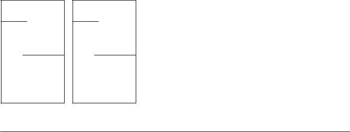
Signature Typography |
Signature Typography |
Featured |
Featured |
Typography |
Typography |
Supporting Typography
Place the critical information in either or both
-the graphic signature
-the featured position below the graphic signature
•Place only one of the following in the signature typography:
-communicative name
-secondary word mark
-generic product name
-secondary word mark + generic product name
-the slogan, “We bring good things to life.”
•Use any of the following as featured typography:
-secondary word mark
-generic product name
-product number
-product size, style, or color
-any combination of the above
-the slogan, “We bring good things to life.”
•Further emphasize signature typography and featured typography by using either or both
-large type
-bold type (Univers 68)
Place all other information in a supporting position, separated from signature and featured typography.
•Use any of the following as supporting typography:
-product number
-product size, style, or color
-any promotional slogan
-quantity and/or weight of contents
-product use instructions
-handling instructions
-product warranty
-bar code
-identification block
•Further deemphasize supporting typography by using either or both
-small type
-light type (Univers 48)
continued
GE Identity Program |
230, Shipping Cases & Cartons |
GE Identity Website: http://www.ge.com/identity |
GE Identity Hotline: 800 654-2696 or 518 869-2824 (DC: 232-2696)

Shipping Cases & Cartons |
230.03 |
Guidelines, continued |
|
eSupporting Typography
Signature Typography
Featured
Typography
Use the compact signature at the top of each printed panel.
•Size the capital height (CH) of the signature typography to equal 1⁄4, 1⁄3, 1⁄2, or 3⁄4 the diameter (D) of the signature Monogram.
For more information on the compact signature, see document 131, Graphic Signatures, pages 13 and 14.
For guidelines on the use and specification of signature typography, see document 131, Graphic Signatures, pages 31 to 35.
•Other graphic signatures may be used:
-primary signature
-vertical signature
-special signatures (only if required)
Use Univers 68 and Univers 48 for most typography.
•Use Univers 68 for signature typography. Note: When a graphic signature contains both a secondary word mark and a generic product
name, use Univers 48 for the generic product name.
•Use Univers 68 and Univers 48 for featured typography and supporting typography.
•Use Univers 47 for warranties and instructions.
•Do not use the ITC New Baskerville series (except in consumer shipping cases and cartons, provided high-quality reproduction is used).
•Limit the number of type sizes on a case or carton and select ones that are distinctly different from each other. Generally, use no more than three sizes.
For more information on the use and specification of the Univers series, see document 133, Typography, pages 02 and 03.
Use a layout with a clear left margin determined by the position of the signature typography.
•Position signature typography to the right of the signature Monogram, separated by a space equal to at least 1⁄4 the diameter of the signature Monogram. When space is extremely limited, signature typography may align with the right edge of the signature Monogram.
•Align all featured typography, supporting typography, rules, and bars flush left with the signature typography. Note: If necessary, illustrations, bar codes, and bands of color may appear in the left margin.
•Use a generous left margin to prevent typography from appearing to be horizontally centered in the panel.
Use rules outside the graphic signature to structure and emphasize featured and supporting typography.
•Use rules either as
-dividers between information
-underlines to emphasize information
•For all rules on the case or carton, use a weight (thickness) that is either
-the same as the Laser Line in the graphic signature
-distinctly heavier (thicker) than the Laser Line
•Use the space between the signature typography and the Laser Line as the amount of space between featured or supporting typography and rules that function as underlines.
Use bars to structure, differentiate, and emphasize featured and supporting typography.
•Size bars to be significantly heavier, or thicker, than rules—at least half the diameter of the Monogram in depth.
•Begin bars flush at the left margin and bleed at the right edge and either the top or bottom edge of a panel. Generally, when a bar is used at the top of a panel, keep the bottom of the bar above the top of the signature Monogram.
continued
Supporting Typography
GE Identity Program |
230, Shipping Cases & Cartons |
GE Identity Website: http://www.ge.com/identity |
GE Identity Hotline: 800 654-2696 or 518 869-2824 (DC: 232-2696)

Shipping Cases & Cartons |
230.04 |
Guidelines, continued |
|
Use bands to contain and emphasize the graphic signature and supporting typography, if desired.
•Connect bands around all panels and bleed at the top edge of each panel.
•Use color in bands when color coding is required.
Use the linear version of the Dynamic Monogram for graphic support, if desired, as shown on pages 11 to 13.
•Use either
-the circular version, which may extend into the left margin but not beyond the right edge of the signature Monogram
-the bar version, which is aligned with the beginning of the signature typography
•Bleed either version at the right and bottom edges of a panel. Do not wrap the remainder of the Dynamic Monogram around panel edges.
•Featured and supporting typography and rules may overlap the Dynamic Monogram if the information remains legible. To help maintain the legibility of overlapping typography, use a second color in the Dynamic Monogram. Note: Do not overlap the Dynamic Monogram with a heavy (thick) bar.
The linear Dynamic Monograms are provided in GE Logo Font, available from the GE Identity Website or Hotline.
eSupporting Typography
Signature Typography
Featured
Typography
xSupporting Typography
Signature |
Typography |
|
|
Featured |
|
Typography |
|
Supporting |
Typography |
|
GE Identity Program |
230, Shipping Cases & Cartons |
Typography
Signature
Featured
Typography
Typography
Supporting
Use product illustrations for graphic support in place of the Dynamic Monogram, if desired. Do not combine the Dynamic Monogram with an illustration on the same panel.
Use color correctly.
•In graphic signatures, use the corporate colors or black whenever possible. Note: Do not use Platinum Grey on kraft-colored stock because it provides insufficient contrast.
•In either version of the linear Dynamic Monogram, use black or a dark color against kraft-colored stock.
•In other elements, including featured and supporting typography, rules, bars, bands, and backgrounds, repeat colors used in the graphic signature or use any appropriate color, including those from the GE color palettes, that provides sufficient contrast to the background.
For guidelines on color, see document 132, Color.
GE color samples are available from the GE Identity Website or Hotline.
Unify all sides of a shipping case or carton by consistently repeating elements.
•Use a graphic signature on each printed panel with the same size of signature Monogram and the same thickness of Laser Line. Horizontally align the signatures.
•Use the same size of signature typography, aligned horizontally, in each graphic signature whenever possible. Narrow side panels may require smaller signature typography than front and back panels.
•Repeat featured typography and supporting typography as necessary and, if possible, use the same size and placement on each panel.
-Use rules, bars, and bands of consistent thicknesses.
-Use the fewest number of type sizes required to differentiate the information.
continued
GE Identity Website: http://www.ge.com/identity
GE Identity Hotline: 800 654-2696 or 518 869-2824 (DC: 232-2696)

Shipping Cases & Cartons |
230.05 |
Guidelines, continued |
|
Sources of Reproduction Materials
GE Logo Font, a custom font that contains, instead of the the alphabet, all versions of the signature and Dynamic Monograms, is available to all GE employees and their suppliers from the GE Identity Website or Hotline.
GE Identity Program |
230, Shipping Cases & Cartons |
GE Identity Website: http://www.ge.com/identity |
GE Identity Hotline: 800 654-2696 or 518 869-2824 (DC: 232-2696)