Chapter 13. Statistical Graphs from Series and Groups
EViews provides several methods for exploratory data analysis. In Chapter 11, “Series”, on page 309 we document several graph views that may be used to characterize the distribution of a series. This chapter describes bivariate scatterplot views which allow you to fit lines using parametric, and nonparametric procedures, and boxplot views which may be used to characterize the distribution of your data.
These views, some of which involve relatively complicated calculations or have a number of specialized options, are documented in detail below. While the discussion may sometimes involves fairly technical issues, you should not feel as though you need to master all of the details to use these views. The graphs correspond to familiar concepts, and are designed to be simple and easy to understand visual displays of your data. The EViews default settings should be sufficient for all but the most specialized of analyses. Feel free to explore each of the views, clicking on OK to accept the default settings.
Distribution Graphs of Series
The view menu of a series lists three graphs that characterize the empirical distribution of
the series under View/Distribution...
CDF-Survivor-Quantile
This view plots the empirical cumulative distribution, survivor, and quantile functions of the series together with the plus or
minus two standard error bands. Select View/Distribution Graphs/CDF-Survivor-Quan- tile…
•The Cumulative Distribution option plots the empirical cumulative distribution function (CDF) of the series. The CDF is the probability of observing a value from the series not exceeding a specified value r :
Fx(r) = Pr(x ≤ r ) . |
(13.1) |
392—Chapter 13. Statistical Graphs from Series and Groups
•The Survivor option plots the empirical survivor function of the series. The survivor function gives the probability of observing a value from the series at least as large as some specified value r and is equal to one minus the CDF:
Sx( r) = Pr( x > r) = 1 − Fx( r) |
(13.2) |
•The Quantile option plots the empirical quantiles of the series. For 0 < q < 1 , the q -th quantile x(q) of x is a number such that:
Pr( x ≤ x(q)) ≤ q
(13.3)
Pr( x ≥ x(q)) ≤ 1 − q
The quantile is the inverse function of the CDF; graphically, the quantile can be obtained by flipping the horizontal and vertical axis of the CDF.
• The All option plots the CDF, survivor, and quantiles.
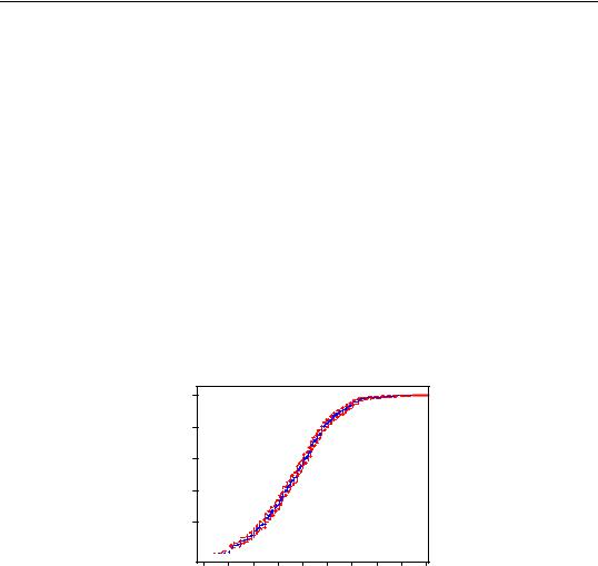
For example, working with the series LWAGE containing log wage data, and selecting a CDF plot yields:
Empirical CDF
1.0
0.8
0.6
0.4
0.2
0.0 


0.8 |
1.2 |
1.6 |
2.0 |
2.4 |
2.8 |
3.2 |
3.6 |
4.0 |
4.4 |
|
|
|
Log of hourly wage |
|
|
|
Standard Errors
The Include standard errors option plots the approximate 95% confidence intervals together with the empirical distribution functions. The methodology for computing these intervals is described in detail in Conover (1980, pp. 114–116). Note that using this approach, we do not compute confidence intervals for the quantiles corresponding to the first and last few order statistics.
Distribution Graphs of Series—393
Saved matrix name
This optional edit field allows you to save the results in a matrix object. See cdfplot (p. 235) of the Command and Programming Reference for details on the structure of the saved matrix.
Options
EViews provides several methods of computing the empirical CDF used in the CDF and quantile computations:
Given a total of N observations, the CDF for value r is estimated as:
Rankit (default) |
( r − 1 ⁄ 2 ) ⁄ N |
|
|
Ordinary |
r ⁄ N |
|
|
Van der Waerden |
r ⁄ ( N + 1 ) |
|
|
Blom |
( r − 3 ⁄ 8) ⁄ ( N + 1 ⁄ 4) |
|
|
Tukey |
( r − 1 ⁄ 3) ⁄ ( N + 1 ⁄ 3) |
|
|
The various methods differ in how they adjust for non-continuity in the CDF computation. The differences between these alternatives will become negligible as the sample size N grows.
Quantile-Quantile
The quantile-quantile (QQ)-plot is a simple yet powerful tool for comparing two distributions (Cleveland, 1994). This view plots the quantiles of the chosen series against the quantiles of another series or a theoretical distribution. If the two distributions are the same, the QQ-plot should lie on a straight line. If the QQ-plot does not lie on a straight line, the two distributions differ along some dimension. The pattern of deviation from linearity provides an indication of the nature of the mismatch.
394—Chapter 13. Statistical Graphs from Series and Groups
To generate a QQ-plot, select View/Distribution Graphs/Quantile-Quantile…You can plot against the quantiles of the following theoretical distributions:
•Normal. Bell-shaped and symmetric distribution.
•Uniform. Rectangular density function. Equal probabilities associated with any fixed interval size in the support.
•Exponential. The unit exponential is a positively skewed distribution with a long right tail.
•Logistic. This symmetric distribution is similar to the normal, except that it has longer tails than the normal.
•Extreme value. The Type-I (minimum) extreme value is a negatively skewed distribution with a long left tail—it is very close to a lognormal distribution.
You can also plot against the quantiles of any series in your workfile. Type the names of the series or groups in the edit box, and select Series or Group. EViews will compute a QQ-plot against each series in the list. You can use this option to plot against the quantiles of a simulated series from any distribution; see the example below.
The checkbox provides you with the option of plotting a regression line through the quantile values.
The Options button provides you with several methods for computing the empirical quantiles. The options are explained in the CDF-Survivor-Quantile section above; the choice should not make much difference unless the sample is very small.
For additional details, see Cleveland (1994), or Chambers, et al. (1983, Chapter 6).
Illustration
Labor economists typically estimate wage earnings equations with the log of wage on the left-hand side instead of the wage itself. This is because the log of wage has a distribution more close to the normal than the wage, and classical small sample inference procedures are more likely to be valid. To check this claim, we can plot the quantiles of the wage and log of wage against those from the normal distribution. Highlight the series, double click, select View/Distribution Graphs/Quantile-Quantile…, and choose the (default) Normal distribution option:
Distribution Graphs of Series—395
Theoretical Quantile-Quantile |
Theoretical Quantile-Quantile |
|
8 |
|
|
|
|
|
|
|
|
4 |
|
|
|
|
|
|
|
|
|
|
6 |
|
|
|
|
|
|
|
|
3 |
|
|
|
|
|
|
|
|
|
|
|
|
|
|
|
|
|
|
|
|
|
|
|
|
|
|
|
|
|
|
|
|
|
|
|
|
|
|
2 |
|
|
|
|
|
|
|
|
|
Quantile |
4 |
|
|
|
|
|
|
|
Quantile |
1 |
|
|
|
|
|
|
|
|
|
|
|
|
|
|
|
|
|
|
|
|
|
|
|
|
|
|
2 |
|
|
|
|
|
|
|
0 |
|
|
|
|
|
|
|
|
|
Normal |
0 |
|
|
|
|
|
|
|
Normal |
-1 |
|
|
|
|
|
|
|
|
|
|
|
|
|
|
|
|
|
|
|
|
|
|
|
|
|
|
|
|
|
|
|
|
|
|
|
|
-2 |
|
|
|
|
|
|
|
|
|
|
-2 |
|
|
|
|
|
|
|
|
-3 |
|
|
|
|
|
|
|
|
|
|
|
|
|
|
|
|
|
|
|
|
|
|
|
|
|
|
|
|
|
-4 |
|
|
|
|
|
|
|
|
-4 |
|
|
|
|
|
|
|
|
|
|
0 |
10 |
20 |
30 |
40 |
50 |
60 |
70 |
|
0.8 |
1.2 |
1.6 |
2.0 |
2.4 |
2.8 |
3.2 |
3.6 |
4.0 |
4.4 |
|
|
|
|
Hourly wage |
|
|
|
|
|
|
|
Log of hourly wage |
|
|
|
If the distributions of the series on the vertical and horizontal axes match, the plots should lie on a straight line. The two plots clearly indicate that the log of wage has a distribution closer to the normal than the wage.
The concave shape of the QQ-plot for the wage indicates that the distribution of the wage series is positively skewed with a long right tail. If the shape were convex, it would indicate that the distribution is negatively skewed.
The QQ-plot for the log of wage falls nearly on a straight line except at the left end, where the plot curves downward. QQ-plots that fall on a straight line in the middle but curve upward at the left end and curve downward at the right end indicate that the distribution is leptokurtic and has a thicker tail than the normal distribution. If the plot curves downward at the left, and upward at the right, it is an indication that the distribution is platykurtic and has a thinner tail than the normal distribution. Here, it appears that log wages are somewhat platykurtic.
If you want to compare your series with a distribution not in the option list, you can use the random number generator in EViews and plot against the quantiles of the simulated series from the distribution. For example, suppose we wanted to compare the distribution of the log of wage with the F-distribution with 10 numerator degrees of freedom and 50 denominator degrees of freedom. First generate a random draw from an F(10,50) distribution using the command:
series fdist=@rfdist(10,50)
Then highlight the log of wage series, double click, select View/Distribution Graphs/ Quantile-Quantile…, and choose the Series or Group option and type in the name of the simulated series (in this case fdist).
396—Chapter 13. Statistical Graphs from Series and Groups
The plot is slightly convex, indicating that the distribution of the log of wage is slightly negatively skewed compared to the F(10,50).
Kernel Density
This view plots the kernel density estimate of the distribution of the series. The simplest nonparametric density estimate of a distribution of a series is the histogram. You can view the histogram by selecting View/Descriptive Statistics/Histogram and Stats. The histogram, however, is sensitive to the choice of origin and is not continuous.
Empirical Quantile-Quantile
|
4 |
|
|
|
|
|
|
|
|
|
|
3 |
|
|
|
|
|
|
|
|
|
FDIST |
2 |
|
|
|
|
|
|
|
|
|
1 |
|
|
|
|
|
|
|
|
|
|
|
|
|
|
|
|
|
|
|
|
0 |
|
|
|
|
|
|
|
|
|
|
-1 |
|
|
|
|
|
|
|
|
|
|
0.8 |
1.2 |
1.6 |
2.0 |
2.4 |
2.8 |
3.2 |
3.6 |
4.0 |
4.4 |
|
|
|
|
Log of hourly w age |
|
|
|
The kernel density estimator replaces the
“boxes” in a histogram by “bumps” that are smooth (Silverman 1986). Smoothing is done by putting less weight on observations that are further from the point being evaluated. More technically, the kernel density estimate of a series X at a point x is estimated by:
1 |
N |
|
|
x − Xi |
|
|
|
K |
, |
(13.4) |
f(x) = -------- |
Σ |
--------------- |
Nh |
|
|
h |
|
|
|
i = 1 |
|
|
|
|
|
where N is the number of observations, h is the bandwidth (or smoothing parameter) and K is a kernel weighting function that integrates to one.
When you choose View/Distribution Graphs/Kernel Density…, the Kernel Density dialog appears:
To display the kernel density estimates, you need to specify the following:
•Kernel. The kernel function is a weighting function that determines the shape of the bumps. EViews provides the following options for the kernel function K :
Distribution Graphs of Series—397
Epanechnikov (default) |
3 |
( 1 − u |
|
2 |
) I( |
|
u |
|
≤ 1 ) |
|
-- |
|
|
|
|
|
|
|
4 |
|
|
|
|
|
|
|
|
|
|
|
|
|
|
|
|
|
|
|
|
|
|
|
|
|
|
|
|
|
|
|
|
|
|
|
|
|
|
Triangular |
( 1 − |
u |
) ( I( |
u |
≤ 1) ) |
|
|
|
|
|
|
|
|
|
|
|
|
|
|
|
|
|
|
|
|
|
|
Uniform (Rectangular) |
|
1 |
( I( |
|
u |
|
≤ 1 )) |
|
|
-- |
|
|
|
|
2 |
|
|
|
|
|
|
|
|
|
|
|
|
|
|
|
|
|
|
|
|
|
|
|
|
|
|
|
|
|
|
|
|
|
|
|
|
|
|
|
|
|
Normal (Gaussian) |
|
1 |
|
|
|
|
|
|
|
|
1 |
|
|
2 |
|
|
---------- exp |
− --u |
|
|
2 π |
|
|
|
|
|
|
|
2 |
|
|
|
|
|
|
|
|
|
|
|
|
|
|
|
|
|
|
|
|
|
|
|
|
|
|
Biweight (Quartic) |
15 |
( 1 − u |
2 |
) |
2 |
|
|
|
|
|
u |
|
≤ 1 ) |
|
----- |
|
|
|
|
I( |
|
|
16 |
|
|
|
|
|
|
|
|
|
|
|
|
|
|
|
|
|
|
|
|
|
|
|
|
|
|
|
|
|
|
|
|
|
|
|
|
|
|
|
|
|
|
Triweight |
35 |
( 1 − u |
2 |
) |
3 |
|
|
|
|
|
u |
|
≤ 1 ) |
|
----- |
|
|
|
|
I( |
|
|
32 |
|
|
|
|
|
|
|
|
|
|
|
|
|
|
|
|
|
|
|
|
Cosinus |
π |
|
π |
|
|
|
|
|
|
|
( |
|
u |
|
|
≤ 1 ) |
|
-- cos |
--u I |
|
|
|
|
4 |
|
2 |
|
|
|
|
|
|
|
|
|
|
|
|
|
|
|
|
|
|
|
|
|
|
|
|
|
|
|
|
|
|
|
|
|
|
|
|
|
where u is the argument of the kernel function and I is the indicator function that takes a value of one if its argument is true, and zero otherwise.
•Bandwidth. The bandwidth h controls the smoothness of the density estimate; the larger the bandwidth, the smoother the estimate. Bandwidth selection is of crucial importance in density estimation (Silverman, 1986), and various methods have been suggested in the literature. The Silverman option (default) uses a data-based automatic bandwidth:
h = 0.9kN−1 ⁄ 5min( s, R ⁄ 1.34 ) |
(13.5) |
where N is the number of observations, s is the standard deviation, and R is the interquartile range of the series (Silverman 1986, equation 3.31). The factor k is a canonical bandwidth-transformation that differs across kernel functions (Marron and Nolan 1989; Härdle 1991). The canonical bandwidth-transformation adjusts the bandwidth so that the automatic density estimates have roughly the same amount of smoothness across various kernel functions.
To specify a bandwidth of your choice, mark User Specified option and type a nonnegative number for the bandwidth in the field box. Although there is no general rule for the appropriate choice of the bandwidth, Silverman (1986, section 3.4) makes a case for undersmoothing by choosing a somewhat small bandwidth, since it is easier for the eye to smooth than it is to unsmooth.
398—Chapter 13. Statistical Graphs from Series and Groups
The Bracket Bandwidth option allows you to investigate the sensitivity of your estimates to variations in the bandwidth. If you choose to bracket the bandwidth, EViews plots three density estimates using bandwidths 0.5h , h , and 1.5h .
•Number of Points. You must specify the number of points M at which you will evaluate the density function. The default is M = 100 points. Suppose the mini-
mum and maximum value to be considered are given by XL and XU , respectively. |
Then f( x) is evaluated at M equi-spaced points given by: |
|
xi = XL + i |
XU − XL |
(13.6) |
--------------------- , for i = 0, 1, … M − 1 . |
|
M |
|
|
EViews selects the lower and upper evaluation points by extending the minimum and maximum values of the data by two (for the normal kernel) or one (for all other kernels) bandwidth units.
•Method. By default, EViews utilizes the Linear Binning approximation algorithm of Fan and Marron (1994) to limit the number of evaluations required in computing the density estimates. For large samples, the computational savings are substantial.
The Exact option evaluates the density function using all of the data points for each
Xj , j = 1, 2, …, N for each xi . The number of kernel evaluations is therefore of order O( NM) , which, for large samples, may be quite time-consuming.
Unless there is a strong reason to compute the exact density estimate or unless your sample is very small, we recommend that you use the binning algorithm.
•Saved matrix name. This optional edit field allows you to save the results in a matrix object. See kdensity (p. 328) in the Command and Programming Reference for details on the structure of the saved matrix.
Illustration
As an illustration of kernel density estimation, we use the three month CD rate data for 69 Long Island banks and thrifts used in Simonoff (1996). The histogram of the CD rate looks as follows:
Distribution Graphs of Series—399
14 |
|
|
|
|
|
|
12 |
|
|
|
|
|
|
10 |
|
|
|
|
|
|
8 |
|
|
|
|
|
|
6 |
|
|
|
|
|
|
4 |
|
|
|
|
|
|
2 |
|
|
|
|
|
|
0 |
|
|
|
|
|
|
7.6 |
7.8 |
8.0 |
8.2 |
8.4 |
8.6 |
8.8 |
Series: CDRATE
Sample 1 69
Observations 69
Mean |
8.264203 |
Median |
8.340000 |
Maximum |
8.780000 |
Minimum |
7.510000 |
Std. Dev. |
0.298730 |
Skewness |
-0.608449 |
Kurtosis |
2.710969 |
Jarque-Bera |
4.497587 |
Probability |
0.105526 |
This histogram is a very crude estimate of the distribution of CD rates and does not provide us with much information about the underlying distribution. To view the kernel density estimate, select View/Distribution Graphs/Kernel Density… The default options produced the following view:
Kernel Density (Epanechnikov, h = 0.25)
1.6 |
|
|
|
|
|
|
|
|
1.4 |
|
|
|
|
|
|
|
|
1.2 |
|
|
|
|
|
|
|
|
1.0 |
|
|
|
|
|
|
|
|
0.8 |
|
|
|
|
|
|
|
|
0.6 |
|
|
|
|
|
|
|
|
0.4 |
|
|
|
|
|
|
|
|
0.2 |
|
|
|
|
|
|
|
|
0.0 |
|
|
|
|
|
|
|
|
7.4 |
7.6 |
7.8 |
8.0 |
8.2 |
8.4 |
8.6 |
8.8 |
9.0 |
|
|
|
CDRATE |
|
|
|
|
This density estimate seems to be oversmoothed. Simonoff (1996, chapter 3) uses a Gaussian kernel with bandwidth 0.08. To replicate his results, select View/Distribution Graphs/ Kernel Density… and fill in the dialog box as follows: