

- •brief contents
- •about this book
- •The Windows Forms namespace
- •Part 1: Hello Windows Forms
- •Part 2: Basic Windows Forms
- •Part 3: Advanced Windows Forms
- •Who should read this book?
- •Conventions
- •Action
- •Result
- •Source code downloads
- •Author online
- •acknowledgments
- •about .NET
- •Casting the .NET
- •Windows Forms overview
- •about the cover illustration
- •Hello Windows Forms
- •1.1 Programming in C#
- •1.1.1 Namespaces and classes
- •1.1.2 Constructors and methods
- •1.1.3 C# types
- •1.1.4 The entry point
- •1.1.5 The Application class
- •1.1.6 Program execution
- •1.2 Adding controls
- •1.2.1 Shortcuts and fully qualified names
- •1.2.2 Fields and properties
- •1.2.3 The Controls property
- •1.3 Loading files
- •1.3.1 Events
- •1.3.2 The OpenFileDialog class
- •1.3.3 Bitmap images
- •1.4 Resizing forms
- •1.4.1 Desktop layout properties
- •1.4.2 The Anchor property
- •1.4.3 The Dock property
- •1.5 Recap
- •2.1 Programming with Visual Studio .NET
- •2.1.1 Creating a project
- •Action
- •Result
- •2.1.2 Executing a program
- •Action
- •Result
- •2.1.3 Viewing the source code
- •View the code generated by Visual Studio .NET
- •Action
- •Result
- •2.2 Adding controls
- •2.2.1 The AssemblyInfo file
- •Action
- •Results
- •2.2.2 Renaming a form
- •Action
- •Result
- •2.2.3 The Toolbox window
- •Action
- •Result
- •2.3 Loading files
- •2.3.1 Event handlers in Visual Studio .NET
- •Action
- •Result
- •2.3.2 Exception handling
- •Action
- •Result
- •Action
- •Results and Comments
- •2.4 Resizing forms
- •2.4.1 Assign the Anchor property
- •Action
- •Result
- •2.4.2 Assign the MinimumSize property
- •Action
- •Result
- •2.5 Recap
- •Basic Windows Forms
- •Menus
- •Action
- •Result
- •Action
- •Result
- •Action
- •Result
- •Action
- •Result
- •3.3 Click events
- •Action
- •Result
- •Action
- •Result
- •Action
- •Result
- •Action
- •Result
- •Action
- •Result
- •Action
- •Result
- •3.5 Context menus
- •Action
- •Result
- •Action
- •Result
- •3.6 Recap
- •Status bars
- •4.1 The Control class
- •4.2 The StatusBar class
- •Action
- •Result
- •Action
- •Result
- •4.3.1 Adding panels to a status bar
- •Action
- •Result
- •Action
- •Result
- •Action
- •Result
- •Action
- •Result
- •4.5 Recap
- •Reusable libraries
- •5.1 C# classes and interfaces
- •5.2 Class libraries
- •Action
- •Result
- •Action
- •Result
- •Action
- •Result
- •Action
- •Result
- •Action
- •Result
- •Action
- •Result
- •Action
- •Result
- •Action
- •Result
- •Action
- •Result
- •5.3 Interfaces revisited
- •Action
- •Result
- •Action
- •Result
- •Action
- •Result
- •5.4 Robustness issues
- •Action
- •Result
- •Action
- •Result
- •Action
- •Result
- •Action
- •Result
- •Action
- •Result
- •Action
- •Result
- •Common file dialogs
- •Action
- •Results
- •Action
- •Result
- •Action
- •Result
- •Action
- •Result
- •Action
- •Result
- •6.3 Paint events
- •Action
- •Result
- •Action
- •Result
- •6.4 Context menus revisited
- •Action
- •Result
- •Action
- •Result
- •6.5 Files and paths
- •Action
- •Result
- •Action
- •Result
- •Action
- •Result
- •6.6 Save file dialogs
- •Action
- •Result
- •Action
- •Result
- •Action
- •Result
- •Action
- •Result
- •Action
- •Result
- •6.7 Open file dialogs
- •Action
- •Result
- •Action
- •Result
- •6.8 Recap
- •Drawing and scrolling
- •7.1 Form class hierarchy
- •Action
- •Result
- •Action
- •Result
- •Action
- •Result
- •Action
- •Result
- •Action
- •Result
- •Action
- •Result
- •Action
- •Result
- •Action
- •Result
- •Action
- •Result
- •Action
- •Result
- •Action
- •Result
- •Action
- •Result
- •7.4 Panels
- •Action
- •Result
- •Action
- •Result
- •Action
- •Result
- •Action
- •Result
- •Action
- •Result
- •Dialog boxes
- •8.1 Message boxes
- •Action
- •Result
- •Action
- •Result
- •8.1.4 Creating A YesNoCancel dialog
- •Action
- •Result
- •Action
- •Result
- •8.2 The Form.Close method
- •8.2.1 The relationship between Close and Dispose
- •Action
- •Result
- •8.3 Modal dialog boxes
- •Action
- •Result
- •Action
- •Result
- •8.3.2 Preserving caption values
- •Action
- •Result
- •Action
- •Result
- •Action
- •Result
- •Action
- •Result
- •Action
- •Result
- •Action
- •Result
- •Action
- •Result
- •Action
- •Result
- •Action
- •Result
- •Action
- •Result
- •Action
- •Result
- •Action
- •Result
- •Action
- •Result
- •Action
- •Result
- •Action
- •Result
- •Action
- •Result
- •Action
- •Result
- •Basic controls
- •Action
- •Result
- •Action
- •Result
- •Action
- •Result
- •9.1.2 Creating a derived form
- •Action
- •Result
- •9.2 Labels and text boxes
- •Action
- •Result
- •Action
- •Result
- •Action
- •Result
- •Action
- •Result
- •Action
- •Result
- •Action
- •Result
- •Action
- •Result
- •Action
- •Result
- •Action
- •Result
- •Action
- •Result
- •Action
- •Result
- •Action
- •Result
- •Action
- •Result
- •Action
- •Result
- •Action
- •Result
- •Action
- •Result
- •Action
- •Result
- •Action
- •Result
- •9.3.6 Adding AlbumEditDlg to our main form
- •Action
- •Result
- •Action
- •Result
- •9.4 Recap
- •List controls
- •10.1 List boxes
- •Action
- •Result
- •Action
- •Result
- •Action
- •Result
- •Action
- •Result
- •10.2 Multiselection list boxes
- •10.2.1 Enabling multiple selection
- •Action
- •Result
- •Action
- •Result
- •Action
- •Result
- •Action
- •Result
- •10.3 Combo boxes
- •Action
- •Result
- •Action
- •Result
- •10.4 Combo box edits
- •Action
- •Result
- •Action
- •Result
- •Action
- •Result
- •10.5 Owner-drawn lists
- •Action
- •Result
- •Action
- •Result
- •Action
- •Result
- •Action
- •Result
- •More controls
- •Action
- •Result
- •Action
- •Result
- •11.2 Tab pages
- •Action
- •Result
- •Action
- •Result
- •11.3.1 Dates and times
- •Action
- •Result
- •Action
- •Result
- •Action
- •Result
- •Action
- •Result
- •Action
- •Result
- •Action
- •Result
- •11.5 Recap
- •A .NET assortment
- •12.1 Keyboard events
- •Action
- •Result
- •Action
- •Result
- •12.2 Mouse events
- •Action
- •Result
- •Action
- •Result
- •Action
- •Result
- •12.3 Image buttons
- •Action
- •Result
- •Action
- •Result
- •Action
- •Result
- •Action
- •Result
- •Action
- •Result
- •Action
- •Result
- •Action
- •Result
- •Action
- •Result
- •Action
- •Result
- •12.4 Icons
- •Action
- •Result
- •Action
- •Result
- •Action
- •Result
- •12.5 Recap
- •Toolbars and tips
- •13.1 Toolbars
- •Action
- •Result
- •Action
- •Result
- •Action
- •Result
- •Action
- •Result
- •Action
- •Result
- •Action
- •Result
- •Action
- •Result
- •Action
- •Result
- •Action
- •Result
- •13.4.2 Creating tool tips
- •Action
- •Result
- •Action
- •Result
- •Advanced Windows Forms
- •List views
- •14.2 The ListView class
- •Action
- •Result
- •Action
- •Result
- •Action
- •Result
- •Action
- •Result
- •14.2.3 Populating a ListView
- •Action
- •Result
- •Action
- •14.3 ListView columns
- •Action
- •Result
- •Action
- •Result
- •Action
- •Result
- •Action
- •Result
- •Action
- •Result
- •Action
- •Result
- •Action
- •Result
- •Action
- •Result
- •Action
- •Result
- •Action
- •Result
- •Action
- •Result
- •Action
- •Result
- •Action
- •Result
- •Action
- •Result
- •Action
- •Result
- •Action
- •Result
- •Action
- •Result
- •Action
- •Result
- •Action
- •Result
- •14.6 Recap
- •Tree views
- •Action
- •Result
- •Action
- •Result
- •Action
- •Result
- •15.3 Dynamic tree nodes
- •Action
- •Result
- •Action
- •Result
- •Action
- •Result
- •Action
- •Result
- •Action
- •Result
- •15.4 Node selection
- •Action
- •Result
- •Action
- •Result
- •Action
- •Result
- •Action
- •Result
- •Action
- •Result
- •15.5 Fun with tree views
- •Action
- •Result
- •Action
- •Result
- •Action
- •Result
- •Multiple document interfaces
- •Action
- •Result
- •Action
- •Result
- •Action
- •Result
- •16.3 Merged menus
- •Action
- •Result
- •Action
- •Result
- •Action
- •Result
- •Action
- •Result
- •16.4 MDI children
- •Action
- •Result
- •Action
- •Result
- •Action
- •Result
- •Action
- •Result
- •Action
- •Result
- •Action
- •Result
- •Action
- •Result
- •Action
- •Result
- •Action
- •Result
- •Action
- •Result
- •16.5 MDI child window management
- •Action
- •Result
- •Action
- •Result
- •16.6 Recap
- •Data binding
- •17.1 Data grids
- •Action
- •Result
- •Action
- •Result
- •17.2 Data grid customization
- •Action
- •Result
- •Action
- •Result
- •Action
- •Result
- •Action
- •Result
- •Action
- •Result
- •Action
- •Result
- •Action
- •Result
- •Action
- •Result
- •Action
- •Result
- •Action
- •Result
- •Action
- •Result
- •Odds and ends .NET
- •Action
- •Result
- •Action
- •Result
- •Action
- •Result
- •Action
- •Result
- •18.2 Timers
- •Action
- •Result
- •Action
- •Result
- •18.3 Drag and drop
- •Action
- •Result
- •Action
- •Result
- •18.4 ActiveX controls
- •Action
- •Result
- •Action
- •Result
- •Action
- •Result
- •Action
- •Result
- •Action
- •Result
- •18.5 Recap
- •C# primer
- •A.1 C# programs
- •A.1.1 Assemblies
- •A.1.2 Namespaces
- •A.2 Types
- •A.2.1 Classes
- •A.2.2 Structures
- •A.2.3 Interfaces
- •A.2.4 Enumerations
- •A.2.5 Delegates
- •A.3 Language elements
- •A.3.1 Built-in types
- •A.3.2 Operators
- •A.3.3 Keywords
- •A.4 Special features
- •A.4.1 Exceptions
- •A.4.2 Arrays
- •A.4.3 Main
- •A.4.4 Boxing
- •A.4.5 Documentation
- •.NET namespaces
- •B.1 System.Collections
- •B.2 System.ComponentModel
- •B.3 System.Data
- •B.4 System.Drawing
- •B.5 System.Globalization
- •B.6 System.IO
- •B.7 System.Net
- •B.8 System.Reflection
- •B.9 System.Resources
- •B.10 System.Security
- •B.11 System.Threading
- •B.12 System.Web
- •B.13 System.Windows.Forms
- •B.14 System.XML
- •Visual index
- •C.1 Objects
- •C.2 Marshal by reference objects
- •C.3 Components
- •C.4 Common dialogs
- •C.7 Event data
- •C.8 Enumerations
- •For more information
- •bibliography
- •Symbols
- •Index

DISPLAY THE PROPERTY DIALOGS (continued)
|
Action |
Result |
|
|
|
4 |
Also display the photograph’s |
private void lstPhotos_DoubleClick |
|
properties when the user |
(object sender, System.EventArgs e) |
|
double-clicks on the list. |
{ |
|
btnPhotoProp.PerformClick(); |
|
|
|
|
|
How-to |
} |
|
Handle the DoubleClick event |
|
|
for the ListBox control. |
|
|
|
|
In the code to display the Photograph Properties dialog, note how the
dex property is used. If no items are selected, then SelectedIndex will contain the value –1, and the current position in the album is not modified. When a photograph is actually selected, the current position is updated to the selected index. This assignment relies on the fact that the order of photographs in the ListBox control matches the order of photographs in the album itself.
if (lstPhotos.SelectedIndex >= 0)
_album.CurrentPosition = lstPhotos.SelectedIndex;
For both dialogs, a C# using block ensures that any resources used by the dialog are cleaned up when we are finished. We also call UpdateList to update our application with any relevant changes made. In fact, neither property dialog permits any changes that we would display at this time. Even so, updating the list is a good idea in case we add such a change in the future.
Compile and run your application to ensure that the dialog boxes display correctly. Note how easily we reused these dialogs in our new application. Make some changes and then reopen an album to verify that everything works as you expect.
One minor issue with our application occurs when the album is empty. When a user clicks the photo’s Properties button, nothing happens. This is not the best user interface design, and we will address this fact in the next section.
So far our application only allows a single item to be selected at a time. List boxes can also permit multiple items to be selected simultaneously—a topic we will examine next.
10.2MULTISELECTION LIST BOXES
So far we have permitted only a single item at a time to be selected from our list. In this section we enable multiple item selection, and add some buttons to perform various actions based on the selected items. Specifically, we will add Move Up and Move Down buttons to alter the position of the selected photographs, and a Remove button to delete the selected photographs from the album.
10.2.1Enabling multiple selection
Enabling the ListBox to allow multiple selections simply requires setting the right property value, namely the SelectionMode property, to the value MultiSimple or MultiExtended. We discuss this property in detail later in the section.
MULTISELECTION LIST BOXES |
325 |
Whenever you enable new features in a control, in this case enabling multiple selection in our list box, it is a good idea to review the existing functionality of the form to accommodate the new feature. In our case, what does the Properties button in the Photographs group box do when more than a single item is selected? While we could display the properties of the first selected item, this seems rather arbitrary. A more logical solution might be to disable the button when multiple items are selected. This is, in fact, what we will do here.
Since the Properties button will be disabled, we should probably have some other buttons that make sense when multiple items are selected. We will add three buttons. The first two will move the selected items up or down in the list as well as within the corresponding PhotoAlbum object. The third will remove the selected items from the list and the album.
The steps required are shown in the following table:
Set the version number of the MyAlbumEditor application to 10.2.
ENABLE MULTIPLE SELECTIONS IN THE LIST BOX
|
|
|
Action |
|
|
Result |
|
|
|
|
|
|
|
|
|
1 |
In the MainForm.cs [Design] window, |
This permits multiple items to be selected |
|||||
|
modify the SelectionMode property |
similarly to how files can be selected in Windows |
|||||
|
for the list box to be MultiExtended. |
Explorer. |
|||||
|
|
|
|
|
|
|
|
2 |
Add three new buttons within the |
|
|||||
|
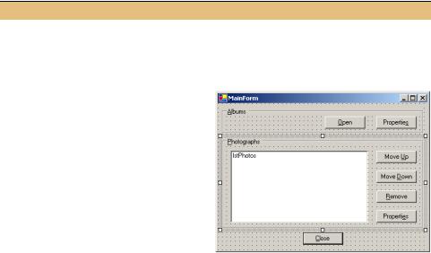
Photographs group box as shown in the |
|
|||||
|
graphic. |
|
|
|
|
|
|
|
|
|
Settings |
|
|
|
|
|
|
|
|
|
|
|
|
|
|
Button |
Property |
|
Value |
|
|
|
|
Move Up |
(Name) |
|
btnMoveUp |
|
|
|
|
|
Anchor |
|
Top, Right |
|
|
|
|
|
Text |
|
Move &Up |
|
|
|
|
Move Down |
(Name) |
|
btnMoveDown |
|
|
|
|
|
Anchor |
|
Top, Right |
|
|
|
|
|
Text |
|
Move &Down |
|
|
|
|
Remove |
(Name) |
|
btnRemove |
|
|
|
|
|
Anchor |
|
Top, Right |
|
|
|
|
|
Text |
|
&Remove |
|
|
|
|
|
|
|
|
|
|
326 |
CHAPTER 10 LIST CONTROLS |

ENABLE MULTIPLE SELECTIONS IN THE LIST BOX (continued)
|
Action |
Result |
|
|
|
3 |
Set the Enabled property for the four |
The code in the InitializeComponent method |
|
buttons in the Photographs group box |
for all four buttons is modified so that their |
|
to false. |
Enabled properties are set to false. |
|
How-to |
btnMoveUp.Enabled = false; |
|
a. Click the first button. |
. . . |
|
btnMoveDown.Enabled = false; |
|
|
b. Hold down the Ctrl key and click the |
|
|
. . . |
|
|
other buttons so that all four buttons |
|
|
are highlighted. |
|
|
c. Display the Properties window. |
|
|
d. Set the Enabled item to False. |
|
|
Note: This technique can be used to |
|
|
set a common property for any set of |
|
|
controls on a form to the same value. |
|
|
|
|
4 |
Rewrite the UpdateList method to |
This allows us to manipulate and modify the |
|
add each item to the list manually. |
individual items in the list, which is prohibited |
|
Note: The BeginUpdate method pre- |
when filling the list with the DisplaySource |
|
property. |
|
|
vents the list box from drawing the |
|
|
|
|
|
control while new items are added. |
private void UpdateList() |
|
This improves performance and pre- |
{ |
|
vents the screen from flickering. |
lstPhotos.BeginUpdate(); |
|
lstPhotos.Items.Clear(); |
|
|
|
|
|
|
foreach (Photograph photo in _album) |
|
|
{ |
|
|
lstPhotos.Items.Add(photo); |
|
|
} |
|
|
lstPhotos.EndUpdate(); |
|
|
} |
|
|
|
5 |
Handle the SelectedIndexChanged |
private void |
|
event for the ListBox control. |
lstPhotos_SelectedIndexChanged |
|
How-to |
(object sender, System.EventArgs e) |
|
{ |
|
|
This is the default event for all list |
int numSelected |
|
controls, so simply double-click on the |
= lstPhotos.SelectedIndices.Count; |
|
|
|
|
control. |
|
|
|
|
6 |
Implement this handler to enable or |
bool someSelected = (numSelected > 0); |
|
disable the buttons in the Photographs |
btnMoveUp.Enabled = (someSelected |
|
group box based on the number of |
|
|
&& !lstPhotos.GetSelected(0)); |
|
|
items selected in the list box. |
|
|
btnMoveDown.Enabled = (someSelected |
|
|
Note: The Move Up button should be |
&& (!lstPhotos.GetSelected( |
|
lstPhotos.Items.Count - 1))); |
|
|
disabled if the first item is selected. |
|
|
btnRemove.Enabled = someSelected; |
|
|
The Move Down button should be dis- |
btnPhotoProp.Enabled |
|
abled if the last item is selected. The |
|
|
GetSelected method is used to deter- |
= (numSelected == 1); |
|
} |
|
|
mine if a given index is currently |
|
|
|
|
|
selected. |
|
|
|
|
MULTISELECTION LIST BOXES |
327 |

You can compile and run this code if you like. Our new buttons do not do anything, but you can watch them become enabled and disabled as you select items in a newly opened album.
We assigned the MultiExtended selection mode setting to the ListBox.SelectionMode property, which permits selecting a range of items using the mouse or keyboard. This is one of four possible values for the SelectionMode enumeration, as described in .NET Table 10.3.
TRY IT! Change the list box selection mode to MultiSimple and run your program to see how the selection behavior differs between this and the MultiExtended mode.
Our next task will be to provide an implementation for these buttons. We will pick up this topic in the next section.
10.2.2HANDLING THE MOVE UP AND MOVE DOWN BUTTONS
Now that our list box allows multiple selections, we need to implement our three buttons that handle these selections from the list. This will permit us to discuss some collection and list box methods that are often used when processing multiple selections in a list.
We will look at the Move Up and Move Down buttons first. There are two problems we need to solve. The first is that our PhotoAlbum class does not currently provide an easy way to perform these actions. We will fix this by adding two methods to our album class for this purpose.
.NET Table 10.3 SelectionMode enumeration
The SelectionMode enumeration specifies the selection behavior of a list box control, such as the ListBox and CheckedListBox classes. This enumeration is part of the System.Windows.Forms namespace.
|
None |
Items cannot be selected. |
|
One |
A single item can be selected using a mouse |
|
|
click or the space bar key. |
Enumeration |
MultiSimple |
Multiple items can be selected. Items are |
|
selected or deselected using a mouse click or |
|
Values |
|
|
|
the space bar. |
|
|
|
|
|
MultiExtended |
Multiple items can be selected. This extends |
|
|
simple selection to permit a range of items to be |
|
|
selected using a drag of the mouse or the Shift, |
|
|
Ctrl, and arrow keys. |
|
|
|
The second problem is that if we move an item, then the index value of that item changes. For example, if we want to move items 3 and 4 down, then item 3 should move to position 4, and item 4 to position 5. As illustrated in figure 10.3, if we first
328 |
CHAPTER 10 LIST CONTROLS |