

- •brief contents
- •about this book
- •The Windows Forms namespace
- •Part 1: Hello Windows Forms
- •Part 2: Basic Windows Forms
- •Part 3: Advanced Windows Forms
- •Who should read this book?
- •Conventions
- •Action
- •Result
- •Source code downloads
- •Author online
- •acknowledgments
- •about .NET
- •Casting the .NET
- •Windows Forms overview
- •about the cover illustration
- •Hello Windows Forms
- •1.1 Programming in C#
- •1.1.1 Namespaces and classes
- •1.1.2 Constructors and methods
- •1.1.3 C# types
- •1.1.4 The entry point
- •1.1.5 The Application class
- •1.1.6 Program execution
- •1.2 Adding controls
- •1.2.1 Shortcuts and fully qualified names
- •1.2.2 Fields and properties
- •1.2.3 The Controls property
- •1.3 Loading files
- •1.3.1 Events
- •1.3.2 The OpenFileDialog class
- •1.3.3 Bitmap images
- •1.4 Resizing forms
- •1.4.1 Desktop layout properties
- •1.4.2 The Anchor property
- •1.4.3 The Dock property
- •1.5 Recap
- •2.1 Programming with Visual Studio .NET
- •2.1.1 Creating a project
- •Action
- •Result
- •2.1.2 Executing a program
- •Action
- •Result
- •2.1.3 Viewing the source code
- •View the code generated by Visual Studio .NET
- •Action
- •Result
- •2.2 Adding controls
- •2.2.1 The AssemblyInfo file
- •Action
- •Results
- •2.2.2 Renaming a form
- •Action
- •Result
- •2.2.3 The Toolbox window
- •Action
- •Result
- •2.3 Loading files
- •2.3.1 Event handlers in Visual Studio .NET
- •Action
- •Result
- •2.3.2 Exception handling
- •Action
- •Result
- •Action
- •Results and Comments
- •2.4 Resizing forms
- •2.4.1 Assign the Anchor property
- •Action
- •Result
- •2.4.2 Assign the MinimumSize property
- •Action
- •Result
- •2.5 Recap
- •Basic Windows Forms
- •Menus
- •Action
- •Result
- •Action
- •Result
- •Action
- •Result
- •Action
- •Result
- •3.3 Click events
- •Action
- •Result
- •Action
- •Result
- •Action
- •Result
- •Action
- •Result
- •Action
- •Result
- •Action
- •Result
- •3.5 Context menus
- •Action
- •Result
- •Action
- •Result
- •3.6 Recap
- •Status bars
- •4.1 The Control class
- •4.2 The StatusBar class
- •Action
- •Result
- •Action
- •Result
- •4.3.1 Adding panels to a status bar
- •Action
- •Result
- •Action
- •Result
- •Action
- •Result
- •Action
- •Result
- •4.5 Recap
- •Reusable libraries
- •5.1 C# classes and interfaces
- •5.2 Class libraries
- •Action
- •Result
- •Action
- •Result
- •Action
- •Result
- •Action
- •Result
- •Action
- •Result
- •Action
- •Result
- •Action
- •Result
- •Action
- •Result
- •Action
- •Result
- •5.3 Interfaces revisited
- •Action
- •Result
- •Action
- •Result
- •Action
- •Result
- •5.4 Robustness issues
- •Action
- •Result
- •Action
- •Result
- •Action
- •Result
- •Action
- •Result
- •Action
- •Result
- •Action
- •Result
- •Common file dialogs
- •Action
- •Results
- •Action
- •Result
- •Action
- •Result
- •Action
- •Result
- •Action
- •Result
- •6.3 Paint events
- •Action
- •Result
- •Action
- •Result
- •6.4 Context menus revisited
- •Action
- •Result
- •Action
- •Result
- •6.5 Files and paths
- •Action
- •Result
- •Action
- •Result
- •Action
- •Result
- •6.6 Save file dialogs
- •Action
- •Result
- •Action
- •Result
- •Action
- •Result
- •Action
- •Result
- •Action
- •Result
- •6.7 Open file dialogs
- •Action
- •Result
- •Action
- •Result
- •6.8 Recap
- •Drawing and scrolling
- •7.1 Form class hierarchy
- •Action
- •Result
- •Action
- •Result
- •Action
- •Result
- •Action
- •Result
- •Action
- •Result
- •Action
- •Result
- •Action
- •Result
- •Action
- •Result
- •Action
- •Result
- •Action
- •Result
- •Action
- •Result
- •Action
- •Result
- •7.4 Panels
- •Action
- •Result
- •Action
- •Result
- •Action
- •Result
- •Action
- •Result
- •Action
- •Result
- •Dialog boxes
- •8.1 Message boxes
- •Action
- •Result
- •Action
- •Result
- •8.1.4 Creating A YesNoCancel dialog
- •Action
- •Result
- •Action
- •Result
- •8.2 The Form.Close method
- •8.2.1 The relationship between Close and Dispose
- •Action
- •Result
- •8.3 Modal dialog boxes
- •Action
- •Result
- •Action
- •Result
- •8.3.2 Preserving caption values
- •Action
- •Result
- •Action
- •Result
- •Action
- •Result
- •Action
- •Result
- •Action
- •Result
- •Action
- •Result
- •Action
- •Result
- •Action
- •Result
- •Action
- •Result
- •Action
- •Result
- •Action
- •Result
- •Action
- •Result
- •Action
- •Result
- •Action
- •Result
- •Action
- •Result
- •Action
- •Result
- •Action
- •Result
- •Basic controls
- •Action
- •Result
- •Action
- •Result
- •Action
- •Result
- •9.1.2 Creating a derived form
- •Action
- •Result
- •9.2 Labels and text boxes
- •Action
- •Result
- •Action
- •Result
- •Action
- •Result
- •Action
- •Result
- •Action
- •Result
- •Action
- •Result
- •Action
- •Result
- •Action
- •Result
- •Action
- •Result
- •Action
- •Result
- •Action
- •Result
- •Action
- •Result
- •Action
- •Result
- •Action
- •Result
- •Action
- •Result
- •Action
- •Result
- •Action
- •Result
- •Action
- •Result
- •9.3.6 Adding AlbumEditDlg to our main form
- •Action
- •Result
- •Action
- •Result
- •9.4 Recap
- •List controls
- •10.1 List boxes
- •Action
- •Result
- •Action
- •Result
- •Action
- •Result
- •Action
- •Result
- •10.2 Multiselection list boxes
- •10.2.1 Enabling multiple selection
- •Action
- •Result
- •Action
- •Result
- •Action
- •Result
- •Action
- •Result
- •10.3 Combo boxes
- •Action
- •Result
- •Action
- •Result
- •10.4 Combo box edits
- •Action
- •Result
- •Action
- •Result
- •Action
- •Result
- •10.5 Owner-drawn lists
- •Action
- •Result
- •Action
- •Result
- •Action
- •Result
- •Action
- •Result
- •More controls
- •Action
- •Result
- •Action
- •Result
- •11.2 Tab pages
- •Action
- •Result
- •Action
- •Result
- •11.3.1 Dates and times
- •Action
- •Result
- •Action
- •Result
- •Action
- •Result
- •Action
- •Result
- •Action
- •Result
- •Action
- •Result
- •11.5 Recap
- •A .NET assortment
- •12.1 Keyboard events
- •Action
- •Result
- •Action
- •Result
- •12.2 Mouse events
- •Action
- •Result
- •Action
- •Result
- •Action
- •Result
- •12.3 Image buttons
- •Action
- •Result
- •Action
- •Result
- •Action
- •Result
- •Action
- •Result
- •Action
- •Result
- •Action
- •Result
- •Action
- •Result
- •Action
- •Result
- •Action
- •Result
- •12.4 Icons
- •Action
- •Result
- •Action
- •Result
- •Action
- •Result
- •12.5 Recap
- •Toolbars and tips
- •13.1 Toolbars
- •Action
- •Result
- •Action
- •Result
- •Action
- •Result
- •Action
- •Result
- •Action
- •Result
- •Action
- •Result
- •Action
- •Result
- •Action
- •Result
- •Action
- •Result
- •13.4.2 Creating tool tips
- •Action
- •Result
- •Action
- •Result
- •Advanced Windows Forms
- •List views
- •14.2 The ListView class
- •Action
- •Result
- •Action
- •Result
- •Action
- •Result
- •Action
- •Result
- •14.2.3 Populating a ListView
- •Action
- •Result
- •Action
- •14.3 ListView columns
- •Action
- •Result
- •Action
- •Result
- •Action
- •Result
- •Action
- •Result
- •Action
- •Result
- •Action
- •Result
- •Action
- •Result
- •Action
- •Result
- •Action
- •Result
- •Action
- •Result
- •Action
- •Result
- •Action
- •Result
- •Action
- •Result
- •Action
- •Result
- •Action
- •Result
- •Action
- •Result
- •Action
- •Result
- •Action
- •Result
- •Action
- •Result
- •14.6 Recap
- •Tree views
- •Action
- •Result
- •Action
- •Result
- •Action
- •Result
- •15.3 Dynamic tree nodes
- •Action
- •Result
- •Action
- •Result
- •Action
- •Result
- •Action
- •Result
- •Action
- •Result
- •15.4 Node selection
- •Action
- •Result
- •Action
- •Result
- •Action
- •Result
- •Action
- •Result
- •Action
- •Result
- •15.5 Fun with tree views
- •Action
- •Result
- •Action
- •Result
- •Action
- •Result
- •Multiple document interfaces
- •Action
- •Result
- •Action
- •Result
- •Action
- •Result
- •16.3 Merged menus
- •Action
- •Result
- •Action
- •Result
- •Action
- •Result
- •Action
- •Result
- •16.4 MDI children
- •Action
- •Result
- •Action
- •Result
- •Action
- •Result
- •Action
- •Result
- •Action
- •Result
- •Action
- •Result
- •Action
- •Result
- •Action
- •Result
- •Action
- •Result
- •Action
- •Result
- •16.5 MDI child window management
- •Action
- •Result
- •Action
- •Result
- •16.6 Recap
- •Data binding
- •17.1 Data grids
- •Action
- •Result
- •Action
- •Result
- •17.2 Data grid customization
- •Action
- •Result
- •Action
- •Result
- •Action
- •Result
- •Action
- •Result
- •Action
- •Result
- •Action
- •Result
- •Action
- •Result
- •Action
- •Result
- •Action
- •Result
- •Action
- •Result
- •Action
- •Result
- •Odds and ends .NET
- •Action
- •Result
- •Action
- •Result
- •Action
- •Result
- •Action
- •Result
- •18.2 Timers
- •Action
- •Result
- •Action
- •Result
- •18.3 Drag and drop
- •Action
- •Result
- •Action
- •Result
- •18.4 ActiveX controls
- •Action
- •Result
- •Action
- •Result
- •Action
- •Result
- •Action
- •Result
- •Action
- •Result
- •18.5 Recap
- •C# primer
- •A.1 C# programs
- •A.1.1 Assemblies
- •A.1.2 Namespaces
- •A.2 Types
- •A.2.1 Classes
- •A.2.2 Structures
- •A.2.3 Interfaces
- •A.2.4 Enumerations
- •A.2.5 Delegates
- •A.3 Language elements
- •A.3.1 Built-in types
- •A.3.2 Operators
- •A.3.3 Keywords
- •A.4 Special features
- •A.4.1 Exceptions
- •A.4.2 Arrays
- •A.4.3 Main
- •A.4.4 Boxing
- •A.4.5 Documentation
- •.NET namespaces
- •B.1 System.Collections
- •B.2 System.ComponentModel
- •B.3 System.Data
- •B.4 System.Drawing
- •B.5 System.Globalization
- •B.6 System.IO
- •B.7 System.Net
- •B.8 System.Reflection
- •B.9 System.Resources
- •B.10 System.Security
- •B.11 System.Threading
- •B.12 System.Web
- •B.13 System.Windows.Forms
- •B.14 System.XML
- •Visual index
- •C.1 Objects
- •C.2 Marshal by reference objects
- •C.3 Components
- •C.4 Common dialogs
- •C.7 Event data
- •C.8 Enumerations
- •For more information
- •bibliography
- •Symbols
- •Index
.
UPDATE THE SAVE AND OPEN METHODS IN PHOTOALBUM CLASS
|
Action |
Result |
|
|
|
8 |
In the PhotoAlbum.cs source code |
private const int CurrentVersion = 92; |
|
window, set the current version |
|
|
constant to 92. |
|
|
|
|
9 |
Modify the Save method to use the |
public void Save(string fileName) |
|
new Photograph.Write method. |
{ |
|
Note: The initial part of this |
. . . |
|
try |
|
|
method creates the FileStream |
{ |
|
and StreamWriter objects. This |
sw.WriteLine( |
|
_CurrentVersion.ToString()); |
|
|
code does not change, and is not |
|
|
|
|
|
shown here. |
// Store each photo separately |
|
Similarly, the code for the |
foreach (Photograph photo in this) |
|
finally clause is also not shown. |
{ |
|
photo.Write(sw); |
|
|
|
|
|
|
} |
|
|
this._fileName = fileName; |
|
|
} |
|
|
finally |
|
|
. . . |
|
|
} |
|
|
|
10 |
Modify the Open method to use the |
public void Open(string fileName) |
|
new ReadDelegate delegate. |
{ |
|
|
. . . |
|
|
try |
|
|
{ |
|
|
Clear(); |
|
|
this._fileName = fileName; |
|
|
Photograph.ReadDelegate ReadPhoto; |
|
|
|
11 |
In the switch statement, select the |
switch (version) |
|
correct version of the Photograph |
{ |
|
reader. |
case 66: |
|
ReadPhoto = new |
|
|
|
|
|
How-to |
Photograph.ReadDelegate( |
|
Use a new statement to instantiate |
Photograph.ReadVersion66); |
|
break; |
|
|
a new version of the delegate for |
|
|
|
|
|
each version. |
case 83: |
|
|
ReadPhoto = new |
|
|
Photograph.ReadDelegate( |
|
|
Photograph.ReadVersion83); |
|
|
break; |
|
|
case 92: |
|
|
ReadPhoto = new |
|
|
Photograph.ReadDelegate( |
|
|
Photograph.ReadVersion92); |
|
|
break; |
|
|
default: |
|
|
// Unknown version or bad file. |
|
|
throw (new IOException(. . .)); |
|
|
} |
|
|
|
276 |
CHAPTER 9 BASIC CONTROLS |

UPDATE THE SAVE AND OPEN METHODS IN PHOTOALBUM CLASS (continued)
|
Action |
Result |
|
|
|
12 |
Use the reader delegate to load the |
// Read each photograph in the album |
|
individual photographs. |
Photograph p = ReadPhoto(sr); |
|
Note: The code for the finally |
while (p != null) |
|
{ |
|
|
clause remains the same and is not |
this.Add(p); |
|
shown here. |
p = ReadPhoto(sr); |
|
} |
|
|
|
|
|
|
} |
|
|
finally |
|
|
. . . |
|
|
} |
|
|
|
This neat little use of delegates makes our code much more readable. A delegate instance is declared just like any other variable, except that in this case the type is our delegate.
Photograph.ReadDelegate ReadPhoto;
This variable is assigned by creating a new instance of the delegate object, providing a method with a matching signature. Note that in our case the method happens to be static. A delegate tracks both an object and a method, allowing both internal and static members of a class to be used. In our code, when the version number is 92, the PhotoReader variable is initialized as follows. If the method provided does not match the signature assigned to the delegate, a compiler error is generated. Such compilertime checking is a big advantage of delegates in C# over function pointers in C++.
case 92:
ReadPhoto = new Photograph.ReadDelegate(Photograph.ReadVersion92);
break;
The delegate is then used like any other function call to invoke the assigned method.
// Read each photograph in the album Photograph p = ReadPhoto(sr);
while (p != null)
{
this.Add(p);
p = ReadPhoto(sr);
}
Our PhotoAlbum class is now ready. Let’s get back to our PhotoEditDlg form and begin creating our new form.
9.2.2CREATING THE PHOTOEDITDLG PANEL AREA
Looking back at the PhotoEditDlg dialog we wish to create, let’s focus on the Panel control at the top of the form. In chapter 7 we made use of the Panel class for its drawing and scrolling capabilities. Here, we will use this class as a container for other controls to improve the overall appearance of our form. While we will not
LABELS AND TEXT BOXES |
277 |
enable scrolling in our panel, realize that controls can be placed outside of the visible portion of a panel and made accessible via the automated scroll bars discussed in chapter 7.
We have used the Label and TextBox controls previously in our program, so let’s update our panel before we talk about these classes in more detail. As you recall, the Panel object is inherited from the base form, but is modifiable by our class since it has a protected access level.
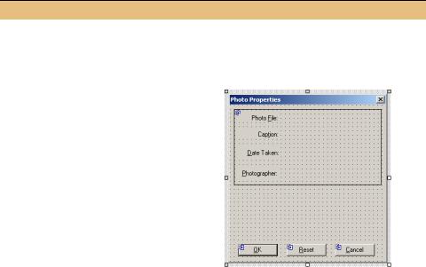
CREATE THE PANEL AREA OF THE PHOTOEDITDLG FORM
|
|
|
Action |
|
|
Result |
|
|
|
|
|
|
|
|
|
1 |
In the PhotoEditDlg.cs [Design] window, |
|
|||||
|
modify the Text property for the new |
|
|||||
|
dialog to be “Photo Properties.” |
|
|||||
|
|
|
|
|
|
|
|
2 |
Add the four Label controls to the left |
|
|||||
|
side of the panel, as shown in the graphic. |
|
|||||
|
Resize the panel control if necessary. Set |
|
|||||
|
the properties for each label as shown. |
|
|||||
|
Note: In this step you are placing the con- |
|
|||||
|
trols inside the Panel, rather than inside |
|
|||||
|
the Form. This is an important distinction. |
|
|||||
|
|
|
Settings |
|
|||
|
|
|
|
|
|
|
|
|
|
Label |
Property |
|
Value |
|
|
|
|
label1 |
Text |
|
Photo &File: |
|
|
|
|
|
TextAlign |
|
MiddleRight |
|
|
|
|
label2 |
Text |
|
Cap&tion: |
|
|
|
|
|
TextAlign |
|
MiddleRight |
|
|
|
|
label3 |
Text |
|
&Date Taken: |
|
|
|
|
|
TextAlign |
|
MiddleRight |
|
|
|
|
label4 |
Text |
|
&Photographer: |
|
|
|
|
|
TextAlign |
|
MiddleRight |
|
|
|
|
|
|
|
|
|
|
278 |
CHAPTER 9 BASIC CONTROLS |
CREATE THE PANEL AREA OF THE PHOTOEDITDLG FORM
|
|
|
Action |
|
|
Result |
|
|
|
|
|
|
|
3 |
Add the four TextBox controls to the right |
|
||||
|
side of the panel. Position and size these |
|
||||
|
controls as in the graphic, and use the |
|
||||
|
following properties. |
|
|
|
||
|
|
|
Settings |
|
|
|
|
|
|
|
|
|
|
|
|
TextBox |
Property |
Value |
|
|
|
|
Photo File |
(Name) |
txtPhotoFile |
|
|
|
|
|
ReadOnly |
True |
|
|
|
|
|
Text |
|
|
|
|
|
Caption |
(Name) |
txtCaption |
|
|
|
|
|
Text |
|
|
|
|
|
Date |
(Name) |
txtDate |
|
|
|
|
|
Text |
|
|
|
|
|
Photographer |
(Name) |
txtPhotographer |
|
|
|
|
|
Text |
|
|
|
|
|
Note: The txtPhotoFile text box dis- |
|
|||
|
|
plays a gray background to indicate it is |
|
|||
|
|
read-only. |
|
|
|
|
|
|
|
|
|
|
|
4 |
Set the tab order for these new controls. |
|
||||
|
How-to |
|
|
|
|
|
|
In the tab order view of the page, click |
|
||||
|
controls within the panel in order. Press |
|
||||
|
the Esc key when finished. |
|
||||
|
|
Note: As you can see in the graphic, the |
|
|||
|
|
controls within the panel are numbered to |
|
|||
|
|
indicate both the tab index of the panel |
|
|||
|
|
and of the specific control. |
|
|||
|
|
|
|
|
|
|
Note that the labels and text boxes here are defined within the Panel control, rather than within the form. In the InitializeComponent method, the controls are added to the Panel object much like we have seen other controls added to the Form class in previous chapters.
this.panel1.Controls.AddRange(new System.Windows.Forms.Control[] {
this.txtPhotographer,
this.txtDate,
this.txtCaption,
this.txtPhotoFile,
this.label4,
this.label3,
this.label2,
this.label1 });
LABELS AND TEXT BOXES |
279 |

The setting of the tab order in the final step, which internally assigns the TabIndex property for each control, is very important here. We could have set these values explicitly in steps 2 and 3, but the method in step 4 allowed us to set all controls at once. Since the Label and TextBox controls are located within the Panel object, the tab order defined applies only within the panel, so the TabIndex values for our labels and text boxes start at zero.
While label controls do not participate in the tab order, their TabIndex setting is still utilized. When you tab to or activate a label, the next control in the tab order will receive focus. This is the same behavior provided by the MFC CStatic class in Visual C++.
.NET Table 9.1 Label class
The Label class is a control that displays a text string or image within a form. This class is part of the of the System.Windows.Forms namespace, and inherits from the Control class. A Label object can be assigned a tab index, but when activated the next control in the tab order will always receive focus. See .NET Table 4.1 on page 104 for a list of members inherited from the Control class.
|
AutoSize |
Gets or sets whether the label should |
|
|
|
automatically resize to display its contents. |
|
|
BorderStyle |
Gets or sets the border for the label, taken from |
|
|
|
the BorderStyle enumeration. The default is |
|
|
|
None. |
|
|
FlatStyle |
Gets or sets the flat style for the label, using the |
|
|
|
FlatStyle enumeration. The default is |
|
|
|
Standard. |
|
|
Image |
Gets or sets the image to appear on the label. |
|
|
ImageList |
Gets or sets an ImageList object to associate |
|
Public Properties |
|
with the label. The ImageIndex property |
|
|
determines which image is displayed on the |
||
|
|
||
|
|
label. |
|
|
PreferredHeight |
Gets the height of the control, in pixels, |
|
|
|
assuming a single line of text is displayed. |
|
|
PreferredWidth |
Gets the width of the control, in pixels, assuming |
|
|
|
a single line of text is displayed. |
|
|
TextAlign |
Gets or sets the text alignment to use for text in |
|
|
|
the control. |
|
|
UseMnemonic |
Gets or sets whether an ampersand (&) in the |
|
|
|
Text property is interpreted as an access key |
|
|
|
prefix character. |
|
|
|
|
|
|
AutoSizeChanged |
Occurs when the value of the AutoSize |
|
Public Events |
|
property changes. |
|
TextAlignChanged |
Occurs when the value of the TextAlign |
||
|
|||
|
|
property changes. |
|
|
|
|
280 |
CHAPTER 9 BASIC CONTROLS |
This tab order behavior is especially relevant for the assigned access key, also called a mnemonic. For example, the ampersand character “&” in the Photo File label defines the ‘F’ character as the access key. Typing the keystroke Alt+F sets the focus to this label. When you do this, the txtPhotoFile control actually receives the focus. Similarly, typing Alt+P for the Caption label will set the focus to the
tion control. Such mnemonics are very useful for users, myself included, who prefer to avoid the mouse and keep their fingers on the keyboard.
Labels include other features as well, of course. As we saw in chapter 8, they can display a border and define an alignment for displayed text. These and other features of the Label class are summarized in .NET Table 9.1. The Label class is also the parent of the LinkLabel class, which adds the ability to perform an action when the text on the label is clicked, similar to an HTML link in a web browser. We will use the LinkLabel class in chapter 18 while discussing how to include ActiveX controls on a form.
We will use Label objects again in future sections. For now, let’s move on to discuss some of the features of our TextBox controls, and the TextBox class in general.
9.2.3CREATING THE MULTILINE TEXT BOX
The TextBox controls on our form are used to display various properties of the Photograph object. We have already created the text box controls within the panel area. In this section we create the text box for displaying the Photograph.Notes property in our dialog, and implement the protected members we defined in our base class earlier in the chapter.
As we saw in the previous section, text boxes can be editable or read-only. In some ways a read-only text box is similar to a Label object with a 3D border. The major difference is that a text box supports cut and paste operations, while a label does not. The existing CaptionDlg form in our application used a 3D label to illustrate this point, so you can verify this for yourself if you prefer.
As a result, a read-only TextBox should be used when displaying text that a user may wish to copy. This, in fact, is why our PhotoEditDlg form uses a read-only TextBox to display the photograph’s file name.
The TextBox class is based on the TextBoxBase class, which provides much of the core functionality for text controls. An overview of this base class appears in .NET Table 9.2.
LABELS AND TEXT BOXES |
281 |

.NET Table 9.2 TextBoxBase class
The TextBoxBase class is a control that displays editable text and can interact with the Clipboard class to permit cut and paste operations. This class is part of the of the System.Windows.Forms namespace, and inherits from the Control class. Both the TextBox and RichTextBox classes are derived from this abstract class. See .NET Table 4.1 on page 104 for a list of members inherited from the Control class, and .NET Table 9.3 on page 288 for an overview of the TextBox class.
|
AcceptsTab |
Gets or sets whether a multiline text box displays a Tab |
|
|
|
character or moves focus to the next control when the Tab |
|
|
|
key is pressed. |
|
|
CanUndo |
Gets or sets whether the user can undo the previous edit |
|
|
|
performed in the text box. |
|
|
Lines |
Gets or sets the array of strings representing the lines of |
|
|
|
text in the control. |
|
Public |
MaxLength |
Gets or sets the maximum number of characters the control |
|
|
will accept. |
||
Properties |
|
||
|
|
||
|
Multiline |
Gets or sets whether this is a multiline text box. |
|
|
ReadOnly |
Gets or sets whether the text is read-only. |
|
|
SelectedText |
Gets or sets the currently selected text in the control. The |
|
|
|
SelectedStart property indicates the location of the first |
|
|
|
selected character. |
|
|
WordWrap |
Gets or sets whether a multiline control automatically |
|
|
|
wraps to the next line as required. |
|
|
|
|
|
|
AppendText |
Appends a string to the existing text in the control. |
|
|
Copy |
Copies the current text into the Clipboard. |
|
|
Paste |
Replaces the current selection with the contents of the |
|
Public |
|
Clipboard. |
|
ScrollToCaret |
Ensures the current caret position is visible in a multiline |
||
Methods |
|||
|
|
text box. |
|
|
SelectAll |
Selects all text in the control. The Select method can be |
|
|
|
used to select a substring. |
|
|
Undo |
Undoes the last edit operation in the text box. |
|
|
|
|
|
|
AcceptsTab- |
Occurs when the AcceptsTab property changes. |
|
Public |
Changed |
|
|
|
|
||
Events |
Multiline- |
Occurs when the Multiline property changes. |
|
|
|||
|
Changed |
|
|
|
|
|
As shown in the table, the TextBoxBase class provides a Multiline property that indicates whether a derived control can accept multiple lines of text. The bottom part of our PhotoEditDlg form is designed to show off such a text box. This control
282 |
CHAPTER 9 BASIC CONTROLS |