

- •brief contents
- •about this book
- •The Windows Forms namespace
- •Part 1: Hello Windows Forms
- •Part 2: Basic Windows Forms
- •Part 3: Advanced Windows Forms
- •Who should read this book?
- •Conventions
- •Action
- •Result
- •Source code downloads
- •Author online
- •acknowledgments
- •about .NET
- •Casting the .NET
- •Windows Forms overview
- •about the cover illustration
- •Hello Windows Forms
- •1.1 Programming in C#
- •1.1.1 Namespaces and classes
- •1.1.2 Constructors and methods
- •1.1.3 C# types
- •1.1.4 The entry point
- •1.1.5 The Application class
- •1.1.6 Program execution
- •1.2 Adding controls
- •1.2.1 Shortcuts and fully qualified names
- •1.2.2 Fields and properties
- •1.2.3 The Controls property
- •1.3 Loading files
- •1.3.1 Events
- •1.3.2 The OpenFileDialog class
- •1.3.3 Bitmap images
- •1.4 Resizing forms
- •1.4.1 Desktop layout properties
- •1.4.2 The Anchor property
- •1.4.3 The Dock property
- •1.5 Recap
- •2.1 Programming with Visual Studio .NET
- •2.1.1 Creating a project
- •Action
- •Result
- •2.1.2 Executing a program
- •Action
- •Result
- •2.1.3 Viewing the source code
- •View the code generated by Visual Studio .NET
- •Action
- •Result
- •2.2 Adding controls
- •2.2.1 The AssemblyInfo file
- •Action
- •Results
- •2.2.2 Renaming a form
- •Action
- •Result
- •2.2.3 The Toolbox window
- •Action
- •Result
- •2.3 Loading files
- •2.3.1 Event handlers in Visual Studio .NET
- •Action
- •Result
- •2.3.2 Exception handling
- •Action
- •Result
- •Action
- •Results and Comments
- •2.4 Resizing forms
- •2.4.1 Assign the Anchor property
- •Action
- •Result
- •2.4.2 Assign the MinimumSize property
- •Action
- •Result
- •2.5 Recap
- •Basic Windows Forms
- •Menus
- •Action
- •Result
- •Action
- •Result
- •Action
- •Result
- •Action
- •Result
- •3.3 Click events
- •Action
- •Result
- •Action
- •Result
- •Action
- •Result
- •Action
- •Result
- •Action
- •Result
- •Action
- •Result
- •3.5 Context menus
- •Action
- •Result
- •Action
- •Result
- •3.6 Recap
- •Status bars
- •4.1 The Control class
- •4.2 The StatusBar class
- •Action
- •Result
- •Action
- •Result
- •4.3.1 Adding panels to a status bar
- •Action
- •Result
- •Action
- •Result
- •Action
- •Result
- •Action
- •Result
- •4.5 Recap
- •Reusable libraries
- •5.1 C# classes and interfaces
- •5.2 Class libraries
- •Action
- •Result
- •Action
- •Result
- •Action
- •Result
- •Action
- •Result
- •Action
- •Result
- •Action
- •Result
- •Action
- •Result
- •Action
- •Result
- •Action
- •Result
- •5.3 Interfaces revisited
- •Action
- •Result
- •Action
- •Result
- •Action
- •Result
- •5.4 Robustness issues
- •Action
- •Result
- •Action
- •Result
- •Action
- •Result
- •Action
- •Result
- •Action
- •Result
- •Action
- •Result
- •Common file dialogs
- •Action
- •Results
- •Action
- •Result
- •Action
- •Result
- •Action
- •Result
- •Action
- •Result
- •6.3 Paint events
- •Action
- •Result
- •Action
- •Result
- •6.4 Context menus revisited
- •Action
- •Result
- •Action
- •Result
- •6.5 Files and paths
- •Action
- •Result
- •Action
- •Result
- •Action
- •Result
- •6.6 Save file dialogs
- •Action
- •Result
- •Action
- •Result
- •Action
- •Result
- •Action
- •Result
- •Action
- •Result
- •6.7 Open file dialogs
- •Action
- •Result
- •Action
- •Result
- •6.8 Recap
- •Drawing and scrolling
- •7.1 Form class hierarchy
- •Action
- •Result
- •Action
- •Result
- •Action
- •Result
- •Action
- •Result
- •Action
- •Result
- •Action
- •Result
- •Action
- •Result
- •Action
- •Result
- •Action
- •Result
- •Action
- •Result
- •Action
- •Result
- •Action
- •Result
- •7.4 Panels
- •Action
- •Result
- •Action
- •Result
- •Action
- •Result
- •Action
- •Result
- •Action
- •Result
- •Dialog boxes
- •8.1 Message boxes
- •Action
- •Result
- •Action
- •Result
- •8.1.4 Creating A YesNoCancel dialog
- •Action
- •Result
- •Action
- •Result
- •8.2 The Form.Close method
- •8.2.1 The relationship between Close and Dispose
- •Action
- •Result
- •8.3 Modal dialog boxes
- •Action
- •Result
- •Action
- •Result
- •8.3.2 Preserving caption values
- •Action
- •Result
- •Action
- •Result
- •Action
- •Result
- •Action
- •Result
- •Action
- •Result
- •Action
- •Result
- •Action
- •Result
- •Action
- •Result
- •Action
- •Result
- •Action
- •Result
- •Action
- •Result
- •Action
- •Result
- •Action
- •Result
- •Action
- •Result
- •Action
- •Result
- •Action
- •Result
- •Action
- •Result
- •Basic controls
- •Action
- •Result
- •Action
- •Result
- •Action
- •Result
- •9.1.2 Creating a derived form
- •Action
- •Result
- •9.2 Labels and text boxes
- •Action
- •Result
- •Action
- •Result
- •Action
- •Result
- •Action
- •Result
- •Action
- •Result
- •Action
- •Result
- •Action
- •Result
- •Action
- •Result
- •Action
- •Result
- •Action
- •Result
- •Action
- •Result
- •Action
- •Result
- •Action
- •Result
- •Action
- •Result
- •Action
- •Result
- •Action
- •Result
- •Action
- •Result
- •Action
- •Result
- •9.3.6 Adding AlbumEditDlg to our main form
- •Action
- •Result
- •Action
- •Result
- •9.4 Recap
- •List controls
- •10.1 List boxes
- •Action
- •Result
- •Action
- •Result
- •Action
- •Result
- •Action
- •Result
- •10.2 Multiselection list boxes
- •10.2.1 Enabling multiple selection
- •Action
- •Result
- •Action
- •Result
- •Action
- •Result
- •Action
- •Result
- •10.3 Combo boxes
- •Action
- •Result
- •Action
- •Result
- •10.4 Combo box edits
- •Action
- •Result
- •Action
- •Result
- •Action
- •Result
- •10.5 Owner-drawn lists
- •Action
- •Result
- •Action
- •Result
- •Action
- •Result
- •Action
- •Result
- •More controls
- •Action
- •Result
- •Action
- •Result
- •11.2 Tab pages
- •Action
- •Result
- •Action
- •Result
- •11.3.1 Dates and times
- •Action
- •Result
- •Action
- •Result
- •Action
- •Result
- •Action
- •Result
- •Action
- •Result
- •Action
- •Result
- •11.5 Recap
- •A .NET assortment
- •12.1 Keyboard events
- •Action
- •Result
- •Action
- •Result
- •12.2 Mouse events
- •Action
- •Result
- •Action
- •Result
- •Action
- •Result
- •12.3 Image buttons
- •Action
- •Result
- •Action
- •Result
- •Action
- •Result
- •Action
- •Result
- •Action
- •Result
- •Action
- •Result
- •Action
- •Result
- •Action
- •Result
- •Action
- •Result
- •12.4 Icons
- •Action
- •Result
- •Action
- •Result
- •Action
- •Result
- •12.5 Recap
- •Toolbars and tips
- •13.1 Toolbars
- •Action
- •Result
- •Action
- •Result
- •Action
- •Result
- •Action
- •Result
- •Action
- •Result
- •Action
- •Result
- •Action
- •Result
- •Action
- •Result
- •Action
- •Result
- •13.4.2 Creating tool tips
- •Action
- •Result
- •Action
- •Result
- •Advanced Windows Forms
- •List views
- •14.2 The ListView class
- •Action
- •Result
- •Action
- •Result
- •Action
- •Result
- •Action
- •Result
- •14.2.3 Populating a ListView
- •Action
- •Result
- •Action
- •14.3 ListView columns
- •Action
- •Result
- •Action
- •Result
- •Action
- •Result
- •Action
- •Result
- •Action
- •Result
- •Action
- •Result
- •Action
- •Result
- •Action
- •Result
- •Action
- •Result
- •Action
- •Result
- •Action
- •Result
- •Action
- •Result
- •Action
- •Result
- •Action
- •Result
- •Action
- •Result
- •Action
- •Result
- •Action
- •Result
- •Action
- •Result
- •Action
- •Result
- •14.6 Recap
- •Tree views
- •Action
- •Result
- •Action
- •Result
- •Action
- •Result
- •15.3 Dynamic tree nodes
- •Action
- •Result
- •Action
- •Result
- •Action
- •Result
- •Action
- •Result
- •Action
- •Result
- •15.4 Node selection
- •Action
- •Result
- •Action
- •Result
- •Action
- •Result
- •Action
- •Result
- •Action
- •Result
- •15.5 Fun with tree views
- •Action
- •Result
- •Action
- •Result
- •Action
- •Result
- •Multiple document interfaces
- •Action
- •Result
- •Action
- •Result
- •Action
- •Result
- •16.3 Merged menus
- •Action
- •Result
- •Action
- •Result
- •Action
- •Result
- •Action
- •Result
- •16.4 MDI children
- •Action
- •Result
- •Action
- •Result
- •Action
- •Result
- •Action
- •Result
- •Action
- •Result
- •Action
- •Result
- •Action
- •Result
- •Action
- •Result
- •Action
- •Result
- •Action
- •Result
- •16.5 MDI child window management
- •Action
- •Result
- •Action
- •Result
- •16.6 Recap
- •Data binding
- •17.1 Data grids
- •Action
- •Result
- •Action
- •Result
- •17.2 Data grid customization
- •Action
- •Result
- •Action
- •Result
- •Action
- •Result
- •Action
- •Result
- •Action
- •Result
- •Action
- •Result
- •Action
- •Result
- •Action
- •Result
- •Action
- •Result
- •Action
- •Result
- •Action
- •Result
- •Odds and ends .NET
- •Action
- •Result
- •Action
- •Result
- •Action
- •Result
- •Action
- •Result
- •18.2 Timers
- •Action
- •Result
- •Action
- •Result
- •18.3 Drag and drop
- •Action
- •Result
- •Action
- •Result
- •18.4 ActiveX controls
- •Action
- •Result
- •Action
- •Result
- •Action
- •Result
- •Action
- •Result
- •Action
- •Result
- •18.5 Recap
- •C# primer
- •A.1 C# programs
- •A.1.1 Assemblies
- •A.1.2 Namespaces
- •A.2 Types
- •A.2.1 Classes
- •A.2.2 Structures
- •A.2.3 Interfaces
- •A.2.4 Enumerations
- •A.2.5 Delegates
- •A.3 Language elements
- •A.3.1 Built-in types
- •A.3.2 Operators
- •A.3.3 Keywords
- •A.4 Special features
- •A.4.1 Exceptions
- •A.4.2 Arrays
- •A.4.3 Main
- •A.4.4 Boxing
- •A.4.5 Documentation
- •.NET namespaces
- •B.1 System.Collections
- •B.2 System.ComponentModel
- •B.3 System.Data
- •B.4 System.Drawing
- •B.5 System.Globalization
- •B.6 System.IO
- •B.7 System.Net
- •B.8 System.Reflection
- •B.9 System.Resources
- •B.10 System.Security
- •B.11 System.Threading
- •B.12 System.Web
- •B.13 System.Windows.Forms
- •B.14 System.XML
- •Visual index
- •C.1 Objects
- •C.2 Marshal by reference objects
- •C.3 Components
- •C.4 Common dialogs
- •C.7 Event data
- •C.8 Enumerations
- •For more information
- •bibliography
- •Symbols
- •Index
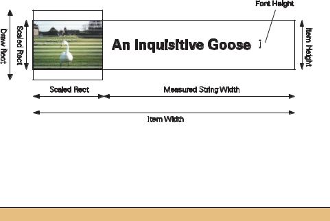
Figure 10.8 This figure shows the various measurements used to calculate a list item’s width and height.
The following steps implement the code required for the MeasureItem event. Figure 10.8 illustrates the various measurements used to determine the width and height of the item.
CALCULATE THE LIST ITEM SIZE DYNAMICALLY
|
Action |
Result |
|
|
|
1 |
In the MainForm.cs window, add |
private static Rectangle _drawRect |
|
a static Rectangle to the |
= new Rectangle(0,0,45,45); |
|
MainForm class to hold the |
|
|
drawing rectangle for the image. |
|
|
|
|
2 |
Add a MeasureItem event |
private void lstPhotos_MeasureItem |
|
handler for the lstPhotos list |
(object sender, |
|
box. |
Windows.Forms.MeasureItemEventArgs e) |
|
{ |
|
|
|
|
|
|
|
3 |
Calculate the size of the image |
Photograph p = _album[e.Index]; |
|
when scaled into the drawing |
Rectangle scaledRect |
|
rectangle. |
= p.ScaleToFit(_drawRect); |
|
|
|
|
|
|
4 |
Calculate the item’s height. |
e.ItemHeight = Math.Max(scaledRect.Height, |
|
|
lstPhotos.Font.Height) + 2; |
|
|
|
5 |
Calculate the item’s width. |
e.ItemWidth = scaledRect.Width + 2 |
|
|
+ (int) e.Graphics.MeasureString( |
|
|
p.Caption, lstPhotos.Font).Width; |
|
|
} |
|
|
|
For the item’s height, this code uses the larger of the scaled item’s height and the ListBox control’s font height, plus 2 pixels as padding between subsequent items in the list.
e.ItemHeight = Math.Max(scaledRect.Height, lstPhotos.Font.Height) + 2;
For the item’s width, the width of the scaled image plus the width of the drawn string is used, plus 2 pixels as padding between the image and the text. To do this, the
OWNER-DRAWN LISTS |
347 |

Graphics.MeasureString method is used to calculate the size of the string when drawn with the Font object used by the ListBox control.
e.ItemWidth = scaledRect.Width + 2
+ e.Graphics.MeasureString(p.Caption, lstPhotos.Font);
Our final task is to draw the actual items using the DrawItem event.
10.5.3DRAWING THE LIST ITEMS
As you may recall, the DrawItem event and related DrawItemEventArgs class were discussed in chapter 4. See .NET Table 4.4 on page 119 for an overview of the
DrawItemEventArgs class.
Before we look at how to draw the list items in our application, let’s make a small change to the Photograph class to improve the performance of our drawing. Since we may have to draw an item multiple times, it would be nice to avoid drawing the thumbnail from the entire image each time. To avoid this, let’s create a Thumbnail property in our Photograph class to obtain a more appropriately sized image.
Set the version number of the MyPhotoAlbum library to 10.5.
STORE A THUMBNAIL IMAGE IN THE PHOTOGRAPH OBJECT
|
Action |
Result |
|
|
|
1 |
In the Photograph.cs file, create an |
. . . |
|
internal _thumbnail field to store |
private Bitmap _thumbnail = null; |
|
the new thumbnail image. |
|
|
|
|
2 |
Update the Dispose method to |
public void Dispose() |
|
properly dispose of the new object. |
{ |
|
|
if (_bitmap != null |
|
|
&& _bitmap != InvalidPhotoImage) |
|
|
_bitmap.Dispose(); |
|
|
if (_thumbnail != null) |
|
|
_thumbnail.Dispose(); |
|
|
_bitmap = null; |
|
|
_thumbnail = null; |
|
|
} |
|
|
|
3 |
Add a static constant to store the |
private const int ThumbSize = 90; |
|
default width and height for a |
|
|
thumbnail. |
|
|
|
|
348 |
CHAPTER 10 LIST CONTROLS |

STORE A THUMBNAIL IMAGE IN THE PHOTOGRAPH OBJECT
|
Action |
Result |
|
|
|
4 |
Add a property to retrieve the |
public Bitmap Thumbnail |
|
thumbnail. |
{ |
|
Note: While we draw our list items |
get |
|
{ |
|
|
into a 45-pixel box, we draw our |
if (_thumbnail == null) |
|
thumbnail into a 90-pixel box. Aside |
{ |
|
// Create the "thumbnail" bitmap |
|
|
from the fact that we might want to |
|
|
Rectangle sr = this.ScaleToFit( |
|
|
use the Thumbnail property in other |
new Rectangle(0,0, |
|
code, it is beneficial, when downsiz- |
ThumbSize,ThumbSize)); |
|
ing an image, to have an original |
Bitmap bm = new Bitmap(sr.Width, |
|
sr.Height); |
|
|
image with a higher resolution than |
|
|
Graphics g = Graphics.FromImage(bm); |
|
|
the final size. |
GraphicsUnit u = g.PageUnit; |
|
|
g.DrawImage(this.Image, |
|
|
bm.GetBounds(ref u)); |
|
|
_thumbnail = bm; |
|
|
} |
|
|
return _thumbnail; |
|
|
} |
|
|
} |
|
|
|
This ensures that we will not have to load up and scale the full-size image every time we draw an item. With this property in place, we have everything we need to draw our list items.
HANDLE THE DRAWITEM EVENT TO DRAW A LIST ITEM
|
Action |
Result |
|
|
|
5 |
Add a static Brush field to |
private static SolidBrush _textBrush |
|
the MainForm.cs file. |
= new SolidBrush(SystemColors.WindowText); |
|
|
Note: This will improve the performance of our handler |
|
|
by eliminating the need to recreate a brush each time |
|
|
an item is drawn. |
|
|
|
6 |
Add a DrawItem event |
private void lstPhotos_DrawItem |
|
handler for the ListBox |
(object sender, |
|
control. |
System.Windows.Forms.DrawItemEventArgs e) |
|
{ |
|
|
|
|
|
|
|
7 |
To implement this method, |
Graphics g = e.Graphics; |
|
get the Graphics and |
Photograph p = _album[e.Index]; |
|
Photograph objects |
|
|
required for this handler. |
|
|
|
|
OWNER-DRAWN LISTS |
349 |

HANDLE THE DRAWITEM EVENT TO DRAW A LIST ITEM (continued)
|
Action |
Result |
|
|
|
8 |
Calculate the Rectangle |
Rectangle scaledRect |
|
that will contain the |
= p.ScaleToFit(_drawRect); |
|
thumbnail image. |
Rectangle imageRect = e.Bounds; |
|
imageRect.Y += 1; |
|
|
|
|
|
How-to |
imageRect.Height = scaledRect.Height; |
|
imageRect.X += 2; |
|
|
a. Use e.Bounds to obtain |
|
|
imageRect.Width = scaledRect.Width; |
|
|
the bounding rectangle |
|
|
for item. |
|
|
b. Adjust this rectangle |
|
|
based on the size of the |
|
|
scaled image. |
|
|
|
|
9 |
Draw the thumbnail image |
g.DrawImage(p.Thumbnail, imageRect); |
|
into this rectangle. |
g.DrawRectangle(Pens.Black, imageRect); |
|
How-to |
|
|
a. Use DrawImage to paint |
|
|
the thumbnail into the |
|
|
rectangle. |
|
|
b. Use DrawRectangle to |
|
|
paint a black border |
|
|
around the image. |
|
|
|
|
10 |
Calculate the Rectangle |
Rectangle textRect = new Rectangle( |
|
that will contain the caption |
imageRect.Right + 2, |
|
for the image. |
imageRect.Y + ((imageRect.Height |
|
- e.Font.Height) / 2), |
|
|
|
|
|
How-to |
e.Bounds.Width - imageRect.Width - 4, |
|
Use the bounding rectangle |
e.Font.Height); |
|
|
|
|
without the image area and |
|
|
centered vertically for the |
|
|
current font. |
|
|
|
|
11 |
If the current item is |
if ((e.State & DrawItemState.Selected) |
|
selected, make sure the text |
== DrawItemState.Selected) |
|
will appear selected as well. |
{ |
|
_textBrush.Color |
|
|
|
|
|
How-to |
= SystemColors.Highlight; |
|
a. Use the State property |
g.FillRectangle(_textBrush, textRect); |
|
_textBrush.Color |
|
|
to determine if this item |
|
|
= SystemColors.HighlightText; |
|
|
is selected. |
|
|
} |
|
|
b. Use the system High- |
Note: The State property used here defines the state |
|
light color for the back- |
|
|
settings for the current item. This contains an or’d set |
|
|
ground. |
|
|
of values taken from the DrawItemState enumeration. |
|
|
c. Use the HighlightText |
|
|
The code here is preferred over the use of a method |
|
|
color for the actual text. |
such as ListBox.GetSelected since these and other |
|
|
methods may not reflect recent user changes until after |
|
|
the DrawItem event is processed. |
|
|
|
350 |
CHAPTER 10 LIST CONTROLS |

HANDLE THE DRAWITEM EVENT TO DRAW A LIST ITEM (continued)
|
Action |
Result |
|
|
|
12 |
If the current item is not |
else |
|
selected, make sure the text |
{ |
|
will appear normally. |
_textBrush.Color = SystemColors.Window; |
|
g.FillRectangle(_textBrush, textRect); |
|
|
|
|
|
How-to |
_textBrush.Color |
|
= SystemColors.WindowText; |
|
|
a. Use the system Window |
|
|
} |
|
|
color for the background. |
|
|
b. Use the WindowText |
|
|
color for the actual text. |
|
|
|
|
13 |
Draw the caption string in |
g.DrawString(p.Caption, e.Font, |
|
the text rectangle using the |
_textBrush, textRect); |
|
default font. |
} |
|
|
|
|
|
|
Well done! You’ve just created your first owner-drawn list box. This code provides a number of features that should be useful in your own applications. It includes how to draw the image as well as the string for the item, and how to handle selected and deselected text. Compile and run the application. Click the Thumbnail context menu and watch the list display thumbnails. Click it again and the list reverts to normal strings.
TRY IT! Our list box currently displays the file name for each photograph when DrawMode is Normal, and the caption string when DrawMode is OwnerDrawVariable. It would be nice if the user could select which string to display in either mode.
Try implementing this change by adding additional entries to the ListBox control’s context menu. Add a parent menu called “Display As,” and a submenu to allow the user to select between “File Name,” “Caption,” and “Photographer.” Based on their selection, set the DisplayMember property for the list to the appropriate property string.
In normal draw mode, the framework picks up the DisplayMember property automatically. For the DrawItem event, you will need to retrieve the appropriate string based on the DisplayMember value. You can use string comparisons to do this, or use the System.Reflection namespace classes and types. This namespace is not discussed in detail in this book, but the following code excerpt can be used at the end of your DrawItem event handler to dynamically determine the value associated with the property corresponding to a given string.
PropertyInfo pi = typeof(Photograph).
GetProperty(lstPhotos.DisplayMember);
object propValue = pi.GetValue(p, null);
g.DrawString(propValue.ToString(), e.Font,
_textBrush, textRect);
OWNER-DRAWN LISTS |
351 |
This completes our discussion of list controls. The next section provides a quick recap of the chapter just in case you have already forgotten.
10.6RECAP
This chapter discussed the basic list classes in the .NET Framework, namely the ListBox and ComboBox controls. We created a new application for this purpose, the MyAlbumEditor application, and built this application from the ground up using our existing MyPhotoAlbum library.
We began with a discussion of the common base class for list controls, namely the ListControl class, followed by a discussion of both single and multiple selection in the ListBox class. We saw how to enable and disable controls on the form based on the number of items selected, and how to handle double clicks for quick access to a common operation.
For the ComboBox class, we created a noneditable ComboBox to hold the list of available album files. Modifying the selected value automatically closed the previous album and opened the newly selected one. We then looked at an editable ComboBox for our photographer setting in the PhotoEditDlg dialog box. We discussed how to dynamically add new items to the list, and how to automatically select an existing item as the user is typing.
We ended with a discussion of owner-drawn list items by providing the option of displaying image thumbnails in our list box. We saw how to draw both images and text, including selected text.
There are additional controls than those discussed in chapters 9 and 10, of course. We will see some of these in the next chapter, and others as we continue our progression through the book. In chapter 11 we continue with our new MyAlbumEditor application, and look at Tab pages as a way to organize large amounts of information on a single form.
352 |
CHAPTER 10 LIST CONTROLS |