

- •brief contents
- •about this book
- •The Windows Forms namespace
- •Part 1: Hello Windows Forms
- •Part 2: Basic Windows Forms
- •Part 3: Advanced Windows Forms
- •Who should read this book?
- •Conventions
- •Action
- •Result
- •Source code downloads
- •Author online
- •acknowledgments
- •about .NET
- •Casting the .NET
- •Windows Forms overview
- •about the cover illustration
- •Hello Windows Forms
- •1.1 Programming in C#
- •1.1.1 Namespaces and classes
- •1.1.2 Constructors and methods
- •1.1.3 C# types
- •1.1.4 The entry point
- •1.1.5 The Application class
- •1.1.6 Program execution
- •1.2 Adding controls
- •1.2.1 Shortcuts and fully qualified names
- •1.2.2 Fields and properties
- •1.2.3 The Controls property
- •1.3 Loading files
- •1.3.1 Events
- •1.3.2 The OpenFileDialog class
- •1.3.3 Bitmap images
- •1.4 Resizing forms
- •1.4.1 Desktop layout properties
- •1.4.2 The Anchor property
- •1.4.3 The Dock property
- •1.5 Recap
- •2.1 Programming with Visual Studio .NET
- •2.1.1 Creating a project
- •Action
- •Result
- •2.1.2 Executing a program
- •Action
- •Result
- •2.1.3 Viewing the source code
- •View the code generated by Visual Studio .NET
- •Action
- •Result
- •2.2 Adding controls
- •2.2.1 The AssemblyInfo file
- •Action
- •Results
- •2.2.2 Renaming a form
- •Action
- •Result
- •2.2.3 The Toolbox window
- •Action
- •Result
- •2.3 Loading files
- •2.3.1 Event handlers in Visual Studio .NET
- •Action
- •Result
- •2.3.2 Exception handling
- •Action
- •Result
- •Action
- •Results and Comments
- •2.4 Resizing forms
- •2.4.1 Assign the Anchor property
- •Action
- •Result
- •2.4.2 Assign the MinimumSize property
- •Action
- •Result
- •2.5 Recap
- •Basic Windows Forms
- •Menus
- •Action
- •Result
- •Action
- •Result
- •Action
- •Result
- •Action
- •Result
- •3.3 Click events
- •Action
- •Result
- •Action
- •Result
- •Action
- •Result
- •Action
- •Result
- •Action
- •Result
- •Action
- •Result
- •3.5 Context menus
- •Action
- •Result
- •Action
- •Result
- •3.6 Recap
- •Status bars
- •4.1 The Control class
- •4.2 The StatusBar class
- •Action
- •Result
- •Action
- •Result
- •4.3.1 Adding panels to a status bar
- •Action
- •Result
- •Action
- •Result
- •Action
- •Result
- •Action
- •Result
- •4.5 Recap
- •Reusable libraries
- •5.1 C# classes and interfaces
- •5.2 Class libraries
- •Action
- •Result
- •Action
- •Result
- •Action
- •Result
- •Action
- •Result
- •Action
- •Result
- •Action
- •Result
- •Action
- •Result
- •Action
- •Result
- •Action
- •Result
- •5.3 Interfaces revisited
- •Action
- •Result
- •Action
- •Result
- •Action
- •Result
- •5.4 Robustness issues
- •Action
- •Result
- •Action
- •Result
- •Action
- •Result
- •Action
- •Result
- •Action
- •Result
- •Action
- •Result
- •Common file dialogs
- •Action
- •Results
- •Action
- •Result
- •Action
- •Result
- •Action
- •Result
- •Action
- •Result
- •6.3 Paint events
- •Action
- •Result
- •Action
- •Result
- •6.4 Context menus revisited
- •Action
- •Result
- •Action
- •Result
- •6.5 Files and paths
- •Action
- •Result
- •Action
- •Result
- •Action
- •Result
- •6.6 Save file dialogs
- •Action
- •Result
- •Action
- •Result
- •Action
- •Result
- •Action
- •Result
- •Action
- •Result
- •6.7 Open file dialogs
- •Action
- •Result
- •Action
- •Result
- •6.8 Recap
- •Drawing and scrolling
- •7.1 Form class hierarchy
- •Action
- •Result
- •Action
- •Result
- •Action
- •Result
- •Action
- •Result
- •Action
- •Result
- •Action
- •Result
- •Action
- •Result
- •Action
- •Result
- •Action
- •Result
- •Action
- •Result
- •Action
- •Result
- •Action
- •Result
- •7.4 Panels
- •Action
- •Result
- •Action
- •Result
- •Action
- •Result
- •Action
- •Result
- •Action
- •Result
- •Dialog boxes
- •8.1 Message boxes
- •Action
- •Result
- •Action
- •Result
- •8.1.4 Creating A YesNoCancel dialog
- •Action
- •Result
- •Action
- •Result
- •8.2 The Form.Close method
- •8.2.1 The relationship between Close and Dispose
- •Action
- •Result
- •8.3 Modal dialog boxes
- •Action
- •Result
- •Action
- •Result
- •8.3.2 Preserving caption values
- •Action
- •Result
- •Action
- •Result
- •Action
- •Result
- •Action
- •Result
- •Action
- •Result
- •Action
- •Result
- •Action
- •Result
- •Action
- •Result
- •Action
- •Result
- •Action
- •Result
- •Action
- •Result
- •Action
- •Result
- •Action
- •Result
- •Action
- •Result
- •Action
- •Result
- •Action
- •Result
- •Action
- •Result
- •Basic controls
- •Action
- •Result
- •Action
- •Result
- •Action
- •Result
- •9.1.2 Creating a derived form
- •Action
- •Result
- •9.2 Labels and text boxes
- •Action
- •Result
- •Action
- •Result
- •Action
- •Result
- •Action
- •Result
- •Action
- •Result
- •Action
- •Result
- •Action
- •Result
- •Action
- •Result
- •Action
- •Result
- •Action
- •Result
- •Action
- •Result
- •Action
- •Result
- •Action
- •Result
- •Action
- •Result
- •Action
- •Result
- •Action
- •Result
- •Action
- •Result
- •Action
- •Result
- •9.3.6 Adding AlbumEditDlg to our main form
- •Action
- •Result
- •Action
- •Result
- •9.4 Recap
- •List controls
- •10.1 List boxes
- •Action
- •Result
- •Action
- •Result
- •Action
- •Result
- •Action
- •Result
- •10.2 Multiselection list boxes
- •10.2.1 Enabling multiple selection
- •Action
- •Result
- •Action
- •Result
- •Action
- •Result
- •Action
- •Result
- •10.3 Combo boxes
- •Action
- •Result
- •Action
- •Result
- •10.4 Combo box edits
- •Action
- •Result
- •Action
- •Result
- •Action
- •Result
- •10.5 Owner-drawn lists
- •Action
- •Result
- •Action
- •Result
- •Action
- •Result
- •Action
- •Result
- •More controls
- •Action
- •Result
- •Action
- •Result
- •11.2 Tab pages
- •Action
- •Result
- •Action
- •Result
- •11.3.1 Dates and times
- •Action
- •Result
- •Action
- •Result
- •Action
- •Result
- •Action
- •Result
- •Action
- •Result
- •Action
- •Result
- •11.5 Recap
- •A .NET assortment
- •12.1 Keyboard events
- •Action
- •Result
- •Action
- •Result
- •12.2 Mouse events
- •Action
- •Result
- •Action
- •Result
- •Action
- •Result
- •12.3 Image buttons
- •Action
- •Result
- •Action
- •Result
- •Action
- •Result
- •Action
- •Result
- •Action
- •Result
- •Action
- •Result
- •Action
- •Result
- •Action
- •Result
- •Action
- •Result
- •12.4 Icons
- •Action
- •Result
- •Action
- •Result
- •Action
- •Result
- •12.5 Recap
- •Toolbars and tips
- •13.1 Toolbars
- •Action
- •Result
- •Action
- •Result
- •Action
- •Result
- •Action
- •Result
- •Action
- •Result
- •Action
- •Result
- •Action
- •Result
- •Action
- •Result
- •Action
- •Result
- •13.4.2 Creating tool tips
- •Action
- •Result
- •Action
- •Result
- •Advanced Windows Forms
- •List views
- •14.2 The ListView class
- •Action
- •Result
- •Action
- •Result
- •Action
- •Result
- •Action
- •Result
- •14.2.3 Populating a ListView
- •Action
- •Result
- •Action
- •14.3 ListView columns
- •Action
- •Result
- •Action
- •Result
- •Action
- •Result
- •Action
- •Result
- •Action
- •Result
- •Action
- •Result
- •Action
- •Result
- •Action
- •Result
- •Action
- •Result
- •Action
- •Result
- •Action
- •Result
- •Action
- •Result
- •Action
- •Result
- •Action
- •Result
- •Action
- •Result
- •Action
- •Result
- •Action
- •Result
- •Action
- •Result
- •Action
- •Result
- •14.6 Recap
- •Tree views
- •Action
- •Result
- •Action
- •Result
- •Action
- •Result
- •15.3 Dynamic tree nodes
- •Action
- •Result
- •Action
- •Result
- •Action
- •Result
- •Action
- •Result
- •Action
- •Result
- •15.4 Node selection
- •Action
- •Result
- •Action
- •Result
- •Action
- •Result
- •Action
- •Result
- •Action
- •Result
- •15.5 Fun with tree views
- •Action
- •Result
- •Action
- •Result
- •Action
- •Result
- •Multiple document interfaces
- •Action
- •Result
- •Action
- •Result
- •Action
- •Result
- •16.3 Merged menus
- •Action
- •Result
- •Action
- •Result
- •Action
- •Result
- •Action
- •Result
- •16.4 MDI children
- •Action
- •Result
- •Action
- •Result
- •Action
- •Result
- •Action
- •Result
- •Action
- •Result
- •Action
- •Result
- •Action
- •Result
- •Action
- •Result
- •Action
- •Result
- •Action
- •Result
- •16.5 MDI child window management
- •Action
- •Result
- •Action
- •Result
- •16.6 Recap
- •Data binding
- •17.1 Data grids
- •Action
- •Result
- •Action
- •Result
- •17.2 Data grid customization
- •Action
- •Result
- •Action
- •Result
- •Action
- •Result
- •Action
- •Result
- •Action
- •Result
- •Action
- •Result
- •Action
- •Result
- •Action
- •Result
- •Action
- •Result
- •Action
- •Result
- •Action
- •Result
- •Odds and ends .NET
- •Action
- •Result
- •Action
- •Result
- •Action
- •Result
- •Action
- •Result
- •18.2 Timers
- •Action
- •Result
- •Action
- •Result
- •18.3 Drag and drop
- •Action
- •Result
- •Action
- •Result
- •18.4 ActiveX controls
- •Action
- •Result
- •Action
- •Result
- •Action
- •Result
- •Action
- •Result
- •Action
- •Result
- •18.5 Recap
- •C# primer
- •A.1 C# programs
- •A.1.1 Assemblies
- •A.1.2 Namespaces
- •A.2 Types
- •A.2.1 Classes
- •A.2.2 Structures
- •A.2.3 Interfaces
- •A.2.4 Enumerations
- •A.2.5 Delegates
- •A.3 Language elements
- •A.3.1 Built-in types
- •A.3.2 Operators
- •A.3.3 Keywords
- •A.4 Special features
- •A.4.1 Exceptions
- •A.4.2 Arrays
- •A.4.3 Main
- •A.4.4 Boxing
- •A.4.5 Documentation
- •.NET namespaces
- •B.1 System.Collections
- •B.2 System.ComponentModel
- •B.3 System.Data
- •B.4 System.Drawing
- •B.5 System.Globalization
- •B.6 System.IO
- •B.7 System.Net
- •B.8 System.Reflection
- •B.9 System.Resources
- •B.10 System.Security
- •B.11 System.Threading
- •B.12 System.Web
- •B.13 System.Windows.Forms
- •B.14 System.XML
- •Visual index
- •C.1 Objects
- •C.2 Marshal by reference objects
- •C.3 Components
- •C.4 Common dialogs
- •C.7 Event data
- •C.8 Enumerations
- •For more information
- •bibliography
- •Symbols
- •Index
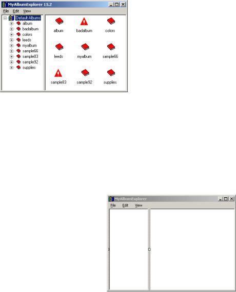
Figure 15.2
A traditional explorer-style interface displaying photo albums.
15.2.1CREATING A TREE VIEW
There is, in fact, an issue here with how a tree view and list view are arranged on the form. The gray vertical bar in the middle of our interface is a special control called a splitter to separate the two controls. We will talk about splitters in a moment. First, let’s add a TreeView to our form and see what happens.
Set the version number for the MyAlbumExplorer application to 15.2.
|
|
|
CREATING A TREE VIEW CONTROL |
||
|
|
|
|
|
|
|
|
Action |
Result |
||
|
|
|
|
|
|
1 |
In the MainForm.cs [Design] |
|
|||
|
window, drag a TreeView |
|
|||
|
control onto the form and set its |
|
|||
|
properties. |
|
|
|
|
|
|
Settings |
|
||
|
|
|
|
|
|
|
|
Property |
Value |
|
|
|
|
(Name) |
treeViewMain |
|
|
|
|
Dock |
Left |
|
|
|
|
|
|
|
|
2 |
Bring the list view to the top of |
|
|||
|
the z-order. |
|
|
|
|
|
How-to: Right-click the List- |
|
|||
|
View control and select the |
|
|||
|
Bring to Front option. |
|
|||
|
|
|
|
|
|
3 |
Set the HideSelection |
Note: This will highlight the selected object in both |
|||
|
property in both the ListView |
controls even when these controls do not have the |
|||
|
and the TreeView to false. |
focus. |
|||
|
|
|
|
|
|
488 |
CHAPTER 15 TREE VIEWS |

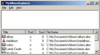
So far, so good. We have a TreeView on the left and a ListView on the right. If you run this program, you will see the interface shown in figure 15.3. The tree control is on the left, and the list view on the right. We have not added any nodes to our tree yet, but the photo albums from the default album directory appear in the list view as was discussed in chapter 14. Note here that the ListView must be brought to the top of the z-order in step 2 to ensure it is not obscured by the TreeView control.
TRY IT! Send the ListView control to the bottom of the z-order using the Send to Back menu item. Run the application to see what happens. Because the controls are placed on the form starting at the bottom of the z-order, the ListView in this case fills the entire client window. The TreeView is then docked to the left of the form. When the ListView is at the top, the TreeView is docked first, and then the ListView fills the remaining area.
You will note that if you resize the form in figure 15.3, the size of the tree view does not change. In addition, the line between the two controls cannot be dragged as is the case in other explorer-style programs such as Windows Explorer.
We can enable this behavior by adding a Splitter control to our form. We will do this next, after which we will look at populating our tree with some items.
Figure 15.3
The ListView control here works as before, just within a smaller area.
15.2.2USING THE SPLITTER CLASS
As a short aside to our discussion on tree views, the Splitter class is useful for dividing all or part of a form or other container into two resizable sections. While some readers may not consider a splitter control to be an advanced concept, it fits nicely into our discussion of the MyAlbumExplorer application, so this is where it goes.
Typically a splitter provides separate areas for two collection or container controls, normally one of the ListBox, ListView, TreeView, or Panel controls. An overview of the Splitter class is given in .NET Table 15.2.
A splitter can appear horizontally or vertically. When docked to the top or bottom of a container, it is a horizontal splitter; when docked to the left or right, it is a vertical
THE TREEVIEW CLASS |
489 |

splitter. We will create a vertical splitter in our MyAlbumExplorer application, and then discuss how to turn this into a horizontal splitter.
.NET Table 15.2 Splitter class
The Splitter class represents a control that divides a container into two sections. Each section contains a docked control, and the splitter permits the user to resize each section at runtime. This class is part of the System.Windows.Forms namespace, and inherits from the Control class. See .NET Table 4.1 on page 104 for a list of members inherited by this class.
|
BorderStyle |
Gets or sets the border style for the control. |
|
Cursor |
Gets or sets the cursor for the control. A horizontal splitter |
|
(overridden from |
uses the HSplit cursor by default, while a vertical splitter |
|
Control) |
uses the VSplit cursor by default. |
|
Dock |
Gets or sets the docking style. A splitter must be docked |
|
(overridden from |
to one side of its container. This setting determines the |
|
Control) |
orientation, either vertical or horizontal, of the splitter. The |
Public |
|
None and Fill values are not permitted. The position of |
|
the splitter in the z-order determines the location of the |
|
Properties |
|
|
|
splitter within its container. |
|
|
|
|
|
MinExtra |
Gets or sets the minimum size for the remainder of the |
|
|
container, which is occupied by the subsequent control in |
|
|
the docking order. |
|
MinSize |
Gets or sets the minimum size for the target of the |
|
|
splitter, which is the previous control in the docking order. |
|
SplitPosition |
Gets or sets the position of the splitter, in pixels. |
|
|
|
Public |
SplitterMoved |
Occurs when the splitter has moved. |
|
|
|
Events |
SplitterMoving |
Occurs when the splitter is moving. |
|
||
|
|
|
The steps to create a vertical splitter are detailed in the following table.
ADD A SPLITTER CONTROL
|
Action |
Result |
|
|
|
1 |
In the MainForm.cs [Design] |
|
|
window, drag a Splitter object |
|
|
onto the form. |
|
|
|
|
2 |
Set the MinExtra property for |
Note: This ensures that the large icons in our List- |
|
the splitter to 100. |
View will always be visible. |
|
|
|
3 |
Move the ListView control to |
The window looks much the same as before. The |
|
the front of the z-order. |
difference occurs when the application is executed. |
|
|
|
Compile the application to see the splitter in action. Figure 15.4 shows our window with the splitter dragged far to the right. The MinExtra property setting ensures that the items in the ListView cannot be obscured by dragging the splitter all the way to the right side of the window. The ListView can still disappear when the form is resized, which we will fix in a moment.
490 |
CHAPTER 15 TREE VIEWS |

Figure 15.4
The splitter control permits the user to resize the display areas as required for the specific contents.
Before we make some additional changes to our application, let’s talk briefly about how the splitter is positioned. Here is an excerpt of the InitializeComponent method generated by Visual Studio .NET for our form.
private void InitializeComponent()
{
. . .
this.listViewMain.Dock = System.Windows.Forms.DockStyle.Fill;
. . .
this.treeViewMain.Dock = System.Windows.Forms.DockStyle.Left; this.treeViewMain.Size = new System.Drawing.Size(100, 253);
. . .
//
//splitter1
this.splitter1.Location = new System.Drawing.Point(100, 0); this.splitter1.MinExtra = 100;
this.splitter1.Size = new System.Drawing.Size(3, 253);
. . .
//MainForm
//
this.ClientSize = new System.Drawing.Size(392, 253); this.Controls.AddRange(new System.Windows.Forms.Control[] {
this.listViewMain,
this.splitter1,
this.treeViewMain});
. . .
}
In the AddRange call made within this code, note how the Splitter control “splits” the Control array added to the Controls property for the form. This establishes the proper z-order for the form so that the controls appear properly. We can change this to a vertical splitter by changing the Dock property for both the Splitter and the TreeView controls to DockStyle.Top. Visual Studio .NET
THE TREEVIEW CLASS |
491 |
automatically adjusts the zontal orientation.
While this is not part of our final application, these changes are shown in the following code. The corresponding application window appears in figure 15.5.
private void InitializeComponent()
{
//Changes to configure the application with a horizontal splitter
//( not part of our final application )
. . .
this.listViewMain.Dock = System.Windows.Forms.DockStyle.Fill;
. . .
this.treeViewMain.Dock = System.Windows.Forms.DockStyle.Top; this.treeViewMain.Size = new System.Drawing.Size(392, 100);
. . .
//
// splitter1
//
this.splitter1.Dock = System.Windows.Forms.DockStyle.Top; this.splitter1.Location = new System.Drawing.Point(100, 0); this.splitter1.MinExtra = 100;
this.splitter1.Size = new System.Drawing.Size(392, 3);
. . .
}
Figure 15.5
This figure displays a horizontal splitter between a tree view and list view control (not our approach).
If you make these changes in your code, make certain you undo them before continuing, as we would like to have a vertical splitter in our final application. Let’s get back to our TreeView object and add some nodes to this control.
15.2.3USING THE TREENODE CLASS
Now that the list and tree views on our form are separated by a splitter control, we will get back to the tree view itself. Tree views contain nodes, which may contain other nodes, which may contain still other nodes, and so forth. Each node in the tree is represented by a TreeNode object. This class is summarized in .NET Table 15.3. In the Windows Explorer application, for example, each directory is represented as a tree node, and may contain other directories or files.
492 |
CHAPTER 15 TREE VIEWS |

.NET Table 15.3 TreeNode class
The TreeNode class represents a marshal by reference object that acts as an element, or a node, within a TreeView control. A TreeNode object can contain other nodes to represent a hierarchy of objects within a tree view. Contained nodes are called child nodes. A top-level node in a TreeView object is called a root node of the tree. Each TreeNode object can be contained by exactly one TreeView or TreeNode object. This class is part of the System.Windows.Forms namespace, and inherits from the System.MarshalByRefObject class.
|
|
TreeNode |
Initializes a new TreeNode instance. |
|
|
|
Overloads |
|
Public |
|
TreeNode(string label); |
|
Constructors |
|
TreeNode(string label, |
|
|
TreeNode[] childNodes); |
|
|
|
|
|
|
|
|
TreeNode(string label, |
|
|
|
int imageIndex, |
|
|
|
int selectedImageIndex); |
|
|
|
|
|
|
FirstNode |
Gets the first child node contained by this node. |
|
|
ImageIndex |
Gets or sets an index into the tree’s image list of the |
|
|
|
default image to display for this node. |
|
|
Index |
Gets the position of this node within the Nodes collection |
|
|
|
of the containing TreeView or TreeNode. |
|
|
IsEditing |
Gets whether this node is currently being edited. |
|
|
IsExpanded |
Gets whether the children of this node are currently |
|
|
|
displayed. |
|
|
IsSelected |
Gets whether this node is currently selected. |
|
|
IsVisible |
Gets whether this node is currently visible in the |
|
|
|
containing tree view. |
|
Public |
NextVisibleNode |
Gets the first subsequent child, sibling, or other node |
|
Properties |
|
visible in the containing tree view control. |
|
|
NodeFont |
Gets or sets the Font used to display the label text for this |
|
|
|
node. |
|
|
Nodes |
Gets the collection of TreeNode objects assigned to this |
|
|
|
node. |
|
|
Parent |
Gets the TreeNode object containing this node, if any. |
|
|
PrevNode |
Gets the previous tree node in the Nodes collection |
|
|
|
containing this node. |
|
|
SelectedImage- |
Gets or sets an index into the tree’s image list of the image |
|
|
Index |
to display by this node when the node is selected. |
|
|
Tag |
Gets or sets an object to associate with this tree node. |
|
|
Text |
Gets or sets the text displayed in the label for this node. |
|
|
|
|
|
|
BeginEdit |
Initiates an edit of this node’s label. |
|
Public |
Collapse |
Ensures that no children of this node are currently displayed. |
|
ExpandAll |
Expands all tree nodes contained by this node. |
|
|
Methods |
||
|
|
|
|
|
|
Toggle |
Toggles the tree node between the expanded or collapsed |
|
|
|
state, based on the IsExpanded setting. |
|
|
|
|
THE TREEVIEW CLASS |
493 |