

- •brief contents
- •about this book
- •The Windows Forms namespace
- •Part 1: Hello Windows Forms
- •Part 2: Basic Windows Forms
- •Part 3: Advanced Windows Forms
- •Who should read this book?
- •Conventions
- •Action
- •Result
- •Source code downloads
- •Author online
- •acknowledgments
- •about .NET
- •Casting the .NET
- •Windows Forms overview
- •about the cover illustration
- •Hello Windows Forms
- •1.1 Programming in C#
- •1.1.1 Namespaces and classes
- •1.1.2 Constructors and methods
- •1.1.3 C# types
- •1.1.4 The entry point
- •1.1.5 The Application class
- •1.1.6 Program execution
- •1.2 Adding controls
- •1.2.1 Shortcuts and fully qualified names
- •1.2.2 Fields and properties
- •1.2.3 The Controls property
- •1.3 Loading files
- •1.3.1 Events
- •1.3.2 The OpenFileDialog class
- •1.3.3 Bitmap images
- •1.4 Resizing forms
- •1.4.1 Desktop layout properties
- •1.4.2 The Anchor property
- •1.4.3 The Dock property
- •1.5 Recap
- •2.1 Programming with Visual Studio .NET
- •2.1.1 Creating a project
- •Action
- •Result
- •2.1.2 Executing a program
- •Action
- •Result
- •2.1.3 Viewing the source code
- •View the code generated by Visual Studio .NET
- •Action
- •Result
- •2.2 Adding controls
- •2.2.1 The AssemblyInfo file
- •Action
- •Results
- •2.2.2 Renaming a form
- •Action
- •Result
- •2.2.3 The Toolbox window
- •Action
- •Result
- •2.3 Loading files
- •2.3.1 Event handlers in Visual Studio .NET
- •Action
- •Result
- •2.3.2 Exception handling
- •Action
- •Result
- •Action
- •Results and Comments
- •2.4 Resizing forms
- •2.4.1 Assign the Anchor property
- •Action
- •Result
- •2.4.2 Assign the MinimumSize property
- •Action
- •Result
- •2.5 Recap
- •Basic Windows Forms
- •Menus
- •Action
- •Result
- •Action
- •Result
- •Action
- •Result
- •Action
- •Result
- •3.3 Click events
- •Action
- •Result
- •Action
- •Result
- •Action
- •Result
- •Action
- •Result
- •Action
- •Result
- •Action
- •Result
- •3.5 Context menus
- •Action
- •Result
- •Action
- •Result
- •3.6 Recap
- •Status bars
- •4.1 The Control class
- •4.2 The StatusBar class
- •Action
- •Result
- •Action
- •Result
- •4.3.1 Adding panels to a status bar
- •Action
- •Result
- •Action
- •Result
- •Action
- •Result
- •Action
- •Result
- •4.5 Recap
- •Reusable libraries
- •5.1 C# classes and interfaces
- •5.2 Class libraries
- •Action
- •Result
- •Action
- •Result
- •Action
- •Result
- •Action
- •Result
- •Action
- •Result
- •Action
- •Result
- •Action
- •Result
- •Action
- •Result
- •Action
- •Result
- •5.3 Interfaces revisited
- •Action
- •Result
- •Action
- •Result
- •Action
- •Result
- •5.4 Robustness issues
- •Action
- •Result
- •Action
- •Result
- •Action
- •Result
- •Action
- •Result
- •Action
- •Result
- •Action
- •Result
- •Common file dialogs
- •Action
- •Results
- •Action
- •Result
- •Action
- •Result
- •Action
- •Result
- •Action
- •Result
- •6.3 Paint events
- •Action
- •Result
- •Action
- •Result
- •6.4 Context menus revisited
- •Action
- •Result
- •Action
- •Result
- •6.5 Files and paths
- •Action
- •Result
- •Action
- •Result
- •Action
- •Result
- •6.6 Save file dialogs
- •Action
- •Result
- •Action
- •Result
- •Action
- •Result
- •Action
- •Result
- •Action
- •Result
- •6.7 Open file dialogs
- •Action
- •Result
- •Action
- •Result
- •6.8 Recap
- •Drawing and scrolling
- •7.1 Form class hierarchy
- •Action
- •Result
- •Action
- •Result
- •Action
- •Result
- •Action
- •Result
- •Action
- •Result
- •Action
- •Result
- •Action
- •Result
- •Action
- •Result
- •Action
- •Result
- •Action
- •Result
- •Action
- •Result
- •Action
- •Result
- •7.4 Panels
- •Action
- •Result
- •Action
- •Result
- •Action
- •Result
- •Action
- •Result
- •Action
- •Result
- •Dialog boxes
- •8.1 Message boxes
- •Action
- •Result
- •Action
- •Result
- •8.1.4 Creating A YesNoCancel dialog
- •Action
- •Result
- •Action
- •Result
- •8.2 The Form.Close method
- •8.2.1 The relationship between Close and Dispose
- •Action
- •Result
- •8.3 Modal dialog boxes
- •Action
- •Result
- •Action
- •Result
- •8.3.2 Preserving caption values
- •Action
- •Result
- •Action
- •Result
- •Action
- •Result
- •Action
- •Result
- •Action
- •Result
- •Action
- •Result
- •Action
- •Result
- •Action
- •Result
- •Action
- •Result
- •Action
- •Result
- •Action
- •Result
- •Action
- •Result
- •Action
- •Result
- •Action
- •Result
- •Action
- •Result
- •Action
- •Result
- •Action
- •Result
- •Basic controls
- •Action
- •Result
- •Action
- •Result
- •Action
- •Result
- •9.1.2 Creating a derived form
- •Action
- •Result
- •9.2 Labels and text boxes
- •Action
- •Result
- •Action
- •Result
- •Action
- •Result
- •Action
- •Result
- •Action
- •Result
- •Action
- •Result
- •Action
- •Result
- •Action
- •Result
- •Action
- •Result
- •Action
- •Result
- •Action
- •Result
- •Action
- •Result
- •Action
- •Result
- •Action
- •Result
- •Action
- •Result
- •Action
- •Result
- •Action
- •Result
- •Action
- •Result
- •9.3.6 Adding AlbumEditDlg to our main form
- •Action
- •Result
- •Action
- •Result
- •9.4 Recap
- •List controls
- •10.1 List boxes
- •Action
- •Result
- •Action
- •Result
- •Action
- •Result
- •Action
- •Result
- •10.2 Multiselection list boxes
- •10.2.1 Enabling multiple selection
- •Action
- •Result
- •Action
- •Result
- •Action
- •Result
- •Action
- •Result
- •10.3 Combo boxes
- •Action
- •Result
- •Action
- •Result
- •10.4 Combo box edits
- •Action
- •Result
- •Action
- •Result
- •Action
- •Result
- •10.5 Owner-drawn lists
- •Action
- •Result
- •Action
- •Result
- •Action
- •Result
- •Action
- •Result
- •More controls
- •Action
- •Result
- •Action
- •Result
- •11.2 Tab pages
- •Action
- •Result
- •Action
- •Result
- •11.3.1 Dates and times
- •Action
- •Result
- •Action
- •Result
- •Action
- •Result
- •Action
- •Result
- •Action
- •Result
- •Action
- •Result
- •11.5 Recap
- •A .NET assortment
- •12.1 Keyboard events
- •Action
- •Result
- •Action
- •Result
- •12.2 Mouse events
- •Action
- •Result
- •Action
- •Result
- •Action
- •Result
- •12.3 Image buttons
- •Action
- •Result
- •Action
- •Result
- •Action
- •Result
- •Action
- •Result
- •Action
- •Result
- •Action
- •Result
- •Action
- •Result
- •Action
- •Result
- •Action
- •Result
- •12.4 Icons
- •Action
- •Result
- •Action
- •Result
- •Action
- •Result
- •12.5 Recap
- •Toolbars and tips
- •13.1 Toolbars
- •Action
- •Result
- •Action
- •Result
- •Action
- •Result
- •Action
- •Result
- •Action
- •Result
- •Action
- •Result
- •Action
- •Result
- •Action
- •Result
- •Action
- •Result
- •13.4.2 Creating tool tips
- •Action
- •Result
- •Action
- •Result
- •Advanced Windows Forms
- •List views
- •14.2 The ListView class
- •Action
- •Result
- •Action
- •Result
- •Action
- •Result
- •Action
- •Result
- •14.2.3 Populating a ListView
- •Action
- •Result
- •Action
- •14.3 ListView columns
- •Action
- •Result
- •Action
- •Result
- •Action
- •Result
- •Action
- •Result
- •Action
- •Result
- •Action
- •Result
- •Action
- •Result
- •Action
- •Result
- •Action
- •Result
- •Action
- •Result
- •Action
- •Result
- •Action
- •Result
- •Action
- •Result
- •Action
- •Result
- •Action
- •Result
- •Action
- •Result
- •Action
- •Result
- •Action
- •Result
- •Action
- •Result
- •14.6 Recap
- •Tree views
- •Action
- •Result
- •Action
- •Result
- •Action
- •Result
- •15.3 Dynamic tree nodes
- •Action
- •Result
- •Action
- •Result
- •Action
- •Result
- •Action
- •Result
- •Action
- •Result
- •15.4 Node selection
- •Action
- •Result
- •Action
- •Result
- •Action
- •Result
- •Action
- •Result
- •Action
- •Result
- •15.5 Fun with tree views
- •Action
- •Result
- •Action
- •Result
- •Action
- •Result
- •Multiple document interfaces
- •Action
- •Result
- •Action
- •Result
- •Action
- •Result
- •16.3 Merged menus
- •Action
- •Result
- •Action
- •Result
- •Action
- •Result
- •Action
- •Result
- •16.4 MDI children
- •Action
- •Result
- •Action
- •Result
- •Action
- •Result
- •Action
- •Result
- •Action
- •Result
- •Action
- •Result
- •Action
- •Result
- •Action
- •Result
- •Action
- •Result
- •Action
- •Result
- •16.5 MDI child window management
- •Action
- •Result
- •Action
- •Result
- •16.6 Recap
- •Data binding
- •17.1 Data grids
- •Action
- •Result
- •Action
- •Result
- •17.2 Data grid customization
- •Action
- •Result
- •Action
- •Result
- •Action
- •Result
- •Action
- •Result
- •Action
- •Result
- •Action
- •Result
- •Action
- •Result
- •Action
- •Result
- •Action
- •Result
- •Action
- •Result
- •Action
- •Result
- •Odds and ends .NET
- •Action
- •Result
- •Action
- •Result
- •Action
- •Result
- •Action
- •Result
- •18.2 Timers
- •Action
- •Result
- •Action
- •Result
- •18.3 Drag and drop
- •Action
- •Result
- •Action
- •Result
- •18.4 ActiveX controls
- •Action
- •Result
- •Action
- •Result
- •Action
- •Result
- •Action
- •Result
- •Action
- •Result
- •18.5 Recap
- •C# primer
- •A.1 C# programs
- •A.1.1 Assemblies
- •A.1.2 Namespaces
- •A.2 Types
- •A.2.1 Classes
- •A.2.2 Structures
- •A.2.3 Interfaces
- •A.2.4 Enumerations
- •A.2.5 Delegates
- •A.3 Language elements
- •A.3.1 Built-in types
- •A.3.2 Operators
- •A.3.3 Keywords
- •A.4 Special features
- •A.4.1 Exceptions
- •A.4.2 Arrays
- •A.4.3 Main
- •A.4.4 Boxing
- •A.4.5 Documentation
- •.NET namespaces
- •B.1 System.Collections
- •B.2 System.ComponentModel
- •B.3 System.Data
- •B.4 System.Drawing
- •B.5 System.Globalization
- •B.6 System.IO
- •B.7 System.Net
- •B.8 System.Reflection
- •B.9 System.Resources
- •B.10 System.Security
- •B.11 System.Threading
- •B.12 System.Web
- •B.13 System.Windows.Forms
- •B.14 System.XML
- •Visual index
- •C.1 Objects
- •C.2 Marshal by reference objects
- •C.3 Components
- •C.4 Common dialogs
- •C.7 Event data
- •C.8 Enumerations
- •For more information
- •bibliography
- •Symbols
- •Index
provide a collection of control objects with no scrolling capabilities. A group box includes a simple border, and the Text property for this control displays an optional label as part of the border. In general, use a group box control to provide simple containment of controls, especially when you wish to provide a label for the group.
The Panel and GroupBox controls are similar in that they are both used to contain controls. The Panel class provides some advanced features such as automated scrolling and configurable borders, while the GroupBox control provides a simple border with an optional label.
The steps to create the radio buttons on our form are provided in the following table. Note in particular how the Tag property inherited from the Control class is used to hold the enumeration value associated with the button.
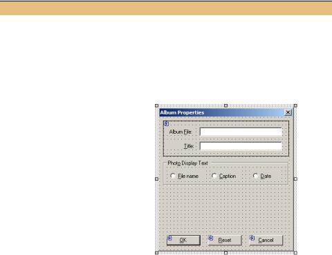
CREATE THE GROUP BOX SECTION OF THE ALBUMEDITDLG FORM
|
|
|
Action |
|
|
Result |
|
|
|
|
|
|
|
|
|
1 |
In the AlbumEditDlg.cs [Design] |
A GroupBox object is added to the form. |
|||||
|
window, drag a GroupBox control |
|
|||||
|
from the Toolbox onto the form. |
|
|||||
|
|
|
|
|
|
|
|
2 |
Set the Text property of the |
This text is shown in the graphic for step 3. |
|||||
|
GroupBox control to “Phot&o |
|
|||||
|
Display Text.” |
|
|
|
|||
|
|
|
|
|
|
|
|
3 |
Add three RadioButton buttons |
|
|||||
|
within this GroupBox, and position |
|
|||||
|
as in the graphic. |
|
|
|
|||
|
|
|
Settings |
|
|
|
|
|
|
|
|
|
|
|
|
|
|
Button |
Property |
|
Value |
|
|
|
|
File name |
(Name) |
|
rbtnFileName |
|
|
|
|
|
Text |
|
File &name |
|
|
|
|
Caption |
(Name) |
|
rbtnCaption |
|
|
|
|
|
Text |
|
Ca&ption |
|
|
|
|
Date |
(Name) |
|
rbtnDate |
|
|
|
|
|
Text |
|
&Date |
|
|
|
|
|
|
|
|
|
|
4 |
In the AlbumEditDlg constructor, |
public AlbumEditDlg() |
|||||
|
initialize the Tag property for each |
{ |
|||||
|
control to contain the corresponding |
. . . |
|||||
|
// Initialize radio button tags |
||||||
|
enumeration value. |
|
|
||||
|
|
|
this.rbtnCaption.Tag = (int) |
||||
|
|
|
|
|
|
|
PhotoAlbum.DisplayValEnum.Caption; |
|
|
|
|
|
|
|
this.rbtnDate.Tag = (int) |
|
|
|
|
|
|
|
PhotoAlbum.DisplayValEnum.Date; |
|
|
|
|
|
|
|
this.rbtnFileName.Tag = (int) |
|
|
|
|
|
|
|
PhotoAlbum.DisplayValEnum.FileName; |
|
|
|
|
|
|
|
} |
|
|
|
|
|
|
|
|
BUTTON CLASSES |
301 |

CREATE THE GROUP BOX SECTION OF THE ALBUMEDITDLG FORM (continued)
|
Action |
Result |
|
|
|
5 |
Add a private field to the |
private PhotoAlbum.DisplayValEnum |
|
AlbumEditDlg class to hold the |
_selectedDisplayOption; |
|
currently selected radio button. |
|
|
|
|
6 |
Create a DisplayOption_Click |
private void DisplayOption_Click |
|
method to serve as the Click event |
(object sender, System.EventArgs e) |
|
handler for all three buttons. |
{ |
|
RadioButton rb = sender as RadioButton; |
|
|
|
|
|
|
if (rb != null) |
|
|
this._selectedDisplayOption = |
|
|
(PhotoAlbum.DisplayValEnum)rb.Tag; |
|
|
} |
|
|
|
7 |
Add this new method as the Click |
|
|
handler for each of the three radio |
|
|
buttons. |
|
|
|
|
Before we discuss the new code here, the tab behavior of RadioButton and GroupBox controls is worth a mention.
For radio button controls, all radio buttons in a group are treated as a single tab index. When you tab to a group of radio buttons, the selected button receives the focus, and then the left and right arrow keys alter the selected button.
The tab behavior for the GroupBox control is much like the Label class, in that it never receives the focus directly. Instead, the first control in the box receives the focus. In our form, when you tab to the group box, or use the access key Alt+O, the currently selected radio button receives the focus on behalf of the group. We will set the tab order for our controls shortly, after which we can see this behavior for ourselves.
As for the code changes here, let’s look at them in a bit more detail. Here is an excerpt of the AlbumEditDlg.cs source file after the previously mentioned code modifications have been made.
namespace Manning.MyPhotoAlbum
{
public class AlbumEditDlg : Manning.MyPhotoAlbum.BaseEditDlg
{
. . .
private PhotoAlbum.DisplayValEnum _selectedDisplayOption;
public AlbumEditDlg(PhotoAlbum album) |
|
|
|
|
{ |
|
|
|
|
// This call is required by the Windows Form Designer |
|
|
|
|
InitializeComponent(); |
Assign tag |
b |
||
// Initialize radio button tags |
values |
|||
|
|
|||
|
|
|
||
this.rbtnCaption.Tag = (int)PhotoAlbum.DisplayValEnum.Caption; |
|
|
||
|
|
|||
this.rbtnDate.Tag = (int)PhotoAlbum.DisplayValEnum.Date; |
|
|
|
|
|
|
|
||
this.rbtnFileName.Tag = (int)PhotoAlbum.DisplayValEnum.FileName; |
|
|
||
} |
|
|
|
|
#region Designer generated code |
|
|
|
|
302 |
CHAPTER 9 BASIC CONTROLS |
. . . |
|
|
|
|
|
private void InitializeComponent() |
|
|
|
|
|
{ |
|
|
|
|
|
. . . |
|
c Suspend |
|||
this.panel1.SuspendLayout(); |
|
||||
|
|||||
this.groupBox1.SuspendLayout(); |
|
layout logic |
|||
|
|
|
|
|
|
this.SuspendLayout(); |
|
Add radio |
|||
|
|||||
// |
|
||||
// groupBox1 |
|
buttons to |
|||
// |
|
group box d |
|||
this.groupBox1.Controls.AddRange( |
|
|
|
|
|
new System.Windows.Forms.Control[] { |
|
|
|
||
|
|||||
|
this.rbtnCaption, |
|
|
|
|
|
this.rbtnFileName, |
|
|
|
|
|
this.rbtnDate}); |
|
|
|
|
this.groupBox1.Location = new System.Drawing.Point(8, 104); this.groupBox1.Name = "groupBox1";
this.groupBox1.Size = new System.Drawing.Size(280, 56); this.groupBox1.TabIndex = 4;
this.groupBox1.TabStop = false; this.groupBox1.Text = "Phot&o Display Text";
//
// rbtnFileName
//
this.rbtnFileName.Location = new System.Drawing.Point(8, 24); this.rbtnFileName.Name = "rbtnFileName"; this.rbtnFileName.Size = new System.Drawing.Size(80, 24); this.rbtnFileName.TabIndex = 0;
this.rbtnFileName.Text = "File |
&name"; |
Set click |
e |
||
handler |
|||||
this.rbtnFileName.Click += new |
|
||||
|
|
|
|
||
System.EventHandler(this.DisplayOption_Click); |
|
|
|||
|
|
||||
. . .
this.Controls.AddRange(new System.Windows.Forms.Control[] { this.groupBox1, this.panel1});
. . .
this.panel1.ResumeLayout(false); |
Add controls to form |
|
|
||
this.groupBox1.ResumeLayout(false); |
Record selected |
|
this.ResumeLayout(false); |
||
radio button |
||
} |
||
|
||
#endregion |
|
f
g
. . .
private void DisplayOption_Click(object sender, System.EventArgs e)
{
RadioButton rb = sender as RadioButton;
if (rb != null)
this._selectedDisplayOption = (PhotoAlbum.DisplayValEnum)rb.Tag;
}
}
}
BUTTON CLASSES |
303 |
Let’s look at the numbered sections of this code in a little more detail.
bThe Tag property contains an object to associate with the control. This provides a general mechanism for associating any data with any control. In our case, we use this property to hold the DisplayValEnum enumeration value corresponding to the individual buttons.
cVisual Studio suspends the layout logic for all container controls during initialization, including our group box. This ensures that the controls do not perform any layout of their contained objects during initialization.
dAs we saw for our Panel control previously, the contained controls, in this case the three radio buttons, are added directly to the GroupBox control. This means that layout-related values, such as the Anchor and Dock properties, apply within the GroupBox container, and not within the Form.
eThe Click handler for our three radio buttons is set using the standard += notation for events.
fIt is interesting to note that the form itself only contains two controls so far. These are the Panel control and the GroupBox control.
gThe shared click handler, DisplayOption_Click, receives a radio button object and records its Tag value as the currently selected radio button. We will use this selected value to save the settings for our dialog box when the user clicks OK.
Also note the use of the C# as keyword in our shared click handler. An as statement works much like a cast, except that the value null is assigned if the provided variable is not of the given type, as opposed to the InvalidCastException that is thrown when a cast operation fails. This handler could also be written as follows, although the following code is slightly less efficient since the sender parameter is checked twice—once for the is statement and once for the cast.
private void DisplayOption_Click(object sender, System.EventArgs e)
{
// Our click handler using the is statement – not our approach if (sender is RadioButton)
{
RadioButton rb = (RadioButton) sender; this._selectedDisplayOption = (PhotoAlbum.DisplayValEnum)rb.Tag;
}
}
Before we hook up this new form to our application, let’s create the check box control on our form as well.
9.3.5USING CHECK BOX BUTTONS
The CheckBox control is similar to a radio button. While a radio button is used for a set of mutually exclusive options, a check box is used for a single option that can be turned on or off. A check box normally appears as a small square followed by a textual
304 |
CHAPTER 9 BASIC CONTROLS |

description of the option. The settings for this control are rather similar to those provided for RadioButton objects, and are summarized in .NET Table 9.7.
.NET Table 9.7 CheckBox class
The CheckBox class represents a button that displays an option to the user. Typically, a check box represents one of two states, either checked or unchecked. A three-state check box can also be established, with an additional intermediate state. This third state is useful when used with a set of objects, where some objects have the option checked and some unchecked.
This control is part of the System.Windows.Forms namespace, and inherits from the ButtonBase class. See .NET Table 9.4 on page 292 for members inherited from the ButtonBase class.
|
Appearance |
Gets or sets whether the control appears as a normal |
|
|
check box button or as a toggle button. |
|
AutoCheck |
Gets or sets whether the control is checked |
|
|
automatically or manually. The default is true. |
Public |
Checked |
Gets or sets whether the control is checked. |
Properties |
CheckState |
Gets or sets the state of a three-state check box as a |
|
||
|
|
CheckState enumeration value. This is either |
|
|
Checked, Unchecked (the default), or Intermediate. |
|
ThreeState |
Gets or sets whether the check box displays three |
|
|
states. The default is false. |
|
|
|
Public |
CheckedChanged |
Occurs when the Checked property changes. |
|
|
|
Events |
CheckStateChanged |
Occurs when the CheckState property changes. |
|
||
|
|
|
Check boxes are normally used in one of two ways. The first is as a simple on or off state. For example, we could have elected to add a check box indicating whether the album can be modified. If yes, then photographs could be added to and removed from the album. If no, then any attempt to modify the album could throw an InvalidOperationException object. In a Windows dialog box, this option could be represented as a check box, which the user would click to turn modifications on or off.
Another common usage for a check box is to enable or disable a set of controls related to a specific option. This is the type of check box we will create here. In our case, the check box relates to whether the photo album has a password associated with it or not. If it does, then controls to set this password will be enabled on our form. If it does not, then these controls will be disabled.
Let’s begin by adding the CheckBox and related controls to our AlbumEditDlg form. These steps also add some logic for processing the check box and associated controls. We discuss the events used here following the table.
BUTTON CLASSES |
305 |