

- •brief contents
- •about this book
- •The Windows Forms namespace
- •Part 1: Hello Windows Forms
- •Part 2: Basic Windows Forms
- •Part 3: Advanced Windows Forms
- •Who should read this book?
- •Conventions
- •Action
- •Result
- •Source code downloads
- •Author online
- •acknowledgments
- •about .NET
- •Casting the .NET
- •Windows Forms overview
- •about the cover illustration
- •Hello Windows Forms
- •1.1 Programming in C#
- •1.1.1 Namespaces and classes
- •1.1.2 Constructors and methods
- •1.1.3 C# types
- •1.1.4 The entry point
- •1.1.5 The Application class
- •1.1.6 Program execution
- •1.2 Adding controls
- •1.2.1 Shortcuts and fully qualified names
- •1.2.2 Fields and properties
- •1.2.3 The Controls property
- •1.3 Loading files
- •1.3.1 Events
- •1.3.2 The OpenFileDialog class
- •1.3.3 Bitmap images
- •1.4 Resizing forms
- •1.4.1 Desktop layout properties
- •1.4.2 The Anchor property
- •1.4.3 The Dock property
- •1.5 Recap
- •2.1 Programming with Visual Studio .NET
- •2.1.1 Creating a project
- •Action
- •Result
- •2.1.2 Executing a program
- •Action
- •Result
- •2.1.3 Viewing the source code
- •View the code generated by Visual Studio .NET
- •Action
- •Result
- •2.2 Adding controls
- •2.2.1 The AssemblyInfo file
- •Action
- •Results
- •2.2.2 Renaming a form
- •Action
- •Result
- •2.2.3 The Toolbox window
- •Action
- •Result
- •2.3 Loading files
- •2.3.1 Event handlers in Visual Studio .NET
- •Action
- •Result
- •2.3.2 Exception handling
- •Action
- •Result
- •Action
- •Results and Comments
- •2.4 Resizing forms
- •2.4.1 Assign the Anchor property
- •Action
- •Result
- •2.4.2 Assign the MinimumSize property
- •Action
- •Result
- •2.5 Recap
- •Basic Windows Forms
- •Menus
- •Action
- •Result
- •Action
- •Result
- •Action
- •Result
- •Action
- •Result
- •3.3 Click events
- •Action
- •Result
- •Action
- •Result
- •Action
- •Result
- •Action
- •Result
- •Action
- •Result
- •Action
- •Result
- •3.5 Context menus
- •Action
- •Result
- •Action
- •Result
- •3.6 Recap
- •Status bars
- •4.1 The Control class
- •4.2 The StatusBar class
- •Action
- •Result
- •Action
- •Result
- •4.3.1 Adding panels to a status bar
- •Action
- •Result
- •Action
- •Result
- •Action
- •Result
- •Action
- •Result
- •4.5 Recap
- •Reusable libraries
- •5.1 C# classes and interfaces
- •5.2 Class libraries
- •Action
- •Result
- •Action
- •Result
- •Action
- •Result
- •Action
- •Result
- •Action
- •Result
- •Action
- •Result
- •Action
- •Result
- •Action
- •Result
- •Action
- •Result
- •5.3 Interfaces revisited
- •Action
- •Result
- •Action
- •Result
- •Action
- •Result
- •5.4 Robustness issues
- •Action
- •Result
- •Action
- •Result
- •Action
- •Result
- •Action
- •Result
- •Action
- •Result
- •Action
- •Result
- •Common file dialogs
- •Action
- •Results
- •Action
- •Result
- •Action
- •Result
- •Action
- •Result
- •Action
- •Result
- •6.3 Paint events
- •Action
- •Result
- •Action
- •Result
- •6.4 Context menus revisited
- •Action
- •Result
- •Action
- •Result
- •6.5 Files and paths
- •Action
- •Result
- •Action
- •Result
- •Action
- •Result
- •6.6 Save file dialogs
- •Action
- •Result
- •Action
- •Result
- •Action
- •Result
- •Action
- •Result
- •Action
- •Result
- •6.7 Open file dialogs
- •Action
- •Result
- •Action
- •Result
- •6.8 Recap
- •Drawing and scrolling
- •7.1 Form class hierarchy
- •Action
- •Result
- •Action
- •Result
- •Action
- •Result
- •Action
- •Result
- •Action
- •Result
- •Action
- •Result
- •Action
- •Result
- •Action
- •Result
- •Action
- •Result
- •Action
- •Result
- •Action
- •Result
- •Action
- •Result
- •7.4 Panels
- •Action
- •Result
- •Action
- •Result
- •Action
- •Result
- •Action
- •Result
- •Action
- •Result
- •Dialog boxes
- •8.1 Message boxes
- •Action
- •Result
- •Action
- •Result
- •8.1.4 Creating A YesNoCancel dialog
- •Action
- •Result
- •Action
- •Result
- •8.2 The Form.Close method
- •8.2.1 The relationship between Close and Dispose
- •Action
- •Result
- •8.3 Modal dialog boxes
- •Action
- •Result
- •Action
- •Result
- •8.3.2 Preserving caption values
- •Action
- •Result
- •Action
- •Result
- •Action
- •Result
- •Action
- •Result
- •Action
- •Result
- •Action
- •Result
- •Action
- •Result
- •Action
- •Result
- •Action
- •Result
- •Action
- •Result
- •Action
- •Result
- •Action
- •Result
- •Action
- •Result
- •Action
- •Result
- •Action
- •Result
- •Action
- •Result
- •Action
- •Result
- •Basic controls
- •Action
- •Result
- •Action
- •Result
- •Action
- •Result
- •9.1.2 Creating a derived form
- •Action
- •Result
- •9.2 Labels and text boxes
- •Action
- •Result
- •Action
- •Result
- •Action
- •Result
- •Action
- •Result
- •Action
- •Result
- •Action
- •Result
- •Action
- •Result
- •Action
- •Result
- •Action
- •Result
- •Action
- •Result
- •Action
- •Result
- •Action
- •Result
- •Action
- •Result
- •Action
- •Result
- •Action
- •Result
- •Action
- •Result
- •Action
- •Result
- •Action
- •Result
- •9.3.6 Adding AlbumEditDlg to our main form
- •Action
- •Result
- •Action
- •Result
- •9.4 Recap
- •List controls
- •10.1 List boxes
- •Action
- •Result
- •Action
- •Result
- •Action
- •Result
- •Action
- •Result
- •10.2 Multiselection list boxes
- •10.2.1 Enabling multiple selection
- •Action
- •Result
- •Action
- •Result
- •Action
- •Result
- •Action
- •Result
- •10.3 Combo boxes
- •Action
- •Result
- •Action
- •Result
- •10.4 Combo box edits
- •Action
- •Result
- •Action
- •Result
- •Action
- •Result
- •10.5 Owner-drawn lists
- •Action
- •Result
- •Action
- •Result
- •Action
- •Result
- •Action
- •Result
- •More controls
- •Action
- •Result
- •Action
- •Result
- •11.2 Tab pages
- •Action
- •Result
- •Action
- •Result
- •11.3.1 Dates and times
- •Action
- •Result
- •Action
- •Result
- •Action
- •Result
- •Action
- •Result
- •Action
- •Result
- •Action
- •Result
- •11.5 Recap
- •A .NET assortment
- •12.1 Keyboard events
- •Action
- •Result
- •Action
- •Result
- •12.2 Mouse events
- •Action
- •Result
- •Action
- •Result
- •Action
- •Result
- •12.3 Image buttons
- •Action
- •Result
- •Action
- •Result
- •Action
- •Result
- •Action
- •Result
- •Action
- •Result
- •Action
- •Result
- •Action
- •Result
- •Action
- •Result
- •Action
- •Result
- •12.4 Icons
- •Action
- •Result
- •Action
- •Result
- •Action
- •Result
- •12.5 Recap
- •Toolbars and tips
- •13.1 Toolbars
- •Action
- •Result
- •Action
- •Result
- •Action
- •Result
- •Action
- •Result
- •Action
- •Result
- •Action
- •Result
- •Action
- •Result
- •Action
- •Result
- •Action
- •Result
- •13.4.2 Creating tool tips
- •Action
- •Result
- •Action
- •Result
- •Advanced Windows Forms
- •List views
- •14.2 The ListView class
- •Action
- •Result
- •Action
- •Result
- •Action
- •Result
- •Action
- •Result
- •14.2.3 Populating a ListView
- •Action
- •Result
- •Action
- •14.3 ListView columns
- •Action
- •Result
- •Action
- •Result
- •Action
- •Result
- •Action
- •Result
- •Action
- •Result
- •Action
- •Result
- •Action
- •Result
- •Action
- •Result
- •Action
- •Result
- •Action
- •Result
- •Action
- •Result
- •Action
- •Result
- •Action
- •Result
- •Action
- •Result
- •Action
- •Result
- •Action
- •Result
- •Action
- •Result
- •Action
- •Result
- •Action
- •Result
- •14.6 Recap
- •Tree views
- •Action
- •Result
- •Action
- •Result
- •Action
- •Result
- •15.3 Dynamic tree nodes
- •Action
- •Result
- •Action
- •Result
- •Action
- •Result
- •Action
- •Result
- •Action
- •Result
- •15.4 Node selection
- •Action
- •Result
- •Action
- •Result
- •Action
- •Result
- •Action
- •Result
- •Action
- •Result
- •15.5 Fun with tree views
- •Action
- •Result
- •Action
- •Result
- •Action
- •Result
- •Multiple document interfaces
- •Action
- •Result
- •Action
- •Result
- •Action
- •Result
- •16.3 Merged menus
- •Action
- •Result
- •Action
- •Result
- •Action
- •Result
- •Action
- •Result
- •16.4 MDI children
- •Action
- •Result
- •Action
- •Result
- •Action
- •Result
- •Action
- •Result
- •Action
- •Result
- •Action
- •Result
- •Action
- •Result
- •Action
- •Result
- •Action
- •Result
- •Action
- •Result
- •16.5 MDI child window management
- •Action
- •Result
- •Action
- •Result
- •16.6 Recap
- •Data binding
- •17.1 Data grids
- •Action
- •Result
- •Action
- •Result
- •17.2 Data grid customization
- •Action
- •Result
- •Action
- •Result
- •Action
- •Result
- •Action
- •Result
- •Action
- •Result
- •Action
- •Result
- •Action
- •Result
- •Action
- •Result
- •Action
- •Result
- •Action
- •Result
- •Action
- •Result
- •Odds and ends .NET
- •Action
- •Result
- •Action
- •Result
- •Action
- •Result
- •Action
- •Result
- •18.2 Timers
- •Action
- •Result
- •Action
- •Result
- •18.3 Drag and drop
- •Action
- •Result
- •Action
- •Result
- •18.4 ActiveX controls
- •Action
- •Result
- •Action
- •Result
- •Action
- •Result
- •Action
- •Result
- •Action
- •Result
- •18.5 Recap
- •C# primer
- •A.1 C# programs
- •A.1.1 Assemblies
- •A.1.2 Namespaces
- •A.2 Types
- •A.2.1 Classes
- •A.2.2 Structures
- •A.2.3 Interfaces
- •A.2.4 Enumerations
- •A.2.5 Delegates
- •A.3 Language elements
- •A.3.1 Built-in types
- •A.3.2 Operators
- •A.3.3 Keywords
- •A.4 Special features
- •A.4.1 Exceptions
- •A.4.2 Arrays
- •A.4.3 Main
- •A.4.4 Boxing
- •A.4.5 Documentation
- •.NET namespaces
- •B.1 System.Collections
- •B.2 System.ComponentModel
- •B.3 System.Data
- •B.4 System.Drawing
- •B.5 System.Globalization
- •B.6 System.IO
- •B.7 System.Net
- •B.8 System.Reflection
- •B.9 System.Resources
- •B.10 System.Security
- •B.11 System.Threading
- •B.12 System.Web
- •B.13 System.Windows.Forms
- •B.14 System.XML
- •Visual index
- •C.1 Objects
- •C.2 Marshal by reference objects
- •C.3 Components
- •C.4 Common dialogs
- •C.7 Event data
- •C.8 Enumerations
- •For more information
- •bibliography
- •Symbols
- •Index

Set the version number of the MyPhotos application to 13.3.
ADD THE TOOLBAR BUTTONS FOR THE FILE MENU
|
|
|
|
Action |
|
|
|
Result |
|
|
|
|
|
|
|
|
|
|
|
1 |
|
In the MainForm.cs [Design] |
The images in our image list are now available to any |
||||||
|
|
window, modify the properties |
buttons placed on the toolbar. |
||||||
|
|
for the toolBarMain control. |
|
||||||
|
|
|
|
Settings |
|
|
|
|
|
|
|
|
|
|
|
|
|
|
|
|
|
Property |
|
Value |
|
||||
|
|
ButtonSize |
|
16, 16 |
|
|
|
||
|
|
ImageList |
|
imageListToolBar |
|
||||
|
|
|
|
|
|
|
|
|
|
2 |
|
Display the ToolBarButton |
|
||||||
|
|
Collection Editor window. |
|
||||||
|
|
How-to |
|
|
|
|
|
|
|
|
|
In the toolbar’s Properties |
|
||||||
|
|
window, click the … button |
|
||||||
|
|
associated with the Buttons |
|
||||||
|
|
item. |
|
|
|
|
|
|
|
|
|
|
|
|
|
|
|
|
|
3 |
|
Click the Add button three times |
|
||||||
|
|
to create three new |
|
|
|
|
|||
|
|
ToolBarButton objects. |
|
||||||
|
|
|
|
Settings |
|
|
|
|
|
|
|
|
|
|
|
|
|||
|
|
Button |
|
Property |
Value |
|
|||
|
|
0 (New) |
|
(Name) |
tbbNew |
|
|||
|
|
|
ImageIndex |
0 |
|
|
|
||
|
|
|
ToolTipText |
Create |
Note: You can modify the properties for these |
||||
|
|
|
|
|
|
album |
objects in the collection editor or in the Properties |
||
|
|
1 (Open) |
|
(Name) |
tbbOpen |
||||
|
|
|
window. The collection editor is shown here. To use |
||||||
|
|
|
ImageIndex |
1 |
|
|
the Properties window, create the buttons, click OK |
||
|
|
|
ToolTipText |
Open |
to close the window, and then simply select the |
||||
|
|
|
|
|
|
album |
desired toolbar button from the list at the top of the |
||
|
|
2 (Save) |
|
(Name) |
tbbSave |
Properties window. |
|||
|
|
|
ImageIndex |
2 |
|
|
|
||
|
|
|
ToolTipText |
Save |
|
||||
|
|
|
|
|
|
album |
|
||
|
|
|
|
|
|
|
|
|
|
4 |
|
Click OK to close the editor. |
The new buttons appear on the form. |
||||||
|
|
|
|
|
|
|
|
|
|
Our ToolBar now contains three toolbar buttons. Visual Studio displays the images associated with each button in the designer window. If text is assigned to a button,
TOOLBAR BUTTONS |
421 |

Visual Studio will display this as well, assuming the button provides room for the text to appear.
The next step is to link these to operations within our form. The ButtonClick event in the ToolBar class is used for this purpose. Event handlers for this event receive a ToolBarButtonClickEventArgs parameter that contains a Button property. This property retrieves the ToolBarButton instance clicked by the user.
One means for handling our button clicks uses a series of if statements. The code would look something like the following:
private void toolBarMain_ButtonClick(object sender, System.Windows.Forms.ToolBarButtonClickEventArgs e)
{
// Determine which button was clicked – not our approach if (e.Button == tbbNew)
{
menuNew.PerformClick();
}
else if (e.Button == tbbOpen)
{
menuOpen.PerformClick();
}
else if (e.Button == tbbSave)
{
menuSave.PerformClick();
}
}
This can get a bit unwieldy as the number of buttons increase. A more elegant approach takes advantage of the Tag property for ToolBarButton instances. This property holds an object instance, and in particular can hold a MenuItem object to associate with the button. Since we would like our buttons to perform the same action as the corresponding menu item, we will associate the proper menu item with each of our buttons. Continuing our prior steps:
SET THE TAG PROPERTY FOR THE TOOLBAR BUTTONS
|
Action |
Result |
|
|
|
5 |
Create a new InitToolBarButtons |
private void InitToolBarButtons() |
|
method in the MainForm.cs code window. |
{ |
|
|
|
6 |
Set the Tag property for each toolbar |
tbbNew.Tag = menuNew; |
|
button to the corresponding MenuItem |
tbbOpen.Tag = menuOpen; |
|
object. |
tbbSave.Tag = menuSave; |
|
} |
|
|
|
|
|
|
|
7 |
Add a call to this new method from the |
public MainForm() |
|
MainForm instance constructor. |
{ |
|
|
. . . |
|
|
InitToolBarButtons(); |
|
|
} |
|
|
|
422 |
CHAPTER 13 TOOLBARS AND TIPS |
Our implementation of the ButtonClick handler for our toolbar can now take advantage of these settings to simply invoke the Click event handler associated with the corresponding menu item.
HANDLE THE BUTTONCLICK EVENT FOR THE TOOLBAR
|
Action |
Result |
|
|
|
8 |
Add a ButtonClick event handler for |
private void toolBarMain_ButtonClick |
|
the ToolBar control. |
(object sender, System.Windows.Forms. |
|
How-to |
ToolBarButtonClickEventArgs e) |
|
{ |
|
|
This is the default event for toolbars, so |
|
|
simply double-click the toolbar control |
|
|
in the MainForm.cs [Design] window. |
|
|
|
|
9 |
Implement this handler using the Tag |
// Handle menu buttons |
|
property of the ToolBarButton |
MenuItem mi = e.Button.Tag as MenuItem; |
|
component. |
if (mi != null) |
|
mi.PerformClick(); |
|
|
|
|
|
|
} |
|
|
|
Note how the as keyword is used to ensure that the Tag property does, in fact, refer to a MenuItem object. If a new button is added without an associated menu, then this code is safely ignored.
We can also use this method for the Next and Previous toolbar buttons. The following steps also define a separator button to differentiate between these two sets of buttons.
ADD THE NEXT AND PREVIOUS TOOLBAR BUTTONS
|
|
|
Action |
|
|
Result |
|
|
|
|
|
|
|
10 |
In the ToolBarButton Collection Editor, |
|
||||
|
add three new toolbar buttons. |
|
||||
|
|
|
Settings |
|
|
|
|
|
|
|
|
|
|
|
|
Button |
Property |
Value |
|
|
|
3 |
Style |
Separator |
|
||
|
|
4 (Prev) |
(Name) |
tbbPrevious |
|
|
|
|
|
ImageIndex |
3 |
|
|
|
|
|
ToolTipText |
Previous |
|
|
|
|
|
|
image |
|
|
|
|
5 (Next) |
(Name) |
tbbNext |
|
|
|
|
|
ImageIndex |
4 |
|
|
|
|
|
ToolTipText |
Next image |
|
|
|
|
|
|
|
|
|
11 |
Update the InitToolBarButtons |
private void InitToolBarButtons() |
||||
|
method for these new buttons. |
{ |
||||
|
|
|
|
|
|
tbbNew.Tag = menuNew; |
|
|
|
|
|
|
tbbOpen.Tag = menuOpen; |
|
|
|
|
|
|
tbbSave.Tag = menuSave; |
|
|
|
|
|
|
tbbPrevious.Tag = menuPrevious; |
|
|
|
|
|
|
tbbNext.Tag = menuNext; |
|
|
|
|
|
|
} |
|
|
|
|
|
|
|
TOOLBAR BUTTONS |
423 |

Our ButtonClick event handler automatically handles these buttons based on their associated menu items, so no further changes are needed. Compile and run the program to make use of these buttons. Note how the tool tips pop up when the mouse hovers over these buttons.
TRY IT! Two things to try here. First, modify the Appearance property for the toolbar to be Flat. The buttons will no longer have a three-dimensional appearance, and the separator will be a line between the two sets of buttons.
Second, modify the Dock property for the toolbar to be Left. This places the control on the left side of the form. Run the program to verify that everything still works as expected.
There are two other types of toolbar buttons, namely the DropDownButton and ToggleButton styles. The next two sections take a look at these alternate button styles.
13.3.2ADDING A DROPDOWN BUTTON
To create a dropdown menu on our form, we will make use of our existing Images submenu displayed via the menuImages menu item created way back in chapter 3, and updated in chapter 6. The changes are detailed by the following steps, and discussed in the subsequent text.
ADD A DROPDOWN BUTTON
|
Action |
Result |
|
|
|
1 |
In the MainForm.cs [Design] window, |
A second context menu appears in the |
|
add a new ContextMenu object to the |
component tray. |
|
MainForm window. |
|
|
|
|
2 |
Set the (Name) for the menu to |
|
|
ctxtMenuImage. |
|
|
|
|
3 |
Assign the menuImage_Popup event |
Note: If you look at our implementation of |
|
handler as the Popup event handler for |
this event handler back in chapter 3, you |
|
the ctxtMenuImage menu. |
will find that we cast the sender parame- |
|
|
ter to a Menu object, rather than a Menu- |
|
|
Item object, so that it would work with any |
|
|
type of menu. |
|
|
|
4 |
Modify the DefineContextMenu |
private void DefineContextMenu() |
|
method to copy the contents of the |
{ |
|
menuImage menu into the new context |
//Copy View menu into ctxtMenuView |
|
. . . |
|
|
menu. |
|
|
// Copy Image menu into ctxtMenuImage |
|
|
Note: This clones the submenus of the |
foreach (MenuItem mi in |
|
menuImage.MenuItems) |
|
|
menuImage object and assigns them to |
|
|
{ |
|
|
the ctxtMenuImage object. We created |
ctxtMenuImage.MenuItems. |
|
and discussed this method in chapter 3. |
Add(mi.Index, mi.CloneMenu()); |
|
|
} |
|
|
} |
|
|
|
424 |
CHAPTER 13 TOOLBARS AND TIPS |
ADD A DROPDOWN BUTTON (continued)
|
|
|
Action |
|
|
Result |
|
|
|
|
|
|
|
5 |
|
In the ToolBarButton Collection Editor, |
|
|||
|
|
add two new toolbar buttons. |
|
|||
|
|
|
Settings |
|
|
|
|
|
|
|
|
|
|
|
|
Button |
Property |
Value |
|
|
|
6 |
Style |
Separator |
|
||
|
|
|
(Name) |
tbbImage |
Note: The down arrow to the right of the |
|
|
|
|
DropDownMenu |
ctxtMenuImage |
image appears because the toolbar’s |
|
|
|
7 (Image) |
ImageIndex |
5 |
|
DropDownArrow property is true. Set this |
|
|
|
Style |
DropDownButton |
property to false to display the button |
|
|
|
|
without the arrow. |
|||
|
|
|
ToolTipText |
Set display mode |
||
|
|
|
|
|||
|
|
|
|
|
|
|
Our new toolbar button requires a new context menu, which we use as the dropdown menu for our new button. Even though the DropDownMenu property for the ToolBarButton class is defined as a type of Menu object, a ContextMenu instance is required to properly display a dropdown menu beneath the button. We could have used the ctxtMenuView context menu, although we would then display the entire View menu beneath the toolbar button.
Compile, run, open, click, and otherwise make sure the new button works. The
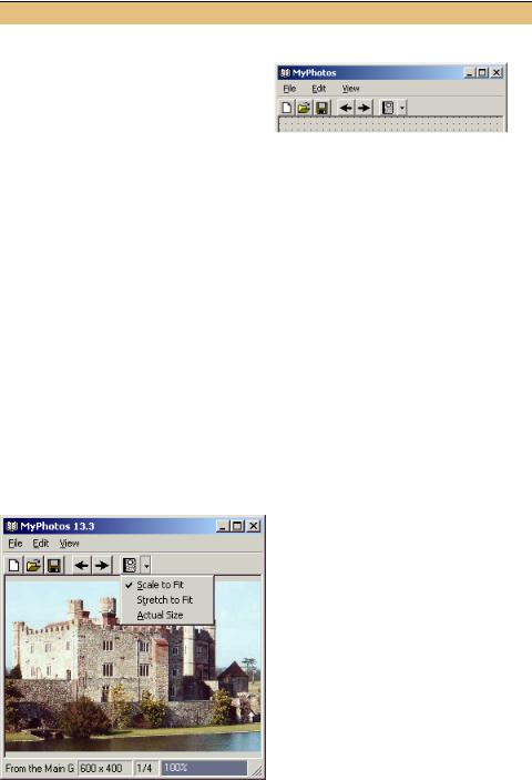
.NET Framework does all the hard work here. When the button is clicked, the menu item collection associated with the ctxtMenuImage menu is displayed. This causes the Popup event associated with this menu to fire, invoking the menuImage_Popup event handler. Figure 13.2 shows the application with the popup menu displayed for our new button.
Figure 13.2
When the down arrow for a toolbar button is shown, as it is here, the user must click on this arrow to display the associated menu.
TOOLBAR BUTTONS |
425 |
Of course, you don’t always have an existing menu in your menu bar to clone and use in your dropdown toolbar buttons. A custom ContextMenu object can be created and assigned to the button. If desired, you can also draw your own menu items similar to how we drew a custom status bar panel in chapter 4 and list box items in chapter 10.
Alternately, you may wish to forgo a menu entirely and create a custom window to associate with your button. This can be done as well. The ButtonDropDown event occurs for the parent ToolBar control whenever a dropdown menu on the control is clicked. Event handlers for this event receive a
class instance as the event parameter. This class contains a Button property to retrieve the dropdown ToolBarButton instance that was clicked. The Rectangle property for the button identifies the location of the button and can be used to properly place a small window or other graphical object at the proper location.
Our last style of button is a toggle button.
13.3.3ADDING A TOGGLE BUTTON
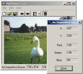
Our final toolbar button will illustrate the ToggleButton style to show and hide the pixel data dialog created in chapter 8. Toggle buttons, as you may recall from chapter 9, provide two different states: one when the button is pressed in, and one when it is not.
We will do something a little different here that seems appropriate for our example. If you are keeping track of the images available in our image list, you may realize there are two images left, while only one more button. We will use one image when the button is pushed in, and the other when it is not. Figure 13.3 shows our application with the button pressed in and the PixelDlg form displayed.
Figure 13.3
The toggle button on our toolbar displays a green light when the pixel dialog is shown, and a red light otherwise.
426 |
CHAPTER 13 TOOLBARS AND TIPS |
This will require some coordination with the rest of the application to make sure the button is never pressed when the pixel dialog is hidden. We’ll begin by creating the button and implementing the ButtonClick event support.
|
|
|
|
|
ADD THE TOGGLE TOOLBAR BUTTONS |
||
|
|
|
|
|
|
|
|
|
|
|
ACTION |
|
|
RESULT |
|
|
|
|
|
|
|
|
|
1 |
In the ToolBarButton Collection Editor, |
|
|||||
|
add two new toolbar buttons. |
|
|||||
|
|
|
Settings |
|
|
|
|
|
|
|
|
|
|
|
|
|
|
Button |
Property |
|
Value |
|
|
|
8 |
Style |
|
Separator |
|
||
|
|
|
(Name) |
|
tbbPixelData |
|
|
|
|
9 (Pixel) |
ImageIndex |
|
6 |
|
|
|
|
Style |
|
ToggleButton |
|
||
|
|
|
|
|
|||
|
|
|
ToolTipText |
|
Show pixel data |
|
|
|
|
|
|
|
|
|
|
2 |
Implement an AssignPixelData |
protected void |
|||||
|
method in the MainForm.cs code |
AssignPixelToggle(bool push) |
|||||
|
window to adjust the button settings |
{ |
|||||
|
tbbPixelData.Pushed = push; |
||||||
|
based a specified value. |
|
|
||||
|
|
|
if (push) |
||||
|
How-to |
|
|
|
|
{ |
|
|
|
|
|
|
tbbPixelData.ImageIndex = 7; |
||
|
Display the green light icon when the |
||||||
|
tbbPixelData.ToolTipText |
||||||
|
button is pushed, and the red light |
= "Hide pixel data"; |
|||||
|
otherwise. |
|
|
|
|
} |
|
|
Note: This will be used by various meth- |
else |
|||||
|
{ |
||||||
|
ods to update the toggle button as the |
tbbPixelData.ImageIndex = 6; |
|||||
|
state of the pixel data dialog changes. |
tbbPixelData.ToolTipText |
|||||
|
= "Show pixel data"; |
||||||
|
|
|
|
|
|
|
|
|
|
|
|
|
|
|
} |
|
|
|
|
|
|
|
} |
|
|
|
|
|
|
|
|
3 |
Update the ButtonClick event handler |
private void toolBarMain_ButtonClick |
|||||
|
to adjust the state of both the dialog and |
(object sender, |
|||||
|
the button when the toggle is clicked. |
ToolBarButtonClickEventArgs e) |
|||||
|
{ |
||||||
|
|
|
|
|
|
|
|
|
How-to |
|
|
|
|
// Handle menu buttons |
|
|
|
|
|
|
. . . |
||
|
a. When the button is pushed, invoke |
||||||
|
// Handle Pixel Data button |
||||||
|
|
the Pixel Data menu to ensure the |
if (e.Button == tbbPixelData) |
||||
|
|
dialog is displayed. |
|
|
{ |
||
|
b. Otherwise, hide the dialog if it is cur- |
if (e.Button.Pushed) |
|||||
|
{ |
||||||
|
|
rently displayed. |
|
|
// Display pixel dialog |
||
|
c. Also call the AssignPixelToggle |
menuPixelData.PerformClick(); |
|||||
|
} |
||||||
|
|
method to update the button settings. |
|||||
|
|
else if (this._dlgPixel != null |
|||||
|
|
|
|
|
|
|
&& _dlgPixel.Visible) |
|
|
|
|
|
|
|
{ |
|
|
|
|
|
|
|
// Hide pixel dialog |
|
|
|
|
|
|
|
_dlgPixel.Hide(); |
|
|
|
|
|
|
|
} |
|
|
|
|
|
|
|
// Update the button settings |
|
|
|
|
|
|
|
AssignPixelToggle(e.Button.Pushed); |
|
|
|
|
|
|
|
} |
|
|
|
|
|
|
|
} |
|
|
|
|
|
|
|
|
TOOLBAR BUTTONS |
427 |