

- •brief contents
- •about this book
- •The Windows Forms namespace
- •Part 1: Hello Windows Forms
- •Part 2: Basic Windows Forms
- •Part 3: Advanced Windows Forms
- •Who should read this book?
- •Conventions
- •Action
- •Result
- •Source code downloads
- •Author online
- •acknowledgments
- •about .NET
- •Casting the .NET
- •Windows Forms overview
- •about the cover illustration
- •Hello Windows Forms
- •1.1 Programming in C#
- •1.1.1 Namespaces and classes
- •1.1.2 Constructors and methods
- •1.1.3 C# types
- •1.1.4 The entry point
- •1.1.5 The Application class
- •1.1.6 Program execution
- •1.2 Adding controls
- •1.2.1 Shortcuts and fully qualified names
- •1.2.2 Fields and properties
- •1.2.3 The Controls property
- •1.3 Loading files
- •1.3.1 Events
- •1.3.2 The OpenFileDialog class
- •1.3.3 Bitmap images
- •1.4 Resizing forms
- •1.4.1 Desktop layout properties
- •1.4.2 The Anchor property
- •1.4.3 The Dock property
- •1.5 Recap
- •2.1 Programming with Visual Studio .NET
- •2.1.1 Creating a project
- •Action
- •Result
- •2.1.2 Executing a program
- •Action
- •Result
- •2.1.3 Viewing the source code
- •View the code generated by Visual Studio .NET
- •Action
- •Result
- •2.2 Adding controls
- •2.2.1 The AssemblyInfo file
- •Action
- •Results
- •2.2.2 Renaming a form
- •Action
- •Result
- •2.2.3 The Toolbox window
- •Action
- •Result
- •2.3 Loading files
- •2.3.1 Event handlers in Visual Studio .NET
- •Action
- •Result
- •2.3.2 Exception handling
- •Action
- •Result
- •Action
- •Results and Comments
- •2.4 Resizing forms
- •2.4.1 Assign the Anchor property
- •Action
- •Result
- •2.4.2 Assign the MinimumSize property
- •Action
- •Result
- •2.5 Recap
- •Basic Windows Forms
- •Menus
- •Action
- •Result
- •Action
- •Result
- •Action
- •Result
- •Action
- •Result
- •3.3 Click events
- •Action
- •Result
- •Action
- •Result
- •Action
- •Result
- •Action
- •Result
- •Action
- •Result
- •Action
- •Result
- •3.5 Context menus
- •Action
- •Result
- •Action
- •Result
- •3.6 Recap
- •Status bars
- •4.1 The Control class
- •4.2 The StatusBar class
- •Action
- •Result
- •Action
- •Result
- •4.3.1 Adding panels to a status bar
- •Action
- •Result
- •Action
- •Result
- •Action
- •Result
- •Action
- •Result
- •4.5 Recap
- •Reusable libraries
- •5.1 C# classes and interfaces
- •5.2 Class libraries
- •Action
- •Result
- •Action
- •Result
- •Action
- •Result
- •Action
- •Result
- •Action
- •Result
- •Action
- •Result
- •Action
- •Result
- •Action
- •Result
- •Action
- •Result
- •5.3 Interfaces revisited
- •Action
- •Result
- •Action
- •Result
- •Action
- •Result
- •5.4 Robustness issues
- •Action
- •Result
- •Action
- •Result
- •Action
- •Result
- •Action
- •Result
- •Action
- •Result
- •Action
- •Result
- •Common file dialogs
- •Action
- •Results
- •Action
- •Result
- •Action
- •Result
- •Action
- •Result
- •Action
- •Result
- •6.3 Paint events
- •Action
- •Result
- •Action
- •Result
- •6.4 Context menus revisited
- •Action
- •Result
- •Action
- •Result
- •6.5 Files and paths
- •Action
- •Result
- •Action
- •Result
- •Action
- •Result
- •6.6 Save file dialogs
- •Action
- •Result
- •Action
- •Result
- •Action
- •Result
- •Action
- •Result
- •Action
- •Result
- •6.7 Open file dialogs
- •Action
- •Result
- •Action
- •Result
- •6.8 Recap
- •Drawing and scrolling
- •7.1 Form class hierarchy
- •Action
- •Result
- •Action
- •Result
- •Action
- •Result
- •Action
- •Result
- •Action
- •Result
- •Action
- •Result
- •Action
- •Result
- •Action
- •Result
- •Action
- •Result
- •Action
- •Result
- •Action
- •Result
- •Action
- •Result
- •7.4 Panels
- •Action
- •Result
- •Action
- •Result
- •Action
- •Result
- •Action
- •Result
- •Action
- •Result
- •Dialog boxes
- •8.1 Message boxes
- •Action
- •Result
- •Action
- •Result
- •8.1.4 Creating A YesNoCancel dialog
- •Action
- •Result
- •Action
- •Result
- •8.2 The Form.Close method
- •8.2.1 The relationship between Close and Dispose
- •Action
- •Result
- •8.3 Modal dialog boxes
- •Action
- •Result
- •Action
- •Result
- •8.3.2 Preserving caption values
- •Action
- •Result
- •Action
- •Result
- •Action
- •Result
- •Action
- •Result
- •Action
- •Result
- •Action
- •Result
- •Action
- •Result
- •Action
- •Result
- •Action
- •Result
- •Action
- •Result
- •Action
- •Result
- •Action
- •Result
- •Action
- •Result
- •Action
- •Result
- •Action
- •Result
- •Action
- •Result
- •Action
- •Result
- •Basic controls
- •Action
- •Result
- •Action
- •Result
- •Action
- •Result
- •9.1.2 Creating a derived form
- •Action
- •Result
- •9.2 Labels and text boxes
- •Action
- •Result
- •Action
- •Result
- •Action
- •Result
- •Action
- •Result
- •Action
- •Result
- •Action
- •Result
- •Action
- •Result
- •Action
- •Result
- •Action
- •Result
- •Action
- •Result
- •Action
- •Result
- •Action
- •Result
- •Action
- •Result
- •Action
- •Result
- •Action
- •Result
- •Action
- •Result
- •Action
- •Result
- •Action
- •Result
- •9.3.6 Adding AlbumEditDlg to our main form
- •Action
- •Result
- •Action
- •Result
- •9.4 Recap
- •List controls
- •10.1 List boxes
- •Action
- •Result
- •Action
- •Result
- •Action
- •Result
- •Action
- •Result
- •10.2 Multiselection list boxes
- •10.2.1 Enabling multiple selection
- •Action
- •Result
- •Action
- •Result
- •Action
- •Result
- •Action
- •Result
- •10.3 Combo boxes
- •Action
- •Result
- •Action
- •Result
- •10.4 Combo box edits
- •Action
- •Result
- •Action
- •Result
- •Action
- •Result
- •10.5 Owner-drawn lists
- •Action
- •Result
- •Action
- •Result
- •Action
- •Result
- •Action
- •Result
- •More controls
- •Action
- •Result
- •Action
- •Result
- •11.2 Tab pages
- •Action
- •Result
- •Action
- •Result
- •11.3.1 Dates and times
- •Action
- •Result
- •Action
- •Result
- •Action
- •Result
- •Action
- •Result
- •Action
- •Result
- •Action
- •Result
- •11.5 Recap
- •A .NET assortment
- •12.1 Keyboard events
- •Action
- •Result
- •Action
- •Result
- •12.2 Mouse events
- •Action
- •Result
- •Action
- •Result
- •Action
- •Result
- •12.3 Image buttons
- •Action
- •Result
- •Action
- •Result
- •Action
- •Result
- •Action
- •Result
- •Action
- •Result
- •Action
- •Result
- •Action
- •Result
- •Action
- •Result
- •Action
- •Result
- •12.4 Icons
- •Action
- •Result
- •Action
- •Result
- •Action
- •Result
- •12.5 Recap
- •Toolbars and tips
- •13.1 Toolbars
- •Action
- •Result
- •Action
- •Result
- •Action
- •Result
- •Action
- •Result
- •Action
- •Result
- •Action
- •Result
- •Action
- •Result
- •Action
- •Result
- •Action
- •Result
- •13.4.2 Creating tool tips
- •Action
- •Result
- •Action
- •Result
- •Advanced Windows Forms
- •List views
- •14.2 The ListView class
- •Action
- •Result
- •Action
- •Result
- •Action
- •Result
- •Action
- •Result
- •14.2.3 Populating a ListView
- •Action
- •Result
- •Action
- •14.3 ListView columns
- •Action
- •Result
- •Action
- •Result
- •Action
- •Result
- •Action
- •Result
- •Action
- •Result
- •Action
- •Result
- •Action
- •Result
- •Action
- •Result
- •Action
- •Result
- •Action
- •Result
- •Action
- •Result
- •Action
- •Result
- •Action
- •Result
- •Action
- •Result
- •Action
- •Result
- •Action
- •Result
- •Action
- •Result
- •Action
- •Result
- •Action
- •Result
- •14.6 Recap
- •Tree views
- •Action
- •Result
- •Action
- •Result
- •Action
- •Result
- •15.3 Dynamic tree nodes
- •Action
- •Result
- •Action
- •Result
- •Action
- •Result
- •Action
- •Result
- •Action
- •Result
- •15.4 Node selection
- •Action
- •Result
- •Action
- •Result
- •Action
- •Result
- •Action
- •Result
- •Action
- •Result
- •15.5 Fun with tree views
- •Action
- •Result
- •Action
- •Result
- •Action
- •Result
- •Multiple document interfaces
- •Action
- •Result
- •Action
- •Result
- •Action
- •Result
- •16.3 Merged menus
- •Action
- •Result
- •Action
- •Result
- •Action
- •Result
- •Action
- •Result
- •16.4 MDI children
- •Action
- •Result
- •Action
- •Result
- •Action
- •Result
- •Action
- •Result
- •Action
- •Result
- •Action
- •Result
- •Action
- •Result
- •Action
- •Result
- •Action
- •Result
- •Action
- •Result
- •16.5 MDI child window management
- •Action
- •Result
- •Action
- •Result
- •16.6 Recap
- •Data binding
- •17.1 Data grids
- •Action
- •Result
- •Action
- •Result
- •17.2 Data grid customization
- •Action
- •Result
- •Action
- •Result
- •Action
- •Result
- •Action
- •Result
- •Action
- •Result
- •Action
- •Result
- •Action
- •Result
- •Action
- •Result
- •Action
- •Result
- •Action
- •Result
- •Action
- •Result
- •Odds and ends .NET
- •Action
- •Result
- •Action
- •Result
- •Action
- •Result
- •Action
- •Result
- •18.2 Timers
- •Action
- •Result
- •Action
- •Result
- •18.3 Drag and drop
- •Action
- •Result
- •Action
- •Result
- •18.4 ActiveX controls
- •Action
- •Result
- •Action
- •Result
- •Action
- •Result
- •Action
- •Result
- •Action
- •Result
- •18.5 Recap
- •C# primer
- •A.1 C# programs
- •A.1.1 Assemblies
- •A.1.2 Namespaces
- •A.2 Types
- •A.2.1 Classes
- •A.2.2 Structures
- •A.2.3 Interfaces
- •A.2.4 Enumerations
- •A.2.5 Delegates
- •A.3 Language elements
- •A.3.1 Built-in types
- •A.3.2 Operators
- •A.3.3 Keywords
- •A.4 Special features
- •A.4.1 Exceptions
- •A.4.2 Arrays
- •A.4.3 Main
- •A.4.4 Boxing
- •A.4.5 Documentation
- •.NET namespaces
- •B.1 System.Collections
- •B.2 System.ComponentModel
- •B.3 System.Data
- •B.4 System.Drawing
- •B.5 System.Globalization
- •B.6 System.IO
- •B.7 System.Net
- •B.8 System.Reflection
- •B.9 System.Resources
- •B.10 System.Security
- •B.11 System.Threading
- •B.12 System.Web
- •B.13 System.Windows.Forms
- •B.14 System.XML
- •Visual index
- •C.1 Objects
- •C.2 Marshal by reference objects
- •C.3 Components
- •C.4 Common dialogs
- •C.7 Event data
- •C.8 Enumerations
- •For more information
- •bibliography
- •Symbols
- •Index
For our purposes, we will continue to use the typed IList interface supported by our PhotoAlbum class. Later in the chapter we will add support for the IEditableObject interface in order to properly save modifications made in our data grid.
The next section discusses various ways of customizing what appears in the grid.
17.2DATA GRID CUSTOMIZATION
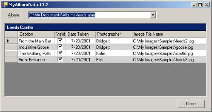
One of the obvious drawbacks of letting .NET do all the work in laying out the contents of a data grid is that we have no control over the selection and order of columns to appear in the grid. In this section we will look at how to customize the contents of a data grid for a particular data source using table and column styles. This will enable us to build the application shown in figure 17.4.
Figure 17.4 This data grid displays only certain properties of photographs, and the size and content of each column are somewhat customized compared with the application in the previous section.
In our current application we display a single kind of table, namely one based on the PhotoAlbum class. In general, the data displayed in a data grid may vary depending on the actions of the user. For example, just as our ListView control in chapter 14 displayed both albums and photographs, we could create an AlbumCollection class derived from CollectionBase to contain the set of albums located in a given directory. We could then use this class to display both album files and the contents of albums in our data grid.
More commonly, a data grid is filled with information from a database, which includes one or more tables. An employee database at a company might have one table containing department information, another table containing the employees assigned to each department, and another containing the projects each employee is assigned to. A single data grid could display all three types of tables based on a set of options, and it would be nice to customize the appearance of each type of table.
DATA GRID CUSTOMIZATION |
573 |

The TableStyles property in the DataGrid class supports this notion of configuring the appearance of multiple tables. This property contains a collection of DataGridTableStyle objects, each of which describes the configuration for a table that might be displayed by the grid. The DataGridTableStyle class, in turn, provides a
GridColumnStyles property that contains a collection of DataGridColumnStyle objects. We will discuss each of these classes separately.
17.2.1CUSTOMIZING TABLE STYLES
The DataGridTableStyle class permits a custom style for a specific type of table to be defined. Many of the members of this class are duplicates of similar members in the DataGrid class. The members of the active table style always override the default settings for the data grid. A summary of this class appears in .NET Table 17.2.
.NET Table 17.2 DataGridTableStyle class
The DataGridTableStyle class represents the style in which to display a particular table that can appear in a DataGrid control. It configures not only the general properties for the table but also the individual columns that should appear in the table. This class is part of the System.Windows.Forms namespace, and inherits from the System.ComponentModel.Component class.
|
AllowSorting |
Gets or sets whether sorting is allowed on the grid when this |
|
|
DataGridTableStyle is used. |
|
AlternatingBack- |
Gets or sets the background color for alternating rows in the |
|
Color |
grid when this DataGridTableStyle is used. |
|
DataGrid |
Gets or sets the DataGrid control containing this style. |
|
GridColumn- |
Gets or sets the collection of DataGridColumnStyle objects |
|
Styles |
to use for the grid when this style is used. |
|
LinkColor |
Gets or sets the color of link text to use in the grid when this |
Public |
|
style is used. |
|
|
|
Properties |
MappingName |
Gets or sets the name used to associate this table style with |
|
||
|
|
a specific data source. For a data source based on an IList |
|
|
interface, the name of the list is specified, as in |
|
|
myList.GetType().Name. For a data source based on a |
|
|
DataSet instance, a valid table name in the data set should |
|
|
be specified. |
|
ReadOnly |
Gets or sets whether columns can be edited in the grid when |
|
|
this style is used. |
|
RowHeader- |
Gets or sets the width of row headers in the grid when this |
|
Width |
style is used. |
|
|
|
|
BeginEdit |
Requests an edit operation on a row in the grid. |
Public |
EndEdit |
Requests an end to an edit operation in the grid. |
Methods |
ResetBackColor |
Resets the BackColor property to its default value. A |
|
||
|
|
number of other reset methods exist with a similar purpose. |
|
|
|
Public |
AllowSorting- |
Occurs when the AllowSorting property value changes. A |
Events |
Changed |
number of other changed events exist with a similar purpose. |
|
|
|
574 |
CHAPTER 17 DATA BINDING |

There are two keys to understanding the DataGridTableStyle class. The first is the MappingName property. When a new source of data is assigned to a DataGrid control, the list of table styles is examined to locate a style whose MappingName setting matches the name of the table. If one is found, then that style is used to display the grid. If no match is found, then the default settings for the grid control are used. It is an error to assign identical mapping names to multiple styles within the same data grid.
The second key to understanding this class is the GridColumnStyles property. This property is a collection of DataGridColumnStyle objects and specifies the selection and order of columns to display in the grid. If the GridColumnStyles property is null, then the default set of columns is displayed.
We can use the DataGridTableStyle class to modify the appearance of our DataGrid control when a PhotoAlbum is displayed. We will make the very simple change of providing an alternating background color for the table. The steps required are presented in the following table.
Set the version number of the MyAlbumData application to 17.2
PROVIDE A CUSTOM TABLE STYLE WHEN A PHOTOALBUM IS DISPLAYED
|
Action |
Result |
|
|
|
1 |
In the MainForm.cs code |
protected override void OnLoad(EventArgs e) |
|
window, create a table style |
{ |
|
instance in the OnLoad method. |
. . . |
|
// Table style for PhotoAlbum data source |
|
|
|
|
|
Note: A table style can also be |
DataGridTableStyle albumStyle |
|
created in the [Design] window |
= new DataGridTableStyle(); |
|
|
|
|
by clicking on the … button in |
|
|
the TableStyles property. |
|
|
Here we elect to create the |
|
|
table style by hand. |
|
|
|
|
2 |
Configure the new style for a |
albumStyle.MappingName = "PhotoAlbum"; |
|
PhotoAlbum table with an |
albumStyle.AlternatingBackColor |
|
alternating background color of |
= Color.LightGray; |
|
albumStyle.RowHeaderWidth = 15; |
|
|
LightGray. |
|
|
|
|
|
|
|
3 |
Assign the new style to the |
// Assign the table style to the data grid |
|
existing DataGrid control. |
gridPhotoAlbum.TableStyles.Add(albumStyle); |
|
|
} |
|
|
|
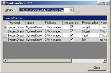
This very simple change causes the application to display as is shown in figure 17.5. Of course, the AlternatingBackColor and RowHeaderWidth properties are available in the DataGrid class and can be set explicitly for this class. Assigning them in a table style uses these properties only when a matching table name is displayed, in this case a PhotoAlbum object.
Note that our choice of light gray may not work very well with some user’s desktop colors. You can use an alternate color if you prefer, or a system color such as SystemColors.ControlLight. In your own applications, make sure you carefully select
DATA GRID CUSTOMIZATION |
575 |
color choices for settings such as this, and use system settings where possible. Hardcoding a specific color such as we do here is not typically recommended, since different users may configure their desktops to appear using different sets of conflicting colors.
Figure 17.5 This figure shows an alternating background color of light gray to present a ledger-like appearance.
Note that the assignment of the MappingName is critical here. Using a name other than PhotoAlbum would have no effect on our table since the name of the table would not match the mapping name of the table style.
Of course, our table still uses the default set of columns since we have not yet assigned any column styles to the GridColumnStyles property. Customizing the columns in our table is our next topic.
17.2.2CUSTOMIZING COLUMN STYLES
Now that we know how to customize the properties of a table, let’s look at how to customize the columns that appear in the table. The DataGridColumnStyle class is used for this purpose, and is summarized in .NET Table 17.3. This is an abstract class from which various types of columns are derived. The .NET Framework currently provides classes to represent boolean and text columns, namely the DataGridBoolColumn and DataGridTextBoxColumn classes.
576 |
CHAPTER 17 DATA BINDING |

.NET Table 17.3 DataGridColumnStyle class
The DataGridColumnStyle class represents a specific column that should appear when a specific style table is displayed in a DataGrid control. This object is typically contained within a DataGridTableStyle object, and indicates the position and style for the corresponding column when a table of the specified type is displayed. This class is part of the System.Windows.Forms namespace, and inherits from the System.ComponentModel.Component class. A DataGridColumnStyle object cannot be instantiated, as this is an abstract class. The
DataGridBoolColumn and DataGridTextBoxColumn classes derived from this class are used to represent a column of boolean or textual values, respectively. Custom column styles derived from this class may also be created.
|
Alignment |
Gets or sets the alignment of data within the column. |
|
DataGridTableStyle |
Gets the table style containing this column style. |
|
HeaderText |
Gets or sets the header text for this column when the |
|
|
associated table style is used. |
|
MappingName |
Gets or sets the name used to associate this column |
|
|
style with a specific data value in an associated data |
|
|
source. For an IList data source, a valid property name |
Public |
|
in the list should be specified. For a DataSet data |
|
source, a valid column name in the associated table |
|
Properties |
|
|
|
should be provided. |
|
|
NullText |
Gets or sets the text that is displayed when the column |
|
|
contains a null reference. |
|
PropertyDescriptor |
Gets or sets the PropertyDescriptor object |
|
|
containing attributes of the data displayed by this |
|
|
column style. |
|
ReadOnly |
Gets or sets whether to treat the column as read-only. |
|
Width |
Gets or sets the width in pixels for this column. |
|
|
|
Public |
ResetHeaderText |
Resets the HeaderText property to its default value, |
Methods |
|
which is a null reference. |
|
|
|
|
AlignmentChanged |
Occurs when the Alignment property for the column |
Public |
|
style changes. |
|
|
|
Events |
FontChanged |
Occurs when the column’s font changes. A number of |
|
||
|
|
other changed events exist with a similar purpose. |
|
|
|
The order in which columns are assigned to a table style determines the order in which they will appear in the data grid. We will use this feature to extend the table style we created for our form to display only a subset of the available columns.
The code to make this change is detailed in the following table. Note that this code uses the DataGridBoolColumn and DataGridTextBoxColumn classes. We will discuss these classes in more detail in a moment.
DATA GRID CUSTOMIZATION |
577 |