- •Contents
- •Figures and Tables
- •Introduction to the Aqua Human Interface Guidelines
- •The Benefits of Applying the Interface Guidelines
- •Deciding What to Do First
- •Tools and Resources for Applying the Guidelines
- •If You Have a Need Not Covered by the Guidelines
- •Human Interface Design
- •Human Interface Design Principles
- •Metaphors
- •See-and-Point
- •Direct Manipulation
- •User Control
- •Feedback and Communication
- •Consistency
- •WYSIWYG (What You See Is What You Get)
- •Forgiveness
- •Perceived Stability
- •Aesthetic Integrity
- •Modelessness
- •Knowledge of Your Audience
- •Worldwide Compatibility
- •Cultural Values
- •Language Differences
- •Default Alignment of Interface Elements
- •Resources
- •Universal Accessibility
- •Visual Disabilities
- •Hearing Disabilities
- •Physical Disabilities
- •The Dock
- •The Dock’s Onscreen Position
- •Dock Notification Behavior
- •Dock Menus
- •Clicking in the Dock
- •Menus
- •Menu Elements
- •Menu Titles
- •Menu Items
- •Grouping Items in Menus
- •Hierarchical Menus (Submenus)
- •Menu Behavior
- •Scrolling Menus
- •Toggled Menu Items
- •Sticky Menus
- •Standard Pull-Down Menus (The Menu Bar)
- •The Apple Menu
- •The Application Menu
- •The Application Menu Title
- •The Application Menu Contents
- •The File Menu
- •The Edit Menu
- •The View Menu
- •The Window Menu
- •The Help Menu
- •Menu Bar Status Items
- •Other Menus
- •Contextual Menus
- •Using Special Characters and Text Styles in Menus
- •Using Symbols in Menus
- •Using Text Styles and Fonts in Menus
- •Using Ellipses in Menus and Buttons
- •Windows
- •Window Layering
- •Window Appearance and Behavior
- •Textured Windows
- •Opening and Naming Windows
- •Positioning Windows
- •Closing Windows
- •Moving Windows
- •Resizing and Zooming Windows
- •Active and Inactive Windows
- •Click-Through
- •Scroll Bars and Scrolling Windows
- •Automatic Scrolling
- •Minimizing and Expanding Windows
- •Windows With Changeable Panes
- •Special Windows
- •Drawers
- •When to Use Drawers
- •Drawer Behavior
- •Utility Windows
- •The About Window
- •Dialogs
- •Types of Dialogs and When to Use Them
- •Document-Modal Dialogs (Sheets)
- •Sheet Behavior
- •When to Use Sheets
- •When Not to Use Sheets
- •Alerts
- •Dialog Behavior
- •Accepting Changes
- •The Open Dialog
- •Saving, Closing, and Quitting Behavior
- •Save Dialogs
- •Closing a Document With Unsaved Changes
- •Saving Documents During a Quit Operation
- •Saving a Document With the Same Name as an Existing Document
- •The Choose Dialog
- •The Printing Dialogs
- •Controls
- •Control Behavior and Appearance
- •Push Buttons
- •Push Button Specifications
- •Radio Buttons and Checkboxes
- •Radio Button and Checkbox Specifications
- •Selections Containing More Than One Checkbox State
- •Pop-Up Menus
- •Pop-Up Menu Specifications
- •Command Pop-Down Menus
- •Command Pop-Down Menu Specifications
- •Combination Boxes
- •Combo Box Specifications
- •The Text Entry Field
- •The Scrolling List
- •Placards
- •Bevel Buttons
- •Bevel Button Specifications
- •Toolbars
- •Pop-Up Icon Buttons and Pop-Up Bevel Buttons
- •Slider Controls
- •Slider Control Specifications
- •Tab Controls
- •Tab Control Specifications
- •Progress Indicators
- •Text Fields and Scrolling Lists
- •Tools for Creating Lists
- •Text Input Field Specifications
- •Scrolling List Specifications
- •Image Wells
- •Disclosure Triangles
- •Layout Guidelines
- •Group Boxes
- •Sample Dialog Layouts
- •Using Small Versions of Controls
- •User Input
- •The Mouse and Other Pointing Devices
- •Using the Mouse
- •Clicking
- •Double-Clicking
- •Pressing
- •Dragging
- •The Keyboard
- •The Functions of Specific Keys
- •Character Keys
- •Modifier Keys
- •Arrow Keys
- •Function Keys
- •Key Combinations Reserved by the System
- •Recommended Keyboard Equivalents
- •Creating Your Own Keyboard Equivalents
- •Keyboard Focus and Navigation
- •Full Keyboard Access Mode
- •Type-Ahead and Auto-Repeat
- •Selecting
- •Selection Methods
- •Selection by Clicking
- •Selection by Dragging
- •Changing a Selection With Shift-Click
- •Changing a Selection With Command-Click
- •Selections in Text
- •Selecting With the Mouse
- •What Constitutes a Word
- •Selecting Text With the Arrow Keys
- •Selections in Graphics
- •Selections in Arrays and Tables
- •Editing Text
- •Inserting Text
- •Deleting Text
- •Replacing a Selection
- •Intelligent Cut and Paste
- •Editing Text Fields
- •Entering Passwords
- •Fonts
- •Icons
- •Icon Genres and Families
- •Application Icons
- •User Application Icons
- •Viewer, Player, and Accessory Icons
- •Utility Icons
- •Non-Application Icons
- •Document Icons
- •Icons for Preferences and Plug-ins
- •Icons for Hardware and Removable Media
- •Toolbar Icons
- •Icon Perspectives and Materials
- •Conveying an Emotional Quality in Icons
- •Suggested Process for Creating Aqua Icons
- •Tips for Designing Aqua Icons
- •Drag and Drop
- •Drag and Drop Design Overview
- •Drag and Drop Semantics
- •Move Versus Copy
- •When to Check the Option Key State
- •Selection Feedback
- •Single-Gesture Selection and Dragging
- •Background Selections
- •Drag Feedback
- •Destination Feedback
- •Windows
- •Text
- •Multiple Dragged Items
- •Automatic Scrolling
- •Using the Trash as a Destination
- •Drop Feedback
- •Finder Icons
- •Graphics
- •Text
- •Transferring a Selection
- •Feedback for an Invalid Drop
- •Clippings
- •Language
- •Style
- •Terminology
- •Developer Terms and User Terms
- •Labels for Interface Elements
- •Capitalization of Interface Elements
- •Using Contractions in the Interface
- •Writing Good Alert Messages
- •User Help and Assistants
- •Apple’s Philosophy of Help
- •Help Viewer
- •Providing Access to Help
- •Help Tags
- •Help Tag Guidelines
- •Setup Assistants
- •Files
- •Installing Files
- •Where to Put Files
- •Handling Plug-ins
- •Naming Files and Showing Filename Extensions
- •Displaying Pathnames
- •Speech Recognition and Synthesis
- •Speech Recognition
- •Speakable Items
- •The Speech Recognition Interface
- •Speech-Recognition Errors
- •Guidelines for Implementing Speech Recognition
- •Speech Synthesis
- •Guidelines for Implementing Speech Synthesis
- •Spoken Dialogues and Delegation
- •General Considerations
- •Installation and File Location
- •Graphic Design
- •Menus
- •Pop-Up Menus
- •Windows
- •Utility Windows
- •Scrolling
- •Dialogs
- •Feedback and Alerts
- •The Mouse
- •Keyboard Equivalents
- •Text
- •Icons
- •User Documentation
- •Help Tags
- •Document Revision History
- •Glossary
- •Index
C H A P T E R 1 4
User Help and Assistants
Avoid adding items to the Help menu that essentially lead to the same place— your help book. Multiple entries that open Help Viewer can be confusing; differences between sections of your help book may not be as obvious to users as you think they are. Navigating between sections of a help book is typically best handled by providing links in the Help Viewer window.
■Help buttons. When necessary, you can use a Help button, typically placed in the lower-left corner of a dialog or window, to provide easy access to specific sections of your help. When a user clicks a Help button, send either a search term or an anchor lookup (which leads to a specific page or pages) to Help Viewer.
It’s not necessary for every dialog and window in your application to have a Help button. If there is no contextually relevant information in the help, don’t display a Help button.
■Contextual Help menu item. If contextually appropriate help content is available for an object being pointed to, the first item in the contextual menu is Help. As with help buttons, the menu item can send either a search term or an anchor lookup to Help Viewer.
Help Tags
Help tags are short messages that appear when the user leaves the pointer hovering over an interface element for a few seconds. When the pointer leaves the object, the tag vanishes. Use help tags to assist users in identifying the purpose of interface elements. You can define an object’s help tag in Interface Builder for Carbon and Cocoa applications.
The text of the help tags should
■name an object only if the name is relevant to its function and does not have a text label
■briefly describe what the object does
■reflect the current state of the interface item or be state-independent. You can check the state of the item (dimmed, selected, and so on) before displaying the tag.
238Help Tags
Apple Computer, Inc. June 2002
C H A P T E R 1 4
User Help and Assistants
For example, the help tag for a button labeled “Forward” in an email program might read “Send the selected message to someone else.” This provides more detail than the button label, but does not repeat it, and it explains that a message must be selected to enable the button.
It is not necessary for every object to have a help tag. Don’t provide them for common interface elements, menu items, or items that are self-explanatory or obvious.
If necessary, Carbon developers can implement expanded help tags—text that replaces the original help tag and that further explains the control’s function. Users display an expanded help tag by pressing the Command key. Not every tag needs an expanded state.
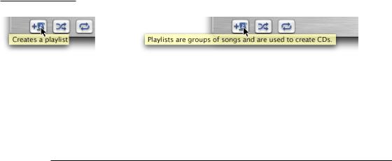
Figure 14-1 A help tag and an expanded help tag
Help tags should always appear in the same place, regardless of the pointer location. The default position for help tags in Carbon applications is below the control, centered horizontally (if necessary, this position can be changed on a per-tag basis).
Help Tag Guidelines
Here are some guidelines to help you create effective tag messages.
■Use the fewest words possible. Try to keep your tags to a maximum of 60 to 75 characters. Since help tags are always on, it is important to keep your tag text unobtrusive—that is, short—and useful. Present one concept per tag and make sure the concept is directly related to the item. Localization lengthens the text by 20 to 30 percent, which is another good reason to keep the tag short.
■Write the main help tag in any of these ways, depending on the interface you’re documenting:
Help Tags |
239 |
Apple Computer, Inc. June 2002
C H A P T E R 1 4
User Help and Assistants
■Describe what the user will accomplish by using the control. Examples: “Add or remove a language from your list.” “Reduce red tint in the selected area.” Most help tags can use this format.
■Give extra information to explain the results of the user’s action. This kind of tag is most effective in an interface that already includes some instructional text, because the tag and the interface text work together to describe what the control does and how the user manipulates it.
■Define terms that may be unknown to the user. This kind of tag should be used only if the interface already contains instructions to the user.
■You can create contextually sensitive help tags but you don’t have to; the same text can appear when an item is selected, dimmed, and so on. By describing what the item accomplishes, you may help the user understand the current state of the control even if the tag is applicable to all situations.
■Use help tags to provide functional information for controls that are unique to your application. Don’t tag window controls, scroll bars, and other parts of the standard Mac OS X interface.
■Don’t put the item’s name in the tag unless the name helps the user and isn’t available onscreen. If an item is referred to by name in the documentation and in the tag, make sure the names match.
■You can use a sentence fragment beginning with a verb, for example, “Restores default settings.” You can also omit articles to limit the size of the tag. If the tag text is a complete sentence, end it with a period.
■Describe only the item the user points to.
■Use help tags primarily to provide necessary information, rather than incidental tips.
■If you implement an expanded tag to add another layer of information, don’t repeat the text in the original tag. An expanded tag should do one of the following:
■More fully explain or describe the results of the action described in the small help tag.
Help tag: Shuffles the play order.
Expanded tag: Plays the current list of songs in random order.
240Help Tags
Apple Computer, Inc. June 2002