- •Contents
- •Figures and Tables
- •Introduction to the Aqua Human Interface Guidelines
- •The Benefits of Applying the Interface Guidelines
- •Deciding What to Do First
- •Tools and Resources for Applying the Guidelines
- •If You Have a Need Not Covered by the Guidelines
- •Human Interface Design
- •Human Interface Design Principles
- •Metaphors
- •See-and-Point
- •Direct Manipulation
- •User Control
- •Feedback and Communication
- •Consistency
- •WYSIWYG (What You See Is What You Get)
- •Forgiveness
- •Perceived Stability
- •Aesthetic Integrity
- •Modelessness
- •Knowledge of Your Audience
- •Worldwide Compatibility
- •Cultural Values
- •Language Differences
- •Default Alignment of Interface Elements
- •Resources
- •Universal Accessibility
- •Visual Disabilities
- •Hearing Disabilities
- •Physical Disabilities
- •The Dock
- •The Dock’s Onscreen Position
- •Dock Notification Behavior
- •Dock Menus
- •Clicking in the Dock
- •Menus
- •Menu Elements
- •Menu Titles
- •Menu Items
- •Grouping Items in Menus
- •Hierarchical Menus (Submenus)
- •Menu Behavior
- •Scrolling Menus
- •Toggled Menu Items
- •Sticky Menus
- •Standard Pull-Down Menus (The Menu Bar)
- •The Apple Menu
- •The Application Menu
- •The Application Menu Title
- •The Application Menu Contents
- •The File Menu
- •The Edit Menu
- •The View Menu
- •The Window Menu
- •The Help Menu
- •Menu Bar Status Items
- •Other Menus
- •Contextual Menus
- •Using Special Characters and Text Styles in Menus
- •Using Symbols in Menus
- •Using Text Styles and Fonts in Menus
- •Using Ellipses in Menus and Buttons
- •Windows
- •Window Layering
- •Window Appearance and Behavior
- •Textured Windows
- •Opening and Naming Windows
- •Positioning Windows
- •Closing Windows
- •Moving Windows
- •Resizing and Zooming Windows
- •Active and Inactive Windows
- •Click-Through
- •Scroll Bars and Scrolling Windows
- •Automatic Scrolling
- •Minimizing and Expanding Windows
- •Windows With Changeable Panes
- •Special Windows
- •Drawers
- •When to Use Drawers
- •Drawer Behavior
- •Utility Windows
- •The About Window
- •Dialogs
- •Types of Dialogs and When to Use Them
- •Document-Modal Dialogs (Sheets)
- •Sheet Behavior
- •When to Use Sheets
- •When Not to Use Sheets
- •Alerts
- •Dialog Behavior
- •Accepting Changes
- •The Open Dialog
- •Saving, Closing, and Quitting Behavior
- •Save Dialogs
- •Closing a Document With Unsaved Changes
- •Saving Documents During a Quit Operation
- •Saving a Document With the Same Name as an Existing Document
- •The Choose Dialog
- •The Printing Dialogs
- •Controls
- •Control Behavior and Appearance
- •Push Buttons
- •Push Button Specifications
- •Radio Buttons and Checkboxes
- •Radio Button and Checkbox Specifications
- •Selections Containing More Than One Checkbox State
- •Pop-Up Menus
- •Pop-Up Menu Specifications
- •Command Pop-Down Menus
- •Command Pop-Down Menu Specifications
- •Combination Boxes
- •Combo Box Specifications
- •The Text Entry Field
- •The Scrolling List
- •Placards
- •Bevel Buttons
- •Bevel Button Specifications
- •Toolbars
- •Pop-Up Icon Buttons and Pop-Up Bevel Buttons
- •Slider Controls
- •Slider Control Specifications
- •Tab Controls
- •Tab Control Specifications
- •Progress Indicators
- •Text Fields and Scrolling Lists
- •Tools for Creating Lists
- •Text Input Field Specifications
- •Scrolling List Specifications
- •Image Wells
- •Disclosure Triangles
- •Layout Guidelines
- •Group Boxes
- •Sample Dialog Layouts
- •Using Small Versions of Controls
- •User Input
- •The Mouse and Other Pointing Devices
- •Using the Mouse
- •Clicking
- •Double-Clicking
- •Pressing
- •Dragging
- •The Keyboard
- •The Functions of Specific Keys
- •Character Keys
- •Modifier Keys
- •Arrow Keys
- •Function Keys
- •Key Combinations Reserved by the System
- •Recommended Keyboard Equivalents
- •Creating Your Own Keyboard Equivalents
- •Keyboard Focus and Navigation
- •Full Keyboard Access Mode
- •Type-Ahead and Auto-Repeat
- •Selecting
- •Selection Methods
- •Selection by Clicking
- •Selection by Dragging
- •Changing a Selection With Shift-Click
- •Changing a Selection With Command-Click
- •Selections in Text
- •Selecting With the Mouse
- •What Constitutes a Word
- •Selecting Text With the Arrow Keys
- •Selections in Graphics
- •Selections in Arrays and Tables
- •Editing Text
- •Inserting Text
- •Deleting Text
- •Replacing a Selection
- •Intelligent Cut and Paste
- •Editing Text Fields
- •Entering Passwords
- •Fonts
- •Icons
- •Icon Genres and Families
- •Application Icons
- •User Application Icons
- •Viewer, Player, and Accessory Icons
- •Utility Icons
- •Non-Application Icons
- •Document Icons
- •Icons for Preferences and Plug-ins
- •Icons for Hardware and Removable Media
- •Toolbar Icons
- •Icon Perspectives and Materials
- •Conveying an Emotional Quality in Icons
- •Suggested Process for Creating Aqua Icons
- •Tips for Designing Aqua Icons
- •Drag and Drop
- •Drag and Drop Design Overview
- •Drag and Drop Semantics
- •Move Versus Copy
- •When to Check the Option Key State
- •Selection Feedback
- •Single-Gesture Selection and Dragging
- •Background Selections
- •Drag Feedback
- •Destination Feedback
- •Windows
- •Text
- •Multiple Dragged Items
- •Automatic Scrolling
- •Using the Trash as a Destination
- •Drop Feedback
- •Finder Icons
- •Graphics
- •Text
- •Transferring a Selection
- •Feedback for an Invalid Drop
- •Clippings
- •Language
- •Style
- •Terminology
- •Developer Terms and User Terms
- •Labels for Interface Elements
- •Capitalization of Interface Elements
- •Using Contractions in the Interface
- •Writing Good Alert Messages
- •User Help and Assistants
- •Apple’s Philosophy of Help
- •Help Viewer
- •Providing Access to Help
- •Help Tags
- •Help Tag Guidelines
- •Setup Assistants
- •Files
- •Installing Files
- •Where to Put Files
- •Handling Plug-ins
- •Naming Files and Showing Filename Extensions
- •Displaying Pathnames
- •Speech Recognition and Synthesis
- •Speech Recognition
- •Speakable Items
- •The Speech Recognition Interface
- •Speech-Recognition Errors
- •Guidelines for Implementing Speech Recognition
- •Speech Synthesis
- •Guidelines for Implementing Speech Synthesis
- •Spoken Dialogues and Delegation
- •General Considerations
- •Installation and File Location
- •Graphic Design
- •Menus
- •Pop-Up Menus
- •Windows
- •Utility Windows
- •Scrolling
- •Dialogs
- •Feedback and Alerts
- •The Mouse
- •Keyboard Equivalents
- •Text
- •Icons
- •User Documentation
- •Help Tags
- •Document Revision History
- •Glossary
- •Index
C H A P T E R 7
Controls
■Spacing: For buttons with rounded corners that contain a 24 x 24 (or larger) icon, leave at least 8 pixels between buttons, stacked vertically or aligned horizontally. Otherwise, buttons should butt up against each other.
■Text: Label font (10-point Lucida Grande Regular)
If a bevel button has an icon and a label, you can put the text anywhere in relation to the icon. Carbon and Cocoa developers can specify the location in Interface Builder or programmatically. Cocoa developers can create square bevel buttons with the NSButton class. Carbon developers can use the CreateBevelButtonControl function or, in Appearance Manager, the DrawThemeButton function with the kThemeBevelButton constant.
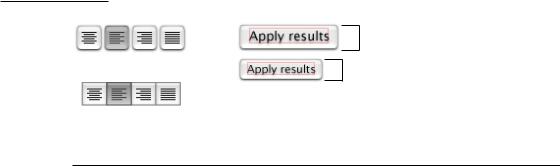
In some situations—providing text-alignment options in a toolbar, for example—it is appropriate to use bevel buttons to graphically represent several mutually exclusive choices. You can also use bevel buttons for nonstandard-size push buttons.
Figure 7-15 Bevel buttons as radio buttons and push buttons
24
20
Toolbars
Toolbars are useful for giving users immediate access to the most frequently used commands. Any item in a toolbar should also be available as a menu command. An application-wide toolbar in its own window is also called a tool palette; for more information, see “Utility Windows” (page 91). This section focuses on toolbars that are part of a window with other content. Carbon developers can create a toolbar with the HIToolBarCreate function; Cocoa developers can use the NSToolbar class.
Control Behavior and Appearance |
133 |
Apple Computer, Inc. June 2002
C H A P T E R 7
Controls
The set of toolbar items you provide should fit in the default window size; users should be able to customize which items appear in the toolbar, and in what order. As the default, a toolbar should display icons with text labels; users should be able to change the display to icons only or text only. You can provide these options with a Customize Toolbar command in the View menu.
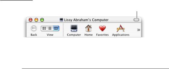
If your application uses toolbars as part of a window with other content, include a control in the window’s title bar for showing and hiding the toolbar, as shown in Figure 7-16. You should also put commands for showing and hiding the toolbar in the View menu (see “The View Menu” (page 61)).
Figure 7-16 The toolbar control
Toolbar button
For information about designing icons for toolbars, see “Toolbar Icons” (page 211).
Pop-Up Icon Buttons and Pop-Up Bevel Buttons
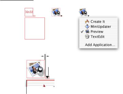
An icon button does not have a rectangular edge around it; the clickable area is the graphic itself (for example, the toolbar buttons in Finder windows). An icon button or a bevel button containing a pop-up menu has a single downward-pointing arrow, as shown in Figure 7-17. The button can behave like a standard pop-up menu, in which the image on the button is the current selection, or the button can represent the menu title and always display the same image.
134Control Behavior and Appearance
Apple Computer, Inc. June 2002
C H A P T E R 7
Controls
The menu and the button (or the bounding rectangle around the icon) are left-aligned, with no space between the top of the menu window and the bottom of the button. The arrow is 7 pixels wide at the top. The tip of the arrow is positioned 1 pixel below the icon’s bottom edge. There should be 3 pixels from the tip of the arrow to the top of the menu window.
Figure 7-17 Pop-up icon button
1
Arrow is 7 pixels wide at the top.
Menu and icon left-aligned
Control Behavior and Appearance |
135 |
Apple Computer, Inc. June 2002
C H A P T E R 7
Controls
Figure 7-18 Pop-up bevel button with square corners
7
7
Arrow is 7 pixels wide at the top and positioned 2 pixels to the right of the icon edge.
8
Menu and button are left-aligned, with no space between the bottom
of the button and the top of the menu.
Figure 7-19 Pop-up bevel button with rounded corners
7
7
8
136Control Behavior and Appearance
Apple Computer, Inc. June 2002