- •Contents
- •Figures and Tables
- •Introduction to the Aqua Human Interface Guidelines
- •The Benefits of Applying the Interface Guidelines
- •Deciding What to Do First
- •Tools and Resources for Applying the Guidelines
- •If You Have a Need Not Covered by the Guidelines
- •Human Interface Design
- •Human Interface Design Principles
- •Metaphors
- •See-and-Point
- •Direct Manipulation
- •User Control
- •Feedback and Communication
- •Consistency
- •WYSIWYG (What You See Is What You Get)
- •Forgiveness
- •Perceived Stability
- •Aesthetic Integrity
- •Modelessness
- •Knowledge of Your Audience
- •Worldwide Compatibility
- •Cultural Values
- •Language Differences
- •Default Alignment of Interface Elements
- •Resources
- •Universal Accessibility
- •Visual Disabilities
- •Hearing Disabilities
- •Physical Disabilities
- •The Dock
- •The Dock’s Onscreen Position
- •Dock Notification Behavior
- •Dock Menus
- •Clicking in the Dock
- •Menus
- •Menu Elements
- •Menu Titles
- •Menu Items
- •Grouping Items in Menus
- •Hierarchical Menus (Submenus)
- •Menu Behavior
- •Scrolling Menus
- •Toggled Menu Items
- •Sticky Menus
- •Standard Pull-Down Menus (The Menu Bar)
- •The Apple Menu
- •The Application Menu
- •The Application Menu Title
- •The Application Menu Contents
- •The File Menu
- •The Edit Menu
- •The View Menu
- •The Window Menu
- •The Help Menu
- •Menu Bar Status Items
- •Other Menus
- •Contextual Menus
- •Using Special Characters and Text Styles in Menus
- •Using Symbols in Menus
- •Using Text Styles and Fonts in Menus
- •Using Ellipses in Menus and Buttons
- •Windows
- •Window Layering
- •Window Appearance and Behavior
- •Textured Windows
- •Opening and Naming Windows
- •Positioning Windows
- •Closing Windows
- •Moving Windows
- •Resizing and Zooming Windows
- •Active and Inactive Windows
- •Click-Through
- •Scroll Bars and Scrolling Windows
- •Automatic Scrolling
- •Minimizing and Expanding Windows
- •Windows With Changeable Panes
- •Special Windows
- •Drawers
- •When to Use Drawers
- •Drawer Behavior
- •Utility Windows
- •The About Window
- •Dialogs
- •Types of Dialogs and When to Use Them
- •Document-Modal Dialogs (Sheets)
- •Sheet Behavior
- •When to Use Sheets
- •When Not to Use Sheets
- •Alerts
- •Dialog Behavior
- •Accepting Changes
- •The Open Dialog
- •Saving, Closing, and Quitting Behavior
- •Save Dialogs
- •Closing a Document With Unsaved Changes
- •Saving Documents During a Quit Operation
- •Saving a Document With the Same Name as an Existing Document
- •The Choose Dialog
- •The Printing Dialogs
- •Controls
- •Control Behavior and Appearance
- •Push Buttons
- •Push Button Specifications
- •Radio Buttons and Checkboxes
- •Radio Button and Checkbox Specifications
- •Selections Containing More Than One Checkbox State
- •Pop-Up Menus
- •Pop-Up Menu Specifications
- •Command Pop-Down Menus
- •Command Pop-Down Menu Specifications
- •Combination Boxes
- •Combo Box Specifications
- •The Text Entry Field
- •The Scrolling List
- •Placards
- •Bevel Buttons
- •Bevel Button Specifications
- •Toolbars
- •Pop-Up Icon Buttons and Pop-Up Bevel Buttons
- •Slider Controls
- •Slider Control Specifications
- •Tab Controls
- •Tab Control Specifications
- •Progress Indicators
- •Text Fields and Scrolling Lists
- •Tools for Creating Lists
- •Text Input Field Specifications
- •Scrolling List Specifications
- •Image Wells
- •Disclosure Triangles
- •Layout Guidelines
- •Group Boxes
- •Sample Dialog Layouts
- •Using Small Versions of Controls
- •User Input
- •The Mouse and Other Pointing Devices
- •Using the Mouse
- •Clicking
- •Double-Clicking
- •Pressing
- •Dragging
- •The Keyboard
- •The Functions of Specific Keys
- •Character Keys
- •Modifier Keys
- •Arrow Keys
- •Function Keys
- •Key Combinations Reserved by the System
- •Recommended Keyboard Equivalents
- •Creating Your Own Keyboard Equivalents
- •Keyboard Focus and Navigation
- •Full Keyboard Access Mode
- •Type-Ahead and Auto-Repeat
- •Selecting
- •Selection Methods
- •Selection by Clicking
- •Selection by Dragging
- •Changing a Selection With Shift-Click
- •Changing a Selection With Command-Click
- •Selections in Text
- •Selecting With the Mouse
- •What Constitutes a Word
- •Selecting Text With the Arrow Keys
- •Selections in Graphics
- •Selections in Arrays and Tables
- •Editing Text
- •Inserting Text
- •Deleting Text
- •Replacing a Selection
- •Intelligent Cut and Paste
- •Editing Text Fields
- •Entering Passwords
- •Fonts
- •Icons
- •Icon Genres and Families
- •Application Icons
- •User Application Icons
- •Viewer, Player, and Accessory Icons
- •Utility Icons
- •Non-Application Icons
- •Document Icons
- •Icons for Preferences and Plug-ins
- •Icons for Hardware and Removable Media
- •Toolbar Icons
- •Icon Perspectives and Materials
- •Conveying an Emotional Quality in Icons
- •Suggested Process for Creating Aqua Icons
- •Tips for Designing Aqua Icons
- •Drag and Drop
- •Drag and Drop Design Overview
- •Drag and Drop Semantics
- •Move Versus Copy
- •When to Check the Option Key State
- •Selection Feedback
- •Single-Gesture Selection and Dragging
- •Background Selections
- •Drag Feedback
- •Destination Feedback
- •Windows
- •Text
- •Multiple Dragged Items
- •Automatic Scrolling
- •Using the Trash as a Destination
- •Drop Feedback
- •Finder Icons
- •Graphics
- •Text
- •Transferring a Selection
- •Feedback for an Invalid Drop
- •Clippings
- •Language
- •Style
- •Terminology
- •Developer Terms and User Terms
- •Labels for Interface Elements
- •Capitalization of Interface Elements
- •Using Contractions in the Interface
- •Writing Good Alert Messages
- •User Help and Assistants
- •Apple’s Philosophy of Help
- •Help Viewer
- •Providing Access to Help
- •Help Tags
- •Help Tag Guidelines
- •Setup Assistants
- •Files
- •Installing Files
- •Where to Put Files
- •Handling Plug-ins
- •Naming Files and Showing Filename Extensions
- •Displaying Pathnames
- •Speech Recognition and Synthesis
- •Speech Recognition
- •Speakable Items
- •The Speech Recognition Interface
- •Speech-Recognition Errors
- •Guidelines for Implementing Speech Recognition
- •Speech Synthesis
- •Guidelines for Implementing Speech Synthesis
- •Spoken Dialogues and Delegation
- •General Considerations
- •Installation and File Location
- •Graphic Design
- •Menus
- •Pop-Up Menus
- •Windows
- •Utility Windows
- •Scrolling
- •Dialogs
- •Feedback and Alerts
- •The Mouse
- •Keyboard Equivalents
- •Text
- •Icons
- •User Documentation
- •Help Tags
- •Document Revision History
- •Glossary
- •Index
C H A P T E R 4
Menus
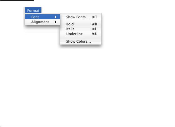
Figure 4-3 A hierarchical menu
Because submenus add complexity to the interface and are physically more difficult to use, you should use them only when you have more menus than fit in the menu bar or for closely related commands. Use only one level of submenus. If a submenu contains more than five items, consider giving it its own menu.
When you use submenus, include them in a menu with a logical relationship to the choices they contain; the submenu title should clearly represent the choices it contains. Hierarchical menus work best for providing submenus of attributes (rather than actions).
Menu Behavior
To choose an item in a menu, the user positions the pointer on the menu title and drags to the desired item. Each item is highlighted as it is selected. No action should actually happen until the user releases the mouse button. (See “Using the Mouse” (page 164).) By moving the pointer off a menu before releasing the mouse button, people can open and scan menus to find out what features are available, without having to actually perform an action. When a menu item has been activated, it blinks briefly.
It may be appropriate in some cases to provide dynamic menu items—commands that change when the user presses a modifier key. For example, if the user opens the File menu in the Finder and then presses the Option key, the Close Window command changes to Close All. The system appropriately sizes the menu to hold the widest item, including Option-enabled commands.
Menu Behavior |
49 |
Apple Computer, Inc. June 2002
C H A P T E R 4
Menus
Scrolling Menus
A scrolling menu contains more items than are visible onscreen. Your application shouldn’t have any scrolling menus; they should exist only when a user adds many items to a customizable menu.
If a menu becomes too long to fit onscreen, a downward-pointing indicator at the bottom of the menu indicates that there are more items. When the user starts to scroll, an upward-pointing indicator appears at the top of the menu to show that some items are no longer visible in that direction. When the user drags past the last visible item, the menu scrolls to show the additional items. When the last item is shown, the downward-pointing indicator disappears. This behavior happens automatically if you use the standard system menu definition procedure (MDEF).
If the user drags back up to the top, the menu scrolls back down in the same manner. The next time the menu is opened, it appears in its original state (with the indicator at the bottom), unless the menu stores a setting, in which case the menu displays the last user-selected item.
Toggled Menu Items
A toggled menu item changes between two states each time a user chooses it. There are three types of toggled menu items:
■A group of two menu items that are opposite states; for example, Grid On and Grid Off. The state currently in effect has a checkmark next to it. If you have room in your menu, it’s a good idea to display both items (rather than changing the name depending on its state) so there’s less chance of confusion about each item’s effect.
■One menu item whose name changes to reflect the current state; for example, Show Ruler and Hide Ruler. Use this type if your menu doesn’t have room to show both states.
Use two verbs that express opposite actions. Make sure the command name is completely unambiguous. For example, Turn Grid On and Turn Grid Off is unambiguous. Choosing the command Use Grid, however, could turn the grid on (it describes what happens as a result of choosing the command) or off (it describes the current state).
50Menu Behavior
Apple Computer, Inc. June 2002
C H A P T E R 4
Menus
Figure 4-4 Avoid ambiguous toggled menu items
■A menu item that has a checkmark next to it when it is in effect; for example, a style attribute such as Bold. Don’t use this kind of toggled item to indicate the presence or absence of a feature like a grid or ruler. It’s unclear whether the checkmark means that the feature is in effect or whether choosing the command turns the feature on.
Also see “Using Special Characters and Text Styles in Menus” (page 65).
Sticky Menus
Standard Aqua system menus and submenus are sticky: When a user clicks the menu title, the menu stays open without the user having to continue holding down the mouse button. The user can then move the pointer to an item to select it. In Mac OS X, once a menu is opened with a click, it remains open until another action forces it to close. Such actions include
■moving the pointer to another menu title
■a click elsewhere
■a system-initiated alert
■a system-initiated application switch or quit
Menu Behavior |
51 |
Apple Computer, Inc. June 2002