

C H A P T E R 7
Controls
Selections Containing More Than One Checkbox State
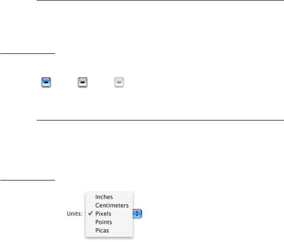
When a user selection comprises more than one state, use a dash in the appropriate checkboxes. (This symbol is consistent with the mixed-state indicator in menus, as described in “Using Symbols in Menus” (page 65).)
Figure 7-6 Dashes in checkboxes representing a selection with more than one state
Active |
Inactive |
Disabled |
Pop-Up Menus
Use pop-up menus to present a list of mutually exclusive choices in a dialog or window. Pop-up menus are used as a means of selecting one choice from a list of many. If you have a dialog with five or more radio buttons in one section, consider using a pop-up menu instead.
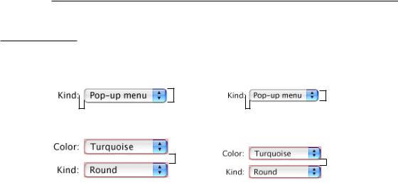
Figure 7-7 An open pop-up menu
Label |
|
|
|
The arrows indicate that |
|
|
|
||
|
|
|
|
this is a pop-up menu. |
A pop-up menu
■has a label to the left (in left-to-right scripts)
■has a drop shadow and a double-triangle indicator
■contains nouns (things) or adjectives (states or attributes), but not verbs (commands); use pull-down menus for commands
■has a checkmark beside the current value when open
124Control Behavior and Appearance
Apple Computer, Inc. June 2002
C H A P T E R 7
Controls
A pop-up menu behaves like other menus: Users drag to choose an item—which then flashes briefly and appears as the current choice—or move outside the menu to leave the current value active. An exploratory press in the menu to see what’s available doesn’t select a new value.
In special cases, you may want to include a command that affects the contents of the pop-up menu itself. For example, in the Print dialog, the Printer pop-up menu contains Edit Printer List, so users can add a printer to the menu; the new printer becomes the menu’s default selection. Put such commands at the bottom
of a pop-up menu, below a separator.
Use pop-up menus to present up to 12 mutually exclusive choices that the user doesn’t need to see all the time.
Don’t use pop-up menus
■for more than 12 items; use a scrolling list
■for 4 or fewer items; use radio buttons
■when more than one selection is appropriate, such as text styles (in which you can select bold and italic, for example); use checkboxes or a pull-down menu in which checkmarks appear
Be very cautious about creating a pop-up menu with submenus. Doing so hides choices too deeply and is physically difficult to use.
Bevel buttons and icon buttons can also be pop-up menus. See “Pop-Up Icon Buttons and Pop-Up Bevel Buttons” (page 134).
Control Behavior and Appearance |
125 |
Apple Computer, Inc. June 2002
C H A P T E R 7
Controls
Pop-Up Menu Specifications
Figure 7-8 Pop-up menu spacing
Standard pop-up menu
9 |
9 |
|
|
|
|
20
8
12
If stacking vertically, leave at least 12 pixels in between.
Small pop-up menu
7 |
7 |
|
|
|
|
17
6
8
If stacking vertically, leave at least 8 pixels in between.
■Height: 20 pixels. Small: 17 pixels.
■Width: Wide enough to accommodate the longest menu item.
■Spacing: Leave at least 12 pixels of space between stacked controls. Small: Leave at least 8 pixels of space.
■Menu item text: System font (13-point Lucida Grande Regular), 9 pixels from left edge and at least 9 pixels from the double-triangle section. Small: Small system font (11-point Lucida Grande Regular), 7 pixels from left edge and at least 7 pixels of space on the right.
■Menu label text: Emphasized system font (13-point Lucida Grande Bold), 8 pixels from text (colon) to left edge of menu. Small: Emphasized small system font (11-point Lucida Grande Bold), 6 pixels from text (colon) to left edge of menu.
126Control Behavior and Appearance
Apple Computer, Inc. June 2002