


C H A P T E R 8
Layout Guidelines
This chapter provides basic suggestions for arranging controls in dialogs and windows. These guidelines use many of the default control sizes defined in Interface Builder; any exceptions are noted. To simplify the process of resizing and repositioning existing dialogs and windows, most values are based on a multiple of 2 pixels. All user-visible text should use the standard fonts described in “Fonts” (page 197).
The Control Manager (Carbon) and Application Kit (Cocoa) include smaller versions of the most commonly used controls, for use in utility windows when necessary. For utility window layout information, see “Using Small Versions of Controls” (page 160).
Positioning Controls in Dialogs and Windows
Keep these guidelines in mind when designing dialogs and windows:
■In general, try for a more centered approach to dialog layout, as opposed to the strongly left-biased approach of the traditional Mac OS 9 dialog. Most of the sample layouts in this document illustrate the center-biased approach.
■All spacing between dialog elements involves a multiple of 2 pixels—2, 4, 6, 8, and so on.
Positioning Controls in Dialogs and Windows |
149 |
Apple Computer, Inc. June 2002 |
|
C H A P T E R 8
Layout Guidelines
■Maintain a 20-pixel space between the left and right edge of the window and any controls. Keep 20 pixels of space between the bottom edge and any controls; this can include the shadow of any push buttons in that area. Top spacing is determined by which controls are placed closest to the top of the dialog. For example, Figure 8-6 (page 156) uses a radio button as the topmost control, so the spacing is set to 14 pixels. In contrast, Figure 8-7 (page 157) uses a tab control as the topmost element, so the spacing is set to 12 pixels.
■For dialogs that contain a mix of controls, set 16 pixels of vertical space between groups of controls. Vertical spacing between controls is determined by the tallest control in the row.
■Groups of controls should be separated by 20 pixels of vertical spacing and subgroups of controls within groups should be separated by 16 pixels.
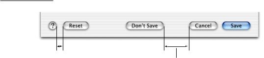
■The default button for dismissing a dialog should go in the lower-right corner. If there’s a Cancel button, it should be to the left of the default button.
If there’s a third button for dismissing the dialog, it should go to the left of the Cancel button. If the third button could result in data loss—Don’t Save, for example—position it at least 12 pixels away from the “safe” buttons (Cancel and Save, for example).
A button that affects the contents of the dialog itself, such as Reset, should have its left edge aligned with the main dialog text or 12 pixels to the right of the help button (if there is one).
Figure 8-1 Position of buttons at the bottom of a dialog
12
A button that could result in lost data should be at least 12 pixels (preferably more) away from
safe buttons.
150Positioning Controls in Dialogs and Windows
Apple Computer, Inc. June 2002
C H A P T E R 8
Layout Guidelines
■The minimum screen resolution a dialog needs to accommodate is 800 by 600. (Support for 640 by 480 is provided for games.)
■For most document windows that contain a single view (scrolling text or tables, for example), do not specify any space between the window edge and scroll bars (when using the Control Manager) or the frame of the view (in Interface Builder).
Group Boxes
A group box is used to associate a set of related items—such as radio buttons or pop-up menus—in a dialog.
As much as possible, use additional space between controls to create groups of controls, rather than group boxes. Excessive use of group boxes creates visual clutter; too many lines and edges can distract users. Also use space or separator lines, rather than secondary group boxes, for subgroupings. The following figures show examples of how to successfully re-create dialogs using space rather than group boxes. When space alone isn’t enough to clearly divide areas, use a label and a separator, as shown in the following “after” examples.
Within a group box, no control or label should be positioned within 16 pixels of the box’s top, bottom, left, or right borders.
Group boxes can be untitled or titled. Titles can be static text, a checkbox label, or text in a pop-up menu.
Group Boxes |
151 |
Apple Computer, Inc. June 2002
C H A P T E R 8
Layout Guidelines
Figure 8-2 Dialog redesigned without group boxes (first example)
Before (with group boxes)
After (example 1, with separator)
After (example 2)
In the second “after” example, the group boxes have been replaced by horizontal lines that serve as separators; the lines are 2 pixels to the right of the label and base-aligned with the label text. Although the overall look of the dialog is centered, the two labels, as well as the lines, are right-aligned; flush-left controls would imply an inappropriate hierarchy. The distance from the left edge of the pane to the label text and from the end of the line to the right edge of the pane should be equal.
152Group Boxes
Apple Computer, Inc. June 2002
C H A P T E R 8
Layout Guidelines
Figure 8-3 Dialog redesigned without group boxes (second example)
Before
After
In the “after” example, the labels are left-aligned, since they are next to checkboxes, which are most commonly stacked vertically.
Group Boxes |
153 |
Apple Computer, Inc. June 2002