


C H A P T E R 7
Controls
Text Fields and Scrolling Lists
There are various kinds of controls that incorporate text:
■A text input field, also called an editable text field, is a rectangular area in which the user enters text or modifies existing text. The text input field can be active or disabled. It supports keyboard focus and password entry.
Your application’s text input fields should perform appropriate edit checks. For example, if the only legitimate value for a field is a string of digits, the application issues an alert if the user types nondigits. In most cases, the appropriate time to check the data in the field is when the user clicks outside the field or presses the Return, Enter, or Tab key.
Combination boxes are text input fields that also contain a menu or a list of choices. See “Combination Boxes” (page 128).
■Use a static text field for informational text in a dialog (text not intended to be modified by users). Static text fields have two states: active and dimmed.
When it provides an obvious user benefit, static text should be selectable. Error message text, for example, should be selectable. Text that is likely to be copied so that it can be pasted accurately into another context (such as a serial number or a host name) is another example.
■A scrolling list can contain as many items as necessary. Users can scroll through the list without selecting anything, or can click an item to select it, use Shift-click to select more than one continuous item, or use Command-click for a discontinuous selection. Users can press the arrow keys to navigate through the list and can quickly select an item by typing the first few characters.
If an item is too long to fit in the list box, insert ellipses in the middle and preserve the beginning and end of the item. Users often add version numbers to the end of document names, so both the beginning and end should be visible.
Don’t use scrolling lists to provide choices in a limited range. Because the full range may not be visible all at once, it can be difficult for users to understand the scope of their choices. Use sliders, discussed in “Slider Controls” (page 137), instead.
Tools for Creating Lists
Functions, data types, and constants for creating and managing the new data browser control have been added to the Control Manager. The data browser
144Control Behavior and Appearance
Apple Computer, Inc. June 2002
C H A P T E R 7
Controls
(available to Carbon applications) provides a convenient way to create easily customized lists and consistent sortable, movable, and resizable columns. If your application uses the data browser functions to display lists, they will always look right in Mac OS 9 and Mac OS X.
The data browser control has two versions: list view and column view. Finder windows have examples of both, selectable with the View control (in the upper-left area of the toolbar). The middle button is the list-view button; the button on the right is the column-view button.
Similar functionality is available to Cocoa developers through three classes of interface objects:
■NSOutlineView. You can see an example in the Mailboxes drawer of the Mail application, which can show a list hierarchy with disclosure triangles.
■NSTableView. You can see an example in the list of contents of a mailbox in the Mail application. It is multicolumn and row-based.
■NSBrowser. You can see an example in the Open dialog of a Cocoa-based application. This class provides the same sort of hierarchical data as NSOutlineView in column format.
For more information, see the data browser control technical note, available at http://developer.apple.com/technotes/tn/tn2009.html.
Text Input Field Specifications
Figure 7-30 |
Text input field specifications |
|||||
|
|
|
|
3-pixel shadow inside box |
||
22 |
|
|
|
|
|
Normal state with text |
|
|
|
|
|
||
|
|
|
|
|
||
|
|
|
|
|
and insertion point |
|
|
|
|
|
|
|
|
|
|
|
|
|
|
With focus |
|
|
|
|
|
|
With selection |
Control Behavior and Appearance |
145 |
Apple Computer, Inc. June 2002
C H A P T E R 7
Controls
Figure 7-31 Small text input field specifications
2-pixel shadow inside box
19 |
|
|
|
Normal state with text |
|
|
|
||
|
|
|
||
|
|
|
and insertion point |
|
|
|
|
|
|
|
|
|
|
|
|
|
|
|
With focus |
|
|
|
|
With selection |
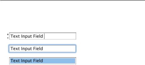
■Height: 22 pixels (to accommodate the system font, which is 16 pixels high without line spacing). If you specify the small system font, the text input field dimensions are reduced proportionally. To accommodate the small system font, the text field height is 19 pixels.
■Selection rectangle: 16 pixels high. Small: 13 pixels.
■Spacing: Leave a minimum of 10 pixels between stacked text input fields (8 pixels between stacked small text input fields).
■Text: System font (13-point Lucida Grande Regular). Small: Small system font (11-point Lucida Grande Regular).
For more information about highlighting selections in text fields, see “Keyboard Focus and Navigation” (page 182) and “Selections in Text” (page 189).
Scrolling List Specifications
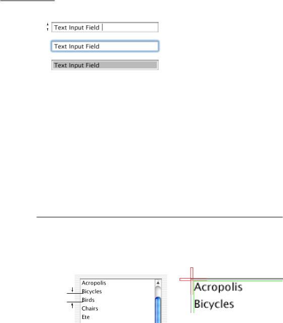
Figure 7-32 |
Scrolling list dimensions |
|
||
|
|
12-point |
|
|
|
|
font |
3 |
|
|
|
|
|
3 |
|
|
|
|
|
|
|
|
|
|
19 points baseline to baseline
146Control Behavior and Appearance
Apple Computer, Inc. June 2002