

C H A P T E R 7
Controls
Control Behavior and Appearance
Note: The Control Manager (Carbon) and Application Kit (Cocoa) include smaller versions of the most commonly used controls, for use in utility windows when necessary. The specifications listed here are for the standard size controls. If a small version of a control is available, it’s shown (with its dimensions) after the standard-size version. For more information, see “Using Small Versions of Controls” (page 160).
Push Buttons
A push button is a rounded rectangle with a text label on it. Clicking a push button performs an instantaneous action, such as saving a document, completing operations defined by a dialog, or acknowledging an error message. If a button initiates an indeterminate process, the button should be dimmed until the process is complete, or status feedback should be provided.
Button names should be verbs that describe the action performed—Save, Close, Print, Delete, and so on. If a button acts on a single setting, label the button as specifically as possible; “Choose Picture…,” for example, is more helpful than “Choose…” Because most buttons initiate an immediate action, it shouldn’t be necessary to use “now” (“Scan Now,” for example) in the label. Don’t use push buttons to indicate a state such as On or Off.
In some circumstances, it’s appropriate to implement an Apply button—for example, to permit a user to see the effect of multiple text attributes before committing to them. In cases like these, clicking Cancel should undo any of the applied changes. Be cautious about using an Apply button for operations that take a long time to implement or undo; it might not be obvious to users that they can interrupt or reverse the process.
All push buttons should be clear except the default button—the button selected by pressing the Return key—which should use the default color (in addition to pulsing). For example, in a dialog containing a default OK button and a Cancel button, the Cancel button is clear and the OK button uses color and pulses. When
120Control Behavior and Appearance
Apple Computer, Inc. June 2002
C H A P T E R 7
Controls
the user presses a nondefault button such as Cancel, the button acquires color and the default button loses its color. If you use standard controls, this behavior is automatic.
For information about proper capitalization of button labels, see “Capitalization of Interface Elements” (page 231). For information about when it is appropriate to use ellipses in buttons, see “Using Ellipses in Menus and Buttons” (page 67).
Push Button Specifications
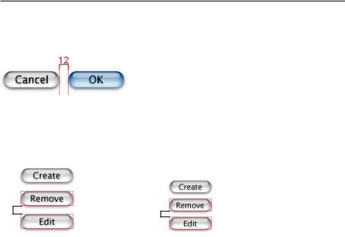
Figure 7-1 |
|
Example of standard push buttons |
||||||
|
|
|
|
|
|
|
|
|
|
|
|
12 |
|
|
|
|
|
|
|
|
|
|
|
|||
|
|
|
|
|
|
|
||
69 |
69 |
|
|
|||||
Figure 7-2 |
|
Stacked push buttons |
|
|||||
|
|
|
|
|
|
|
|
|
|
Standard push button |
Small push button |
||||||
12 |
8 |
|
If stacking vertically, leave |
If stacking vertically, leave |
a minimum of 12 pixels |
a minimum of 8 pixels |
in between. |
in between. |
Control Behavior and Appearance |
121 |
Apple Computer, Inc. June 2002