- •Contents
- •Figures and Tables
- •Introduction to the Aqua Human Interface Guidelines
- •The Benefits of Applying the Interface Guidelines
- •Deciding What to Do First
- •Tools and Resources for Applying the Guidelines
- •If You Have a Need Not Covered by the Guidelines
- •Human Interface Design
- •Human Interface Design Principles
- •Metaphors
- •See-and-Point
- •Direct Manipulation
- •User Control
- •Feedback and Communication
- •Consistency
- •WYSIWYG (What You See Is What You Get)
- •Forgiveness
- •Perceived Stability
- •Aesthetic Integrity
- •Modelessness
- •Knowledge of Your Audience
- •Worldwide Compatibility
- •Cultural Values
- •Language Differences
- •Default Alignment of Interface Elements
- •Resources
- •Universal Accessibility
- •Visual Disabilities
- •Hearing Disabilities
- •Physical Disabilities
- •The Dock
- •The Dock’s Onscreen Position
- •Dock Notification Behavior
- •Dock Menus
- •Clicking in the Dock
- •Menus
- •Menu Elements
- •Menu Titles
- •Menu Items
- •Grouping Items in Menus
- •Hierarchical Menus (Submenus)
- •Menu Behavior
- •Scrolling Menus
- •Toggled Menu Items
- •Sticky Menus
- •Standard Pull-Down Menus (The Menu Bar)
- •The Apple Menu
- •The Application Menu
- •The Application Menu Title
- •The Application Menu Contents
- •The File Menu
- •The Edit Menu
- •The View Menu
- •The Window Menu
- •The Help Menu
- •Menu Bar Status Items
- •Other Menus
- •Contextual Menus
- •Using Special Characters and Text Styles in Menus
- •Using Symbols in Menus
- •Using Text Styles and Fonts in Menus
- •Using Ellipses in Menus and Buttons
- •Windows
- •Window Layering
- •Window Appearance and Behavior
- •Textured Windows
- •Opening and Naming Windows
- •Positioning Windows
- •Closing Windows
- •Moving Windows
- •Resizing and Zooming Windows
- •Active and Inactive Windows
- •Click-Through
- •Scroll Bars and Scrolling Windows
- •Automatic Scrolling
- •Minimizing and Expanding Windows
- •Windows With Changeable Panes
- •Special Windows
- •Drawers
- •When to Use Drawers
- •Drawer Behavior
- •Utility Windows
- •The About Window
- •Dialogs
- •Types of Dialogs and When to Use Them
- •Document-Modal Dialogs (Sheets)
- •Sheet Behavior
- •When to Use Sheets
- •When Not to Use Sheets
- •Alerts
- •Dialog Behavior
- •Accepting Changes
- •The Open Dialog
- •Saving, Closing, and Quitting Behavior
- •Save Dialogs
- •Closing a Document With Unsaved Changes
- •Saving Documents During a Quit Operation
- •Saving a Document With the Same Name as an Existing Document
- •The Choose Dialog
- •The Printing Dialogs
- •Controls
- •Control Behavior and Appearance
- •Push Buttons
- •Push Button Specifications
- •Radio Buttons and Checkboxes
- •Radio Button and Checkbox Specifications
- •Selections Containing More Than One Checkbox State
- •Pop-Up Menus
- •Pop-Up Menu Specifications
- •Command Pop-Down Menus
- •Command Pop-Down Menu Specifications
- •Combination Boxes
- •Combo Box Specifications
- •The Text Entry Field
- •The Scrolling List
- •Placards
- •Bevel Buttons
- •Bevel Button Specifications
- •Toolbars
- •Pop-Up Icon Buttons and Pop-Up Bevel Buttons
- •Slider Controls
- •Slider Control Specifications
- •Tab Controls
- •Tab Control Specifications
- •Progress Indicators
- •Text Fields and Scrolling Lists
- •Tools for Creating Lists
- •Text Input Field Specifications
- •Scrolling List Specifications
- •Image Wells
- •Disclosure Triangles
- •Layout Guidelines
- •Group Boxes
- •Sample Dialog Layouts
- •Using Small Versions of Controls
- •User Input
- •The Mouse and Other Pointing Devices
- •Using the Mouse
- •Clicking
- •Double-Clicking
- •Pressing
- •Dragging
- •The Keyboard
- •The Functions of Specific Keys
- •Character Keys
- •Modifier Keys
- •Arrow Keys
- •Function Keys
- •Key Combinations Reserved by the System
- •Recommended Keyboard Equivalents
- •Creating Your Own Keyboard Equivalents
- •Keyboard Focus and Navigation
- •Full Keyboard Access Mode
- •Type-Ahead and Auto-Repeat
- •Selecting
- •Selection Methods
- •Selection by Clicking
- •Selection by Dragging
- •Changing a Selection With Shift-Click
- •Changing a Selection With Command-Click
- •Selections in Text
- •Selecting With the Mouse
- •What Constitutes a Word
- •Selecting Text With the Arrow Keys
- •Selections in Graphics
- •Selections in Arrays and Tables
- •Editing Text
- •Inserting Text
- •Deleting Text
- •Replacing a Selection
- •Intelligent Cut and Paste
- •Editing Text Fields
- •Entering Passwords
- •Fonts
- •Icons
- •Icon Genres and Families
- •Application Icons
- •User Application Icons
- •Viewer, Player, and Accessory Icons
- •Utility Icons
- •Non-Application Icons
- •Document Icons
- •Icons for Preferences and Plug-ins
- •Icons for Hardware and Removable Media
- •Toolbar Icons
- •Icon Perspectives and Materials
- •Conveying an Emotional Quality in Icons
- •Suggested Process for Creating Aqua Icons
- •Tips for Designing Aqua Icons
- •Drag and Drop
- •Drag and Drop Design Overview
- •Drag and Drop Semantics
- •Move Versus Copy
- •When to Check the Option Key State
- •Selection Feedback
- •Single-Gesture Selection and Dragging
- •Background Selections
- •Drag Feedback
- •Destination Feedback
- •Windows
- •Text
- •Multiple Dragged Items
- •Automatic Scrolling
- •Using the Trash as a Destination
- •Drop Feedback
- •Finder Icons
- •Graphics
- •Text
- •Transferring a Selection
- •Feedback for an Invalid Drop
- •Clippings
- •Language
- •Style
- •Terminology
- •Developer Terms and User Terms
- •Labels for Interface Elements
- •Capitalization of Interface Elements
- •Using Contractions in the Interface
- •Writing Good Alert Messages
- •User Help and Assistants
- •Apple’s Philosophy of Help
- •Help Viewer
- •Providing Access to Help
- •Help Tags
- •Help Tag Guidelines
- •Setup Assistants
- •Files
- •Installing Files
- •Where to Put Files
- •Handling Plug-ins
- •Naming Files and Showing Filename Extensions
- •Displaying Pathnames
- •Speech Recognition and Synthesis
- •Speech Recognition
- •Speakable Items
- •The Speech Recognition Interface
- •Speech-Recognition Errors
- •Guidelines for Implementing Speech Recognition
- •Speech Synthesis
- •Guidelines for Implementing Speech Synthesis
- •Spoken Dialogues and Delegation
- •General Considerations
- •Installation and File Location
- •Graphic Design
- •Menus
- •Pop-Up Menus
- •Windows
- •Utility Windows
- •Scrolling
- •Dialogs
- •Feedback and Alerts
- •The Mouse
- •Keyboard Equivalents
- •Text
- •Icons
- •User Documentation
- •Help Tags
- •Document Revision History
- •Glossary
- •Index
C H A P T E R 1 1
Icons
Toolbar Icons
The concept behind toolbars is that they provide access to items as if they were sitting on a shelf in front of you. Toolbars should conserve screen real estate while still being inviting and easily clickable; 32 pixels by 32 pixels is the recommended size for toolbar icons.
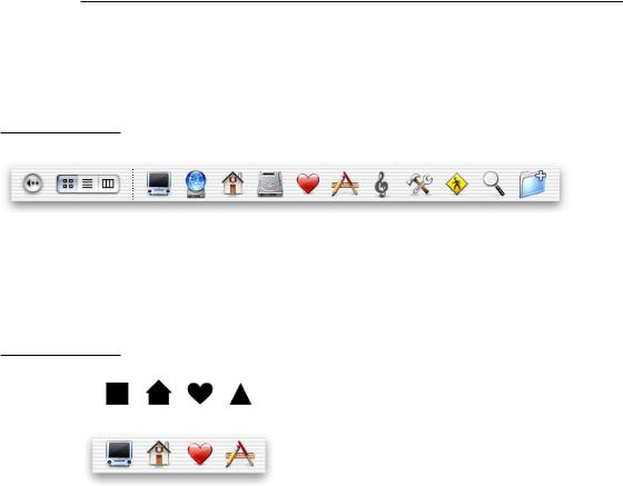
Figure 11-16 Finder toolbar icons
Each toolbar icon should be easily and quickly distinguishable from the other items in the toolbar. Toolbar icons emphasize their outline form. As shown in Figure 11-17, each Finder toolbar icon’s shape is unique.
Figure 11-17 Toolbar icons and their dominant shapes
Note that although each Finder toolbar icon has a unique shape, the icons harmonize together in their perspective, use of color, size, and visual weight.
Although icons designed specifically for use in a toolbar appear as if they are sitting on a shelf in front of you, if you place a very recognizable object from elsewhere in the interface in a toolbar, the object should retain its perspective. That is, don’t redesign a toolbar version of a well-known interface element.
Icon Genres and Families |
211 |
Apple Computer, Inc. June 2002
C H A P T E R 1 1
Icons
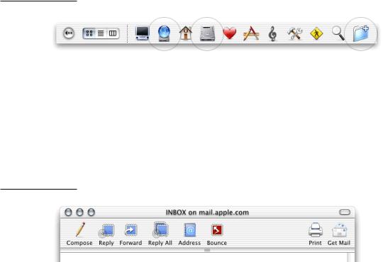
Figure 11-18 The circled icons appear elsewhere in the interface; they retain their perspective when used in a toolbar
For toolbars in applications, you can start with a consistent “look” when it makes sense, and introduce differences when necessary. In the Mail application toolbar, for example, the Reply, Reply All, Forward, and Bounce buttons—all for actions the user can apply to a selected received message—use a stamp as the dominant symbol. Because the Bounce button is potentially destructive (the user can no longer read the bounced message), its icon is red. The pencil is depicted in recognizable and realistic yellow.
Figure 11-19 The Mail toolbar
Creating a family of toolbar icons helps make an application recognizable and unique. Mail, for example, uses blue and white as dominant colors in its toolbar icons.
Also see “Toolbars” (page 133).
212Icon Genres and Families
Apple Computer, Inc. June 2002