

C H A P T E R 1 1
Icons
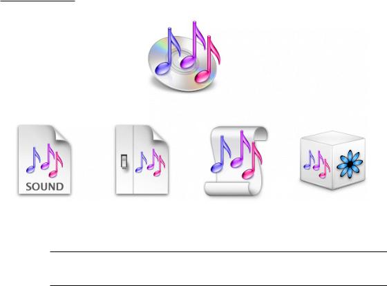
Figure 11-4 An icon family: The iTunes application icon and its associated icons
iTunes application icon
Document icon |
Preferences icon |
Playlist icon |
Plug-in icon |
Application Icons
User Application Icons
Mac OS X user application icons should be vibrant and inviting, and should immediately convey the application’s purpose. The TextEdit icon, for example, indicates clearly that you would use this application to create text documents.
204Icon Genres and Families
Apple Computer, Inc. June 2002

C H A P T E R 1 1
Icons
Figure 11-5 The TextEdit application icon makes it obvious what this application is for
If the primary function of your application is creating or handling media, its icon should display the media the application creates or views. If appropriate, the icon should also contain a tool that communicates the type of task the application allows the user to accomplish. The Preview icon, for example, uses a magnification tool to help convey that the application can be used to view pictures. If you include a supportive tool element, it should closely relate to the base object that it rests upon.
Figure 11-6 The Preview application icon: An example of a tool element
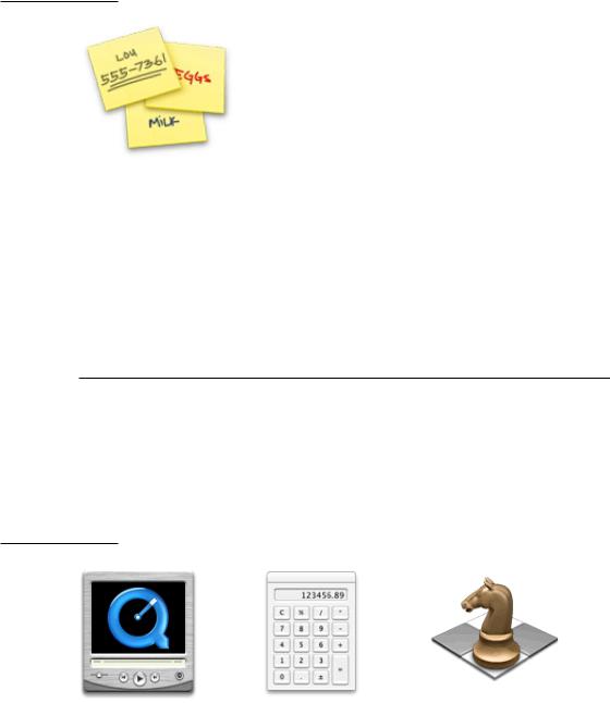
In the Stickies application icon, however, the yellow rectangles are easily identifiable as sticky notes; the icon doesn’t include a tool because it isn’t necessary to tell the icon’s story.
Icon Genres and Families |
205 |
Apple Computer, Inc. June 2002
C H A P T E R 1 1
Icons
Figure 11-7 The Stickies application icon: Effective without the addition of a tool
Notice that the text in the Stickies icon is actual text, not simply wavy lines representing text. If you want to “greek” text in an Aqua icon, use actual text and make it unreadable by shrinking it or doubling the layers.
Generally, Mac OS X user application icons are designed to appear as if they’re sitting on a desk in front of you. They have a slightly diminishing perspective (they are wider at the bottom). For more information, see “Icon Perspectives and Materials” (page 213).
Viewer, Player, and Accessory Icons
Some applications that represent objects, such as QuickTime Player and Calculator, are most easily recognized by the objects themselves. When creating icons for such applications, it’s more aesthetically pleasing to create a simplified, idealized representation of the object, rather than using an actual screen shot of the software. Re-creating the object is particularly important when users could confuse the icon with the actual interface.
Figure 11-8 The icons for QuickTime Player, Calculator, and Chess
206Icon Genres and Families
Apple Computer, Inc. June 2002