- •Contents
- •Figures and Tables
- •Introduction to the Aqua Human Interface Guidelines
- •The Benefits of Applying the Interface Guidelines
- •Deciding What to Do First
- •Tools and Resources for Applying the Guidelines
- •If You Have a Need Not Covered by the Guidelines
- •Human Interface Design
- •Human Interface Design Principles
- •Metaphors
- •See-and-Point
- •Direct Manipulation
- •User Control
- •Feedback and Communication
- •Consistency
- •WYSIWYG (What You See Is What You Get)
- •Forgiveness
- •Perceived Stability
- •Aesthetic Integrity
- •Modelessness
- •Knowledge of Your Audience
- •Worldwide Compatibility
- •Cultural Values
- •Language Differences
- •Default Alignment of Interface Elements
- •Resources
- •Universal Accessibility
- •Visual Disabilities
- •Hearing Disabilities
- •Physical Disabilities
- •The Dock
- •The Dock’s Onscreen Position
- •Dock Notification Behavior
- •Dock Menus
- •Clicking in the Dock
- •Menus
- •Menu Elements
- •Menu Titles
- •Menu Items
- •Grouping Items in Menus
- •Hierarchical Menus (Submenus)
- •Menu Behavior
- •Scrolling Menus
- •Toggled Menu Items
- •Sticky Menus
- •Standard Pull-Down Menus (The Menu Bar)
- •The Apple Menu
- •The Application Menu
- •The Application Menu Title
- •The Application Menu Contents
- •The File Menu
- •The Edit Menu
- •The View Menu
- •The Window Menu
- •The Help Menu
- •Menu Bar Status Items
- •Other Menus
- •Contextual Menus
- •Using Special Characters and Text Styles in Menus
- •Using Symbols in Menus
- •Using Text Styles and Fonts in Menus
- •Using Ellipses in Menus and Buttons
- •Windows
- •Window Layering
- •Window Appearance and Behavior
- •Textured Windows
- •Opening and Naming Windows
- •Positioning Windows
- •Closing Windows
- •Moving Windows
- •Resizing and Zooming Windows
- •Active and Inactive Windows
- •Click-Through
- •Scroll Bars and Scrolling Windows
- •Automatic Scrolling
- •Minimizing and Expanding Windows
- •Windows With Changeable Panes
- •Special Windows
- •Drawers
- •When to Use Drawers
- •Drawer Behavior
- •Utility Windows
- •The About Window
- •Dialogs
- •Types of Dialogs and When to Use Them
- •Document-Modal Dialogs (Sheets)
- •Sheet Behavior
- •When to Use Sheets
- •When Not to Use Sheets
- •Alerts
- •Dialog Behavior
- •Accepting Changes
- •The Open Dialog
- •Saving, Closing, and Quitting Behavior
- •Save Dialogs
- •Closing a Document With Unsaved Changes
- •Saving Documents During a Quit Operation
- •Saving a Document With the Same Name as an Existing Document
- •The Choose Dialog
- •The Printing Dialogs
- •Controls
- •Control Behavior and Appearance
- •Push Buttons
- •Push Button Specifications
- •Radio Buttons and Checkboxes
- •Radio Button and Checkbox Specifications
- •Selections Containing More Than One Checkbox State
- •Pop-Up Menus
- •Pop-Up Menu Specifications
- •Command Pop-Down Menus
- •Command Pop-Down Menu Specifications
- •Combination Boxes
- •Combo Box Specifications
- •The Text Entry Field
- •The Scrolling List
- •Placards
- •Bevel Buttons
- •Bevel Button Specifications
- •Toolbars
- •Pop-Up Icon Buttons and Pop-Up Bevel Buttons
- •Slider Controls
- •Slider Control Specifications
- •Tab Controls
- •Tab Control Specifications
- •Progress Indicators
- •Text Fields and Scrolling Lists
- •Tools for Creating Lists
- •Text Input Field Specifications
- •Scrolling List Specifications
- •Image Wells
- •Disclosure Triangles
- •Layout Guidelines
- •Group Boxes
- •Sample Dialog Layouts
- •Using Small Versions of Controls
- •User Input
- •The Mouse and Other Pointing Devices
- •Using the Mouse
- •Clicking
- •Double-Clicking
- •Pressing
- •Dragging
- •The Keyboard
- •The Functions of Specific Keys
- •Character Keys
- •Modifier Keys
- •Arrow Keys
- •Function Keys
- •Key Combinations Reserved by the System
- •Recommended Keyboard Equivalents
- •Creating Your Own Keyboard Equivalents
- •Keyboard Focus and Navigation
- •Full Keyboard Access Mode
- •Type-Ahead and Auto-Repeat
- •Selecting
- •Selection Methods
- •Selection by Clicking
- •Selection by Dragging
- •Changing a Selection With Shift-Click
- •Changing a Selection With Command-Click
- •Selections in Text
- •Selecting With the Mouse
- •What Constitutes a Word
- •Selecting Text With the Arrow Keys
- •Selections in Graphics
- •Selections in Arrays and Tables
- •Editing Text
- •Inserting Text
- •Deleting Text
- •Replacing a Selection
- •Intelligent Cut and Paste
- •Editing Text Fields
- •Entering Passwords
- •Fonts
- •Icons
- •Icon Genres and Families
- •Application Icons
- •User Application Icons
- •Viewer, Player, and Accessory Icons
- •Utility Icons
- •Non-Application Icons
- •Document Icons
- •Icons for Preferences and Plug-ins
- •Icons for Hardware and Removable Media
- •Toolbar Icons
- •Icon Perspectives and Materials
- •Conveying an Emotional Quality in Icons
- •Suggested Process for Creating Aqua Icons
- •Tips for Designing Aqua Icons
- •Drag and Drop
- •Drag and Drop Design Overview
- •Drag and Drop Semantics
- •Move Versus Copy
- •When to Check the Option Key State
- •Selection Feedback
- •Single-Gesture Selection and Dragging
- •Background Selections
- •Drag Feedback
- •Destination Feedback
- •Windows
- •Text
- •Multiple Dragged Items
- •Automatic Scrolling
- •Using the Trash as a Destination
- •Drop Feedback
- •Finder Icons
- •Graphics
- •Text
- •Transferring a Selection
- •Feedback for an Invalid Drop
- •Clippings
- •Language
- •Style
- •Terminology
- •Developer Terms and User Terms
- •Labels for Interface Elements
- •Capitalization of Interface Elements
- •Using Contractions in the Interface
- •Writing Good Alert Messages
- •User Help and Assistants
- •Apple’s Philosophy of Help
- •Help Viewer
- •Providing Access to Help
- •Help Tags
- •Help Tag Guidelines
- •Setup Assistants
- •Files
- •Installing Files
- •Where to Put Files
- •Handling Plug-ins
- •Naming Files and Showing Filename Extensions
- •Displaying Pathnames
- •Speech Recognition and Synthesis
- •Speech Recognition
- •Speakable Items
- •The Speech Recognition Interface
- •Speech-Recognition Errors
- •Guidelines for Implementing Speech Recognition
- •Speech Synthesis
- •Guidelines for Implementing Speech Synthesis
- •Spoken Dialogues and Delegation
- •General Considerations
- •Installation and File Location
- •Graphic Design
- •Menus
- •Pop-Up Menus
- •Windows
- •Utility Windows
- •Scrolling
- •Dialogs
- •Feedback and Alerts
- •The Mouse
- •Keyboard Equivalents
- •Text
- •Icons
- •User Documentation
- •Help Tags
- •Document Revision History
- •Glossary
- •Index
C H A P T E R 1 1
Icons
Icon Perspectives and Materials
The angles and shadows used for depicting various kinds of icons are intended to reflect how the objects would appear in reality. All Aqua interface elements have a common light source from directly above, not from the upper-left corner as in Mac OS 9 and earlier. The various perspectives are achieved by changing the position of the camera capturing the icon.
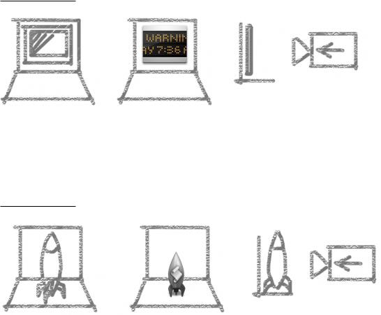
Application icons look like they are sitting on a desk in front of you.
Figure 11-20 Perspective for application icons: Sitting on a desk in front of you
Utility icons are depicted as if they are on a shelf in front of you. Flat objects appear as if there is a wall behind them with an appropriate shadow behind the object.
Icon Perspectives and Materials |
213 |
Apple Computer, Inc. June 2002
C H A P T E R 1 1
Icons
Figure 11-21 Perspective for flat utility icons: On a shelf in front of you, with a shadow on the wall behind
An actual three-dimensional object such as a rocket, however, would more realistically be viewed sitting on the ground; its icon shows the rocket sitting on a shelf, with its shadow below it.
Figure 11-22 Perspective for three-dimensional object: Sitting on a shelf in front of you, with the shadow below the object
For toolbar icons, the perspective is also straight-on, as if the object is on a shelf in front of you.
214Icon Perspectives and Materials
Apple Computer, Inc. June 2002
C H A P T E R 1 1
Icons
Figure 11-23 Perspective for toolbar icons: Straight-on, with subtle shadow on the “floor”
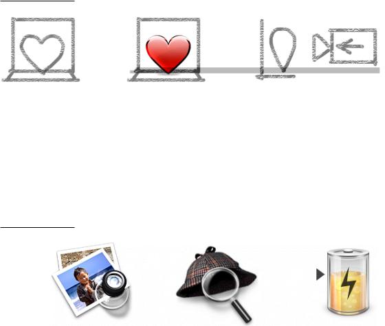
Icons that represent actual objects should look as though they are made of real materials. Examine various objects to study the characteristics of plastic, glass, paper, and metal. Your icon will look more realistic if you successfully convey the item’s weight and feel, as well as its appearance.
Use transparency only when it is convincing and when it helps complete the story the icon is telling. You would never see a transparent sneaker, for example, so don’t use one in your icon.
Figure 11-24 Materials: Transparency used to convey meaning
Icon Perspectives and Materials |
|
215 |
Apple Computer, Inc. June 2002
C H A P T E R 1 1
Icons
Conveying an Emotional Quality in Icons
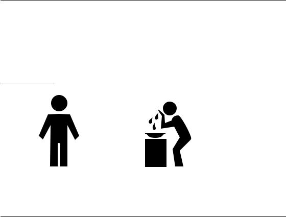
Figure 11-25 illustrates the difference between communicating a message in a straightforward way compared with presenting the same message with an emotive quality. In an appropriate context, we would recognize the figure on the left as the symbol for men’s bathroom. The figure on the right, however, tells a story even when it is viewed outside of its context.
Figure 11-25 Being emotive: The same message conveyed two ways
Suggested Process for Creating Aqua Icons
You need to provide at least the following files:
■a 128 by 128 image (for Finder icons)
■a mask that defines the image’s edges, so the operating system can determine which regions are clickable
216Conveying an Emotional Quality in Icons
Apple Computer, Inc. June 2002
C H A P T E R 1 1
Icons
Icons that display in the Finder are viewed at different sizes: they can be magnified in the Dock, they can be previewed at full size, and users can specify a preferred size. For the best-looking icons at all sizes, you should also provide customized image files (“hints”) at three other sizes: 64 x 64, 32 x 32, and 16 x 16. Although the Dock doesn’t use hints (it uses a sophisticated algorithm on the 128 x 128 version), hints are important for preserving crucial details in Finder icons.
If you are creating an icon that will never change size—on a bevel button, for example—you can supply the image only at actual size.
Here are the suggested steps for creating an icon:
1.Sketch the icon.
Work out the concept and details of your design on paper, not with software. You should be ready to execute the idea by the time you open an application.
2.Create a software illustration of the icon.
Although you may want the final icon to look like a photograph, in most cases it’s inadvisable to start with an actual photograph. An illustration provides much more flexibility for conveying a concept in a very small space. An illustration also gives you necessary control over details, perspective, light and shadow, texture, and so on.
3.Add detail and color.
For each enhancement you make to a larger-version icon, consider whether it is truly adding something to the icon’s usability, or whether it is just adding complexity or clutter.
4.Add shadows.
Shadows give objects dimensionality and realism. They also help tie the elements of an icon together so it doesn’t look like a collage. The light source should be above and slightly in front of the object. The resulting shadow should create the sense that the icon is resting on a surface.
5.In an image-editing program, manipulate the image to get precise effects and create the icon mask.
6.Convert the icon to a .icns file.
You can complete this step with Icon Composer, included on the Mac OS X Developer Tools CD. There are also several third-party tools available for completing this step.
Suggested Process for Creating Aqua Icons |
217 |
Apple Computer, Inc. June 2002