

- •brief contents
- •contents
- •preface
- •acknowledgments
- •about this book
- •What’s new in the second edition
- •Who should read this book
- •Roadmap
- •Advice for data miners
- •Code examples
- •Code conventions
- •Author Online
- •About the author
- •about the cover illustration
- •1 Introduction to R
- •1.2 Obtaining and installing R
- •1.3 Working with R
- •1.3.1 Getting started
- •1.3.2 Getting help
- •1.3.3 The workspace
- •1.3.4 Input and output
- •1.4 Packages
- •1.4.1 What are packages?
- •1.4.2 Installing a package
- •1.4.3 Loading a package
- •1.4.4 Learning about a package
- •1.5 Batch processing
- •1.6 Using output as input: reusing results
- •1.7 Working with large datasets
- •1.8 Working through an example
- •1.9 Summary
- •2 Creating a dataset
- •2.1 Understanding datasets
- •2.2 Data structures
- •2.2.1 Vectors
- •2.2.2 Matrices
- •2.2.3 Arrays
- •2.2.4 Data frames
- •2.2.5 Factors
- •2.2.6 Lists
- •2.3 Data input
- •2.3.1 Entering data from the keyboard
- •2.3.2 Importing data from a delimited text file
- •2.3.3 Importing data from Excel
- •2.3.4 Importing data from XML
- •2.3.5 Importing data from the web
- •2.3.6 Importing data from SPSS
- •2.3.7 Importing data from SAS
- •2.3.8 Importing data from Stata
- •2.3.9 Importing data from NetCDF
- •2.3.10 Importing data from HDF5
- •2.3.11 Accessing database management systems (DBMSs)
- •2.3.12 Importing data via Stat/Transfer
- •2.4 Annotating datasets
- •2.4.1 Variable labels
- •2.4.2 Value labels
- •2.5 Useful functions for working with data objects
- •2.6 Summary
- •3 Getting started with graphs
- •3.1 Working with graphs
- •3.2 A simple example
- •3.3 Graphical parameters
- •3.3.1 Symbols and lines
- •3.3.2 Colors
- •3.3.3 Text characteristics
- •3.3.4 Graph and margin dimensions
- •3.4 Adding text, customized axes, and legends
- •3.4.1 Titles
- •3.4.2 Axes
- •3.4.3 Reference lines
- •3.4.4 Legend
- •3.4.5 Text annotations
- •3.4.6 Math annotations
- •3.5 Combining graphs
- •3.5.1 Creating a figure arrangement with fine control
- •3.6 Summary
- •4 Basic data management
- •4.1 A working example
- •4.2 Creating new variables
- •4.3 Recoding variables
- •4.4 Renaming variables
- •4.5 Missing values
- •4.5.1 Recoding values to missing
- •4.5.2 Excluding missing values from analyses
- •4.6 Date values
- •4.6.1 Converting dates to character variables
- •4.6.2 Going further
- •4.7 Type conversions
- •4.8 Sorting data
- •4.9 Merging datasets
- •4.9.1 Adding columns to a data frame
- •4.9.2 Adding rows to a data frame
- •4.10 Subsetting datasets
- •4.10.1 Selecting (keeping) variables
- •4.10.2 Excluding (dropping) variables
- •4.10.3 Selecting observations
- •4.10.4 The subset() function
- •4.10.5 Random samples
- •4.11 Using SQL statements to manipulate data frames
- •4.12 Summary
- •5 Advanced data management
- •5.2 Numerical and character functions
- •5.2.1 Mathematical functions
- •5.2.2 Statistical functions
- •5.2.3 Probability functions
- •5.2.4 Character functions
- •5.2.5 Other useful functions
- •5.2.6 Applying functions to matrices and data frames
- •5.3 A solution for the data-management challenge
- •5.4 Control flow
- •5.4.1 Repetition and looping
- •5.4.2 Conditional execution
- •5.5 User-written functions
- •5.6 Aggregation and reshaping
- •5.6.1 Transpose
- •5.6.2 Aggregating data
- •5.6.3 The reshape2 package
- •5.7 Summary
- •6 Basic graphs
- •6.1 Bar plots
- •6.1.1 Simple bar plots
- •6.1.2 Stacked and grouped bar plots
- •6.1.3 Mean bar plots
- •6.1.4 Tweaking bar plots
- •6.1.5 Spinograms
- •6.2 Pie charts
- •6.3 Histograms
- •6.4 Kernel density plots
- •6.5 Box plots
- •6.5.1 Using parallel box plots to compare groups
- •6.5.2 Violin plots
- •6.6 Dot plots
- •6.7 Summary
- •7 Basic statistics
- •7.1 Descriptive statistics
- •7.1.1 A menagerie of methods
- •7.1.2 Even more methods
- •7.1.3 Descriptive statistics by group
- •7.1.4 Additional methods by group
- •7.1.5 Visualizing results
- •7.2 Frequency and contingency tables
- •7.2.1 Generating frequency tables
- •7.2.2 Tests of independence
- •7.2.3 Measures of association
- •7.2.4 Visualizing results
- •7.3 Correlations
- •7.3.1 Types of correlations
- •7.3.2 Testing correlations for significance
- •7.3.3 Visualizing correlations
- •7.4 T-tests
- •7.4.3 When there are more than two groups
- •7.5 Nonparametric tests of group differences
- •7.5.1 Comparing two groups
- •7.5.2 Comparing more than two groups
- •7.6 Visualizing group differences
- •7.7 Summary
- •8 Regression
- •8.1 The many faces of regression
- •8.1.1 Scenarios for using OLS regression
- •8.1.2 What you need to know
- •8.2 OLS regression
- •8.2.1 Fitting regression models with lm()
- •8.2.2 Simple linear regression
- •8.2.3 Polynomial regression
- •8.2.4 Multiple linear regression
- •8.2.5 Multiple linear regression with interactions
- •8.3 Regression diagnostics
- •8.3.1 A typical approach
- •8.3.2 An enhanced approach
- •8.3.3 Global validation of linear model assumption
- •8.3.4 Multicollinearity
- •8.4 Unusual observations
- •8.4.1 Outliers
- •8.4.3 Influential observations
- •8.5 Corrective measures
- •8.5.1 Deleting observations
- •8.5.2 Transforming variables
- •8.5.3 Adding or deleting variables
- •8.5.4 Trying a different approach
- •8.6 Selecting the “best” regression model
- •8.6.1 Comparing models
- •8.6.2 Variable selection
- •8.7 Taking the analysis further
- •8.7.1 Cross-validation
- •8.7.2 Relative importance
- •8.8 Summary
- •9 Analysis of variance
- •9.1 A crash course on terminology
- •9.2 Fitting ANOVA models
- •9.2.1 The aov() function
- •9.2.2 The order of formula terms
- •9.3.1 Multiple comparisons
- •9.3.2 Assessing test assumptions
- •9.4 One-way ANCOVA
- •9.4.1 Assessing test assumptions
- •9.4.2 Visualizing the results
- •9.6 Repeated measures ANOVA
- •9.7 Multivariate analysis of variance (MANOVA)
- •9.7.1 Assessing test assumptions
- •9.7.2 Robust MANOVA
- •9.8 ANOVA as regression
- •9.9 Summary
- •10 Power analysis
- •10.1 A quick review of hypothesis testing
- •10.2 Implementing power analysis with the pwr package
- •10.2.1 t-tests
- •10.2.2 ANOVA
- •10.2.3 Correlations
- •10.2.4 Linear models
- •10.2.5 Tests of proportions
- •10.2.7 Choosing an appropriate effect size in novel situations
- •10.3 Creating power analysis plots
- •10.4 Other packages
- •10.5 Summary
- •11 Intermediate graphs
- •11.1 Scatter plots
- •11.1.3 3D scatter plots
- •11.1.4 Spinning 3D scatter plots
- •11.1.5 Bubble plots
- •11.2 Line charts
- •11.3 Corrgrams
- •11.4 Mosaic plots
- •11.5 Summary
- •12 Resampling statistics and bootstrapping
- •12.1 Permutation tests
- •12.2 Permutation tests with the coin package
- •12.2.2 Independence in contingency tables
- •12.2.3 Independence between numeric variables
- •12.2.5 Going further
- •12.3 Permutation tests with the lmPerm package
- •12.3.1 Simple and polynomial regression
- •12.3.2 Multiple regression
- •12.4 Additional comments on permutation tests
- •12.5 Bootstrapping
- •12.6 Bootstrapping with the boot package
- •12.6.1 Bootstrapping a single statistic
- •12.6.2 Bootstrapping several statistics
- •12.7 Summary
- •13 Generalized linear models
- •13.1 Generalized linear models and the glm() function
- •13.1.1 The glm() function
- •13.1.2 Supporting functions
- •13.1.3 Model fit and regression diagnostics
- •13.2 Logistic regression
- •13.2.1 Interpreting the model parameters
- •13.2.2 Assessing the impact of predictors on the probability of an outcome
- •13.2.3 Overdispersion
- •13.2.4 Extensions
- •13.3 Poisson regression
- •13.3.1 Interpreting the model parameters
- •13.3.2 Overdispersion
- •13.3.3 Extensions
- •13.4 Summary
- •14 Principal components and factor analysis
- •14.1 Principal components and factor analysis in R
- •14.2 Principal components
- •14.2.1 Selecting the number of components to extract
- •14.2.2 Extracting principal components
- •14.2.3 Rotating principal components
- •14.2.4 Obtaining principal components scores
- •14.3 Exploratory factor analysis
- •14.3.1 Deciding how many common factors to extract
- •14.3.2 Extracting common factors
- •14.3.3 Rotating factors
- •14.3.4 Factor scores
- •14.4 Other latent variable models
- •14.5 Summary
- •15 Time series
- •15.1 Creating a time-series object in R
- •15.2 Smoothing and seasonal decomposition
- •15.2.1 Smoothing with simple moving averages
- •15.2.2 Seasonal decomposition
- •15.3 Exponential forecasting models
- •15.3.1 Simple exponential smoothing
- •15.3.3 The ets() function and automated forecasting
- •15.4 ARIMA forecasting models
- •15.4.1 Prerequisite concepts
- •15.4.2 ARMA and ARIMA models
- •15.4.3 Automated ARIMA forecasting
- •15.5 Going further
- •15.6 Summary
- •16 Cluster analysis
- •16.1 Common steps in cluster analysis
- •16.2 Calculating distances
- •16.3 Hierarchical cluster analysis
- •16.4 Partitioning cluster analysis
- •16.4.2 Partitioning around medoids
- •16.5 Avoiding nonexistent clusters
- •16.6 Summary
- •17 Classification
- •17.1 Preparing the data
- •17.2 Logistic regression
- •17.3 Decision trees
- •17.3.1 Classical decision trees
- •17.3.2 Conditional inference trees
- •17.4 Random forests
- •17.5 Support vector machines
- •17.5.1 Tuning an SVM
- •17.6 Choosing a best predictive solution
- •17.7 Using the rattle package for data mining
- •17.8 Summary
- •18 Advanced methods for missing data
- •18.1 Steps in dealing with missing data
- •18.2 Identifying missing values
- •18.3 Exploring missing-values patterns
- •18.3.1 Tabulating missing values
- •18.3.2 Exploring missing data visually
- •18.3.3 Using correlations to explore missing values
- •18.4 Understanding the sources and impact of missing data
- •18.5 Rational approaches for dealing with incomplete data
- •18.6 Complete-case analysis (listwise deletion)
- •18.7 Multiple imputation
- •18.8 Other approaches to missing data
- •18.8.1 Pairwise deletion
- •18.8.2 Simple (nonstochastic) imputation
- •18.9 Summary
- •19 Advanced graphics with ggplot2
- •19.1 The four graphics systems in R
- •19.2 An introduction to the ggplot2 package
- •19.3 Specifying the plot type with geoms
- •19.4 Grouping
- •19.5 Faceting
- •19.6 Adding smoothed lines
- •19.7 Modifying the appearance of ggplot2 graphs
- •19.7.1 Axes
- •19.7.2 Legends
- •19.7.3 Scales
- •19.7.4 Themes
- •19.7.5 Multiple graphs per page
- •19.8 Saving graphs
- •19.9 Summary
- •20 Advanced programming
- •20.1 A review of the language
- •20.1.1 Data types
- •20.1.2 Control structures
- •20.1.3 Creating functions
- •20.2 Working with environments
- •20.3 Object-oriented programming
- •20.3.1 Generic functions
- •20.3.2 Limitations of the S3 model
- •20.4 Writing efficient code
- •20.5 Debugging
- •20.5.1 Common sources of errors
- •20.5.2 Debugging tools
- •20.5.3 Session options that support debugging
- •20.6 Going further
- •20.7 Summary
- •21 Creating a package
- •21.1 Nonparametric analysis and the npar package
- •21.1.1 Comparing groups with the npar package
- •21.2 Developing the package
- •21.2.1 Computing the statistics
- •21.2.2 Printing the results
- •21.2.3 Summarizing the results
- •21.2.4 Plotting the results
- •21.2.5 Adding sample data to the package
- •21.3 Creating the package documentation
- •21.4 Building the package
- •21.5 Going further
- •21.6 Summary
- •22 Creating dynamic reports
- •22.1 A template approach to reports
- •22.2 Creating dynamic reports with R and Markdown
- •22.3 Creating dynamic reports with R and LaTeX
- •22.4 Creating dynamic reports with R and Open Document
- •22.5 Creating dynamic reports with R and Microsoft Word
- •22.6 Summary
- •afterword Into the rabbit hole
- •appendix A Graphical user interfaces
- •appendix B Customizing the startup environment
- •appendix C Exporting data from R
- •Delimited text file
- •Excel spreadsheet
- •Statistical applications
- •appendix D Matrix algebra in R
- •appendix E Packages used in this book
- •appendix F Working with large datasets
- •F.1 Efficient programming
- •F.2 Storing data outside of RAM
- •F.3 Analytic packages for out-of-memory data
- •F.4 Comprehensive solutions for working with enormous datasets
- •appendix G Updating an R installation
- •G.1 Automated installation (Windows only)
- •G.2 Manual installation (Windows and Mac OS X)
- •G.3 Updating an R installation (Linux)
- •references
- •index
- •Symbols
- •Numerics
- •23.1 The lattice package
- •23.2 Conditioning variables
- •23.3 Panel functions
- •23.4 Grouping variables
- •23.5 Graphic parameters
- •23.6 Customizing plot strips
- •23.7 Page arrangement
- •23.8 Going further
268 |
CHAPTER 11 Intermediate graphs |
judgments about volume than distance. But bubble charts are popular in the business world, so I’m including them here for completeness.
l’ve certainly had a lot to say about scatter plots. This attention to detail is due, in part, to the central place that scatter plots hold in data analysis. Although simple, they can help you visualize your data in an immediate and straightforward manner, uncovering relationships that might otherwise be missed.
11.2 Line charts
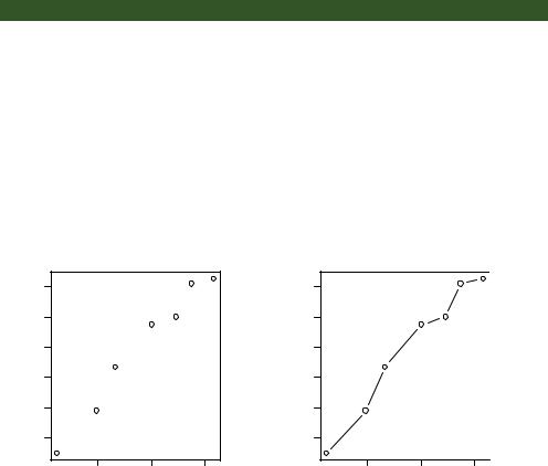
If you connect the points in a scatter plot moving from left to right, you have a line plot. The dataset Orange that come with the base installation contains age and circumference data for five orange trees. Consider the growth of the first orange tree, depicted in figure 11.14. The plot on the left is a scatter plot, and the plot on the right is a line chart. As you can see, line charts are particularly good vehicles for conveying change. The graphs in figure 11.14 were created with the code in the following listing.
Listing 11.2 Creating side-by-side scatter and line plots
opar <- par(no.readonly=TRUE) par(mfrow=c(1,2))
t1 <- subset(Orange, Tree==1) plot(t1$age, t1$circumference,
xlab="Age (days)", ylab="Circumference (mm)", main="Orange Tree 1 Growth")
plot(t1$age, t1$circumference, xlab="Age (days)", ylab="Circumference (mm)", main="Orange Tree 1 Growth", type="b")
par(opar)
|
Orange Tree 1 Growth |
|
Orange Tree 1 Growth |
||||
|
140 |
|
|
|
140 |
|
|
Circumference (mm) |
60 80 100 120 |
|
|
Circumference (mm) |
60 80 100 120 |
|
|
|
40 |
|
|
|
40 |
|
|
|
500 |
1000 |
1500 |
|
500 |
1000 |
1500 |
|
|
Age (days) |
|
|
|
Age (days) |
|
Figure 11.14 Comparison of a scatter plot and a line plot
Line charts |
269 |
You’ve seen the elements that make up this code in chapter 3, so I won’t go into detail here. The main difference between the two plots in figure 11.14 is produced by the option type="b". In general, line charts are created with one of the following two functions
plot(x, y, type=) lines(x, y, type=)
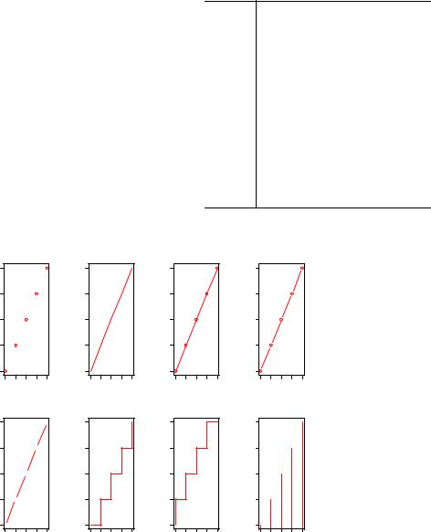
where x and y are numeric vectors of (x,y) points to connect. The option type= can take the values described in table 11.1.
Examples of each type are given in figure 11.15. As you can see, type="p" produces the typical scatter plot. The option type="b" is the most common for line charts. The difference between b and c is whether the points appear or gaps are left instead. Both type="s" and type="S" produce stair steps (step functions). The first runs, then rises, whereas the second rises, then runs.
Table 11.1 Line chart options
Type |
What is plotted |
|
|
p |
Points only |
l |
Lines only |
oOver-plotted points (that is, lines overlaid on top of points)
b, c |
Points (empty if c) joined by lines |
s, S |
Stair steps |
h |
Histogram-line vertical lines |
nDoesn’t produce any points or lines (used to set up the axes for later commands)
type= "p" |
type= "l" |
|
5 |
|
|
|
|
5 |
|
|
|
|
|
5 |
|
4 |
|
|
|
|
4 |
|
|
|
|
|
4 |
y |
3 |
|
|
|
y |
3 |
|
|
|
|
y |
3 |
|
2 |
|
|
|
|
2 |
|
|
|
|
|
2 |
|
1 |
|
|
|
|
1 |
|
|
|
|
|
1 |
|
1 |
2 |
3 |
4 |
5 |
|
1 |
2 |
3 |
4 |
5 |
|
|
|
|
x |
|
|
|
|
|
x |
|
|
|
type= "c" |
type= "s" |
|
5 |
|
|
|
|
5 |
|
|
|
|
|
5 |
|
4 |
|
|
|
|
4 |
|
|
|
|
|
4 |
y |
3 |
|
|
|
y |
3 |
|
|
|
|
y |
3 |
|
2 |
|
|
|
|
2 |
|
|
|
|
|
2 |
|
1 |
|
|
|
|
1 |
|
|
|
|
|
1 |
|
1 |
2 |
3 |
4 |
5 |
|
1 |
2 |
3 |
4 |
5 |
|
|
|
|
x |
|
|
|
|
|
x |
|
|
|
type= "o"
1 |
2 |
3 |
4 |
5 |
|
|
x |
|
|
type= "S"
1 2 3 4 5
x
type= "b"
|
5 |
|
|
|
|
|
4 |
|
|
|
|
y |
3 |
|
|
|
|
|
2 |
|
|
|
|
|
1 |
|
|
|
|
|
1 |
2 |
3 |
4 |
5 |
|
|
|
x |
|
|
type= "h"
|
5 |
|
4 |
y |
3 |
|
2 |
|
1 |
1 2 3 4 5
x
Figure 11.15 type= options in the plot() and lines() functions
270 |
CHAPTER 11 Intermediate graphs |
There’s an important difference between the plot() and lines() functions. The plot() function creates a new graph when invoked. The lines() function adds information to an existing graph but can’t produce a graph on its own.
Because of this, the lines() function is typically used after a plot() command has produced a graph. If desired, you can use the type="n" option in the plot() function to set up the axes, titles, and other graph features, and then use the lines() function to add various lines to the plot.
To demonstrate the creation of a more complex line chart, let’s plot the growth of all five orange trees over time. Each tree will have its own distinctive line. The code is shown in the next listing and the results in figure 11.16.
Listing 11.3 Line chart displaying the growth of five orange trees over time
Orange$Tree <- as.numeric(Orange$Tree) ntrees <- max(Orange$Tree)
xrange <- range(Orange$age)
yrange <- range(Orange$circumference)
plot(xrange, yrange, type="n", xlab="Age (days)",
ylab="Circumference (mm)"
)
colors <- rainbow(ntrees) linetype <- c(1:ntrees)
plotchar <- seq(18, 18+ntrees, 1)
for (i in 1:ntrees) {
tree <- subset(Orange, Tree==i) lines(tree$age, tree$circumference,
type="b",
lwd=2,
lty=linetype[i],
col=colors[i],
pch=plotchar[i]
)
}
Converts a factor to numeric for convenience
Sets up the plot
Adds lines
title("Tree Growth", "example of line plot")
legend(xrange[1], yrange[2], 1:ntrees,
cex=0.8,
col=colors,
pch=plotchar, Adds a legend lty=linetype,
title="Tree"
)
In listing 11.3, the plot() function is used to set up the graph and specify the axis labels and ranges but plots no actual data. The lines() function is then used to add a separate line and set of points for each orange tree. You can see that tree 4 and tree 5

Corrgrams |
271 |
Tree Growth
|
|
Tree |
|
|
|
200 |
1 |
|
|
|
2 |
|
|
|
|
|
|
|
|
|
|
3 |
|
|
|
|
4 |
|
|
|
|
5 |
|
|
(mm) |
150 |
|
|
|
Circumference |
100 |
|
|
|
|
50 |
|
|
|
|
|
500 |
1000 |
1500 |
Age (days) example of line plot
Figure 11.16 Line chart displaying the growth of five orange trees
demonstrated the greatest growth across the range of days measured, and that tree 5 overtakes tree 4 at around 664 days.
Many of the programming conventions in R that I discussed in chapters 2, 3, and 4 are used in listing 11.3. You may want to test your understanding by working through each line of code and visualizing what it’s doing. If you can, you’re on your way to becoming a serious R programmer (and fame and fortune is near at hand)! In the next section, you’ll explore ways of examining a number of correlation coefficients at once.
11.3 Corrgrams
Correlation matrices are a fundamental aspect of multivariate statistics. Which variables under consideration are strongly related to each other, and which aren’t? Are there clusters of variables that relate in specific ways? As the number of variables grows, such questions can be harder to answer. Corrgrams are a relatively recent tool for visualizing the data in correlation matrices.
It’s easier to explain a corrgram once you’ve seen one. Consider the correlations among the variables in the mtcars data frame. Here you have 11 variables, each measuring some aspect of 32 automobiles. You can get the correlations using the following code:
>options(digits=2)
>cor(mtcars)
|
mpg |
cyl |
disp |
hp |
drat |
wt |
qsec |
vs |
am |
gear |
carb |
mpg |
1.00 |
-0.85 |
-0.85 |
-0.78 |
0.681 |
-0.87 |
0.419 |
0.66 |
0.600 |
0.48 |
-0.551 |
cyl |
-0.85 |
1.00 |
0.90 |
0.83 |
-0.700 |
0.78 |
-0.591 |
-0.81 |
-0.523 |
-0.49 |
0.527 |
272 |
|
|
|
CHAPTER 11 Intermediate graphs |
|
|
|
|
|||
disp -0.85 |
0.90 |
1.00 |
0.79 |
-0.710 |
0.89 |
-0.434 -0.71 -0.591 -0.56 |
0.395 |
||||
hp |
-0.78 |
0.83 |
0.79 |
1.00 |
-0.449 |
0.66 |
-0.708 -0.72 -0.243 -0.13 |
0.750 |
|||
drat |
0.68 |
-0.70 -0.71 -0.45 |
1.000 |
-0.71 |
0.091 |
0.44 |
0.713 |
0.70 |
-0.091 |
||
wt |
-0.87 |
0.78 |
0.89 |
0.66 |
-0.712 |
1.00 |
-0.175 -0.55 -0.692 -0.58 |
0.428 |
|||
qsec |
0.42 |
-0.59 -0.43 -0.71 |
0.091 |
-0.17 |
1.000 |
0.74 |
-0.230 -0.21 -0.656 |
||||
vs |
0.66 |
-0.81 -0.71 -0.72 |
0.440 |
-0.55 |
0.745 |
1.00 |
0.168 |
0.21 |
-0.570 |
||
am |
0.60 |
-0.52 -0.59 -0.24 |
0.713 |
-0.69 -0.230 |
0.17 |
1.000 |
0.79 |
0.058 |
|||
gear |
0.48 |
-0.49 -0.56 -0.13 |
0.700 |
-0.58 -0.213 0.21 0.794 1.00 |
0.274 |
||||||
carb -0.55 |
0.53 |
0.39 |
0.75 |
-0.091 |
0.43 |
-0.656 -0.57 |
0.058 |
0.27 |
1.000 |
||
Which variables are most related? Which variables are relatively independent? Are there any patterns? It isn’t that easy to tell from the correlation matrix without significant time and effort (and probably a set of colored pens to make notations).
You can display that same correlation matrix using the corrgram() function in the corrgram package (see figure 11.17). The code is
library(corrgram)
corrgram(mtcars, order=TRUE, lower.panel=panel.shade, upper.panel=panel.pie, text.panel=panel.txt, main="Corrgram of mtcars intercorrelations")
Corrgram of mtcars intercorrelations
gear |
am |
drat |
mpg |
vs |
qsec |
wt |


 disp
disp
cyl
hp


 carb
carb
Figure 11.17 Corrgram of the correlations among the variables in the mtcars data frame. Rows and columns have been reordered using principal components analysis.
Corrgrams |
273 |
To interpret this graph, start with the lower triangle of cells (the cells below the principal diagonal). By default, a blue color and hashing that goes from lower left to upper right represent a positive correlation between the two variables that meet at that cell. Conversely, a red color and hashing that goes from the upper left to lower right represent a negative correlation. The darker and more saturated the color, the greater the magnitude of the correlation. Weak correlations, near zero, appear washed out. In the current graph, the rows and columns have been reordered (using principal components analysis) to cluster variables together that have similar correlation patterns.
You can see from the shaded cells that gear, am, drat, and mpg are positively correlated with one another. You can also see that wt, disp, cyl, hp, and carb are positively correlated with one another. But the first group of variables is negatively correlated with the second group of variables. You can also see that the correlation between carb and am is weak, as is the correlation between vs and gear, vs and am, and drat and qsec.
The upper triangle of cells displays the same information using pies. Here, color plays the same role, but the strength of the correlation is displayed by the size of the filled pie slice. Positive correlations fill the pie starting at 12 o’clock and moving in a clockwise direction. Negative correlations fill the pie by moving in a counterclockwise direction.
The format of the corrgram() function is
corrgram(x, order=, panel=, text.panel=, diag.panel=)
where x is a data frame with one observation per row. When order=TRUE, the variables are reordered using a principal component analysis of the correlation matrix. Reordering can help make patterns of bivariate relationships more obvious.
The option panel specifies the type of off-diagonal panels to use. Alternatively, you can use the options lower.panel and upper.panel to choose different options below and above the main diagonal. The text.panel and diag.panel options refer to the main diagonal. Allowable values for panel are described in table 11.2.
Table 11.2 Panel options for the corrgram() function
Placement |
Panel Option |
Description |
|
|
|
Off diagonal |
panel.pie |
The filled portion of the pie indicates the magnitude of the |
|
|
correlation. |
|
panel.shade |
The depth of the shading indicates the magnitude of the correlation. |
|
panel.ellipse |
Plots a confidence ellipse and smoothed line. |
|
panel.pts |
Plots a scatter plot. |
|
panel.conf |
Prints correlations and their confidence intervals. |
Main diagonal |
panel.txt |
Prints the variable name. |
|
panel.minmax |
Prints the minimum and maximum value and variable name. |
|
panel.density |
Prints the kernel density plot and variable name. |
|
|
|
274 |
CHAPTER 11 Intermediate graphs |
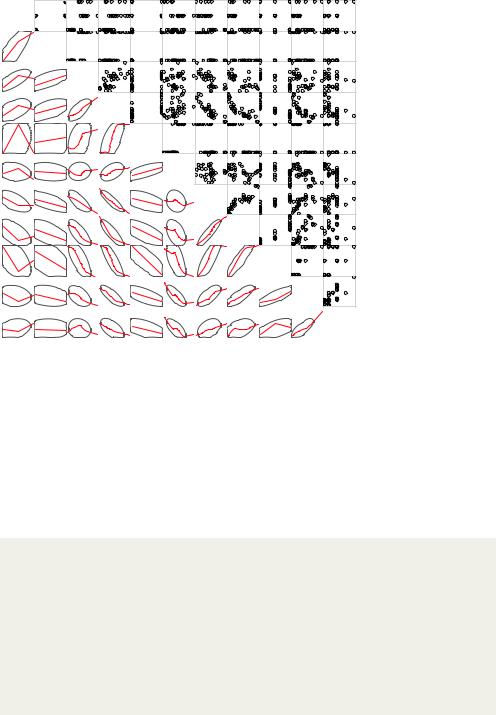
Corrgram of mtcars data using scatter plots and ellipses
5 |
gear |
3 |
1 |
am |
0 |
4.93 |
drat |
2.76 |
33.9 |
mpg |
10.4 |
1 |
vs |
0 |
22.9 |
qsec |
14.5 |
5.42 |
wt |
1.51 |
472 |
disp |
71.1 |
8 |
cyl |
4 |
335 |
hp |
52 |
8 |
carb |
1 |
Figure 11.18 Corrgram of the correlations among the variables in the mtcars data frame. The lower triangle contains smoothed bestfit lines and confidence ellipses, and the upper triangle contains scatter plots. The diagonal panel contains minimum and maximum values. Rows and columns have been reordered using principal components analysis.
Let’s try a second example. The code
library(corrgram)
corrgram(mtcars, order=TRUE, lower.panel=panel.ellipse, upper.panel=panel.pts, text.panel=panel.txt, diag.panel=panel.minmax,
main="Corrgram of mtcars data using scatter plots and ellipses")
produces the graph in figure 11.18. Here you’re using smoothed fit lines and confidence ellipses in the lower triangle and scatter plots in the upper triangle.
Why do the scatter plots look odd?
Several of the variables that are plotted in figure 11.18 have limited allowable values. For example, the number of gears is 3, 4, or 5. The number of cylinders is 4, 6, or 8. Both am (transmission type) and vs (V/S) are dichotomous. This explains the oddlooking scatter plots in the upper diagonal.
Always be careful that the statistical methods you choose are appropriate to the form of the data. Specifying these variables as ordered or unordered factors can serve as a useful check. When R knows that a variable is categorical or ordinal, it attempts to apply statistical methods that are appropriate to that level of measurement.
Corrgrams |
275 |
We’ll finish with one more example. The code
library(corrgram)
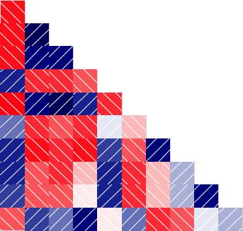
corrgram(mtcars, lower.panel=panel.shade, upper.panel=NULL, text.panel=panel.txt, main="Car Mileage Data (unsorted)")
produces the graph in figure 11.19. Here you’re using shading in the lower triangle, keeping the original variable order, and leaving the upper triangle blank.
Before moving on, I should point out that you can control the colors used by the corrgram() function. To do so, specify four colors in the colorRampPalette() function, and include the results using the col.regions option. Here’s an example:
library(corrgram)
cols <- colorRampPalette(c("darkgoldenrod4", "burlywood1", "darkkhaki", "darkgreen"))
corrgram(mtcars, order=TRUE, col.regions=cols, lower.panel=panel.shade, upper.panel=panel.conf, text.panel=panel.txt,
main="A Corrgram (or Horse) of a Different Color")
Try it and see what you get.
Car Mileage Data (unsorted)
mpg |
cyl |
disp |
hp |
drat |
wt |
qsec |
vs |
am |
gear |
carb |
Figure 11.19 Corrgram of the correlations among the variables in the mtcars data frame. The lower triangle is shaded to represent the magnitude and direction of the correlations. The variables are plotted in their original order.