

|
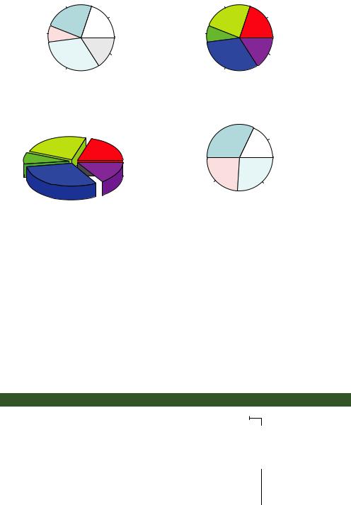
Pie charts |
123 |
Simple Pie Chart |
Pie Chart with Percentages |
|
UK |
UK 24% |
|
US |
US 20% |
|
Australia |
Australia 8% |
|
France |
France 16% |
|
Germany |
Germany 32% |
|
3D Pie Chart
Pie Chart from a Table (with sample sizes)
UK
US
Australia
 France
Germany
South
16
Northeast 9
North Central |
West |
12 |
13 |
Figure 6.6 Pie chart examples
6.2Pie charts
Whereas pie charts are ubiquitous in the business world, they’re denigrated by most statisticians, including the authors of the R documentation. They recommend bar or dot plots over pie charts because people are able to judge length more accurately than volume. Perhaps for this reason, the pie chart options in R are limited when compared with other statistical software.
Pie charts are created with the function
pie(x, labels)
where x is a non-negative numeric vector indicating the area of each slice and labels provides a character vector of slice labels. Four examples are given in the next listing; the resulting plots are provided in figure 6.6.
Listing 6.5 Pie charts
par(mfrow=c(2, 2)) slices <- c(10, 12,4, 16, 8)
lbls <- c("US", "UK", "Australia", "Germany", "France") pie(slices, labels = lbls,
main="Simple Pie Chart")
pct <- round(slices/sum(slices)*100)
lbls2 <- paste(lbls, " ", pct, "%", sep="") pie(slices, labels=lbls2, col=rainbow(length(lbls2)),
main="Pie Chart with Percentages")
Combines four b graphs into one
c Adds percentages to the pie chart
124 CHAPTER 6 Basic graphs
library(plotrix)
pie3D(slices, labels=lbls,explode=0.1, main="3D Pie Chart ")
mytable <- table(state.region) 
 lbls3 <- paste(names(mytable), "\n", mytable, sep="") pie(mytable, labels = lbls3,
main="Pie Chart from a Table\n (with sample sizes)")
First you set up the plot so that four graphs are combined into one b. (Combining multiple graphs is covered in chapter 3.) Then you input the data that will be used for the first three graphs.
For the second pie chart c, you convert the sample sizes to percentages and add the information to the slice labels. The second pie chart also defines the colors of the slices using the rainbow() function, described in chapter 3. Here rainbow(length(lbls2)) resolves to rainbow(5), providing five colors for the graph.
The third pie chart is a 3D chart created using the pie3D() function from the plotrix package. Be sure to download and install this package before using it for the first time. If statisticians dislike pie charts, they positively despise 3D pie charts (although they may secretly find them pretty). This is because the 3D effect adds no additional insight into the data and is considered distracting eye candy.
The fourth pie chart demonstrates how to create a chart from a table d. In this case, you count the number of states by US region and append the information to the labels before producing the plot.
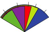
Pie charts make it difficult to compare the values of the slices (unless the values are appended to the labels). For example, looking at the simple pie chart, can you tell how the US compares to Germany? (If you can, you’re more perceptive than I am.) In an attempt to improve on this situation, a variation of the pie chart, called a fan plot, has been developed. The fan plot (Lemon & Tyagi, 2009) provides you with a way to display both relative quantities and differences. In R, it’s implemented through the fan.plot() function in the plotrix package.
Consider the following code and the resulting graph (figure 6.7):
library(plotrix)
slices <- c(10, 12,4, 16, 8)
lbls <- c("US", "UK", "Australia", "Germany", "France") fan.plot(slices, labels = lbls, main="Fan Plot")
In a fan plot, the slices are rearranged to overlap each other, and the radii are modified so that each slice is visible. Here you can see that Germany is the largest slice and that the US slice is roughly 60% as large. France appears to be half as large as Germany and twice as large as Australia. Remember that the width of the slice and not the radius is what’s important here.
Fan Plot
France US UK
Australia |
Germany |
Figure 6.7 A fan plot of the country data

Histograms |
125 |
As you can see, it’s much easier to determine the relative sizes of the slice in a fan plot than in a pie chart. Fan plots haven’t caught on yet, but they’re new.
Now that we’ve covered pie and fan charts, let’s move on to histograms. Unlike bar plots and pie charts, histograms describe the distribution of a continuous variable.
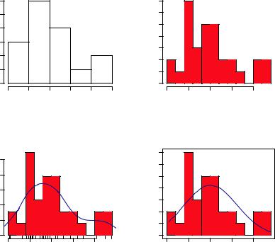
6.3Histograms
Histograms display the distribution of a continuous variable by dividing the range of scores into a specified number of bins on the x-axis and displaying the frequency of scores in each bin on the y-axis. You can create histograms with the function
hist(x)
where x is a numeric vector of values. The option freq=FALSE creates a plot based on probability densities rather than frequencies. The breaks option controls the number of bins. The default produces equally spaced breaks when defining the cells of the histogram. The following listing provides the code for four variations of a histogram; the results are plotted in figure 6.8.
Listing 6.6 Histograms
par(mfrow=c(2,2))
b Simple histogram
hist(mtcars$mpg)
hist(mtcars$mpg, breaks=12, col="red",
xlab="Miles Per Gallon",
main="Colored histogram with 12 bins")
hist(mtcars$mpg, freq=FALSE, breaks=12, col="red",
xlab="Miles Per Gallon",
main="Histogram, rug plot, density curve") rug(jitter(mtcars$mpg)) lines(density(mtcars$mpg), col="blue", lwd=2)
x <- mtcars$mpg h<-hist(x,
breaks=12,
col="red",
xlab="Miles Per Gallon",
main="Histogram with normal curve and box") xfit<-seq(min(x), max(x), length=40) yfit<-dnorm(xfit, mean=mean(x), sd=sd(x))
yfit <- yfit*diff(h$mids[1:2])*length(x) lines(xfit, yfit, col="blue", lwd=2) box()
c With specified bins and color
d With a rug plot
eWith a normal curve and frame
126 |
CHAPTER 6 Basic graphs |
The first histogram bdemonstrates the default plot when no options are specified. In this case, five bins are created, and the default axis labels and titles are printed. For the second histogram c, you specified 12 bins, a red fill for the bars, and more attractive and informative labels and title.
The third histogram d maintains the same colors, bins, labels, and titles as the previous plot but adds a density curve and rug-plot overlay. The density curve is a kernel density estimate and is described in the next section. It provides a smoother description of the distribution of scores. You use the lines() function to overlay this curve in a blue color and a width that’s twice the default thickness for lines. Finally, a rug plot is a one-dimensional representation of the actual data values. If there are many tied values, you can jitter the data on the rug plot using code like the following:
rug(jitter(mtcars$mpag, amount=0.01))
This adds a small random value to each data point (a uniform random variate between ±amount), in order to avoid overlapping points.
The fourth histogram e is similar to the second but has a superimposed normal curve and a box around the figure. The code for superimposing the normal curve
Histogram of mtcars$mpg Colored histogram with 12 bins
|
12 |
|
|
|
|
|
|
7 |
|
|
|
|
|
10 |
|
|
|
|
|
|
6 |
|
|
|
|
Frequency |
4 6 8 |
|
|
|
|
|
Frequency |
5 |
|
|
|
|
|
|
|
|
|
3 4 |
|
|
|
|
|||
|
|
|
|
|
|
|
|
2 |
|
|
|
|
|
2 |
|
|
|
|
|
|
1 |
|
|
|
|
|
0 |
|
|
|
|
|
|
0 |
|
|
|
|
|
10 |
15 |
20 |
25 |
30 |
35 |
|
10 |
15 |
20 |
25 |
30 |
mtcars$mpg Miles Per Gallon
Histogram, rug plot, density curve Histogram with normal curve and box
|
|
|
|
|
|
7 |
|
0.04 0.08 |
|
|
|
|
6 |
Density |
|
|
|
Frequency |
2 3 4 5 |
|
|
|
|
|
|
|
1 |
|
0.00 |
|
|
|
|
0 |
|
10 |
15 |
20 |
25 |
30 |
|
|
|
|
Miles Per Gallon |
|
|
|
10 |
15 |
20 |
25 |
30 |
Miles Per Gallon
Figure 6.8 Histogram examples