


118 |
CHAPTER 6 Basic graphs |
be familiar to you, whereas others (such as fan plots or violin plots) may be new to you. The goal, as always, is to understand your data better and to communicate this understanding to others. Let’s start with bar plots.
6.1Bar plots
A bar plot displays the distribution (frequency) of a categorical variable through vertical or horizontal bars. In its simplest form, the format of the barplot() function is
barplot(height)
where height is a vector or matrix.
In the following examples, you’ll plot the outcome of a study investigating a new treatment for rheumatoid arthritis. The data are contained in the Arthritis data frame distributed with the vcd package. This package isn’t included in the default R installation, so install it before first use (install.packages("vcd")).
Note that the vcd package isn’t needed to create bar plots. You’re loading it in order to gain access to the Arthritis dataset. But you’ll need the vcd package when creating spinograms, which are described in section 6.1.5.
6.1.1Simple bar plots
If height is a vector, the values determine the heights of the bars in the plot, and a vertical bar plot is produced. Including the option horiz=TRUE produces a horizontal bar chart instead. You can also add annotating options. The main option adds a plot title, whereas the xlab and ylab options add x-axis and y-axis labels, respectively.
In the Arthritis study, the variable Improved records the patient outcomes for individuals receiving a placebo or drug:
>library(vcd)
>counts <- table(Arthritis$Improved)
>counts
None Some Marked
42 14 28
Here, you see that 28 patients showed marked improvement, 14 showed some improvement, and 42 showed no improvement. We’ll discuss the use of the table() function to obtain cell counts more fully in chapter 7.
You can graph the variable counts using a vertical or horizontal bar plot. The code is provided in the following listing, and the resulting graphs are displayed in figure 6.1.
Listing 6.1 Simple bar plots
barplot(counts, |
|
Simple bar plot |
|
main="Simple Bar Plot", |
|
||
xlab="Improvement", ylab="Frequency") |
|
|
|
barplot(counts, |
|
|
|
|
|
||
main="Horizontal Bar Plot", |
Horizontal bar plot |
||
xlab="Frequency", ylab="Improvement", |
|||
|
|
||
horiz=TRUE) |
|
|
|

Bar plots |
119 |
|
|
|
|
Simple Bar Plot |
|
|
|
Horizontal Bar Plot |
|
|
||||||||||
Frequency |
10 20 30 40 |
|
|
|
|
|
|
|
Improvement |
None Some Marked |
|
|
|
|
|
|
|
|
|
|
|
|
|
|
|
|
|
|
|
|
|
|
|
|
|
|
|||||
|
|
|
|
|
|
|
|
|
|
|
|
|
|
|
|
|||||
|
|
|
|
|
|
|
|
|
|
|
|
|
|
|
|
|||||
|
|
|
|
|
|
|
|
|
|
|
|
|
|
|
|
|||||
|
|
|
|
|
|
|
|
|
|
|
|
|
|
|
|
|||||
|
|
|
|
|
|
|
|
|
|
|
|
|
|
|
|
|||||
|
|
|
|
|
|
|
|
|
|
|
|
|
|
|
|
|||||
|
|
|
|
|
|
|
|
|
|
|
|
|
|
|
|
|
||||
|
|
|
|
|
|
|
|
|
|
|
|
|
|
|
|
|
||||
|
|
|
|
|
|
|
|
|
|
|
|
|
|
|
|
|
|
|||
|
0 |
|
|
|
|
|
|
|
|
|
|
|
|
|
|
|
|
|
|
|
|
|
|
|
|
|
|
|
|
|
|
|
|
|
|
|
|
|
|
|
|
|
|
|
|
None |
|
Some Marked |
|
0 |
10 |
20 |
30 |
40 |
||||||||
|
|
|
|
|
Improvement |
|
|
|
|
|
Frequency |
|
|
|||||||
Figure 6.1 Simple vertical and horizontal bar charts
Creating bar plots with factor variables
If the categorical variable to be plotted is a factor or ordered factor, you can create a vertical bar plot quickly with the plot() function. Because Arthritis$Improved is a factor, the code
plot(Arthritis$Improved, main="Simple Bar Plot", xlab="Improved", ylab="Frequency")
plot(Arthritis$Improved, horiz=TRUE, main="Horizontal Bar Plot", xlab="Frequency", ylab="Improved")
will generate the same bar plots as those in listing 6.1, but without the need to tabulate values with the table() function.
What happens if you have long labels? In section 6.1.4, you’ll see how to tweak labels so that they don’t overlap.
6.1.2Stacked and grouped bar plots
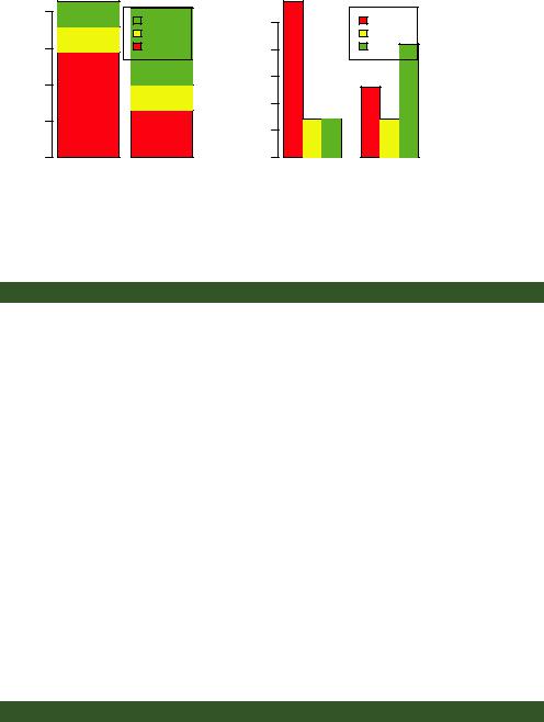
If height is a matrix rather than a vector, the resulting graph will be a stacked or grouped bar plot. If beside=FALSE (the default), then each column of the matrix produces a bar in the plot, with the values in the column giving the heights of stacked “sub-bars.” If beside=TRUE, each column of the matrix represents a group, and the values in each column are juxtaposed rather than stacked.
Consider the cross-tabulation of treatment type and improvement status:
>library(vcd)
>counts <- table(Arthritis$Improved, Arthritis$Treatment)
>counts
Treatment
Improved Placebo Treated
None |
29 |
13 |
Some |
7 |
7 |
Marked |
7 |
21 |
120 |
CHAPTER 6 Basic graphs |
|
40 |
Frequency |
20 30 |
|
10 |
|
0 |
Stacked Bar Plot |
Grouped Bar Plot |
|
Marked |
25 |
|
Some |
|
|
|
|
|
None |
10 15 20 |
|
Frequency |
|
|
|
5 |
|
|
0 |
Placebo |
Treated |
Placebo |
None |
Some |
Marked |
Treated |
Treatment |
Treatment |
Figure 6.2
Stacked and grouped bar plots
You can graph the results as either a stacked or a grouped bar plot (see the next listing). The resulting graphs are displayed in figure 6.2.
Listing 6.2 Stacked and grouped bar plots
barplot(counts, |
|
|
|
main="Stacked Bar |
Plot", |
Stacked bar plot |
|
xlab="Treatment", |
ylab="Frequency", |
||
col=c("red", "yellow","green"), |
|
|
|
legend=rownames(counts)) |
|
|
|
barplot(counts, |
|
|
|
main="Grouped Bar |
Plot", |
|
|
xlab="Treatment", |
ylab="Frequency", |
|
Grouped bar plot |
col=c("red", "yellow", "green"), |
|
|
|
legend=rownames(counts), beside=TRUE) |
|
|
|
The first barplot() function produces a stacked bar plot, whereas the second produces a grouped bar plot. We’ve also added the col option to add color to the bars plotted. The legend.text parameter provides bar labels for the legend (which are only useful when height is a matrix).
In chapter 3, we covered ways to format and place the legend to maximum benefit. See if you can rearrange the legend to avoid overlap with the bars.
6.1.3Mean bar plots
Bar plots needn’t be based on counts or frequencies. You can create bar plots that represent means, medians, standard deviations, and so forth by using the aggregate function and passing the results to the barplot() function. The following listing shows an example, which is displayed in figure 6.3.
Listing 6.3 Bar plot for sorted mean values
>states <- data.frame(state.region, state.x77)
>means <- aggregate(states$Illiteracy, by=list(state.region), FUN=mean)
>means
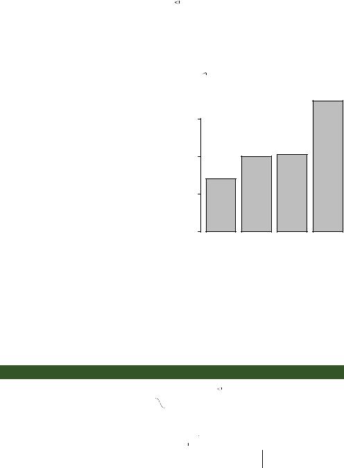
Bar plots |
121 |
Group.1 x
1Northeast 1.00
2South 1.74
3North Central 0.70
4West 1.02
> means <- means[order(means$x),] |
|
|
|
|
||
|
|
|
|
|||
> means |
x |
b Sorts means, smallest to largest |
||||
|
Group.1 |
|
|
|
|
|
3 |
North Central 0.70 |
|
|
|
|
|
1 |
Northeast 1.00 |
|
|
|
|
|
4 |
West 1.02 |
|
|
|
|
|
2 |
South 1.74 |
|
|
c Adds title |
||
> barplot(means$x, names.arg=means$Group.1) |
||||||
> title("Mean Illiteracy Rate") |
|
|
|
|
||
|
|
|
|
|||
Listing 6.3 sorts the means from smallest to largest b. Also note that using the title() function c is equivalent to adding the main option in the plot call. means$x is the vector containing the heights of the bars, and the option names.arg=means$Group.1 is added to provide labels.
You can take this example further. The bars can be connected with straight-line segments using the lines() function. You can also create mean bar plots with superimposed confidence intervals using the barplot2() function in the gplots package. See help(barplot2) for examples.
Mean Illiteracy Rate |
|
||
1.5 |
|
|
|
1.0 |
|
|
|
0.5 |
|
|
|
0.0 |
|
|
|
North Central |
Northeast |
West |
South |
Figure 6.3 Bar plot of mean illiteracy rates for US regions sorted by rate
6.1.4Tweaking bar plots
There are several ways to tweak the appearance of a bar plot. For example, with many bars, bar labels may start to overlap. You can decrease the font size using the cex.names option. Specifying values smaller than 1 will shrink the size of the labels. Optionally, the names.arg argument allows you to specify a character vector of names used to label the bars. You can also use graphical parameters to help text spacing. An example is given in the following listing, with the output displayed in figure 6.4.
Listing 6.4 Fitting labels in a bar plot
par(mar=c(5,8,4,2))
par(las=2)  counts <- table(Arthritis$Improved) barplot(counts,
main="Treatment Outcome", horiz=TRUE, cex.names=0.8,
 Increases the size of the y margin
Rotates the FL bar labels
Decreases the font size in order
 to fit the labels comfortably
names.arg=c("No Improvement", "Some Improvement",
Changes the label text
"Marked Improvement"))