

- •brief contents
- •contents
- •preface
- •acknowledgments
- •about this book
- •What’s new in the second edition
- •Who should read this book
- •Roadmap
- •Advice for data miners
- •Code examples
- •Code conventions
- •Author Online
- •About the author
- •about the cover illustration
- •1 Introduction to R
- •1.2 Obtaining and installing R
- •1.3 Working with R
- •1.3.1 Getting started
- •1.3.2 Getting help
- •1.3.3 The workspace
- •1.3.4 Input and output
- •1.4 Packages
- •1.4.1 What are packages?
- •1.4.2 Installing a package
- •1.4.3 Loading a package
- •1.4.4 Learning about a package
- •1.5 Batch processing
- •1.6 Using output as input: reusing results
- •1.7 Working with large datasets
- •1.8 Working through an example
- •1.9 Summary
- •2 Creating a dataset
- •2.1 Understanding datasets
- •2.2 Data structures
- •2.2.1 Vectors
- •2.2.2 Matrices
- •2.2.3 Arrays
- •2.2.4 Data frames
- •2.2.5 Factors
- •2.2.6 Lists
- •2.3 Data input
- •2.3.1 Entering data from the keyboard
- •2.3.2 Importing data from a delimited text file
- •2.3.3 Importing data from Excel
- •2.3.4 Importing data from XML
- •2.3.5 Importing data from the web
- •2.3.6 Importing data from SPSS
- •2.3.7 Importing data from SAS
- •2.3.8 Importing data from Stata
- •2.3.9 Importing data from NetCDF
- •2.3.10 Importing data from HDF5
- •2.3.11 Accessing database management systems (DBMSs)
- •2.3.12 Importing data via Stat/Transfer
- •2.4 Annotating datasets
- •2.4.1 Variable labels
- •2.4.2 Value labels
- •2.5 Useful functions for working with data objects
- •2.6 Summary
- •3 Getting started with graphs
- •3.1 Working with graphs
- •3.2 A simple example
- •3.3 Graphical parameters
- •3.3.1 Symbols and lines
- •3.3.2 Colors
- •3.3.3 Text characteristics
- •3.3.4 Graph and margin dimensions
- •3.4 Adding text, customized axes, and legends
- •3.4.1 Titles
- •3.4.2 Axes
- •3.4.3 Reference lines
- •3.4.4 Legend
- •3.4.5 Text annotations
- •3.4.6 Math annotations
- •3.5 Combining graphs
- •3.5.1 Creating a figure arrangement with fine control
- •3.6 Summary
- •4 Basic data management
- •4.1 A working example
- •4.2 Creating new variables
- •4.3 Recoding variables
- •4.4 Renaming variables
- •4.5 Missing values
- •4.5.1 Recoding values to missing
- •4.5.2 Excluding missing values from analyses
- •4.6 Date values
- •4.6.1 Converting dates to character variables
- •4.6.2 Going further
- •4.7 Type conversions
- •4.8 Sorting data
- •4.9 Merging datasets
- •4.9.1 Adding columns to a data frame
- •4.9.2 Adding rows to a data frame
- •4.10 Subsetting datasets
- •4.10.1 Selecting (keeping) variables
- •4.10.2 Excluding (dropping) variables
- •4.10.3 Selecting observations
- •4.10.4 The subset() function
- •4.10.5 Random samples
- •4.11 Using SQL statements to manipulate data frames
- •4.12 Summary
- •5 Advanced data management
- •5.2 Numerical and character functions
- •5.2.1 Mathematical functions
- •5.2.2 Statistical functions
- •5.2.3 Probability functions
- •5.2.4 Character functions
- •5.2.5 Other useful functions
- •5.2.6 Applying functions to matrices and data frames
- •5.3 A solution for the data-management challenge
- •5.4 Control flow
- •5.4.1 Repetition and looping
- •5.4.2 Conditional execution
- •5.5 User-written functions
- •5.6 Aggregation and reshaping
- •5.6.1 Transpose
- •5.6.2 Aggregating data
- •5.6.3 The reshape2 package
- •5.7 Summary
- •6 Basic graphs
- •6.1 Bar plots
- •6.1.1 Simple bar plots
- •6.1.2 Stacked and grouped bar plots
- •6.1.3 Mean bar plots
- •6.1.4 Tweaking bar plots
- •6.1.5 Spinograms
- •6.2 Pie charts
- •6.3 Histograms
- •6.4 Kernel density plots
- •6.5 Box plots
- •6.5.1 Using parallel box plots to compare groups
- •6.5.2 Violin plots
- •6.6 Dot plots
- •6.7 Summary
- •7 Basic statistics
- •7.1 Descriptive statistics
- •7.1.1 A menagerie of methods
- •7.1.2 Even more methods
- •7.1.3 Descriptive statistics by group
- •7.1.4 Additional methods by group
- •7.1.5 Visualizing results
- •7.2 Frequency and contingency tables
- •7.2.1 Generating frequency tables
- •7.2.2 Tests of independence
- •7.2.3 Measures of association
- •7.2.4 Visualizing results
- •7.3 Correlations
- •7.3.1 Types of correlations
- •7.3.2 Testing correlations for significance
- •7.3.3 Visualizing correlations
- •7.4 T-tests
- •7.4.3 When there are more than two groups
- •7.5 Nonparametric tests of group differences
- •7.5.1 Comparing two groups
- •7.5.2 Comparing more than two groups
- •7.6 Visualizing group differences
- •7.7 Summary
- •8 Regression
- •8.1 The many faces of regression
- •8.1.1 Scenarios for using OLS regression
- •8.1.2 What you need to know
- •8.2 OLS regression
- •8.2.1 Fitting regression models with lm()
- •8.2.2 Simple linear regression
- •8.2.3 Polynomial regression
- •8.2.4 Multiple linear regression
- •8.2.5 Multiple linear regression with interactions
- •8.3 Regression diagnostics
- •8.3.1 A typical approach
- •8.3.2 An enhanced approach
- •8.3.3 Global validation of linear model assumption
- •8.3.4 Multicollinearity
- •8.4 Unusual observations
- •8.4.1 Outliers
- •8.4.3 Influential observations
- •8.5 Corrective measures
- •8.5.1 Deleting observations
- •8.5.2 Transforming variables
- •8.5.3 Adding or deleting variables
- •8.5.4 Trying a different approach
- •8.6 Selecting the “best” regression model
- •8.6.1 Comparing models
- •8.6.2 Variable selection
- •8.7 Taking the analysis further
- •8.7.1 Cross-validation
- •8.7.2 Relative importance
- •8.8 Summary
- •9 Analysis of variance
- •9.1 A crash course on terminology
- •9.2 Fitting ANOVA models
- •9.2.1 The aov() function
- •9.2.2 The order of formula terms
- •9.3.1 Multiple comparisons
- •9.3.2 Assessing test assumptions
- •9.4 One-way ANCOVA
- •9.4.1 Assessing test assumptions
- •9.4.2 Visualizing the results
- •9.6 Repeated measures ANOVA
- •9.7 Multivariate analysis of variance (MANOVA)
- •9.7.1 Assessing test assumptions
- •9.7.2 Robust MANOVA
- •9.8 ANOVA as regression
- •9.9 Summary
- •10 Power analysis
- •10.1 A quick review of hypothesis testing
- •10.2 Implementing power analysis with the pwr package
- •10.2.1 t-tests
- •10.2.2 ANOVA
- •10.2.3 Correlations
- •10.2.4 Linear models
- •10.2.5 Tests of proportions
- •10.2.7 Choosing an appropriate effect size in novel situations
- •10.3 Creating power analysis plots
- •10.4 Other packages
- •10.5 Summary
- •11 Intermediate graphs
- •11.1 Scatter plots
- •11.1.3 3D scatter plots
- •11.1.4 Spinning 3D scatter plots
- •11.1.5 Bubble plots
- •11.2 Line charts
- •11.3 Corrgrams
- •11.4 Mosaic plots
- •11.5 Summary
- •12 Resampling statistics and bootstrapping
- •12.1 Permutation tests
- •12.2 Permutation tests with the coin package
- •12.2.2 Independence in contingency tables
- •12.2.3 Independence between numeric variables
- •12.2.5 Going further
- •12.3 Permutation tests with the lmPerm package
- •12.3.1 Simple and polynomial regression
- •12.3.2 Multiple regression
- •12.4 Additional comments on permutation tests
- •12.5 Bootstrapping
- •12.6 Bootstrapping with the boot package
- •12.6.1 Bootstrapping a single statistic
- •12.6.2 Bootstrapping several statistics
- •12.7 Summary
- •13 Generalized linear models
- •13.1 Generalized linear models and the glm() function
- •13.1.1 The glm() function
- •13.1.2 Supporting functions
- •13.1.3 Model fit and regression diagnostics
- •13.2 Logistic regression
- •13.2.1 Interpreting the model parameters
- •13.2.2 Assessing the impact of predictors on the probability of an outcome
- •13.2.3 Overdispersion
- •13.2.4 Extensions
- •13.3 Poisson regression
- •13.3.1 Interpreting the model parameters
- •13.3.2 Overdispersion
- •13.3.3 Extensions
- •13.4 Summary
- •14 Principal components and factor analysis
- •14.1 Principal components and factor analysis in R
- •14.2 Principal components
- •14.2.1 Selecting the number of components to extract
- •14.2.2 Extracting principal components
- •14.2.3 Rotating principal components
- •14.2.4 Obtaining principal components scores
- •14.3 Exploratory factor analysis
- •14.3.1 Deciding how many common factors to extract
- •14.3.2 Extracting common factors
- •14.3.3 Rotating factors
- •14.3.4 Factor scores
- •14.4 Other latent variable models
- •14.5 Summary
- •15 Time series
- •15.1 Creating a time-series object in R
- •15.2 Smoothing and seasonal decomposition
- •15.2.1 Smoothing with simple moving averages
- •15.2.2 Seasonal decomposition
- •15.3 Exponential forecasting models
- •15.3.1 Simple exponential smoothing
- •15.3.3 The ets() function and automated forecasting
- •15.4 ARIMA forecasting models
- •15.4.1 Prerequisite concepts
- •15.4.2 ARMA and ARIMA models
- •15.4.3 Automated ARIMA forecasting
- •15.5 Going further
- •15.6 Summary
- •16 Cluster analysis
- •16.1 Common steps in cluster analysis
- •16.2 Calculating distances
- •16.3 Hierarchical cluster analysis
- •16.4 Partitioning cluster analysis
- •16.4.2 Partitioning around medoids
- •16.5 Avoiding nonexistent clusters
- •16.6 Summary
- •17 Classification
- •17.1 Preparing the data
- •17.2 Logistic regression
- •17.3 Decision trees
- •17.3.1 Classical decision trees
- •17.3.2 Conditional inference trees
- •17.4 Random forests
- •17.5 Support vector machines
- •17.5.1 Tuning an SVM
- •17.6 Choosing a best predictive solution
- •17.7 Using the rattle package for data mining
- •17.8 Summary
- •18 Advanced methods for missing data
- •18.1 Steps in dealing with missing data
- •18.2 Identifying missing values
- •18.3 Exploring missing-values patterns
- •18.3.1 Tabulating missing values
- •18.3.2 Exploring missing data visually
- •18.3.3 Using correlations to explore missing values
- •18.4 Understanding the sources and impact of missing data
- •18.5 Rational approaches for dealing with incomplete data
- •18.6 Complete-case analysis (listwise deletion)
- •18.7 Multiple imputation
- •18.8 Other approaches to missing data
- •18.8.1 Pairwise deletion
- •18.8.2 Simple (nonstochastic) imputation
- •18.9 Summary
- •19 Advanced graphics with ggplot2
- •19.1 The four graphics systems in R
- •19.2 An introduction to the ggplot2 package
- •19.3 Specifying the plot type with geoms
- •19.4 Grouping
- •19.5 Faceting
- •19.6 Adding smoothed lines
- •19.7 Modifying the appearance of ggplot2 graphs
- •19.7.1 Axes
- •19.7.2 Legends
- •19.7.3 Scales
- •19.7.4 Themes
- •19.7.5 Multiple graphs per page
- •19.8 Saving graphs
- •19.9 Summary
- •20 Advanced programming
- •20.1 A review of the language
- •20.1.1 Data types
- •20.1.2 Control structures
- •20.1.3 Creating functions
- •20.2 Working with environments
- •20.3 Object-oriented programming
- •20.3.1 Generic functions
- •20.3.2 Limitations of the S3 model
- •20.4 Writing efficient code
- •20.5 Debugging
- •20.5.1 Common sources of errors
- •20.5.2 Debugging tools
- •20.5.3 Session options that support debugging
- •20.6 Going further
- •20.7 Summary
- •21 Creating a package
- •21.1 Nonparametric analysis and the npar package
- •21.1.1 Comparing groups with the npar package
- •21.2 Developing the package
- •21.2.1 Computing the statistics
- •21.2.2 Printing the results
- •21.2.3 Summarizing the results
- •21.2.4 Plotting the results
- •21.2.5 Adding sample data to the package
- •21.3 Creating the package documentation
- •21.4 Building the package
- •21.5 Going further
- •21.6 Summary
- •22 Creating dynamic reports
- •22.1 A template approach to reports
- •22.2 Creating dynamic reports with R and Markdown
- •22.3 Creating dynamic reports with R and LaTeX
- •22.4 Creating dynamic reports with R and Open Document
- •22.5 Creating dynamic reports with R and Microsoft Word
- •22.6 Summary
- •afterword Into the rabbit hole
- •appendix A Graphical user interfaces
- •appendix B Customizing the startup environment
- •appendix C Exporting data from R
- •Delimited text file
- •Excel spreadsheet
- •Statistical applications
- •appendix D Matrix algebra in R
- •appendix E Packages used in this book
- •appendix F Working with large datasets
- •F.1 Efficient programming
- •F.2 Storing data outside of RAM
- •F.3 Analytic packages for out-of-memory data
- •F.4 Comprehensive solutions for working with enormous datasets
- •appendix G Updating an R installation
- •G.1 Automated installation (Windows only)
- •G.2 Manual installation (Windows and Mac OS X)
- •G.3 Updating an R installation (Linux)
- •references
- •index
- •Symbols
- •Numerics
- •23.1 The lattice package
- •23.2 Conditioning variables
- •23.3 Panel functions
- •23.4 Grouping variables
- •23.5 Graphic parameters
- •23.6 Customizing plot strips
- •23.7 Page arrangement
- •23.8 Going further
Smoothing and seasonal decomposition |
345 |
|
50 |
|
|
|
|
40 |
|
|
|
tsales |
30 |
|
|
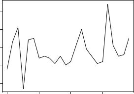
Figure 15.2 Time-series plot for the |
|
|
|
|
sales data in listing 15.1. The |
|
20 |
|
|
decimal notation on the time |
|
|
|
dimension is used to represent the |
|
|
|
|
|
|
|
|
|
|
portion of a year. For example, |
|
10 |
|
|
2003.5 represents July 1 (halfway |
|
|
|
|
through 2003). |
|
2003.0 |
2003.5 |
2004.0 |
2004.5 |
|
|
|
Time |
|
Once you’ve created the time-series object, you can use functions like start(), end(), and frequency() to return its properties c. You can also use the window() function to create a new time series that’s a subset of the original d.
15.2 Smoothing and seasonal decomposition
Just as analysts explore a dataset with descriptive statistics and graphs before attempting to model the data, describing a time series numerically and visually should be the first step before attempting to build complex models. In this section, we’ll look at smoothing a time series to clarify its general trend, and decomposing a time series in order to observe any seasonal effects.
15.2.1Smoothing with simple moving averages
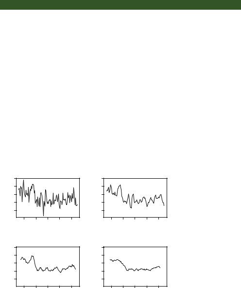
The first step when investigating a time series is to plot it, as in listing 15.1. Consider the Nile time series. It records the annual flow of the river Nile at Ashwan from 1871– 1970. A plot of the series can be seen in the upper-left panel of figure 15.3. The time series appears to be decreasing, but there is a great deal of variation from year to year.
Time series typically have a significant irregular or error component. In order to discern any patterns in the data, you’ll frequently want to plot a smoothed curve that damps down these fluctuations. One of the simplest methods of smoothing a time series is to use simple moving averages. For example, each data point can be replaced with the mean of that observation and one observation before and after it. This is called a centered moving average. A centered moving average is defined as
St = (Yt-q + … + Yt + … + Yt+q) / (2q + 1)
where St is the smoothed value at time t and k = 2q + 1 is the number of observations that are averaged. The k value is usually chosen to be an odd number (3 in this example). By necessity, when using a centered moving average, you lose the (k – 1) / 2
observations at each end of the series.
346 |
CHAPTER 15 Time series |
Several functions in R can provide a simple moving average, including SMA() in the TTR package, rollmean() in the zoo package, and ma() in the forecast package. Here, you’ll use the ma() function to smooth the Nile time series that comes with the base R installation.
The code in the next listing plots the raw time series and smoothed versions using k equal to 3, 7, and 15. The plots are given in figure 15.3.
Listing 15.2 Simple moving averages
library(forecast)
opar <- par(no.readonly=TRUE) par(mfrow=c(2,2))
ylim <- c(min(Nile), max(Nile)) plot(Nile, main="Raw time series")
plot(ma(Nile, 3), main="Simple Moving Averages (k=3)", ylim=ylim) plot(ma(Nile, 7), main="Simple Moving Averages (k=7)", ylim=ylim) plot(ma(Nile, 15), main="Simple Moving Averages (k=15)", ylim=ylim) par(opar)
As k increases, the plot becomes increasingly smoothed. The challenge is to find the value of k that highlights the major patterns in the data, without underor oversmoothing. This is more art than science, and you’ll probably want to try several values of k before settling on one. From the plots in figure 15.3, there certainly appears to have been a drop in river flow between 1892 and 1900. Other changes are open to interpretation. For example, there may have been a small increasing trend between 1941 and 1961, but this could also have been a random variation.
For time-series data with a periodicity greater than one (that is, with a seasonal component), you’ll want to go beyond a description of the overall trend. Seasonal decomposition can be used to examine both seasonal and general trends.
Raw time series
|
1400 |
|
|
1400 |
Nile |
1000 |
|
ma(Nile, 3) |
1000 |
|
600 |
|
|
600 |
|
1880 |
1920 |
1960 |
|
|
|
Time |
|
|
Simple Moving Averages (k=7)
ma(Nile, 7) |
1000 1400 |
|
ma(Nile, 15) |
1000 1400 |
|
600 |
|
|
600 |
|
1880 |
1920 |
1960 |
|
|
|
Time |
|
|
Simple Moving Averages (k=3)
1880 |
1920 |
1960 |
|
Time |
|
Simple Moving Averages (k=15)
1880 |
1920 |
1960 |
|
Time |
|
Figure 15.3 The Nile time series measuring annual river flow at Ashwan from 1871–1970 (upper left). The other plots are smoothed versions using simple moving averages at three smoothing levels (k=3, 7, and 15).

Smoothing and seasonal decomposition |
347 |
15.2.2Seasonal decomposition
Time-series data that have a seasonal aspect (such as monthly or quarterly data) can be decomposed into a trend component, a seasonal component, and an irregular component. The trend component captures changes in level over time. The seasonal component captures cyclical effects due to the time of year. The irregular (or error) component captures those influences not described by the trend and seasonal effects.
The decomposition can be additive or multiplicative. In an additive model, the components sum to give the values of the time series. Specifically,
Yt = Trendt + Seasonalt + Irregulart
where the observation at time t is the sum of the contributions of the trend at time t, the seasonal effect at time t, and an irregular effect at time t.
In a multiplicative model, given by the equation Yt = Trendt * Seasonalt * Irregulart
the trend, seasonal, and irregular influences are multiplied. Examples are given in figure 15.4.
(a) Stationary
|
650 |
|
|
|
|
|
700 900 |
Y |
600 |
|
|
|
|
Y |
500 |
|
550 |
|
|
|
|
|
300 |
|
2000 |
2002 |
2004 |
2006 |
2008 |
2010 |
|
|
|
|
Time |
|
|
|
|
(b) Additive Trend
and Irregular Components
2000 |
2002 |
2004 |
2006 |
2008 |
2010 |
|
|
Time |
|
|
|
(c) Additive Seasonal
and Irregular Components
|
700 |
|
|
|
|
|
|
Y |
600 |
|
|
|
|
Y |
600 |
|
500 |
|
|
|
|
|
200 |
|
2000 |
2002 |
2004 |
2006 |
2008 |
2010 |
|
|
|
|
Time |
|
|
|
|
(d) Additive Trend, Seasonal,
and Irregular Components
2000 |
2002 |
2004 |
2006 |
2008 |
2010 |
|
|
Time |
|
|
|
(e)Multiplicative Trend, Seasonal, and Irregular Components
|
1000 |
|
|
|
|
|
Y |
600 |
|
|
|
|
|
|
200 |
|
|
|
|
|
|
2000 |
2002 |
2004 |
2006 |
2008 |
2010 |
|
|
|
Time |
|
|
|
Figure 15.4 Time-series examples consisting of different combinations of trend, seasonal, and irregular components
348 |
CHAPTER 15 Time series |
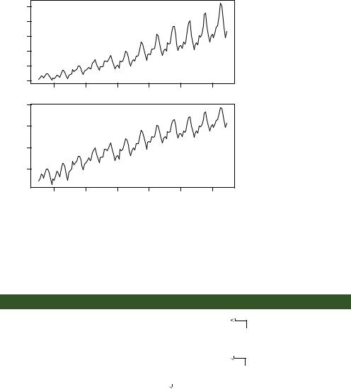
In the first plot (a), there is neither a trend nor a seasonal component. The only influence is a random fluctuation around a given level. In the second plot (b), there is an upward trend over time, as well as random fluctuations. In the third plot (c), there are seasonal effects and random fluctuations, but no overall trend away from a horizontal line. In the fourth plot (d), all three components are present: an upward trend, seasonal effects, and random fluctuations. You also see all three components in the final plot (e), but here they combine in a multiplicative way. Notice how the variability is proportional to the level: as the level increases, so does the variability. This amplification (or possible damping) based on the current level of the series strongly suggests a multiplicative model.
An example may make the difference between additive and multiplicative models clearer. Consider a time series that records the monthly sales of motorcycles over a 10year period. In a model with an additive seasonal effect, the number of motorcycles sold tends to increase by 500 in November and December (due to the Christmas rush) and decrease by 200 in January (when sales tend to be down). The seasonal increase or decrease is independent of the current sales volume.
In a model with a multiplicative seasonal effect, motorcycle sales in November and December tend to increase by 20% and decrease in January by 10%. In the multiplicative case, the impact of the seasonal effect is proportional to the current sales volume. This isn’t the case in an additive model. In many instances, the multiplicative model is more realistic.
A popular method for decomposing a time series into trend, seasonal, and irregular components is seasonal decomposition by loess smoothing. In R, this can be accomplished with the stl() function. The format is
stl(ts, s.window=, t.window=)
where ts is the time series to be decomposed, s.window controls how fast the seasonal effects can change over time, and t.window controls how fast the trend can change over time. Smaller values allow more rapid change. Setting s.window="periodic" forces seasonal effects to be identical across years. Only the ts and s.window parameters are required. See help(stl) for details.
The stl() function can only handle additive models, but this isn’t a serious limitation. Multiplicative models can be transformed into additive models using a log transformation:
log(Yt) = log(Trendt * Seasonalt * Irregulart)
= log(Trendt) + log(Seasonalt) + log(Irregulart)
After fitting the additive model to the log transformed series, the results can be backtransformed to the original scale. Let’s look at an example.
The time series AirPassengers comes with a base R installation and describes the monthly totals (in thousands) of international airline passengers between 1949 and 1960. A plot of the data is given in the top of figure 15.5. From the graph, it appears that variability of the series increases with the level, suggesting a multiplicative model.
Smoothing and seasonal decomposition |
349 |
|
600 |
|
|
|
|
|
AirPassengers |
200 300 400 500 |
|
|
|
|
|
|
100 |
|
|
|
|
|
|
1950 |
1952 |
1954 |
1956 |
1958 |
1960 |
|
6.5 |
|
|
|
|
|
log(AirPassengers) |
5.0 5.5 6.0 |
1950 |
1952 |
1954 |
1956 |
1958 |
1960 |
Time
Figure 15.5 Plot of the
AirPassengers time series (top). The time series contains the monthly totals (in thousands) of international airline passengers between 1949 and 1960. The logtransformed time series (bottom) stabilizes the variance and fits an additive seasonal decomposition model better.
The plot in the lower portion of figure 15.5 displays the time series created by taking the log of each observation. The variance has stabilized, and the logged series looks like an appropriate candidate for an additive decomposition. This is carried out using the stl() function in the following listing.
Listing 15.3 Seasonal decomposition using stl()
>plot(AirPassengers)
>lAirPassengers <- log(AirPassengers)
>plot(lAirPassengers, ylab="log(AirPassengers)")
>fit <- stl(lAirPassengers, s.window="period")
>plot(fit)
b
c
Plots the time series
Decomposes the time series
> fit$time.series |
|
|
|
Components for |
|
|
|
|
|||
|
seasonal trend |
|
d each observation |
||
|
remainder |
||||
Jan 1949 -0.09164 4.829 -0.0192494 |
|||||
Feb 1949 -0.11403 4.830 |
0.0543448 |
|
|
||
Mar 1949 |
0.01587 |
4.831 |
0.0355884 |
|
|
Apr 1949 -0.01403 4.833 |
0.0404633 |
|
|
||
May 1949 -0.01502 4.835 -0.0245905 |
|||||
Jun 1949 |
0.10979 |
4.838 |
-0.0426814 |
|
|
Jul 1949 |
0.21640 |
4.841 |
-0.0601152 |
|
|
Aug 1949 |
0.20961 |
4.843 |
-0.0558625 |
|
|
Sep 1949 |
0.06747 |
4.846 |
-0.0008274 |
|
|
Oct 1949 -0.07025 4.851 -0.0015113 |
|||||
Nov 1949 -0.21353 4.856 |
0.0021631 |
|
|
||
350 |
CHAPTER 15 Time series |
Dec 1949 -0.10064 4.865 0.0067347
... output omitted ...
> exp(fit$time.series)
seasonal trend remainder
Jan 1949 |
0.9124 |
125.1 |
0.9809 |
Feb 1949 |
0.8922 |
125.3 |
1.0558 |
Mar 1949 |
1.0160 |
125.4 |
1.0362 |
Apr 1949 |
0.9861 |
125.6 |
1.0413 |
May 1949 |
0.9851 |
125.9 |
0.9757 |
Jun 1949 |
1.1160 |
126.2 |
0.9582 |
Jul 1949 |
1.2416 |
126.6 |
0.9417 |
Aug 1949 |
1.2332 |
126.9 |
0.9457 |
Sep 1949 |
1.0698 |
127.2 |
0.9992 |
Oct 1949 |
0.9322 |
127.9 |
0.9985 |
Nov 1949 |
0.8077 |
128.5 |
1.0022 |
Dec 1949 |
0.9043 |
129.6 |
1.0068 |
... output |
omitted ... |
|
|
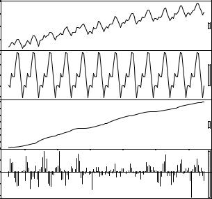
First, the time series is plotted and transformed b. A seasonal decomposition is performed and saved in an object called fit c. Plotting the results gives the graph in figure 15.6. The graph shows the time series, seasonal, trend, and irregular components from 1949 to 1960. Note that the seasonal components have been constrained to
|
6.5 |
|
|
|
|
|
|
6.0 |
|
|
|
|
|
data |
5.5 |
|
|
|
|
|
|
5.0 |
|
|
|
|
|
|
|
|
|
|
|
0.2 |
seasonal |
|
|
|
|
|
0.0 0.1 |
|
|
|
|
|
|
−0.2 |
|
6.0 |
|
|
|
|
|
trend |
5.6 |
|
|
|
|
|
|
5.2 |
|
|
|
|
|
|
4.8 |
|
|
|
|
|
irregular |
|
|
|
|
|
0.00 |
|
|
|
|
|
|
−0.10 |
|
1950 |
1952 |
1954 |
1956 |
1958 |
1960 |
|
|
|
|
time |
|
|
Figure 15.6 A seasonal decomposition of the logged AirPassengers time series using the stl() function. The time series (data) is decomposed into seasonal, trend, and irregular components.
Smoothing and seasonal decomposition |
351 |
remain the same across each year (using the s.window="period" option). The trend is monotonically increasing, and the seasonal effect suggests more passengers in the summer (perhaps during vacations). The grey bars on the right are magnitude guides—each bar represents the same magnitude. This is useful because the y-axes are different for each graph.
The object returned by the stl() function contains a component called time.series that contains the trend, season, and irregular portion of each observation d. In this case, fit$time.series is based on the logged time series. exp(fit$time.series) converts the decomposition back to the original metric. Examining the seasonal effects suggests that the number of passengers increased by 24% in July (a multiplier of 1.24) and decreased by 20% in November (with a multiplier of .80).
Two additional graphs can help to visualize a seasonal decomposition. They’re created by the monthplot() function that comes with base R and the seasonplot() function provided in the forecast package. The code
par(mfrow=c(2,1))
library(forecast)
monthplot(AirPassengers, xlab="", ylab="") seasonplot(AirPassengers, year.labels="TRUE", main="")
produces the graphs in figure 15.7.
600 |
|
|
|
|
|
|
|
|
|
|
|
500 |
|
|
|
|
|
|
|
|
|
|
|
400 |
|
|
|
|
|
|
|
|
|
|
|
300 |
|
|
|
|
|
|
|
|
|
|
|
200 |
|
|
|
|
|
|
|
|
|
|
|
100 |
|
|
|
|
|
|
|
|
|
|
|
J |
F |
M |
A |
M |
J |
J |
A |
S |
O |
N |
D |
600 |
|
|
500 |
|
|
400 |
1960 |
|
1959 |
||
300 |
19578 |
|
1956 |
||
1955 |
||
|
||
200 |
1954 |
|
19532 |
||
|
1951 |
|
|
1950 |
|
100 |
1949 |
|
|
Figure 15.7 A month plot (top) and season plot (bottom) for the
AirPassengers time series. Each shows an increasing trend and similar seasonal pattern year to year.
Jan Feb Mar Apr May Jun |
Jul |
Aug Sep Oct Nov Dec |