

Box plots |
129 |
tor of the labels. The third option assigns a color from the vector colfill to each level of cyl.f. The results are displayed in figure 6.10.
Overlapping kernel density plots can be a powerful way to compare groups of observations on an outcome variable. Here you can see both the shapes of the distribution of scores for each group and the amount of overlap between groups. (The moral of the story is that my next car will have four cylinders—or a battery.)
Box plots are also a wonderful (and more commonly used) graphical approach to visualizing distributions and differences among groups. We’ll discuss them next.
6.5Box plots
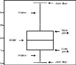
A box-and-whiskers plot describes the distribution of a continuous variable by plotting its five-num- ber summary: the minimum, lower quartile (25th percentile), median (50th percentile), upper quartile (75th percentile), and maximum. It can also display observations that may be outliers (values outside the range of
± 1.5*IQR, where IQR is the interquartile range defined as the upper quartile minus the lower quartile). For example, this statement produces the plot shown in figure 6.11:
Box plot
Miles Per Gallon
Figure 6.11 Box plot with annotations added by hand
boxplot(mtcars$mpg, main="Box plot", ylab="Miles per Gallon")
I added annotations by hand to illustrate the components.
By default, each whisker extends to the most extreme data point, which is no more than 1.5 times the interquartile range for the box. Values outside this range are depicted as dots (not shown here).
For example, in the sample of cars, the median mpg is 19.2, 50% of the scores fall between 15.3 and 22.8, the smallest value is 10.4, and the largest value is 33.9. How did I read this so precisely from the graph? Issuing boxplot.stats(mtcars$mpg) prints the statistics used to build the graph (in other words, I cheated). There don’t appear to be any outliers, and there is a mild positive skew (the upper whisker is longer than the lower whisker).
6.5.1Using parallel box plots to compare groups
Box plots can be created for individual variables or for variables by group. The format is
boxplot(formula, data=dataframe)
130 |
CHAPTER 6 Basic graphs |
where formula is a formula and dataframe denotes the data frame (or list) providing the data. An example of a formula is y ~ A, where a separate box plot for numeric variable y is generated for each value of categorical variable A. The formula y ~ A*B would produce a box plot of numeric variable y, for each combination of levels in categorical variables A and B.
Adding the option varwidth=TRUE makes the box-plot widths proportional to the square root of their sample sizes. Add horizontal=TRUE to reverse the axis orientation.
The following code revisits the impact of four, six, and eight cylinders on auto mpg with parallel box plots. The plot is provided in figure 6.12:
boxplot(mpg ~ cyl, data=mtcars, main="Car Mileage Data", xlab="Number of Cylinders", ylab="Miles Per Gallon")
You can see in figure 6.12 that |
|
|
|
|
|
|
|
Car Mileage Data |
there’s a good separation of |
|
|
|
|
|
|
|
|
|
|
|
|
|
|
|
|
|
groups based on gas mileage. |
|
|
|
|
|
|
|
|
You can also see that the distri- |
30 |
|
|
|
|
|
|
|
|
|
|
|
|
|
|
||
bution of mpg for six-cylinder |
|
|
|
|
|
|
|
|
|
|
|
|
|
|
|
|
|
cars is more symmetrical than |
|
|
|
|
|
|
|
|
for the |
other two |
car |
types. |
Gallon |
25 |
|
|
|
|
|
|
|
|
|
|
|
|
|
|
|
|
|
|
|
|
|
|
|
|
|
|
|
|
|
|
|
|
|
|
|
|
|
|
|
|
|
|
||||||
Cars with four cylinders show |
|
|
|
|
|
|
|
|
|
|
|
|
|
|
|
|
|
|
|
|
|
|||||
Per |
|
|
|
|
|
|
|
|
|
|
|
|
|
|
|
|
|
|
|
|
|
|
||||
the greatest spread (and posi- |
|
|
|
|
|
|
|
|
|
|
|
|
|
|
|
|
|
|
|
|
|
|
||||
|
|
|
|
|
|
|
|
|
|
|
|
|
|
|
|
|
|
|
|
|
|
|||||
Miles |
20 |
|
|
|
|
|
|
|
|
|
|
|
|
|
|
|
|
|
|
|
|
|
||||
tive skew) of mpg scores, when |
|
|
|
|
|
|
|
|
|
|
|
|
|
|
|
|
|
|
|
|
|
|||||
|
|
|
|
|
|
|
|
|
|
|
|
|
|
|
|
|
|
|
|
|
|
|||||
|
|
|
|
|
|
|
|
|
|
|
|
|
|
|
|
|
|
|
|
|
|
|||||
compared with sixand eight- |
|
|
|
|
|
|
|
|
|
|
|
|
|
|
|
|
|
|
|
|
|
|
|
|||
|
|
|
|
|
|
|
|
|
|
|
|
|
|
|
|
|
|
|
|
|
|
|
||||
cylinder |
cars. There’s also an |
|
15 |
|
|
|
|
|
|
|
|
|
|
|
|
|
|
|
|
|
|
|
|
|
||
|
|
|
|
|
|
|
|
|
|
|
|
|
|
|
|
|
|
|
|
|
|
|||||
outlier in the eight-cylinder |
|
|
|
|
|
|
|
|
|
|
|
|
|
|
|
|
|
|
|
|
|
|
|
|||
|
|
|
|
|
|
|
|
|
|
|
|
|
|
|
|
|
|
|
|
|
|
|
||||
group. |
|
|
|
|
|
|
|
|
|
|
|
|
|
|
|
|
|
|
|
|
|
|
|
|
|
|
Box plots are very versatile. |
|
10 |
|
|
|
|
|
|
|
|
|
|
|
|
|
|
|
|
|
|
|
|
|
|||
|
|
|
|
|
|
|
|
|
|
|
|
|
|
|
|
|
|
|
|
|
|
|||||
By adding notch=TRUE, you get |
|
4 |
|
6 |
|
|
8 |
|
|
|||||||||||||||||
|
|
|
|
|
|
|
|
|
|
|
|
|
|
|
|
|
|
|
|
|
|
|
||||
notched box plots. If two boxes’ |
|
|
|
|
|
|
|
|
|
|
Number of Cylinders |
|
|
|
|
|
|
|||||||||
|
|
|
|
|
|
|
|
|
|
|
|
|
|
|
|
|
|
|
|
|
|
|
||||
notches |
don’t overlap, |
there’s |
Figure 6.12 Box plots of car mileage vs. number of cylinders |
|||||||||||||||||||||||
strong |
evidence |
that |
their |
|
|
|
|
|
|
|
|
|
|
|
|
|
|
|
|
|
|
|
|
|
|
|
medians differ (Chambers et al., 1983, p. 62). The following code creates notched box plots for the mpg example:
boxplot(mpg ~ cyl, data=mtcars, notch=TRUE, varwidth=TRUE, col="red",
main="Car Mileage Data", xlab="Number of Cylinders", ylab="Miles Per Gallon")
The col option fills the box plots with a red color, and varwidth=TRUE produces box plots with widths that are proportional to their sample sizes.
Box plots |
131 |
Car Mileage Data
|
30 |
Gallon |
25 |
Miles Per |
20 |
|
15 |
|
10 |
4 |
6 |
8 |
Number of Cylinders
Figure 6.13 Notched box plots for car mileage vs. number of cylinders
You can see in figure 6.13 that the median car mileage for four-, six-, and eight-cylin- der cars differs. Mileage clearly decreases with number of cylinders.
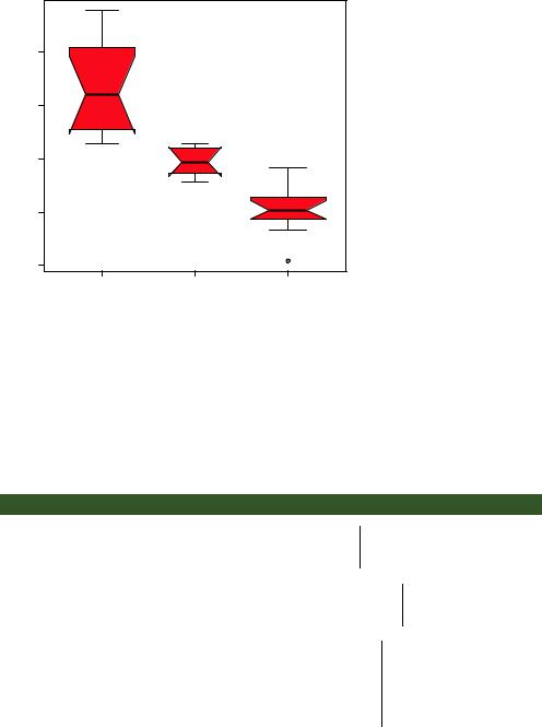
Finally, you can produce box plots for more than one grouping factor. Listing 6.9 provides box plots for mpg versus the number of cylinders and transmission type in an automobile (see figure 6.14). Again, you use the col option to fill the box plots with color. Note that colors recycle; in this case, there are six box plots and only two specified colors, so the colors repeat three times.
Listing 6.9 Box plots for two crossed factors
mtcars$cyl.f <- factor(mtcars$cyl, levels=c(4,6,8), labels=c("4","6","8"))
mtcars$am.f <- factor(mtcars$am, levels=c(0,1),
labels=c("auto", "standard"))
boxplot(mpg ~ am.f *cyl.f, data=mtcars, varwidth=TRUE, col=c("gold","darkgreen"),
main="MPG Distribution by Auto Type", xlab="Auto Type", ylab="Miles Per Gallon")
Creates a factor for the number of cylinders
Creates a factor for transmission type
Generates the box plot
From figure 6.14, it’s again clear that median mileage decreases with number of cylinders. For fourand six-cylinder cars, mileage is higher for standard transmissions. But
132 |
CHAPTER 6 Basic graphs |
MPG Distribution by Auto Type
|
30 |
|
|
|
|
|
|
|
|
|
|
|
|
|
|
|
|
|
|
|
|
|
|
|
|
|
|
|
|
|
|
|
|
|
|
|
|
|
|
|
|
|
|
|
|
|
|
|
|
|
|
|
|
|
|
|
|
|
|
|
|
|
|
|
|
|
|
|
|
|
|
|
|
|
|
|
|
|
|
|
|
|
|
|
|
|
|
|
|
|
|
|
|
|
|
|
|
|
|
|
|
|
|
|
|
|
|
|
|
|
|
|
|
|
|
Gallon |
25 |
|
|
|
|
|
|
|
|
|
|
|
|
|
|
|
|
|
|
|
|
|
|
|
|
|
|
|
|
|
|
|
|
|
|
|
|
|
|
|
|
|
|
|
|
|
|
|
|
|
|
|
|
|
|
||
|
|
|
|
|
|
|
|
|
|
|
|
|
|
|
|
|
|
|
|
|
|
|
|
|
|
|
||
|
|
|
|
|
|
|
|
|
|
|
|
|
|
|
|
|
|
|
|
|
|
|
|
|
|
|
|
|
|
|
|
|
|
|
|
|
|
|
|
|
|
|
|
|
|
|
|
|
|
|
|
|
|
|
|
|
|
|
|
|
|
|
|
|
|
|
|
|
|
|
|
|
|
|
|
|
|
|
|
|
|
|
|
|
|
|
Miles Per |
20 |
|
|
|
|
|
|
|
|
|
|
|
|
|
|
|
|
|
|
|
|
|
|
|
|
|
|
|
|
|
|
|
|
|
|
|
|
|
|
|
|
|
|
|
|
|
|
|
|
|
|
|
|
|
|
||
|
|
|
|
|
|
|
|
|
|
|
|
|
|
|
|
|
|
|
|
|
|
|
|
|
|
|
||
|
|
|
|
|
|
|
|
|
|
|
|
|
|
|
|
|
|
|
|
|
|
|
|
|
|
|
||
|
|
|
|
|
|
|
|
|
|
|
|
|
|
|
|
|
|
|
|
|
|
|
|
|
||||
15 |
|
|
|
|
|
|
|
|
|
|
|
|
|
|
|
|
|
|
|
|
|
|
|
|
|
|
|
|
|
|
|
|
|
|
|
|
|
|
|
|
|
|
|
|
|
|
|
|
|
|
|
|
|
|
|
|
|
|
|
|
|
|
|
|
|
|
|
|
|
|
|
|
|
|
|
|
|
|
|
|
|
|
|
|
|
|
|
|
|
|
|
|
|
|
|
|
|
|
|
|
|
|
|
|
|
|
|
|
|
|
|
|
|
|
|
|
|
|
|
|
|
|
|
|
|
|
|
|
|
|
|
|
|
|
|
|
|
|
|
|
|
|
|
|
|
10 |
|
|
|
|
|
|
|
|
|
|
|
|
|
|
|
|
|
|
|
|
|
|
|
|
|
|
|
|
|
|
|
|
|
|
|
|
|
|
|
|
|
|
|
|
|
|
|
|
|
|
|
|
|
|
|
|
|
|
|
|
|
|
|
|
|
|
|
|
|
|
|
|
|
|
|
|
|
|
|
|
|
|
|||
|
|
|
|
|
|
|
|
|
|
|
|
|
|
|
|
|
|
|
|
|
|
|
|
|
|
|
|
auto.4 standard.4 auto.6 standard.6 auto.8 standard.8
Auto Type
Figure 6.14 Box plots for car mileage vs. transmission type and number of cylinders
for eight-cylinder cars, there doesn’t appear to be a difference. You can also see from the widths of the box plots that standard four-cylinder and automatic eight-cylinder cars are the most common in this dataset.
6.5.2Violin plots
Before we end our discussion of box plots, it’s worth examining a variation called a violin plot. A violin plot is a combination of a box plot and a kernel density plot. You can create one using the vioplot() function from the vioplot package. Be sure to install the vioplot package before first use.
The format for the vioplot() function is
vioplot(x1, x2, ... , names=, col=)
where x1, x2, ... represent one or more numeric vectors to be plotted (one violin plot is produced for each vector). The names parameter provides a character vector of labels for the violin plots, and col is a vector specifying the colors for each violin plot. An example is given in the following listing.
Listing 6.10 Violin plots
library(vioplot)
x1 <- mtcars$mpg[mtcars$cyl==4]
x2 <- mtcars$mpg[mtcars$cyl==6]
x3 <- mtcars$mpg[mtcars$cyl==8] vioplot(x1, x2, x3,
names=c("4 cyl", "6 cyl", "8 cyl"), col="gold")