- •brief contents
- •contents
- •preface
- •acknowledgments
- •about this book
- •What’s new in the second edition
- •Who should read this book
- •Roadmap
- •Advice for data miners
- •Code examples
- •Code conventions
- •Author Online
- •About the author
- •about the cover illustration
- •1 Introduction to R
- •1.2 Obtaining and installing R
- •1.3 Working with R
- •1.3.1 Getting started
- •1.3.2 Getting help
- •1.3.3 The workspace
- •1.3.4 Input and output
- •1.4 Packages
- •1.4.1 What are packages?
- •1.4.2 Installing a package
- •1.4.3 Loading a package
- •1.4.4 Learning about a package
- •1.5 Batch processing
- •1.6 Using output as input: reusing results
- •1.7 Working with large datasets
- •1.8 Working through an example
- •1.9 Summary
- •2 Creating a dataset
- •2.1 Understanding datasets
- •2.2 Data structures
- •2.2.1 Vectors
- •2.2.2 Matrices
- •2.2.3 Arrays
- •2.2.4 Data frames
- •2.2.5 Factors
- •2.2.6 Lists
- •2.3 Data input
- •2.3.1 Entering data from the keyboard
- •2.3.2 Importing data from a delimited text file
- •2.3.3 Importing data from Excel
- •2.3.4 Importing data from XML
- •2.3.5 Importing data from the web
- •2.3.6 Importing data from SPSS
- •2.3.7 Importing data from SAS
- •2.3.8 Importing data from Stata
- •2.3.9 Importing data from NetCDF
- •2.3.10 Importing data from HDF5
- •2.3.11 Accessing database management systems (DBMSs)
- •2.3.12 Importing data via Stat/Transfer
- •2.4 Annotating datasets
- •2.4.1 Variable labels
- •2.4.2 Value labels
- •2.5 Useful functions for working with data objects
- •2.6 Summary
- •3 Getting started with graphs
- •3.1 Working with graphs
- •3.2 A simple example
- •3.3 Graphical parameters
- •3.3.1 Symbols and lines
- •3.3.2 Colors
- •3.3.3 Text characteristics
- •3.3.4 Graph and margin dimensions
- •3.4 Adding text, customized axes, and legends
- •3.4.1 Titles
- •3.4.2 Axes
- •3.4.3 Reference lines
- •3.4.4 Legend
- •3.4.5 Text annotations
- •3.4.6 Math annotations
- •3.5 Combining graphs
- •3.5.1 Creating a figure arrangement with fine control
- •3.6 Summary
- •4 Basic data management
- •4.1 A working example
- •4.2 Creating new variables
- •4.3 Recoding variables
- •4.4 Renaming variables
- •4.5 Missing values
- •4.5.1 Recoding values to missing
- •4.5.2 Excluding missing values from analyses
- •4.6 Date values
- •4.6.1 Converting dates to character variables
- •4.6.2 Going further
- •4.7 Type conversions
- •4.8 Sorting data
- •4.9 Merging datasets
- •4.9.1 Adding columns to a data frame
- •4.9.2 Adding rows to a data frame
- •4.10 Subsetting datasets
- •4.10.1 Selecting (keeping) variables
- •4.10.2 Excluding (dropping) variables
- •4.10.3 Selecting observations
- •4.10.4 The subset() function
- •4.10.5 Random samples
- •4.11 Using SQL statements to manipulate data frames
- •4.12 Summary
- •5 Advanced data management
- •5.2 Numerical and character functions
- •5.2.1 Mathematical functions
- •5.2.2 Statistical functions
- •5.2.3 Probability functions
- •5.2.4 Character functions
- •5.2.5 Other useful functions
- •5.2.6 Applying functions to matrices and data frames
- •5.3 A solution for the data-management challenge
- •5.4 Control flow
- •5.4.1 Repetition and looping
- •5.4.2 Conditional execution
- •5.5 User-written functions
- •5.6 Aggregation and reshaping
- •5.6.1 Transpose
- •5.6.2 Aggregating data
- •5.6.3 The reshape2 package
- •5.7 Summary
- •6 Basic graphs
- •6.1 Bar plots
- •6.1.1 Simple bar plots
- •6.1.2 Stacked and grouped bar plots
- •6.1.3 Mean bar plots
- •6.1.4 Tweaking bar plots
- •6.1.5 Spinograms
- •6.2 Pie charts
- •6.3 Histograms
- •6.4 Kernel density plots
- •6.5 Box plots
- •6.5.1 Using parallel box plots to compare groups
- •6.5.2 Violin plots
- •6.6 Dot plots
- •6.7 Summary
- •7 Basic statistics
- •7.1 Descriptive statistics
- •7.1.1 A menagerie of methods
- •7.1.2 Even more methods
- •7.1.3 Descriptive statistics by group
- •7.1.4 Additional methods by group
- •7.1.5 Visualizing results
- •7.2 Frequency and contingency tables
- •7.2.1 Generating frequency tables
- •7.2.2 Tests of independence
- •7.2.3 Measures of association
- •7.2.4 Visualizing results
- •7.3 Correlations
- •7.3.1 Types of correlations
- •7.3.2 Testing correlations for significance
- •7.3.3 Visualizing correlations
- •7.4 T-tests
- •7.4.3 When there are more than two groups
- •7.5 Nonparametric tests of group differences
- •7.5.1 Comparing two groups
- •7.5.2 Comparing more than two groups
- •7.6 Visualizing group differences
- •7.7 Summary
- •8 Regression
- •8.1 The many faces of regression
- •8.1.1 Scenarios for using OLS regression
- •8.1.2 What you need to know
- •8.2 OLS regression
- •8.2.1 Fitting regression models with lm()
- •8.2.2 Simple linear regression
- •8.2.3 Polynomial regression
- •8.2.4 Multiple linear regression
- •8.2.5 Multiple linear regression with interactions
- •8.3 Regression diagnostics
- •8.3.1 A typical approach
- •8.3.2 An enhanced approach
- •8.3.3 Global validation of linear model assumption
- •8.3.4 Multicollinearity
- •8.4 Unusual observations
- •8.4.1 Outliers
- •8.4.3 Influential observations
- •8.5 Corrective measures
- •8.5.1 Deleting observations
- •8.5.2 Transforming variables
- •8.5.3 Adding or deleting variables
- •8.5.4 Trying a different approach
- •8.6 Selecting the “best” regression model
- •8.6.1 Comparing models
- •8.6.2 Variable selection
- •8.7 Taking the analysis further
- •8.7.1 Cross-validation
- •8.7.2 Relative importance
- •8.8 Summary
- •9 Analysis of variance
- •9.1 A crash course on terminology
- •9.2 Fitting ANOVA models
- •9.2.1 The aov() function
- •9.2.2 The order of formula terms
- •9.3.1 Multiple comparisons
- •9.3.2 Assessing test assumptions
- •9.4 One-way ANCOVA
- •9.4.1 Assessing test assumptions
- •9.4.2 Visualizing the results
- •9.6 Repeated measures ANOVA
- •9.7 Multivariate analysis of variance (MANOVA)
- •9.7.1 Assessing test assumptions
- •9.7.2 Robust MANOVA
- •9.8 ANOVA as regression
- •9.9 Summary
- •10 Power analysis
- •10.1 A quick review of hypothesis testing
- •10.2 Implementing power analysis with the pwr package
- •10.2.1 t-tests
- •10.2.2 ANOVA
- •10.2.3 Correlations
- •10.2.4 Linear models
- •10.2.5 Tests of proportions
- •10.2.7 Choosing an appropriate effect size in novel situations
- •10.3 Creating power analysis plots
- •10.4 Other packages
- •10.5 Summary
- •11 Intermediate graphs
- •11.1 Scatter plots
- •11.1.3 3D scatter plots
- •11.1.4 Spinning 3D scatter plots
- •11.1.5 Bubble plots
- •11.2 Line charts
- •11.3 Corrgrams
- •11.4 Mosaic plots
- •11.5 Summary
- •12 Resampling statistics and bootstrapping
- •12.1 Permutation tests
- •12.2 Permutation tests with the coin package
- •12.2.2 Independence in contingency tables
- •12.2.3 Independence between numeric variables
- •12.2.5 Going further
- •12.3 Permutation tests with the lmPerm package
- •12.3.1 Simple and polynomial regression
- •12.3.2 Multiple regression
- •12.4 Additional comments on permutation tests
- •12.5 Bootstrapping
- •12.6 Bootstrapping with the boot package
- •12.6.1 Bootstrapping a single statistic
- •12.6.2 Bootstrapping several statistics
- •12.7 Summary
- •13 Generalized linear models
- •13.1 Generalized linear models and the glm() function
- •13.1.1 The glm() function
- •13.1.2 Supporting functions
- •13.1.3 Model fit and regression diagnostics
- •13.2 Logistic regression
- •13.2.1 Interpreting the model parameters
- •13.2.2 Assessing the impact of predictors on the probability of an outcome
- •13.2.3 Overdispersion
- •13.2.4 Extensions
- •13.3 Poisson regression
- •13.3.1 Interpreting the model parameters
- •13.3.2 Overdispersion
- •13.3.3 Extensions
- •13.4 Summary
- •14 Principal components and factor analysis
- •14.1 Principal components and factor analysis in R
- •14.2 Principal components
- •14.2.1 Selecting the number of components to extract
- •14.2.2 Extracting principal components
- •14.2.3 Rotating principal components
- •14.2.4 Obtaining principal components scores
- •14.3 Exploratory factor analysis
- •14.3.1 Deciding how many common factors to extract
- •14.3.2 Extracting common factors
- •14.3.3 Rotating factors
- •14.3.4 Factor scores
- •14.4 Other latent variable models
- •14.5 Summary
- •15 Time series
- •15.1 Creating a time-series object in R
- •15.2 Smoothing and seasonal decomposition
- •15.2.1 Smoothing with simple moving averages
- •15.2.2 Seasonal decomposition
- •15.3 Exponential forecasting models
- •15.3.1 Simple exponential smoothing
- •15.3.3 The ets() function and automated forecasting
- •15.4 ARIMA forecasting models
- •15.4.1 Prerequisite concepts
- •15.4.2 ARMA and ARIMA models
- •15.4.3 Automated ARIMA forecasting
- •15.5 Going further
- •15.6 Summary
- •16 Cluster analysis
- •16.1 Common steps in cluster analysis
- •16.2 Calculating distances
- •16.3 Hierarchical cluster analysis
- •16.4 Partitioning cluster analysis
- •16.4.2 Partitioning around medoids
- •16.5 Avoiding nonexistent clusters
- •16.6 Summary
- •17 Classification
- •17.1 Preparing the data
- •17.2 Logistic regression
- •17.3 Decision trees
- •17.3.1 Classical decision trees
- •17.3.2 Conditional inference trees
- •17.4 Random forests
- •17.5 Support vector machines
- •17.5.1 Tuning an SVM
- •17.6 Choosing a best predictive solution
- •17.7 Using the rattle package for data mining
- •17.8 Summary
- •18 Advanced methods for missing data
- •18.1 Steps in dealing with missing data
- •18.2 Identifying missing values
- •18.3 Exploring missing-values patterns
- •18.3.1 Tabulating missing values
- •18.3.2 Exploring missing data visually
- •18.3.3 Using correlations to explore missing values
- •18.4 Understanding the sources and impact of missing data
- •18.5 Rational approaches for dealing with incomplete data
- •18.6 Complete-case analysis (listwise deletion)
- •18.7 Multiple imputation
- •18.8 Other approaches to missing data
- •18.8.1 Pairwise deletion
- •18.8.2 Simple (nonstochastic) imputation
- •18.9 Summary
- •19 Advanced graphics with ggplot2
- •19.1 The four graphics systems in R
- •19.2 An introduction to the ggplot2 package
- •19.3 Specifying the plot type with geoms
- •19.4 Grouping
- •19.5 Faceting
- •19.6 Adding smoothed lines
- •19.7 Modifying the appearance of ggplot2 graphs
- •19.7.1 Axes
- •19.7.2 Legends
- •19.7.3 Scales
- •19.7.4 Themes
- •19.7.5 Multiple graphs per page
- •19.8 Saving graphs
- •19.9 Summary
- •20 Advanced programming
- •20.1 A review of the language
- •20.1.1 Data types
- •20.1.2 Control structures
- •20.1.3 Creating functions
- •20.2 Working with environments
- •20.3 Object-oriented programming
- •20.3.1 Generic functions
- •20.3.2 Limitations of the S3 model
- •20.4 Writing efficient code
- •20.5 Debugging
- •20.5.1 Common sources of errors
- •20.5.2 Debugging tools
- •20.5.3 Session options that support debugging
- •20.6 Going further
- •20.7 Summary
- •21 Creating a package
- •21.1 Nonparametric analysis and the npar package
- •21.1.1 Comparing groups with the npar package
- •21.2 Developing the package
- •21.2.1 Computing the statistics
- •21.2.2 Printing the results
- •21.2.3 Summarizing the results
- •21.2.4 Plotting the results
- •21.2.5 Adding sample data to the package
- •21.3 Creating the package documentation
- •21.4 Building the package
- •21.5 Going further
- •21.6 Summary
- •22 Creating dynamic reports
- •22.1 A template approach to reports
- •22.2 Creating dynamic reports with R and Markdown
- •22.3 Creating dynamic reports with R and LaTeX
- •22.4 Creating dynamic reports with R and Open Document
- •22.5 Creating dynamic reports with R and Microsoft Word
- •22.6 Summary
- •afterword Into the rabbit hole
- •appendix A Graphical user interfaces
- •appendix B Customizing the startup environment
- •appendix C Exporting data from R
- •Delimited text file
- •Excel spreadsheet
- •Statistical applications
- •appendix D Matrix algebra in R
- •appendix E Packages used in this book
- •appendix F Working with large datasets
- •F.1 Efficient programming
- •F.2 Storing data outside of RAM
- •F.3 Analytic packages for out-of-memory data
- •F.4 Comprehensive solutions for working with enormous datasets
- •appendix G Updating an R installation
- •G.1 Automated installation (Windows only)
- •G.2 Manual installation (Windows and Mac OS X)
- •G.3 Updating an R installation (Linux)
- •references
- •index
- •Symbols
- •Numerics
- •23.1 The lattice package
- •23.2 Conditioning variables
- •23.3 Panel functions
- •23.4 Grouping variables
- •23.5 Graphic parameters
- •23.6 Customizing plot strips
- •23.7 Page arrangement
- •23.8 Going further
50 |
CHAPTER 3 Getting started with graphs |
Line plots are covered in detail in chapter 11. Now let’s modify the appearance of this graph.
3.3Graphical parameters
You can customize many features of a graph (fonts, colors, axes, and labels) through options called graphical parameters. One way is to specify these options through the par() function. Values set in this manner will be in effect for the rest of the session or until they’re changed. The format is par(optionname=value, optionname=value,
...). Specifying par() without parameters produces a list of the current graphical settings. Adding the no.readonly=TRUE option produces a list of current graphical settings that can be modified.
Continuing the example, let’s say that you’d like to use a solid triangle rather than an open circle as your plotting symbol, and connect points using a dashed line rather than a solid line. You can do so with the following code:
opar <- par(no.readonly=TRUE) par(lty=2, pch=17)
plot(dose, drugA, type="b") par(opar)
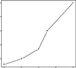
The resulting graph is shown in figure 3.3.
The first statement makes a copy of the current settings. The second statement changes the default line type to dashed (lty=2) and the default symbol for plotting points to a solid triangle (pch=17). You then generate the plot and restore the original settings. Line types and symbols are covered in section 3.3.1.
You can have as many par() functions as desired, so par(lty=2, pch=17) could also be written as
par(lty=2)
par(pch=17)
|
60 |
|
|
|
|
|
50 |
|
|
|
|
ugA |
40 |
|
|
|
|
dr |
|
|
|
|
|
|
30 |
|
|
|
|
|
20 |
|
|
|
|
|
20 |
30 |
40 |
50 |
60 |
|
|
|
dose |
|
|
Figure 3.3 Line plot of dose vs. response for drug A with modified line type and symbol
A second way to specify graphical parameters is by providing the optionname=value pairs directly to a high-level plotting function. In this case, the options are only in effect for that specific graph. You could generate the same graph with this code:
plot(dose, drugA, type="b", lty=2, pch=17)
Graphical parameters |
51 |
Not all high-level plotting functions allow you to specify all possible graphical parameters. See the help for a specific plotting function (such as ?plot, ?hist, or ?boxplot) to determine which graphical parameters can be set in this way. The remainder of section 3.3 describes many of the important graphical parameters that you can set.
3.3.1Symbols and lines
As you’ve seen, you can use graphical parameters to specify the plotting symbols and lines used in your graphs. The relevant parameters are shown in table 3.2.
Table 3.2 Parameters for specifying symbols and lines
Parameter |
Description |
|
|
pch |
Specifies the symbol to use when plotting points (see figure 3.4). |
cex |
Specifies the symbol size. cex is a number indicating the amount by which plotting |
|
symbols should be scaled relative to the default. 1 = default, 1.5 is 50% larger, 0.5 is |
|
50% smaller, and so forth. |
lty |
Specifies the line type (see figure 3.5). |
lwd |
Specifies the line width. lwd is expressed relative to the default (1 = default). For |
|
example, lwd=2 generates a line twice as wide as the default. |
|
|
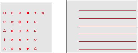
The pch= option specifies the symbols to use when plotting points. Possible values are shown in figure 3.4. For symbols 21 through 25, you can also specify the border (col=) and fill (bg=) colors.
Use lty= to specify the type of line desired. The option values are shown in figure 3.5.
Taking these options together, the code
plot(dose, drugA, type="b", lty=3, lwd=3, pch=15, cex=2)
plot symbols: pch= |
line types: lty= |
||||||
6 |
|||||||
0 |
5 |
10 |
15 |
20 |
25 |
||
|
|||||||
1 |
6 |
11 |
16 |
21 |
|
5 |
|
|
|
||||||
|
|
|
|
|
|
4 |
|
2 |
7 |
12 |
17 |
22 |
|
3 |
|
|
|
|
|
|
|
||
3 |
8 |
13 |
18 |
23 |
|
2 |
|
|
|
|
|
|
|
||
4 |
9 |
14 |
19 |
24 |
|
1 |
|
Figure 3.4 |
|
Plotting symbols |
|
Figure 3.5 Line types specified with |
|||
specified with the pch parameter |
the lty parameter |
52 |
CHAPTER 3 Getting started with graphs |
would produce a plot with a dotted line that was three times wider than the default width, connecting points displayed as filled squares that are twice as large as the default symbol size. The results are shown in figure 3.6.
Next, let’s look at specifying colors.
Figure 3.6 Line plot of dose vs. response for drug A with modified line type, line width, symbol, and symbol width
|
60 |
|
|
|
|
|
50 |
|
|
|
|
drugA |
40 |
|
|
|
|
|
30 |
|
|
|
|
|
20 |
|
|
|
|
|
20 |
30 |
40 |
50 |
60 |
|
|
|
dose |
|
|
3.3.2Colors
There are several color-related parameters in R. Table 3.3 shows some of the common ones.
Table 3.3 Parameters for specifying colors
Parameter |
Description |
|
|
col |
Default plotting color. Some functions (such as lines and pie) accept a vector of |
|
values that are recycled. For example, if col=c("red", "blue") and three |
|
lines are plotted, the first line will be red, the second blue, and the third red. |
col.axis |
Color for axis text. |
col.lab |
Color for axis labels. |
col.main |
Color for titles. |
col.sub |
Color for subtitles. |
fg |
Color for the plot’s foreground. |
bg |
Color for the plot’s background. |
|
|
You can specify colors in R by index, name, hexadecimal, RGB, or HSV. For example, col=1, col="white", col="#FFFFFF", col=rgb(1,1,1), and col=hsv(0,0,1) are equivalent ways of specifying the color white. The function rgb()creates colors based on red-green-blue values, whereas hsv() creates colors based on hue-saturation values. See the help feature on these functions for more details.
The function colors() returns all available color names. Earl F. Glynn has created an excellent online chart of R colors, available at http://mng.bz/9C5p. R also has a number of functions that can be used to create vectors of contiguous colors. These
Graphical parameters |
53 |
include rainbow(), heat.colors(), terrain.colors(), topo.colors(), and cm.colors(). For example, rainbow(10) produces 10 contiguous “rainbow” colors.
The RColorBrewer package is particularly popular for creating attractive color palettes. Be sure to download it (install.packages("RColorBrewer")) before first use. Once it’s installed, use the brewer.pal(n, name) function to generate a vector of colors. For example, the code
library(RColorBrewer) n <- 7
mycolors <- brewer.pal(n, "Set1") barplot(rep(1,n), col=mycolors)
returns a vector of seven colors in hexadecimal format from the Set1 palette. To get a list of the available palettes, type brewer.pal.info; or type display.brewer.all() to produces a plot of each palette in a single display. See help(RColorBrewer) for more details.
Finally, gray levels are generated with the gray() function in the base installation. In this case, you specify gray levels as a vector of numbers between 0 and 1. gray(0:10/10) produces 10 gray levels. Try the following code to see how this works:
n <- 10
mycolors <- rainbow(n)
pie(rep(1, n), labels=mycolors, col=mycolors) mygrays <- gray(0:n/n)
pie(rep(1, n), labels=mygrays, col=mygrays)
As you can see, R provides numerous methods for generating color vectors. You’ll see examples that use color parameters throughout this chapter.
3.3.3Text characteristics
Graphic parameters are also used to specify text size, font, and style. Parameters controlling text size are explained in table 3.4. Font family and style can be controlled with font options (see table 3.5).
Table 3.4 Parameters specifying text size
Parameter |
Description |
|
|
cex |
Number indicating the amount by which plotted text should be scaled relative to |
|
the default. 1 = default, 1.5 is 50% larger, 0.5 is 50% smaller, and so on. |
cex.axis |
Magnification of axis text relative to cex. |
cex.lab |
Magnification of axis labels relative to cex. |
cex.main |
Magnification of titles relative to cex. |
cex.sub |
Magnification of subtitles relative to cex. |
|
|
For example, all graphs created after the statement
par(font.lab=3, cex.lab=1.5, font.main=4, cex.main=2)