

- •brief contents
- •contents
- •preface
- •acknowledgments
- •about this book
- •What’s new in the second edition
- •Who should read this book
- •Roadmap
- •Advice for data miners
- •Code examples
- •Code conventions
- •Author Online
- •About the author
- •about the cover illustration
- •1 Introduction to R
- •1.2 Obtaining and installing R
- •1.3 Working with R
- •1.3.1 Getting started
- •1.3.2 Getting help
- •1.3.3 The workspace
- •1.3.4 Input and output
- •1.4 Packages
- •1.4.1 What are packages?
- •1.4.2 Installing a package
- •1.4.3 Loading a package
- •1.4.4 Learning about a package
- •1.5 Batch processing
- •1.6 Using output as input: reusing results
- •1.7 Working with large datasets
- •1.8 Working through an example
- •1.9 Summary
- •2 Creating a dataset
- •2.1 Understanding datasets
- •2.2 Data structures
- •2.2.1 Vectors
- •2.2.2 Matrices
- •2.2.3 Arrays
- •2.2.4 Data frames
- •2.2.5 Factors
- •2.2.6 Lists
- •2.3 Data input
- •2.3.1 Entering data from the keyboard
- •2.3.2 Importing data from a delimited text file
- •2.3.3 Importing data from Excel
- •2.3.4 Importing data from XML
- •2.3.5 Importing data from the web
- •2.3.6 Importing data from SPSS
- •2.3.7 Importing data from SAS
- •2.3.8 Importing data from Stata
- •2.3.9 Importing data from NetCDF
- •2.3.10 Importing data from HDF5
- •2.3.11 Accessing database management systems (DBMSs)
- •2.3.12 Importing data via Stat/Transfer
- •2.4 Annotating datasets
- •2.4.1 Variable labels
- •2.4.2 Value labels
- •2.5 Useful functions for working with data objects
- •2.6 Summary
- •3 Getting started with graphs
- •3.1 Working with graphs
- •3.2 A simple example
- •3.3 Graphical parameters
- •3.3.1 Symbols and lines
- •3.3.2 Colors
- •3.3.3 Text characteristics
- •3.3.4 Graph and margin dimensions
- •3.4 Adding text, customized axes, and legends
- •3.4.1 Titles
- •3.4.2 Axes
- •3.4.3 Reference lines
- •3.4.4 Legend
- •3.4.5 Text annotations
- •3.4.6 Math annotations
- •3.5 Combining graphs
- •3.5.1 Creating a figure arrangement with fine control
- •3.6 Summary
- •4 Basic data management
- •4.1 A working example
- •4.2 Creating new variables
- •4.3 Recoding variables
- •4.4 Renaming variables
- •4.5 Missing values
- •4.5.1 Recoding values to missing
- •4.5.2 Excluding missing values from analyses
- •4.6 Date values
- •4.6.1 Converting dates to character variables
- •4.6.2 Going further
- •4.7 Type conversions
- •4.8 Sorting data
- •4.9 Merging datasets
- •4.9.1 Adding columns to a data frame
- •4.9.2 Adding rows to a data frame
- •4.10 Subsetting datasets
- •4.10.1 Selecting (keeping) variables
- •4.10.2 Excluding (dropping) variables
- •4.10.3 Selecting observations
- •4.10.4 The subset() function
- •4.10.5 Random samples
- •4.11 Using SQL statements to manipulate data frames
- •4.12 Summary
- •5 Advanced data management
- •5.2 Numerical and character functions
- •5.2.1 Mathematical functions
- •5.2.2 Statistical functions
- •5.2.3 Probability functions
- •5.2.4 Character functions
- •5.2.5 Other useful functions
- •5.2.6 Applying functions to matrices and data frames
- •5.3 A solution for the data-management challenge
- •5.4 Control flow
- •5.4.1 Repetition and looping
- •5.4.2 Conditional execution
- •5.5 User-written functions
- •5.6 Aggregation and reshaping
- •5.6.1 Transpose
- •5.6.2 Aggregating data
- •5.6.3 The reshape2 package
- •5.7 Summary
- •6 Basic graphs
- •6.1 Bar plots
- •6.1.1 Simple bar plots
- •6.1.2 Stacked and grouped bar plots
- •6.1.3 Mean bar plots
- •6.1.4 Tweaking bar plots
- •6.1.5 Spinograms
- •6.2 Pie charts
- •6.3 Histograms
- •6.4 Kernel density plots
- •6.5 Box plots
- •6.5.1 Using parallel box plots to compare groups
- •6.5.2 Violin plots
- •6.6 Dot plots
- •6.7 Summary
- •7 Basic statistics
- •7.1 Descriptive statistics
- •7.1.1 A menagerie of methods
- •7.1.2 Even more methods
- •7.1.3 Descriptive statistics by group
- •7.1.4 Additional methods by group
- •7.1.5 Visualizing results
- •7.2 Frequency and contingency tables
- •7.2.1 Generating frequency tables
- •7.2.2 Tests of independence
- •7.2.3 Measures of association
- •7.2.4 Visualizing results
- •7.3 Correlations
- •7.3.1 Types of correlations
- •7.3.2 Testing correlations for significance
- •7.3.3 Visualizing correlations
- •7.4 T-tests
- •7.4.3 When there are more than two groups
- •7.5 Nonparametric tests of group differences
- •7.5.1 Comparing two groups
- •7.5.2 Comparing more than two groups
- •7.6 Visualizing group differences
- •7.7 Summary
- •8 Regression
- •8.1 The many faces of regression
- •8.1.1 Scenarios for using OLS regression
- •8.1.2 What you need to know
- •8.2 OLS regression
- •8.2.1 Fitting regression models with lm()
- •8.2.2 Simple linear regression
- •8.2.3 Polynomial regression
- •8.2.4 Multiple linear regression
- •8.2.5 Multiple linear regression with interactions
- •8.3 Regression diagnostics
- •8.3.1 A typical approach
- •8.3.2 An enhanced approach
- •8.3.3 Global validation of linear model assumption
- •8.3.4 Multicollinearity
- •8.4 Unusual observations
- •8.4.1 Outliers
- •8.4.3 Influential observations
- •8.5 Corrective measures
- •8.5.1 Deleting observations
- •8.5.2 Transforming variables
- •8.5.3 Adding or deleting variables
- •8.5.4 Trying a different approach
- •8.6 Selecting the “best” regression model
- •8.6.1 Comparing models
- •8.6.2 Variable selection
- •8.7 Taking the analysis further
- •8.7.1 Cross-validation
- •8.7.2 Relative importance
- •8.8 Summary
- •9 Analysis of variance
- •9.1 A crash course on terminology
- •9.2 Fitting ANOVA models
- •9.2.1 The aov() function
- •9.2.2 The order of formula terms
- •9.3.1 Multiple comparisons
- •9.3.2 Assessing test assumptions
- •9.4 One-way ANCOVA
- •9.4.1 Assessing test assumptions
- •9.4.2 Visualizing the results
- •9.6 Repeated measures ANOVA
- •9.7 Multivariate analysis of variance (MANOVA)
- •9.7.1 Assessing test assumptions
- •9.7.2 Robust MANOVA
- •9.8 ANOVA as regression
- •9.9 Summary
- •10 Power analysis
- •10.1 A quick review of hypothesis testing
- •10.2 Implementing power analysis with the pwr package
- •10.2.1 t-tests
- •10.2.2 ANOVA
- •10.2.3 Correlations
- •10.2.4 Linear models
- •10.2.5 Tests of proportions
- •10.2.7 Choosing an appropriate effect size in novel situations
- •10.3 Creating power analysis plots
- •10.4 Other packages
- •10.5 Summary
- •11 Intermediate graphs
- •11.1 Scatter plots
- •11.1.3 3D scatter plots
- •11.1.4 Spinning 3D scatter plots
- •11.1.5 Bubble plots
- •11.2 Line charts
- •11.3 Corrgrams
- •11.4 Mosaic plots
- •11.5 Summary
- •12 Resampling statistics and bootstrapping
- •12.1 Permutation tests
- •12.2 Permutation tests with the coin package
- •12.2.2 Independence in contingency tables
- •12.2.3 Independence between numeric variables
- •12.2.5 Going further
- •12.3 Permutation tests with the lmPerm package
- •12.3.1 Simple and polynomial regression
- •12.3.2 Multiple regression
- •12.4 Additional comments on permutation tests
- •12.5 Bootstrapping
- •12.6 Bootstrapping with the boot package
- •12.6.1 Bootstrapping a single statistic
- •12.6.2 Bootstrapping several statistics
- •12.7 Summary
- •13 Generalized linear models
- •13.1 Generalized linear models and the glm() function
- •13.1.1 The glm() function
- •13.1.2 Supporting functions
- •13.1.3 Model fit and regression diagnostics
- •13.2 Logistic regression
- •13.2.1 Interpreting the model parameters
- •13.2.2 Assessing the impact of predictors on the probability of an outcome
- •13.2.3 Overdispersion
- •13.2.4 Extensions
- •13.3 Poisson regression
- •13.3.1 Interpreting the model parameters
- •13.3.2 Overdispersion
- •13.3.3 Extensions
- •13.4 Summary
- •14 Principal components and factor analysis
- •14.1 Principal components and factor analysis in R
- •14.2 Principal components
- •14.2.1 Selecting the number of components to extract
- •14.2.2 Extracting principal components
- •14.2.3 Rotating principal components
- •14.2.4 Obtaining principal components scores
- •14.3 Exploratory factor analysis
- •14.3.1 Deciding how many common factors to extract
- •14.3.2 Extracting common factors
- •14.3.3 Rotating factors
- •14.3.4 Factor scores
- •14.4 Other latent variable models
- •14.5 Summary
- •15 Time series
- •15.1 Creating a time-series object in R
- •15.2 Smoothing and seasonal decomposition
- •15.2.1 Smoothing with simple moving averages
- •15.2.2 Seasonal decomposition
- •15.3 Exponential forecasting models
- •15.3.1 Simple exponential smoothing
- •15.3.3 The ets() function and automated forecasting
- •15.4 ARIMA forecasting models
- •15.4.1 Prerequisite concepts
- •15.4.2 ARMA and ARIMA models
- •15.4.3 Automated ARIMA forecasting
- •15.5 Going further
- •15.6 Summary
- •16 Cluster analysis
- •16.1 Common steps in cluster analysis
- •16.2 Calculating distances
- •16.3 Hierarchical cluster analysis
- •16.4 Partitioning cluster analysis
- •16.4.2 Partitioning around medoids
- •16.5 Avoiding nonexistent clusters
- •16.6 Summary
- •17 Classification
- •17.1 Preparing the data
- •17.2 Logistic regression
- •17.3 Decision trees
- •17.3.1 Classical decision trees
- •17.3.2 Conditional inference trees
- •17.4 Random forests
- •17.5 Support vector machines
- •17.5.1 Tuning an SVM
- •17.6 Choosing a best predictive solution
- •17.7 Using the rattle package for data mining
- •17.8 Summary
- •18 Advanced methods for missing data
- •18.1 Steps in dealing with missing data
- •18.2 Identifying missing values
- •18.3 Exploring missing-values patterns
- •18.3.1 Tabulating missing values
- •18.3.2 Exploring missing data visually
- •18.3.3 Using correlations to explore missing values
- •18.4 Understanding the sources and impact of missing data
- •18.5 Rational approaches for dealing with incomplete data
- •18.6 Complete-case analysis (listwise deletion)
- •18.7 Multiple imputation
- •18.8 Other approaches to missing data
- •18.8.1 Pairwise deletion
- •18.8.2 Simple (nonstochastic) imputation
- •18.9 Summary
- •19 Advanced graphics with ggplot2
- •19.1 The four graphics systems in R
- •19.2 An introduction to the ggplot2 package
- •19.3 Specifying the plot type with geoms
- •19.4 Grouping
- •19.5 Faceting
- •19.6 Adding smoothed lines
- •19.7 Modifying the appearance of ggplot2 graphs
- •19.7.1 Axes
- •19.7.2 Legends
- •19.7.3 Scales
- •19.7.4 Themes
- •19.7.5 Multiple graphs per page
- •19.8 Saving graphs
- •19.9 Summary
- •20 Advanced programming
- •20.1 A review of the language
- •20.1.1 Data types
- •20.1.2 Control structures
- •20.1.3 Creating functions
- •20.2 Working with environments
- •20.3 Object-oriented programming
- •20.3.1 Generic functions
- •20.3.2 Limitations of the S3 model
- •20.4 Writing efficient code
- •20.5 Debugging
- •20.5.1 Common sources of errors
- •20.5.2 Debugging tools
- •20.5.3 Session options that support debugging
- •20.6 Going further
- •20.7 Summary
- •21 Creating a package
- •21.1 Nonparametric analysis and the npar package
- •21.1.1 Comparing groups with the npar package
- •21.2 Developing the package
- •21.2.1 Computing the statistics
- •21.2.2 Printing the results
- •21.2.3 Summarizing the results
- •21.2.4 Plotting the results
- •21.2.5 Adding sample data to the package
- •21.3 Creating the package documentation
- •21.4 Building the package
- •21.5 Going further
- •21.6 Summary
- •22 Creating dynamic reports
- •22.1 A template approach to reports
- •22.2 Creating dynamic reports with R and Markdown
- •22.3 Creating dynamic reports with R and LaTeX
- •22.4 Creating dynamic reports with R and Open Document
- •22.5 Creating dynamic reports with R and Microsoft Word
- •22.6 Summary
- •afterword Into the rabbit hole
- •appendix A Graphical user interfaces
- •appendix B Customizing the startup environment
- •appendix C Exporting data from R
- •Delimited text file
- •Excel spreadsheet
- •Statistical applications
- •appendix D Matrix algebra in R
- •appendix E Packages used in this book
- •appendix F Working with large datasets
- •F.1 Efficient programming
- •F.2 Storing data outside of RAM
- •F.3 Analytic packages for out-of-memory data
- •F.4 Comprehensive solutions for working with enormous datasets
- •appendix G Updating an R installation
- •G.1 Automated installation (Windows only)
- •G.2 Manual installation (Windows and Mac OS X)
- •G.3 Updating an R installation (Linux)
- •references
- •index
- •Symbols
- •Numerics
- •23.1 The lattice package
- •23.2 Conditioning variables
- •23.3 Panel functions
- •23.4 Grouping variables
- •23.5 Graphic parameters
- •23.6 Customizing plot strips
- •23.7 Page arrangement
- •23.8 Going further

10 |
BONUS CHAPTER 23 Advanced graphics with the lattice package |
Miles per Gallon
|
MPG vs Displacement by Transmission Type |
|
||||
|
|
|
100 |
200 |
300 |
400 |
35 |
|
Automatic |
|
|
Manual |
|
|
|
|
|
|
|
|
30 |
|
|
|
|
|
|
25 |
|
|
|
|
|
|
20 |
|
|
|
|
|
|
15 |
|
|
|
|
|
|
10 |
|
|
|
|
|
|
100 |
200 |
300 |
400 |
|
|
|
Displacement
Dotted lines are Group Means
Figure 23.4 Trellis graph of miles per gallon vs. engine displacement conditioned on transmission type. Smoothed lines (loess), grids, and group mean levels have been added.
23.4 Grouping variables
When you include a conditioning variable in a lattice graph formula, a separate panel is produced for each level of that variable. If you want to superimpose the results for each level instead, you can specify the variable as a grouping variable.
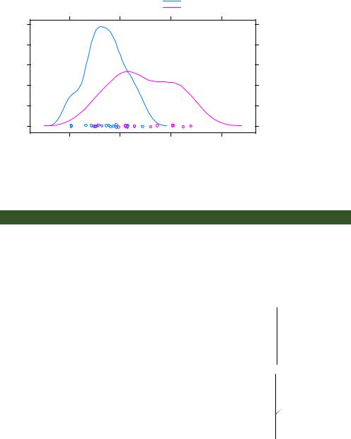
Let’s say that you want to display the distribution of gas mileage for cars with manual and automatic transmissions using kernel-density plots. You can superimpose these plots using this code:
library(lattice)
mtcars$transmission <- factor(mtcars$am, levels=c(0, 1), labels=c("Automatic", "Manual"))
densityplot(~mpg, data=mtcars, group=transmission,
main="MPG Distribution by Transmission Type", xlab="Miles per Gallon",
auto.key=TRUE)
The resulting graph is presented in figure 23.5. By default, the group= option superimposes the plots from each level of the grouping variable. Points are plotted as open circles, lines are solid, and level information is distinguished by color. As you can see, the colors are difficult to differentiate when printed in grayscale. Later you’ll learn how to change these defaults.
Note that legends and keys aren’t produced by default. The option auto.key=TRUE creates a rudimentary legend and places it above the graph. You can make limited changes to this automated key by specifying options in a list. For example,
auto.key=list(space="right", columns=1, title="Transmission")
places the legend to the right of the graph, presents the key values in a single column, and adds a legend title.
Density
0.10
0.08
0.06
0.04
0.02
0.00
Grouping variables |
11 |
MPG Distribution by Transmission Type
Automatic
Manual
Figure 23.5 Kerneldensity plots for miles per gallon grouped by transmission type. Jittered points are provided on the horizontal axis.
10 |
20 |
30 |
40 |
Miles per Gallon
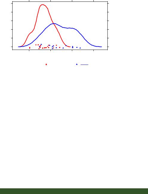
If you want to exert greater control over the legend, you can use the key= option. An example is given next. The resulting graph is shown in figure 23.6.
Listing 23.4 Kernel-density plot with a group variable and customized legend
library(lattice)
mtcars$transmission <- factor(mtcars$am, levels=c(0, 1), labels=c("Automatic", "Manual"))
colors |
<- c("red", "blue") |
b Color, line, and point |
||
lines |
<- |
c(1,2) |
specifications |
|
points <- |
c(16,17) |
|||
|
||||
|
|
|
|
|
key.trans <- list(title="Transmission", space="bottom", columns=2,
text=list(levels(mtcars$transmission)), points=list(pch=points, col=colors), lines=list(col=colors, lty=lines), cex.title=1, cex=.9)
densityplot(~mpg, data=mtcars, group=transmission,
main="MPG Distribution by Transmission Type", xlab="Miles per Gallon",
pch=points, lty=lines, col=colors, lwd=2, jitter=.005,
key=key.trans)
 c Legendcustomization
d Density plot
Here, the plotting symbols, line types, and colors are specified as vectors b. The first element of each vector is applied to the first level of the group variable, the second element to the second level, and so forth. A list object is created to hold the legend options c. These options place the legend below the graph in two columns and
12 |
BONUS CHAPTER 23 Advanced graphics with the lattice package |
MPG Distribution by Transmission Type
|
0.10 |
|
|
|
|
0.08 |
|
|
|
Density |
0.06 |
|
|
|
0.04 |
|
|
|
|
|
0.02 |
|
|
|
|
0.00 |
|
|
|
|
10 |
20 |
30 |
40 |
Miles per Gallon
Transmission
Automatic |
|
Manual |
|
Figure 23.6 Kernel-density plots for miles per gallon grouped by transmission type.
Graphical parameters have been modified, and a customized legend has been added.
The custom legend specifies color, shape, line type, character size, and title.
include the level names, point symbols, line types, and colors. The legend title is rendered slightly larger than the text for the symbols.
The same plot symbols, line types, and colors are specified in the densityplot() function d. Additionally, the line width and jitter are increased to improve the appearance of the graph. Finally, the key is set to use the previously defined list. This approach to specifying a legend for the grouping variable gives you a great deal of flexibility. In fact, you can create more than one legend and place them in different areas of the graph (not shown here).
Before completing this section, let’s consider an example that includes group and conditioning variables in a single plot. The CO2 data frame, included with the base R installation, describes a study of cold tolerance of the grass species Echinochloa crus-galli.
The data describe carbon dioxide uptake rates (uptake) for 12 plants (Plant), at 7 ambient carbon dioxide concentrations (conc). Six plants were from Quebec and six plants were from Mississippi. Three plants from each location were studied under chilled conditions, and three plants were studied under non-chilled conditions. In this example, Plant is the group variable and both Type (Quebec/Mississippi) and Treatment (chilled/non-chilled) are conditioning variables. The following code produces the plot in figure 23.7.
Listing 23.5 xyplot with group and conditioning variables and customized legend
library(lattice) colors <- "darkgreen" symbols <- c(1:12) linetype <- c(1:3)
Grouping variables |
13 |
key.species <- list(title="Plant", space="right",
text=list(levels(CO2$Plant)), points=list(pch=symbols, col=colors))
xyplot(uptake~conc|Type*Treatment, data=CO2, group=Plant,
type="o",
pch=symbols, col=colors, lty=linetype, main="Carbon Dioxide Uptake\nin Grass Plants", ylab=expression(paste("Uptake ",
bgroup("(", italic(frac("umol","m"^2)), ")"))), xlab=expression(paste("Concentration ",
bgroup("(", italic(frac(mL,L)), ")"))), sub = "Grass Species: Echinochloa crus-galli", key=key.species)
Note the use of \n to give you a two-line title and the use of the expression() function to add mathematical notation to the axis labels. Here, color is suppressed as a group differentiator by specifying a single color in the col= option. In this case, adding 12 different colors is overkill and distracts from the goal of easily visualizing the
m2
umol Uptake
Carbon Dioxide Uptake
in Grass Plants
200 400 600 800 1000
chilled |
chilled |
|
Quebec |
Mississippi |
|
|
40 |
|
|
30 |
Plant |
|
|
|
|
20 |
Qn1 |
|
|
Qn2 |
|
|
Qn3 |
|
10 |
Qc1 |
|
|
Qc3 |
nonchilled |
nonchilled |
Qc2 |
Quebec |
Mississippi |
Mn3 |
|
|
Mn2 |
|
|
Mn1 |
40 |
|
Mc2 |
|
|
Mc3 |
|
|
Mc1 |
30 |
|
|
20
10
200 400 600 800 1000
mL
Concentration L
Grass Species: Echinochloa crus−galli
Figure 23.7 xyplot showing the impact of ambient carbon dioxide concentrations on carbon dioxide uptake for 12 plants in two treatment conditions and two types. Plant is the group variable, and Treatment and Type are the conditioning variables.