

- •brief contents
- •contents
- •preface
- •acknowledgments
- •about this book
- •What’s new in the second edition
- •Who should read this book
- •Roadmap
- •Advice for data miners
- •Code examples
- •Code conventions
- •Author Online
- •About the author
- •about the cover illustration
- •1 Introduction to R
- •1.2 Obtaining and installing R
- •1.3 Working with R
- •1.3.1 Getting started
- •1.3.2 Getting help
- •1.3.3 The workspace
- •1.3.4 Input and output
- •1.4 Packages
- •1.4.1 What are packages?
- •1.4.2 Installing a package
- •1.4.3 Loading a package
- •1.4.4 Learning about a package
- •1.5 Batch processing
- •1.6 Using output as input: reusing results
- •1.7 Working with large datasets
- •1.8 Working through an example
- •1.9 Summary
- •2 Creating a dataset
- •2.1 Understanding datasets
- •2.2 Data structures
- •2.2.1 Vectors
- •2.2.2 Matrices
- •2.2.3 Arrays
- •2.2.4 Data frames
- •2.2.5 Factors
- •2.2.6 Lists
- •2.3 Data input
- •2.3.1 Entering data from the keyboard
- •2.3.2 Importing data from a delimited text file
- •2.3.3 Importing data from Excel
- •2.3.4 Importing data from XML
- •2.3.5 Importing data from the web
- •2.3.6 Importing data from SPSS
- •2.3.7 Importing data from SAS
- •2.3.8 Importing data from Stata
- •2.3.9 Importing data from NetCDF
- •2.3.10 Importing data from HDF5
- •2.3.11 Accessing database management systems (DBMSs)
- •2.3.12 Importing data via Stat/Transfer
- •2.4 Annotating datasets
- •2.4.1 Variable labels
- •2.4.2 Value labels
- •2.5 Useful functions for working with data objects
- •2.6 Summary
- •3 Getting started with graphs
- •3.1 Working with graphs
- •3.2 A simple example
- •3.3 Graphical parameters
- •3.3.1 Symbols and lines
- •3.3.2 Colors
- •3.3.3 Text characteristics
- •3.3.4 Graph and margin dimensions
- •3.4 Adding text, customized axes, and legends
- •3.4.1 Titles
- •3.4.2 Axes
- •3.4.3 Reference lines
- •3.4.4 Legend
- •3.4.5 Text annotations
- •3.4.6 Math annotations
- •3.5 Combining graphs
- •3.5.1 Creating a figure arrangement with fine control
- •3.6 Summary
- •4 Basic data management
- •4.1 A working example
- •4.2 Creating new variables
- •4.3 Recoding variables
- •4.4 Renaming variables
- •4.5 Missing values
- •4.5.1 Recoding values to missing
- •4.5.2 Excluding missing values from analyses
- •4.6 Date values
- •4.6.1 Converting dates to character variables
- •4.6.2 Going further
- •4.7 Type conversions
- •4.8 Sorting data
- •4.9 Merging datasets
- •4.9.1 Adding columns to a data frame
- •4.9.2 Adding rows to a data frame
- •4.10 Subsetting datasets
- •4.10.1 Selecting (keeping) variables
- •4.10.2 Excluding (dropping) variables
- •4.10.3 Selecting observations
- •4.10.4 The subset() function
- •4.10.5 Random samples
- •4.11 Using SQL statements to manipulate data frames
- •4.12 Summary
- •5 Advanced data management
- •5.2 Numerical and character functions
- •5.2.1 Mathematical functions
- •5.2.2 Statistical functions
- •5.2.3 Probability functions
- •5.2.4 Character functions
- •5.2.5 Other useful functions
- •5.2.6 Applying functions to matrices and data frames
- •5.3 A solution for the data-management challenge
- •5.4 Control flow
- •5.4.1 Repetition and looping
- •5.4.2 Conditional execution
- •5.5 User-written functions
- •5.6 Aggregation and reshaping
- •5.6.1 Transpose
- •5.6.2 Aggregating data
- •5.6.3 The reshape2 package
- •5.7 Summary
- •6 Basic graphs
- •6.1 Bar plots
- •6.1.1 Simple bar plots
- •6.1.2 Stacked and grouped bar plots
- •6.1.3 Mean bar plots
- •6.1.4 Tweaking bar plots
- •6.1.5 Spinograms
- •6.2 Pie charts
- •6.3 Histograms
- •6.4 Kernel density plots
- •6.5 Box plots
- •6.5.1 Using parallel box plots to compare groups
- •6.5.2 Violin plots
- •6.6 Dot plots
- •6.7 Summary
- •7 Basic statistics
- •7.1 Descriptive statistics
- •7.1.1 A menagerie of methods
- •7.1.2 Even more methods
- •7.1.3 Descriptive statistics by group
- •7.1.4 Additional methods by group
- •7.1.5 Visualizing results
- •7.2 Frequency and contingency tables
- •7.2.1 Generating frequency tables
- •7.2.2 Tests of independence
- •7.2.3 Measures of association
- •7.2.4 Visualizing results
- •7.3 Correlations
- •7.3.1 Types of correlations
- •7.3.2 Testing correlations for significance
- •7.3.3 Visualizing correlations
- •7.4 T-tests
- •7.4.3 When there are more than two groups
- •7.5 Nonparametric tests of group differences
- •7.5.1 Comparing two groups
- •7.5.2 Comparing more than two groups
- •7.6 Visualizing group differences
- •7.7 Summary
- •8 Regression
- •8.1 The many faces of regression
- •8.1.1 Scenarios for using OLS regression
- •8.1.2 What you need to know
- •8.2 OLS regression
- •8.2.1 Fitting regression models with lm()
- •8.2.2 Simple linear regression
- •8.2.3 Polynomial regression
- •8.2.4 Multiple linear regression
- •8.2.5 Multiple linear regression with interactions
- •8.3 Regression diagnostics
- •8.3.1 A typical approach
- •8.3.2 An enhanced approach
- •8.3.3 Global validation of linear model assumption
- •8.3.4 Multicollinearity
- •8.4 Unusual observations
- •8.4.1 Outliers
- •8.4.3 Influential observations
- •8.5 Corrective measures
- •8.5.1 Deleting observations
- •8.5.2 Transforming variables
- •8.5.3 Adding or deleting variables
- •8.5.4 Trying a different approach
- •8.6 Selecting the “best” regression model
- •8.6.1 Comparing models
- •8.6.2 Variable selection
- •8.7 Taking the analysis further
- •8.7.1 Cross-validation
- •8.7.2 Relative importance
- •8.8 Summary
- •9 Analysis of variance
- •9.1 A crash course on terminology
- •9.2 Fitting ANOVA models
- •9.2.1 The aov() function
- •9.2.2 The order of formula terms
- •9.3.1 Multiple comparisons
- •9.3.2 Assessing test assumptions
- •9.4 One-way ANCOVA
- •9.4.1 Assessing test assumptions
- •9.4.2 Visualizing the results
- •9.6 Repeated measures ANOVA
- •9.7 Multivariate analysis of variance (MANOVA)
- •9.7.1 Assessing test assumptions
- •9.7.2 Robust MANOVA
- •9.8 ANOVA as regression
- •9.9 Summary
- •10 Power analysis
- •10.1 A quick review of hypothesis testing
- •10.2 Implementing power analysis with the pwr package
- •10.2.1 t-tests
- •10.2.2 ANOVA
- •10.2.3 Correlations
- •10.2.4 Linear models
- •10.2.5 Tests of proportions
- •10.2.7 Choosing an appropriate effect size in novel situations
- •10.3 Creating power analysis plots
- •10.4 Other packages
- •10.5 Summary
- •11 Intermediate graphs
- •11.1 Scatter plots
- •11.1.3 3D scatter plots
- •11.1.4 Spinning 3D scatter plots
- •11.1.5 Bubble plots
- •11.2 Line charts
- •11.3 Corrgrams
- •11.4 Mosaic plots
- •11.5 Summary
- •12 Resampling statistics and bootstrapping
- •12.1 Permutation tests
- •12.2 Permutation tests with the coin package
- •12.2.2 Independence in contingency tables
- •12.2.3 Independence between numeric variables
- •12.2.5 Going further
- •12.3 Permutation tests with the lmPerm package
- •12.3.1 Simple and polynomial regression
- •12.3.2 Multiple regression
- •12.4 Additional comments on permutation tests
- •12.5 Bootstrapping
- •12.6 Bootstrapping with the boot package
- •12.6.1 Bootstrapping a single statistic
- •12.6.2 Bootstrapping several statistics
- •12.7 Summary
- •13 Generalized linear models
- •13.1 Generalized linear models and the glm() function
- •13.1.1 The glm() function
- •13.1.2 Supporting functions
- •13.1.3 Model fit and regression diagnostics
- •13.2 Logistic regression
- •13.2.1 Interpreting the model parameters
- •13.2.2 Assessing the impact of predictors on the probability of an outcome
- •13.2.3 Overdispersion
- •13.2.4 Extensions
- •13.3 Poisson regression
- •13.3.1 Interpreting the model parameters
- •13.3.2 Overdispersion
- •13.3.3 Extensions
- •13.4 Summary
- •14 Principal components and factor analysis
- •14.1 Principal components and factor analysis in R
- •14.2 Principal components
- •14.2.1 Selecting the number of components to extract
- •14.2.2 Extracting principal components
- •14.2.3 Rotating principal components
- •14.2.4 Obtaining principal components scores
- •14.3 Exploratory factor analysis
- •14.3.1 Deciding how many common factors to extract
- •14.3.2 Extracting common factors
- •14.3.3 Rotating factors
- •14.3.4 Factor scores
- •14.4 Other latent variable models
- •14.5 Summary
- •15 Time series
- •15.1 Creating a time-series object in R
- •15.2 Smoothing and seasonal decomposition
- •15.2.1 Smoothing with simple moving averages
- •15.2.2 Seasonal decomposition
- •15.3 Exponential forecasting models
- •15.3.1 Simple exponential smoothing
- •15.3.3 The ets() function and automated forecasting
- •15.4 ARIMA forecasting models
- •15.4.1 Prerequisite concepts
- •15.4.2 ARMA and ARIMA models
- •15.4.3 Automated ARIMA forecasting
- •15.5 Going further
- •15.6 Summary
- •16 Cluster analysis
- •16.1 Common steps in cluster analysis
- •16.2 Calculating distances
- •16.3 Hierarchical cluster analysis
- •16.4 Partitioning cluster analysis
- •16.4.2 Partitioning around medoids
- •16.5 Avoiding nonexistent clusters
- •16.6 Summary
- •17 Classification
- •17.1 Preparing the data
- •17.2 Logistic regression
- •17.3 Decision trees
- •17.3.1 Classical decision trees
- •17.3.2 Conditional inference trees
- •17.4 Random forests
- •17.5 Support vector machines
- •17.5.1 Tuning an SVM
- •17.6 Choosing a best predictive solution
- •17.7 Using the rattle package for data mining
- •17.8 Summary
- •18 Advanced methods for missing data
- •18.1 Steps in dealing with missing data
- •18.2 Identifying missing values
- •18.3 Exploring missing-values patterns
- •18.3.1 Tabulating missing values
- •18.3.2 Exploring missing data visually
- •18.3.3 Using correlations to explore missing values
- •18.4 Understanding the sources and impact of missing data
- •18.5 Rational approaches for dealing with incomplete data
- •18.6 Complete-case analysis (listwise deletion)
- •18.7 Multiple imputation
- •18.8 Other approaches to missing data
- •18.8.1 Pairwise deletion
- •18.8.2 Simple (nonstochastic) imputation
- •18.9 Summary
- •19 Advanced graphics with ggplot2
- •19.1 The four graphics systems in R
- •19.2 An introduction to the ggplot2 package
- •19.3 Specifying the plot type with geoms
- •19.4 Grouping
- •19.5 Faceting
- •19.6 Adding smoothed lines
- •19.7 Modifying the appearance of ggplot2 graphs
- •19.7.1 Axes
- •19.7.2 Legends
- •19.7.3 Scales
- •19.7.4 Themes
- •19.7.5 Multiple graphs per page
- •19.8 Saving graphs
- •19.9 Summary
- •20 Advanced programming
- •20.1 A review of the language
- •20.1.1 Data types
- •20.1.2 Control structures
- •20.1.3 Creating functions
- •20.2 Working with environments
- •20.3 Object-oriented programming
- •20.3.1 Generic functions
- •20.3.2 Limitations of the S3 model
- •20.4 Writing efficient code
- •20.5 Debugging
- •20.5.1 Common sources of errors
- •20.5.2 Debugging tools
- •20.5.3 Session options that support debugging
- •20.6 Going further
- •20.7 Summary
- •21 Creating a package
- •21.1 Nonparametric analysis and the npar package
- •21.1.1 Comparing groups with the npar package
- •21.2 Developing the package
- •21.2.1 Computing the statistics
- •21.2.2 Printing the results
- •21.2.3 Summarizing the results
- •21.2.4 Plotting the results
- •21.2.5 Adding sample data to the package
- •21.3 Creating the package documentation
- •21.4 Building the package
- •21.5 Going further
- •21.6 Summary
- •22 Creating dynamic reports
- •22.1 A template approach to reports
- •22.2 Creating dynamic reports with R and Markdown
- •22.3 Creating dynamic reports with R and LaTeX
- •22.4 Creating dynamic reports with R and Open Document
- •22.5 Creating dynamic reports with R and Microsoft Word
- •22.6 Summary
- •afterword Into the rabbit hole
- •appendix A Graphical user interfaces
- •appendix B Customizing the startup environment
- •appendix C Exporting data from R
- •Delimited text file
- •Excel spreadsheet
- •Statistical applications
- •appendix D Matrix algebra in R
- •appendix E Packages used in this book
- •appendix F Working with large datasets
- •F.1 Efficient programming
- •F.2 Storing data outside of RAM
- •F.3 Analytic packages for out-of-memory data
- •F.4 Comprehensive solutions for working with enormous datasets
- •appendix G Updating an R installation
- •G.1 Automated installation (Windows only)
- •G.2 Manual installation (Windows and Mac OS X)
- •G.3 Updating an R installation (Linux)
- •references
- •index
- •Symbols
- •Numerics
- •23.1 The lattice package
- •23.2 Conditioning variables
- •23.3 Panel functions
- •23.4 Grouping variables
- •23.5 Graphic parameters
- •23.6 Customizing plot strips
- •23.7 Page arrangement
- •23.8 Going further
Scatter plots |
263 |
Hexagonal Binning with 10,000 Observations
10 |
|
|
Counts |
|
|
|
|
|
|
|
262 |
|
|
|
246 |
|
|
|
229 |
5 |
|
|
213 |
|
|
197 |
|
|
|
|
|
|
|
|
180 |
y |
|
|
164 |
|
|
148 |
|
|
|
|
|
|
|
|
132 |
0 |
|
|
115 |
|
|
99 |
|
|
|
|
|
|
|
|
83 |
|
|
|
66 |
|
|
|
50 |
|
|
|
34 |
−5 |
|
|
17 |
|
|
1 |
|
|
|
|
|
−5 |
0 |
5 |
10 |
|
|
x |
|
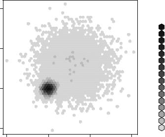
Figure 11.7 Scatter plot using hexagonal binning to display the number of observations at each point. Data concentrations are easy to see, and counts can be read from the legend.
It’s useful to note that the smoothScatter() function in the base package, along with the ipairs() function in the IDPmisc package, can be used to create readable scatter plot matrices for large datasets as well. See ?smoothScatter and ?ipairs for examples.
11.1.33D scatter plots
Scatter plots and scatter-plot matrices display bivariate relationships. What if you want to visualize the interaction of three quantitative variables at once? In this case, you can use a 3D scatter plot.
For example, say that you’re interested in the relationship between automobile mileage, weight, and displacement. You can use the scatterplot3d() function in the scatterplot3d package to picture their relationship. The format is
scatterplot3d(x, y, z)
where x is plotted on the horizontal axis, y is plotted on the vertical axis, and z is plotted in perspective. Continuing the example,
library(scatterplot3d)
attach(mtcars) scatterplot3d(wt, disp, mpg,
main="Basic 3D Scatter Plot")
264 |
CHAPTER 11 Intermediate graphs |
Basic 3D Scatter Plot
|
35 |
|
|
|
|
|
|
|
|
30 |
|
|
|
|
|
|
|
mpg |
25 |
|
|
|
|
|
|
|
20 |
|
|
|
|
|
500 |
disp |
|
|
|
|
|
|
|
|
400 |
|
|
|
|
|
|
|
|
300 |
|
|
15 |
|
|
|
|
|
200 |
|
|
|
|
|
|
|
|
|
|
|
|
|
|
|
|
|
100 |
|
|
10 |
|
|
|
|
|
0 |
|
|
1 |
2 |
3 |
4 |
5 |
6 |
Figure 11.8 3D scatter plot of miles per |
|
|
|
|
|
wt |
|
|
gallon, auto weight, and displacement |
|
produces the 3D scatter plot in figure 11.8.
The scatterplot3d() function offers many options, including the ability to specify symbols, axes, colors, lines, grids, highlighting, and angles. For example, the code
library(scatterplot3d)
attach(mtcars) scatterplot3d(wt, disp, mpg,
pch=16,
highlight.3d=TRUE,
type="h",
main="3D Scatter Plot with Vertical Lines")
produces a 3D scatter plot with highlighting to enhance the impression of depth, and vertical lines connecting points to the horizontal plane (see figure 11.9).
Figure 11.9 3D scatter plot with vertical lines and shading
3D Scatter Plot with Vertical Lines
|
35 |
|
|
|
|
|
|
|
30 |
|
|
|
|
|
|
mpg |
25 |
|
|
|
|
|
|
20 |
|
|
|
|
500 |
disp |
|
|
|
|
|
|
|
400 |
|
|
|
|
|
|
|
300 |
|
|
15 |
|
|
|
|
200 |
|
|
|
|
|
|
|
|
|
|
|
|
|
|
|
100 |
|
|
10 |
|
|
|
|
0 |
|
|
1 |
2 |
3 |
4 |
5 |
6 |
|
|
|
|
|
wt |
|
|
|
Scatter plots |
265 |
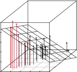
As a final example, let’s take the previous graph and add a regression plane. The necessary code is
library(scatterplot3d)
attach(mtcars)
s3d <-scatterplot3d(wt, disp, mpg, pch=16,
highlight.3d=TRUE,
type="h",
main="3D Scatter Plot with Vertical Lines and Regression Plane") fit <- lm(mpg ~ wt+disp)
s3d$plane3d(fit)
The resulting graph is provided in figure 11.10.
The graph allows you to visualize the prediction of miles per gallon from automobile weight and displacement using a multipleregression equation. The plane represents the predicted values, and the points are the actual values. The vertical distances from the plane to the points are the residuals. Points that lie above the plane are under-predicted, whereas points that lie below the line are over-predicted. Multiple regression is covered in chapter 8.
3D Scatter Plot with Vertical Lines and Regression Plane
|
35 |
|
|
|
|
|
|
|
30 |
|
|
|
|
|
|
mpg |
25 |
|
|
|
|
|
|
20 |
|
|
|
|
500 |
disp |
|
|
|
|
|
|
|
400 |
|
|
|
|
|
|
|
300 |
|
|
15 |
|
|
|
|
200 |
|
|
|
|
|
|
|
|
|
|
|
|
|
|
|
100 |
|
|
10 |
|
|
|
|
0 |
|
|
1 |
2 |
3 |
4 |
5 |
6 |
|
|
|
|
|
wt |
|
|
|
Figure 11.10 3D scatter plot with vertical lines, shading, and overlaid regression plane
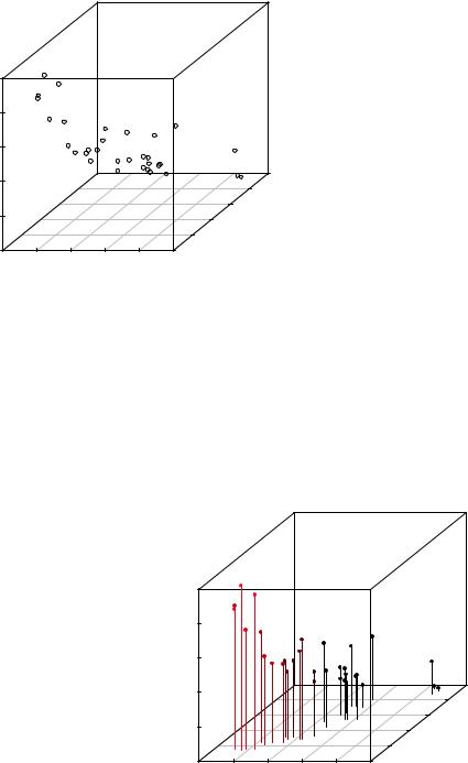
11.1.4Spinning 3D scatter plots
Three-dimensional scatter plots are much easier to interpret if you can interact with them. R provides several mechanisms for rotating graphs so that you can see the plotted points from more than one angle.
For example, you can create an interactive 3D scatter plot using the plot3d() function in the rgl package. It creates a spinning 3D scatter plot that can be rotated with the mouse. The format is
plot3d(x, y, z)
where x, y, and z are numeric vectors representing points. You can also add options like col and size to control the color and size of the points, respectively. Continuing the example, try this code:
library(rgl)
attach(mtcars)
plot3d(wt, disp, mpg, col="red", size=5)
266 |
CHAPTER 11 Intermediate graphs |
You should get a graph like the one depicted in figure 11.11. Use the mouse to rotate the axes. I think you’ll find that being able to rotate the scatter plot in three dimensions makes the graph much easier to understand.
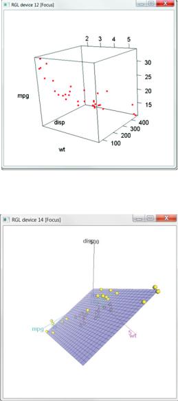
You can perform a similar function with scatter3d() in the car package:
library(car)
with(mtcars,
scatter3d(wt, disp, mpg))
The results are displayed in figure 11.12.
The scatter3d() function can include a variety of regression surfaces, such as linear, quadratic, smooth, and additive. The linear surface depicted is the default. Additionally, there are options for interactively identifying points. See help(scatter3d) for more details.
11.1.5Bubble plots
In the previous section, you displayed the relationship between three quantitative variables using a 3D scatter plot. Another approach is to create a 2D scatter plot and use the size of the plotted point to represent the value of the third variable. This approach is referred to as a bubble plot.
You can create a bubble plot
using the symbols() function. This function can be used to draw circles,
squares, stars, thermometers, and box plots at a specified set of (x, y) coordinates. For plotting circles, the format is
symbols(x, y, circle=radius)
where x, y, and radius are vectors specifying the x and y coordinates and circle radii, respectively.
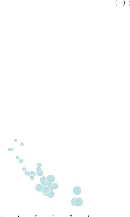
Scatter plots |
267 |
You want the areas, rather than the radii, of the circles to be proportional to the
values of a third variable. Given the formula for the radius of a circle r = −A |
, the |
π |
|
proper call is |
|
symbols(x, y, circle=sqrt(z/pi))
where z is the third variable to be plotted.
Let’s apply this to the mtcars data, plotting car weight on the x-axis, miles per gallon on the y-axis, and engine displacement as the bubble size. The following code
attach(mtcars)
r <- sqrt(disp/pi)
symbols(wt, mpg, circle=r, inches=0.30, fg="white", bg="lightblue",
main="Bubble Plot with point size proportional to displacement", ylab="Miles Per Gallon",
xlab="Weight of Car (lbs/1000)") text(wt, mpg, rownames(mtcars), cex=0.6) detach(mtcars)
produces the graph in figure 11.13. The option inches is a scaling factor that can be used to control the size of the circles (the default is to make the largest circle 1 inch). The text() function is optional. Here it is used to add the names of the cars to the plot. From the figure, you can see that increased gas mileage is associated with both decreased car weight and engine displacement.
In general, statisticians involved in the R project tend to avoid bubble plots for the same reason they avoid pie charts. Humans typically have a harder time making
|
35 |
|
30 |
Gallon |
25 |
Miles Per |
20 |
|
15 |
|
10 |
Bubble Plot with point size proportional to displacement
|
|
|
Toyota Corolla |
|
|
|
|
|
|
|
|
|
|
||
|
|
|
|
|
|
|
|
|
|
|
|
|
|||
|
|
|
|
|
Fiat 128 |
|
|
|
|
|
|
|
|
|
|
|
|
|
LotusHondaEuropaCivic |
|
|
|
|
|
|
|
|
|
|
||
|
|
|
Fiat X1−9 |
|
|
|
|
|
|
|
|
|
|
||
|
|
|
Porsche 914−2 |
|
|
|
|
|
|
|
|
|
|
||
|
|
|
|
|
|
Merc 240D |
|
|
|
|
|
||||
|
|
|
|
|
|
|
|
|
|
|
|||||
|
|
|
|
|
Datsun 710 |
Merc 230 |
|
|
|
|
|
||||
|
|
|
|
|
Toyota CoronaVolvo 142EHornet 4 Drive |
|
|
|
|
|
|||||
|
|
|
|
|
MazdaMazdaRX4RX4 Wag |
|
|
|
|
|
|||||
|
|
|
|
|
|
Ferrari Dino |
|
|
|
|
|
||||
|
|
|
|
|
|
|
|
|
|
|
|||||
|
|
|
|
|
|
|
|
Merc 280Pontiac Firebird |
|
|
|
|
|
||
|
|
|
|
|
|
|
|
Hornet Sportabout |
|
|
|
|
|
||
|
|
|
|
|
|
|
|
Valiant |
|
|
|
|
|
||
|
|
|
|
|
|
|
|
Merc 280C |
|
|
|
|
|
||
|
|
|
|
|
|
|
|
Merc 450SL |
|
|
|
|
|
||
|
|
|
|
|
|
|
|
Merc 450SE |
|
|
|
|
|
||
|
|
|
|
|
|
Ford Pantera L |
|
|
|
|
|
||||
|
|
|
|
|
|
|
|
Dodge Challenger |
|
|
|
|
|
||
|
|
|
|
|
|
|
|
AMC JavMercelin 450SLC |
|
|
|
|
|
||
|
|
|
|
|
|
|
|
Maserati Bora |
|
|
Chrysler Imperial |
|
|||
|
|
|
|
|
|
|
|
Duster 360 |
|
|
|
||||
|
|
|
|
|
|
|
|
|
|
|
|
|
|||
|
|
|
|
|
|
|
|
Camaro Z28 |
|
|
|
|
|
||
|
|
|
|
|
|
|
|
|
|
|
|
|
|
|
Figure 11.13 Bubble plot |
|
|
|
|
|
|
|
|
|
|
|
CadillacLincoFlneetwoodContinental |
of car weight vs. mpg, where |
|||
|
|
|
|
|
|
|
|
|
|
|
|
|
|
|
point size is proportional to |
|
|
|
|
|
|
|
|
|
|
|
|
|
|
|
engine displacement |
Weight of Car (lbs/1000)