


Getting started with graphs
This chapter covers
■Creating and saving graphs
■Customizing symbols, lines, colors, and axes
■Annotating with text and titles
■Controlling a graph’s dimensions
■Combining multiple graphs into one
On many occasions, I’ve presented clients with carefully crafted statistical results in the form of numbers and text, only to have their eyes glaze over while the chirping of crickets permeated the room. Yet those same clients had enthusiastic “Ah-ha!” moments when I presented the same information to them in the form of graphs. Often I can see patterns in data or detect anomalies in data values by looking at graphs—patterns or anomalies that I completely missed when conducting more formal statistical analyses.
Human beings are remarkably adept at discerning relationships from visual representations. A well-crafted graph can help you make meaningful comparisons among thousands of pieces of information, extracting patterns not easily found through other methods. This is one reason why advances in the field of statistical
46
Working with graphs |
47 |
graphics have had such a major impact on data analysis. Data analysts need to look at their data, and this is one area where R shines.
In this chapter, we’ll review general methods for working with graphs. We’ll start with how to create and save graphs. Then we’ll look at how to modify the features that are found in any graph. These features include graph titles, axes, labels, colors, lines, symbols, and text annotations. Our focus will be on generic techniques that apply across graphs. (In later chapters, we’ll focus on specific types of graphs.) Finally, we’ll investigate ways to combine multiple graphs into one overall graph.
3.1Working with graphs
R is an amazing platform for building graphs. I’m using the term building intentionally. In a typical interactive session, you build a graph one statement at a time, adding features, until you have what you want.
Consider the following five lines:
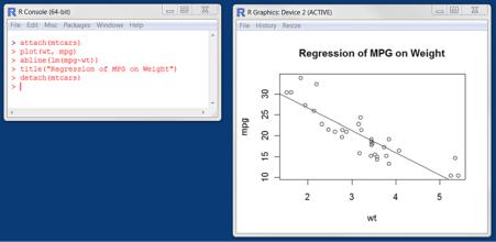
attach(mtcars) plot(wt, mpg) abline(lm(mpg~wt))
title("Regression of MPG on Weight") detach(mtcars)
The first statement attaches the data frame mtcars. The second statement opens a graphics window and generates a scatter plot between automobile weight on the horizontal axis and miles per gallon on the vertical axis. The third statement adds a line of best fit. The fourth statement adds a title. The final statement detaches the data frame. In R, graphs are typically created in this interactive fashion (see figure 3.1).
You can save your graphs via code or through GUI menus. To save a graph via code, sandwich the statements that produce the graph between a statement that sets a destination and a statement that closes that destination. For example, the following will
Figure 3.1 Creating a graph
48 CHAPTER 3 Getting started with graphs
save the graph as a PDF document named mygraph.pdf in the current working directory:
pdf("mygraph.pdf")
attach(mtcars)
plot(wt, mpg) abline(lm(mpg~wt))
title("Regression of MPG on Weight") detach(mtcars)
dev.off()
In addition to pdf(), you can use the functions win.metafile(), png(), jpeg(), bmp(), tiff(), xfig(), and postscript() to save graphs in other formats. (Note: The Windows metafile format is only available on Windows platforms.) See chapter 1, section 1.3.4 for more details on sending graphic output to files.
Saving graphs via the GUI is platform specific. On a Windows platform, select File > Save As from the graphics window, and choose the format and location desired in the resulting dialog. On a Mac, choose File > Save As from the menu bar when the Quartz graphics window is highlighted. The only output format provided is PDF. On a Unix platform, graphs must be saved via code. In appendix A, we’ll consider alternative GUIs for each platform that will give you more options.
Creating a new graph by issuing a high-level plotting command such as plot(), hist() (for histograms), or boxplot() typically overwrites a previous graph. How can you create more than one graph and still have access to each? There are several methods.
First, you can open a new graph window before creating a new graph:
dev.new()
statements to create graph 1 dev.new()
statements to create a graph 2 etc.
Each new graph will appear in the most recently opened window.
Second, you can access multiple graphs via the GUI. On a Mac platform, you can step through the graphs at any time using Back and Forward on the Quartz menu. On a Windows platform, you must use a two-step process. After opening the first graph window, choose History > Recording. Then use the Previous and Next menu items to step through the graphs that are created.
Finally, you can use the functions dev.new(), dev.next(), dev.prev(), dev.set(), and dev.off() to have multiple graph windows open at one time and choose which output is sent to which windows. This approach works on any platform. See help(dev.cur) for details on this approach.
R creates attractive graphs with a minimum of input on your part. But you can also use graphical parameters to specify fonts, colors, line styles, axes, reference lines, and annotations. This flexibility allows for a wide degree of customization.
In this chapter, we’ll start with a simple graph and explore the ways you can modify and enhance it to meet your needs. Then we’ll look at more complex examples that
A simple example |
49 |
illustrate additional customization methods. The focus will be on techniques that you can apply to a wide range of the graphs you’ll create in R. The methods discussed here will work on all the graphs described in this book, with the exception of those created with the ggplot2 package in chapter 19. (The ggplot2 package has its own methods for customizing a graph’s appearance.) In other chapters, we’ll explore each specific type of graph and discuss where and when each is most useful.
3.2A simple example
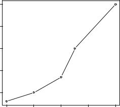
Let’s begin with the simple fictitious dataset given in table 3.1. It describes patient responses to two drugs at five dosage levels.
Table 3.1 Patient responses to two drugs at five dosage levels
Dosage |
Response to Drug A |
Response to Drug B |
|
|
|
20 |
16 |
15 |
30 |
20 |
18 |
40 |
27 |
25 |
45 |
40 |
31 |
60 |
60 |
40 |
|
|
|
You can input this data using the following code:
dose <- c(20, 30, 40, 45, 60) drugA <- c(16, 20, 27, 40, 60) drugB <- c(15, 18, 25, 31, 40)
A simple line graph relating dose to response for drug A can be created using
plot(dose, drugA, type="b")
plot() is a generic function that plots objects in R (its output varies according to the type of object being plotted). In this case, plot(x, y, type="b") places x on the horizontal axis and y on the vertical
axis, plots the (x, y) data points, and |
|
60 |
|
|
|
||
connects them with line segments. |
|
|
|
The option type="b" indicates that |
|
50 |
|
both points and lines should be |
|
||
|
|
||
plotted. Use help(plot) to view |
drugA |
40 |
|
other options. The graph is dis- |
|||
|
|
||
played in figure 3.2. |
|
|
|
|
|
30 |
Figure 3.2 Line plot of dose vs. response for drug A
20
20 |
30 |
40 |
50 |
60 |
dose