

- •brief contents
- •contents
- •preface
- •acknowledgments
- •about this book
- •What’s new in the second edition
- •Who should read this book
- •Roadmap
- •Advice for data miners
- •Code examples
- •Code conventions
- •Author Online
- •About the author
- •about the cover illustration
- •1 Introduction to R
- •1.2 Obtaining and installing R
- •1.3 Working with R
- •1.3.1 Getting started
- •1.3.2 Getting help
- •1.3.3 The workspace
- •1.3.4 Input and output
- •1.4 Packages
- •1.4.1 What are packages?
- •1.4.2 Installing a package
- •1.4.3 Loading a package
- •1.4.4 Learning about a package
- •1.5 Batch processing
- •1.6 Using output as input: reusing results
- •1.7 Working with large datasets
- •1.8 Working through an example
- •1.9 Summary
- •2 Creating a dataset
- •2.1 Understanding datasets
- •2.2 Data structures
- •2.2.1 Vectors
- •2.2.2 Matrices
- •2.2.3 Arrays
- •2.2.4 Data frames
- •2.2.5 Factors
- •2.2.6 Lists
- •2.3 Data input
- •2.3.1 Entering data from the keyboard
- •2.3.2 Importing data from a delimited text file
- •2.3.3 Importing data from Excel
- •2.3.4 Importing data from XML
- •2.3.5 Importing data from the web
- •2.3.6 Importing data from SPSS
- •2.3.7 Importing data from SAS
- •2.3.8 Importing data from Stata
- •2.3.9 Importing data from NetCDF
- •2.3.10 Importing data from HDF5
- •2.3.11 Accessing database management systems (DBMSs)
- •2.3.12 Importing data via Stat/Transfer
- •2.4 Annotating datasets
- •2.4.1 Variable labels
- •2.4.2 Value labels
- •2.5 Useful functions for working with data objects
- •2.6 Summary
- •3 Getting started with graphs
- •3.1 Working with graphs
- •3.2 A simple example
- •3.3 Graphical parameters
- •3.3.1 Symbols and lines
- •3.3.2 Colors
- •3.3.3 Text characteristics
- •3.3.4 Graph and margin dimensions
- •3.4 Adding text, customized axes, and legends
- •3.4.1 Titles
- •3.4.2 Axes
- •3.4.3 Reference lines
- •3.4.4 Legend
- •3.4.5 Text annotations
- •3.4.6 Math annotations
- •3.5 Combining graphs
- •3.5.1 Creating a figure arrangement with fine control
- •3.6 Summary
- •4 Basic data management
- •4.1 A working example
- •4.2 Creating new variables
- •4.3 Recoding variables
- •4.4 Renaming variables
- •4.5 Missing values
- •4.5.1 Recoding values to missing
- •4.5.2 Excluding missing values from analyses
- •4.6 Date values
- •4.6.1 Converting dates to character variables
- •4.6.2 Going further
- •4.7 Type conversions
- •4.8 Sorting data
- •4.9 Merging datasets
- •4.9.1 Adding columns to a data frame
- •4.9.2 Adding rows to a data frame
- •4.10 Subsetting datasets
- •4.10.1 Selecting (keeping) variables
- •4.10.2 Excluding (dropping) variables
- •4.10.3 Selecting observations
- •4.10.4 The subset() function
- •4.10.5 Random samples
- •4.11 Using SQL statements to manipulate data frames
- •4.12 Summary
- •5 Advanced data management
- •5.2 Numerical and character functions
- •5.2.1 Mathematical functions
- •5.2.2 Statistical functions
- •5.2.3 Probability functions
- •5.2.4 Character functions
- •5.2.5 Other useful functions
- •5.2.6 Applying functions to matrices and data frames
- •5.3 A solution for the data-management challenge
- •5.4 Control flow
- •5.4.1 Repetition and looping
- •5.4.2 Conditional execution
- •5.5 User-written functions
- •5.6 Aggregation and reshaping
- •5.6.1 Transpose
- •5.6.2 Aggregating data
- •5.6.3 The reshape2 package
- •5.7 Summary
- •6 Basic graphs
- •6.1 Bar plots
- •6.1.1 Simple bar plots
- •6.1.2 Stacked and grouped bar plots
- •6.1.3 Mean bar plots
- •6.1.4 Tweaking bar plots
- •6.1.5 Spinograms
- •6.2 Pie charts
- •6.3 Histograms
- •6.4 Kernel density plots
- •6.5 Box plots
- •6.5.1 Using parallel box plots to compare groups
- •6.5.2 Violin plots
- •6.6 Dot plots
- •6.7 Summary
- •7 Basic statistics
- •7.1 Descriptive statistics
- •7.1.1 A menagerie of methods
- •7.1.2 Even more methods
- •7.1.3 Descriptive statistics by group
- •7.1.4 Additional methods by group
- •7.1.5 Visualizing results
- •7.2 Frequency and contingency tables
- •7.2.1 Generating frequency tables
- •7.2.2 Tests of independence
- •7.2.3 Measures of association
- •7.2.4 Visualizing results
- •7.3 Correlations
- •7.3.1 Types of correlations
- •7.3.2 Testing correlations for significance
- •7.3.3 Visualizing correlations
- •7.4 T-tests
- •7.4.3 When there are more than two groups
- •7.5 Nonparametric tests of group differences
- •7.5.1 Comparing two groups
- •7.5.2 Comparing more than two groups
- •7.6 Visualizing group differences
- •7.7 Summary
- •8 Regression
- •8.1 The many faces of regression
- •8.1.1 Scenarios for using OLS regression
- •8.1.2 What you need to know
- •8.2 OLS regression
- •8.2.1 Fitting regression models with lm()
- •8.2.2 Simple linear regression
- •8.2.3 Polynomial regression
- •8.2.4 Multiple linear regression
- •8.2.5 Multiple linear regression with interactions
- •8.3 Regression diagnostics
- •8.3.1 A typical approach
- •8.3.2 An enhanced approach
- •8.3.3 Global validation of linear model assumption
- •8.3.4 Multicollinearity
- •8.4 Unusual observations
- •8.4.1 Outliers
- •8.4.3 Influential observations
- •8.5 Corrective measures
- •8.5.1 Deleting observations
- •8.5.2 Transforming variables
- •8.5.3 Adding or deleting variables
- •8.5.4 Trying a different approach
- •8.6 Selecting the “best” regression model
- •8.6.1 Comparing models
- •8.6.2 Variable selection
- •8.7 Taking the analysis further
- •8.7.1 Cross-validation
- •8.7.2 Relative importance
- •8.8 Summary
- •9 Analysis of variance
- •9.1 A crash course on terminology
- •9.2 Fitting ANOVA models
- •9.2.1 The aov() function
- •9.2.2 The order of formula terms
- •9.3.1 Multiple comparisons
- •9.3.2 Assessing test assumptions
- •9.4 One-way ANCOVA
- •9.4.1 Assessing test assumptions
- •9.4.2 Visualizing the results
- •9.6 Repeated measures ANOVA
- •9.7 Multivariate analysis of variance (MANOVA)
- •9.7.1 Assessing test assumptions
- •9.7.2 Robust MANOVA
- •9.8 ANOVA as regression
- •9.9 Summary
- •10 Power analysis
- •10.1 A quick review of hypothesis testing
- •10.2 Implementing power analysis with the pwr package
- •10.2.1 t-tests
- •10.2.2 ANOVA
- •10.2.3 Correlations
- •10.2.4 Linear models
- •10.2.5 Tests of proportions
- •10.2.7 Choosing an appropriate effect size in novel situations
- •10.3 Creating power analysis plots
- •10.4 Other packages
- •10.5 Summary
- •11 Intermediate graphs
- •11.1 Scatter plots
- •11.1.3 3D scatter plots
- •11.1.4 Spinning 3D scatter plots
- •11.1.5 Bubble plots
- •11.2 Line charts
- •11.3 Corrgrams
- •11.4 Mosaic plots
- •11.5 Summary
- •12 Resampling statistics and bootstrapping
- •12.1 Permutation tests
- •12.2 Permutation tests with the coin package
- •12.2.2 Independence in contingency tables
- •12.2.3 Independence between numeric variables
- •12.2.5 Going further
- •12.3 Permutation tests with the lmPerm package
- •12.3.1 Simple and polynomial regression
- •12.3.2 Multiple regression
- •12.4 Additional comments on permutation tests
- •12.5 Bootstrapping
- •12.6 Bootstrapping with the boot package
- •12.6.1 Bootstrapping a single statistic
- •12.6.2 Bootstrapping several statistics
- •12.7 Summary
- •13 Generalized linear models
- •13.1 Generalized linear models and the glm() function
- •13.1.1 The glm() function
- •13.1.2 Supporting functions
- •13.1.3 Model fit and regression diagnostics
- •13.2 Logistic regression
- •13.2.1 Interpreting the model parameters
- •13.2.2 Assessing the impact of predictors on the probability of an outcome
- •13.2.3 Overdispersion
- •13.2.4 Extensions
- •13.3 Poisson regression
- •13.3.1 Interpreting the model parameters
- •13.3.2 Overdispersion
- •13.3.3 Extensions
- •13.4 Summary
- •14 Principal components and factor analysis
- •14.1 Principal components and factor analysis in R
- •14.2 Principal components
- •14.2.1 Selecting the number of components to extract
- •14.2.2 Extracting principal components
- •14.2.3 Rotating principal components
- •14.2.4 Obtaining principal components scores
- •14.3 Exploratory factor analysis
- •14.3.1 Deciding how many common factors to extract
- •14.3.2 Extracting common factors
- •14.3.3 Rotating factors
- •14.3.4 Factor scores
- •14.4 Other latent variable models
- •14.5 Summary
- •15 Time series
- •15.1 Creating a time-series object in R
- •15.2 Smoothing and seasonal decomposition
- •15.2.1 Smoothing with simple moving averages
- •15.2.2 Seasonal decomposition
- •15.3 Exponential forecasting models
- •15.3.1 Simple exponential smoothing
- •15.3.3 The ets() function and automated forecasting
- •15.4 ARIMA forecasting models
- •15.4.1 Prerequisite concepts
- •15.4.2 ARMA and ARIMA models
- •15.4.3 Automated ARIMA forecasting
- •15.5 Going further
- •15.6 Summary
- •16 Cluster analysis
- •16.1 Common steps in cluster analysis
- •16.2 Calculating distances
- •16.3 Hierarchical cluster analysis
- •16.4 Partitioning cluster analysis
- •16.4.2 Partitioning around medoids
- •16.5 Avoiding nonexistent clusters
- •16.6 Summary
- •17 Classification
- •17.1 Preparing the data
- •17.2 Logistic regression
- •17.3 Decision trees
- •17.3.1 Classical decision trees
- •17.3.2 Conditional inference trees
- •17.4 Random forests
- •17.5 Support vector machines
- •17.5.1 Tuning an SVM
- •17.6 Choosing a best predictive solution
- •17.7 Using the rattle package for data mining
- •17.8 Summary
- •18 Advanced methods for missing data
- •18.1 Steps in dealing with missing data
- •18.2 Identifying missing values
- •18.3 Exploring missing-values patterns
- •18.3.1 Tabulating missing values
- •18.3.2 Exploring missing data visually
- •18.3.3 Using correlations to explore missing values
- •18.4 Understanding the sources and impact of missing data
- •18.5 Rational approaches for dealing with incomplete data
- •18.6 Complete-case analysis (listwise deletion)
- •18.7 Multiple imputation
- •18.8 Other approaches to missing data
- •18.8.1 Pairwise deletion
- •18.8.2 Simple (nonstochastic) imputation
- •18.9 Summary
- •19 Advanced graphics with ggplot2
- •19.1 The four graphics systems in R
- •19.2 An introduction to the ggplot2 package
- •19.3 Specifying the plot type with geoms
- •19.4 Grouping
- •19.5 Faceting
- •19.6 Adding smoothed lines
- •19.7 Modifying the appearance of ggplot2 graphs
- •19.7.1 Axes
- •19.7.2 Legends
- •19.7.3 Scales
- •19.7.4 Themes
- •19.7.5 Multiple graphs per page
- •19.8 Saving graphs
- •19.9 Summary
- •20 Advanced programming
- •20.1 A review of the language
- •20.1.1 Data types
- •20.1.2 Control structures
- •20.1.3 Creating functions
- •20.2 Working with environments
- •20.3 Object-oriented programming
- •20.3.1 Generic functions
- •20.3.2 Limitations of the S3 model
- •20.4 Writing efficient code
- •20.5 Debugging
- •20.5.1 Common sources of errors
- •20.5.2 Debugging tools
- •20.5.3 Session options that support debugging
- •20.6 Going further
- •20.7 Summary
- •21 Creating a package
- •21.1 Nonparametric analysis and the npar package
- •21.1.1 Comparing groups with the npar package
- •21.2 Developing the package
- •21.2.1 Computing the statistics
- •21.2.2 Printing the results
- •21.2.3 Summarizing the results
- •21.2.4 Plotting the results
- •21.2.5 Adding sample data to the package
- •21.3 Creating the package documentation
- •21.4 Building the package
- •21.5 Going further
- •21.6 Summary
- •22 Creating dynamic reports
- •22.1 A template approach to reports
- •22.2 Creating dynamic reports with R and Markdown
- •22.3 Creating dynamic reports with R and LaTeX
- •22.4 Creating dynamic reports with R and Open Document
- •22.5 Creating dynamic reports with R and Microsoft Word
- •22.6 Summary
- •afterword Into the rabbit hole
- •appendix A Graphical user interfaces
- •appendix B Customizing the startup environment
- •appendix C Exporting data from R
- •Delimited text file
- •Excel spreadsheet
- •Statistical applications
- •appendix D Matrix algebra in R
- •appendix E Packages used in this book
- •appendix F Working with large datasets
- •F.1 Efficient programming
- •F.2 Storing data outside of RAM
- •F.3 Analytic packages for out-of-memory data
- •F.4 Comprehensive solutions for working with enormous datasets
- •appendix G Updating an R installation
- •G.1 Automated installation (Windows only)
- •G.2 Manual installation (Windows and Mac OS X)
- •G.3 Updating an R installation (Linux)
- •references
- •index
- •Symbols
- •Numerics
- •23.1 The lattice package
- •23.2 Conditioning variables
- •23.3 Panel functions
- •23.4 Grouping variables
- •23.5 Graphic parameters
- •23.6 Customizing plot strips
- •23.7 Page arrangement
- •23.8 Going further
182 |
CHAPTER 8 Regression |
You can see from this graph that as the weight of the car increases, the relationship between horsepower and miles per gallon weakens. For wt=4.2, the line is almost horizontal, indicating that as hp increases, mpg doesn’t change.
Unfortunately, fitting the model is only the first step in the analysis. Once you fit a regression model, you need to evaluate whether you’ve met the statistical assumptions underlying your approach before you can have confidence in the inferences you draw. This is the topic of the next section.
hp*wt effect plot
|
|
|
|
wt |
|
|
|
|
|
|
2.2 |
|
|
|
|
|
|
3.2 |
|
|
|
|
|
|
4.2 |
|
|
|
25 |
|
|
|
|
|
mpg |
20 |
|
|
|
|
|
|
15 |
|
|
|
|
|
|
50 |
100 |
150 |
200 |
250 |
300 |
Figure 8.5 Interaction plot for hp*wt. This plot displays the relationship between mpg and hp at three values of wt.
8.3Regression diagnostics
In the previous section, you used the lm() function to fit an OLS regression model and the summary() function to obtain the model parameters and summary statistics. Unfortunately, nothing in this printout tells you whether the model you’ve fit is appropriate. Your confidence in inferences about regression parameters depends on the degree to which you’ve met the statistical assumptions of the OLS model. Although the summary() function in listing 8.4 describes the model, it provides no information concerning the degree to which you’ve satisfied the statistical assumptions underlying the model.
Why is this important? Irregularities in the data or misspecifications of the relationships between the predictors and the response variable can lead you to settle on a model that’s wildly inaccurate. On the one hand, you may conclude that a predictor and a response variable are unrelated when, in fact, they are. On the other hand, you may conclude that a predictor and a response variable are related when, in fact, they aren’t! You may also end up with a model that makes poor predictions when applied in real-world settings, with significant and unnecessary error.
Let’s look at the output from the confint() function applied to the states multiple regression problem in section 8.2.4:
> states <- as.data.frame(state.x77[,c("Murder", "Population", "Illiteracy", "Income", "Frost")])
>fit <- lm(Murder ~ Population + Illiteracy + Income + Frost, data=states)
>confint(fit)
2.5 % |
97.5 % |
(Intercept) -6.55e+00 9.021318
|
|
Regression diagnostics |
183 |
Population |
4.14e-05 |
0.000406 |
|
Illiteracy |
2.38e+00 |
5.903874 |
|
Income |
-1.31e-03 |
0.001441 |
|
Frost |
-1.97e-02 |
0.020830 |
|
The results suggest that you can be 95% confident that the interval [2.38, 5.90] contains the true change in murder rate for a 1% change in illiteracy rate. Additionally, because the confidence interval for Frost contains 0, you can conclude that a change in temperature is unrelated to murder rate, holding the other variables constant. But your faith in these results is only as strong as the evidence you have that your data satisfies the statistical assumptions underlying the model.
A set of techniques called regression diagnostics provides the necessary tools for evaluating the appropriateness of the regression model and can help you to uncover and correct problems. We’ll start with a standard approach that uses functions that come with R’s base installation. Then we’ll look at newer, improved methods available through the car package.
8.3.1A typical approach
R’s base installation provides numerous methods for evaluating the statistical assumptions in a regression analysis. The most common approach is to apply the plot() function to the object returned by the lm(). Doing so produces four graphs that are useful for evaluating the model fit. Applying this approach to the simple linear regression example
fit <- lm(weight ~ height, data=women) par(mfrow=c(2,2))
plot(fit)
produces the graphs shown in figure 8.6. The par(mfrow=c(2,2)) statement is used to combine the four plots produced by the plot() function into one large 2 × 2 graph. The par() function is described in chapter 3.
To understand these graphs, consider the assumptions of OLS regression:
■Normality—If the dependent variable is normally distributed for a fixed set of predictor values, then the residual values should be normally distributed with a mean of 0. The Normal Q-Q plot (upper right) is a probability plot of the standardized residuals against the values that would be expected under normality. If you’ve met the normality assumption, the points on this graph should fall on the straight 45-degree line. Because they don’t, you’ve clearly violated the normality assumption.
■Independence—You can’t tell if the dependent variable values are independent from these plots. You have to use your understanding of how the data was collected. There’s no a priori reason to believe that one woman’s weight influences another woman’s weight. If you found out that the data were sampled from families, you might have to adjust your assumption of independence.
184 |
CHAPTER 8 Regression |
Residuals vs Fitted |
Normal Q−Q |
|
3 |
|
|
|
15 |
|
|
|
|
15 |
Residuals |
|
|
|
|
Standardizedresiduals |
0 1 2 |
|
|
|
|
0−11 2 |
|
|
|
|
|
|
|
|||
|
1 |
|
|
|
|
|
|
|
|
1 |
|
|
|
|
|
|
|
|
|
|
|
|
−2 |
|
8 |
|
|
|
−1 |
8 |
|
|
|
|
|
|
|
|
|
|
|
|
|
|
120 |
130 |
140 |
150 |
160 |
|
|
−1 |
0 |
1 |
|
|
Fitted values |
|
|
|
|
Theoretical Quantiles |
|||
|
1.5 |
Scale−Location |
|
|
||
|
|
|
|
15 |
|
|
residuals |
1 |
|
|
|
residuals |
1 2 |
1.0 |
|
8 |
|
|||
|
|
|
|
|
|
|
Standardized |
0.5 |
|
|
|
Standardized |
−1 0 |
|
0.0 |
|
|
|
|
|
|
120 |
130 |
140 |
150 |
160 |
|
|
|
Fitted values |
|
|
|
|
Residuals vs Leverage
|
|
|
|
15 |
|
1 |
|
|
|
|
1 |
0.5 |
|
|
|
|
|
|
|
|
|
|
|
|
14 |
|
|
|
Cook’s distance |
|
|
|
||
0.00 |
0.05 |
0.10 |
0.15 |
0.20 |
0.25 |
|
|
|
Leverage |
|
|
|
|
Figure 8.6 Diagnostic plots for the regression of weight on height
■Linearity—If the dependent variable is linearly related to the independent variables, there should be no systematic relationship between the residuals and the predicted (that is, fitted) values. In other words, the model should capture all the systematic variance present in the data, leaving nothing but random noise. In the Residuals vs. Fitted graph (upper left), you see clear evidence of a curved relationship, which suggests that you may want to add a quadratic term to the regression.
■Homoscedasticity—If you’ve met the constant variance assumption, the points in the Scale-Location graph (bottom left) should be a random band around a horizontal line. You seem to meet this assumption.
Finally, the Residuals vs. Leverage graph (bottom right) provides information about individual observations that you may wish to attend to. The graph identifies outliers, high-leverage points, and influential observations. Specifically:
■An outlier is an observation that isn’t predicted well by the fitted regression model (that is, has a large positive or negative residual).

Regression diagnostics |
185 |
■An observation with a high leverage value has an unusual combination of predictor values. That is, it’s an outlier in the predictor space. The dependent variable value isn’t used to calculate an observation’s leverage.
■An influential observation is an observation that has a disproportionate impact on the determination of the model parameters. Influential observations are identified using a statistic called Cook’s distance, or Cook’s D.
To be honest, I find the Residuals vs. Leverage plot difficult to read and not useful. You’ll see better representations of this information in later sections.
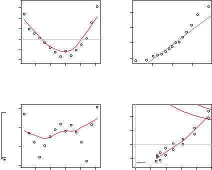
To complete this section, let’s look at the diagnostic plots for the quadratic fit. The necessary code is
fit2 <- lm(weight ~ height + I(height^2), data=women) par(mfrow=c(2,2))
plot(fit2)
and the resulting graph is provided in figure 8.7.
This second set of plots suggests that the polynomial regression provides a better fit with regard to the linearity assumption, normality of residuals (except for observation
Residuals vs Fitted
|
0.6 |
|
|
|
|
15 |
2 |
|
|
|
|
|
s |
||
Residuals |
−0.2 0.2 |
2 |
|
|
|
Standardized residual |
−1 0 1 |
|
−0.6 |
|
|
13 |
|
|
|
|
|
|
|
|
|
||
|
|
|
|
|
|
|
|
|
|
120 |
130 |
140 |
150 |
160 |
|
Fitted values
|
1.5 |
Scale−Location |
|
|
||
residuals |
|
|
|
15 |
1 2 |
|
01. |
|
|
13 |
residuals |
||
|
2 |
|
|
|
|
|
Standardized |
0.5 |
|
|
|
Standardized |
−1 0 |
|
0.0 |
|
|
|
|
|
|
120 |
130 |
140 |
150 |
160 |
|
|
|
Fitted values |
|
|
|
|
Normal Q−Q
15
 13
13  2
2
−1 |
0 |
1 |
Theoretical Quantiles
Residuals vs Leverage
|
|
|
|
15 |
|
|
|
|
1 |
|
|
|
|
0.5 |
|
|
13 |
2 |
0.5 |
|
|
|
||
|
Cook’s distance |
1 |
||
|
|
|
|
|
0.0 |
0.1 |
0.2 |
0.3 |
0.4 |
|
|
Leverage |
|
|
Figure 8.7 Diagnostic plots for the regression of weight on height and height-squared
186 |
CHAPTER 8 Regression |
13), and homoscedasticity (constant residual variance). Observation 15 appears to be influential (based on a large Cook’s D value), and deleting it has an impact on the parameter estimates. In fact, dropping both observations 13 and 15 produces a better model fit. To see this, try
newfit <- lm(weight~ height + I(height^2), data=women[-c(13,15),])
for yourself. But you need to be careful when deleting data. Your models should fit your data, not the other way around!
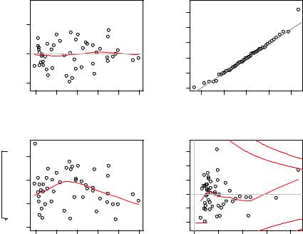
Finally, let’s apply the basic approach to the states multiple regression problem:
states <- as.data.frame(state.x77[,c("Murder", "Population", "Illiteracy", "Income", "Frost")])
fit <- lm(Murder ~ Population + Illiteracy + Income + Frost, data=states) par(mfrow=c(2,2))
plot(fit)
The results are displayed in figure 8.8. As you can see from the graph, the model assumptions appear to be well satisfied, with the exception that Nevada is an outlier.
Although these standard diagnostic plots are helpful, better tools are now available in R and I recommend their use over the plot(fit) approach.
Residuals vs Fitted
 Nevada
|
5 |
|
|
|
|
|
Residuals |
0 |
|
|
|
|
|
|
−5 |
Massachusetts |
|
|
|
|
|
Rhode Island |
|
|
|
||
|
|
|
|
|
||
|
4 |
6 |
8 |
10 |
12 |
14 |
|
|
|
Fitted values |
|
|
|
|
|
|
Scale−Location |
|
|
|
residualsStandardized |
Nevada |
|
|
|
|
|
1.00.51.5 |
Rhode Island |
|
|
|
||
|
|
|
Alaska |
|
|
|
|
0.0 |
|
|
|
|
|
|
4 |
6 |
8 |
10 |
12 |
14 |
Fitted values
Normal Q−Q
|
3 |
|
|
|
|
Nevada |
s |
|
|
|
|
|
|
residual |
2 |
|
|
|
|
Alaska |
|
|
|
|
|
|
|
Standardized |
−1 0 1 |
|
|
|
|
|
|
−2 |
Rhode Island |
|
|
|
|
|
|
|
|
|
||
|
|
−2 |
−1 |
0 |
1 |
2 |
|
|
|
Theoretical Quantiles |
|||
Residuals vs Leverage
|
3 |
Nevada |
|
|
|
|
s |
|
|
|
|
|
|
Standardized residual |
|
|
|
|
|
1 |
−1 0 1 2 |
|
|
|
Alaska |
0.5 |
|
|
Hawaii |
|
0.5 |
|||
|
−2 |
|
|
|||
|
Cook’s distance |
|
|
|||
|
|
|
1 |
|||
|
|
|
|
|
|
|
|
0.0 |
0.1 |
0.2 |
0.3 |
0.4 |
|
|
|
|
Leverage |
|
|
|
Figure 8.8 Diagnostic plots for the regression of murder rate on state characteristics