

6 |
BONUS CHAPTER 23 Advanced graphics with the lattice package |
You can issue these options in the high-level function calls or within the panel functions discussed in section 23.3.
You can also use the update() function to modify a lattice graphic object. Continuing the singer example, the following
newgraph <- update(mygraph, col="red", pch=16, cex=.8, jitter=.05, lwd=2)
would modify mygraph using red curves and symbols (color="red"), filled dots (pch=16), smaller (cex=.8) and more highly jittered points (jitter=.05), and lines of double thickness (lwd=2). The resulting graph is saved as newgraph. Now that we’ve reviewed the general structure of a high-level lattice function, let’s look at conditioning variables in more detail.
23.2 Conditioning variables
As you’ve seen, one of the most powerful features of lattice graphs is the ability to add conditioning variables. If one conditioning variable is present, a separate panel is created for each level. If two conditioning variables are present, a separate panel is created for each combination of levels for the two variables. It’s rarely useful to include more than two conditioning variables.
Typically, conditioning variables are factors. But what if you want to condition on a continuous variable? One approach would be to transform the continuous variable into a discrete variable using R’s cut() function. Alternatively, the lattice package provides functions for transforming a continuous variable into a data structure called a shingle. Specifically, the continuous variable is divided into a series of (possibly) overlapping ranges. For example, the function
myshingle <- equal.count(x, number=n, overlap=proportion)
takes continuous variable x and divides it into n intervals with proportion overlap and equal numbers of observations in each range, and returns it as the variable myshingle (of class shingle). Printing or plotting this object (for example, plot(myshingle)) displays the shingle’s intervals.
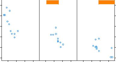
Once a continuous variable has been converted to a shingle, you can use it as a conditioning variable. For example, let’s use the mtcars dataset to explore the relationship between miles per gallon and car weight conditioned on engine displacement. Because engine displacement is a continuous variable, first let’s convert it to a shingle variable with three levels:
displacement <- equal.count(mtcars$disp, number=3, overlap=0)
Next, use this variable in the xyplot() function:
xyplot(mpg~wt|displacement, data=mtcars,
main = "Miles per Gallon vs. Weight by Engine Displacement", xlab = "Weight", ylab = "Miles per Gallon",
layout=c(3, 1), aspect=1.5)

Panel functions |
9 |
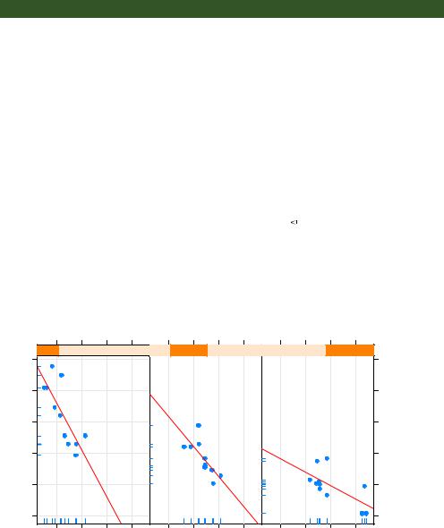
function adds rug plots to both the x- and y-axes of each panel. panel.rug(x, FALSE) or panel.rug(FALSE, y) would have added rugs to just the horizontal or vertical axis, respectively. The panel.grid() function adds horizontal and vertical grid lines (using negative numbers forces them to line up with the axis labels). Finally, the panel
.lmline() function adds a regression line that’s rendered as red (col="red"), dashed (lty=2) lines, of standard thickness (lwd=1). Each default panel function has its own structure and options. See the help page on each (for example, help(panel.lmline)) for further details.
As a second example, you’ll graph the relationship between gas mileage and engine displacement (considered as a continuous variable), conditioned on type of automobile transmission. In addition to creating separate panels for automatic and manual transmission engines, you’ll add smoothed fit lines and horizontal mean lines. The code is given in the following listing.
Listing 23.3 xyplot with a custom panel function and additional options
library(lattice)
mtcars$transmission <- factor(mtcars$am, levels=c(0,1), labels=c("Automatic", "Manual"))
panel.smoother <- function(x, y) { panel.grid(h=-1, v=-1) panel.xyplot(x, y) panel.loess(x, y)
panel.abline(h=mean(y), lwd=2, lty=2, col="darkgreen")
}
xyplot(mpg~disp|transmission,data=mtcars, scales=list(cex=.8, col="red"), panel=panel.smoother,
xlab="Displacement", ylab="Miles per Gallon", main="MPG vs Displacement by Transmission Type", sub = "Dotted lines are Group Means", aspect=1)
The graph produced by this code is provided in figure 23.4.
There are several things to note in this new code. The panel.xyplot() function plots the individual points, and the panel.loess() function plots nonparametric fit lines in each panel. The panel.abline() function adds horizontal reference lines at the mean mpg value for each level of the conditioning variable. (If you replaced h=mean(y) with h=mean(mtcars$mpg), a single reference line would be drawn at the mean mpg value for the entire sample.) The scales= option renders scale annotations (the axis numbers and tick marks) in red and at 80% of the default font size.
In the previous example, you could use scales=list(x=list(), y=list()) to specify separate options for the horizontal and vertical axes. See help(xyplot) for details on the many scale options available. In the next section, you’ll learn how to superimpose data from groups of observations, rather than presenting them in separate panels.