

Dot plots |
133 |
Violin Plots of Miles Per Gallon
Gallon |
30 |
|
|
|
|
|
|
|
|
|
|
||
25 |
|
|
|
|
|
|
|
|
|
|
|
||
|
|
|
|
|
|
|
Miles Per |
20 |
|
|
|
|
|
|
|
|
|
|
||
|
|
|
|
|
||
|
|
|
|
|
||
15 |
|
|
|
|
|
|
|
|
|
|
|
|
|
|
|
|
|
|
|
|
|
|
|
|
|
|
|
|
10 |
|
|
|
|
|
|
|
|
|
|
|
|
|
|
|
|
|
|
4 cyl |
6 cyl |
8 cyl |
Number of Cylinders
Figure 6.15 Violin plots of mpg vs. number of cylinders
title("Violin Plots of Miles Per Gallon", ylab="Miles Per Gallon", xlab="Number of Cylinders")
Note that the vioplot() function requires you to separate the groups to be plotted into separate variables. The results are displayed in figure 6.15.
Violin plots are basically kernel density plots superimposed in a mirror-image fashion over box plots. Here, the white dot is the median, the black boxes range from the lower to the upper quartile, and the thin black lines represent the whiskers. The outer shape provides the kernel density plot. Violin plots haven’t really caught on yet. Again, this may be due to a lack of easily accessible software; time will tell.
We’ll end this chapter with a look at dot plots. Unlike the graphs you’ve seen previously, dot plots plot every value for a variable.
6.6Dot plots
Dot plots provide a method of plotting a large number of labeled values on a simple horizontal scale. You create them with the dotchart() function, using the format
dotchart(x, labels=)
where x is a numeric vector and labels specifies a vector that labels each point. You can add a groups option to designate a factor specifying how the elements of x are grouped. If so, the option gcolor controls the color of the groups label, and cex controls the size of the labels. Here’s an example with the mtcars dataset:
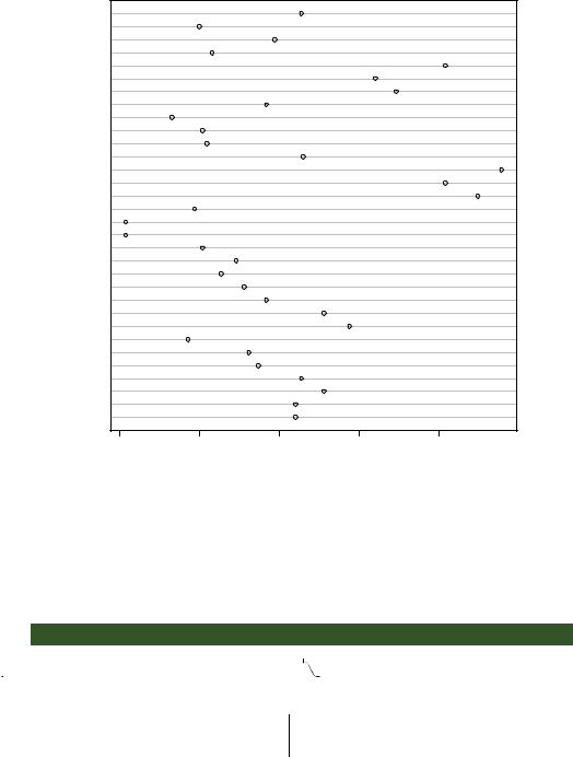
dotchart(mtcars$mpg, labels=row.names(mtcars), cex=.7, main="Gas Mileage for Car Models", xlab="Miles Per Gallon")
134 |
CHAPTER 6 Basic graphs |
Gas Mileage for Car Models
Volvo 142E
Maserati Bora
Ferrari Dino
Ford Pantera L
Lotus Europa
Porsche 914−2
Fiat X1−9
Pontiac Firebird
Camaro Z28
AMC Javelin
Dodge Challenger
Toyota Corona
Toyota Corolla
Honda Civic
Fiat 128
Chrysler Imperial
Lincoln Continental
Cadillac Fleetwood
Merc 450SLC
Merc 450SL
Merc 450SE
Merc 280C
Merc 280
Merc 230
Merc 240D
Duster 360
Valiant
Hornet Sportabout
Hornet 4 Drive
Datsun 710
Mazda RX4 Wag
Mazda RX4
10 |
15 |
20 |
25 |
30 |
Miles Per Gallon
Figure 6.16 Dot plot of mpg for each car model
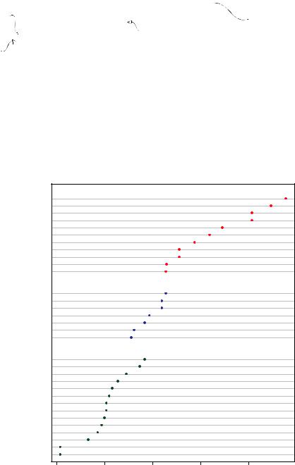
The resulting plot is given in figure 6.16. This graph allows you to see the mpg for each make of car on the same horizontal axis. Dot plots typically become most interesting when they’re sorted and grouping factors are distinguished by symbol and color. An example is given in the following listing and shown in figure 6.17.
Transforms the numeric vector cyl  into a factor
Listing 6.11 Dot plot grouped, sorted, and colored
x <- mtcars[order(mtcars$mpg),]
 x$cyl <- factor(x$cyl)
x$color[x$cyl==4] <- "red" x$color[x$cyl==6] <- "blue" x$color[x$cyl==8] <- "darkgreen"
Sorts the data frame mtcars by mpg (lowest to highest) and saves it as data frame x
Adds a character vector (color) to data frame x containing the value "red", "blue", or "darkgreen" depending on the value of cyl
|
|
|
Dot plots |
135 |
|
dotchart(x$mpg, |
|
|
|
||
Prints the numbers |
labels |
= row.names(x), |
|
The labels for the data |
|
cex=.7, |
|
|
points are taken from |
||
4, 6, and 8 in black |
groups |
= x$cyl, |
Groups data points by |
the row names of the |
|
|
gcolor |
= "black", |
data frame (car makes). |
||
The colors of the |
number of cylinders |
||||
color = x$color, |
|
||||
|
|
||||
points and labels |
pch=19, |
|
|
|
|
are derived from |
main = |
"Gas Mileage for Car Models\ngrouped by cylinder", |
|||
the color vector. |
xlab = |
"Miles Per Gallon") |
|
||
|
|
||||
In figure 6.17, a number of features become evident for the first time. Again, you see an increase in gas mileage as the number of cylinders decreases. But you also see exceptions. For example, the Pontiac Firebird, with eight cylinders, gets higher gas mileage than the Mercury 280C and the Valiant, each with six cylinders. The Hornet 4 Drive, with six cylinders, gets the same miles per gallon as the Volvo 142E, which has
Gas Mileage for Car Models grouped by cylinder
4
Toyota Corolla Fiat 128 Lotus Europa Honda Civic Fiat X1−9
Porsche 914−2 Merc 240D Merc 230 Datsun 710 Toyota Corona Volvo 142E
6
Hornet 4 Drive
Mazda RX4 Wag Mazda RX4 Ferrari Dino Merc 280 Valiant
Merc 280C
8
Pontiac Firebird Hornet Sportabout Merc 450SL
Merc 450SE Ford Pantera L Dodge Challenger AMC Javelin Merc 450SLC Maserati Bora Chrysler Imperial Duster 360 Camaro Z28
Lincoln Continental Cadillac Fleetwood
10 |
15 |
20 |
25 |
30 |
Miles Per Gallon
Figure 6.17 Dot plot of mpg for car models grouped by number of cylinders
136 |
CHAPTER 6 Basic graphs |
four cylinders. It’s also clear that the Toyota Corolla gets the best gas mileage by far, whereas the Lincoln Continental and Cadillac Fleetwood are outliers on the low end.
You can gain significant insight from a dot plot in this example because each point is labeled, the value of each point is inherently meaningful, and the points are arranged in a manner that promotes comparisons. But as the number of data points increases, the utility of the dot plot decreases.
NOTE There are many variations of the dot plot. Jacoby (2006) provides a very informative discussion of the dot plot and includes R code for innovative applications. Additionally, the Hmisc package offers a dot-plot function (aptly named dotchart2()) with a number of additional features.
6.7Summary
In this chapter, you learned how to describe continuous and categorical variables. You saw how bar plots and (to a lesser extent) pie charts can be used to gain insight into the distribution of a categorical variable, and how stacked and grouped bar charts can help you understand how groups differ on a categorical outcome. We also explored how histograms, plots, box plots, rug plots, and dot plots can help you visualize the distribution of continuous variables. Finally, we explored how overlapping kernel density plots, parallel box plots, and grouped dot plots can help you visualize group differences on a continuous outcome variable.
In later chapters, we’ll extend this univariate focus to include bivariate and multivariate graphical methods. You’ll see how to visually depict relationships among many variables at once using such methods as scatter plots, multigroup line plots, mosaic plots, correlograms, lattice graphs, and more.
In the next chapter, we’ll look at basic statistical methods for describing distributions and bivariate relationships numerically, as well as inferential methods for evaluating whether relationships among variables exist or are due to sampling error.