

56 |
CHAPTER 3 Getting started with graphs |
|
60 |
|
|
|
|
|
40 |
|
|
|
|
|
50 |
|
|
|
|
|
35 |
|
|
|
|
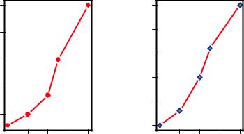
drugA |
40 |
|
|
|
|
drugB |
25 30 |
|
|
|
|
|
30 |
|
|
|
|
|
|
|
|
|
|
|
|
|
|
|
|
|
20 |
|
|
|
|
|
20 |
|
|
|
|
|
|
|
|
|
|
|
|
|
|
|
|
|
15 |
|
|
|
|
|
20 |
30 |
40 |
50 |
60 |
|
20 |
30 |
40 |
50 |
60 |
dose |
dose |
Figure 3.7 Line plot of dose vs. response for both drug A and drug B
In the next section, we’ll turn to the customization of text annotations (such as titles and labels) and axes. For more information on the graphical parameters that are available, take a look at help(par).
3.4Adding text, customized axes, and legends
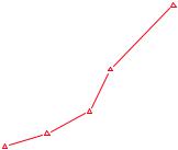
Many high-level plotting functions (for example, plot, hist, and boxplot) allow you to include axis and text options, as well as graphical parameters. For example, the following adds a title (main), a subtitle (sub), axis labels (xlab, ylab), and axis ranges (xlim, ylim). The results are presented in figure 3.8:
plot(dose, drugA, type="b", col="red", lty=2, pch=2, lwd=2,
main="Clinical Trials for Drug A", sub="This is hypothetical data", xlab="Dosage", ylab="Drug Response", xlim=c(0, 60), ylim=c(0, 70))
Again, not all functions allow you to add these options. See the help for the function of interest to see what options are accepted. For finer control and for modularization, you can use the functions described in the remainder of this section to control titles, axes, legends, and text annotations.
NOTE Some high-level plotting functions include default titles and labels. You can remove them by adding ann=FALSE in the plot() statement or in a separate par() statement.
3.4.1Titles
Use the title() function to add a title and axis labels to a plot. The format is
title(main="main title", sub="subtitle", xlab="x-axis label", ylab="y-axis label")
|
|
|
|
|
|
|
|
|
|
Adding text, customized axes, and legends |
57 |
|||||||||||||
|
|
|
|
|
|
|
|
Clinical Trials for Drug A |
|
|
|
|
|
|
|
|
||||||||
|
70 |
|
|
|
|
|
|
|
|
|
|
|
|
|
|
|
|
|
|
|
|
|
|
|
|
|
|
|
|
|
|
|
|
|
|
|
|
|
|
|
|
|
|
|
|
|
|
|
|
|
|
|
|
|
|
|
|
|
|
|
|
|
|
|
|
|
|
|
|
|
|
|
|
|
|
60 |
|
|
|
|
|
|
|
|
|
|
|
|
|
|
|
|
|
|
|
|
|
|
|
|
|
|
|
|
|
|
|
|
|
|
|
|
|
|
|
|
|
|
|
|
|
|
|
|
Response |
50 |
|
|
|
|
|
|
|
|
|
|
|
|
|
|
|
|
|
|
|
|
|
|
|
|
|
|
|
|
|
|
|
|
|
|
|
|
|
|
|
|
|
|
|
|
|
|
||
40 |
|
|
|
|
|
|
|
|
|
|
|
|
|
|
|
|
|
|
|
|
|
|
|
|
|
|
|
|
|
|
|
|
|
|
|
|
|
|
|
|
|
|
|
|
|
|
|
||
Drug |
30 |
|
|
|
|
|
|
|
|
|
|
|
|
|
|
|
|
|
|
|
|
|
|
|
|
|
|
|
|
|
|
|
|
|
|
|
|
|
|
|
|
|
|
|
|
|
|
||
|
20 |
|
|
|
|
|
|
|
|
|
|
|
|
|
|
|
|
|
|
|
|
|
|
|
|
|
|
|
|
|
|
|
|
|
|
|
|
|
|
|
|
|
|
|
|
|
|
|
|
|
10 |
|
|
|
|
|
|
|
|
|
|
|
|
|
|
|
|
|
|
|
|
|
Figure 3.8 Line plot of dose vs. |
|
|
|
|
|
|
|
|
|
|
|
|
|
|
|
|
|
|
|
|
|
|
|
|
||
|
|
|
|
|
|
|
|
|
|
|
|
|
|
|
|
|
|
|
|
|
|
|
|
|
|
0 |
|
|
|
|
|
|
|
|
|
|
|
|
|
|
|
|
|
|
|
|
|
response for drug A with title, subtitle, |
|
|
|
|
|
|
|
|
|
|
|
|
|
|
|
|
|
|
|
|
|
|
|
and modified axes |
|
|
|
|
|
|
|
|
|
|
|
|
|
|
|
|
|
|
|
|
|
|
|
|
|
|
|
|
0 |
10 |
20 |
30 |
40 |
50 |
60 |
|
|
|||||||||||||||
Dosage
This is hypothetical data
Graphical parameters (such as text size, font, rotation, and color) can also be specified in title(). For example, the following code produces a red title and a blue subtitle, and creates green x and y labels that are 25% smaller than the default text size:
title(main="My Title", col.main="red",
sub="My Subtitle", col.sub="blue",
xlab="My X label", ylab="My Y label",
col.lab="green", cex.lab=0.75)
The title() function is typically used to add information to a plot in which the default title and axis labels have been suppressed via the ann=FALSE option.
3.4.2Axes
Rather than use R’s default axes, you can create custom axes with the axis() function. The format is
axis(side, at=, labels=, pos=, lty=, col=, las=, tck=, ...)
where each parameter is described in table 3.7.
Table 3.7 Axis options
Option |
Description |
|
|
side |
Integer indicating the side of the graph on which to draw the axis (1 = bottom, 2 = |
|
left, 3 = top, and 4 = right). |
at |
Numeric vector indicating where tick marks should be drawn. |
|
|
58 |
|
CHAPTER 3 Getting started with graphs |
|
Table 3.7 Axis options (continued) |
|
|
|
|
|
Option |
Description |
|
|
|
|
labels |
Character vector of labels to be placed at the tick marks (if NULL, the at values |
|
|
are used). |
|
pos |
Coordinate at which the axis line is to be drawn (that is, the value on the other axis |
|
|
where it crosses). |
|
lty |
Line type. |
|
col |
Line and tick mark color. |
|
las |
Specifies that labels are parallel (= 0) or perpendicular (= 2) to the axis. |
|
tck |
Length of each tick mark as a fraction of the plotting region (a negative number is |
|
|
outside the graph, a positive number is inside, 0 suppresses ticks, and 1 creates |
|
|
gridlines). The default is –0.01. |
(...) |
Other graphical parameters. |
|
|
|
|
When creating a custom axis, you should suppress the axis that’s automatically generated by the high-level plotting function. The option axes=FALSE suppresses all axes (including all axis frame lines, unless you add the option frame.plot=TRUE). The options xaxt="n" and yaxt="n" suppress the x-axis and y-axis, respectively (leaving the frame lines, without ticks). Listing 3.2 is a somewhat silly and overblown example that demonstrates each of the features we’ve discussed so far. The resulting graph is presented in figure 3.9.
An Example of Creative Axes
|
10 |
|
|
|
10 |
|
9 |
|
|
|
|
|
8 |
|
|
|
|
|
7 |
|
|
|
|
Y=X |
6 |
|
|
|
|
|
|
|
|
y=1/x |
|
|
|
|
|
|
|
|
5 |
|
|
|
5 |
|
4 |
|
|
|
|
|
|
|
|
|
3.33 |
|
3 |
|
|
|
|
|
|
|
|
|
2.5 |
|
2 |
|
|
|
2 |
|
|
|
|
|
1.67 |
|
|
|
|
|
1.43 |
|
|
|
|
|
1.25 |
|
1 |
|
|
|
1.11 |
|
|
|
|
1 |
|
|
2 |
4 |
6 |
8 |
10 |
Figure 3.9 A demonstration of axis options
X values
|
Adding text, customized axes, and legends |
59 |
||
|
|
|
|
|
Listing 3.2 An example of custom axes |
|
|
|
|
x <- |
c(1:10) |
|
Specifies data |
|
|
|
|||
y <- |
x |
|
|
|
z <- |
10/x |
|
|
|
opar |
<- par(no.readonly=TRUE) |
|
Increases margins |
|
|
|
|
|
|
par(mar=c(5, 4, 4, 8) + 0.1) |
|
|
|
|
plot(x, y, type="b", |
|
Plots x vs. y, suppressing annotations |
|
|
|
pch=21, col="red", |
|
|
|
|
yaxt="n", lty=3, ann=FALSE) |
|
|
|
lines(x, z, type="b", pch=22, col="blue", lty=2)
Adds an x versus 1/x line
axis(2, at=x, labels=x, col.axis="red", las=2)
Draws the axes
axis(4, at=z, labels=round(z, digits=2), col.axis="blue", las=2, cex.axis=0.7, tck=-.01)
mtext("y=1/x", side=4, line=3, cex.lab=1, las=2, col="blue") |
|
title("An Example of Creative Axes", |
Adds titles and text |
xlab="X values", |
|
ylab="Y=X") |
|
par(opar) |
|
At this point, we’ve covered everything in listing 3.2 except the line() and mtext() statements. A plot() statement starts a new graph. By using line() instead, you can add new graph elements to an existing graph. You’ll use it again when you plot the response of drug A and drug B on the same graph in section 3.4.4. The mtext() function is used to add text to the margins of the plot. mtext() is covered in section 3.4.5, and line() is covered more fully in chapter 11.
Minor tick marks
Notice that each of the graphs you’ve created so far has major tick marks but not minor tick marks. To create minor tick marks, you need the minor.tick() function in the Hmisc package. If you don’t already have Hmisc installed, be sure to install it first (see chapter 1, section 1.4.2). You can add minor tick marks with the code
library(Hmisc)
minor.tick(nx=n, ny=n, tick.ratio=n)
where nx and ny specify the number of intervals into which to divide the area between major tick marks on the x-axis and y-axis, respectively. tick.ratio is the size of the minor tick mark relative to the major tick mark. The current length of the major tick mark can be retrieved using par("tck"). For example, the following statement adds one tick mark between each major tick mark on the x-axis and two tick marks between each major tick mark on the y-axis:
minor.tick(nx=2, ny=3, tick.ratio=0.5)
These tick marks will be 50% as long as the major tick marks. An example of minor tick marks is given in section 3.4.4 (listing 3.3 and figure 3.10).