Specifying the plot type with geoms |
443 |
you’ll be able to create a wide variety of interesting and useful plots with just a few lines of code.
Let’s start with a description of geom functions and the type of graphs they can create. Then we’ll look at the aes() function in more detail and how you can use it to group data. Next, we’ll consider faceting and the creation of trellis graphs. Finally, we’ll look at ways to tweak the appearance of ggplot2 graphs, including modifying axes and legends, changing color schemes, and adding annotations. The chapter will end with pointers to resources that can help you master the ggplot2 approach more fully.
19.3 Specifying the plot type with geoms
Whereas the ggplot() function specifies the data source and variables to be plotted, the geom functions specify how these variables are to be visually represented (using points, bars, lines, and shaded regions). Currently, 37 geoms are available. Table 19.2 lists the more common ones, along with frequently used options. The options are described more fully in table 19.3.
Table 19.2 Geom functions
Function |
Adds |
Options |
|
|
|
geom_bar() |
Bar chart |
color, fill, alpha |
geom_boxplot() |
Box plot |
color, fill, alpha, notch, width |
geom_density() |
Density plot |
color, fill, alpha, linetype |
geom_histogram() |
Histogram |
color, fill, alpha, linetype, binwidth |
geom_hline() |
Horizontal lines |
color, alpha, linetype, size |
geom_jitter() |
Jittered points |
color, size, alpha, shape |
geom_line() |
Line graph |
colorvalpha, linetype, size |
geom_point() |
Scatterplot |
color, alpha, shape, size |
geom_rug() |
Rug plot |
color, side |
geom_smooth() |
Fitted line |
method, formula, color, fill, linetype, size |
geom_text() |
Text annotations |
Many; see the help for this function |
geom_violin() |
Violin plot |
color, fill, alpha, linetype |
geom_vline() |
Vertical lines |
color, alpha, linetype, size |
|
|
|
Most of the graphs described in this book can be created using the geoms in table 19.2. For example, the code
data(singer, package="lattice")
ggplot(singer, aes(x=height)) + geom_histogram()
Specifying the plot type with geoms |
445 |
Note that only the x variable was specified when creating a histogram, but both an x and a y variable were specified for the box plot. The geom_histogram() function defaults to counts on the y-axis when no y variable is specified. See the documentation for each function for details and additional examples.
Each geom function has a set of options that can be used to modify its representation. Common options are listed in table 19.3.
Table 19.3 Common options for geom functions
Option |
Specifies |
|
|
color |
Color of points, lines, and borders around filled regions. |
fill |
Color of filled areas such as bars and density regions. |
alpha |
Transparency of colors, ranging from 0 (fully transparent) to 1 (opaque). |
linetype |
Pattern for lines (1 = solid, 2 = dashed, 3 = dotted, 4 = dotdash, 5 = longdash, |
|
6 = twodash). |
size |
Point size and line width. |
shape |
Point shapes (same as pch, with 0 = open square, 1 = open circle, 2 = open triangle, |
|
and so on). See figure 3.4 for examples. |
position |
Position of plotted objects such as bars and points. For bars, "dodge" places grouped |
|
bar charts side by side, "stacked" vertically stacks grouped bar charts, and "fill" |
|
vertically stacks grouped bar charts and standardizes their heights to be equal. For |
|
points, "jitter" reduces point overlap. |
binwidth |
Bin width for histograms. |
notch |
Indicates whether box plots should be notched (TRUE/FALSE). |
sides |
Placement of rug plots on the graph ("b" = bottom, "l" = left, "t" = top, "r" = right, |
|
"bl" = both bottom and left, and so on). |
width |
Width of box plots. |
|
|
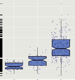
You can examine the use of many of these options using the Salaries dataset. The code
data(Salaries, package="car") library(ggplot2)
ggplot(Salaries, aes(x=rank, y=salary)) + geom_boxplot(fill="cornflowerblue", color="black", notch=TRUE)+
geom_point(position="jitter", color="blue", alpha=.5)+ geom_rug(side="l", color="black")
produces the plot in figure 19.6. The figure displays notched box plots of salary by academic rank. The actual observations (teachers) are overlaid and given some transparency so they don’t obscure the box plots. They’re also jittered to reduce their overlap. Finally, a rug plot is provided on the left to indicate the general spread of salaries.