

- •brief contents
- •contents
- •preface
- •acknowledgments
- •about this book
- •What’s new in the second edition
- •Who should read this book
- •Roadmap
- •Advice for data miners
- •Code examples
- •Code conventions
- •Author Online
- •About the author
- •about the cover illustration
- •1 Introduction to R
- •1.2 Obtaining and installing R
- •1.3 Working with R
- •1.3.1 Getting started
- •1.3.2 Getting help
- •1.3.3 The workspace
- •1.3.4 Input and output
- •1.4 Packages
- •1.4.1 What are packages?
- •1.4.2 Installing a package
- •1.4.3 Loading a package
- •1.4.4 Learning about a package
- •1.5 Batch processing
- •1.6 Using output as input: reusing results
- •1.7 Working with large datasets
- •1.8 Working through an example
- •1.9 Summary
- •2 Creating a dataset
- •2.1 Understanding datasets
- •2.2 Data structures
- •2.2.1 Vectors
- •2.2.2 Matrices
- •2.2.3 Arrays
- •2.2.4 Data frames
- •2.2.5 Factors
- •2.2.6 Lists
- •2.3 Data input
- •2.3.1 Entering data from the keyboard
- •2.3.2 Importing data from a delimited text file
- •2.3.3 Importing data from Excel
- •2.3.4 Importing data from XML
- •2.3.5 Importing data from the web
- •2.3.6 Importing data from SPSS
- •2.3.7 Importing data from SAS
- •2.3.8 Importing data from Stata
- •2.3.9 Importing data from NetCDF
- •2.3.10 Importing data from HDF5
- •2.3.11 Accessing database management systems (DBMSs)
- •2.3.12 Importing data via Stat/Transfer
- •2.4 Annotating datasets
- •2.4.1 Variable labels
- •2.4.2 Value labels
- •2.5 Useful functions for working with data objects
- •2.6 Summary
- •3 Getting started with graphs
- •3.1 Working with graphs
- •3.2 A simple example
- •3.3 Graphical parameters
- •3.3.1 Symbols and lines
- •3.3.2 Colors
- •3.3.3 Text characteristics
- •3.3.4 Graph and margin dimensions
- •3.4 Adding text, customized axes, and legends
- •3.4.1 Titles
- •3.4.2 Axes
- •3.4.3 Reference lines
- •3.4.4 Legend
- •3.4.5 Text annotations
- •3.4.6 Math annotations
- •3.5 Combining graphs
- •3.5.1 Creating a figure arrangement with fine control
- •3.6 Summary
- •4 Basic data management
- •4.1 A working example
- •4.2 Creating new variables
- •4.3 Recoding variables
- •4.4 Renaming variables
- •4.5 Missing values
- •4.5.1 Recoding values to missing
- •4.5.2 Excluding missing values from analyses
- •4.6 Date values
- •4.6.1 Converting dates to character variables
- •4.6.2 Going further
- •4.7 Type conversions
- •4.8 Sorting data
- •4.9 Merging datasets
- •4.9.1 Adding columns to a data frame
- •4.9.2 Adding rows to a data frame
- •4.10 Subsetting datasets
- •4.10.1 Selecting (keeping) variables
- •4.10.2 Excluding (dropping) variables
- •4.10.3 Selecting observations
- •4.10.4 The subset() function
- •4.10.5 Random samples
- •4.11 Using SQL statements to manipulate data frames
- •4.12 Summary
- •5 Advanced data management
- •5.2 Numerical and character functions
- •5.2.1 Mathematical functions
- •5.2.2 Statistical functions
- •5.2.3 Probability functions
- •5.2.4 Character functions
- •5.2.5 Other useful functions
- •5.2.6 Applying functions to matrices and data frames
- •5.3 A solution for the data-management challenge
- •5.4 Control flow
- •5.4.1 Repetition and looping
- •5.4.2 Conditional execution
- •5.5 User-written functions
- •5.6 Aggregation and reshaping
- •5.6.1 Transpose
- •5.6.2 Aggregating data
- •5.6.3 The reshape2 package
- •5.7 Summary
- •6 Basic graphs
- •6.1 Bar plots
- •6.1.1 Simple bar plots
- •6.1.2 Stacked and grouped bar plots
- •6.1.3 Mean bar plots
- •6.1.4 Tweaking bar plots
- •6.1.5 Spinograms
- •6.2 Pie charts
- •6.3 Histograms
- •6.4 Kernel density plots
- •6.5 Box plots
- •6.5.1 Using parallel box plots to compare groups
- •6.5.2 Violin plots
- •6.6 Dot plots
- •6.7 Summary
- •7 Basic statistics
- •7.1 Descriptive statistics
- •7.1.1 A menagerie of methods
- •7.1.2 Even more methods
- •7.1.3 Descriptive statistics by group
- •7.1.4 Additional methods by group
- •7.1.5 Visualizing results
- •7.2 Frequency and contingency tables
- •7.2.1 Generating frequency tables
- •7.2.2 Tests of independence
- •7.2.3 Measures of association
- •7.2.4 Visualizing results
- •7.3 Correlations
- •7.3.1 Types of correlations
- •7.3.2 Testing correlations for significance
- •7.3.3 Visualizing correlations
- •7.4 T-tests
- •7.4.3 When there are more than two groups
- •7.5 Nonparametric tests of group differences
- •7.5.1 Comparing two groups
- •7.5.2 Comparing more than two groups
- •7.6 Visualizing group differences
- •7.7 Summary
- •8 Regression
- •8.1 The many faces of regression
- •8.1.1 Scenarios for using OLS regression
- •8.1.2 What you need to know
- •8.2 OLS regression
- •8.2.1 Fitting regression models with lm()
- •8.2.2 Simple linear regression
- •8.2.3 Polynomial regression
- •8.2.4 Multiple linear regression
- •8.2.5 Multiple linear regression with interactions
- •8.3 Regression diagnostics
- •8.3.1 A typical approach
- •8.3.2 An enhanced approach
- •8.3.3 Global validation of linear model assumption
- •8.3.4 Multicollinearity
- •8.4 Unusual observations
- •8.4.1 Outliers
- •8.4.3 Influential observations
- •8.5 Corrective measures
- •8.5.1 Deleting observations
- •8.5.2 Transforming variables
- •8.5.3 Adding or deleting variables
- •8.5.4 Trying a different approach
- •8.6 Selecting the “best” regression model
- •8.6.1 Comparing models
- •8.6.2 Variable selection
- •8.7 Taking the analysis further
- •8.7.1 Cross-validation
- •8.7.2 Relative importance
- •8.8 Summary
- •9 Analysis of variance
- •9.1 A crash course on terminology
- •9.2 Fitting ANOVA models
- •9.2.1 The aov() function
- •9.2.2 The order of formula terms
- •9.3.1 Multiple comparisons
- •9.3.2 Assessing test assumptions
- •9.4 One-way ANCOVA
- •9.4.1 Assessing test assumptions
- •9.4.2 Visualizing the results
- •9.6 Repeated measures ANOVA
- •9.7 Multivariate analysis of variance (MANOVA)
- •9.7.1 Assessing test assumptions
- •9.7.2 Robust MANOVA
- •9.8 ANOVA as regression
- •9.9 Summary
- •10 Power analysis
- •10.1 A quick review of hypothesis testing
- •10.2 Implementing power analysis with the pwr package
- •10.2.1 t-tests
- •10.2.2 ANOVA
- •10.2.3 Correlations
- •10.2.4 Linear models
- •10.2.5 Tests of proportions
- •10.2.7 Choosing an appropriate effect size in novel situations
- •10.3 Creating power analysis plots
- •10.4 Other packages
- •10.5 Summary
- •11 Intermediate graphs
- •11.1 Scatter plots
- •11.1.3 3D scatter plots
- •11.1.4 Spinning 3D scatter plots
- •11.1.5 Bubble plots
- •11.2 Line charts
- •11.3 Corrgrams
- •11.4 Mosaic plots
- •11.5 Summary
- •12 Resampling statistics and bootstrapping
- •12.1 Permutation tests
- •12.2 Permutation tests with the coin package
- •12.2.2 Independence in contingency tables
- •12.2.3 Independence between numeric variables
- •12.2.5 Going further
- •12.3 Permutation tests with the lmPerm package
- •12.3.1 Simple and polynomial regression
- •12.3.2 Multiple regression
- •12.4 Additional comments on permutation tests
- •12.5 Bootstrapping
- •12.6 Bootstrapping with the boot package
- •12.6.1 Bootstrapping a single statistic
- •12.6.2 Bootstrapping several statistics
- •12.7 Summary
- •13 Generalized linear models
- •13.1 Generalized linear models and the glm() function
- •13.1.1 The glm() function
- •13.1.2 Supporting functions
- •13.1.3 Model fit and regression diagnostics
- •13.2 Logistic regression
- •13.2.1 Interpreting the model parameters
- •13.2.2 Assessing the impact of predictors on the probability of an outcome
- •13.2.3 Overdispersion
- •13.2.4 Extensions
- •13.3 Poisson regression
- •13.3.1 Interpreting the model parameters
- •13.3.2 Overdispersion
- •13.3.3 Extensions
- •13.4 Summary
- •14 Principal components and factor analysis
- •14.1 Principal components and factor analysis in R
- •14.2 Principal components
- •14.2.1 Selecting the number of components to extract
- •14.2.2 Extracting principal components
- •14.2.3 Rotating principal components
- •14.2.4 Obtaining principal components scores
- •14.3 Exploratory factor analysis
- •14.3.1 Deciding how many common factors to extract
- •14.3.2 Extracting common factors
- •14.3.3 Rotating factors
- •14.3.4 Factor scores
- •14.4 Other latent variable models
- •14.5 Summary
- •15 Time series
- •15.1 Creating a time-series object in R
- •15.2 Smoothing and seasonal decomposition
- •15.2.1 Smoothing with simple moving averages
- •15.2.2 Seasonal decomposition
- •15.3 Exponential forecasting models
- •15.3.1 Simple exponential smoothing
- •15.3.3 The ets() function and automated forecasting
- •15.4 ARIMA forecasting models
- •15.4.1 Prerequisite concepts
- •15.4.2 ARMA and ARIMA models
- •15.4.3 Automated ARIMA forecasting
- •15.5 Going further
- •15.6 Summary
- •16 Cluster analysis
- •16.1 Common steps in cluster analysis
- •16.2 Calculating distances
- •16.3 Hierarchical cluster analysis
- •16.4 Partitioning cluster analysis
- •16.4.2 Partitioning around medoids
- •16.5 Avoiding nonexistent clusters
- •16.6 Summary
- •17 Classification
- •17.1 Preparing the data
- •17.2 Logistic regression
- •17.3 Decision trees
- •17.3.1 Classical decision trees
- •17.3.2 Conditional inference trees
- •17.4 Random forests
- •17.5 Support vector machines
- •17.5.1 Tuning an SVM
- •17.6 Choosing a best predictive solution
- •17.7 Using the rattle package for data mining
- •17.8 Summary
- •18 Advanced methods for missing data
- •18.1 Steps in dealing with missing data
- •18.2 Identifying missing values
- •18.3 Exploring missing-values patterns
- •18.3.1 Tabulating missing values
- •18.3.2 Exploring missing data visually
- •18.3.3 Using correlations to explore missing values
- •18.4 Understanding the sources and impact of missing data
- •18.5 Rational approaches for dealing with incomplete data
- •18.6 Complete-case analysis (listwise deletion)
- •18.7 Multiple imputation
- •18.8 Other approaches to missing data
- •18.8.1 Pairwise deletion
- •18.8.2 Simple (nonstochastic) imputation
- •18.9 Summary
- •19 Advanced graphics with ggplot2
- •19.1 The four graphics systems in R
- •19.2 An introduction to the ggplot2 package
- •19.3 Specifying the plot type with geoms
- •19.4 Grouping
- •19.5 Faceting
- •19.6 Adding smoothed lines
- •19.7 Modifying the appearance of ggplot2 graphs
- •19.7.1 Axes
- •19.7.2 Legends
- •19.7.3 Scales
- •19.7.4 Themes
- •19.7.5 Multiple graphs per page
- •19.8 Saving graphs
- •19.9 Summary
- •20 Advanced programming
- •20.1 A review of the language
- •20.1.1 Data types
- •20.1.2 Control structures
- •20.1.3 Creating functions
- •20.2 Working with environments
- •20.3 Object-oriented programming
- •20.3.1 Generic functions
- •20.3.2 Limitations of the S3 model
- •20.4 Writing efficient code
- •20.5 Debugging
- •20.5.1 Common sources of errors
- •20.5.2 Debugging tools
- •20.5.3 Session options that support debugging
- •20.6 Going further
- •20.7 Summary
- •21 Creating a package
- •21.1 Nonparametric analysis and the npar package
- •21.1.1 Comparing groups with the npar package
- •21.2 Developing the package
- •21.2.1 Computing the statistics
- •21.2.2 Printing the results
- •21.2.3 Summarizing the results
- •21.2.4 Plotting the results
- •21.2.5 Adding sample data to the package
- •21.3 Creating the package documentation
- •21.4 Building the package
- •21.5 Going further
- •21.6 Summary
- •22 Creating dynamic reports
- •22.1 A template approach to reports
- •22.2 Creating dynamic reports with R and Markdown
- •22.3 Creating dynamic reports with R and LaTeX
- •22.4 Creating dynamic reports with R and Open Document
- •22.5 Creating dynamic reports with R and Microsoft Word
- •22.6 Summary
- •afterword Into the rabbit hole
- •appendix A Graphical user interfaces
- •appendix B Customizing the startup environment
- •appendix C Exporting data from R
- •Delimited text file
- •Excel spreadsheet
- •Statistical applications
- •appendix D Matrix algebra in R
- •appendix E Packages used in this book
- •appendix F Working with large datasets
- •F.1 Efficient programming
- •F.2 Storing data outside of RAM
- •F.3 Analytic packages for out-of-memory data
- •F.4 Comprehensive solutions for working with enormous datasets
- •appendix G Updating an R installation
- •G.1 Automated installation (Windows only)
- •G.2 Manual installation (Windows and Mac OS X)
- •G.3 Updating an R installation (Linux)
- •references
- •index
- •Symbols
- •Numerics
- •23.1 The lattice package
- •23.2 Conditioning variables
- •23.3 Panel functions
- •23.4 Grouping variables
- •23.5 Graphic parameters
- •23.6 Customizing plot strips
- •23.7 Page arrangement
- •23.8 Going further
256 |
CHAPTER 11 Intermediate graphs |
■How can you picture the relationships among an automobile’s mileage, weight, displacement, and rear axle ratio in a single graph?
■When plotting the relationship between two variables drawn from a large dataset (say, 10,000 observations), how can you deal with the massive overlap of data points you’re likely to see? In other words, what do you do when your graph is one big smudge?
■How can you visualize the multivariate relationships among three variables at once (given a 2D computer screen or sheet of paper, and a budget slightly less than that for Avatar)?
■How can you display the growth of several trees over time?
■How can you visualize the correlations among a dozen variables in a single graph? How does it help you to understand the structure of your data?
■How can you visualize the relationship of class, gender, and age with passenger survival on the Titanic? What can you learn from such a graph?
These are the types of questions that can be answered with the methods described in this chapter. The datasets that we’ll use are examples of what’s possible. It’s the general techniques that are most important. If the topic of automobile characteristics or tree growth isn’t interesting to you, plug in your own data!
We’ll start with scatter plots and scatter-plot matrices. Then, we’ll explore line charts of various types. These approaches are well known and widely used in research. Next, we’ll review the use of corrgrams for visualizing correlations and mosaic plots for visualizing multivariate relationships among categorical variables. These approaches are also useful but much less well known among researchers and data analysts. You’ll see examples of how you can use each of these approaches to gain a better understanding of your data and communicate these findings to others.
11.1 Scatter plots
As you’ve seen in previous chapters, scatter plots describe the relationship between two continuous variables. In this section, we’ll start with a depiction of a single bivariate relationship (x versus y). We’ll then explore ways to enhance this plot by superimposing additional information. Next, you’ll learn how to combine several scatter plots into a scatter-plot matrix so that you can view many bivariate relationships at once. We’ll also review the special case where many data points overlap, limiting your ability to picture the data, and we’ll discuss a number of ways around this difficulty. Finally, we’ll extend the two-dimensional graph to three dimensions, with the addition of a third continuous variable. This will include 3D scatter plots and bubble plots. Each can help you understand the multivariate relationship among three variables at once.
The basic function for creating a scatter plot in R is plot(x, y), where x and y are numeric vectors denoting the (x, y) points to plot. The following listing presents an example.
Scatter plots |
257 |
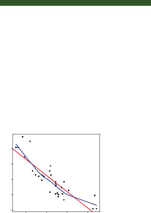
Listing 11.1 A scatter plot with best-fit lines
attach(mtcars) plot(wt, mpg,
main="Basic Scatter plot of MPG vs. Weight", xlab="Car Weight (lbs/1000)",
ylab="Miles Per Gallon ", pch=19) abline(lm(mpg~wt), col="red", lwd=2, lty=1) lines(lowess(wt,mpg), col="blue", lwd=2, lty=2)
The resulting graph is provided in figure 11.1.
The code in listing 11.1 attaches the mtcars data frame and creates a basic scatter plot using filled circles for the plotting symbol. As expected, as car weight increases, miles per gallon decreases, although the relationship isn’t perfectly linear. The abline() function is used to add a linear line of best fit, and the lowess() function is used to add a smoothed line. This smoothed line is a nonparametric fit line based on locally weighted polynomial regression. See Cleveland (1981) for details on the algorithm.
NOTE R has two functions for producing lowess fits: lowess() and loess(). The loess() function is a newer, formula-based version of lowess() and is more powerful. The two functions have different defaults, so be careful not to confuse them.
The scatterplot() function in the car package offers many enhanced features and convenience functions for producing scatter plots, including fit lines, marginal box plots, confidence ellipses, plotting by subgroups, and interactive point identification.
Basic Scatter plot of MPG vs. Weight
|
30 |
|
|
|
Gallon |
25 |
|
|
|
Miles Per |
20 |
|
|
|
|
15 |
|
|
|
|
10 |
|
|
|
|
2 |
3 |
4 |
5 |
Figure 11.1 Scatter plot of car mileage vs. weight, with superimposed linear and lowess fit lines
Car Weight (lbs/1000)
258 |
CHAPTER 11 Intermediate graphs |
For example, a more complex version of the previous plot is produced by the following code:
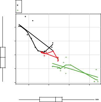
library(car)
scatterplot(mpg ~ wt | cyl, data=mtcars, lwd=2, span=0.75, main="Scatter Plot of MPG vs. Weight by # Cylinders", xlab="Weight of Car (lbs/1000)",
ylab="Miles Per Gallon", legend.plot=TRUE, id.method="identify", labels=row.names(mtcars), boxplots="xy"
)
Here, the scatterplot() function is used to plot miles per gallon versus weight for automobiles that have four, six, or eight cylinders. The formula mpg ~ wt | cyl indicates conditioning (that is, separate plots between mpg and wt for each level of cyl). The graph is provided in figure 11.2.
By default, subgroups are differentiated by color and plotting symbol, and separate linear and loess lines are fit. The span parameter controls the amount of smoothing in the loess line. Larger values lead to smoother fits. The id.method option indicates that points will be identified interactively by mouse clicks, until you select Stop (via the Graphics or context-sensitive menu) or press the Esc key. The labels option indicates that points will be identified with their row names. Here you see that the Toyota Corolla and Fiat 128 have unusually good gas mileage, given their weights. The
cyl
4
 6 Scatter Plot of MPG vs. Weight by # Cylinders
8
|
30 |
|
|
|
Gallon |
25 |
|
|
|
Miles Per |
20 |
|
|
|
|
15 |
|
|
|
|
10 |
|
|
|
|
2 |
3 |
4 |
5 |
Weight of Car (lbs/1000)
Figure 11.2 Scatter plot with subgroups and separately estimated fit lines
Scatter plots |
259 |
legend.plot option adds a legend to the upper-left margin, and marginal box plots for mpg and weight are requested with the boxplots option. The scatterplot() function has many features worth investigating, including robust options and data concentration ellipses not covered here. See help(scatterplot) for more details.
Scatter plots help you visualize relationships between quantitative variables, two at a time. But what if you wanted to look at the bivariate relationships between automobile mileage, weight, displacement (cubic inch), and rear axle ratio? One way is to arrange these six scatter plots in a matrix. When there are several quantitative variables, you can represent their relationships in a scatter-plot matrix, which is covered next.
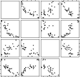
11.1.1Scatter-plot matrices
There are many useful functions for creating scatter-plot matrices in R. A basic scatterplot matrix can be created with the pairs() function. The following code produces a scatter-plot matrix for the variables mpg, disp, drat, and wt:
pairs(~mpg+disp+drat+wt, data=mtcars, main="Basic Scatter Plot Matrix")
All the variables on the right of the ~ are included in the plot. The graph is provided in figure 11.3.
Here you can see the bivariate relationship among all the variables specified. For example, the scatter plot between mpg and disp is found at the row and column
100 200 300 400
2 3 4 5
mpg
Basic Scatter Plot Matrix
100 |
200 |
300 |
400 |
2 |
3 |
4 |
5 |
10 15 20 25 30
disp
|
5.0 |
|
|
4.5 |
|
drat |
4.0 |
|
3.5 |
||
|
||
|
3.0 |
wt |
Figure 11.3 Scatter-plot |
|
|
|
matrix created by the |
|
pairs() function |
|
10 |
15 |
20 |
25 |
30 |
3.0 |
3.5 |
4.0 |
4.5 |
5.0 |
260 |
CHAPTER 11 Intermediate graphs |
intersection of those two variables. Note that the six scatter plots below the principal diagonal are the same as those above the diagonal. This arrangement is a matter of convenience. By adjusting the options, you could display just the lower or upper triangle. For example, the option upper.panel=NULL would produce a graph with just the lower triangle of plots.
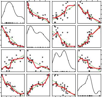
The scatterplotMatrix() function in the car package can also produce scatterplot matrices and can optionally do the following:
■Condition the scatter plot matrix on a factor.
■Include linear and loess fit lines.
■Place box plots, densities, or histograms in the principal diagonal.
■Add rug plots in the margins of the cells.
Here’s an example:
library(car)
scatterplotMatrix(~ mpg + disp + drat + wt, data=mtcars, spread=FALSE, smoother.args=list(lty=2), main="Scatter Plot Matrix via car Package")
The graph is provided in figure 11.4. Here you can see that linear and smoothed (loess) fit lines are added by default and that kernel density and rug plots are added to the principal diagonal. The spread=FALSE option suppresses lines showing spread
Scatter Plot Matrix via car Package
mpg
400 |
300 |
200 |
100 |
5 |
|
|
|
|
4 |
|
|
|
|
3 |
|
|
|
|
2 |
|
|
|
|
10 |
15 |
20 |
25 |
30 |
100 |
200 |
300 |
400 |
|
disp |
|
|
drat |
3.0 |
3.5 |
4.0 |
4.5 |
5.0 |
2 |
3 |
4 |
5 |
|
|
|
30 |
|
|
|
25 |
|
|
|
20 |
|
|
|
15 |
|
|
|
10 |
5.0 |
4.5 |
4.0 |
3.5 |
3.0 |
wt |
Figure 11.4 Scatter-plot matrix created with the scatterplotMatrix() function. The graph includes kernel density and rug plots in the principal diagonal and linear and loess fit lines.
Scatter plots |
261 |
and asymmetry, and the smoother.args=list(lty=2) option displays the loess fit lines using dashed rather than solid lines.
R provides many other ways to create scatter-plot matrices. You may want to explore the cpars() function in the glus package, the pairs2() function in the TeachingDemos package, the xysplom() function in the HH package, the kepairs() function in the ResourceSelection package, and pairs.mod() in the SMPracticals package. Each adds its own unique twist. Analysts must love scatter-plot matrices!
11.1.2High-density scatter plots
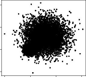
When there’s a significant overlap among data points, scatter plots become less useful for observing relationships. Consider the following contrived example with 10,000 observations falling into two overlapping clusters of data:
set.seed(1234) n <- 10000
c1 <- matrix(rnorm(n, mean=0, sd=.5), ncol=2)
c2 <- matrix(rnorm(n, mean=3, sd=2), ncol=2) mydata <- rbind(c1, c2)
mydata <- as.data.frame(mydata) names(mydata) <- c("x", "y")
If you generate a standard scatter plot between these variables using the following code
with(mydata,
plot(x, y, pch=19, main="Scatter Plot with 10,000 Observations"))
you’ll obtain a graph like the one in figure 11.5.
Scatter Plot with 10,000 Observations
10
5
y
0
−5
−5 |
0 |
5 |
10 |
x
Figure 11.5 Scatter plot with 10,000 observations and significant overlap of data points. Note that the overlap of data points makes it difficult to discern where the concentration of data is greatest.
262 |
CHAPTER 11 Intermediate graphs |
The overlap of data points in figure 11.5 makes it difficult to discern the relationship between x and y. R provides several graphical approaches that can be used when this occurs. They include the use of binning, color, and transparency to indicate the number of overprinted data points at any point on the graph.
The smoothScatter() function uses a kernel-density estimate to produce smoothed color density representations of the scatter plot. The following code
with(mydata,
smoothScatter(x, y, main="Scatter Plot Colored by Smoothed Densities"))
produces the graph in figure 11.6.
Using a different approach, the hexbin() function in the hexbin package provides bivariate binning into hexagonal cells (it looks better than it sounds). Applying this function to the dataset
library(hexbin) with(mydata, {
bin <- hexbin(x, y, xbins=50)
plot(bin, main="Hexagonal Binning with 10,000 Observations") })
you get the scatter plot in figure 11.7.
Scatter Plot Colored by Smoothed Densities
10
5
y
0
−5
−5 |
0 |
5 |
10 |
x
Figure 11.6 Scatter plot using smoothScatter() to plot smoothed density estimates. Densities are easy to read from the graph.