
- •brief contents
- •contents
- •preface
- •acknowledgments
- •about this book
- •What’s new in the second edition
- •Who should read this book
- •Roadmap
- •Advice for data miners
- •Code examples
- •Code conventions
- •Author Online
- •About the author
- •about the cover illustration
- •1 Introduction to R
- •1.2 Obtaining and installing R
- •1.3 Working with R
- •1.3.1 Getting started
- •1.3.2 Getting help
- •1.3.3 The workspace
- •1.3.4 Input and output
- •1.4 Packages
- •1.4.1 What are packages?
- •1.4.2 Installing a package
- •1.4.3 Loading a package
- •1.4.4 Learning about a package
- •1.5 Batch processing
- •1.6 Using output as input: reusing results
- •1.7 Working with large datasets
- •1.8 Working through an example
- •1.9 Summary
- •2 Creating a dataset
- •2.1 Understanding datasets
- •2.2 Data structures
- •2.2.1 Vectors
- •2.2.2 Matrices
- •2.2.3 Arrays
- •2.2.4 Data frames
- •2.2.5 Factors
- •2.2.6 Lists
- •2.3 Data input
- •2.3.1 Entering data from the keyboard
- •2.3.2 Importing data from a delimited text file
- •2.3.3 Importing data from Excel
- •2.3.4 Importing data from XML
- •2.3.5 Importing data from the web
- •2.3.6 Importing data from SPSS
- •2.3.7 Importing data from SAS
- •2.3.8 Importing data from Stata
- •2.3.9 Importing data from NetCDF
- •2.3.10 Importing data from HDF5
- •2.3.11 Accessing database management systems (DBMSs)
- •2.3.12 Importing data via Stat/Transfer
- •2.4 Annotating datasets
- •2.4.1 Variable labels
- •2.4.2 Value labels
- •2.5 Useful functions for working with data objects
- •2.6 Summary
- •3 Getting started with graphs
- •3.1 Working with graphs
- •3.2 A simple example
- •3.3 Graphical parameters
- •3.3.1 Symbols and lines
- •3.3.2 Colors
- •3.3.3 Text characteristics
- •3.3.4 Graph and margin dimensions
- •3.4 Adding text, customized axes, and legends
- •3.4.1 Titles
- •3.4.2 Axes
- •3.4.3 Reference lines
- •3.4.4 Legend
- •3.4.5 Text annotations
- •3.4.6 Math annotations
- •3.5 Combining graphs
- •3.5.1 Creating a figure arrangement with fine control
- •3.6 Summary
- •4 Basic data management
- •4.1 A working example
- •4.2 Creating new variables
- •4.3 Recoding variables
- •4.4 Renaming variables
- •4.5 Missing values
- •4.5.1 Recoding values to missing
- •4.5.2 Excluding missing values from analyses
- •4.6 Date values
- •4.6.1 Converting dates to character variables
- •4.6.2 Going further
- •4.7 Type conversions
- •4.8 Sorting data
- •4.9 Merging datasets
- •4.9.1 Adding columns to a data frame
- •4.9.2 Adding rows to a data frame
- •4.10 Subsetting datasets
- •4.10.1 Selecting (keeping) variables
- •4.10.2 Excluding (dropping) variables
- •4.10.3 Selecting observations
- •4.10.4 The subset() function
- •4.10.5 Random samples
- •4.11 Using SQL statements to manipulate data frames
- •4.12 Summary
- •5 Advanced data management
- •5.2 Numerical and character functions
- •5.2.1 Mathematical functions
- •5.2.2 Statistical functions
- •5.2.3 Probability functions
- •5.2.4 Character functions
- •5.2.5 Other useful functions
- •5.2.6 Applying functions to matrices and data frames
- •5.3 A solution for the data-management challenge
- •5.4 Control flow
- •5.4.1 Repetition and looping
- •5.4.2 Conditional execution
- •5.5 User-written functions
- •5.6 Aggregation and reshaping
- •5.6.1 Transpose
- •5.6.2 Aggregating data
- •5.6.3 The reshape2 package
- •5.7 Summary
- •6 Basic graphs
- •6.1 Bar plots
- •6.1.1 Simple bar plots
- •6.1.2 Stacked and grouped bar plots
- •6.1.3 Mean bar plots
- •6.1.4 Tweaking bar plots
- •6.1.5 Spinograms
- •6.2 Pie charts
- •6.3 Histograms
- •6.4 Kernel density plots
- •6.5 Box plots
- •6.5.1 Using parallel box plots to compare groups
- •6.5.2 Violin plots
- •6.6 Dot plots
- •6.7 Summary
- •7 Basic statistics
- •7.1 Descriptive statistics
- •7.1.1 A menagerie of methods
- •7.1.2 Even more methods
- •7.1.3 Descriptive statistics by group
- •7.1.4 Additional methods by group
- •7.1.5 Visualizing results
- •7.2 Frequency and contingency tables
- •7.2.1 Generating frequency tables
- •7.2.2 Tests of independence
- •7.2.3 Measures of association
- •7.2.4 Visualizing results
- •7.3 Correlations
- •7.3.1 Types of correlations
- •7.3.2 Testing correlations for significance
- •7.3.3 Visualizing correlations
- •7.4 T-tests
- •7.4.3 When there are more than two groups
- •7.5 Nonparametric tests of group differences
- •7.5.1 Comparing two groups
- •7.5.2 Comparing more than two groups
- •7.6 Visualizing group differences
- •7.7 Summary
- •8 Regression
- •8.1 The many faces of regression
- •8.1.1 Scenarios for using OLS regression
- •8.1.2 What you need to know
- •8.2 OLS regression
- •8.2.1 Fitting regression models with lm()
- •8.2.2 Simple linear regression
- •8.2.3 Polynomial regression
- •8.2.4 Multiple linear regression
- •8.2.5 Multiple linear regression with interactions
- •8.3 Regression diagnostics
- •8.3.1 A typical approach
- •8.3.2 An enhanced approach
- •8.3.3 Global validation of linear model assumption
- •8.3.4 Multicollinearity
- •8.4 Unusual observations
- •8.4.1 Outliers
- •8.4.3 Influential observations
- •8.5 Corrective measures
- •8.5.1 Deleting observations
- •8.5.2 Transforming variables
- •8.5.3 Adding or deleting variables
- •8.5.4 Trying a different approach
- •8.6 Selecting the “best” regression model
- •8.6.1 Comparing models
- •8.6.2 Variable selection
- •8.7 Taking the analysis further
- •8.7.1 Cross-validation
- •8.7.2 Relative importance
- •8.8 Summary
- •9 Analysis of variance
- •9.1 A crash course on terminology
- •9.2 Fitting ANOVA models
- •9.2.1 The aov() function
- •9.2.2 The order of formula terms
- •9.3.1 Multiple comparisons
- •9.3.2 Assessing test assumptions
- •9.4 One-way ANCOVA
- •9.4.1 Assessing test assumptions
- •9.4.2 Visualizing the results
- •9.6 Repeated measures ANOVA
- •9.7 Multivariate analysis of variance (MANOVA)
- •9.7.1 Assessing test assumptions
- •9.7.2 Robust MANOVA
- •9.8 ANOVA as regression
- •9.9 Summary
- •10 Power analysis
- •10.1 A quick review of hypothesis testing
- •10.2 Implementing power analysis with the pwr package
- •10.2.1 t-tests
- •10.2.2 ANOVA
- •10.2.3 Correlations
- •10.2.4 Linear models
- •10.2.5 Tests of proportions
- •10.2.7 Choosing an appropriate effect size in novel situations
- •10.3 Creating power analysis plots
- •10.4 Other packages
- •10.5 Summary
- •11 Intermediate graphs
- •11.1 Scatter plots
- •11.1.3 3D scatter plots
- •11.1.4 Spinning 3D scatter plots
- •11.1.5 Bubble plots
- •11.2 Line charts
- •11.3 Corrgrams
- •11.4 Mosaic plots
- •11.5 Summary
- •12 Resampling statistics and bootstrapping
- •12.1 Permutation tests
- •12.2 Permutation tests with the coin package
- •12.2.2 Independence in contingency tables
- •12.2.3 Independence between numeric variables
- •12.2.5 Going further
- •12.3 Permutation tests with the lmPerm package
- •12.3.1 Simple and polynomial regression
- •12.3.2 Multiple regression
- •12.4 Additional comments on permutation tests
- •12.5 Bootstrapping
- •12.6 Bootstrapping with the boot package
- •12.6.1 Bootstrapping a single statistic
- •12.6.2 Bootstrapping several statistics
- •12.7 Summary
- •13 Generalized linear models
- •13.1 Generalized linear models and the glm() function
- •13.1.1 The glm() function
- •13.1.2 Supporting functions
- •13.1.3 Model fit and regression diagnostics
- •13.2 Logistic regression
- •13.2.1 Interpreting the model parameters
- •13.2.2 Assessing the impact of predictors on the probability of an outcome
- •13.2.3 Overdispersion
- •13.2.4 Extensions
- •13.3 Poisson regression
- •13.3.1 Interpreting the model parameters
- •13.3.2 Overdispersion
- •13.3.3 Extensions
- •13.4 Summary
- •14 Principal components and factor analysis
- •14.1 Principal components and factor analysis in R
- •14.2 Principal components
- •14.2.1 Selecting the number of components to extract
- •14.2.2 Extracting principal components
- •14.2.3 Rotating principal components
- •14.2.4 Obtaining principal components scores
- •14.3 Exploratory factor analysis
- •14.3.1 Deciding how many common factors to extract
- •14.3.2 Extracting common factors
- •14.3.3 Rotating factors
- •14.3.4 Factor scores
- •14.4 Other latent variable models
- •14.5 Summary
- •15 Time series
- •15.1 Creating a time-series object in R
- •15.2 Smoothing and seasonal decomposition
- •15.2.1 Smoothing with simple moving averages
- •15.2.2 Seasonal decomposition
- •15.3 Exponential forecasting models
- •15.3.1 Simple exponential smoothing
- •15.3.3 The ets() function and automated forecasting
- •15.4 ARIMA forecasting models
- •15.4.1 Prerequisite concepts
- •15.4.2 ARMA and ARIMA models
- •15.4.3 Automated ARIMA forecasting
- •15.5 Going further
- •15.6 Summary
- •16 Cluster analysis
- •16.1 Common steps in cluster analysis
- •16.2 Calculating distances
- •16.3 Hierarchical cluster analysis
- •16.4 Partitioning cluster analysis
- •16.4.2 Partitioning around medoids
- •16.5 Avoiding nonexistent clusters
- •16.6 Summary
- •17 Classification
- •17.1 Preparing the data
- •17.2 Logistic regression
- •17.3 Decision trees
- •17.3.1 Classical decision trees
- •17.3.2 Conditional inference trees
- •17.4 Random forests
- •17.5 Support vector machines
- •17.5.1 Tuning an SVM
- •17.6 Choosing a best predictive solution
- •17.7 Using the rattle package for data mining
- •17.8 Summary
- •18 Advanced methods for missing data
- •18.1 Steps in dealing with missing data
- •18.2 Identifying missing values
- •18.3 Exploring missing-values patterns
- •18.3.1 Tabulating missing values
- •18.3.2 Exploring missing data visually
- •18.3.3 Using correlations to explore missing values
- •18.4 Understanding the sources and impact of missing data
- •18.5 Rational approaches for dealing with incomplete data
- •18.6 Complete-case analysis (listwise deletion)
- •18.7 Multiple imputation
- •18.8 Other approaches to missing data
- •18.8.1 Pairwise deletion
- •18.8.2 Simple (nonstochastic) imputation
- •18.9 Summary
- •19 Advanced graphics with ggplot2
- •19.1 The four graphics systems in R
- •19.2 An introduction to the ggplot2 package
- •19.3 Specifying the plot type with geoms
- •19.4 Grouping
- •19.5 Faceting
- •19.6 Adding smoothed lines
- •19.7 Modifying the appearance of ggplot2 graphs
- •19.7.1 Axes
- •19.7.2 Legends
- •19.7.3 Scales
- •19.7.4 Themes
- •19.7.5 Multiple graphs per page
- •19.8 Saving graphs
- •19.9 Summary
- •20 Advanced programming
- •20.1 A review of the language
- •20.1.1 Data types
- •20.1.2 Control structures
- •20.1.3 Creating functions
- •20.2 Working with environments
- •20.3 Object-oriented programming
- •20.3.1 Generic functions
- •20.3.2 Limitations of the S3 model
- •20.4 Writing efficient code
- •20.5 Debugging
- •20.5.1 Common sources of errors
- •20.5.2 Debugging tools
- •20.5.3 Session options that support debugging
- •20.6 Going further
- •20.7 Summary
- •21 Creating a package
- •21.1 Nonparametric analysis and the npar package
- •21.1.1 Comparing groups with the npar package
- •21.2 Developing the package
- •21.2.1 Computing the statistics
- •21.2.2 Printing the results
- •21.2.3 Summarizing the results
- •21.2.4 Plotting the results
- •21.2.5 Adding sample data to the package
- •21.3 Creating the package documentation
- •21.4 Building the package
- •21.5 Going further
- •21.6 Summary
- •22 Creating dynamic reports
- •22.1 A template approach to reports
- •22.2 Creating dynamic reports with R and Markdown
- •22.3 Creating dynamic reports with R and LaTeX
- •22.4 Creating dynamic reports with R and Open Document
- •22.5 Creating dynamic reports with R and Microsoft Word
- •22.6 Summary
- •afterword Into the rabbit hole
- •appendix A Graphical user interfaces
- •appendix B Customizing the startup environment
- •appendix C Exporting data from R
- •Delimited text file
- •Excel spreadsheet
- •Statistical applications
- •appendix D Matrix algebra in R
- •appendix E Packages used in this book
- •appendix F Working with large datasets
- •F.1 Efficient programming
- •F.2 Storing data outside of RAM
- •F.3 Analytic packages for out-of-memory data
- •F.4 Comprehensive solutions for working with enormous datasets
- •appendix G Updating an R installation
- •G.1 Automated installation (Windows only)
- •G.2 Manual installation (Windows and Mac OS X)
- •G.3 Updating an R installation (Linux)
- •references
- •index
- •Symbols
- •Numerics
- •23.1 The lattice package
- •23.2 Conditioning variables
- •23.3 Panel functions
- •23.4 Grouping variables
- •23.5 Graphic parameters
- •23.6 Customizing plot strips
- •23.7 Page arrangement
- •23.8 Going further
Regression diagnostics |
187 |
8.3.2An enhanced approach
The car package provides a number of functions that significantly enhance your ability to fit and evaluate regression models (see table 8.4).
Table 8.4 Useful functions for regression diagnostics (car package)
Function |
Purpose |
|
|
qqPlot() |
Quantile comparisons plot |
durbinWatsonTest() |
Durbin–Watson test for autocorrelated errors |
crPlots() |
Component plus residual plots |
ncvTest() |
Score test for nonconstant error variance |
spreadLevelPlot() |
Spread-level plots |
outlierTest() |
Bonferroni outlier test |
avPlots() |
Added variable plots |
influencePlot() |
Regression influence plots |
scatterplot() |
Enhanced scatter plots |
scatterplotMatrix() |
Enhanced scatter plot matrixes |
vif() |
Variance inflation factors |
|
|
It’s important to note that there are many changes between version 1.x and version 2.x of the car package, including changes in function names and behavior. This chapter is based on version 2.
In addition, the gvlma package provides a global test for linear model assumptions. Let’s look at each in turn, by applying them to our multiple regression example.
NORMALITY
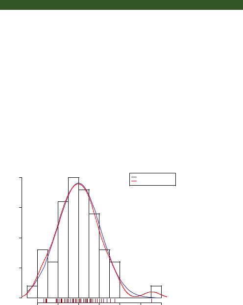
The qqPlot() function provides a more accurate method of assessing the normality assumption than that provided by the plot() function in the base package. It plots the studentized residuals (also called studentized deleted residuals or jackknifed residuals) against a t distribution with n – p – 1 degrees of freedom, where n is the sample size and p is the number of regression parameters (including the intercept). The code follows:
library(car)
states <- as.data.frame(state.x77[,c("Murder", "Population", "Illiteracy", "Income", "Frost")])
fit <- lm(Murder ~ Population + Illiteracy + Income + Frost, data=states) qqPlot(fit, labels=row.names(states), id.method="identify",
simulate=TRUE, main="Q-Q Plot")

188 |
|
CHAPTER 8 Regression |
|
|
||
The qqPlot() function generates |
|
Q-Q Plot |
|
|
||
the probability plot displayed in |
|
|
|
Nevada |
||
figure 8.9. The option id.method |
|
3 |
|
|
||
="identify" makes the plot inter- |
|
|
|
|
||
active—after the graph is drawn, |
Residuals(fit) |
1 2 |
|
|
||
mouse clicks on points in the |
|
|
||||
graph will label them with values |
|
|
||||
specified in the labels option of |
|
|
||||
Studentized |
|
|
|
|||
the function. Pressing the Esc key, |
0 |
|
|
|||
selecting |
Stop from |
the graph’s |
|
|
||
drop-down menu, or right-clicking |
|
|
||||
|
|
|
|
|||
the graph turns off this interactive |
|
|
|
|
||
mode. Here, I identified Nevada. |
|
|
|
|
||
When simulate=TRUE, a 95% con- |
|
0 |
1 |
2 |
||
fidence |
envelope is |
produced |
|
|||
|
t Quantiles |
|
|
|||
using a |
parametric |
bootstrap. |
Figure 8.9 Q-Q plot for studentized residuals |
|
||
(Bootstrap methods |
are consid- |
|
||||
|
|
|
|
ered in chapter 12.)
With the exception of Nevada, all the points fall close to the line and are within the confidence envelope, suggesting that you’ve met the normality assumption fairly well. But you should definitely look at Nevada. It has a large positive residual (actual – predicted), indicating that the model underestimates the murder rate in this state. Specifically:
> states["Nevada",]
|
Murder |
Population |
Illiteracy |
Income |
Frost |
Nevada |
11.5 |
590 |
0.5 |
5149 |
188 |
> fitted(fit)["Nevada"]
Nevada 3.878958
> residuals(fit)["Nevada"]
Nevada 7.621042
> rstudent(fit)["Nevada"]
Nevada 3.542929
Here you see that the murder rate is 11.5%, but the model predicts a 3.9% murder rate. The question that you need to ask is, “Why does Nevada have a higher murder rate than predicted from population, income, illiteracy, and temperature?” Anyone (who
hasn’t see Goodfellas) want to guess?

Regression diagnostics |
189 |
For completeness, here’s another way of visualizing errors. Take a look at the code in the next listing. The residplot() function generates a histogram of the studentized residuals and superimposes a normal curve, kernel-density curve, and rug plot. It doesn’t require the car package.
Listing 8.6 Function for plotting studentized residuals
residplot <- function(fit, nbreaks=10) { z <- rstudent(fit)
hist(z, breaks=nbreaks, freq=FALSE, xlab="Studentized Residual", main="Distribution of Errors")
rug(jitter(z), col="brown") curve(dnorm(x, mean=mean(z), sd=sd(z)),
add=TRUE, col="blue", lwd=2) lines(density(z)$x, density(z)$y,
col="red", lwd=2, lty=2) legend("topright",
legend = c( "Normal Curve", "Kernel Density Curve"), lty=1:2, col=c("blue","red"), cex=.7)
}
residplot(fit)
The results are displayed in figure 8.10.
As you can see, the errors follow a normal distribution quite well, with the exception of a large outlier. Although the Q-Q plot is probably more informative, I’ve always
|
0.4 |
|
0.3 |
Density |
0.2 |
|
0.1 |
|
0.0 |
Distribution of Errors
Normal Curve
Kernel Density Curve
−2 |
−1 |
0 |
1 |
2 |
3 |
4 |
Figure 8.10 Distribution of studentized residuals using the residplot() function
Studentized Residual

190 |
CHAPTER 8 Regression |
found it easier to gauge the skew of a distribution from a histogram or density plot than from a probability plot. Why not use both?
INDEPENDENCE OF ERRORS
As indicated earlier, the best way to assess whether the dependent variable values (and thus the residuals) are independent is from your knowledge of how the data were collected. For example, time series data often display autocorrelation—observations collected closer in time are more correlated with each other than with observations distant in time. The car package provides a function for the Durbin–Watson test to detect such serially correlated errors. You can apply the Durbin–Watson test to the multiple-regression problem with the following code:
> durbinWatsonTest(fit)
lag Autocorrelation D-W Statistic p-value
1 |
-0.201 |
2.32 |
0.282 |
Alternative hypothesis: rho != 0
The nonsignificant p-value (p=0.282) suggests a lack of autocorrelation and, conversely, an independence of errors. The lag value (1 in this case) indicates that each observation is being compared with the one next to it in the dataset. Although appropriate for time-dependent data, the test is less applicable for data that isn’t clustered in this fashion. Note that the durbinWatsonTest() function uses bootstrapping (see chapter 12) to derive p-values. Unless you add the option simulate=FALSE, you’ll get a slightly different value each time you run the test.
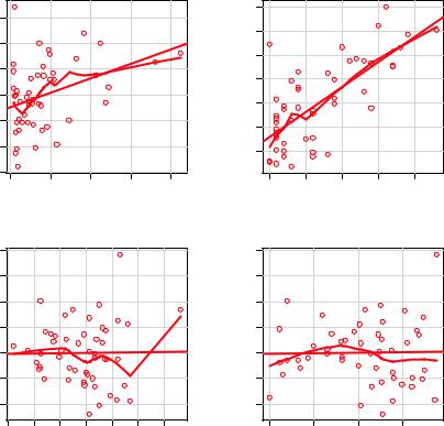
LINEARITY
You can look for evidence of nonlinearity in the relationship between the dependent variable and the independent variables by using component plus residual plots (also known as partial residual plots). The plot is produced by the crPlots() function in the car package. You’re looking for any systematic departure from the linear model that you’ve specified.
To create a component plus residual plot for variable X, you plot the points
εi + (β0 + β1 × X1i + ... + βk × Xki) vs. Xi
where the residuals are based on the full model, and i =1 … n. The straight line in each graph is given by (β0 + β1 × X1i + ... + βk × Xki) vs. Xi . Loess fit lines are described in chapter 11. The code to produce these plots is as follows:
>library(car)
>crPlots(fit)
The resulting plots are provided in figure 8.11. Nonlinearity in any of these plots suggests that you may not have adequately modeled the functional form of that predictor in the regression. If so, you may need to add curvilinear components such as polynomial terms, transform one or more variables (for example, use log(X) instead of X), or abandon linear regression in favor of some other regression variant. Transformations are discussed later in this chapter.

Regression diagnostics |
191 |
Component + Residual Plots
|
|
|
|
|
|
|
8 |
|
|
|
|
Component+Residual(Murder) |
−4 −2 0 2 4 6 |
|
|
|
|
Component+Residual(Murder) |
−4 −2 0 2 4 6 |
|
|
|
|
|
−6 |
|
|
|
|
|
|
|
|
|
|
|
0 |
5000 |
10000 |
15000 |
20000 |
|
0.5 |
1.0 |
1.5 |
2.0 |
2.5 |
|
|
|
Population |
|
|
|
|
Illiteracy |
|
|
8 |
|
|
|
|
8 |
|
|
|
Component+Residual(Murder) |
−4 −2 0 2 4 6 |
|
|
|
Component+Residual(Murder) |
−4 −2 0 2 4 6 |
|
|
|
|
3000 |
4000 |
5000 |
6000 |
|
0 |
50 |
100 |
150 |
|
|
|
Income |
|
|
|
|
Frost |
|
Figure 8.11 Component plus residual plots for the regression of murder rate on state characteristics
The component plus residual plots confirm that you’ve met the linearity assumption. The form of the linear model seems to be appropriate for this dataset.
HOMOSCEDASTICITY
The car package also provides two useful functions for identifying non-constant error variance. The ncvTest() function produces a score test of the hypothesis of constant error variance against the alternative that the error variance changes with the level of the fitted values. A significant result suggests heteroscedasticity (nonconstant error variance).
The spreadLevelPlot() function creates a scatter plot of the absolute standardized residuals versus the fitted values and superimposes a line of best fit. Both functions are demonstrated in the next listing.

192 |
CHAPTER 8 Regression |
Listing 8.7 Assessing homoscedasticity
>library(car)
>ncvTest(fit)
Non-constant Variance Score Test
Variance formula: ~ fitted.values
Chisquare=1.7 Df=1 p=0.19
> spreadLevelPlot(fit)
Suggested power transformation: 1.2
The score test is nonsignificant (p = 0.19), suggesting that you’ve met the constant variance assumption. You can also see this in the spread-level plot (figure 8.12). The points form a random horizontal band around a horizontal line of best fit. If you’d violated the assumption, you’d expect to see a nonhorizontal line. The suggested power transformation in listing 8.7 is the suggested power p (Yp) that would stabilize the nonconstant error variance. For example, if the plot showed a nonhorizontal trend and the suggested power transformation was 0.5, then using Y rather than Y in the regression equation might lead to a model that satisfied homoscedasticity. If the suggested power was 0, you’d use a log transformation. In the current example, there’s no evidence of heteroscedasticity, and the suggested power is close to 1 (no transformation required).
Spread−Level Plot for fit
|
2.00 |
Residuals |
1.00 |
Absolute Studentized |
0.10 0.20 0.50 |
|
0.05 |
4 |
6 |
8 |
10 |
12 |
14 |
Fitted Values
Figure 8.12 Spread-level plot for assessing constant error variance