

GIS For Dummies
.pdfChapter 3: Reading, Analyzing, and Interpreting Maps |
51 |
intensity of that process. For example, if you notice that a portion of a crop isn’t doing well, you might find that the soil in that area is low in nutrients — perhaps because of overplanting or under-fertilization.
Knowing your geometry and patterns
To perform a useful analysis of the patterns in your map, you must recognize the geometry and patterns that you encounter. You need to be able to do three basic things with the patterns:
Accurately describe the patterns in a way that the layperson can understand.
Quantitatively compare and contrast your descriptions of the patterns to those of other features and feature sets.
Analyze the quantities that you identify to determine a measure of their pattern or shape, and to provide a baseline for changes that might take
place over time.
GIS
Analyzing patterns in the real world
The recognition, quantification, and analysis of spatial patterns together carry one important characteristic. They give you the power to interpret what those patterns mean and what importance the patterns might have (if they have any). This chapter includes a few examples about the significance of some patterns, but the list of pattern types and causes is nearly limitless:
Wildlife specialists want to know the locations, extent, and movement of animals so that they can examine the natural or human causes of changes in animal population or habitat.
Urban planners examine street patterns, utility patterns, urban density patterns, regional population changes, and patterns of traffic to control growth so that everyone can move about; have heat, light, and water; and live apart from noisy or polluting industries.
Military analysts need to understand the locations and distributions of troops and armament so that they can deploy their own forces effectively.
Criminologists study distributions and concentrations of crime so that they can protect the public.
Utility companies need to examine their distribution networks for wear and damage from weather and age.
Businesses analyze the distribution and composition of their potential customers so that they can decide where to open new branches.
Emergency care personnel need to know the connectivity of street patterns and the patterns of traffic at different times of day.

52 |
Part I: GIS: Geography on Steroids |
GIS is designed to do much of the analysis automatically. The software anticipates that you’ll need these types of values for future analytical techniques. All pattern descriptions require some basic GIS operations, however. To analyze patterns of numerous objects, the software needs to be able to count objects, determine the absolute locations of the graphical entities (the actual points, lines, and polygons), and measure objects and the spaces between them. These techniques are the same ones that you use to calculate geometry and orientation (see Chapter 11 for more on these calculations).
Using GIS software for the analysis
Your GIS software knows which values you need for your analysis because when you put your spatial data into the computer, you tell the software exactly where each point is and how that point relates to the feature’s real position on the surface of the Earth. When you turn the software on and load up the database, most programs immediately retrieve all the points, lines, polygons, and surfaces that you put in the database and report on the following calculations:
The number of points, lines, and polygons (areas) for the theme you load.
The individual polygon areas and the total area for the theme that you loaded.
The total lengths of linear objects of a particular category.
In short, the software automatically calculates much of what you need to describe patterns and spatial geometry.
So, what’s left for you to do? Well, the GIS can’t anticipate everything you might want to calculate or analyze, so you do have to make some decisions. You can find so many new tools for analyzing that you may feel overwhelmed. I try to help you through the decision-making process by reviewing a few common descriptive analyses in the following sections. You can find more advanced methods, but these simple ones are quite powerful.
Determining the type of pattern
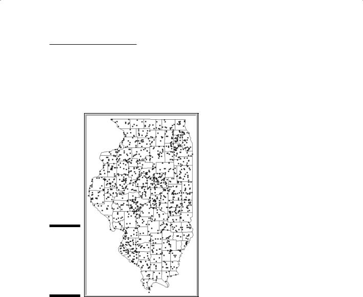
Figure 3-7 shows the distribution of tornados in Illinois from 1950 to 1998. This distribution is clearly not a regular distribution. But deciding whether the distribution is clustered or random is a bit more difficult. Even when a distribution pattern visually appears to be one or the other, you need some way to identify the pattern for sure.
Chapter 3: Reading, Analyzing, and Interpreting Maps |
53 |
In the clustered condition, some points are closer together than others. Put another way, the points in the clusters have many close neighbors, whereas the remaining neighbor distances are much farther apart. The mathematical technique that the GIS uses to make this determination is called, not surprisingly, the nearest neighbor statistic.
Figure 3-7:
GIS can determine whether this tornado pattern is clustered or random.
To determine whether a pattern of points is regular, random, or clustered, your GIS software follows these steps:
1.Find the random nearest neighbor distance by dividing one by twice the square root of the density of points.
In the tornado example, you realize when performing your analysis that the number of tornados for Illinois isn’t the same from one season to the next or from one year to the next. You need a measurement of the average nearest distance that would occur if the distribution were random.
That measurement is based on the density (number of points per unit area) of the distribution, which you identify with this simple equation: Random nearest neighbor distance = 1/(2 × square root of the density)

54 |
Part I: GIS: Geography on Steroids |
In this case, density is the number of tornados per square mile. The average nearest distance changes with the density but always gives you the nearest neighbor distance for a random pattern.
2.Calculate the average pair-wise nearest neighbor distance of your points.
The pair-wise part of this term indicates that each point (denoting a tornado location) is matched with only one other point as its nearest neighbor. And this statistic is pretty easy to calculate. The GIS software finds the x- and y-coordinates for each tornado location, measures the distance to every other location, and determines which location is the nearest neighbor. After collecting this data, the program calculates the average of these pair-wise nearest neighbors.
3.Divide the calculated average pair-wise nearest neighbor distance by the random nearest neighbor distance to compare distances for randomness.
After the software calculates the average pair-wise nearest distance, you need a way to compare the standard for random distributions with other types of distributions — regular and clustered. You just have to compare the measured nearest neighbor distance to the random distribution by dividing the measured (calculated in Step 2) by the random (calculated in Step 1).
4.Compare the number to 0 and 1, where 1 is perfectly random and 0 is perfectly clustered.
Numbers larger than 1 indicate a more regular pattern.
If you calculate the mean of all the nearest neighbor distances and divide that number by the random nearest neighbor distance — and you get a value of 1.0 — the measured nearest neighbor distance shows a perfectly random distribution. If the value you get is 0.0, this measurement is perfectly clustered (meaning as clumped together as you can get). If you get a value greater than 1, your distribution becomes more regular (more dispersed) as the number grows larger. No absolute value exists for determining perfectly regular distributions because the values you get depend on the density of points.
You can determine whether the values that you get from your analysis occur by chance or whether they’re truly meaningful, but you may want to leave that job for the statisticians in the crowd. You need to know only the nature of the distribution.
The nearest neighbor analysis is an effective tool for determining the pattern of point objects, but you can also use this analysis to evaluate the distribution of line objects, and even area and volume objects. You just need to let the software calculate the center of each line — or each polygon or volume feature — and then do the same calculation that you perform for point objects (for example, nearest neighbor). You use nearest neighbor statistics to make sure that what your eye has already told you is real and not a figment of your imagination.

Chapter 3: Reading, Analyzing, and Interpreting Maps |
55 |
Identifying even more patterns
Some calculations can help you identify different types of patterns. You can use certain techniques to determine the average direction of linear objects, such as tornado paths, fallen trees, boulder distributions, shelterbelts (protective barriers such as windbreaks), and many other objects. Without going into the trigonometry, it simply gives you a summary statement of the direction in which these events and objects occur. This calculation might, for example, tell you the direction of wind during storms, the movement of a glacier while it leaves debris behind, or the way that farmers line up planted trees to protect their crops from the wind.
Beyond these calculations of position and dispersion, you can find techniques for calculating the connectivity or circuitry of networks, the ratios of streams branching, the sinuosity of streams, the isolation of forest patches, and many more available inside the GIS software. In most cases, you can find these techniques simply by knowing the appropriate terms describing the condition of the geographic features you wish to examine (connectivity, isolation, and so on) and what they mean, and then searching for them in the help menu. The best part is that most GIS software not only tells you how the commands work, but it also frequently provides short tutorials that explain what the statistics do.
Interpreting the Results
and Making Decisions
Maps show many types of patterns and distributions. As you read more maps, you become more familiar with them and often recognize that many of the patterns are distinctive in their configuration, distribution, or location. The GIS provides you with a mathematical means to quantify and categorize these patterns so that you know they really exist. Although wielding such quantitative power is cool, you don’t use GIS just for fun unless, like me, you really like patterns.
Each pattern exists because of underlying forces, whether those forces are natural or human, random or focused, static or dynamic. After you become familiar with the idea of seeing and recognizing patterns for your own specialty, you next need to use your specialized knowledge to identify the reasons they exist. A process creates every pattern, and every pattern has an effect on the process that created it. As trees reseed themselves in a single plot of land, the density of trees increases. As the density of trees increases, the competition for space increases, and some trees die, thus reducing the density.

56 |
Part I: GIS: Geography on Steroids |
When you analyze your GIS data, follow these steps:
1.Recognize and acknowledge the existence of the patterns.
2.Analyze and verify that the patterns are real.
3.Identify the causes and consequences of these patterns based on your knowledge of the study area.
4.Apply this knowledge in your own profession for prediction and planning.
The data inside the GIS allow you to do all the steps in the preceding list except one. The display shows the patterns so that you can visualize them. The analytical techniques allow you to quantify and summarize the patterns for verification. Finally, the software allows you to create new scenarios and model the consequences of change to help you decide which of your scenarios works best. But the GIS can’t tell you what the functional relationships are. It allows you to test different ideas and make pattern comparisons, but you, as the expert, have to decide which factors to examine and which patterns to compare. GIS is an excellent vehicle, but — like any vehicle — it’s only as good as the person driving it.
GIS specialists can’t always apply the software to effectively solve problems because they’re often not subject matter experts. So, subject matter specialists need to communicate the possible causes and consequences of patterns to the GIS applications developer. For example, a change in traffic patterns might indicate possible traffic congestion. Traffic congestion might further suggest a need for new road construction, which results in even more changes in traffic patterns.

Part II
Geography Goes
Digital

In this part . . .
We live in a digital world, and that world is filled with all sorts of geographic features, surfaces, and dis-
tributions. In this part, I explain how getting the geography into digital form requires that you understand the different data models. You see how each model works and discover its impact on the way you store, retrieve, edit, and analyze geographic data. Dive into this part and get ready to feel much more comfortable with digital map data.

Chapter 4
Creating a Conceptual Model
In This Chapter
Compensating for your computer’s lack of map-reading skills
Understanding how to select the right maps for your GIS
Figuring out what you want in your maps
Inputting map data into your computer
Maps are complex devices that hold tons of information. Some of that information appears outright in the symbols, but a map imparts much
information more subtly, almost covertly. A single shading pattern that represents the distribution of a soil type explicitly shows where the soil is located. But such shading patterns also tell you what soils are adjacent to other types of soils, the relative amounts of each soil type, and even how often the types occur in a single piece of land.
For another example, if your map has point symbols that represent the locations of churches, each point symbol links explicitly to a church’s absolute map coordinates. And when you look at a church symbol on an area map, you can also see a measurable distance to other churches and to potential churchgoers, how many churches are in the area, and their locations within the area’s topography. If you’re looking for the Church on the Hill, you can probably find it on a hill.
Maps are complex, and human map readers (like you) interpret much of the information that those maps contain. So, to create a GIS that has both complex and useful information, you have to show the computer how to think like you do as a map reader.
Formulate a conceptual model (a picture in your mind) of how you plan to tell the computer all the information that you glean from a map. In this chapter, you can discover how to think very precisely about a map so that you can transfer that precision into your GIS projects.

60 |
Part II: Geography Goes Digital |
Helping Computers Read Maps
A traditional map shows the properties of its features as a picture, and skilled cartographers do a good job of drawing the picture. When you see, read, and interpret the map, you often recognize properties because you know what the symbols in the picture mean. You might easily understand that topographic contour lines are close together on a map when the slope is steep, and they’re farther apart when the slope is more gradual. When you see a church on a hill, you know that it’s on a hill and that the people have to go up that hill to get there.
Then, along comes a computer, which really can’t read a map at all on its own. To the computer, contour lines are just a graphic representation of numbers located in its files. It doesn’t understand that the lines represent elevation values. Likewise, the computer doesn’t understand the kind of information that you glean from the map at a glance — for example, that a certain symbol represents a church, that the church is on a hill, that the roads leading up to the church must go uphill, and that those roads connect to a network of other roads leading to the people who attend that church.
You have to tell the computer all this stuff by constructing a conceptual model. You first figure out how the map was constructed and why it was made that way. You determine what decisions went into selecting the map areas, the categories of features included, and the graphics that represent the features. With these details in place, you can make a model that even your computer will love (or, at least, understand).
Embracing the Model-Creation Process
You can’t create useful GIS projects until you have a grasp of what you want to produce. In other words, you start the model-creation process with the big picture by asking what your final product needs to be. Then, you break down, or decompose, the final product into the general types (themes) of maps that you need to use. The last stage in the process involves determining which aspects of each map you need to examine. This final stage actually defines the map elements (features and their related data) that you ultimately plan to combine to create your final map.
Each GIS project has its own map elements, and each has its own proposed outcome. To decide what map features you need, you can just draw a simple flowchart (which is what I like to do), starting with the final outcome and successively breaking it down into themes and individual elements. I recommend that you create this flowchart without thinking about whether these data are available. That way, you devise the most detailed model with no compromises.