

GIS For Dummies
.pdfChapter 3: Reading, Analyzing, and Interpreting Maps |
41 |
Understanding levels of measurement
All map data, including point, line, area, and volume data, come in one of four levels of measurement:
Nominal: Objects are often identified by their name — a church, a house, an interstate highway, rail lines, the range of a plant or animal species, or a parcel of land. This level of measurement is called nominal, meaning named. You can’t compare nominal measurements to each other. The comparison can be literally apples and oranges.
Ordinal: You might also categorize things by a general category of size, such as a small, medium, or large house, road, or land parcel. Such objects are measured at the ordinal scale. The ordinal scale characterizes things by their rank or order in a sequence, so the name ordinal refers to the ordering or ranking.
Interval: If you have detail and can actually measure things by intervals, you might use the interval scale. The interval scale also places things in order, but you can measure the relative difference by exact intervals.
For example, the number 10 is 90 units lower than 100.
Because points are technically considered to have no dimensions, measuring them at the interval scale may seem, well . . . pointless, but that’s not necessarily the case. The point may represent something that’s measurable at that scale, such as an average soil temperature in degrees Fahrenheit.
You can’t make ratios out of interval scale objects. So, if a soil is 32 degrees Fahrenheit in one place (A) and 16 degrees Fahrenheit in another (B), you can say that A is 16 degrees warmer than B, but you can’t say that A is twice as warm as B. The starting point for Fahrenheit was chosen for convenience rather than to represent an absolute starting point where the temperature is at the lowest possible level. Dates on calendars are also interval because different calendars have different starting points (for example, the Mayan calendar versus the Gregorian calendar), and the starting points aren’t based on when time actually began.
Ratio: Items that have an absolute starting point, such as population (where zero is the lowest number you can have), are measured at the ratio scale. The term ratio is used because you actually can make comparison ratios out of such things. For example, a city (A) that has a population of 2,000,000 people has twice the population of another
city (B) that has 1,000,000 people — the ratio here is 2 to 1 or 2:1. Other examples of ratio data include the size of a parcel of land, the length of a border, or the volume of a buried ore body.
42 |
Part I: GIS: Geography on Steroids |
GIS incorporates four primary scales of geographic data measurement — nominal (named, non-comparative), ordinal (ranked, relative sizes), interval (measured by increments, but with an arbitrary starting point), and ratio (measured in increments with an absolute starting point, allowing for ratio comparisons).
Understanding the relationship between symbology and data measurement
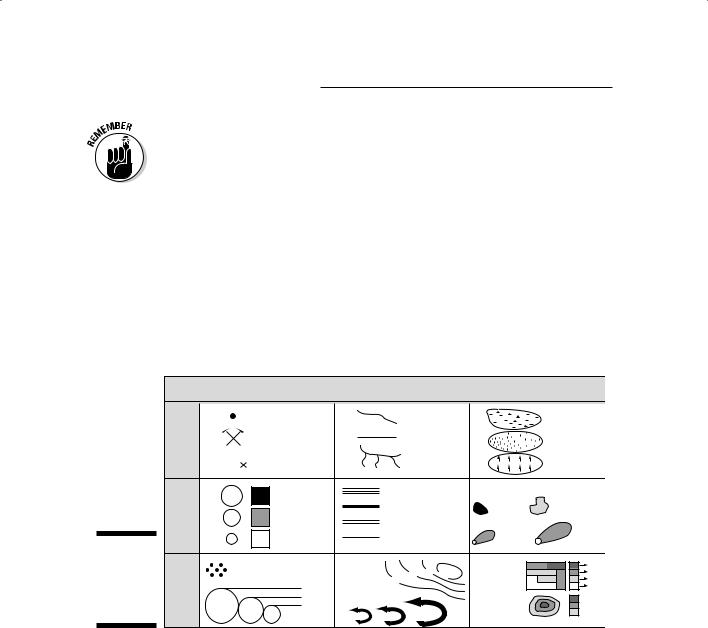
Figure 3-1 shows a table that illustrates the relationships between each scale of data measurement and the symbols depicting geographic features. Each table entry includes an example or two of the type of geographic features that you might run across in your GIS activity.
Figure 3-1:
Geographic features and how they’re measured.
Interval/Ratio Ordinal Nominal
|
Point |
|
Line |
|
|
|
Area |
|
|
town |
|
|
road |
|
|
swamp |
|
|
mine |
|
|
boundary |
|
desert |
||
BM |
bench mark |
|
|
stream |
|
|
forest |
|
|
large |
|
Interstate highway |
Business Districts |
||||
|
|
|
|
|||||
|
|
US highway |
|
primary |
secondary |
|||
|
medium |
|
|
|||||
|
|
State highway |
minor |
major |
||||
|
|
|
||||||
|
small |
|
County road |
|
||||
|
|
|
plume |
plume |
||||
|
|
|
|
|
|
|
||
Each dot represents |
contours |
|
30 |
40 |
50 |
Population |
100 |
|
200 objects 10,000> |
|
20 |
|
|
|
density |
120 |
|
|
|
|
|
60 |
||||
|
|
|
|
|
|
|
|
80 |
|
5,000-9,999 |
flowlines |
|
|
|
Elevation |
4,000 |
|
|
0-4,999 |
|
|
|
||||
|
|
|
|
|
|
|
zones |
2,000 |
|
|
|
|
|
|
|
1,000 |
|
In Figure 3-1, you can find some symbols used for various features on a map: point (zero-dimensional), line (one-dimensional), and area (two-dimensional). Along the left side, the list of measurement scales combines interval and ratio. Although these two data measurement scales do have their differences, the combination makes sense because they share identical symbology.
Working with nominal features
The data measurement level shown at the bottom of Figure 3-1 is nominal. The figure shows typical geographic objects that you encounter on a map, including a town, a mine, a stream, and a forest. A picture or graphic symbol

Chapter 3: Reading, Analyzing, and Interpreting Maps |
43 |
represents each of these features on the map. These features and many more like them are non-comparative, which means you can’t compare them to each other directly. You can’t easily compare Oakmont, the town, to the Black Hills mine.
Other non-comparative features include
Line features: Streets, rail lines, and boundaries, for example, are unique entities and can’t be compared to one another. Geographers say that they’re not the same kind of feature.
Areas: A swamp, the range of a wild species, the land owned by the federal or state government, or the type of zoning for a particular parcel of land are also unique and can’t be compared.
Volume features: Water aquifers, hills, and buried ore bodies all take up volume and are named on maps. You can acknowledge that they exist and give them specific names, but you can’t compare ore bodies to aquifers.
Depicting features that use the ordinal scale
You can add ordinal (ranked) attributes to points, lines, areas, and volumes. Inhabited regions have names, and you can also rank them as hamlets, villages, towns, and cities. This ranking indicates that the features aren’t only the same kind of feature — inhabited places — but they’re also different sizes of inhabited places.
Geographers call these distinctions comparisons of kind, and apply such ranking as follows:
For line data, such as roads: You may want to depict dirt roads, single lane highways, superhighways, and so on. These lines are comparable because they have attributes that are relative in size (ordinal).
For volume data, such as an ore body: You can categorize the ore quality as low-, medium-, or high-grade ore.
Comparing data using the interval and ratio scales
Although the symbols used to represent interval and ratio scales are identical, mapmakers have many options for designing these symbols. To indicate different sizes on the scales, the cartographer can change the size of symbols. How much the symbols vary in size is directly related to the size of the features that the symbols represent, which is why cartographers call such symbols graduated symbols. So, each symbol can be graduated (or sized) to the feature it represents. Easy squeezy.
Not so fast — there’s a catch. Consider this example: The United States has about 3,000 counties. If each county has a map area that contains, say, only 30 towns and cities (in reality, most counties probably contain many more

44 |
Part I: GIS: Geography on Steroids |
towns and cities than 30), you have 90,000 towns and cities that all need symbols. Even if you map only one town for every third county, you still have 1,000 symbols. If each town has a different population, a dedicated cartographer calculates the relative size for each one of those 1,000 symbols. Just imagine the frustration for a map reader trying to identify the differences among so many symbols.
The good news is that you can find a better way to select symbol sizes so the reader will be able to recognize them. You can group these point symbols
to show that features have various sizes by assigning them to classes which break up the range of values into a small set. For example, the population of cities can be grouped into classes with limits of 0 to 10,000, 10,001 to 100,000, 100,001 to 1 million, and over 1 million. Cartographers have a lot of methods that they can use to determine the class limits for point symbols. More importantly, they can apply these same methods to line, area, and volume data that are measured with the interval/ratio scales. Here are some examples:
For line features: Imagine using different-sized lines to represent the levels of flow in a river or stream (see Figure 3-1).
For area features: Consider showing the potential area that a hazardous spill might occupy as a set of differently sized tear-drop shaped symbols.
For volume features: A cartographer can represent the sizes of ore bodies as a set of irregularly shaped area symbols that increase in size, or even symbols shaded to look 3-D.
Cartographers spend a great deal of time creating symbols for point, line, area, and volume features. They’ve developed a host of methods for standardizing the symbols and determining class limits. The good news is that this work has been done for you. The so-so news is that the map data grouped together in this way are less accurate than the raw data used to compile the maps.
Recognizing Patterns
One cool thing about maps is that the symbols represent a scaled-down version of real geography. As much as possible, the map’s symbolic objects, features, and background are distributed and located in ways that closely resemble the locations and distributions of real objects. This aspect of a map is important because patterns of geographic features are — more often than not — related to an underlying process and, as a result, represent cause and effect.
The processes that create location and distribution patterns often took place in the past and are typically still in play during the present. By extension, the processes operating today will continue to operate in the future. Although
Chapter 3: Reading, Analyzing, and Interpreting Maps |
45 |
these statements are generalizations — subject to changes in speed, and the continuation or secession of the underlying processes — making this
assumption allows you to undertake the description, explanation, and prediction of patterns. In this way, you interpret the patterns — but first, you need to recognize that patterns exist.
When you identify patterns, you look for a degree of predictability in the arrangement of the objects you’re interested in. For example, if you see a map showing a group of trees that are dying from some disease, you can predict that the adjacent trees are likely to become infected and die eventually.
Each person interprets patterns differently, based on experience, background, and a variety of other factors. To make the best use of GIS information, the trick is to notice patterns that you may not be used to seeing, such as patterns of trees, houses, roads, rivers, or any other features you encounter.
Identifying random distributional patterns
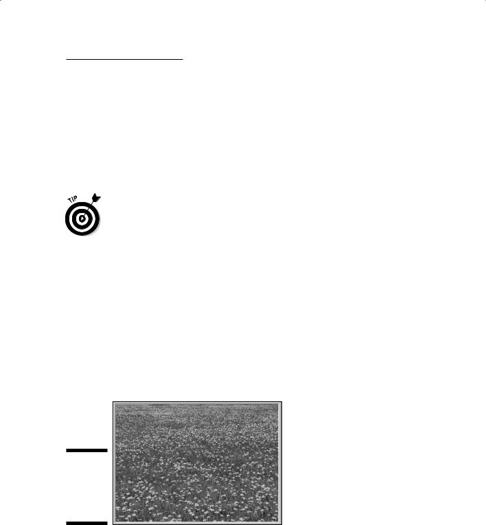
People see spatial patterns based on the separation between objects that they’re observing, meaning they notice how close together or far apart the objects are. Some objects, such as dandelions in your yard, occur pretty much at random (like in Figure 3-2). This type of distributional pattern occurs because of the process that spreads the dandelion seeds. The seeds are spread by the wind, carried on animals — or even people — and spread in other ways that produce a random distribution. The spatial pattern made by these dandelions reflects the widely varying distances between individual plants. Some dandelions are close to each other (within inches), some are far away (several yards), and others are somewhere in between (a few feet).
Figure 3-2:
Dandelions create a random distributional pattern.
46 |
Part I: GIS: Geography on Steroids |
Finding clustered distributional patterns
Certain features occur in clumps, or clusters. In such cases, similar features tend to be very close together (in a cluster), and another cluster of these same features may be far apart from the first cluster. In a clustered distributional pattern, a significant number of features tend to cluster together in portions of your study area. For example, crimes tend to occur in clusters, called hot spots, around specific neighborhoods (as shown in Figure 3-3). These hot spots reflect the processes that facilitate crime, such as the availability of victims or the location of criminals. You might, for example, expect to find clusters of jewelry thefts in locations where wealthy people who have expensive jewelry live. After you start seeing spatial patterns, you see them everywhere — and you then begin to naturally make the link between patterns and the possible causes and ramifications of the patterns.
Be careful when making interpretations of patterns. Maps that show clusters of tornados might tell you more about the number of people who are around to observe those particular tornados than it does about your weather patterns. You can also be misled into making the incorrect conclusion that the more people in an area, the more tornados occur. The population is related to tornado sightings but hopefully not to the cause of tornados.
Figure 3-3:
A clustered distributional pattern appears in a map of crime hot spots.
Chapter 3: Reading, Analyzing, and Interpreting Maps |
47 |
Observing uniform distributional patterns
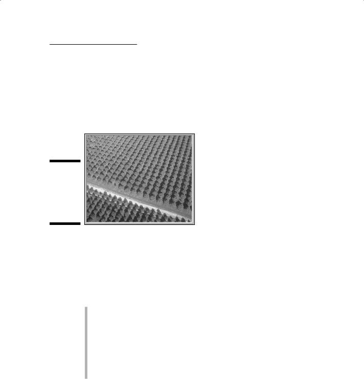
The type of pattern that’s the easiest to observe is called uniform distribution. An orchard (like the one in Figure 3-4) is a classic example of a uniform distribution. Each tree is spaced almost exactly the same distance from each adjacent tree. This type of pattern rarely occurs naturally. It’s pretty obvious that the pattern is driven by some form of human action — in this case, planting.
Figure 3-4:
Humans create a uniform distributional pattern in an orchard.
Seeing patterns among dissimilar features
You may see geographic features present in some places (whatever their spacing) and absent in others. The sizes, shapes, orientations, and juxtapositions of these features, compared to other map features, provide strong evidence that a spatial relationship exists between unlike features. Consider these examples:
A map may show places that have wetlands and places that don’t. And you know that wetlands often occur in places that feature a depression in the landscape.
You may notice that commercial development seems to occur in only selected parts of the city. In this instance, you know that many city codes and zoning regulations control the locations of commercial enterprises.
You observe that a species of plant or animal shows up in one place and not another. Typically, plants and animals adapt to differences in the physical environment at various locations.

48 |
Part I: GIS: Geography on Steroids |
Each of these distributions indicates something about the underlying processes (cause and effect), in the same way that random, clustered, and uniform spacing do (as I discuss in the preceding sections). After you recognize the patterns, you can start thinking about the relationships between patterns and associated processes and how you can exploit that knowledge.
Describing patterns with linear features
Linear features provide both locations and distributions, but because they’re often connected in a variety of ways, you can describe some additional patterns — including connectivity, circuitry, and linkages — that you don’t find in other types of features.
Many linear features connect to each other in a series of pathways, like in the example of road networks and railroad lines. If you look at a map of the major highways of the United States, for example, you notice a pattern immediately. Some places, especially highly populated locations (such as the eastern seaboard), have beaucoup highways with tons of connections and many ways of getting from one place to another. Other places, such as the Great Plains, have way fewer highways with much less connectivity. These different road systems exhibit patterns of road networks based on the number of connections, not just on the number and proximity of roads.
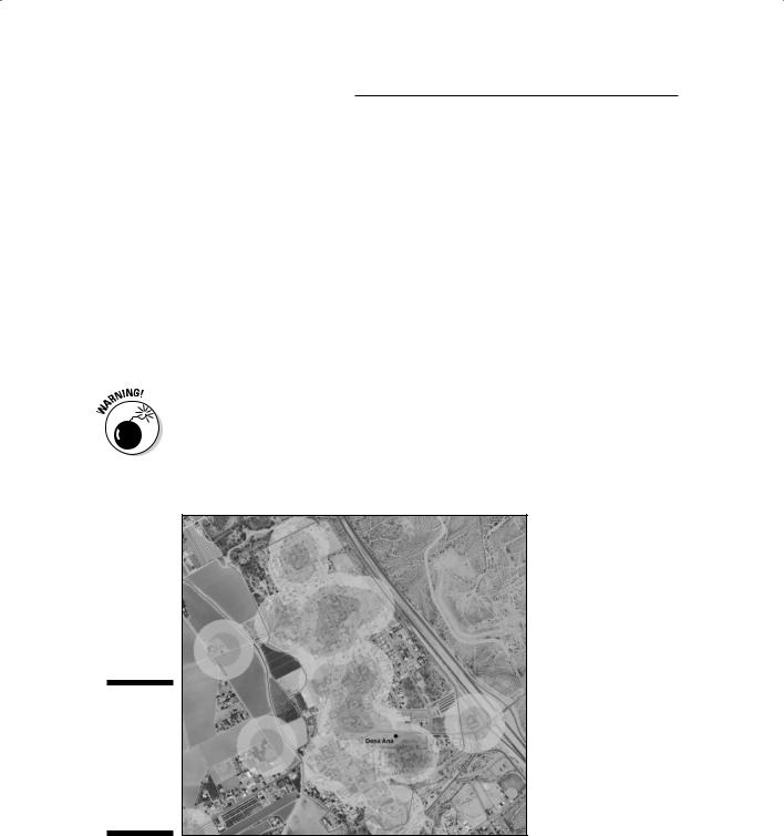
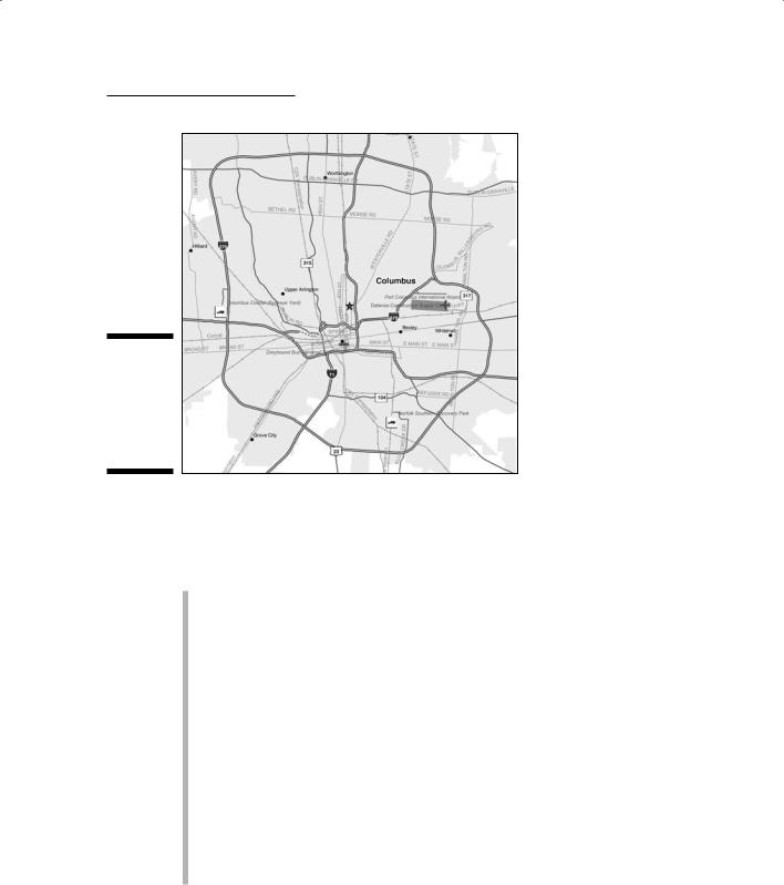
Some road networks and highways allow you to go around obstructions, rather than just through them. These networks form closed loops, or circuits, just like in an electrical circuit. When road networks have circuits, traffic has an alternative because it can flow around obstacles that drivers might want to avoid. Rail lines use circuits so that trains can more easily pass other approaching trains. Perhaps one of the most common forms of transportation circuit is the U.S. Interstate Highway bypass (or outerbelt) that surrounds major metropolitan regions and allows traffic to avoid the congested areas of the internal part of the city (see Figure 3-5). If you see a concentration of circuits, such as outerbelts, you can be fairly certain that the population is high in that location because circuits are designed to allow a lot of vehicles to travel around the densest part of the city where traffic is congested and slow.
Understanding the repeated sequence of shapes
You can recognize patterns when items are arranged to form a repeated sequence of shapes. A simple example of such a pattern is clothing that features a pattern, such as a herringbone suit or a plaid shirt, rather than a solid color. Such patterns occur in linear objects on the Earth, as well.
Chapter 3: Reading, Analyzing, and Interpreting Maps |
49 |
Figure 3-5:
A highway outerbelt allows traffic to flow around the city.
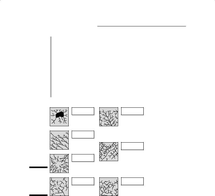
One well-studied set of patterns has to do with how rivers and streams connect to form different designs. Although you can find different terms to describe the following types of patterns, the ideas remain the same. Figure 3-6 shows a thumbnail of each of the following patterns:
Dendritic: The easiest one for me to remember is called dendritic and looks like the branches of a tree. These branches (called tributaries) go out in all directions and seem to have a mind of their own. The flat terrain and absence of strong rock formations allow the water to go in somewhat random directions.
Radial: Another common pattern that streams take is called radial. A radial pattern looks like a dendritic pattern, except that all the streams flow outward, away from a center, like the spokes of a wheel. A radial pattern occurs because a hill (with its higher elevation) at the center of the pattern works with gravity to cause the streams to flow outward and downward from the top.
Centripetal: The opposite of radial patterns, centripetal patterns occur when a low spot or depression affects the flow. The radial pattern is reversed, and the streams flow toward the center.
Parallel: Parallel and sub-parallel streams run along the gentle slopes that result from either natural topography or from land manipulation because of road or mining construction activities.
50 |
Part I: GIS: Geography on Steroids |
Trellis: Trellis stream patterns result from rock strata that’s jointed, exposed, and folded from geological forces acting over time. Trellis patterns resemble the street patterns in neighborhoods loosely organized along a grid.
Rectangular: Rectangular stream patterns show strong right-angle turns and are often the result of cross-cutting joints in the underlying rock. This pattern also occurs in some man-made neighborhoods where drainage ditches are strongly oriented along a grid.
Annular: Annular stream patterns occur in areas which have a dome that is eroded. The erosion forms a series of circular rings that have fractures at right angles to the rings, and the streams are forced to flow in the interrupted portions of these circles. The term annular comes from the geometric form annulus, which is a ring.
Centripetal |
Dendritic |
|
Parallel |
|
|
|
Trellised |
|
Radial |
|
Figure 3-6: |
|
|
Stylized |
Annular |
Rectangular |
illustrations |
||
of stream |
|
|
patterns. |
|
|
Analyzing and Quantifying Patterns
Recognizing that patterns exist is a great start for any GIS user, especially the analyst. Every pattern occurs for a reason, even if the reason is a random one. You analyze patterns to determine whether the process that created them was random, clustered, or uniform (see the section, “Recognizing Patterns,” earlier in the chapter). When you know the processes underlying the pattern, you can begin to take that explanation and make predictions about future patterns based on your knowledge of the presence, absence, or