GIS For Dummies
.pdf
|
Chapter 18: Producing Cartographic Output 291 |
|
|
30 |
30 |
|
|
|
|
|
30 |
|
30 |
|
|
20 |
20 |
|
20 |
|
|
20 |
|
|
10 |
10 |
|
|
|
|
10 |
|
|
20 |
|
|
20 |
10 |
|
20 |
20 |
Figure 18-5: |
|
|
A central- |
|
|
point |
(a) |
(b) |
cartogram. |
||
|
Road network |
Concentric travel timelines |
Figure 18-6:
This transit line system map is a routed line cartogram.

292 Part V: GIS Output and Application

Chapter 19
Generating Non-Cartographic
Output
In This Chapter
Identifying routes and travel directions
Making customer lists and statistical data
Sending signals electronically from your GIS
Creating animated movies and even virtual output
Maps are the traditional output from GIS, but not everyone is wellversed in reading maps — especially thematic maps (which I talk
about in Chapter 2), the typical type of maps resulting from GIS data retrieval or analysis. I’ve been to several conferences where people got into lengthy, often heated, discussions about exactly what a particular map was trying to communicate. Such disagreement often happens because of poor cartography, but it can also happen because of the map reader’s lack of familiarity with map symbols, classification strategies, and legends.
The ultimate goal of GIS is to communicate results. Many people are familiar with lists, tables, statistics, travel directions, and other non-map-like forms of communication. If the intended recipients of your GIS output are more comfortable with these alternatives to maps, then why not provide them with these forms of communication, rather than — or, at least, in addition to — cartographic output?
GIS has many ways to communicate results that are not purely cartographic. This chapter helps you with a few of these methods so that you’re ready to deliver your GIS output to meet the needs of diverse audiences.

Chapter 19: Generating Non-Cartographic Output 295
are and what you purchased. By comparing that record to demographic data (selected characteristics of the general population), businesses can actually target different parts of a city for specific marketing campaigns.
Although maps can provide a general description of customer type and location, the busy business professional often wants a report, rather than a map. In some cases, the report includes maps as part of the document. GIS produces two general types of reports that are suited to business uses:
Tabular reports: Have a spreadsheet-like layout
Columnar reports: Have a newspaper column layout
Whether you choose the tabularor columnar-report format, you can sort by any data field that the report contains. For example, you can list cities alphabetically, by population, market share, or total volume of business. Another useful tool in the GIS reporting toolkit generates summary statistics, such as sum, mean, range, standard deviation, and minimum and maximum for any data field.
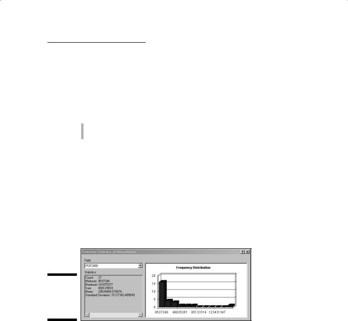
Typically, you can more easily understand summary statistics when they’re presented graphically through bar charts, histograms, line graphs, pie charts, scatterplots, and other forms of non-cartographic graphic output. Most GIS software gives you the option of including both tables and graphs directly on the map itself. Figure 19-2 shows a graphic presentation of summary statistics.
Figure 19-2:
A graph showing summary statistics.
GIS software often presents statistical and tabular data as graphs because graphs provide a visual, easy-to-understand means of communication. Used alone, graphs are handy, but GIS analysts often use them to complement a map because the reader can gather information faster from the graph than from only the map itself. Most GIS software allows you to not only produce maps of GIS data, but also non-spatial data associated with the map. When you base this non-spatial data on the map attributes, the GIS often links that data to the map so that when the data changes, so does the graph. You can even use the same color schemes to make comparisons more natural.
296 Part V: GIS Output and Application
|
In addition to generating maps, a GIS can present virtually any of its data as |
|
|
statistical tables or graphical charts and diagrams. You have a staggering |
|
GIS |
volume of potential output. Here’s a list of some practical and frequently used |
|
GIS output that works well in non-cartographic formats: |
||
|
Market share by region or quarter
Number of customers in a particular city, county, state, or neighborhood
Lightning strikes by state
Customer or potential customer profiles by region
Crop yields and changes in crop yield by year
Lists of households not currently subscribing to a newspaper
Lists of property tax valuation for counties
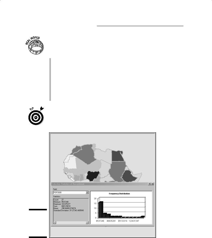
You can more easily read and interpret maps if you include a linked table or graph either on or near the map itself (as shown in Figure 19-3). If you use matching colors to show the correspondence between the map symbols and the tabular or graphed data, you can also improve users’ understanding.
Figure 19-3:
Combining a map with summary statistics.

Chapter 19: Generating Non-Cartographic Output 297
Producing Alarms and Signals
(Audio and Video)
|
Sometimes, GIS produces output that it can’t put in a map or graph. Some |
|
|
home security systems, many E911 systems, and a growing number of market- |
|
GIS |
ing and government bodies now use automated electronic and signaling sys- |
|
tems that, at least in part, employ GIS technologies. Here are some examples: |
||
|
The output from analysis of registered voters could result in automated telephone calls asking for your vote.
Fire and emergency services may receive signals from dispatchers that include both an audible alarm and even a set of routing directions in the vehicle’s GPS unit.
Some military hardware systems combine GPS, GIS, and remote sensing technologies to direct automated aircraft to particular targets.
In precision agriculture solutions, certain combinations of input trigger valves to open and close on machinery that releases specific amounts of fertilizer or pesticide.
Real-time information is sent between GIS operators and forest-fire fighters.
Automobile onboard navigation systems often have voice command and even updated traffic information as part of their output.
Benefiting from Virtual Output
With newer, faster computers and better graphics output devices, GIS has a new set of possibilities for presenting GIS data and analytical results. The following sections show you two major types — animations and flythroughs — both of which involve the development of short movie clips. These types of video output give GIS users a totally different perspective on the data.
Animating your maps
GIS animations are a form of geographic visualization that shows dynamic changes to a single map layer or even multiple map layers simultaneously to allow visual comparisons. You most commonly use GIS animations to depict geographic movements (for example, tracking the movement of wildlife) and temporal changes (such as changes in land cover patterns over many years).


Chapter 19: Generating Non-Cartographic Output 299
By setting up a sequential path: You select a number of key locations that you want to visit in the sequence that you want to view them to create the general flythrough path.
By recording your movements during a flight simulation: You control the speed of the flythrough based on the speed at which you move during the recording process.
Whether you set up a path or use the simulator approach, the software records a sufficient number of frames per second so that when the flythrough is played back, it moves smoothly.
Flythrough is useful for the following GIS applications:
GIS |
Terrain evaluations: To detect landscape features or compare terrain |
|
|
|
texture (ruggedness or smoothness) |
Urban impact assessment: To show the effect of urban structures on wind
Political and cultural studies: To illustrate the often radically different patterns that occur as you cross political boundaries worldwide
Damage estimation: In which flying through an entire valley allows you to observe flood conditions
Ecological research: Making visual comparisons of elevation levels to changes in the size and composition of vegetation
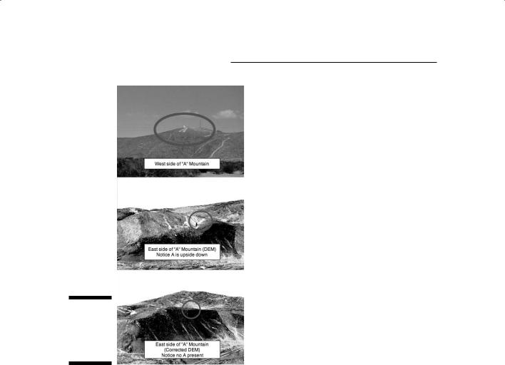
I used this technique to show how datum errors can result in strange mismatches of aerial features on topography. As shown in a snapshot of a flythrough around Tortugas Mountain in Las Cruces, New Mexico (see Figure 19-4), the letter A was turned upside down because the Digital Elevation Model (DEM) and the aerial photography used different datums. (I talk about datums in Chapter 2.)
Vendors usually save flythrough animations in some proprietary format, but in most cases, you can also export flythroughs as Audio Video Interleave (.avi) or Quicktime (.mov) files that you can play back by using Windows Media Player or QuickTime.
Use flythroughs when you need multiple views of a topographic feature or when you want to see the relationships that might exist between elevation and other features on the surface.