A default map (left) and a map with useradded colors (right).
The GIS groups the categories by attribute value, such as land-use type or road type. Using a separate pattern for each category allows the reader to instantly pick out one from another. Two general types of attributes assign unique colors or patterns to category values:
Attributes that describe the names, types, or qualitative condition of the features
Attributes that identify specific objects, such as the names for countries, states, or colors
Most GIS software allows you to use a set of predesigned color or shading schemes, or to create and employ your own. When working in black and white (for publications that don’t use color, for example), you can use the shading patterns rather than colors.
Mapping quantitative data
Most of the output from GIS is based on numbers, statistics, and other quantitative data that describe something about the features you’re mapping.
Most non-cartographers don’t really know how to decide what specific data to map or how to display them. Here are three general rules to help out:
If you want to see the raw data and relative comparisons, map the counts or amounts themselves. Be careful, however, because amounts might be misleading. Imagine looking at numbers of newspaper subscribers in New York City — millions of people — versus Bismarck, North Dakota, with less than 100,000 people. The results of such a map merely reflect total population rather than the number of newspaper readers per capita.
282 Part V: GIS Output and Application
If you want to control for area or number of features (called normalizing your data), use ratios. Ratios require you to compare two values. For example, you could compare the number of newspaper subscriptions per 1,000 people living in the subscription area or population per square mile.
If you want to compare the relative values from place to place or feature to feature, you want to map those values as ranks. You might rank newspaper subscription ratios per 1,000 people for each city. So, you replace the actual numbers with the ranks.
Buying an output device
Even though computers can display maps onscreen, hardcopy still has its charms. People often print out digital text documents, even though they don’t have to, partly because people are usually more comfortable when they can actually touch a map because they’re usually more familiar with maps as documents.
GIS software and hardware can produce hard copy maps. You can find many devices that are designed just for these tasks. Some devices print only text, and others print graphics, as well. Keep these tips in mind when you’re ready to go from your GIS to hard copy output:
Choose an output device that’s right for your needs. Large-format plotters and raster printers can produce large maps, but they require special paper, inks, and supplies that affect your budget.
Choose output devices based on volume.
If you plan to make only a few production maps, you need only one set of devices, but if you plan to create a production facility, you need to consider much higher volume production equipment.
Consider the ink. Most inks fade with time, but some are more prone to fading than others. Ask your vendor about the impact
of light on the ink. Also, keep in mind that the colors of the ink are not the same as what you see on your monitor. Many GIS users are disappointed by the loss of color intensity, lack of contrast, or even the different appearance of the colors.
Keep supplies handy. You never know when a big job will come down the road and you’ll need supplies. You need time to get your hands on some kinds of supplies. Find a good, reliable vendor. Make sure the vendor knows your needs and the demand you place on the equipment and supplies.
Have a backup plan for output. Having supplies such as toner drums, ink, pens, and paper doesn’t help if your printer stops working. Have additional output devices as backups or reach an agreement with another organization that can help you in a pinch.
Check compatibility. Output devices have their own graphics languages. Make sure that your GIS software and your output device can talk to each other. You normally don’t have to worry about a problem if you use professional GIS software that either comes bundled with compatible hardware or is adaptable to changes in hardware.
Chapter 18: Producing Cartographic Output 283
Creating classes
An important aspect of deciding what to map deals with whether you want to map each individual value, or group (classify) the values and then map those groups. If you have only a few items to map (normally, less than ten), you can display each one with a separate symbol or color. If you have more than ten items (which you usually do), you need to group those items. Otherwise,
the reader can’t visually separate the many shades and colors needed to display them.
For example, if you tried to map each of the 3,000 or so counties of the continental United States with a unique color or pattern for each county, the map reader would have to try to distinguish between these 3,000 colors and patterns. For the map to be readable, you’d have to create groups (classes) that reflect real differences in value and enable the readers to see the patterns you want them to see.
You can create classes in many ways and use each class in a variety of ways. You want to put data into classes that allow similar values to be in the same class — sort of like how teachers separate out student exams into letter grades. You need to make two decisions:
How many classes you need
How to divide the classes into appropriate groups
You typically find seven general ways to classify data available in GIS software. Different software uses different names for these classifications, but here are general descriptions:
Equal interval: Equally divides the range of values to be classified, for example, 0-100, 101-200, 201-300, and so on. This method defines the number of classes, as well as the class intervals. This classification works best when you have data ranges that are fairly commonly understood and well known, such as percentages or temperatures.
Defined interval: This method allows you to define the specific ranges of data and lets the software decide how many classes you need. Suppose you tell the software that you want it to divide the percent of people who voted in the last election into intervals based on 5-year age groups. But you’ve already restricted the dataset to only those people between the ages of 30 and 59. In this case, your software will create six classes reflecting your choices: age groups 30-34, 35-39, 40-44, 45-49, 50-54, and 55-59.
284 Part V: GIS Output and Application
Quantiles: This method counts features so that each class has the same number of features (for example, the same number of counties). If you know that your data are distributed in a linear fashion, you can use this approach effectively. If wildly different data occur together or very similar data occur in different classes, you can increase the number of classes you use to better represent the data classes using quantiles.
Natural breaks: I’m rather fond of this approach because I can see the visual changes in the categories and put in the class breaks where they occur naturally. Classes created this way are more likely to be representative of how data should logically be classed. The visual changes occur where the data have large jumps or dips so they are very easy to pick out.
Geometrical intervals: Many datasets change in non-linear fashion, for example, logarithmically. This approach, designed for continuous data, attempts to put the same number of data occurrences in each class regardless of what their values are.
Standard deviations: If you’re sure that your data are distributed in a bell shape (that is, normally distributed), you might want to use this method because it’s based on sound statistical theory. This classification method is designed to use the standard deviations above and below the mean, which identifies the category value based on that standard distance from the mean. ESRI recommends using two colors when you employ this method — one color for those values above the mean and one for those below the mean.
Area-based:Only some software offers this approach. It allows you to use a variety of the other methods, but it divides the classes based not on the distribution of the data, but rather on the distribution of the amount of area for each category. This approach gives you quite a bit of control over the visual appearance of the map and adjusts for graphical artifacts such as disproportionately large polygons that skew the map’s appearance.
Using map elements
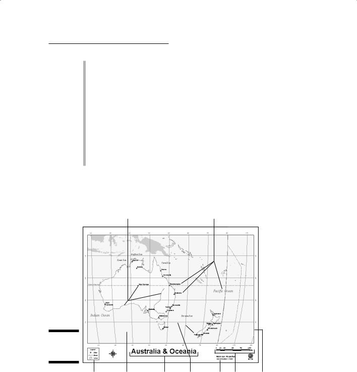
Map elements are the graphic devices that cartographers include on a map. Here’s a list of the standard map elements (see Figure 18-2):
Title: Gives the reader a context for understanding the map.
Legend: Explains what the content and classes mean.
Scale: Helps the reader know how big the area is and how much generalization to expect.
Chapter 18: Producing Cartographic Output 285
Credits: Hey, here’s where you can take credit for your hard mapmaking work. Nothing wrong with that!
Mapped areas: The place where you actually put the geography.
Graticules: A grid of fine lines used to determine scale and position of mapped objects. Maps don’t always need graticules, but they often make a map look really professional.
Borders: Sometimes called neat lines because they surround the map area and make the map look orderly and contained.
Symbols: You can’t really put the mapped areas on the map without using symbols that represent the real geography.
Place names: The names of the locations that are mapped so the reader can find them on the map.
Keep in mind that map standards are always changing, so these elements may be different from what you’ve seen in the past — and they may change in the future.
Symbols
Place names
Figure 18-2:
Anatomy of a map.
Legend
Mapped area
Title Graticules Credits Scale Borders
286 Part V: GIS Output and Application
Purchasing a monitor
Before you ever put ink on paper, your GIS displays the maps on your computer monitor. Monitors come in a wide variety of shapes, sizes, resolutions, and contrast levels. Some monitors are CRT technology (based on oldstyle television tubes), some are LCD (liquid crystal display), and others are plasma-based. Some monitors can handle millions of colors, and others are more limited.
Your visualization needs, budget, and even lighting conditions can affect your decision about what type (or types) of monitor(s) you need. Some systems employ two monitors so that they can separate graphics and text. You don’t need a high-quality, high-resolution monitor for the text side of the system, but you might for the graphics side. Some monitors look washed out if you view them at an angle or surround them with too much light.
GIS vendors often bundle the hardware to their software. You can often get excellent compatibility between the software and the hardware in these bundles because the vendors are familiar with the capabilities of their software relative to the hardware. Even if you don’t purchase a package that includes both your GIS hardware and software, you can ask your software supplier which monitor systems it recommends for your application. Suppliers normally have many different types of users, and the users provide very good feedback on what works and what doesn’t. Here are some basic aspects of graphics monitors for you to ask about:
Resolution
Size
Refresh rate
Material (whether it’s CRT, LCD, or plasma)
Number of colors
Number of monitors (usually one versus two)
Reliability
Compatibility with the software
Vendor responsiveness and warranties
When you ask your GIS vendor about these specifications, be sure that you know your needs. In particular, be able to explain your lighting, space configuration, user requirements, and ergonomics. The vendor may want to know how many stations you need and whether any of your technicians have visual or other impairments that affect seating and viewing. If one of your technicians, for example, is in a wheelchair, his or her monitor needs may be quite different than those who will sit in an office chair to view the monitor, depending on the desk configuration. You may also have users who are colorblind and therefore don’t need a massive color palette (as long as the monitor can display plenty of gray shades). In some cases, you might want to have a very large monitor or a projection system so that you can share the results or the preliminary analyses with your clients comfortably.
Factoring in graphic map design
A map offers more than just a way to store and retrieve data. Its primary functions are analysis and display. Selecting the correct data, scales, projections, classes, and map elements helps you make sure that you’re creating
Chapter 18: Producing Cartographic Output 287
a readable map. But you need to remember that the map is also a graphic device — and some graphics are nicer than others. This aspect of cartography, called graphic map design, borrows heavily from traditional art and graphic design principles, as well. Here are a few questions to ask yourself while you look over your finished product:
Does the map look unbalanced (not visually leaning to one side)? If it does, you need to move the map elements around. Use the text, titles, and legend to help you balance the map graphically.
Can you read the lettering? You need to know how close the readers are going to be to your map. Put yourself in their shoes and increase the lettering as needed.
Do the features stand out? Contrast is the basis of seeing. Putting pink on yellow might work for a designer hat, but this color combination doesn’t help a map-reader see the objects you want him to see.
Does the reader know what to focus on? Use a technique called figure ground where you make sure the background is rather vanilla and the figure (what you want the reader to see) stands out. You may also want to use visual hierarchy — using line thicknesses to help distinguish the importance of geographic features such as nations, states, and counties.
Do you feel dizzy looking at your map? This question may sound funny, but it happens. Poor colors, colliding line patterns, and spiraling shapes make readers uncomfortable — which means they don’t want to read your map, and you’ve failed as a map designer.
Over time, you become sensitized to what works and what doesn’t work in graphic map design. When you look at art, you know what you like and what you don’t like. The same is true of maps. After you become familiar with the terminology of art, you can explain why you like or don’t like art. In the same way, when you become familiar with cartographic design language, you can do the same with maps.
Look at a lot of maps. If you want to be a better mapmaker, you need to see what works and what doesn’t work. If you go to GIS conferences, you can see tons of maps, both good and bad.
Understanding Cartograms
For most GIS cartographic output, the user needs the traditional map. Most users are most comfortable with the typical thematic map output if you keep them apprised while the output progresses. In almost all situations, the usual types of maps make their point quite nicely. Sometimes, however, you might want to make a point that the usual display just doesn’t convey with the impact
288 Part V: GIS Output and Application
you want. When you really want to elicit a reaction from the map reader, you can use a really cool type of map called a cartogram. A cartogram is a map that exaggerates the size of geographic space based on the descriptive attributes, instead of presenting the space in its accurately scaled size and shape. You use a cartogram to communicate a specific aspect of the mapped information more effectively.
In traditional maps, the sizes of the land areas and the lengths of line features portray (as closely as possible) the proportional relationship in their scaled size. This proportional look makes sense, of course, when the features and their relative sizes are familiar to the audience. When you distort these area sizes or change the lengths of features, the reader becomes uncomfortable. This discomfort may be useful to elicit the response you want, or it may detract from that response if the viewer is unfamiliar with the area portrayed on the map. You must be aware of the target audience’s map reading skills and understanding of the portrayed geography before attempting to use cartograms.
Although you don’t want to go out of your way to make your reader uncomfortable with an out-of-proportion map, sometimes the shock of such distortions has the impact on the viewer that you want. Impressionistic artists use this technique in their work to elicit a response rather than to represent reality as accurately as possible. Cartographers use distortion to draw attention to a particular result. These distortions are performed on two types of map elements: areas and distances.
Attracting attention with area cartograms
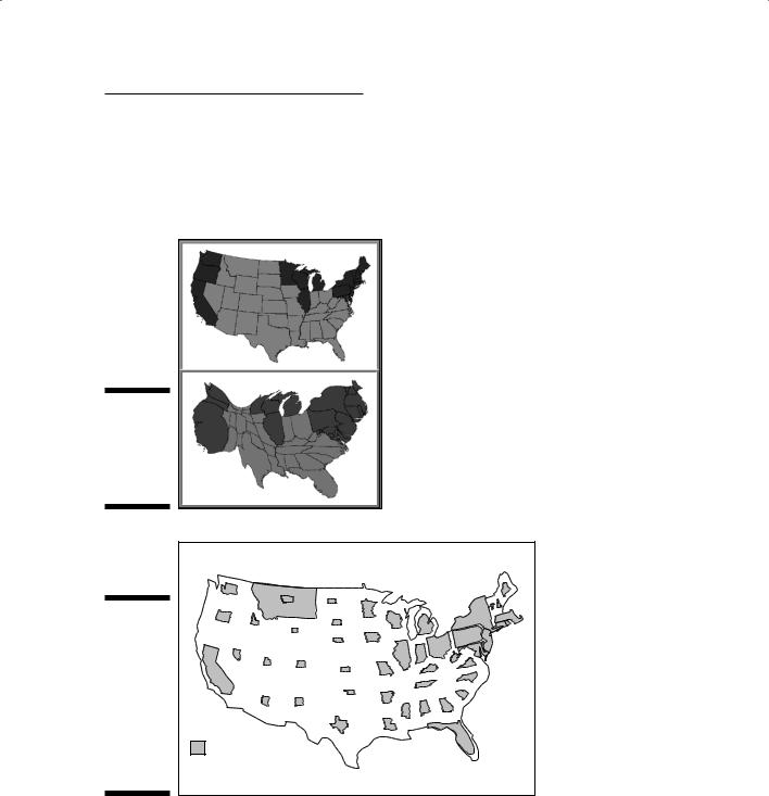
Area cartograms, often called value-by-area maps, distort the sizes of the polygons based on the attribute quantity, rather than its actual physical size. Among the most common examples of a value-by-area map is the analysis
of U.S. presidential election results, like the one shown in Figure 18-3. In this figure, the top map is a traditional choropleth map (a map presenting data on an area-by-area basis) that shows the actual scaled size of the United States. The darker states (the West Coast, East Coast, and areas near the Great Lakes) voted for the Democratic candidate, and the remainder (what appears to be the vast majority of the country) voted for the Republican candidate. But when you distort the areas based on the states’ electoral votes (the number of votes each state gets based on its population), the election results seem much closer than in the original map.
Use value-by-area maps to force the reader to focus on the value of the attribute represented by each area (in Figure 18-3, the electoral votes for each candidate), rather than on the size that the map features take when accurately scaled.
Chapter 18: Producing Cartographic Output 289
Figure 18-3 shows that all the states (polygons) are connected. This type of area cartogram is called a contiguous cartogram. You can also make an area cartogram by exploding the polygons so that they’re relatively close to their proper locations but no longer connected. This type of area cartogram is called a non-contiguous cartogram (Figure 18-4).
Figure 18-3:
Two maps
showing the
results of a
presidential
election.
Figure 18-4:
A non-
contiguous
area car-
togram
maintains
the features’
shapes but
not their
100,000 persons
exact
65 and over
locations.
Source: U.S. Bureau of the Census
290 Part V: GIS Output and Application
Contiguous and non-contiguous area cartograms don’t have any real advantages or disadvantages. Contiguous area cartograms distort shapes, and non-contiguous area cartograms distort relative positions. When deciding which cartogram style to use, consider your potential map readers. The less cartogram experience the readers have, the more they rely on shape, so the non-contiguous style might make sense to them. However, if the shapes are unfamiliar to your readers, the contiguous, shape-distorted style may be as good a choice because the reader is not relying on shape to interpret the map.
Distorting distance with linear cartograms
Linear cartograms distort distances to make their point. Perhaps the most famous linear cartogram, and arguably the first published in the geographical literature (research papers written by geographers), is called the centralpoint cartogram (see Figure 18-5). The central-point cartogram illustrates
the time it takes to travel from a central point to every other place in a city. When travel time lines are displayed with traditional mapping techniques, the time lines are distorted based on the impact of the road network on travel. In Figure 18-5, the travel time lines are concentric, so the map of the city is distorted so that the time travel lines can remain circles. You can display a network analysis this way, rather than with a typical map. (Chapter 15 covers network analysis in detail.)
Mapping sequence with routed line cartograms
Perhaps the most used, but often unrecognized, linear cartogram is a routed line cartogram. Busses and mass transit trains display this kind of cartogram to illustrate the stops in their proper sequence. When you travel on mass transit, you don’t really need to know the distance you travel. You do need to know when your stop occurs within a linear sequence of stops, though. To create this type of map, you ignore the distance between stops and include only the sequence of stops. Figure 18-6 shows an example from a train system.
Use routed line cartograms if the sequence of places is more important than their distances from each other.