

Chapter 1. Introduction to data modeling
You’re about to read a book devoted to data modeling. Before starting it, it is worth determining why you should learn data modeling at all. After all, you can easily grab good insights from your data by simply loading a query in Excel and then opening a PivotTable on top of it. Thus, why should you learn anything about data modeling?
As consultants, we are hired on a daily basis by individuals or companies who struggle to compute the numbers they need. They feel like the number they’re looking for is out there and can be computed, but for some obscure reason, either the formulas become too complicated to be manageable or the numbers do not match. In 99 percent of cases, this is due to some error in the data model. If you fix the model, the formula becomes easy to author and understand. Thus, you must learn data modeling if you want to improve your analytical capabilities and if you prefer to focus on making the right decision rather than on finding the right complex DAX formula.
Data modeling is typically considered a tough skill to learn. We are not here to say that this is not true. Data modeling is a complex topic. It is challenging, and it will require some effort to learn it and to shape your brain in such a way that you see the model in your mind when you are thinking of the scenario. So, data modeling is complex, challenging, and mind-stretching. In other words, it is totally fun!
This chapter provides you with some basic examples of reports where the correct data model makes the formulas easier to compute. Of course, being examples, they might not fit your business perfectly. Still, we hope they will give you an idea of why data modeling is an important skill to acquire. Being a good data modeler basically means being able to match your specific model with one of the many different patterns that have already been studied and solved by others. Your model is not so different than all the other ones. Yes, it has some peculiarities, but it is very likely that your specific problem has already been solved by somebody else. Learning how to discover the similarities between your data model and the ones described in the examples is difficult, but it’s also very satisfying. When you do, the solution appears in front of you, and most of the problems with your calculations suddenly disappear.
For most of our demos, we will use the Contoso database. Contoso is a fictitious company that sells electronics all over the world, through different sales
channels. It is likely that your business is different, in which case, you will need to match the reports and insights we grab from Contoso to your specific business.
Because this is the first chapter, we will start by covering basic terminology and concepts. We will explain what a data model is and why relationships are an important part of a data model. We also give a first introduction to the concepts of normalization, denormalization, and star schemas. This process of introducing concepts by examples will continue through the whole book, but here, during the first steps, it is just more evident.
Fasten your seatbelt! It’s time to get started learning all the secrets of data modeling.
Working with a single table
If you use Excel and PivotTables to discover insights about your data, chances are you load data from some source, typically a database, using a query. Then, you create a PivotTable on top of this dataset and start exploring. Of course, by doing that, you face the usual limitations of Excel—the most relevant being that the dataset cannot exceed 1,000,000 rows. Otherwise, it will not fit into a worksheet. To be honest, the first time we learned about this limitation, we did not even consider it a limitation at all. Why on Earth would somebody load more than 1,000,000 rows in Excel and not use a database instead? The reason, you might guess, is that Excel does not require you to understand data modeling, whereas a database does.
Anyway, this first limitation—if you want to use Excel—can be a very big one. In Contoso, the database we use for demos, the table containing the sales is made of 12,000,000 rows. Thus, there is no way to simply load all these rows in Excel to start the analysis. This problem has an easy solution: Instead of retrieving all the rows, you can perform some grouping to reduce their number. If, for example, you are interested in the analysis of sales by category and subcategory, you can choose not to load the sales of each product, and you can group data by category and subcategory, significantly reducing the number of rows.
For example, the 12,000,000-row sales table—when grouped by manufacturer, brand, category, and subcategory, while retaining the sales for each day— produces a result of 63,984 rows, which are easy to manage in an Excel workbook. Of course, building the right query to perform this grouping is typically a task for an IT department or for a good query editor, unless you already learned SQL as part of your training. If not, then you must ask your IT department to produce such a query. Then, when they come back with the code, you can start to
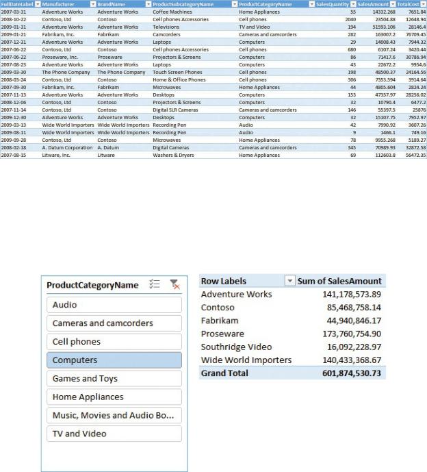
analyze your numbers. In Figure 1-1, you can see the first few rows of the table when imported into Excel.
FIGURE 1-1 Data from sales, when grouped, produces a small and easy-to- analyze table.
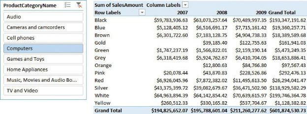
When the table is loaded in Excel, you finally feel at home, and you can easily create a PivotTable to perform an analysis on the data. For example, in Figure 1- 2, you can see the sales divided by manufacturer for a given category, using a standard PivotTable and a slicer.
FIGURE 1-2 You can easily create a PivotTable on top of an Excel table.
Believe it or not, at this point, you’ve already built a data model. Yes, it contains only a single table, but it is a data model. Thus, you can start exploring its analytical power and maybe find some way to improve it. This data model has a

strong limitation because it has fewer rows than the source table.
As a beginner, you might think that the limit of 1,000,000 rows in an Excel table affects only the number of rows that you can retrieve to perform the analysis. While this holds true, it is important to note that the limit on the size directly translates into a limit on the data model. Therefore, there is also a limit on the analytical capabilities of your reports. In fact, to reduce the number of rows, you had to perform a grouping of data at the source level, retrieving only the sales grouped by some columns. In this example, you had to group by category, subcategory, and some other columns.
Doing this, you implicitly limited yourself in your analytical power. For example, if you want to perform an analysis slicing by color, then the table is no longer a good source because you don’t have the product color among the columns. Adding one column to the query is not a big issue. The problem is that the more columns you add, the larger the table becomes—not only in width (the number of columns), but also in length (the number of rows). In fact, a single line holding the sales for a given category— Audio, for example—will become a set of multiple rows, all containing Audio for the category, but with different values for the different colors.
On the extreme side, if you do not want to decide in advance which columns you will use to slice the data, you will end up having to load the full 12,000,000 rows—meaning an Excel table is no longer an option. This is what we mean when we say that Excel’s modeling capabilities are limited. Not being able to load many rows implicitly translates into not being able to perform advanced analysis on large volumes of data.
This is where Power Pivot comes into play. Using Power Pivot, you no longer face the limitation of 1,000,000 rows. Indeed, there is virtually no limit on the number of rows you can load in a Power Pivot table. Thus, by using Power Pivot, you can load the whole sales table in the model and perform a deeper analysis of your data.
 Note
Note
Power Pivot has been available in Excel since Excel 2010 as an external add-in, and it has been included as part of the product since Excel 2013. Starting in Excel 2016, Microsoft began using a new name to describe a Power Pivot model: Excel Data Model. However, the term Power Pivot is still used, too.
Because you have all the sales information in a single table, you can perform a more detailed analysis of your data. For example, in Figure 1-3, you can see a PivotTable coming from the data model (that is, Power Pivot), with all the columns loaded. Now, you can slice by category, color, and year, because all this information is in the same place. Having more columns available in your table increases its analytical power.
FIGURE 1-3 If all the columns are available, you can build more interesting PivotTables on top of your data.
This simple example is already useful to learn the first lesson about data modeling: Size matters because it relates to granularity. But what is granularity? Granularity is one of the most important concepts you will learn in this book, so we are introducing the concept as early as we can. There will be time to go deeper in the rest of the book. For now, let us start with a simple description of granularity. In the first dataset, you grouped information at the category and subcategory levels, losing some detail in favor of a smaller size. A more technical way to express this is to say that you chose the granularity of the information at the category and subcategory level. You can think of granularity as the level of detail in your tables. The higher the granularity, the more detailed your information. Having more details means being able to perform more detailed (granular) analyses. In this last dataset, the one loaded in Power Pivot, the granularity is at the product level (actually, it is even finer than that—it is at the level of the individual sale of the product), whereas in the previous model, it was at the category and subcategory level. Your ability to slice and dice depends on the number of columns in the table—thus, on its granularity. You have already learned that increasing the number of columns increases the number of rows.
Choosing the correct granularity level is always challenging. If you have data at
the wrong granularity, formulas are nearly impossible to write. This is because either you have lost the information (as in the previous example, where you did not have the color information) or it is scattered around the table, where it is organized in the wrong way. In fact, it is not correct to say that a higher granularity is always a good option. You must have data at the right granularity, where right means the best level of granularity to meet your needs, whatever they are.
You have already seen an example of lost information. But what do we mean by scattered information? This is a little bit harder to see. Imagine, for example, that you want to compute the average yearly income of customers who buy a selection of your products. The information is there because, in the sales table, you have all the information about your customers readily available. This is shown in Figure 1- 4, which contains a selection of the columns of the table we are working on. (You must open the Power Pivot window to see the table content.)
FIGURE 1-4 The product and customer information is stored in the same table.
On every row of the Sales table, there is an additional column reporting the yearly income of the customer who bought that product. A simple trial to compute the average yearly income of customers would involve authoring a DAX measure like the following:
Click here to view code image
AverageYearlyIncome := AVERAGE (
Sales[YearlyIncome] )
The measure works just fine, and you can use it in a PivotTable like the one in Figure 1-5, which shows the average yearly income of the customers buying home appliances of different brands.
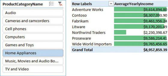
FIGURE 1-5 The figure shows an analysis of the average yearly income of customers buying home appliances.
The report looks fine, but, unfortunately, the computed number is incorrect: It is highly exaggerated. In fact, what you are computing is the average over the sales table, which has a granularity at the individual sale level. In other words, the sales table contains a row for each sale, which means there are potentially multiple rows for the same customer. So if a customer buys three products on three different dates, it will be counted three times in the average, producing an inaccurate result.
You might argue that, in this way, you are computing a weighted average, but this is not totally true. In fact, if you want to compute a weighted average, you must define the weight—and you would not choose the weight to be the number of buy events. You are more likely to use the number of products as the weight, or the total amount spent, or some other meaningful value. Moreover, in this example, we just wanted to compute a basic average, and the measure is not computing it accurately.
Even if it is a bit harder to notice, we are also facing a problem of an incorrect granularity. In this case, the information is available, but instead of being linked to an individual customer, it is scattered all around the sales table, making it hard to write the calculation. To obtain a correct average, you must fix the granularity at the customer level by either reloading the table or relying on a more complex DAX formula.
If you want to rely on DAX, you would use the following formulation for the average, but it is a little challenging to comprehend:
Click here to view code image
CorrectAverage := AVERAGEX (
SUMMARIZE ( Sales,
Sales[CustomerKey],
Sales[YearlyIncome]
),
Sales[YearlyIncome]
)
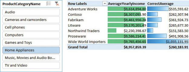
This formula is not easy to understand because you must first aggregate the sales at the customer level (of granularity) and then perform an AVERAGE operation on the resulting table where each customer appears only once. In the example, we are using SUMMARIZE to perform the pre-aggregation at the customer level in a temporary table, and then we average the YearlyIncome of that temporary table. As you can see in Figure 1-6, the correct number is very different from the incorrect number we previously calculated.
FIGURE 1-6 The correct average side-by-side data (including the incorrect average) show how far we were from the accurate insight.
It is worth spending some time to acquire a good understanding of this simple fact: The yearly income is a piece of information that has a meaning at the customer granularity. At the individual sale level, that number—although correct —is not in the right place. Or, stated differently, you cannot use a value that has a meaning at the customer level with the same meaning at the individual sale level. In fact, to gather the right result, we had to reduce the granularity, although in a temporary table.