

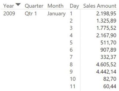
FIGURE 4-8 The matrix shows Year, Quarter, and Month columns, even though these columns are not part of the model.
Like Excel, Power BI Desktop automatically generates a calendar hierarchy. However, it uses a different technique. In fact, if you look at the Sales table, you will not find any new calculated columns. Instead, Power BI Desktop generates a hidden table for each column that contains a date in the model and builds the necessary relationship. When you slice by the date, it uses the hierarchy created in the hidden table. Thus, it is somewhat smarter than Excel. However, this approach has the following limitations:
 The automatically generated table is hidden and there is no way for you to modify its content. For example, there is no way to change the column names or the way data is sorted, or to handle fiscal calendars.
 Power BI Desktop generates one table per column. Thus, if you have multiple fact tables, they will be linked to different Date tables, and you cannot slice multiple tables using a single calendar.
Over time, we have gotten used to disabling automatic calendar generation in Power BI Desktop. (To do so, click the File tab, click Options and Settings to open the Options dialog box, choose the Data Load page, and deselect the Auto Date/Time check box.) And we are always prepared to configure a custom Calendar table over which we have full control that can filter all the fact tables we add to the model. We suggest you do the same.
Using multiple date dimensions
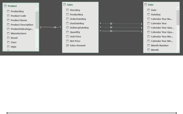
One fact table might contain multiple dates. This happens very frequently. In the Contoso database, for example, each order has three different dates: order date, due date, and delivery date. Moreover, different fact tables might contain dates.
Thus, the number of dates in a data model is frequently high. What is the right way to create a model when there are multiple dates? The answer is very simple: Apart from some very exceptional scenarios, there should be a single date dimension in the whole model. This section is dedicated to understanding the reason for using a single date dimension.
As mentioned, there are three dates in Sales that can be used to relate Sales with Date. You might try to create multiple relationships between the two tables that are based on the three pairs of columns. Unfortunately, the result is that the first relationship you create will be activated, whereas the next two will be created but kept inactive, as shown in Figure 4-9.
FIGURE 4-9 Of the three relationships between Sales and Date, only one is active (a solid line). The other relationships are inactive (dotted lines).
You can temporarily activate inactive relationships by using the USERELATIONSHIP function, but this is a technique we will use later for some formulas. When you project this data model in a PivotTable or a report, inactive relationships are not used by any of your formulas. A user has no way to instruct Excel, for example, to activate a specific relationship in a single PivotTable.
 Note
Note
Relationships cannot be made active because the engine cannot create data models that contain ambiguity. Ambiguity occurs whenever there are multiple ways to start from one table (Sales, in this example) and reach another table (Date, in this example). Imagine you want to create a calculated column in Sales that contains
RELATED ( Date[Calendar Year] ). In such a scenario, DAX would not know which of the three relationships to use. For this reason, only one can be active, and it determines the behavior of RELATED, RELATEDTABLE, and the automatic filter context propagation.
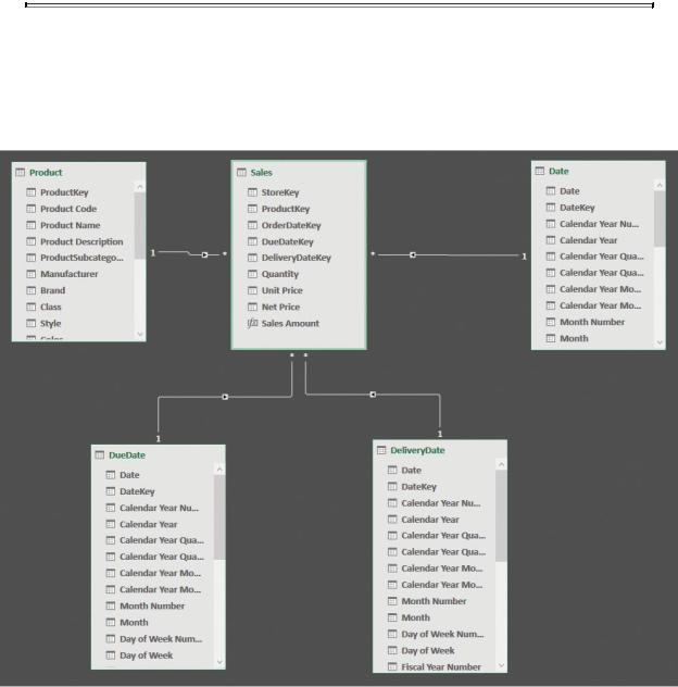
Because using inactive relationships does not seem to be the way to go, you should modify the data model by duplicating the dimension. In our example, you can load the Date table three times: once for the order date, once for the due date, and once for the delivery date. You should obtain a non-ambiguous model like the one shown in Figure 4-10.
FIGURE 4-10 Loading the Date table multiple times removes ambiguity from the model.
Using this model, it is now possible to create reports that show, for example,
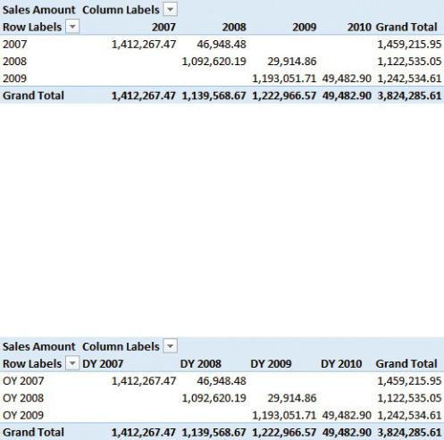
the amount sold in one year but delivered in a different one, as shown in Figure 4- 11.
FIGURE 4-11 The report shows the amount sold in one year and shipped in a different one.
At first glance, the PivotTable in Figure 4-11 is hard to read. It is very difficult to quickly grasp whether the delivery year is in rows or in columns. You can deduce that the delivery year is in columns by analyzing the numbers because delivery always happens after the placement of the order. Nevertheless, this is not evident as it should be in a good report.
It is enough to change the content of the year column using the prefix OY for the order year and DY for the delivery year. This modifies the query of the Calendar table and it makes the report much easier to understand, as shown in Figure 4-12.
FIGURE 4-12 Changing the prefix of the order and delivery years makes the report much easier to understand.
So far, it looks like you can easily handle multiple dates by duplicating the date dimension as many times as needed, taking care to rename columns and add prefixes to the column values to make the report easy to read. To some extent, this is correct. Nevertheless, it is important to learn what might happen as soon as you have multiple fact tables. If you add another fact table to the data model, like Purchases, the scenario becomes much more complex, as shown in Figure 4-13.
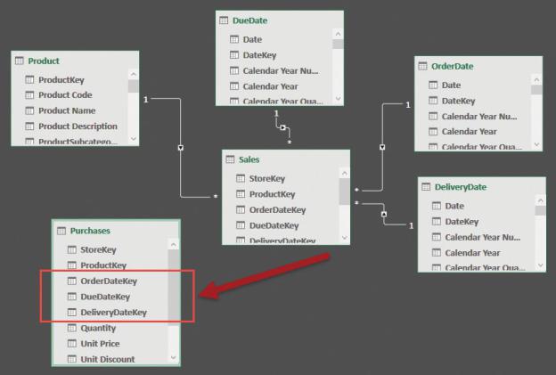
FIGURE 4-13 The Purchases table has three additional dates.
The simple addition of the Purchases table to the model generates three additional dates because purchases also have an order, delivery, and due date. The scenario now requires more skill to correctly design it. In fact, you can add three additional date dimensions to the model, reaching six dates in a single model. Users will be confused by the presence of all these dates. Therefore, although the model is very powerful, it is not easy to use, and it is very likely to lead to a poor user experience. Besides that, can you imagine what happens if, at some point, you need to add further fact tables? This explosion of date dimensions is not good at all.
Another option would be to use the three dimensions that are already present in the model to slice the purchases and sales. Thus, Order Date filters the order dates of both Sales and Purchases. The same thing happens for the other two dimensions, too. The data model becomes the one shown in Figure 4-14.
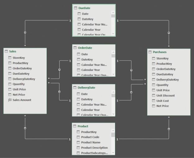
FIGURE 4-14 Using the same dimensions to filter two fact tables makes the model easier to use.
The model in Figure 4-14 is much easier to use, but it is still too complex. Moreover, it is worth noting that we were very lucky with the dimension we added. Purchases had the same three dates as Sales, which is not very common in the real world. It is much more likely that you will add fact tables with dates that have nothing to share with the previous facts. In such cases, you must decide whether to create additional date dimensions, making the model harder to browse, or to join the new fact table to one of the existing dates, which might create problems in terms of the user experience because the names are not likely to match perfectly.
The problem can be solved in a much easier way if you resist the urge to create multiple date dimensions in your model. In fact, if you stick with a single date dimension, the model will be much easier to browse and understand, as shown in
Figure 4-15.
FIGURE 4-15 In this simpler model, there is a single date dimension that is linked to OrderDate in both fact tables.
Using a single date dimension makes the model extremely easy to use. In fact, you intuitively know that Date will slice both Sales and Purchases using their main date column, which is the date of the order. At first sight, this model looks less powerful than the previous ones, and to some extent, this is true. Nevertheless, before concluding that this model is in fact less powerful, it is worth spending some time analyzing what the differences are in analytical power between a model with many dates and one with a single date.
Offering many Date tables to the user makes it possible to produce reports by using multiple dates at once. You saw in a previous example that this might be useful to compute the amount sold versus the amount shipped. Nevertheless, the real question is whether you need multiple dates to show this piece of information. The answer is no. You can easily address this issue by creating specific measures that compute the needed values without having to change the data model.
If, for example, you want to compare the amount sold versus the amount shipped, you can keep an inactive relationship between Sales and Date, based on the DeliveryDateKey, and then activate it for some very specific measure. In our case, you would add one inactive relationship between Sales and Date, obtaining the model shown in Figure 4-16.
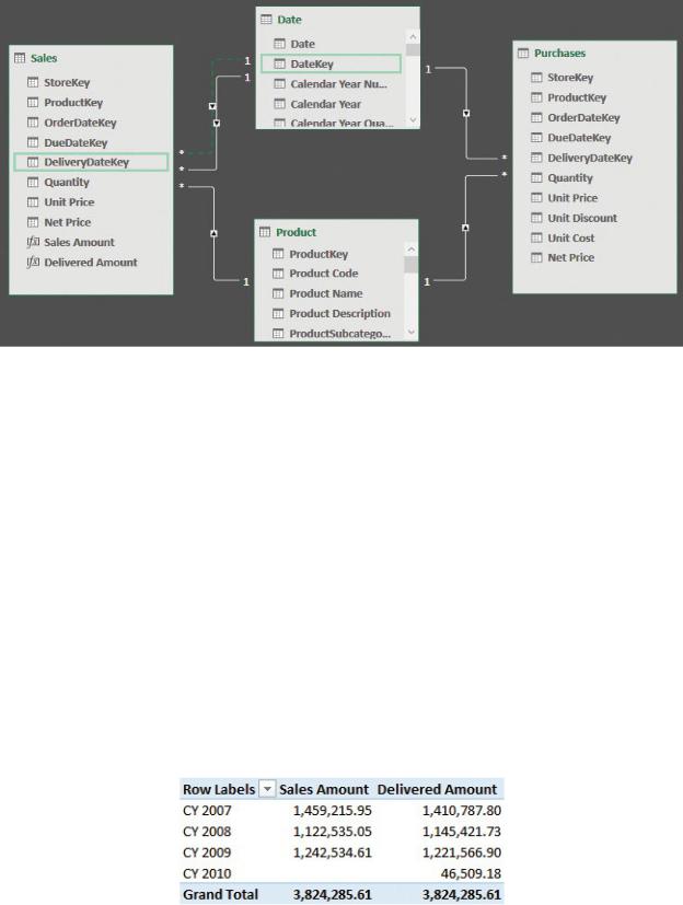
FIGURE 4-16 The relationship between DeliveryDateKey and DateKey is in the model, but it is disabled.
Once the relationship is in place, you can write the Delivered Amount measure in the following way:
Click here to view code image
Delivered Amount := CALCULATE (
[Sales Amount],
USERELATIONSHIP ( Sales[DeliveryDateKey], 'Date'
)
This measure enables the inactive relationship between Sales and Date for only the duration of the calculation. Thus, you can use the Date table to slice your data, and you still get information that is related to the delivery date, as shown in the report in Figure 4-17. By choosing an appropriate name for the measure, you will not incur any ambiguity when using it.