


Chapter 13 |
Graphical User Interface Components: Part 2 |
783 |
JButton buttons[ 0 ] (lines 53–54) has weightx and weighty values of 1. The fill variable is BOTH. Because buttons[ 0 ] is not one of the last two components on the row, it is given a gridwidth of 1 so it will occupy one column. The JButton is added to the content pane with a call to utility method addComponent.
JButton buttons[ 1 ] (lines 57–58) has weightx and weighty values of 1. The fill variable is BOTH. Line 57 specifies that the JButton is to be placed relative to the previous component. The Button is added to the JFrame with a call to addComponent.
JButton buttons[ 2 ] (lines 61–62) has weightx and weighty values of 1. The fill variable is BOTH. This JButton is the last component on the line, so REMAINDER is used. The JButton is added to the content pane with a call to utility method addComponent.
The JComboBox button (lines 65–67) has a weightx 1 and a weighty 0. The JComboBox will not grow in the vertical direction. The JComboBox is the only component on the line, so REMAINDER is used. The JComboBox is added to the content pane with a call to utility method addComponent.
JButton buttons[ 3 ] (lines 70–72) has weightx and weighty values of 1. The fill variable is BOTH. This JButton is the only component on the line, so REMAINDER is used. The JButton is added to the content pane with a call to utility method addComponent.
JButton buttons[ 4 ] (lines 75–76) has weightx and weighty values of 1. The fill variable is BOTH. This JButton is the next-to-last component on the line, so RELATIVE is used. The JButton is added to the content pane with a call to utility method addComponent.
The JList component (lines 79–80) has weightx and weighty values of 1. The fill variable is BOTH. The JList is added to the content pane with a call to utility method addComponent.
13.17 (Optional Case Study) Thinking About Objects: Model-
View-Controller
Design patterns describe proven strategies for building reliable object-oriented software systems. Our case study adheres to the Model-View-Controller (MVC) architecture, which uses several design patterns.1 MVC divides system responsibilities into three parts:
1.the model, which contains all program data and logic;
2.the view, which provides a visual presentation of the model and
3.the controller, which defines the system behavior by sending user input to the model.
Using the controller, the user changes the data in the model. The model then informs the view of the change in data. The view changes its visual presentation to reflect the changes in the model.
For example, in our simulation, the user adds a Person to the model by pressing either the First Floor or Second Floor JButton in the controller (see Fig. 2.22–
1.For those readers who seek further study in design patterns and MVC architecture, we encourage you to read our “Discovering Design Patterns” material in Sections 1.16, 9.24, 13.18, 15.13, 17.11 and 21.12

Chapter 13 |
Graphical User Interface Components: Part 2 |
785 |
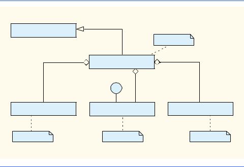
We showed in Fig. 9.38 that class ElevatorModel is an aggregation of several classes. To save space, we do not repeat this aggregation in Fig. 13.19. Class ElevatorView is also an aggregation of several classes—we expand the class diagram of ElevatorView in “Thinking About Objects” Section 22.9 to show these additional classes. Class ElevatorController, as described in Section 12.16, represents the simulation controller. Note that class ElevatorView implements interface ElevatorModelListener, which implements all interfaces used in our simulation, so the ElevatorView can receive all events from the model.
 Software Engineering Observation 13.7
 When appropriate, partition the system class diagram into several smaller class diagrams,
  so each diagram represents a unique subsystem.
Class ElevatorSimulation contains no attributes other than its references to an
ElevatorModel object, an ElevatorView object and an ElevatorController object. The only behavior for class ElevatorSimulation is to start the program— therefore, in Java, class ElevatorSimulation contains a static main method that calls the constructor, which instantiates the ElevatorModel, ElevatorView and
ElevatorController objects. We implement class ElevatorSimulation in Java later in this section.
Component Diagrams
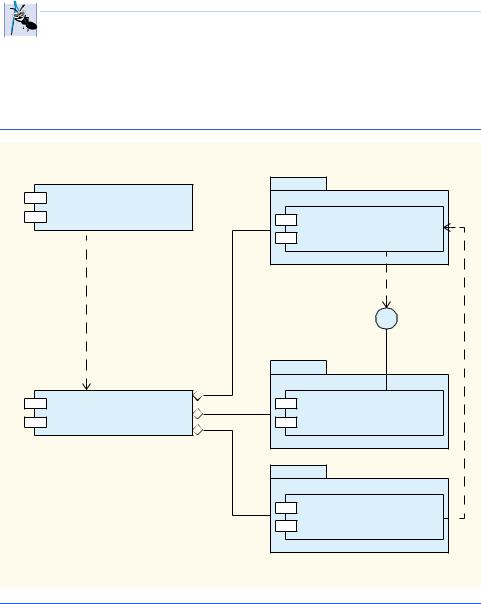
Figure 13.19 helps us construct another diagram of the UML that we use to design our sys- tem—the component diagram. The component diagram models the “pieces”—called com- ponents—that the system needs to perform its tasks. These pieces include binary executables, compiled .class files, .java files, images, packages, resources, etc. We present the component diagram for our simulation in Fig. 13.20.
In Fig. 13.20, each box that contains the two small white boxes overlapping its left side is a component. A component in the UML is drawn similar to a plug (the two overlapping boxes represent the plug’s prongs)—a component may be “plugged-in” to other systems without having to change the component. Our system contains five components: ElevatorSimulation.class, ElevatorSimulation.java, ElevatorModel.java, ElevatorView.java and ElevatorController.java.
In Fig. 13.20, the graphics that resemble folders (boxes with tabs in their upper-left corners) represent packages in the UML. We can group classes, objects, components, use cases, etc., in a package. In this diagram (and in the remainder of our case study), the UML packages refer to Java packages (introduced in Section 8.5). In our discussion, we use lower-case bold-face Courier type for package names. The packages in our system are model, view and controller. Component ElevatorSimulation.java contains one instance each of all components in these packages. Currently, each package contains only one component—a .java file. The model package contains
ElevatorModel.java, the view package contains ElevatorView.java and the controller package contains ElevatorController.java. We add components to each package in the appendices, when we implement each class from our class diagrams into a component (.java file).
The dotted arrows in Fig. 13.20 indicate a dependency between two components—the direction of the arrow indicates the “depends on” relationship. A dependency describes the
 Software Engineering Observation 13.8
 A component diagram’s dependencies help designers group components for reuse in future sys-
  tems. For example, in our simulation, designers can reuse

Chapter 13 |
Graphical User Interface Components: Part 2 |
789 |
should understand better how these components take advantage of design patterns and how developers integrate design patterns with Java GUI applications.
13.18.1 Creational Design Patterns
Now, we continue our treatment of creational design patterns, which provide ways to instantiate objects in a system.
Factory Method
Suppose we are designing a system that opens an image from a specified file. Several different image formats exist, such as GIF and JPEG. We can use method createImage of class java.awt.Component to create an Image object. For example, to create a JPEG and GIF image in an object of a Component subclass—such as a JPanel object, we pass the name of the image file to method createImage, which returns an Image object that stores the image data. We can create two Image objects, each which contains data for two images having entirely different structures. For example, a JPEG image can hold up to 16.7 million colors, whereas a GIF image can hold up to only 256. Also, a GIF image can contain transparent pixels that are not rendered on screen, whereas a JPEG image cannot contain transparent pixels.
Class Image is an abstract class that represents an image we can display on screen. Using the parameter passed by the programmer, method createImage determines the specific Image subclass from which to instantiate the Image object. We can design systems to allow the user to specify which image to create, and method createImage will determine the subclass from which to instantiate the Image. If the parameter passed to method createImage references a JPEG file, method createImage instantiates and returns an object of an Image subclass suitable for JPEG images. If the parameter references a GIF file, createImage instantiates and returns an object of an Image subclass suitable for GIF images.
Method createImage is an example of the Factory Method design pattern. The sole purpose of this factory method is to create objects by allowing the system to determine which class to instantiate at run time. We can design a system that allows a user to specify what type of image to create at run time. Class Component might not be able to determine which Image subclass to instantiate until the user specifies the image to load. For more information on method createImage, visit
www.java.sun.com/j2se/1.3/docs/api/java/awt/Component.html#createImage(java.awt.image.ImageProducer)
13.18.2 Structural Design Patterns
We now discuss three more structural design patterns. The Adapter design pattern helps objects with incompatible interfaces collaborate with one another. The Bridge design pattern helps designers enhance platform independence in their systems. The Composite design pattern provides a way for designers to organize and manipulate objects.
Adapter
The Adapter design pattern provides an object with a new interface that adapts to another object’s interface, allowing both objects to collaborate with one another. The adapter in this

 Portability Tip 13.2
 Designers often use the Bridge design pattern to enhance the platform independence of their
  systems. This design pattern enables designers to create new cross-platform components using a “bridge” to hide platform-specific details.
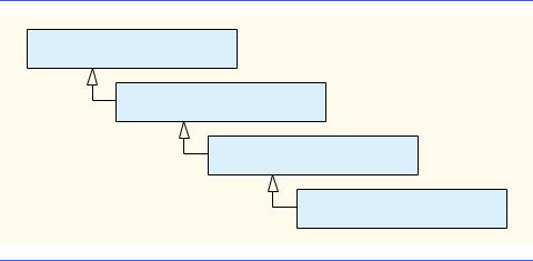
792 |
Graphical User Interface Components: Part 2 |
Chapter 13 |
13.18.3 Behavioral Design Patterns
In this section, we continue our discussion on behavioral design patterns. We discuss the Chain-of-Responsibility, Command, Observer, Strategy and Template Method design patterns.
Chain-of-Responsibility
In object-oriented systems, objects interact by sending messages to one another. Often, a system needs to determine at run time the object that will handle a particular message. For example, consider the design of a three-line office phone system. When a person calls the office, the first line handles the call—if the first line is busy, the second line handles the call, and if the second line is busy, the third line handles the call. If all lines in the system are busy, an automated speaker instructs that person to wait for the next available line— when a line becomes available, that line handles the call.
The Chain-of-Responsibility design pattern enables a system to determine at run time the object that will handle a message. This pattern allows an object to send a message to several objects in a chain of objects. Each object in the chain either may handle the message or pass the message to the next object in the chain. For instance, the first line in the phone system is the first object in the chain of responsibility, the second line is the second object, the third line is the third object, and the automated speaker is the fourth object. Note that this mechanism is not the final object in the chain—the next available line handles the message, and that line is the final object in the chain. The chain is created dynamically in response to the presence or absence of specific message handlers.
Several Java AWT GUI components use the Chain-of-Responsibility design pattern to handle certain events. For example, class java.awt.Button overrides method processEvent of class java.awt.Component to process AWTEvent objects. Method processEvent attempts to handle the AWTEvent upon receiving this event as an argument. If method processEvent determines that the AWTEvent is an ActionEvent (i.e., the Button has been pressed), the method handles the event by invoking method processActionEvent, which informs any ActionListener registered with the Button that the Button has been pressed. If method processEvent determines that the AWTEvent is not an ActionEvent, the method is unable to handle the event and passes the AWTEvent to method processEvent of superclass Component (the next object in the chain).
Command
Applications often provide users with several ways to perform a given task. For example, in a word processor there might be an Edit menu with menu items for cutting, copying and pasting text. There could also be a toolbar and/or a popup menu offering the same items. The functionality the application provides is the same in each case—the different interface components for invoking the functionality are provided for the user's convenience. However, the same GUI component instance (e.g., JButton) cannot be used for menus and toolbars and popup menus, so the developer must code the same functionality three times. If there were many such interface items, repeating this functionality would become tedious and error-prone.
The Command design pattern solves this problem by enabling developers to specify the desired functionality (e.g., copying text) once in a reusable object; that functionality can
Chapter 13 |
Graphical User Interface Components: Part 2 |
793 |
then be added to a menu, toolbar, popup menu or other mechanisms. This design pattern is called Command because it defines a user command, or instruction. This pattern allows a designer to encapsulate a command, so that the command may be used among several objects.
Observer
Suppose we want to design a program for viewing bank account information. This system includes class BankStatementData to store data pertaining to bank statements, and classes TextDisplay, BarGraphDisplay and PieChartDisplay to display the data.2 Figure 13.23 shows the design for our system. Class TextDisplay displays the data in text format, class BarGraphDisplay displays the data in bar-graph format and class PieChartDisplay displays the data as a pie chart. We want to design the system so that the BankStatementData object notifies the objects displaying the data of a change in the data. We also want to design the system to loosen coupling—the degree to which classes depend on each other in a system.
 Software Engineering Observation 13.9
 Loosely-coupled classes are easier to reuse and modify than are tightly-coupled classes,
  which depend heavily on each other. A modification in a class in a tightly-coupled system usually results in modifying other classes in that system. A modification to one of a group of loosely-coupled classes would require little or no modification to the other classes in the group.
The Observer design pattern is appropriate for systems like that of Fig. 13.23. This pattern promotes loose coupling between a subject object and observer objects—a subject notifies the observers when the subject changes state. When notified by the subject, the observers change in response to the change in the subject. In our example, the BankStatementData object is the subject, and the objects displaying the data are the observers. A subject can notify several observers; therefore, the subject contains a one-to- many relationship with the observers.
|
|
|
|
|
|
|
TextDisplay |
|
|
|
|
|
s |
|
|
|
|
|
|
|
|
|
|
|
|
|
|
e |
|
|
|
|
|
|
fi |
|
|
|
|
|
|
ti |
|
|
|
|
|
|
o |
|
|
|
|
|
|
|
n |
|
|
|
|
|
|
|
notifies |
|
|
||||
BankStatementData |
|
|
|||||
|
BarGraphDisplay |
||||||
no |
|
|
|
|
|||
|
|
|
|
|
|
||
|
|
|
|
|
|
||
|
|
ti |
|
|
|
|
|
|
|
|
fi |
|
|
|
|
|
|
|
|
es |
|
|
|
PieChartDisplay
Fig. 13.23 Basis for the Observer design pattern.
2. This approach is the basis for the Model-View-Controller architecture pattern, discussed in Sections 13.17 and 17.11.
794 |
Graphical User Interface Components: Part 2 |
Chapter 13 |
The Java API contains classes that use the Observer design pattern. Class java.util.Observable represents a subject. Class Observable provides method addObserver, which takes a java.util.Observer argument. Interface Observer allows the Observable object to notify the Observer when the Observable objects changes state. The Observer can be an instance of any class that implements interface Observer; because the Observable object invokes methods defined in interface Observer, the objects remain loosely coupled. If a developer changes the way in which a particular Observer responds to changes in the Observable object, the developer does not need to change the Observable object. The Observable object interacts with its Observers only through interface Observer, which enables the loose coupling.
The optional elevator simulation case study in the “Thinking About Objects” sections uses the Observer design pattern to allow the ElevatorModel object (the subject) to notify the ElevatorView object (the observer) of changes in the ElevatorModel. The simulation does not use class Observable and interface Observer from the Java library—rather, it uses a custom interface ElevatorModelListener that provides functionality similar to that of interface Observable.
The Swing GUI components use the Observer design pattern. GUI components collaborate with their listeners to respond to user interactions. For example, an ActionListener observes state changes in a JButton (the subject) by registering to handle that JButton’s events. When pressed by the user, the JButton notifies its ActionListener objects (the observers) that the JButton’s state has changed (i.e., the JButton has been pressed).
Strategy
The Strategy design pattern is similar to the State design pattern (discussed in Section 9.24.3). We mentioned that the State design pattern contains a state object, which encapsulates the state of a context object. The Strategy design pattern contains a strategy object, which is analogous to the State design pattern’s state object. The key difference between a state object and a strategy object is that the strategy object encapsulates an algorithm rather than state information.
For example, java.awt.Container components implement the Strategy design pattern using LayoutManagers (discussed in Section 12.14) as strategy objects. In package java.awt, classes FlowLayout, BorderLayout and GridLayout implement interface LayoutManager. Each class uses method addLayoutComponent to add GUI components to a Container object—however, each method uses a different algorithm to display these GUI components: a FlowLayout displays components in a left-to-right sequence; a BorderLayout displays components in five regions; and a GridLayout displays components in row-column format.
Class Container contains a reference to a LayoutManager object (the strategy object). Because an interface reference (i.e., the reference to the LayoutManager object) can hold references to objects of classes that implement that interface (i.e., the FlowLayout, BorderLayout or GridLayout objects), the LayoutManager object can reference a FlowLayout, BorderLayout or GridLayout at any one time. Class
Container can change this reference through method setLayout to select different layouts at run time.
Class FlowLayoutDemo (Fig. 12.24) demonstrates the application of the Strategy pattern—line 16 declares a new FlowLayout object and line 19 invokes the Con-
Chapter 13 |
Graphical User Interface Components: Part 2 |
795 |
tainer object’s method setLayout to assign the FlowLayout object to the Container object. In this example, the FlowLayout provides the strategy for laying out the components.
Template Method
The Template Method design pattern also deals with algorithms. The Strategy design pattern allows several objects to contain distinct algorithms. However, the Template Method design pattern requires all objects to share a single algorithm defined by a superclass.
For example, consider the design of Fig. 13.23, which we mentioned in the Observer design pattern discussion. Objects of classes TextDisplay, BarGraphDisplay and PieChartDisplay use the same basic algorithm for acquiring and displaying the data—get all statements from the BankStatementData object, parse the statements then display the statements. The Template Method design pattern allows us to create an abstract superclass called BankStatementDisplay that provides the central algorithm for displaying the data. In this example, the algorithm comprises abstract methods getData, parseData and displayData comprise the algorithm. Classes TextDisplay, BarGraphDisplay and PieChartDisplay extend class
BankStatementDisplay to inherit the algorithm, so each object can use the same algorithm. Each BankStatementDisplay subclass then overrides each method in a way specific to that subclass, because each class implements the algorithm differently from one another. For example, classes TextDisplay, BarGraphDisplay and PieChartDisplay might get and parse the data identically, but each class displays that data differently.
The Template Method design pattern allows us to extend the algorithm to other BankStatementDisplay subclasses—e.g., we could create classes, such as LineGraphDisplay or class 3DimensionalDisplay, that use the same algorithm inherited from class BankStatementDisplay.
13.18.4 Conclusion
In this “Discovering Design Patterns” section, we discussed how Swing components take advantage of design patterns and how developers can integrate design patterns with GUI applications in Java. In “Discovering Design Patterns” Section 15.13, we discuss concurrency design patterns, which are particularly useful for developing multithreaded systems.
SUMMARY
•JTextAreas provide an area for manipulating multiple lines of text. Like class JTextField, class JTextArea inherits from JTextComponent.
•An external event (i.e., an event generated by a different GUI component) normally indicates when the text in a JTextArea should be processed.
•Scrollbars are provided for a JTextArea by attaching it to a JScrollPane object.
•Method getSelectedText returns the selected text from a JTextArea. Text is selected by dragging the mouse over the desired text to highlight it.
•Method setText sets the text in a JTextArea.
•To provide automatic word wrap in a JTextArea, attach it to a JScrollPane with horizontal scrollbar policy JScrollPane.HORIZONTAL_SCROLLBAR_NEVER.
796 |
Graphical User Interface Components: Part 2 |
Chapter 13 |
•The horizontal and vertical scrollbar policies for a JScrollPane are set when a JScrollPane is constructed or with methods setHorizontalScrollBarPolicy and setVerticalScrollBarPolicy of class JScrollPane.
•A JPanel can be used as a dedicated drawing area that can receive mouse events and is often extended to create new GUI components.
•Swing components that inherit from class JComponent contain method paintComponent, which helps them draw properly in the context of a Swing GUI. JComponent method paintComponent should be overridden to call to the superclass version of paintComponent as the first statement in its body.
•Classes JFrame and JApplet are not subclasses of JComponent; therefore, they do not contain method paintComponent (they have method paint).
•Calling repaint for a Swing GUI component indicates that the component should be painted as soon as possible. The background of the GUI component is cleared only if the component is opaque. Most Swing components are transparent by default. JComponent method setOpaque can be passed a boolean argument indicating whether the component is opaque (true) or transparent (false). The GUI components of package java.awt are different from Swing components in that repaint results in a call to Component method update (which clears the component’s background) and update calls method paint (rather than paintComponent).
•Method setTitle displays a String in a window’s title bar.
•Drawing on any GUI component is performed with coordinates that are measured from the upperleft corner (0, 0) of that GUI component.
•Layout managers often use a GUI component’s getPreferredSize method to determine the preferred width and height of a component when laying out that component as part of a GUI. If a new component has a preferred width and height, it should override method getPreferredSize to return that width and height as an object of class Dimension (package java.awt).
•The default size of a JPanel object is 0 pixels wide and 0 pixels tall.
•A mouse drag operation begins with a mouse-pressed event. All subsequent mouse drag events (for which mouseDragged will be called) are sent to the GUI component that received the original mouse-pressed event.
•JSliders enable the user to select from a range of integer values. JSliders can display major tick marks, minor tick marks and labels for the tick marks. They also support snap-to ticks, where positioning the thumb between two tick marks causes the thumb to snap to the closest tick mark.
•Most Swing GUI components support user interactions through both the mouse and the keyboard.
•If a JSlider has the focus, the left arrow key and right arrow key cause the thumb of the JSlider to decrease or increase by 1. The down arrow key and up arrow key also cause the thumb of the JSlider to decrease or increase by 1, respectively. The PgDn key (page down) and PgUp key (page up) cause the thumb of the JSlider to decrease or increase by block increments of one-tenth of the range of values, respectively. The Home key moves the thumb to the minimum value of the JSlider and the End key moves the thumb to the maximum value of the JSlider.
•JSliders have either a horizontal orientation or a vertical orientation. For a horizontal JSlider, the minimum value is at the extreme left and the maximum value is at the extreme right of the JSlider. For a vertical JSlider, the minimum value is at the extreme bottom and the maximum value is at the extreme top of the JSlider. The relative position of the thumb indicates the current value of the JSlider.
•Method setMajorTickSpacing of class JSlider sets the spacing for tick marks on a JSlider. Method setPaintTicks with a true argument indicates that the tick marks should be displayed.
Chapter 13 |
Graphical User Interface Components: Part 2 |
797 |
•JSliders generate ChangeEvents (package javax.swing.event) when the user interacts with a JSlider. A ChangeListener (package javax.swing.event) defines method stateChanged that can respond to ChangeEvents.
•Method getValue of class JSlider returns the current thumb position.
•A JFrame is a window with a title bar and a border. Class JFrame is a subclass of java.awt.Frame (which is a subclass of java.awt.Window).
•Class JFrame supports three operations when the user closes the window. By default, a JFrame is hidden when the user closes a window. This can be controlled with JFrame method setDefaultCloseOperation. Interface WindowConstants (package javax.swing) defines three constants for use with this method—DISPOSE_ON_CLOSE, DO_NOTHING_ON_CLOSE and HIDE_ON_CLOSE (the default).
•By default, a window is not displayed on the screen until its setVisible method is called with true as an argument. A window can also be displayed by calling its show method.
•A window’s size should be set with a call to method setSize. The position of a window when it appears on the screen is specified with method setLocation.
•All windows generate window events when the user manipulates the window. Event listeners are registered for window events with method addWindowListener of class Window. The WindowListener interface provides seven methods for handling window events—windowActi- vated (called when the window is made active by clicking the window), windowClosed (called after the window is closed), windowClosing (called when the user initiates closing of the window), windowDeactivated (called when another window is made active), windowIconified (called when the user minimizes a window), windowDeiconified (called when a window is restored from being minimized) and windowOpened (called when a window is first displayed on the screen).
•The command-line arguments are automatically passed to main as the array of Strings called args. The first argument after the application class name is the first String in the array args, and the length of the array is the total number of command-line arguments.
•Menus are an integral part of GUIs. Menus allow the user to perform actions without unnecessarily “cluttering” a graphical user interface with extra GUI components.
•In Swing GUIs, menus can be attached only to objects of the classes that provide method setJMenuBar. Two such classes are JFrame and JApplet.
•The classes used to define menus are JMenuBar, JMenuItem, JMenu, JCheckBoxMenuItem and class JRadioButtonMenuItem.
•A JMenuBar is a container for menus.
•A JMenuItem is a GUI component inside a menu that, when selected, causes an action to be performed. A JMenuItem can be used to initiate an action or it can be a submenu that provides more menu items from which the user can select.
•A JMenu contains menu items and can be added to a JMenuBar or to other JMenus as submenus. When a menu is clicked, the menu expands to show its list of menu items.
•When a JCheckBoxMenuItem is selected, a check appears to the left of the menu item. When the JCheckBoxMenuItem is selected again, the check to the left of the menu item is removed.
•When multiple JRadioButtonMenuItems are maintained as part of a ButtonGroup, only one item in the group can be selected at a given time. When a JRadioButtonMenuItem is selected, a filled circle appears to the left of the menu item. When another JRadioButtonMenuItem is selected, the filled circle to the left of the previously selected menu item is removed.
•JFrame method setJMenuBar attaches a menu bar to a JFrame.
798 |
Graphical User Interface Components: Part 2 |
Chapter 13 |
•AbstractButton method setMnemonic (inherited into class JMenu) specifies the mnemonic for an AbstractButton object. Pressing the Alt key and the mnemonic performs the AbstractButton’s action (in the case of a menu, it opens the menu).
•Mnemonic characters are normally displayed with an underline.
•Dialog boxes can be either modal or modeless. A modal dialog box does not allow any other window in the application to be accessed until the dialog box is dismissed. A modeless dialog box allows other windows to be accessed while the dialog is displayed. By default, the dialogs displayed with class JOptionPane are modal dialogs. Class JDialog can be used to create your own modeless or modal dialogs.
•JMenu method addSeparator adds a separator line to a menu.
•Context-sensitive popup menus are created with class JPopupMenu. These menus provide options that are specific to the component for which the popup-trigger event was generated. On most systems, the popup-trigger event occurs when the user presses and releases the right mouse button.
•MouseEvent method isPopupTrigger returns true if the popup-trigger event occurred.
•Method show of class JPopupMenu displays a JPopupMenu. The first argument to method show specifies the origin component, whose position helps determine where the JPopupMenu will appear on the screen. The last two arguments are the x and y coordinates from the origin component’s upper-left corner at which the JPopupMenu should appear.
•Class UIManager contains a public static inner class called LookAndFeelInfo that is used to maintain information about a look-and-feel.
•UIManager static method getInstalledLookAndFeels gets an array of UIManager.LookAndFeelInfo objects that describe the installed look-and-feels.
•UIManager static method setLookAndFeel changes the look-and-feel.
•SwingUtilities static method updateComponentTreeUI changes the look-and-feel of every component attached to its Component argument to the new look-and-feel.
•Many of today’s applications use a multiple document interface (MDI) [i.e., a main window (often called the parent window) containing other windows (often called child windows)] to manage several open documents that are being processed in parallel.
•Swing’s JDesktopPane and JInternalFrame classes provide support for creating multiple document interfaces.
•BoxLayout is a layout manager that allows GUI components to be arranged left-to-right or top- to-bottom in a container. Class Box defines a container with BoxLayout as its default layout manager and provides static methods to create a Box with a horizontal or vertical BoxLayout.
•CardLayout is a layout manager that stacks components like a deck of cards. Each container in the stack can use any layout manager. Only the container at the “top” of the deck is visible.
•GridBagLayout is a layout manager similar to GridLayout. Unlike with GridLayout, each component size can vary, and components can be added in any order.
•Box static method createHorizontalBox returns a Box container with a horizontal
BoxLayout. Box static method createVerticalBox of class Box returns a Box container with a vertical BoxLayout.
•Box static method createVerticalStrut adds a vertical strut to a container. A vertical strut is an invisible GUI component that has a fixed pixel height and is used to guarantee a fixed amount of space between GUI components. Class Box also defines method createHorizontalStrut for horizontal BoxLayouts.
•Box static method createHorizontalGlue adds horizontal glue to a container. Horizontal glue is an invisible GUI component that can be used between fixed-size GUI components to
Chapter 13 |
Graphical User Interface Components: Part 2 |
799 |
occupy additional space. Class Box also defines method createVerticalGlue for vertical
BoxLayouts.
•Box static method createRigidArea adds a rigid area to a container. A rigid area is an invisible GUI component that always has a fixed pixel width and height.
•The BoxLayout constructor receives a reference to the container for which it controls the layout and a constant indicating whether the layout is horizontal (BoxLayout.X_AXIS) or vertical (BoxLayout.Y_AXIS).
•CardLayout methods first, previous, next and last are used to display a particular card. Method first displays the first card. Method previous displays the previous card. Method next displays the next card. Method last displays the last card.
•To use GridBagLayout, a GridBagConstraints object must be used to specify how a component is placed in a GridBagLayout.
•Method setConstraints of class GridBagLayout takes a Component argument and a
GridBagConstraints argument and sets the constraints of the Component.
TERMINOLOGY
addSeparator method of class JMenu |
GridBagConstraints class |
addWindowListener method of Window |
GridBagConstraints.BOTH |
anchor variable of GridBagConstraints |
GridBagConstraints.CENTER |
automatic word wrap |
GridBagConstraints.EAST |
Box class |
GridBagConstraints.HORIZONTAL |
BoxLayout layout manager |
GridBagConstraints.NONE |
BoxLayout.X_AXIS |
GridBagConstraints.NORTH |
BoxLayout.Y_AXIS |
GridBagConstraints.NORTHEAST |
CardLayout layout manager |
GridBagConstraints.NORTHWEST |
ChangeEvent class |
GridBagConstraints.RELATIVE |
ChangeListener interface |
GridBagConstraints.REMAINDER |
child window |
GridBagConstraints.SOUTH |
command-line arguments |
GridBagConstraints.SOUTHEAST |
context-sensitive popup menu |
GridBagConstraints.SOUTHWEST |
createHorizontalBox method of Box |
GridBagConstraints.VERTICAL |
createHorizontalGlue method of Box |
GridBagConstraints.WEST |
createHorizontalStrut method of Box |
GridBagLayout layout manager |
createRigidArea method of Box |
gridheight variable |
createVerticalBox method of Box |
gridwidth variable |
createVerticalGlue method of Box |
gridx variable of GridBagConstraints |
createVerticalStrut method of Box |
gridy variable of GridBagConstraints |
dedicated drawing area |
isPopupTrigger method of MouseEvent |
Dimension class |
JCheckBoxMenuItem class |
dispose method of class Window |
JDesktopPane class |
external event |
JInternalFrame class |
fill variable of GridBagConstraints |
JMenu class |
first method of CardLayout |
JMenuBar class |
getClassName method |
JMenuItem class |
getInstalledLookAndFeels method |
JPopupMenu class |
getMinimumSize method of Component |
JRadioButtonMenuItem class |
getPreferredSize method of Component |
JSlider class |
getSelectedText method |
JTextArea class |
getValue method of class JSlider |
JTextComponent class |
800 |
Graphical User Interface Components: Part 2 |
Chapter 13 |
|
labels for tick marks |
setSelected method of AbstractButton |
||
last method of class CardLayout |
setTitle method of class Frame |
|
|
major tick mark |
setVerticalScrollBarPolicy method |
||
menu |
|
show method of class JPopupMenu |
|
menu bar |
snap-to ticks |
|
|
menu item |
submenu |
|
|
metal look-and-feel |
super.paintComponent( g ); |
||
method setMnemonic of AbstractButton SwingConstants.HORIZONTAL |
|||
minor tick mark |
SwingConstants.VERTICAL |
|
|
mnemonic |
thumb of a JSlider |
|
|
modal dialog |
tick mark |
|
|
modeless dialog |
UIManager class |
|
|
Motif look-and-feel |
UIManager.LookAndFeelInfo class |
||
multiple document interface (MDI) |
updateComponentTreeUI method |
||
next method of class CardLayout |
vertical strut |
|
|
paintComponent method of JComponent |
weightx variable of GridBagConstraints |
||
parent window |
weighty variable of GridBagConstraints |
||
pluggable look-and-feel (PLAF) |
windowActivated method |
|
|
previous method of class CardLayout |
windowClosed method |
|
|
scrollbar policies for a JScrollPane |
windowClosing method |
|
|
setConstraints method |
WindowConstants.DISPOSE_ON_CLOSE |
||
setDefaultCloseOperation method |
windowDeactivated method |
|
|
setHorizontalScrollBarPolicy methodwindowDeiconified method |
|
||
setJMenuBar method |
windowIconified method |
|
|
setLookAndFeel method |
WindowListener interface |
|
|
setMajorTickSpacing method |
windowOpened method |
|
|
setOpaque method of class JComponent |
Windows look-and-feel |
|
|
setPaintTicks method of class JSlider |
|
|
|
SELF-REVIEW EXERCISES
13.1Fill in the blanks in each of the following statements:
a) |
The |
|
|
class is used to create a menu object. |
|
|
|
|||||
b) |
The |
|
|
method places a separator bar in a menu. |
|
|
|
|||||
c) |
Passing false to a TextArea’s |
method prevents its text from being mod- |
||||||||||
|
ified by the user. |
|
|
|
|
|
|
|
|
|
||
d) |
JSlider events are handled by the |
|
|
|
method of interface |
|
. |
|||||
e) |
The GridBagConstraints instance variable |
|
is set to CENTER by default. |
|||||||||
13.2State whether each of the following is true or false. If false, explain why.
a)When the programmer creates a JFrame, a minimum of one menu must be created and added to the JFrame.
b)The variable fill belongs to the GridBagLayout class.
c)JFrames and applets cannot be used together in the same program.
d)The top-left corner of a JFrame or applet has a coordinate of (0, 0).
e)A JTextArea’s text is always read-only.
f)Class JTextArea is a direct subclass of class Component.
g)The default layout for a Box is BoxLayout.
13.3Find the error(s) in each of the following and explain how to correct the error(s).
a)JMenubar b;
b)mySlider = JSlider( 1000, 222, 100, 450 );
Chapter 13 |
Graphical User Interface Components: Part 2 |
801 |
c)gbc.fill = GridBagConstraints.NORTHWEST; // set fill
d)// override to paint on a customized Swing component public void paintcomponent( Graphics g )
{
g.drawString( "HELLO", 50, 50 );
}
e)// create a JFrame and display it JFrame f = new JFrame( "A Window" ); f.setVisible( true );
ANSWERS TO SELF-REVIEW EXERCISES
13.1a) JMenu. b) addSeparator. c) setEditable. d) stateChanged, ChangeListener. e) anchor.
13.2a) False. A JFrame does not require any menus.
b)False. The variable fill belongs to the GridBagConstraints class.
c)False. They can be used together.
d)True.
e)False. JTextAreas are editable by default.
f)False. JTextArea derives from class JTextComponent.
g)True.
13.3a) JMenubar should be JMenuBar.
b)The first argument to the constructor should be either SwingConstants.HORIZONTAL or SwingConstants.VERTICAL, and the new operator must be used after the = operator.
c)The constant should be either BOTH, HORIZONTAL, VERTICAL or NONE.
d)paintcomponent should be paintComponent and the method should call super.paintComponent( g ) as its first statement.
e)The JFrame’s setSize method must also be called to determine the size of the window.
EXERCISES
13.4Fill in the blanks in each of the following statements:
a) |
A dedicated drawing area can be defined as a subclass of |
|
. |
|
|||||||||
b) |
A JMenuItem that is a JMenu is called a |
|
|
|
|
||||||||
c) |
Both JTextFields and JTextAreas inherit directly from class |
|
. |
||||||||||
d) |
The |
|
|
|
method attaches a JMenuBar to a JFrame. |
|
|
|
|||||
e) |
Container class |
|
|
has a default BoxLayout. |
|
|
|||||||
f) |
A |
|
|
manages a set of child windows defined with class JInternalFrame. |
|||||||||
13.5State whether each of the following is true or false. If false, explain why.
a)Menus require a JMenuBar object so they can be attached to a JFrame.
b)A JPanel object is capable of receiving mouse events.
c)CardLayout is the default layout manager for a JFrame.
d)Method setEditable is a JTextComponent method.
e)The GridBagLayout layout manager implements LayoutManager.
f)JPanel objects are containers to which other GUI components can be attached.
g)Class JFrame inherits directly from class Container.
h)JApplets can contain menus.
13.6Find the error(s) in each of the following. Explain how to correct the error(s).
a)x.add( new JMenuItem( "Submenu Color" ) ); // create submenu
802 |
Graphical User Interface Components: Part 2 |
Chapter 13 |
b)container.setLayout( m = new GridbagLayout() );
c)String s = JTextArea.getText();
13.7Write a program that displays a circle of random size and calculates and displays the area, radius, diameter and circumference. Use the following equations: diameter = 2 × radius, area = π ×
radius2, circumference = 2 × π × radius. Use the constant Math.PI for pi (π). All drawing should be done on a subclass of JPanel, and the results of the calculations should be displayed in a readonly JTextArea.
13.8Enhance the program of Exercise 13.7 by allowing the user to alter the radius with a JSlider. The program should work for all radii in the range from 100 to 200. As the radius changes, the diameter, area and circumference should be updated and displayed. The initial radius should be 150. Use the equations of Exercise 13.7. All drawing should be done on a subclass of JPanel, and the results of the calculations should be displayed in a read-only JTextArea.
13.9Explore the effects of varying the weightx and weighty values of the program of Fig. 13.20. What happens when a component has a nonzero weight, but is not allowed to fill the whole area (i.e., the fill value is not BOTH)?
13.10Write a program that uses the paintComponent method to draw the current value of a JSlider on a subclass of JPanel. In addition, provide a JTextField where a specific value can be entered. The JTextField should display the current value of the JSlider at all times. A JLabel should be used to identify the JTextField. The JSlider methods setValue and getValue should be used. [Note: The setValue method is a public method that does not return a value and takes one integer argument—the JSlider value, which determines the position of the thumb.]
13.11Modify the program of Fig. 13.16 to use a single JComboBox instead of the four separate JButtons. Each “card” should not be modified.
13.12Modify the program of Fig. 13.16 by adding a minimum of two new “cards” to the deck.
13.13Define a subclass of JPanel called MyColorChooser that provides three JSlider objects and three JTextField objects. Each JSlider represents the values from 0 to 255 for the red, green and blue parts of a color. Use the red, green and blue values as the arguments to the Color constructor to create a new Color object. Display the current value of each JSlider in the corresponding JTextField. When the user changes the value of the JSlider, the JTextField should be changed accordingly. Define class MyColorChooser so it can be reused in other applications or applets. Use your new GUI component as part of an applet that displays the current Color value by drawing a filled rectangle.
13.14Modify the MyColorChooser class of Exercise 13.13 to allow the user to type an integer value into a JTextField to set the red, green or blue value. When the user presses Enter in the JTextField, the corresponding JSlider should be set to the appropriate value.
13.15Modify the applet of Exercise 13.14 to draw the current color as a rectangle on an instance of a subclass of JPanel called DrawPanel. Class DrawPanel should provide its own paintComponent method to draw the rectangle and should provide set methods to set the red, green and blue values for the current color. When any set method is invoked for the class DrawPanel, the object should automatically repaint itself.
13.16Modify the applet of Exercise 13.15 to allow the user to drag the mouse across the DrawPanel to draw a shape in the current color. Enable the user to choose what shape to draw.
13.17Modify the program of Exercise 13.16 to enable the program to run as an application. The existing applet’s code should be modified only by adding a main method to launch the application in its own JFrame. Provide the user with the ability to terminate the application by clicking the close
Chapter 13 |
Graphical User Interface Components: Part 2 |
803 |
box on the window that is displayed and by selecting Exit from a File menu. Use the techniques shown in Fig. 13.9.
13.18(Complete Drawing Application) Using the techniques developed in Exercise 12.27– Exercise 12.33 and Exercise 13.13–Exercise 13.17, create a complete drawing program that can execute as both an applet and an application. The program should use the GUI components of Chapter 12 and Chapter 13 to enable the user to select the shape, color and fill characteristics. Each shape should be stored in an array of MyShape objects, where MyShape is the superclass in your hierarchy of shape classes (see Exercise 9.28 and Exercise 9.29). Use a JDesktopPane and JInternalFrames to allow the user to create multiple separate drawings in separate child windows. Create the user interface as a separate child window containing all the GUI components that allow the user to determine the characteristics of the shape to be drawn. The user can then click in any JInternalFrame to draw the shape.
13.19A company pays its employees as managers (who receive a fixed weekly salary), hourly workers (who receive a fixed hourly wage for up to the first 40 hours they work and “time-and-a- half,” i.e., 1.5 times their hourly wage, for overtime hours worked), commission workers (who receive $250 plus 5.7% of their gross weekly sales) or pieceworkers (who receive a fixed amount of money per item for each of the items they produce—each pieceworker in this company works on only one type of item). Write an application to compute the weekly pay for each employee. Each type of employee has its own pay code: Managers have paycode 1, hourly workers have code 2, commission workers have code 3 and pieceworkers have code 4. Use a switch to compute each employee’s pay based on that employee’s paycode. Use a CardLayout to display the appropriate GUI components that allow the user to enter the facts your program needs to calculate each employee’s pay based on that employee’s paycode.