

Chapter 13 |
Graphical User Interface Components: Part 2 |
741 |
Window. Interface WindowListener (implemented by window event listeners) provides seven methods for handling window events—windowActivated (called when the user makes a window the active window), windowClosed (called after the window is closed), windowClosing (called when the user initiates closing of the window), windowDeactivated (called when the user makes another window the active window), windowIconified (called when the user minimizes a window), windowDeiconified (called when the user restores a window from being minimized) and windowOpened (called when a program first displays a window on the screen).
Most windows have an icon at the top-left or top-right corner that enables a user to close the window and terminate a program. Most windows also have an icon in the upperleft corner of the window that displays a menu when the user clicks the icon. This menu normally contains a Close option to close the window and several other options for manipulating the window.
13.7 Designing Programs that Execute as Applets or Applications
It is sometimes desirable to design a Java program that can execute both as a stand-alone application and as an applet in a Web browser. Such a program can be used to provide the same functionality to users worldwide by making the applet available for download via Web and can be installed on a computer as a stand-alone application. The next example discusses how to create a small program that can execute both as an applet and as an application. [Note: In Chapter 16 and Chapter 17, we discuss several issues that make applets different from applications and security restrictions placed on applets that prevent certain application features from working in an applet.]
Frequently, programs use JFrames to create GUI-based applications. The JFrame provides the space in which the application GUI appears. When the user closes the JFrame, the application terminates. In this section, we demonstrate how to convert an applet into a GUI-based application. The program of Fig. 13.9 presents an applet that also can be executed as an application.
 Software Engineering Observation 13.2
 When designing a program to execute as both an applet and an application, begin by defining
  it as an applet, because applets have limitations due to security restrictions imposed on them by Web browsers. If the program executes properly as an applet, it can be made to work properly as an application. However, the reverse is not always true.
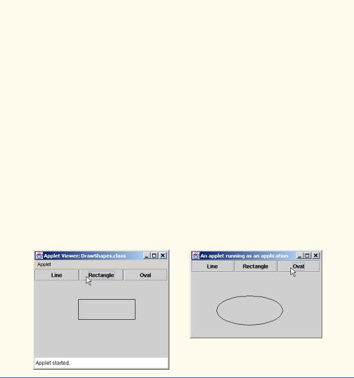
Our applet class DrawShapes presents the user with three buttons which, when pressed, cause an instance of class DrawPanel (lines 121–126) to draw a random line, rectangle or oval (depending on which button is pressed). The applet does not contain any new features as far as GUI components, layouts or drawing are concerned. The only new feature is that the DrawShapes class now also contains a main method (lines 60–99) that can be used to execute the program as an application. We discuss this method in detail below.
The HTML document that loads the applet into the appletviewer or a Web browser specifies the applet’s width and height as 300 and 200, respectively. When the program executes as an application with the java interpreter, you can supply arguments to the program (called command-line arguments) that specify the width and height of the application window. For example, the command


Chapter 13 |
Graphical User Interface Components: Part 2 |
745 |
|
|
|
144 |
case 1: |
|
145 |
g.drawRect( randomX(), randomY(), |
|
146 |
randomX(), randomY() ); |
|
147 |
break; |
|
148 |
|
|
149 |
case 2: |
|
150 |
g.drawOval( randomX(), randomY(), |
|
151 |
randomX(), randomY() ); |
|
152break;
153}
154
155 } // end method paintComponent
156
157// specify current shape choice and repaint
158public void setCurrentChoice( int choice )
159{
160currentChoice = choice;
161repaint();
162}
163
164// pick random x coordinate
165private int randomX()
166{
167return ( int ) ( Math.random() * width );
168}
169
170// pick random y coordinate
171private int randomY()
172{
173return ( int ) ( Math.random() * height );
174}
175
176 } // end class DrawPanel
Fig. 13.9 Creating a GUI-based application from an applet (part 4 of 4).
Lines 65–72 determine the initial width and height of the application window. The if condition determines the length of array args. If the number of elements is not 2, the width and height are set to 300 and 200 by default. Otherwise, lines 70–71 convert the commandline arguments from Strings to int values with parseInt and use them as the width

746 |
Graphical User Interface Components: Part 2 |
Chapter 13 |
and height. [Note: This program assumes that the user inputs whole-number values for the command-line arguments; if not, an exception will occur. In Chapter 14, we discuss how to make our programs more robust by dealing with improper values when they occur.]
When an applet executes, the window in which it executes is supplied by the applet container (i.e., the appletviewer or browser). When a program executes as an application, the application must create its own window (if one is required). Lines 75–76 create the JFrame to which the program will attach the applet. As with any JFrame that is used as the application’s primary window, you should provide a mechanism to terminate the application. Lines 78–79 specify that the application should terminate when the user closes the window.
 Software Engineering Observation 13.3
 To execute an applet as an application, the application must provide a window in which the
  applet can be displayed.
When an applet executes in an applet container, the container creates one object of the applet class to execute the applet’s tasks. In an application, objects are not created unless the application explicitly contains statements that create objects. Line 82 defines one instance of applet class DrawShapes. Notice the call to the no-argument constructor. We did not define a constructor in class DrawShapes (applet classes typically do not define constructors). Remember that the compiler provides a default constructor for a class that does not define any constructors. Lines 83–84 call DrawShapes methods setWidth and setHeight to validate the values for width and height (improper values are set to 300 and 200, respectively).
 Software Engineering Observation 13.4
 To execute an applet as an application, the application must create an instance of the applet
  class to execute.
When an applet executes in an applet container, the container guarantees that methods init, start and paint will be called to begin the applet’s execution. However, these methods are not special to an application. Method init and start are not invoked automatically or required by an application. (Method paint is part of any window and will be called when it is necessary to repaint the window.) Lines 87–88 invoke appletObject’s init method to initialize the applet and set up its GUI, then invoke method start. [Note: In our example, we did not override method start. It is called here to mimic the start-up sequence normally followed for an applet.]
 Software Engineering Observation 13.5
 When executing an applet as an application, the application must call init and start ex-
  plicitly to simulate the normal applet start-up sequence of method calls.
When an applet executes in an applet container, the applet is normally attached to the applet container’s window. An application must explicitly attach an applet object to the application window. Line 91 obtains a reference to the applicationWindow’s content pane and adds the appletObject to the default CENTER of the content pane’s BorderLayout. The appletObject will occupy the entire window.
 Software Engineering Observation 13.6
 When one is executing an applet as an application, the application must attach the applet ob-
  ject to its window.

Chapter 13 |
Graphical User Interface Components: Part 2 |
747 |
Finally, the application window must be sized and displayed on the screen. Line 94 sets the application window’s size, and line 98 displays the window. When a Java program displays any window, all the components attached to the window receive calls to their paint methods (if they are heavyweight components) or their paintComponent methods (if they are lightweight components). Thus, displaying the application window results in a call to the applet’s paint method to complete the normal start-up sequence for the applet.
Try executing this program as an applet and as an application to see that it has the same functionality when executed.
13.8 Using Menus with Frames
Menus are an integral part of GUIs. Menus allow the user to perform actions without unnecessarily “cluttering” a graphical user interface with extra GUI components. In Swing GUIs, menus can be attached only to objects of the classes that provide method setJMenuBar. Two such classes are JFrame and JApplet. The classes used to define menus are JMenuBar, JMenuItem, JMenu, JCheckBoxMenuItem and class JRadioButtonMenuItem.


 Look-and-Feel Observation 13.16


 Menus simplify GUIs by reducing the number of components the user views.
Class JMenuBar (a subclass of JComponent) contains the methods necessary to manage a menu bar, which is a container for menus.
Class JMenuItem (a subclass of javax.swing.AbstractButton) contains the methods necessary to manage menu items. A menu item is a GUI component inside a menu that, when selected, causes an action to be performed. A menu item can be used to initiate an action or it can be a submenu that provides more menu items from which the user can select. Submenus are useful for grouping related menu items in a menu.
Class JMenu (a subclass of javax.swing.JMenuItem) contains the methods necessary for managing menus. Menus contain menu items and are added to menu bars or to other menus as submenus. When a menu is clicked, the menu expands to show its list of menu items. Clicking a menu item generates an action event.
Class JCheckBoxMenuItem (a subclass of javax.swing.JMenuItem) contains the methods necessary to manage menu items that can be toggled on or off. When a JCheckBoxMenuItem is selected, a check appears to the left of the menu item. When the JCheckBoxMenuItem is selected again, the check to the left of the menu item is removed.
Class JRadioButtonMenuItem (a subclass of javax.swing.JMenuItem) contains the methods necessary to manage menu items that can be toggled on or off like
JCheckBoxMenuItems. When multiple JRadioButtonMenuItems are maintained as part of a ButtonGroup, only one item in the group can be selected at a given time. When a JRadioButtonMenuItem is selected, a filled circle appears to the left of the menu item. When another JRadioButtonMenuItem is selected, the filled circle to the left of the previously selected menu item is removed.
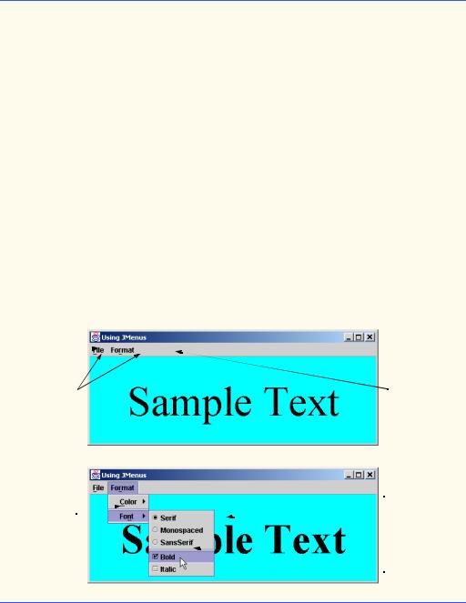
The application of Fig. 13.10 demonstrates various types of menu items. The program also demonstrates how to specify special characters called mnemonics that can provide quick access to a menu or menu item from the keyboard. Mnemonics can be used with objects of all classes that have subclass javax.swing.AbstractButton.

Chapter 13 |
Graphical User Interface Components: Part 2 |
749 |
53// set up Exit menu item
54JMenuItem exitItem = new JMenuItem( "Exit" );
55exitItem.setMnemonic( 'x' );
56 |
|
57 |
exitItem.addActionListener( |
58 |
|
59 |
// anonymous inner class to handle exitItem event |
60 |
new ActionListener() { |
61 |
|
62 |
// terminate application when user clicks exitItem |
63 |
public void actionPerformed( ActionEvent event ) |
64 |
{ |
65 |
System.exit( 0 ); |
66 |
} |
67 |
|
68 |
} // end anonymous inner class |
69 |
|
70 |
); // end call to addActionListener |
71 |
|
72 |
fileMenu.add( exitItem ); |
73 |
|
74// create menu bar and attach it to MenuTest window
75JMenuBar bar = new JMenuBar();
76setJMenuBar( bar );
77bar.add( fileMenu );
78
79// create Format menu, its submenus and menu items
80JMenu formatMenu = new JMenu( "Format" );
81formatMenu.setMnemonic( 'r' );
82
83// create Color submenu
84String colors[] = { "Black", "Blue", "Red", "Green" };
86JMenu colorMenu = new JMenu( "Color" );
87colorMenu.setMnemonic( 'C' );
88
89colorItems = new JRadioButtonMenuItem[ colors.length ];
90colorGroup = new ButtonGroup();
91ItemHandler itemHandler = new ItemHandler();
92
93// create color radio button menu items
94for ( int count = 0; count < colors.length; count++ ) {
95 |
colorItems[ count ] = |
96 |
new JRadioButtonMenuItem( colors[ count ] ); |
97 |
|
98 |
colorMenu.add( colorItems[ count ] ); |
99 |
colorGroup.add( colorItems[ count ] ); |
100 |
|
101colorItems[ count ].addActionListener( itemHandler );
102}
103
104// select first Color menu item
105colorItems[ 0 ].setSelected( true );
Fig. 13.10 Using JMenus and mnemonics (part 2 of 5).


 Look-and-Feel Observation 13.17

 Mnemonics provide quick access to menu commands and button commands through the key-
  board.

 Look-and-Feel Observation 13.18

 Different mnemonics should be used for each button or menu item. Normally, the first letter
 in the label on the menu item or button is used as the mnemonic. If multiple buttons or menu items start with the same letter, choose the next most prominent letter in the name (e.g.,
  not being displayed on the
754 |
Graphical User Interface Components: Part 2 |
Chapter 13 |


 Look-and-Feel Observation 13.19


 Menus normally appear left to right in the order that they are added to a JMenuBar.
Lines 80–81 create menu formatMenu and set its mnemonic to r (F is not used because that is the File menu’s mnemonic).
Lines 86–87 create menu colorMenu (this will be a submenu in the Format menu) and set its mnemonic to C. Line 89 creates JRadioButtonMenuItem array colorItems that refers to the menu items in colorMenu. Line 90 creates the ButtonGroup colorGroup, which ensures that only one of the menu items in the Color submenu is selected at a time. Line 91 defines an instance of inner class ItemHandler (defined at lines 183–208) that responds to selections from the Color submenu and the Font submenu (discussed shortly). The for structure at lines 94–102 creates each JRadioButtonMenuItem in array colorItems, adds each menu item to colorMenu, adds each menu item to colorGroup and registers the ActionListener for each menu item.
Line 105 uses AbstractButton method setSelected to select the first element in the colorItems array. Line 108 adds the colorMenu as a submenu of the formatMenu.


 Look-and-Feel Observation 13.20


 Adding a menu as a menu item in another menu automatically makes the added menu a sub-
 menu. When the mouse is positioned over a submenu (or the submenu’s mnemonic is pressed), the submenu expands to show its menu items.
Line 109 adds a separator line to the menu. The separator appears as a horizontal line in the menu.


 Look-and-Feel Observation 13.21


 Separators can be added to a menu to group menu items logically.


 Look-and-Feel Observation 13.22


 Any lightweight GUI component (i.e., a component that subclasses JComponent) can be
 added to a JMenu or to a JMenuBar.
Lines 114–132 create the Font submenu and several JRadioButtonMenuItems and select the first element of JRadioButtonMenuItem array fonts. Line 139 creates a JCheckBoxMenuItem array to represent the menu items for specifying bold and italic styles for the fonts. Line 140 defines an instance of inner class StyleHandler (defined at lines 211–232) to respond to the JCheckBoxMenuItem events. The for structure at lines 143–150 creates each JCheckBoxMenuItem, adds each menu item to fontMenu and registers the ItemListener for each menu item. Line 153 adds fontMenu as a submenu of formatMenu. Line 156 adds the formatMenu to bar.
Lines 159–163 create a JLabel for which the Format menu items control the font, font color and font style. The initial foreground color is set to the first element of array colorValues (Color.black) and the initial font is set to TimesRoman with PLAIN style and 72-point size. Line 165 sets the background color of the window’s content pane to Color.cyan, and line 166 attaches the JLabel to the CENTER of the content pane’s
BorderLayout.
Chapter 13 |
Graphical User Interface Components: Part 2 |
755 |
Method actionPerformed of class ItemHandler (lines 186–206) uses two for structures to determine which font or color menu item generated the event and sets the font or color of the JLabel display, respectively. The if condition at line 191 uses AbstractButton method isSelected to determine the selected JRadioButtonMenuItem. The if condition at line 199 uses EventSource method getSource to get a reference to the JRadioButtonMenuItem that generated the event. Line 201 uses AbstractButton method getText to obtain the name of the font from the menu item.
The program calls method itemStateChanged of class StyleHandler (lines 214–230) if the user selects a JCheckBoxMenuItem in the fontMenu. Lines 219 and 223 determine whether either or both of the JCheckBoxMenuItems are selected and use their combined state to determine the new style of the font.
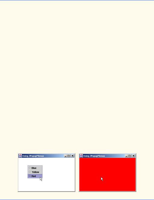
13.9 Using JPopupMenus
Many of today’s computer applications provide so-called context-sensitive popup menus. In Swing, such menus are created with class JPopupMenu (a subclass of JComponent). These menus provide options that are specific to the component for which the popup trigger event was generated. On most systems, the popup trigger event occurs when the user presses and releases the right mouse button.


 Look-and-Feel Observation 13.23


 The popup trigger event is platform specific. On most platforms that use a mouse with multiple
  mouse buttons, the popup trigger event occurs when the user clicks the right mouse button.
Figure 13.11 creates a JPopupMenu that allows the user to select one of three colors and change the background color of the window. When the user clicks the right mouse button on the PopupTest window’s background, a JPopupMenu containing colors appears. If the user clicks one of the JRadioButtonMenuItems that represents a color, method actionPerformed of class ItemHandler changes the background color of the window’s content pane.
1 // Fig. 13.11: PopupTest.java
2 // Demonstrating JPopupMenus
3
4 // Java core packages
5import java.awt.*;
6 import java.awt.event.*;
7
8 // Java extension packages
9 import javax.swing.*;
10
11 public class PopupTest extends JFrame {
12
13private JRadioButtonMenuItem items[];
14private Color colorValues[] =
15{ Color.blue, Color.yellow, Color.red };
17 private JPopupMenu popupMenu;
18
Fig. 13.11 Using a PopupMenu object (part 1 of 3).

756 |
Graphical User Interface Components: Part 2 |
Chapter 13 |
19// set up GUI
20public PopupTest()
21{
22super( "Using JPopupMenus" );
24ItemHandler handler = new ItemHandler();
25String colors[] = { "Blue", "Yellow", "Red" };
27// set up popup menu and its items
28ButtonGroup colorGroup = new ButtonGroup();
29popupMenu = new JPopupMenu();
30items = new JRadioButtonMenuItem[ 3 ];
31
32// construct each menu item and add to popup menu; also
33// enable event handling for each menu item
34for ( int count = 0; count < items.length; count++ ) {
35 |
items[ count ] = |
36 |
new JRadioButtonMenuItem( colors[ count ] ); |
37 |
|
38 |
popupMenu.add( items[ count ] ); |
39 |
colorGroup.add( items[ count ] ); |
40 |
|
41items[ count ].addActionListener( handler );
42}
43
44 getContentPane().setBackground( Color.white );
45
46// define a MouseListener for the window that displays
47// a JPopupMenu when the popup trigger event occurs
48addMouseListener(
49 |
|
50 |
// anonymous inner class to handle mouse events |
51 |
new MouseAdapter() { |
52 |
|
53 |
// handle mouse press event |
54 |
public void mousePressed( MouseEvent event ) |
55 |
{ |
56 |
checkForTriggerEvent( event ); |
57 |
} |
58 |
|
59 |
// handle mouse release event |
60 |
public void mouseReleased( MouseEvent event ) |
61 |
{ |
62 |
checkForTriggerEvent( event ); |
63 |
} |
64 |
|
65 |
// determine whether event should trigger popup menu |
66 |
private void checkForTriggerEvent( MouseEvent event ) |
67 |
{ |
68 |
if ( event.isPopupTrigger() ) |
69 |
popupMenu.show( event.getComponent(), |
70 |
event.getX(), event.getY() ); |
71 |
} |
|
|
Fig. 13.11 |
Using a PopupMenu object (part 2 of 3). |
Chapter 13 |
Graphical User Interface Components: Part 2 |
757 |
72
73 } // end anonymous inner clas
74
75 ); // end call to addMouseListener
76
77setSize( 300, 200 );
78setVisible( true );
79}
80
81// execute application
82public static void main( String args[] )
83{
84PopupTest application = new PopupTest();
86 application.setDefaultCloseOperation(
87JFrame.EXIT_ON_CLOSE );
88}
89
90// private inner class to handle menu item events
91private class ItemHandler implements ActionListener {
93// process menu item selections
94public void actionPerformed( ActionEvent event )
95{
96 |
// determine which menu item was selected |
97 |
for ( int i = 0; i < items.length; i++ ) |
98 |
if ( event.getSource() == items[ i ] ) { |
99 |
getContentPane().setBackground( |
100 |
colorValues[ i ] ); |
101 |
repaint(); |
102 |
return; |
103}
104}
105
106 } // end private inner class ItemHandler
107
108 } // end class PopupTest
Fig. 13.11 Using a PopupMenu object (part 3 of 3).
The constructor for class PopupTest (lines 20–79) defines the JPopupMenu at line 29. The for structure at lines 34–42 creates JRadioButtonMenuItems to add to the JPopupMenu, adds them to the JPopupMenu (line 38), adds them to ButtonGroup


 Look-and-Feel Observation 13.24

 Displaying a
 nents requires registering mouse event handlers to check for the popup-trigger event for each of those GUI components.
 Portability Tip 13.1
 Programs that use Java’s Abstract Windowing Toolkit GUI components (package
 Portability Tip 13.2
 GUI components on each platform have different looks that can require different amounts of
  space to display. This could change the layout and alignments of GUI components.
 Portability Tip 13.3
 GUI components on each platform have different default functionality (e.g., some platforms
  allow a button with the focus to be “pressed” with the space bar, and some do not).
Chapter 13 |
Graphical User Interface Components: Part 2 |
759 |
the look-and-feel to appear as a Microsoft Windows-style look-and-feel or a Motif-style (UNIX) look-and-feel.
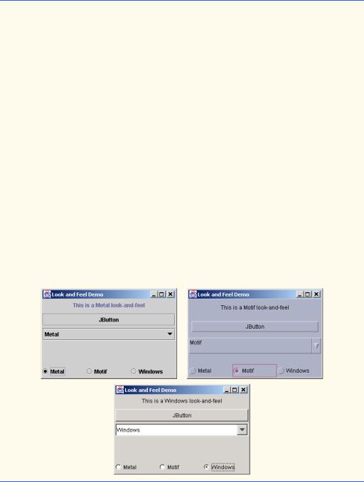
The program of Fig. 13.12 demonstrates how to change the look-and-feel of a Swing GUI. The program creates several GUI components so you can see the change in the look- and-feel of several GUI components at the same time. The first output window shows the standard metal look-and-feel, the second output window shows the Motif look-and-feel, and the third output window shows the Windows look-and-feel.
1 // Fig. 13.12: LookAndFeelDemo.java
2 // Changing the look and feel.
3
4 // Java core packages
5import java.awt.*;
6 import java.awt.event.*;
7
8 // Java extension packages
9 import javax.swing.*;
10
11 public class LookAndFeelDemo extends JFrame {
12
13private String strings[] = { "Metal", "Motif", "Windows" };
14private UIManager.LookAndFeelInfo looks[];
15private JRadioButton radio[];
16private ButtonGroup group;
17private JButton button;
18private JLabel label;
19private JComboBox comboBox;
20
21// set up GUI
22public LookAndFeelDemo()
23{
24super( "Look and Feel Demo" );
26 Container container = getContentPane();
27
28// set up panel for NORTH of BorderLayout
29JPanel northPanel = new JPanel();
30northPanel.setLayout( new GridLayout( 3, 1, 0, 5 ) );
32// set up label for NORTH panel
33label = new JLabel( "This is a Metal look-and-feel",
34SwingConstants.CENTER );
35northPanel.add( label );
36
37// set up button for NORTH panel
38button = new JButton( "JButton" );
39northPanel.add( button );
40
41// set up combo box for NORTH panel
42comboBox = new JComboBox( strings );
43northPanel.add( comboBox );
Fig. 13.12 Changing the look-and-feel of a Swing-based GUI (part 1 of 3).


762 Graphical User Interface Components: Part 2 Chapter 13
Class UIManager (package javax.swing) contains public static inner class LookAndFeelInfo that is used to maintain information about a look-and-feel. Line 14 declares an array of type UIManager.LookAndFeelInfo (notice the syntax used to access the inner class LookAndFeelInfo). Line 71 uses static method getInstalledLookAndFeels of class UIManager to get the array of UIManager.LookAndFeelInfo objects that describe the installed look-and-feels.
Performance Tip 13.1

 Each look-and-feel is represented by a Java class. UIManager method getInstalled-
  LookAndFeels does not load each class. Rather, it provides access to the names of each look-and-feel, so a choice of look-and-feel can be made (presumably one time at program startup). This reduces the overhead of loading additional classes that the program will not use.
Utility method changeTheLookAndFeel (lines 80–93) is called by the event handler (defined in private inner class ItemHandler at lines 105–121) for the JRadioButtons at the bottom of the user interface. The event handler passes an integer representing the element in array looks that should be used to change the look-and-feel. Lines 84–85 use static method setLookAndFeel of class UIManager to change the look-and-feel. Method getClassName of class UIManager.LookAndFeelInfo determines the name of the look-and-feel class that corresponds to the UIManager.LookAndFeelInfo. If the look-and-feel class is not already loaded, it will be loaded as part of the call to setLookAndFeel. Line 86 uses static method updateComponentTreeUI of class SwingUtilities (package javax.swing) to change the look-and-feel of every component attached to its argument (this instance of class LookAndFeelDemo) to the new look-and-feel.
The preceding two statements appear in a special block of code called a try block. This code is part of the exception-handling mechanism discussed in detail in the next chapter. This code is required in case lines 84–85 attempt to change the look-and-feel to a look-and-feel that does not exist. Lines 90–92 complete the exception-handling mechanism with a catch handler that simply processes this problem (if it occurs) by printing an error message at the command line.
13.11 Using JDesktopPane and JInternalFrame
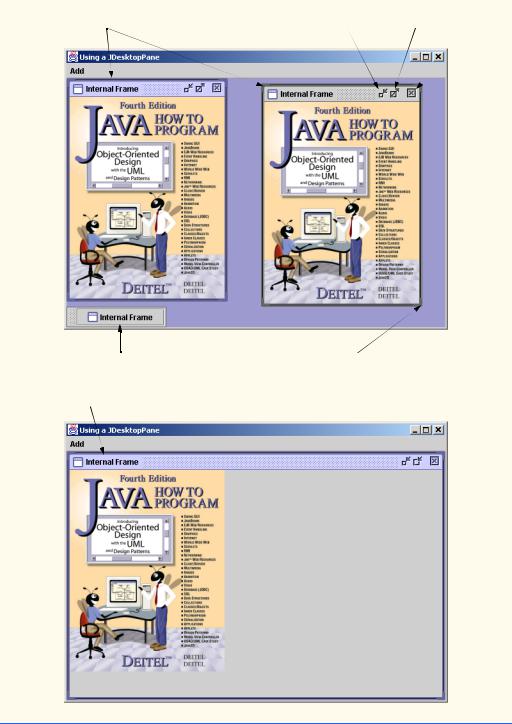
Many of today’s applications use a multiple document interface (MDI) [i.e., a main window (often called the parent window) containing other windows (often called child windows)] to manage several open documents that are being processed in parallel. For example, many e-mail programs allow you to have several e-mail windows open at the same time so you can compose and/or read multiple e-mail messages. Similarly, many word processors allow the user to open multiple documents in separate windows so the user can switch between the documents without having to close the current document to open another document. The program of Fig. 13.13 demonstrates Swing’s JDesktopPane and JInternalFrame classes, which provide support for creating multiple document interfaces. The child windows simply display an image of the cover of this book.
Lines 20–27 define a JMenuBar, a JMenu and a JMenuItem, add the JMenuItem to the JMenu, add the JMenu to the JMenuBar and set the JMenuBar for the application window. When the user selects the JMenuItem newFrame, the program creates and displays a new JInternalFrame.

Chapter 13 |
Graphical User Interface Components: Part 2 |
763 |
1 // Fig. 13.13: DesktopTest.java
2 // Demonstrating JDesktopPane.
3
4 // Java core packages
5import java.awt.*;
6 import java.awt.event.*;
7
8 // Java extension packages
9 import javax.swing.*;
10
11public class DesktopTest extends JFrame {
12private JDesktopPane theDesktop;
13
14// set up GUI
15public DesktopTest()
16{
17super( "Using a JDesktopPane" );
19// create menu bar, menu and menu item
20JMenuBar bar = new JMenuBar();
21JMenu addMenu = new JMenu( "Add" );
22JMenuItem newFrame = new JMenuItem( "Internal Frame" );
24addMenu.add( newFrame );
25bar.add( addMenu );
26
27 setJMenuBar( bar );
28
29// set up desktop
30theDesktop = new JDesktopPane();
31getContentPane().add( theDesktop );
33// set up listener for newFrame menu item
34newFrame.addActionListener(
35 |
|
36 |
// anonymous inner class to handle menu item event |
37 |
new ActionListener() { |
38 |
|
39 |
// display new internal window |
40 |
public void actionPerformed( ActionEvent event ) { |
41 |
|
42 |
// create internal frame |
43 |
JInternalFrame frame = new JInternalFrame( |
44 |
"Internal Frame", true, true, true, true ); |
45 |
|
46 |
// attach panel to internal frame content pane |
47 |
Container container = frame.getContentPane(); |
48 |
MyJPanel panel = new MyJPanel(); |
49 |
container.add( panel, BorderLayout.CENTER ); |
50 |
|
51 |
// set size internal frame to size of its contents |
52 |
frame.pack(); |
53 |
|
|
|
Fig. 13.13 |
Creating a multiple document interface (part 1 of 3). |

764 |
Graphical User Interface Components: Part 2 |
Chapter 13 |
|
|
|
54 |
// attach internal frame to desktop and show it |
|
55 |
theDesktop.add( frame ); |
|
56 |
frame.setVisible( true ); |
|
57 |
} |
|
58 |
|
|
59 |
} // end anonymous inner class |
|
60 |
|
|
61 |
); // end call to addActionListener |
|
62 |
|
|
63setSize( 600, 440 );
64setVisible( true );
66 } // end constructor
67
68// execute application
69public static void main( String args[] )
70{
71DesktopTest application = new DesktopTest();
73 application.setDefaultCloseOperation(
74JFrame.EXIT_ON_CLOSE );
75}
76
77 } // end class DesktopTest
78
79// class to display an ImageIcon on a panel
80class MyJPanel extends JPanel {
81private ImageIcon imageIcon;
82
83// load image
84public MyJPanel()
85{
86imageIcon = new ImageIcon( "jhtp4.png" );
87}
88
89// display imageIcon on panel
90public void paintComponent( Graphics g )
91{
92// call superclass paintComponent method
93super.paintComponent( g );
94
95// display icon
96imageIcon.paintIcon( this, g, 0, 0 );
97}
98
99
100public Dimension getPreferredSize()
101{
102return new Dimension( imageIcon.getIconWidth(),
103imageIcon.getIconHeight() );
104 |
|
} |
105 |
|
|
106 |
} |
// end class MyJPanel |
|
|
|
Fig. 13.13 |
Creating a multiple document interface (part 2 of 3). |
|


Chapter 13 |
Graphical User Interface Components: Part 2 |
767 |
13.13 BoxLayout Layout Manager
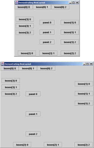
The BoxLayout layout manager arranges GUI components horizontally along the x-axis or vertically along the y-axis of a container. The program of Fig. 13.15 demonstrates BoxLayout and the container class Box that uses BoxLayout as its default layout manager.
In the constructor for class BoxLayoutDemo, lines 19–20 obtain a reference to the content pane and set its layout to a BorderLayout with 30 pixels of horizontal and 30 pixels of vertical gap space between components. The space is to help isolate each of the containers with BoxLayout in this example.
Lines 23–28 define an array of Box container references called boxes and initialize each element of the array with Box objects. Elements 0 and 2 of the array are initialized with static method createHorizontalBox of class Box, which returns a Box container with a horizontal BoxLayout (GUI components are arranged left-to-right). Elements 1 and 3 of the array are initialized with static method createVerticalBox of class Box, which returns a Box container with a vertical BoxLayout (GUI components are arranged top-to-bottom).
1 // Fig. 13.15: BoxLayoutDemo.java
2 // Demonstrating BoxLayout.
3
4 // Java core packages
5import java.awt.*;
6 import java.awt.event.*;
7
8 // Java extension packages
9 import javax.swing.*;
10
11 public class BoxLayoutDemo extends JFrame {
12
13// set up GUI
14public BoxLayoutDemo()
15{
16super( "Demostrating BoxLayout" );
17final int SIZE = 3;
18
19Container container = getContentPane();
20container.setLayout( new BorderLayout( 30, 30 ) );
22// create Box containers with BoxLayout
23Box boxes[] = new Box[ 4 ];
24
25boxes[ 0 ] = Box.createHorizontalBox();
26boxes[ 1 ] = Box.createVerticalBox();
27boxes[ 2 ] = Box.createHorizontalBox();
28boxes[ 3 ] = Box.createVerticalBox();
30// add buttons to boxes[ 0 ]
31for ( int count = 0; count < SIZE; count++ )
32 |
boxes[ 0 ].add( new JButton( "boxes[0]: " + count ) ); |
|
|
Fig. 13.15 |
Demonstrating the BoxLayout layout manager (part 1 of 3). |

Chapter 13 |
Graphical User Interface Components: Part 2 |
769 |
|
|
|
|
|
|
Fig. 13.15 Demonstrating the BoxLayout layout manager (part 3 of 3).
The for structure at lines 31–32 adds three JButtons to boxes[ 0 ] (a horizontal Box). The for structure at lines 35–38 adds three JButtons to boxes[ 1 ] (a vertical Box). Before adding each button, line 36 adds a vertical strut to the container with static method createVerticalStrut of class Box. A vertical strut is an invisible GUI component that has a fixed pixel height and is used to guarantee a fixed amount of space between GUI components. The argument to method createVerticalStrut determines the height of the strut in pixels. Class Box also defines method createHorizontalStrut for horizontal BoxLayouts.
The for structure at lines 41–44 adds three JButtons to boxes[ 2 ] (a horizontal Box). Before adding each button, line 42 adds horizontal glue to the container with static method createHorizontalGlue of class Box. Horizontal glue is an invis-
770 |
Graphical User Interface Components: Part 2 |
Chapter 13 |
ible GUI component that can be used between fixed-size GUI components to occupy additional space. Normally, extra space appears to the right of the last horizontal GUI component or below the last vertical GUI component in a BoxLayout. Glue allows the extra space to be placed between GUI components. Class Box also defines method createVerticalGlue for vertical BoxLayouts.
The for structure at lines 47–51 adds three JButtons to boxes[ 3 ] (a vertical Box). Before adding each button, lines 48–49 add a rigid area to the container with static method createRigidArea of class Box. A rigid area is an invisible GUI component that always has a fixed pixel width and height. The argument to method createRigidArea is a Dimension object that specifies the width and height of the rigid area.
Lines 54–56 create a JPanel object and set its layout in the conventional manner, using Container method setLayout. The BoxLayout constructor receives a reference to the container for which it controls the layout and a constant indicating whether the layout is horizontal (BoxLayout.X_AXIS) or vertical (BoxLayout.Y_AXIS).
The for structure at lines 58–61 adds three JButtons to panel.Before adding each button, line 59 adds a glue component to the container with static method createGlue of class Box. This component expands or contracts based on the size of the Box.
The Box containers and the JPanel are attached to the content pane’s BorderLayout at lines 64–68. Try executing the application. When the window appears, resize the window to see how the glue components, strut components and rigid area affect the layout in each container.
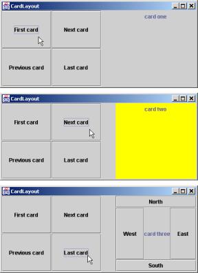
13.14 CardLayout Layout Manager
The CardLayout layout manager arranges components into a “deck” of cards where only the top card is visible. Any card in the deck can be placed at the top of the deck at any time by using methods of class CardLayout. Each card is usually a container, such as a panel, and each card can use any layout manager. Class CardLayout inherits from Object and implements the LayoutManager2 interface.
The program of Fig. 13.16 creates five panels. JPanel deck uses the CardLayout layout manager to control the card that is displayed. JPanels card1, card2 and card3 are the individual cards in deck. JPanel buttons contains four buttons (with labels
First card, Next card, Previous card and Last card) that enable the user to manipulate the deck. When the user clicks the First card button, the first card in deck (i.e., card1) is displayed. When the user clicks the Last card button, the last card (i.e., card3) in deck is displayed. Each time the user clicks the Previous card button, the previous card in deck is displayed. Each time the user clicks the Next card button, the next card in deck is displayed. Clicking the Previous card button or the Next card button repeatedly allows the user to cycle through the deck of cards. Application class CardDeck implements ActionListener, so the action events generated by the JButtons on JPanel buttons are handled by the application in its actionPerformed method.
Class CardDeck declares a reference of type CardLayout called cardManager (line 13). This reference is used to invoke CardLayout methods that manipulate the cards in the deck.

772 |
Graphical User Interface Components: Part 2 |
Chapter 13 |
54card3.add( label3, BorderLayout.CENTER );
55deck.add( card3, label3.getText() ); // add card to deck
57// create and layout buttons that will control deck
58JPanel buttons = new JPanel();
59buttons.setLayout( new GridLayout( 2, 2 ) );
60controls = new JButton[ names.length ];
61 |
|
|
|
62 |
for ( int count = 0; |
count < controls.length; count++ ) { |
|
63 |
controls[ |
count ] |
= new JButton( names[ count ] ); |
64 |
controls[ |
count ].addActionListener( this ); |
|
65buttons.add( controls[ count ] );
66}
67
68// add JPanel deck and JPanel buttons to the applet
69container.add( buttons, BorderLayout.WEST );
70container.add( deck, BorderLayout.EAST );
71
72setSize( 450, 200 );
73setVisible( true );
75 } // end constructor
76
77// handle button events by switching cards
78public void actionPerformed( ActionEvent event )
79{
80// show first card
81if ( event.getSource() == controls[ 0 ] )
82 |
cardManager.first( deck ); |
83 |
|
84// show next card
85else if ( event.getSource() == controls[ 1 ] )
86 |
cardManager.next( deck ); |
87 |
|
88// show previous card
89else if ( event.getSource() == controls[ 2 ] )
90 |
cardManager.previous( deck ); |
91 |
|
92// show last card
93else if ( event.getSource() == controls[ 3 ] )
94cardManager.last( deck );
95}
96
97// execute application
98public static void main( String args[] )
99{
100 CardDeck cardDeckDemo = new CardDeck();
101
102 cardDeckDemo.setDefaultCloseOperation(
103JFrame.EXIT_ON_CLOSE );
104}
105
106 } // end class CardDeck
Fig. 13.16 Demonstrating the CardLayout layout manager (part 2 of 3).
Chapter 13 |
Graphical User Interface Components: Part 2 |
773 |
|
|
|
|
|
|
Fig. 13.16 Demonstrating the CardLayout layout manager (part 3 of 3).
The constructor method (lines 20–75) builds the GUI. Lines 27–29 create JPanel deck, create CardLayout object cardManager and set the layout manager for deck to cardManager. Next, the constructor creates the JPanels card1, card2, and card3 and their GUI components. As we set up each card, we add the card to deck, using Container method add with two arguments—a Component and a String. The Component is the JPanel object that represents the card. The String argument identifies the card. For example, line 36 adds JPanel card1 to deck and uses JLabel label1’s label as the String identifier for the card. JPanels card2 and card3 are added to deck at lines 44–55. Next, the constructor creates the JPanel buttons and its JButton objects (lines 58–66). Line 64 registers the ActionListener for each JButton. Finally, buttons and deck are added to the content pane’s WEST and EAST regions, respectively.
Method actionPerformed (lines 78–95) determines which JButton generated the event by using EventObject method getSource. CardLayout methods first, previous, next and last are used to display the particular card corresponding to which JButton the user pressed. Method first displays the first card added to the deck. Method previous displays the previous card in the deck. Method next displays the next card in the deck. Method last displays the last card in the deck. Note that deck is passed to each of these methods.

Chapter 13 |
Graphical User Interface Components: Part 2 |
775 |
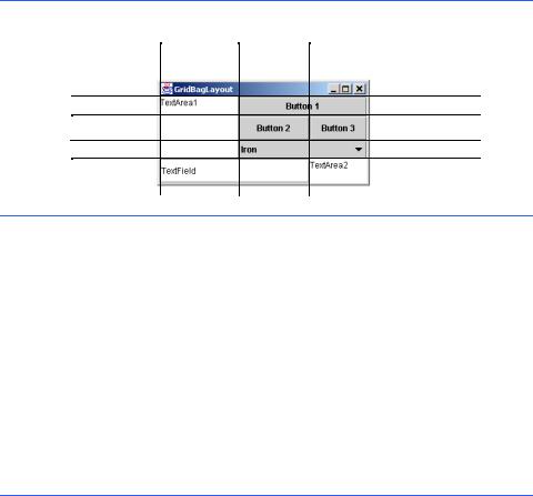
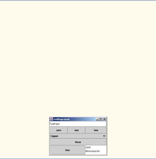
Variables gridx and gridy specify the row and column where the upper-left corner of the component is placed in the grid. Variable gridx corresponds to the column and the variable gridy corresponds to the row. In Fig. 13.17, the JComboBox (displaying “Iron”) has a gridx value of 1 and a gridy value of 2.
Variable gridwidth specifies the number of columns a component occupies. In Fig. 13.17, the JComboBox button occupies two columns. Variable gridheight specifies the number of rows a component occupies. In Fig. 13.17, the JTextArea on the left side of the window occupies three rows.
Variable weightx specifies how to distribute extra horizontal space to components in a GridBagLayout when the container is resized. A zero value indicates that the component does not grow horizontally on its own. However, if the component spans a column containing a component with nonzero weightx value, the component with zero weightx value will grow horizontally in the same proportion as the other component(s) in the same column. This is because each component must be maintained in the same row and column in which it was originally placed.
Variable weighty specifies how to distribute extra vertical space to components in a GridBagLayout when the container is resized. A zero value indicates that the component does not grow vertically on its own. However, if the component spans a row containing a component with nonzero weighty value, the component with zero weighty value grows vertically in the same proportion as the other component(s) in the same row.
In Fig. 13.17, the effects of weighty and weightx cannot easily be seen until the container is resized and additional space becomes available. Components with larger weight values occupy more of the additional space than components with smaller weight values. The exercises explore the effects of varying weightx and weighty.
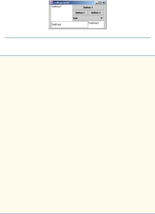
Components should be given nonzero positive weight values—otherwise the components will “huddle” together in the middle of the container. Figure 13.19 shows the GUI of Fig. 13.17—where all weights have been set to zero.
Common Programming Error 13.6
Using a negative value for either weightx or weighty is a logic error.
GridBagConstraints instance variable fill specifies how much of the component’s area (the number of rows and columns the component occupies in the grid) is occupied. The variable fill is assigned one of the following GridBagConstraints constants: NONE, VERTICAL, HORIZONTAL or BOTH. The default value is NONE, which indicates that the component will not grow in either direction. VERTICAL indicates that the component will grow vertically. HORIZONTAL indicates that the component will grow horizontally. BOTH indicates that the component will grow in both directions.
GridBagConstraints instance variable anchor specifies the location of the component in the area when the component does not fill the entire area. The variable anchor is assigned one of the following GridBagConstraints constants: NORTH,
NORTHEAST, EAST, SOUTHEAST, SOUTH, SOUTHWEST, WEST, NORTHWEST or
CENTER. The default value is CENTER.
The program of Fig. 13.20 uses the GridBagLayout layout manager to arrange the components in the GUI of Fig. 13.17. The program does nothing other than demonstrate how to use GridBagLayout.

Chapter 13 |
Graphical User Interface Components: Part 2 |
777 |
39
40// textArea1
41// weightx and weighty are both 0: the default
42// anchor for all components is CENTER: the default
43constraints.fill = GridBagConstraints.BOTH;
44addComponent( textArea1, 0, 0, 1, 3 );
45
46// button1
47// weightx and weighty are both 0: the default
48constraints.fill = GridBagConstraints.HORIZONTAL;
49addComponent( button1, 0, 1, 2, 1 );
50
51// comboBox
52// weightx and weighty are both 0: the default
53// fill is HORIZONTAL
54addComponent( comboBox, 2, 1, 2, 1 );
55
56// button2
57constraints.weightx = 1000; // can grow wider
58 |
constraints.weighty = 1; |
// can grow taller |
59constraints.fill = GridBagConstraints.BOTH;
60addComponent( button2, 1, 1, 1, 1 );
61
62// button3
63// fill is BOTH
64constraints.weightx = 0;
65constraints.weighty = 0;
66addComponent( button3, 1, 2, 1, 1 );
68// textField
69// weightx and weighty are both 0, fill is BOTH
70addComponent( textField, 3, 0, 2, 1 );
71
72// textArea2
73// weightx and weighty are both 0, fill is BOTH
74addComponent( textArea2, 3, 2, 1, 1 );
75
76setSize( 300, 150 );
77setVisible( true );
78}
79
80// method to set constraints on
81private void addComponent( Component component,
82int row, int column, int width, int height )
83{
84// set gridx and gridy
85constraints.gridx = column;
86constraints.gridy = row;
87
88// set gridwidth and gridheight
89constraints.gridwidth = width;
90constraints.gridheight = height;
Fig. 13.20 Demonstrating the GridBagLayout layout manager (part 2 of 3).
778 |
Graphical User Interface Components: Part 2 |
Chapter 13 |
92// set constraints and add component
93layout.setConstraints( component, constraints );
94container.add( component );
95}
96
97// execute application
98public static void main( String args[] )
99{
100 GridBagDemo application = new GridBagDemo();
101
102 application.setDefaultCloseOperation(
103JFrame.EXIT_ON_CLOSE );
104}
105
106 } // end class GridBagDemo
Fig. 13.20 Demonstrating the GridBagLayout layout manager (part 3 of 3).
The GUI consists of three JButtons, two JTextAreas, a JComboBox and a JTextField. The layout manager for the content pane is GridBagLayout. Lines 22– 23 instantiate the GridBagLayout object and set the layout manager for the content pane to layout. The GridBagConstraints object used to determine the location and size
Chapter 13 |
Graphical User Interface Components: Part 2 |
779 |
of each component in the grid is instantiated with line 26. Lines 23 through 30 instantiate each of the GUI components that will be added to the content pane.
JTextArea textArea1 is the first component added to the GridBagLayout
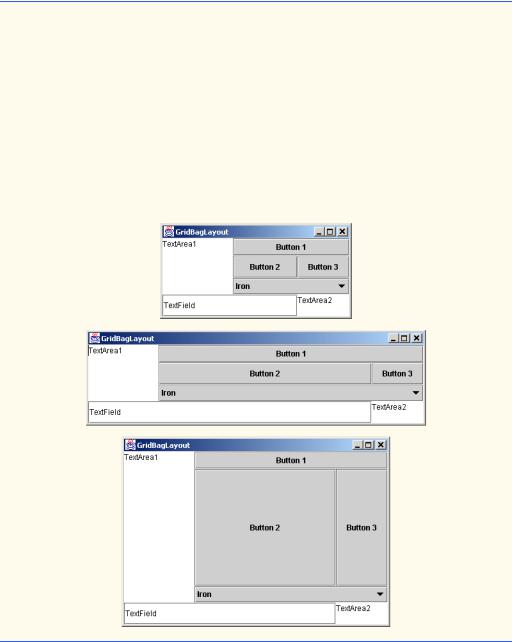
(line 44). The values for weightx and weighty values are not specified in gbConstraints, so each has the value zero by default. Thus, the JTextArea will not resize itself even if space is available. However, the JTextArea spans multiple rows, so the vertical size is subject to the weighty values of JButtons button2 and button3. When either button2 or button3 is resized vertically based on its weighty value, the JTextArea is also resized.
Line 43 sets variable fill in constraints to GridBagConstraints.BOTH, causing the JTextArea to always fill its entire allocated area in the grid. An anchor value is not specified in constraints, so the default CENTER is used. We do not use variable anchor in this program, so all components will use the default. Line 36 calls our utility method addComponent method (defined at lines 81–95). The JTextArea object, the row, the column, the number of columns to span and the number of rows to span are passed as arguments.
Method addComponent’s parameters are a Component reference component and integers row, column, width and height. Lines 85–86 set the GridBagConstraints variables gridx and gridy. The gridx variable is assigned the column in which the Component will be placed, and the gridy value is assigned the row in which the Component will be placed. Lines 89–90 set the GridBagConstraints variables gridwidth and gridheight. The gridwidth variable specifies the number of columns the Component will span in the grid and the gridheight variable specifies the number of rows the Component will span in the grid. Line 93 sets the GridBagConstraints for a component in the GridBagLayout. Method setConstraints of class GridBagLayout takes a Component argument and a GridBagConstraints argument. Method add (line 94) is used to add the component to the content pane.
JButton object button1 is the next component added (lines 48–49). The values of weightx and weighty are still zero. The fill variable is set to HORIZONTAL—the component will always fill its area in the horizontal direction. The vertical direction is not filled. The weighty value is zero, so the button will become taller only if another component in the same row has a nonzero weighty value. JButton b1 is located at row 0, column 1. One row and two columns are occupied.
JComboBox comboBox is the next component added (line 54). The weightx and weighty values are zero, and the fill variable is set to HORIZONTAL. The JComboBox button will grow only in the horizontal direction. Note that the weightx, weighty and fill variables remain set in gbConstraints until they are changed. The JComboBox button is placed at row 2, column 1. One row and two columns are occupied.
JButton object button2 is the next component added (lines 57–60). JButton button2 is given a weightx value of 1000 and a weighty value of 1. The area occupied by the button is capable of growing in the vertical and horizontal directions. The fill variable is set to BOTH, which specifies that the button will always fill the entire area. When the window is resized, b2 will grow. The button is placed at row 1, column 1. One row and one column are occupied.
JButton button3 is added next (lines 64–66). Both the weightx value and weighty value are set to zero, and the value of fill is BOTH. JButton button3 will

780 |
Graphical User Interface Components: Part 2 |
Chapter 13 |
grow if the window is resized; it is affected by the weight values of button2. Note that the weightx value for button2 is much larger than button3. When resizing occurs, button2 will occupy a larger percentage of the new space. The button is placed at row 1, column 2. One row and one column are occupied.
Both the JTextField (line 70) and JTextArea textArea2 (line 74) have a weightx value 0 and a weighty value 0. The value of fill is BOTH. The JTextField is placed at row 3, column 0, and the JTextArea is placed at row 3, column 2. The JTextField occupies one row and two columns. The JTextArea occupies one row and one column.
When you execute this application, try resizing the window to see how the constraints for each GUI component affect its position and size in the window.
13.16 GridBagConstraints Constants RELATIVE and
REMAINDER
A variation of GridBagLayout does not use gridx and gridy. Rather, GridbagConstraints constants RELATIVE and REMAINDER are used in their place. RELATIVE specifies that the next-to-last component in a particular row should be placed to the right of the previous component in that row. REMAINDER specifies that a component is the last component in a row. Any component that is not the second-to-last or last component on a row must specify values for GridbagConstraints variables gridwidth and gridheight. Class GridBagDemo2 in Fig. 13.21 arranges components in GridBagLayout, using these constants.
1// Fig. 13.21: GridBagDemo2.java
2 // Demonstrating GridBagLayout constants.
3
4 // Java core packages
5import java.awt.*;
6 import java.awt.event.*;
7
8 // Java extension packages
9 import javax.swing.*;
10
11public class GridBagDemo2 extends JFrame {
12private GridBagLayout layout;
13private GridBagConstraints constraints;
14private Container container;
15
16// set up GUI
17public GridBagDemo2()
18{
19super( "GridBagLayout" );
21container = getContentPane();
22layout = new GridBagLayout();
23container.setLayout( layout );
Fig. 13.21 Demonstrating the GridBagConstraints constants RELATIVE and REMAINDER (part 1 of 3).
782 |
Graphical User Interface Components: Part 2 |
Chapter 13 |
77
78// list -- weightx and weighty are 1: fill is BOTH
79constraints.gridwidth = GridBagConstraints.REMAINDER;
80addComponent( list );
81
82setSize( 300, 200 );
83setVisible( true );
85 } // end constructor
86
87// addComponent is programmer-defined
88private void addComponent( Component component )
89{
90layout.setConstraints( component, constraints );
91 |
container.add( component ); |
// add component |
92 |
} |
|
93 |
|
|
94// execute application
95public static void main( String args[] )
96{
97GridBagDemo2 application = new GridBagDemo2();
99 application.setDefaultCloseOperation(
100JFrame.EXIT_ON_CLOSE );
101}
102
103 } // end class GridBagDemo2
Fig. 13.21 Demonstrating the GridBagConstraints constants RELATIVE and REMAINDER (part 3 of 3).
Lines 22–23 construct a GridBagLayout and set the content pane’s layout manager to GridBagLayout. The components that are placed in GridBagLayout are each constructed (lines 29–42). The components are five JButtons, one JTextField, one
JList and one JComboBox.
The JTextField is added first (lines 46–50). The weightx and weighty values are set to 1. The fill variable is set to BOTH. Line 49 specifies that the JTextField is the last component on the line. The JTextField is added to the content pane with a call to our utility method addComponent (defined at lines 88–92). Method addComponent takes a Component argument and uses GridBagLayout method setConstraints to set the constraints for the Component. Method add attaches the component to the content pane.