

The Essential Guide to UI Design
.pdf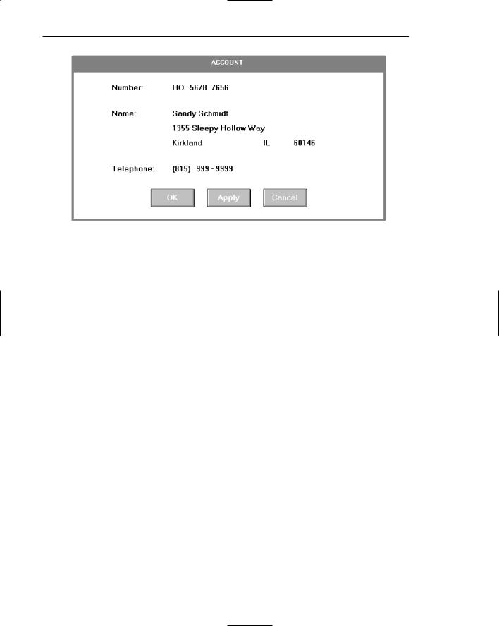
200 Part 2: The User Interface Design Process
Figure 3.44: Display/read-only screen identical to 3.43 except that the captions Street and City/State/Zip have been eliminated to improve data field distinctiveness. The content of the data should make the identity of these fields obvious. The recommended style for this kind of display/read-only screen.
Justification of single captions and data fields can be accomplished in several ways. These include
A. Left-justifying captions; data field immediately follows caption.
Figure 3.45
B.Left-justifying captions; left-justifying data fields; colon (:) associated with captions.
Figure 3.46
C.Left-justifying captions; left-justifying data fields; colon (:) associated with data field.
Figure 3.47
Step 3: Principles of Good Interface and Screen Design 201
D. Right-justifying captions; left-justifying data fields.
Figure 3.48
Alternatives A and C are not recommended. Alternative A, left-justified aligned captions with data fields immediately following, results in poor alignment of data fields and increases the screen’s complexity. It is more difficult to find data when searching data fields. Alternative C, while structurally sound, associates the colon primarily with the data field. The strongest association of the colon should be with the caption.
The two most desirable alternatives are B and D. Alternative B, left-justified captions and data fields, is the first approach illustrated in these guidelines. Alternative D, right-justified captions and left-justified data fields, is the second approach illustrated in these guidelines.
Left-justified captions and data (B). A disadvantage to this approach is that the caption beginning point is usually farther from the entry field than the right-justified caption approach. A mix of caption sizes can cause some captions to be far removed from their corresponding data field, greatly increasing eye movements between the two and possibly making it difficult to accurately tie caption to data field. Tying the caption to the data field by a line of dots (. . . . .) solves the association problem, but adds a great deal of noise to the screen. This does not solve the eye movement problem. Eye movement inefficiencies can be addressed by abbreviating the longer captions. The cost is reduced caption clarity. An advantage to this approach is that section headings using location positioning as the key element in their identification do stand out nicely from the crisp left-justified captions.
Right-justified captions and left-justified entry fields (D). A disadvantage here is that section headings using location positioning as the identification element do not stand out as well. They tend to get lost in the ragged left edge of the captions. Advantages are that captions are always positioned close to their related data fields, thereby minimizing eye movements between the two, and that the screen takes on a more balanced look.
There is no universal agreement as to which is the better approach. Experimental studies have not provided any answers, although most style guides recommend, and illustrate, the left-aligned caption approach.
Examples to follow in this and succeeding chapters reflect both styles. This is done to enable the reader to see and evaluate each. Whichever method is chosen, however, should be consistently followed, through a series of related screens.

202 Part 2: The User Interface Design Process
Headings
Used with related controls in applications, headings are primarily incorporated to create a common identity. In addition to providing meaning, they foster the concept of grouping, create visual appeal, and aid screen learning. Used with Web page text, headings are also used to break up large textual blocks, create visual appeal and aid people in scanning and finding what they are looking for.
In organizing screen controls, three kinds of headings may be incorporated: section headings, subsection or row headings, and field group headings.
Section Headings
■Provide a meaningful heading that clearly describes the relationship of the grouped controls.
■Locate section headings above their related screen controls.
■Display in a distinguishable font style and size in mixed case, using the headline style.
Figure 3.49
—Alternately, headings may be located within a border surrounding a grouping, justified to the upper-left corner.
Figure 3.50
■Indent the control captions to the right of the start of the heading.
■Fully spell out in an uppercase font.
■Display in normal intensity.
—Alternately, if a different font size or style exists, the heading may be displayed in mixed case, using the headline style.
Step 3: Principles of Good Interface and Screen Design 203
Figure 3.51
Section headings should be visually distinguishable through a combination of location and font style. They should not be overly emphasized, however. In the past, many products have displayed headings in the same type size and style as control captions. This provides very poor differentiation between captions and headings, each equally competing for the viewer’s attention. Visual emphasis to section headings in applications should be moderate. Bolding should be reserved for the more important screen data.
Display section headings in an easily distinguishable font. Use mixed case of the headline style (capitalization of all significant words). The method employed should always permit easy, but subtle, discrimination of the section headings from other components of the screen. It should also be visually compatible with other screen components. Whatever styles are chosen, they should be consistently followed throughout a family of screens or a system.
Subsection or Row Headings
■Provide a meaningful heading that clearly describes the relationship of the grouped controls.
■Locate to the left of the
—Row of associated fields.
—Topmost row of a group of associated fields.
■Separate from the adjacent caption through the use of a unique symbol, such as one or two greater-than signs or a filled-in arrow.
■Subsection or row headings may be leftor right-aligned.
■Display in a distinguishable font style and size in mixed case, using the headline style.
Figure 3.52
Row or subsection headings may be positioned to the left of a group of related controls. A meaningful convention to designate subsection or row headings is a filled-in arrow or greater-than sign. It directs the viewer’s attention to the right and indicates that everything that follows refers to this category. Space should separate different subsections. They may also be right-aligned instead of left-aligned, as shown in Figure 3.53. Display row or subsection headings in an easily distinguishable font style in mixed case using the headline style.
204Part 2: The User Interface Design Process
Figure 3.53: Left-aligned and right-aligned row headings.
Field Group Headings
■Provide a meaningful heading that clearly describes the relationship of the grouped controls.
■Center the field group heading above the captions to which it applies.
■Relate it to the captions by a solid line.
■Display in a distinguishable font style and size in mixed case, using the headline style.
AUTOMOBILE
Figure 3.54
Occasionally a group heading above a series of multiple-occurring captions may be needed. It should be centered above the captions to which it applies and related to them through a solid line extending to each end of the grouping. This will provide closure to the grouping. Display row or subsection headings in an easily distinguishable font style in mixed case using the headline style.
MYTH All we really have to do is make the interface look glitzy.
Special Symbols
■Consider special symbols for emphasis.
■Separate symbols from words by a space.
Figure 3.55

Step 3: Principles of Good Interface and Screen Design 205
Special symbols can be considered to emphasize or call attention to elements on a screen. An icon, for example, can precede an error message, or the greater-than sign can be used to direct attention (DELEGATES >>). Symbols should be separated from words by one space.
Instructions
■Incorporate instructions on a screen, as necessary
—In a position just preceding the part, or parts, of a screen to which they apply.
—In a manner that visually distinguishes them, such as
•Displaying them in a unique type style.
•Displaying them in a unique color.
—In a position that visually distinguishes them by
•Left-justifying the instruction and indenting the related captions, headings or text to the right.
•Leaving a space line, if possible, between the instruction and the related control, heading, or text.
Figure 3.56
— Using a mixed-case font.
Instructions to the screen user on what to do with, or how to work with, the screen presented are occasionally necessary. Whether or not to include them will be dependent upon the experience of the user, the frequency of screen use, and the nature of the information itself. Inexperienced or occasional users may need instructions; data that is complex or unfamiliar may also require them. For experienced and frequent screen users, instructions can quickly become visual noise. When you are deciding whether or not to include instructions on a screen, other techniques, such as using Help or the message area should also be considered.
When it is necessary to place instructions on a screen, they must be positioned at the screen point where they are applicable. Instructions placed at the bottom of a screen will probably not be seen. Instructions placed on one screen but applying to another will never be remembered.
When it is necessary to place instructions on a screen, they must be visually recognized as instructions. This will allow them to be easily ignored by the user when they are not needed. Therefore, some visual aspect of the instruction must indicate that it is an instruction. Designers of paper forms do this by presenting instructions in a different font kind or font style such as italics. The form user then immediately recognizes them as instructions, and they can be read or ignored as desired.

206 Part 2: The User Interface Design Process
To make instructions immediately recognizable on a screen, they may also be presented in a unique font or color. If one of these methods is used, however, cautions concerning the excessive use of different font styles (and colors, as are shown in Step 12) must be heeded. Another, but less visually strong, technique is to identify the technique simply by its location. Begin the instruction to the left of the screen elements to which it applies; the left-justification identifies it as an instruction.
Instructions should be presented in the normal mixed-case sentence style. Guidelines for writing text, including instructions, are discussed in Step 8.
Completion Aids
■Incorporate data field completion aids on a screen, as necessary:
—In a position to the right of the text entry control to which they apply.
—In a manner that visually distinguishes them, including
•Displaying them within parentheses ( ).
•Possibly displaying them in a unique font style.
—If the controls are arrayed on the screen in a columnar format, position the completion aid, or aids
•Far enough to the right so as to not detract from the readability of the entry controls within the column.
•But close enough to the related control so that they easily maintain an association with the related control.
—Left-alignment of completion aids in a column of controls is desirable but not absolutely necessary.
Completion Date: ■ / ■ / |
■ (MM/DD/YY) |
|
Frequency: |
■ |
(D, W, M, Y) |
|
||
Figure 3.57
Completion aids are a form of instruction, but they are directed to the contents of a specific entry field control and the content’s format. A date, for example, may require entry of a specified number of characters in a specific order, and it may be necessary to present on the screen a reminder of this format for key entry.
As with instructions, the decision whether or not to include text entry control completion aids will be dependent upon the experience of the user, the frequency of screen use, and the nature of the information itself. Inexperienced or occasional users may need aids; data that is complex or unfamiliar may also require them. For experienced and frequent screen users, however, aids can quickly become visual noise. In deciding whether or not to include completion aids on a screen, other techniques, such as using Help or the message area should also be considered.

Step 3: Principles of Good Interface and Screen Design 207
When it is necessary to place entry control completion aids on a screen, they must be recognized as such. This will allow them to be easily ignored when they are not needed. Therefore, some visual aspect of the completion aid must indicate that it is an aid.
To make completion aids immediately recognizable on a screen, display them within parentheses ( ). A distinguishing font may also be used but parentheses are visually strong enough to stand by themselves, providing an adequate indication that what is contained within is a completion aid.
The best location for a completion aid is to the right of the entry control that it applies to. Right positioning optimizes the screen layout for the expert user by placing the aid outside of the “working area” of a group of columnized controls. Alternate positioning, such as placing the aid within the caption itself, pushes the caption farther away from the entry control, and for the expert this is less efficient and also creates visual noise. Placing the aid above or below the entry control detracts from the readability of the entry control fields, creates an association problem (Is the aid related to the field above or below?), and yields a less efficient screen organization. For the novice or infrequent user, positioning the aid to the right of the entry field is less efficient because his or her eyes must move right to read it, but these kinds of users will be less efficient, anyway.
In a columnized group of controls, position completion aids far enough to the right so as not to detract from the readability of all the entry controls contained in the column. Positioning, however, must be close enough to the related control so that the aid easily maintains an association with its related control. Left-alignment of completion aids in a column of controls is desirable but not absolutely necessary, since the sizes of entry fields may vary significantly. Final positioning of the completion aid must balance all the above factors.
Required and Optional Data
■Use required fields sparingly.
■Request required information at the necessary point in the process.
■Provide defaults for previously captured information.
■Permit unfinished applications to be saved.
■Designate required fields in a standard and consistent way.
■Provide polite feedback to request missing required data.
Required information is information that must be provided by the screen user before the screen’s contents will be accepted by the system. Information is specified as required if it is necessary to the successful completion of an application. Required information must also be complete and valid.
Asking for too much information can be frustrating to a casual user of an application or system. It can be especially frustrating if the user cannot see the value of the requested information or knows that the information has been provided before or could easily be calculated or created by the system. Required fields can also create problems because:

208Part 2: The User Interface Design Process
■■Inexperienced users may not understand the difference between required and optional data.
■■The information may not be completed because the amount of data seemingly requested seems excessive or daunting.
■■Some information incorrectly assumed as being required may be considered as a threat to privacy.
Problems can also occur if people don’t have, or can’t find, the correct data to put in a required field. A solution to this problem may be to enter anything the field will accept.
Use sparingly. Only designate fields as required when absolutely necessary. Never make a field mandatory unless it truly is.
Request at necessary points. In organizing application information, only request required information at the points in the data collection process where the information becomes relevant. Why collect shipping information, for example, before the user has made a decision whether or not to purchase a product?
Provide defaults. Provide defaults based upon what is already known about the user. Known information may already be stored in a database, or be predictable based upon a user’s address or age, for example.
Permit saving. Allow the user adequate time to find and enter required information. Determine in task analysis how much time it may take to find and enter the required information. Do not establish quick time-outs, destroying everything the user has already entered. Allow the user to save unfinished applications until the necessary information can be found.
Designate consistently. Provide indications of required fields an obvious way. Common methods today include displaying symbols such as asterisks (*), check marks, or chevrons (>>) at the beginning of the caption or data field. Other methods include inscribing, the word “Required” near the field caption, displaying captions in a unique color, and displaying the caption bold. A distinctive completion aid message must, however, be prominently displayed at the beginning of the data fields for methods other than the Required word method. Be cautious in the use of Required because visual noise is added to the screen. A different color as an indication of a required field can cause a problem with people who have a color-viewing deficiency. One study (Tullis and Pons, 1997) found that bolded text was preferred to the use of chevrons, check marks, or color. Frequent users of applications do not have to be continually reminded with messages that required data fields are indicated in a certain way. They will be learned. However, for casual users required fields will have to be designated clearly. Unfortunately, people do not always read these messages, so...
Provide polite feedback. Feedback for omissions should be non-threatening, nonchastizing, and clearly indicate the erroneous data field. Message writing is discussed in Step 8. Feedback is discussed in Step 9.
Step 3: Principles of Good Interface and Screen Design 209
Lists
■Present a collection of related items in a vertical list.
■Use sentence or headline style capitalization in a consistent manner.
■Provide a heading for each list.
■Order lists in a meaningful way.
—For items of equal value with no discernable order, arrange items alphabetically or designate each item with a bullet.
—If important or frequently chosen items exist, place at the top of the list.
—For items possessing a particular order, identify each with a number beginning with one (1).
■Format lists for easy identification and scanning through use of surrounding borders, groupings, and white space.
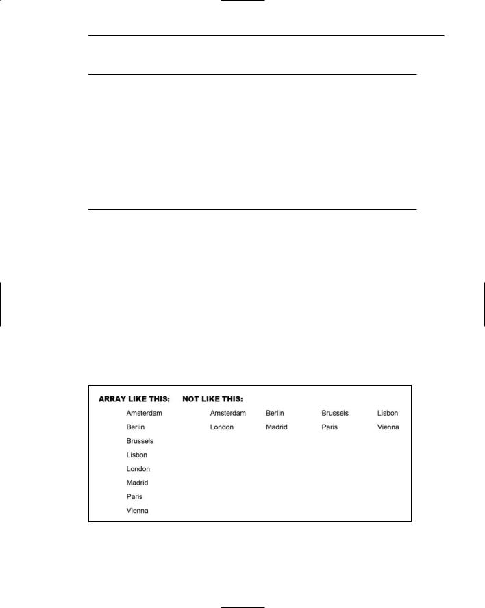
Create lists. Application or Web page information can easily be formatted into lists. An informational list, when compared to paragraph style textual presentation, greatly reduces page density and permits much faster and easier scanning of its contents. Array lists vertically as illustrated in Figure 3.58. One study found that scanning a horizontal list takes people twenty percent longer than scanning a vertical list (Koyani et al., 2004).
Word capitalization. Either sentence style (first word capitalization) or headline style (all significant words capitalized) may be used. The method chosen should be consistently followed. Lower-case-only listings should be avoided.
Headings. Provide a descriptive heading for each list, as illustrated in Figure 3.59. This will help people understand the reason for the list and how the items are related.
Figure 3.58: List Formats.