

The Essential Guide to UI Design
.pdf
140Part 2: The User Interface Design Process
with lines formed through use of white space and display elements. More complex movements may require the aid of display contrasts. Sequence of use can be made more obvious through the incorporation of borders around groupings of related information or screen controls. Borders provide visual cues concerning the arrangement of screen elements, because the eye will tend to stay within a border to complete a task. Aligning elements will also minimize screen scanning and navigation movements. In establishing eye movement through a screen, also consider that the eye tends to move sequentially, for example:
■■From dark areas to light areas.
■■From big objects to little objects.
■■From unusual shapes to common shapes.
■■From highly saturated colors to unsaturated colors.
These techniques can be used initially to focus a person’s attention to one area of the screen and then direct it elsewhere.
For screens containing data, locate the most important or frequently used screen controls to the top left of the screen where initial attention is usually directed. This will also reduce the overall number of eye and manual control movements needed to work with a screen.
Then, maintain a top-to-bottom, left-to-right flow through the screen. This is contrary to the older text-based screen cursor movement direction that precedes left to right, then top to bottom. This top-to-bottom orientation is recommended for information entry for the following reasons:
■■Eye movements between items will be shorter.
■■Control movements between items will be shorter.
■■Groupings are more obvious perceptually.
■■When one’s eye moves away from the screen and then back, it returns to about the same place it left, even if it is seeking the next item in a sequence (a visual anchor point remains).
Unfortunately, most product style guides recommend a left-to-right orientation. This orientation is based upon the presumption that since people read left-to-right, a screen must be organized in this way. Many screens, however, do not present text but listings of small pieces of information that must be scanned. All the research on human scanning finds a top-to-bottom presentation of information is best.
Why do we persist in this left-to-right orientation for nontextual screens? A common screen metaphor applied in today’s systems is that of the paper form. We often see a paper form exactly replicated on a screen. Unfortunately, the left-to-right orientation of the typical form is poorly suited to the needs and characteristics of its user. Its complexity is generally higher than it should be, and its sequentiality is often not as obvious as it should be and certainly not at all efficient.
The left-to-right orientation of paper forms was not dictated by human needs but by mechanical considerations. The metaphor for earliest display screens six decades ago (although this term was not used then) was the typewriter. The left-to-right orientation of the typewriter was developed to permit one to type text on paper, a significant enhancement over handwriting as a medium of human communication. At some

Step 3: Principles of Good Interface and Screen Design 141
point early in the typewriter’s life, however, its ability to be used to complete paper forms also became evident. So, we started designing forms to be completed by typewriter. They had to be filled out left-to-right because the design of the typewriter made any other completion method very difficult for a person to do.
Our earliest display screens reflected this left-to-right entry orientation and have done so for many years. Today in our display-based world, the typewriter’s mechanical limitations no longer exist. Let’s shed the artificial constraints we have imposed upon ourselves and get rid of the left-to-right orientation for nontextual screens. A top- to-bottom orientation has many more advantages for the screen user.
Top-to-bottom orientation is also recommended for presenting displays of readonly information that must be scanned. This will be described shortly.
Visually Pleasing Composition
■Provide a visually or aesthetically pleasing composition possessing the following qualities:
—Balance
—Symmetry
—Regularity
—Predictability
—Sequentiality
—Economy
—Unity
—Proportion
—Simplicity
—Groupings
Eyeball fixation studies also indicate that during the initial scanning of a display in a clockwise direction, people are influenced by the symmetrical balance and weight of the titles, graphics, and text of the display. The human perceptual mechanism seeks order and meaning, trying to impose structure when confronted with uncertainty. Whether a screen has meaningful and evident form or is cluttered and unclear is immediately discerned. A cluttered or unclear screen requires that some effort be expended in learning and understanding what is presented. The screen user who must deal with the display is forced to spend time to learn and understand. The user who has an option concerning whether the screen will or will not be used may reject it at this point if the perceived effort in understanding the screen is greater than the perceived gain in using it.
MAXIM Aesthetic designs are perceived as easier to use than less-aesthetic designs.
An entity’s design composition communicates to a person nonverbally, but quite powerfully. It is an unconscious process that attracts, motivates, directs, or distracts. Meaningfulness and evident form are significantly enhanced by a display that is pleasing to one’s eye. Visually pleasing composition draws attention subliminally, conveying

142Part 2: The User Interface Design Process
a positive message clearly and quickly. A lack of visually pleasing composition is disorienting, obscures the intent and meaning, slows one down and confuses one.
The notion of what is artistic has evolved throughout history. Graphic design experts have, through perceptual research, derived a number of principles for what constitutes a visually pleasing appearance. These include balance, symmetry, regularity, predictability, economy, unity, sequentiality, proportion, simplicity, and groupings. Keep in mind that this discussion of visually pleasing composition does not focus on the words on the screen, but on the perception of structure created by such qualities as spacing, shapes, intensities, and colors, and the relationship of screen elements to one another. It is as if the screen were viewed through “squinted eyes,” causing the words themselves to become a blur.
Balance
■Create screen balance by providing an equal weight of screen elements, left and right, top and bottom.
Balance, illustrated in Figure 3.1, is stabilization or equilibrium, a midway center of suspension. The design elements have an equal weight, left to right, top to bottom. The opposite of balance is instability: the design elements seemingly ready to topple over. Our discomfort with instability, or imbalance, is reflected every time we straighten a picture hanging askew on the wall. Balance is most often informal or asymmetrical, with elements of different colors, sizes and shapes being positioned to strike the proper relationships.
Balance
Instability
Figure 3.1: Balance (versus instability).
Step 3: Principles of Good Interface and Screen Design 143
Dark colors, unusual shapes, and larger objects are “heavier,” whereas light colors, regular shapes, and small objects are “lighter.” Balance on a screen is accomplished through centering the display itself, maintaining an equal weighting of components on each side of the horizontal and vertical axis, and centering titles and illustrations.
In Web page design, vertical, or left-to-right balance is usually the most important concept. Web pages are often scrollable, thereby shifting the horizontal, or top-to-bot- tom, balance point as the screen is scrolled. Horizontal balance is therefore more difficult to maintain.
Symmetry
■ Create symmetry by replicating elements left and right of the screen centerline.
Symmetry, illustrated in Figure 3.2, is axial duplication: A unit on one side of the centerline is exactly replicated on the other side. This exact replication creates formal balance, but the difference is that balance can be achieved without symmetry. Symmetry’s opposite is asymmetry. Our eye tends to perceive something as more compressed or compact when it is symmetric. Asymmetric arrays are perceived as larger.
Symmetry
Asymmetry
Figure 3.2: Symmetry (versus asymmetry).

144 Part 2: The User Interface Design Process
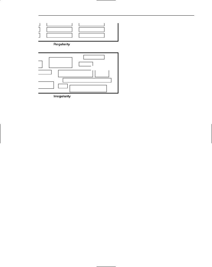
Regularity
■Create regularity by establishing standard and consistently spaced horizontal and vertical alignment points.
■Also, use similar element sizes, shapes, colors, and spacing.
Regularity, illustrated in Figure 3.3, is a uniformity of elements based on some principle or plan. Regularity in screen design is achieved by establishing standard and consistently spaced column and row starting points for screen elements. It is also achieved by using elements similar in size, shape, color, and spacing. The opposite of regularity, irregularity, exists when no such plan or principle is apparent. A critical element on a screen will stand out better, however, if it is not regularized.
Predictability
■Create predictability by being consistent and following conventional orders or arrangements.
Predictability, illustrated in Figure 3.4, suggests a highly conventional order or plan. Viewing one screen enables one to predict how another will look. Viewing part of a screen enables one to predict how the rest of the screen will look. The opposite of predictability — spontaneity — suggests no plan and thus an inability to predict the structure of the remainder of a screen or the structure of other screens. In screen design predictability is also enhanced through design consistency.
Sequentiality
■Provide sequentiality by arranging elements to guide the eye through the screen in an obvious, logical, rhythmic, and efficient manner.
■The eye tends to be attracted to
—A brighter element before one less bright.
—Isolated elements before elements in a group.
—Graphics before text.
—Color before black and white.
—Highly saturated colors before those less saturated.
—Dark areas before light areas.
—A big element before a small one.
—An unusual shape before a usual one.
—Big objects before little objects.
Step 3: Principles of Good Interface and Screen Design 145
Regularity
Irregularity
Figure 3.3: Regularity (versus irregularity).
Predictability
Spontaneity
Figure 3.4: Predictability (versus spontaneity).

146 Part 2: The User Interface Design Process
Sequentiality
Randomness
Figure 3.5: Sequentiality (versus randomness).
Sequentiality, illustrated in Figure 3.5, is a plan of presentation to guide the eye through the screen in a logical, rhythmic order, with the most important information significantly placed. Sequentiality can be achieved by alignment, spacing, and grouping as illustrated. The opposite of sequentiality is randomness, whereby an arrangement and flow cannot be detected.
The eye tends to move first to the elements listed above, and then from one to the other. For example, it moves from highly saturated colors to unsaturated colors, from dark to light areas, from big to little objects, and from unusual to usual shapes.
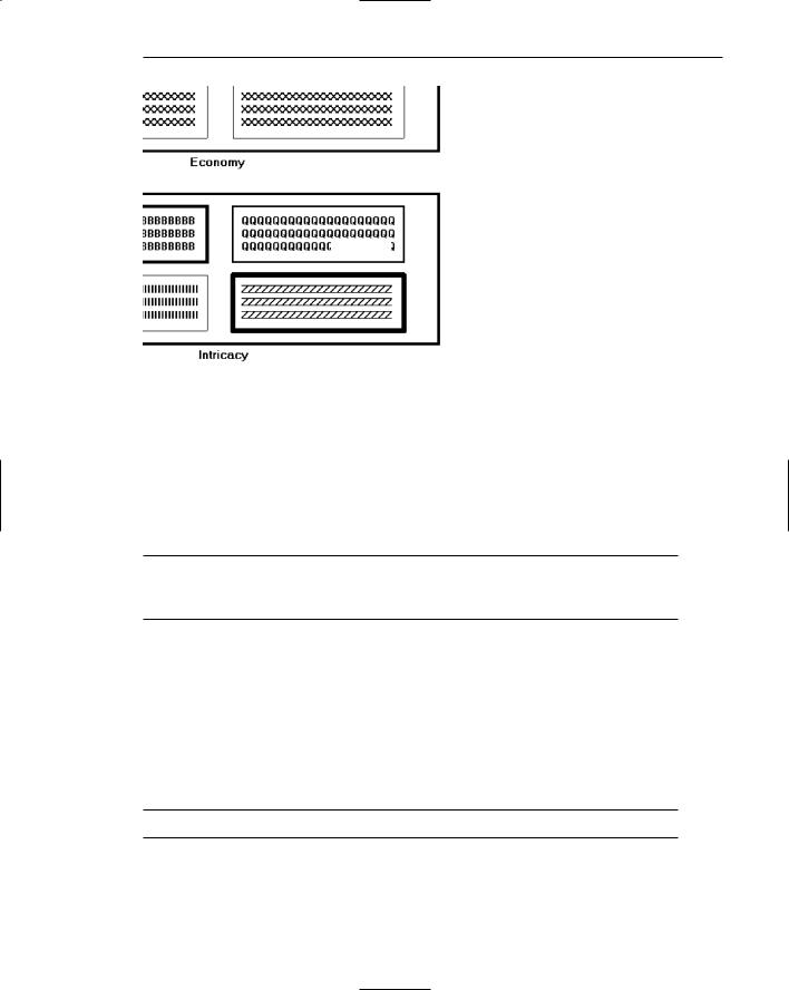
Economy
■ Provide economy by using as few styles, display techniques, and colors as possible.
Economy, illustrated in Figure 3.6, is the frugal and judicious use of display elements to get the message across as simply as possible. The opposite is intricacy, the use of many elements just because they exist. The effect of intricacy is ornamentation, which often detracts from clarity. Economy in screen design means mobilizing just enough display elements and techniques to communicate the desired message, and no more. Historically, the use of color in screens has often violated this principle, with screens sometimes taking on the appearance of Christmas trees.
Step 3: Principles of Good Interface and Screen Design 147
Economy
Intricacy
Figure 3.6: Economy (versus intricacy).
Unity
■Create unity by
—Using similar sizes, shapes, or colors for related information.
—Leaving less space between elements of a screen than the space left at the margins.
Unity, illustrated in Figure 3.7, is coherence, a totality of elements that is visually all one piece. With unity, the elements seem to belong together, to dovetail so completely that they are seen as one thing. The opposite of unity is fragmentation, each piece retaining its own character. In screen design, similar sizes, shapes, and colors promote unity, as does white space — borders at the display boundary. Unity should exist between related screens, and Web site screens, as well.
Proportion
■ Create windows and groupings of data or text with aesthetically pleasing proportions.
Down through the ages, people and cultures have had preferred proportional relationships. What constitutes beauty in one culture is not necessarily considered the same by another culture, but some proportional shapes have stood the test of time and are found in abundance today.

148 Part 2: The User Interface Design Process
Unity
Fragmentation
Figure 3.7: Unity (versus fragmentation).
Marcus (1992) describes the following shapes, illustrated in Figure 3.8, as aesthetically pleasing.
Square (1:1). The simplest of proportions, it has an attention-getting quality and suggests stability and permanence. When rotated it becomes a dynamic diamond, expressing movement and tension.
Square root of two (1:1.414). A divisible rectangle yielding two pleasing proportional shapes. When divided equally in two along its length, the two smaller shapes that result are also both square roots of two rectangles. This property only occurs with this proportion and is often used in book design. An open book has the same outside proportion as the individual pages within it. The square root of two has been adopted as a standard paper size in many countries of the world (the United States excluded).
Golden rectangle (1:1.618). An old (fifth century B.C.) proportion is the golden rectangle. Early Greek architecture used this proportion, and a mathematical relationship exists between this number and growth patterns in plant and animal life. This “divine division of a line” results when a line is divided such that the smaller part is to the greater part as the greater part is to the whole. The golden rectangle also has another unique property. A square created from part of the rectangle leaves a remaining area with sides also in the golden rectangle proportion.
Square root of three (1:1.732). Used less frequently than the other proportions, its narrowness gives it a distinctive shape.
Double square (1:2). In Japan, the tatami mat used for floor covering usually comes in this proportion. Rectangles more elongated than this one have shapes whose distinctiveness is more difficult to sense.

Step 3: Principles of Good Interface and Screen Design 149
Square 1:1
Square root of two 1:1.414
Golden rectangle 1:1.618
Square root of three 1:1.732
Double square 1:2
Figure 3.8: Pleasing proportions.
While these pleasing shapes have passed the test of time, not everything we encounter conforms to these principles. The American letter paper size has a ratio of 1:1.29, a typical American television screen has a ratio of 1:1.33, and CRT screens typically have ratios in the range of about 1:1.33 to 1:1.50.
In screen design, aesthetically pleasing proportions should be considered for major components of the screen, including window sizes, Web page sizes, graphics, and groupings of data or text.
Simplicity (Complexity)
■Optimize the number of elements on a screen, within limits of clarity.
■Minimize the alignment points, especially horizontal or columnar.
— Provide standard grids of horizontal and vertical lines to position elements.
Simplicity, illustrated in Figure 3.9, is directness and singleness of form, a combination of elements that results in ease of comprehending the meaning of a pattern. The opposite pole on the continuum is complexity. The scale created may also be considered a scale of complexity, with extreme complexity at one end and minimal complexity (simplicity) at the other. While the graphics designer usually considers this concept as simplicity, we will address it as complexity since it has been addressed by this term in the design literature, where an objective measure of it has been derived.
This measure of complexity was derived by Tullis (1983) based on the work of Bonsiepe (1968), who proposed a method of measuring the complexity of typographically designed pages through the application of information theory (Shannon and Weaver, 1949). To illustrate, this measure involves the following steps: