

The Essential Guide to UI Design
.pdf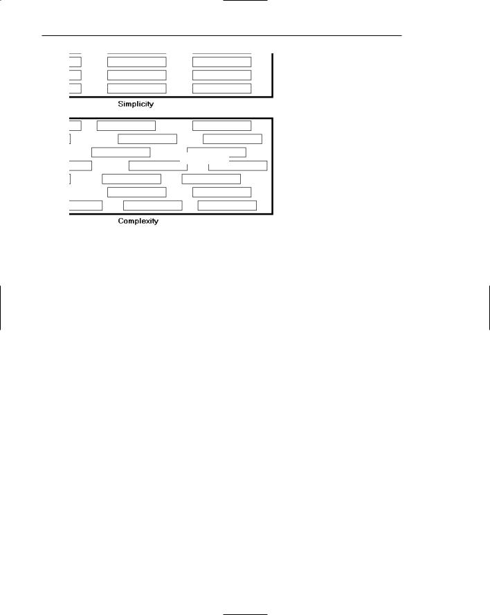
150 Part 2: The User Interface Design Process
Simplicity
Complexity
Figure 3.9: Simplicity (versus complexity).
1.Draw a rectangle around each element on a screen, including captions, controls, headings, data, title, and so on.
2.Count the number of elements and horizontal alignment points (the number of columns in which a field, inscribed by a rectangle, starts).
3.Count the number of elements and vertical alignment points (the number of rows in which an element, inscribed by a rectangle, starts).
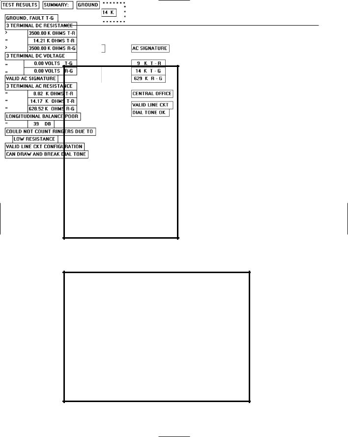
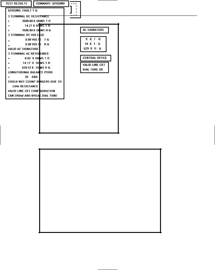
This has been done for the text-based screens illustrated in Figures 3.10 and 3.11. These screens are examples from the earlier study by Tullis (1981) described in the introduction. They are an original read-only inquiry screen (Figure 3.10) from the screens whose mean search time was 8.3 seconds, and a redesigned screen (Figure 3.11) from the screens whose mean search time was 5.0 seconds.
A complexity calculation using information theory for each screen is as follows:
■■Figure 3.10 (original):
■■22 fields with 6 horizontal (column) alignment points = 41 bits.
■■22 fields with 20 vertical (row) alignment points = 93 bits.
■■Overall complexity = 134 bits.
■■Figure 3.11 (redesigned):
■■18 fields with 7 horizontal (column) alignment points = 43 bits.
■■18 fields with 8 vertical (row) alignment points = 53 bits.
■■Overall complexity = 96 bits.
Step 3: Principles of Good Interface and Screen Design 151
The redesigned screen is, thus, about 28 percent simpler, or less complex, than the original screen.
Figure 3.10: Original screen, from Tullis (1981), with title, captions, and data inscribed by rectangles.
Figure 3.11: Redesigned screen, from Tullis (1981), with title, captions, and data inscribed by rectangles.

152 Part 2: The User Interface Design Process
An easier method of calculation, however, yielding similar results, is to count the following: (1) the number of elements on the screen, (2) the number of horizontal (column) alignment points, and (3) the number of vertical (row) alignment points. The sums for the original and redesigned screens by this measure are:
■■Figure 3.10 (original):
■■22 elements
■■6 horizontal (column) alignment points
■■20 vertical (row) alignment points
■■48 = complexity
■■Figure 3.11 (redesigned):
■■18 elements
■■7 horizontal (column) alignment points
■■8 vertical (row) alignment points
■■33 = complexity
By this calculation the redesigned screen is about 31 percent simpler, or less complex, than the original screen.
By both calculations the redesigned screen has a lower complexity measure than the original screen. In the Tullis (1981) study, the redesigned and faster-to-use screens had lower complexity measures. This leads to the following complexity guidelines:
■■Optimize the number of elements on a screen, within limits of clarity.
■■Minimize the alignment points, especially horizontal or columnar.
Obviously, the way to minimize screen complexity is to reduce the number of controls displayed. Fewer controls will yield lower complexity measures. This is unrealistic, however, since ultimate simplicity means nothing is there, which obviously does not accomplish very much. Indeed, Vitz (1966) has found that people have subjective preferences for the right amount of information, and too little is as bad as too much. The practical answer, then, is to optimize the amount of information displayed, within limits of clarity. What is optimum must be considered in light of guidelines to follow, so a final judgment must be postponed.
Alignment. What can be done, however, is to minimize alignment points, most importantly horizontal or columnar alignment points. Fewer alignment points will have a strong positive influence on the complexity calculation. Tullis (1983) has also found, in a follow-up study of some other screens, that fewer alignment points were among the strongest influences creating positive viewer feelings of visually pleasing composition. Grose et al. (1998) also performed a study examining various screen factors and usability. They found that good alignment was related to shorter screen search times and higher viewer preferences for a screen.
Alignment of elements is a powerful means of leading a person through a display of information. Alignment also serves as a visual cue that elements of a display are related. Misalignments and uneven spacing, no matter how slight, can create bothersome unconscious disruptions to our perceptual systems. When things don’t align, a sense of clutter and disorganization often results. In addition to reducing complexity,

Step 3: Principles of Good Interface and Screen Design 153
alignment helps create balance, regularity, sequentiality, and unity. Alignment also reduces variation on a screen. Common alignments are associated with a group identity of their own. Anything that breaks that alignment is quickly seen as an exception.
In laying out a screen, imagine a grid of horizontal and vertical lines beneath it. Use these grids to position elements and to achieve common alignment points.
Groupings
■Provide functional groupings of associated elements.
■Create spatial groupings as closely as possible to five degrees of visual angle (1.67 inches in diameter or about 6 to 7 lines of text, 12 to 14 characters in width).
■Evenly space controls within a grouping, allowing 1/8 to 1/4 inch between each.
■Visually reinforce groupings:
—Provide adequate separation between groupings through liberal use of white space.
—Provide line borders around groups.
■Provide meaningful titles for each grouping.
Grouping screen elements aids in establishing structure, meaningful relationships, and meaningful form. In addition to providing aesthetic appeal, past research has found that grouping aids in information recall and results in a faster screen search. The study by Grose et al. (1998) found that providing groupings of screen elements containing meaningful group titles was also related to shorter screen search times. In this study groupings also contributed to stronger viewer preferences for a screen.
The perceptual principles of proximity, closure, similarity, and matching patterns also foster visual groupings. But the search for a more objective definition of what constitutes a group has gone on for years. Tullis, in his 1981 study, described an objective method for establishing groups based on the work of Zahn (1971) using the Gestalt psychologists’ law of proximity. For the Tullis (1981) screens shown in Figures 3.12 and 3.13
1.Compute the mean distance between each character and its nearest neighbor. Use a character distance of 1 between characters adjacent horizontally and 2 between characters adjacent vertically (between rows).
2.Multiply the mean distance derived by 2.
3.Connect with a line any character pair that is closer than the distance established in step 2.
This has been done for these inquiry screens and the results illustrated in Figures
3.12and 3.13. Boxes have been included around the derived groupings.
■■Figure 3.12 (original):
■■Mean distance between characters = 1.05.
■■Twice the mean distance = 2.10.
■■A line is drawn between characters 1 or 2 apart, not 3 or more.
■■Resulting number of groups = 3.

154Part 2: The User Interface Design Process
■■Figure 3.13 (redesigned):
■■Mean distance between characters = 1.09.
■■Twice the mean distance = 2.18.
■■A line is drawn between characters 1 or 2 apart, not 3 or more.
■■Resulting number of groups = 13.
Tullis found that the redesigned screens had more groupings than the originals.
To use a simplified version of this formula, connect with a line all characters on the screen separated by no more than one space horizontally and no blank lines vertically. Groupings will become immediately obvious.
Tullis also calculated another grouping measure: the average size of each screen’s group. The average size of the three groups in the original screen is 13.3 degrees in visual angle, whereas the 13 groups on the redesigned screen average 5.2 degrees visual angle. The redesigned screen group size, interestingly, closely matches the 5- degree visual acuity screen chunk described in Step 1. It seems that groups 5 degrees or less in size can be scanned with one eye fixation per group. Therefore, screens with these size groupings can be searched faster. Groupings larger than 5 degrees require more eye fixations per grouping, slowing down screen scanning time. So, in addition to complexity, the Tullis redesigned screens differ from the original screens by some grouping measures. The more effective redesigned screens have a greater number of smaller-size groups.
Tullis, in his 1983 follow-up study, also found that groupings were the strongest determinant of a screen’s visual search time. If the size of a group on a screen increased, or the number of groups increased, search time also increased. Number and size of groups have an opposite relationship, however; if the number of groups increases, their size usually decreases. If the size increases, the number of groups usually decreases. What proves to be most effective is a middle-ground solution, a medium number of medium-sized groups. The grouping guidelines described above are based upon this and other research presented.
Functional, semantic groups are those that make sense to the user. Related information should be displayed together. A logical place to “break” a screen is between functional groups of information, but a massive grouping of information should be broken up into smaller groups. The most reasonable point is every five rows. A sixor seven-row grouping may be displayed without a break, if necessary, but do not exceed seven rows.
The 11to 15-character width limitation must take into consideration the data to be displayed. Confining data to this width makes no sense if it thus suffers a reduction in comprehensibility. Legibility and comprehension are most important.
To give unity to a display, the space between groups should be less than that of the margins. The most common and obvious way to achieve spacing is through white or blank space, but there are other ways. Alternatives include contrasting display features such as differing intensity levels, image reversals (white characters on a black background versus black characters on a white background), borders, and color. Spacing, however, appears to be stronger than color. Two studies (Haubner and Benz, 1983; Haubner and Neumann, 1986) found that adequate spacing, not color, is a more important determinant of ease of use for uncluttered, highly structured inquiry screens.
Step 3: Principles of Good Interface and Screen Design 155
Figure 3.12: Original screen, from Tullis (1981), with grouping indicated by bold boxes.
Figure 3.13: Redesigned screen, from Tullis (1981), with grouping indicated by bold boxes.

156 Part 2: The User Interface Design Process
Perceptual Principles and Functional Grouping
■ Use visual organization to create functional groupings. |
|
|
||
— Proximity: |
000 000 000 |
|
|
|
— Similarity: |
AAABBBCCC |
|
|
|
— Closure: |
[ ] [ ] |
[ ] |
|
|
— Matching patterns: |
>> < > |
|
|
|
■ Combine visual organization principles in logical ways. |
|
|
||
— Proximity and similarity: |
AAA |
BBB |
CCC |
|
— Proximity and closure: |
[ ] |
[ ] |
[ ] |
|
— Matching patterns and closure: |
( ) |
< > |
{ } |
|
— Proximity and ordering: |
1234 |
1 |
5 |
|
|
5678 |
2 |
6 |
|
|
|
3 |
7 |
|
|
|
4 |
8 |
|
■ Avoid visual organization principles that conflict. |
|
|
||
— Proximity opposing similarity: |
AAA |
ABB |
BBC |
CCC |
— Proximity opposing closure: |
] [ |
] [ |
] [ |
|
— Proximity opposing ordering: |
1357 |
1 |
2 |
|
|
2468 |
3 |
4 |
|
|
|
5 |
6 |
|
|
|
7 |
8 |
|
|
|
|
|
|
Perceptual principles can be used to aid a person in comprehending groupings. Visual organization can establish a relationship between related items or design elements, as illustrated above.
Proximity. The most common perceptual principle used to establish visual groupings is the proximity principle. Elements positioned close together are perceived as a single group, and are interpreted as more related than elements positioned farther apart. A lack of proximity creates the impression of multiple groups and reinforces differences among elements. In the preceding example, the incorporation of adequate spacing between groups of related elements enhances the “togetherness” of each grouping. Space should always be considered a design component of a screen. The objective should never be to get rid of it.
Similarity. The similarity principle can be used to call attention to various groupings by displaying related groupings in a different manner, such as intensity, font style, or color. Elements that are similar in some manner are perceived to be more related than elements that are dissimilar.
Closure. Because people tend to perceive a set of individual elements as a single recognizable pattern instead of a collection of multiple, individual elements, users will close gaps and fill in missing information to derive a meaningful pattern whenever possible. Closure is strongest when elements approximate simple and recognizable patterns. Closure, generally, will not occur if the effort required to identify a form or pattern is greater than effort required to perceive the elements individually. In the preceding example, the perception of boxes is established through the use of differential spacing.

Step 3: Principles of Good Interface and Screen Design 157
Matching Patterns. The matching patterns principle involves using lines, borders, and unique symbols to identify and relate common information.
Ordering. Certain elements, such as numbers and the alphabet, possess a very welllearned logical ordering scheme.
Combine visual organization principles in logical ways. Visual organization principles can be combined to reinforce groupings. Proximity, a very strong perceptual principle, can guide the eye through an array of information to be scanned in a particular direction. Scanning direction can also be made obvious through similarity (color, intensity, and so on) or matching patterns (lines or borders).
Avoid visual organization principles that conflict. Principles may not always be compatible, however. When the viewer encounters incompatibilities as previously illustrated, confusion results. In the preceding examples, proximity destroys similarity, proximity overwhelms closure, and proximity overwhelms logical ordering.
The aforementioned perceptual principles exert a strong influence on perceived groupings of screen elements. Beck and Palmer (2002) found that in establishing groupings
■■People find it very difficult to ignore color similarity and a common ground.
■■Proximity has a stronger influence than a common ground.
■■Color similarity has a stronger influence than proximity or a common region.
■■Color, shared background, and co-location are stronger grouping cues than outlines.
Grouping Using White Space
■Provide adequate separation between elements through liberal use of white space.
■For Web pages, carefully consider the trade-off between screen white space and the requirement for page scrolling.
Today the term white space is a misnomer, a carry-over from the white paper of printed forms. It might more appropriately simply be called space, areas without text, graphics, and so forth. Whatever it is called, white space should be considered a screen element of equal importance to all others. It is not wasted space. It defines and separates screen elements, and gives a screen proportion and meaningful form, thus assisting in providing the distinctiveness that is so desired. Space is also used to direct attention to adjacent areas that do contain important information. Remember, if a screen is perceived as a homogeneous, cluttered mass, information will only be found through an exhaustive search of the entire screen.
In Web page design the “provide white space” principle directly confronts another principle, “minimize the need for scrolling” (to be discussed shortly). Web pages are typically longer than the maximum visible area of the display on which they are presented. To see the entire page requires screen scrolling. An abundance of white space, therefore, creates a need for excessive scrolling. It also makes page scanning more difficult and moves information further apart spatially, making the determination of information relationships more difficult.

158 Part 2: The User Interface Design Process
Web page guidelines addressing this problem are somewhat contradictory. Recommendations include “use white space moderately” (Koyani et al., 2004), “minimize the use of white space in search tasks” (Bailey, 1999c), sites with large amounts of white space and sparse text are rated poorly (Festa, 1998), and finally users prefer a moderate amount of white space and there is no reliable performance difference with different amounts of white space (Bernard et al., 2000).
On the other hand, white space surrounding an element was found to direct attention and enhance recall (Olsen, 2002), use of white space between paragraphs and in the left and right margins increased comprehension by almost 20 percent (Lin, 2004), and a characteristic of the top 100 Web sites is “lots of white space” (Grok.com).
The most practical recommendation at the moment is that for longer Web pages the use of white space should be reduced, but certainly not at the expense of page clarity. Each page must be evaluated in terms of its specific content, the relationships existing between the various pieces of content, and the page’s scanning and visual search requirements. A trade-off that best meets all these needs must then be established and implemented.
Grouping Using Borders
■Incorporate line borders for
—Focusing attention on groupings or related information.
—Guiding the eye through a screen.
■Do not exceed three line thicknesses or two line styles on a screen, however.
—Use a standard hierarchy for line presentation.
■Create lines consistent in height and length.
■Leave sufficient padding space between the information and the surrounding borders.
■For adjacent groupings with borders, whenever possible, align the borders left, right, top, and bottom.
■Use rules and borders sparingly.
■In Web page design
—Be cautious in using horizontal lines as separators between page sections.
—Reserve horizontal lines for situations in which the difference between adjacent areas must be emphasized.
Line borders. Line borders, or rules, can greatly enhance a screen. Research has found that information displayed with a border around it is easier to read, better in appearance, and preferable. Figures 3.14 and 3.15 illustrate identical screens with and without borders around groupings. While many groupings are obvious without borders, borders certainly reinforce their existence.
Lines or rules assist in focusing attention on related information. They also aid in separating groupings of information from one another. Draw borders around elements to be grouped. Microsoft Windows provides a control called the Group Box to establish a frame around a group of related controls (see Step 7).
Step 3: Principles of Good Interface and Screen Design 159
Rules also serve to guide the viewer’s eye in the desired direction. Use vertical rulings to convey to the screen viewer that information is organized vertically and should be scanned from top to bottom.
Line thickness variations. Too many variations in line thickness on a screen create clutter and are distracting. Use no more than three line weights at one time, or two different styles. Use a standard hierarchy for rules, the thickest to differentiate major components, the thinnest for minor separation. Consider a thin border for individual controls, a slightly thicker border for groupings, and the thickest borders for windows themselves.
Consistent line widths and heights. Similarly, variations in line widths and heights are distracting. Create horizontal lines of equal widths across the screen and vertical lines of equal height whenever possible. This will provide better balance.
Sufficient space padding. When placing information within borders leave “breathing room,” sufficient space between the information and the borders themselves. Avoid looking like your 6 pounds are being stuffed into a 5-pound sack.
Alignment. For adjacent groupings with borders, whenever possible, align the borders left, right, top, and bottom. The most important alignment points are left and top. Do not create right and bottom alignment by leaving excessive white space within the area encompassed by the border. This is not visually appealing.
Use lines and borders sparingly. Too many lines and borders on a screen also create clutter and can be distracting. Like any display technique, lines and borders must be used sparingly.
Web pages. In Web page design, be cautious in using horizontal lines as separators between page sections. Users may assume they have reached the bottom of the page, missing what follows. Separator lines may also make the screen look more cluttered. In general, reserve horizontal lines for situations where the difference between adjacent areas must be emphasized.
Figure 3.14: The effect of line or graphical borders. Groupings without borders.