

The Essential Guide to UI Design
.pdf
220 Part 2: The User Interface Design Process
Organization and Structure Guidelines
What follows is a series of organization and structure guidelines for specific kinds of screens. They are Information Entry and Modification (Conversational), Entry from a Dedicated Source Document, and Display/Read-Only screens.
Information Entry and Modification (Conversational) Screens
■Organization:
—Logical and clear.
—Most frequently used information:
•On the earliest screens.
•At the top of screens.
—Required information:
•On the earliest screens.
•At the top of screens.
■Captions:
—Meaningful.
—Consistently positioned in relation to data field controls.
—Leftor right-aligned.
—Mixed case using headline style.
■Text boxes/selection controls:
—Designate by boxes.
■Spacing and groupings:
—Create logical groupings.
—Make them medium in size, about five to seven lines.
■Headings:
—Uppercase or headline-style mixed case.
—Set off from related controls.
■Control arrangement:
—Align into columns.
—Organize for top-to-bottom completion.
■Required and optional input:
—Consider distinguishing between required and optional data input through
•Placing required and optional information within different screens, windows, or groups.
•Identifying information as required or optional in a completion aid.
•Identifying required information with a unique font or symbol.
■Instructions and completion aids:
—Include as necessary.
•Position instructions before the controls to which they apply.
•Position completion aids to the right of the controls to which they apply.
■Use a Grid for entering large amounts of data or information.
Information entry and modification (conversational) screens are used to collect and modify information, either by entry or selection. These screens are sometimes referred

Step 3: Principles of Good Interface and Screen Design 221
to as conversational screens. They guide a person through a task or process. The screen itself is the user’s focal point for working with information. The viewer is driven by what is presented on the screen in the information collection and designation process. The information needed to complete a screen may be collected from, but is not limited to, these kinds of sources:
■■A person being interviewed or queried at a desk or workstation.
■■A person being queried or interviewed over a telephone.
■■A collection of notes and written materials.
■■An unstructured form.
■■The mind of the user.
These guidelines summarized here have been presented earlier in this chapter.
Organization. Organize these screens logically and clearly, reflecting the exact information needs of the user for the task being performed. In general, place the most frequently used information, or required information, on the earliest screens and at the top of screens.
Captions. Provide meaningful captions, clearly identifying the information to be entered or selected. Use the headline style to display them (all significant words capitalized). Consistently position all captions in relation to their associated controls. They may be leftor right-aligned.
Text boxes/selection controls. Designate by boxes, using either a line border or polarity reversal.
Spacing and groupings. Create logical medium-size groupings of from five to seven elements.
Headings. Provide headings to identify groupings. Set off from their related controls using uppercase or mixed-case headline style.
Control arrangement. Align controls into columns. Maintain a top-to-bottom, then left-to-right arrangement.
Required and optional input. Distinguishing between required and optional data input may or may not be necessary on these screens. The decision on whether or not to distinguish these types of data should be based on the experience of the user doing the key entry, and the information’s familiarity. When a technique to distinguish them is included on a screen, it is a form of completion aid, so the arguments for and against completion aids are applicable here as well. When it is necessary to differentiate required and optional data, consider the following alternatives. First, determine the feasibility of placing the two kinds of data on separate screens or within separate screen windows or groupings. This is the best and cleanest solution. If a meaningful screen organization of information will not permit this, then describe the individual pieces of data as required or optional within a completion aid. The last choice is to identify required information with a unique font or symbol. This alternative, however, requires the user to learn the convention to use it effectively. Displaying a unique font might also lead to screen clutter, if too many different fonts and styles are used on the screen.
Instructions and completion aids. Include these on screens as necessary. Locate instructions so they precede the controls to which they apply. Locate completion aids to the right of the controls to which they apply.

222Part 2: The User Interface Design Process
Grids
■Usage:
—To enter large amounts of related data or information.
■Design guidelines:
—Provide descriptive headings and, where appropriate, subheadings for columns and rows.
•Do not include colons (:) after the headings.
—Justify column headings according to the data presented in the table cells.
•Left-justify headings for columns containing text.
•Right-justify headings for columns containing numbers.
—Left-justify row headings.
—Organize the data or information to be entered logically and clearly.
•Place similar information together.
•Place most important or frequently used information at the top.
•Arrange information chronologically or sequentially.
—Grid format:
•Provide alternate-row shading.
•Use light backgrounds.
•Avoid scrolling.
Usage. Large amounts of related data that must be entered can be collected in grids. Like a table, a grid is a matrix of entry fields arranged in columns and rows. Grids usually consume less screen space than do individual data elements.
Headings. Provide descriptive headings and, where necessary and appropriate, subheadings for columns and rows. Do not include colons (:) after the headings. Justify column headings according to the data presented in the table cells. Use left-justification for columns containing text, right-justification for columns containing numbers. Row headings should be left-justified.
Organization. The organization of grid data or information will follow the same general organizational guidelines previously described. Organize grid data logically and clearly. Place most important or frequently used information at the top and arrange it meaningfully.
Rows. Visually distinguish individual rows by displaying alternate rows in a light color. As described previously, Tullis (2003) found that alternate-row shading yielded the best performance (speed and accuracy of response in finding relevant information) and was rated as the best alternative by study participants. Including alternate-row shading in a data entry task will aid the user in finding information when reviewing screen content. If alternate-row spacing cannot be implemented, or if more than seven rows are presented, insert extra white space after every fifth row.
Backgrounds. For legibility, present table data on light backgrounds, either offwhite or light gray. Use black for the data or information.
Avoid scrolling. Avoid long vertical grids requiring scrolling. A table grid should be entirely contained within the borders of one screen.

Step 3: Principles of Good Interface and Screen Design 223
Text Entry from a Source Document
Occasionally, it may be necessary to key information directly from a source document or paper form into a screen. The document may take the form of an application for insurance, an application for a bank loan, a request for service, and so forth. The key issue for this function is that the document should be dedicated to the screen, and permit “head down” entry of data from the document to the screen, with the screen seldom being the point of the user’s attention. An entire screen should be capable of being completed without the keyer ever looking at the screen. The design guidelines are based upon this assumption. Ideally, the document and screen should be created together so that a document-screen image relationship can be easily achieved. Creating them together permits trade-offs between the document and the screen to achieve this fit.
Sometimes, but not often, an existing document will allow the creation of a screen in its exact image. When this happens, this document can also be considered as dedicated and will follow these rules. Most documents, however, because they were not designed with a screen in mind, cannot be easily matched to a screen. In this case, their corresponding screens should be considered as entry/modification (conversational) screens and should be designed accordingly because the screen, not the document, will drive the keying process. The required information on the screen must be searched for and found on the form.
If an existing document or form is being converted to a screen format, and the existing document will no longer be used, its screens should also be designed following the entry/modification (conversational) guidelines. This is a much more effective approach for information collection, as discussed earlier in this chapter.
Dedicated Source Document Screens
■Organization:
—Image of associated source document.
■Captions:
—Abbreviations and contractions.
—Consistently positioned in relation to data fields.
—Right-aligned.
■Data fields:
—Designate by boxes.
■Spacing and grouping:
—Logical groupings found on source document.
■Headings:
—Include if on source document.
—Uppercase or headline-style mixed case.
—Set off from related controls.
■Control arrangement:
—As arranged on source document.
—Left-to-right completion.

224Part 2: The User Interface Design Process
■Keying procedure:
—Use manual tabbing.
■Required and optional input:
—Not necessary to differentiate.
■Instructions and completion aids:
—None needed.
Organization. The screen must be an exact image of its associated source document. Skipping around a source document to locate information adds a significant amount of time to the keying process. It also imposes a learning requirement on people, because the order and location of screen fields must be mastered. Having the source document and screen in the same image eliminates these problems. Cursor position on the screen is always known because it corresponds with a person’s eye position on the source document.
Captions. To allow the screen to be in the image of a source document, screen captions usually must consist of abbreviations and contractions. The document will always be available to assist in identifying unclear captions. Because text boxes fit fairly tightly on these kinds of screens, captions must be right-aligned so they are associated with the proper box.
Data fields. Designate by boxes, using either a line border or background color.
Spacing and grouping. Create the same groupings as exist on the document. Set off groupings as this is done on the form, through use of either white space and/or borders.
Headings. Include the same headings as are found on the source document. Capitalize or use mixed-case headline style (all significant words capitalized) to set them off from the remainder of the screen. Headings should not be a dominant element on this type of screen.
Control arrangement. Control positioning and alignment on the screen should match that of the source document. Position controls in the same manner, or as close to the same manner as possible, to facilitate eye movements between the document and screen. (A well-designed document should have aligned elements, too. If not, still follow the form alignment.) Maintain a left-to-right entry arrangement, if the form is organized for completion in this direction. If, per chance, the document is organized top-to-bottom, then follow this top-to-bottom scheme.
Keying procedure. Use manual tabbing, not auto skip, to permit a rhythmic keying process. Keying will be faster and less error-prone.
Required and optional input. Distinguishing between required and optional data input is not necessary on these screens. This information will have been included within the source document design.
Instructions and completion aids. These will not be necessary. Instructions and completion aids will be located on the source document.
For more detailed information concerning document screen design, see Galitz (1992).

Step 3: Principles of Good Interface and Screen Design 225
Display/Read-Only Screens
Display/read-only screens are used to display the results of an inquiry request or the contents of computer files. Their design objective is human ease in locating data or information. Thus, they should be developed to optimize human scanning. Scanning is made easier if eye movements are minimized, required eye movement direction is obvious, and a consistent viewing pattern is established. Next is a guideline summary.
■■Organization:
——Logical and clear.
——Limit to what is necessary.
■■Most frequently used information:
——On earliest screens.
——At the top of screens.
■■Captions:
——Meaningful.
——Consistently positioned in relation to data fields.
——Leftor right-aligned.
■■Data fields:
——Do not include a surrounding border or box.
■■Spacing and grouping:
——Create logical groupings.
——Make them medium-sized, about 5 to 7 lines.
■■Headings:
——Uppercase or headline-style mixed case.
——Set off from related controls.
■■Data presentation:
——Visually emphasize the data.
——Display information in a directly usable format.
■■Data arrangement:
——Align into columns.
——Organize for top-to-bottom scanning.
■■Data justification:
——For text and alphanumeric data, left-justify.
——For numeric data, right-justify.
——Create a data “ladder.”
■■Data display:
——Consider not displaying no, or null, data.
——Consider “data statements.”

226 Part 2: The User Interface Design Process
More detailed guidelines for screen organization, and data presentation, arrangement, justification, and display are included in the following discussion.
Organization
■Only display information necessary to perform actions, make decisions, or answer questions.
■Group information in a logical or orderly manner, with the most frequently requested information in the upper-left corner.
■For multiscreen functions, locate the most frequently requested information on the earliest screens.
■Do not pack the screen. Use spaces and lines to balance the screen perceptually.
Information contained on a display/read-only screen should consist of only what is relevant to the question for which an answer is sought. Forcing a person to wade through volumes of data is time consuming, costly, and error-prone. Unfortunately, relevance is most often situation-specific. An item that is relevant one time a screen is displayed may be irrelevant another time it is recalled.
Organization should be logical, orderly, and meaningful. When information is structured in a manner that is consistent with a person’s organizational view of a topic, information is comprehended better and faster.
Finding information on a display/read-only screen can be speeded up by a number of factors. First, if information is never used, do not display it. Limit a screen to only what is necessary to perform actions, make decisions, or answer questions. Second, for multiple-window functions, locate the most frequently sought information on the earliest screens and the most frequently sought information on a screen in the upper-left corner. Never pack a display/read-only screen with information.
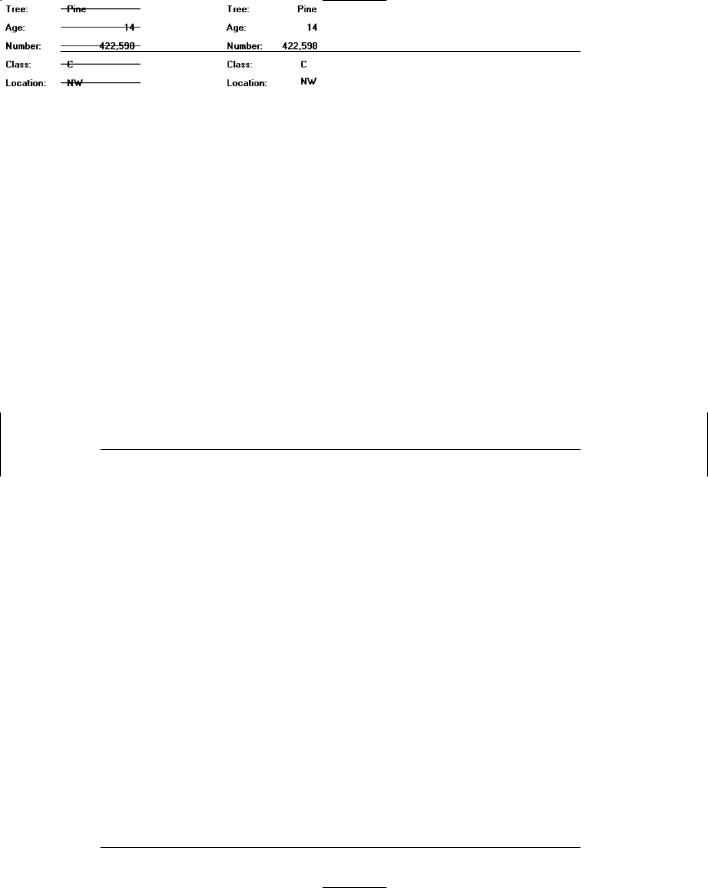
Captions. Provide meaningful captions clearly identifying the information displayed, unless the identity of data is obvious by its shape or structure (for example, an address). Use the headline style (all significant words capitalized), and consistently position all captions in relation to their associated data. Captions may be leftor right-aligned.
Data fields. Do not place a border around display/read-only information; inscribe the data so that it appears on the normal window background. It will be much more readable presented in this manner.
Spacing and grouping. Provide easily scanned and identifiable logical groupings of information. Create groupings of a medium size (five to seven lines) and set them off through liberal use of white space and conservative use of line borders.
Headings. Provide headings to identify groupings. Set off from their related controls using uppercase or mixed-case headline style.

Step 3: Principles of Good Interface and Screen Design 227
Data Presentation
■Provide visual emphasis to the data.
■Display information in a directly usable format.
—Spell out any codes in full.
—Include natural splits or predefined breaks in displaying data.
—Provide multiple data formats when necessary.
Figure 3.64
■Format common items consistently.
■For data strings of five or more numbers or alphanumeric characters with no natural breaks, display in groups of three or four characters with a blank between each group.
Figure 3.65
Data should be visually emphasized to attract attention. This will enable the viewer to quickly isolate the data and begin scanning the display for the needed information. A bolder presentation or bright color is recommended to accomplish this.
Present information in the most useful format possible, staying consistent with familiar standards and conventions. Never require the user to convert, transpose, compute, or translate data into other units. Also, never require users to refer to documentation to determine the meaning of an item of data. Allow the user to choose the format that data with varying formats is displayed in (for example, dates, time). Fully spell out any codes and include natural splits or predefined breaks in displaying common pieces of data such as telephone numbers and dates.
Common items such as telephone numbers and dates should be formatted in a consistent manner on all screens.
A data display should also reinforce the human tendency to break things into groups. People handle information more easily when it is presented in chunks. Display data strings of five or more alphanumeric characters with no natural breaks in groups of three or four, with a blank space between each group.
Data Arrangement
■Align data into columns.
■Organize for top-to-bottom scanning.
228 Part 2: The User Interface Design Process
To aid scanning, align data into columns with a top-to-bottom, left-to-right orientation. This means permitting the eye to move down a column from top to bottom, then move to another column located to the right, and again move from top to bottom. This also means, if the situation warrants it, permitting the eye to move easily left to right across the top of columns to the proper column, before beginning the vertical scanning movement.
Top-to-bottom scanning will minimize eye movements through the screen and enable human perceptual powers to be utilized to their fullest. Display/read-only screens are often visually scanned not through the captions but through the data fields themselves. A search for a customer name in a display of information frequently involves looking for a combination of characters that resembles the picture of a name that we have stored in our memory. The search task is to find a long string of alphabetic characters with one or two gaps (first name, middle initial, last name, perhaps). A date search might have the viewer seeking a numeric code broken up by slashes. Other kinds of information also have recognizable patterns and shapes. Control captions usually play a minor role in the process, being necessary only to differentiate similarlooking data fields, or for new screen users.
Vertical scanning has led to two key requirements in the design of display/readonly screens: call attention to data fields, and make the structural differences between data fields as obvious as possible. Differences are most noticeable in a columnar field structure, since it is easier to compare data when one piece is above the other.
Data Justification
■ Left-justify text and alphanumeric formats.
Figure 3.66
■ Right-justify lists of numeric data.
Figure 3.67
■ Create a data “ladder.”
Figure 3.68
Step 3: Principles of Good Interface and Screen Design 229
In general, columnized text and alphanumeric data should be left-justified, and numeric data should be right-justified. In aligning data fields, keep in mind how the pieces of data will look in relation to one another when they contain typical information. The visual scan should flow relatively straight from top to bottom. This may require that some data fields be right-justified in the column that is created, not leftjustified, or vice versa. The objective is to create what looks like a ladder of data down the screen.
Data Display
■ Consider not displaying data whose values are none, zero, or blank.
Figure 3.69
■ Consider creating “data statements,” in which the caption and data are combined.
Figure 3.70
Consider not displaying fields containing no data. When displayed on a display/read-only screen, some data fields may be blank or contain a value such as zero or none. In many situations it may not be important to the screen viewer to know that the field contains no data. In these cases consider not displaying these screen elements at all. Present on the screen only the fields containing data, thereby creating less cluttered screens.
If this alternative is chosen, space on the screen must be left for situations in which all fields contain data. To avoid large blank screen areas, a useful rule of thumb is to allow enough space to display clearly all data for about 90 percent of all possible screens. For situations in which screens must contain more data than this, going to an additional screen will be necessary.
This nondisplay alternative should only be considered if it is not important that the viewer know something is “not there.” If it is important that the viewer know that the values in a field are zero or none, or that the field is blank, then the fields must be displayed on the screen.
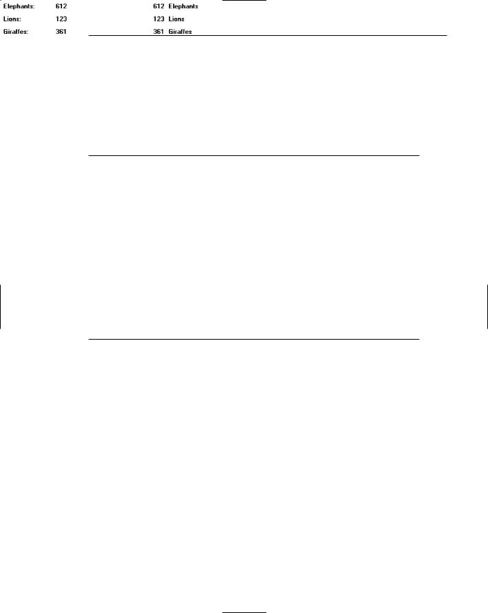
You may also want to consider displaying data statements. The traditional way to display data on an inquiry screen is the “caption: data” format, for example, “Autos: 61.” Another alternative is to create data statements where the caption and data are combined: “61 Autos.” This format improves screen readability and slightly reduces a screen’s density. If this data statement format is followed, consider the statement as data and highlight it entirely.